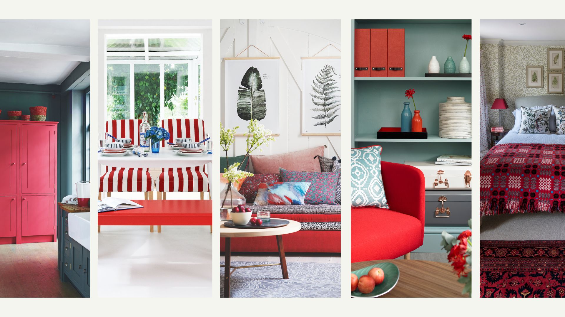
If you're looking to revamp your interiors this spring and are in the mood for something fun, playful, and different, you need to know about the unexpected red theory.
This design rule is taking social media by storm, with homeowners and interior specialists alike swearing by the unexpected red theory as a design secret worth knowing. Trending rule aesthetics often come and go, but this one seems to have cemented itself as a permanent fixture in the world of interior design.
The unexpected red theory, like the design rules to stop your home looking like a show home, provides a way to inject personality into your interiors. It's probably not one for those who prefer to play it safe, but it's perfect for those who like experimenting with bold and playful aesthetics.
What is the unexpected red theory?
"The unexpected red theory is more of a design folklore than a codified rule, but it’s a look that social media content creators are having lots of fun with", Lucy Mather from luxury homeware retailer Arighi Bianchi comments. "Like many ‘trends’ we’re seeing today, it’s gathered pace over on TikTok and Pinterest as style seekers add pops of red into a room, instantly making the room look stylish."
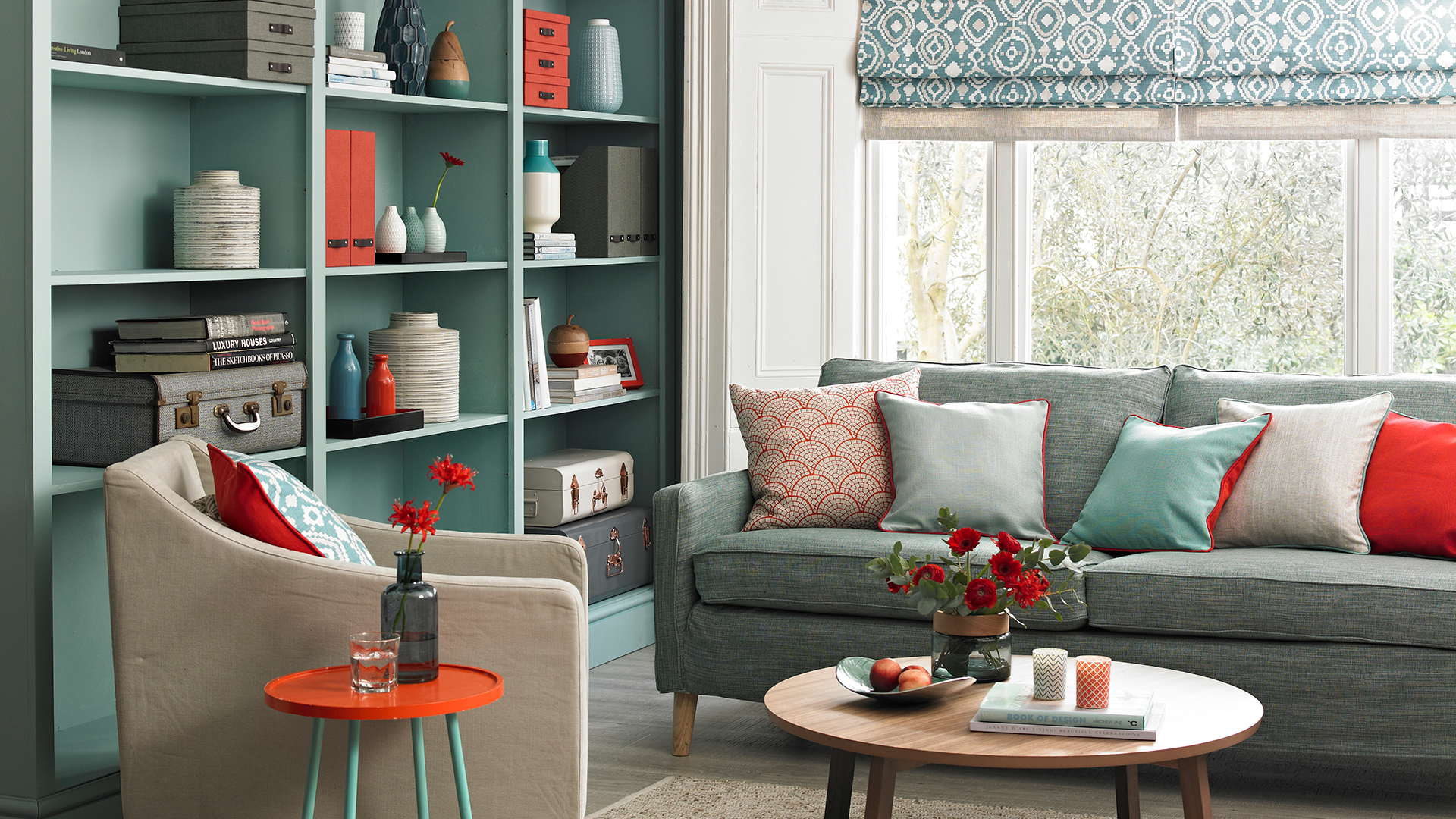
In essence, the unexpected red theory involves adding a pop of red to otherwise neutral decor. The "unexpected" aspect is derived from the fact that the red might seem out of place, or random, with the rest of the interior colour trend or scheme – but as most interior design experts agree, it works.
"The theory refers to the idea that a surprising touch of red, whether deep, muted or vibrant, instantly transforms and harmonises any interior space, injecting elements of depth and energy," Stuart Dance, director of Inhouse Inspired Room Design, explains.
Red isn't a colour everyone would reach for when decorating a home, but that's exactly why the unexpected red theory works so well. It's playful, surprising, and intriguing, making it perfect for those who like to break the norm, like those who pay heed to the kitchen design rules worth breaking, for instance.
"It's a great fit for those who love to entertain, experiment with bold flavours in the kitchen, or just want to feel energised and inspired when they step into the space," Stuart agrees.
The unexpected red theory is underpinned by the idea that by adding red to a room where it doesn't look like it should belong, the room instantly pulls together. It's not exactly clear why this theory works, or where it comes from, but it's something that interior specialists and homeowners alike swear by.
"Even for those that aren't too fond of red for their interiors, when they see a room with red in it, it draws their attention," interior designer Alex Alonso from Mr Alex Tate comments. "There's something quite visceral about red that elicits an emotion."
How to use the unexpected red theory in your home
If you feel like having a bit of fun with your own decor, there are plenty of ways to play around with the unexpected red theory. Whether you're looking to amplify bedroom layout rules or experiment with a new look in the living room, red can be added to your home as subtly or as boldly as you like.
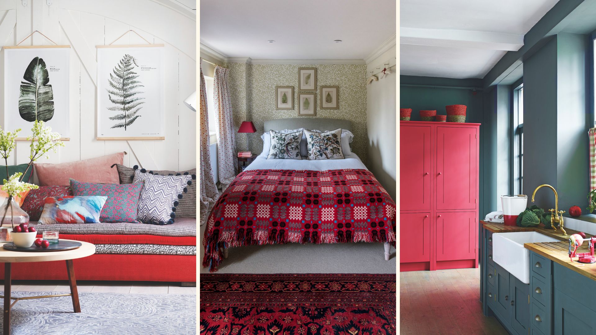
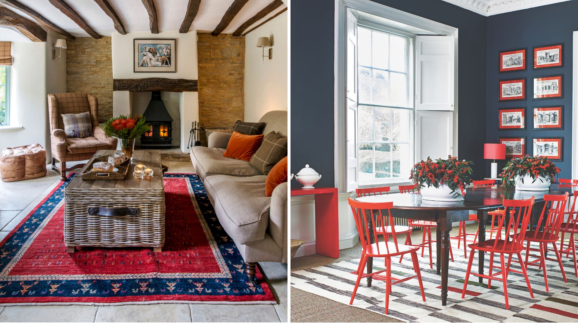
1. Add a red statement chair to your living area
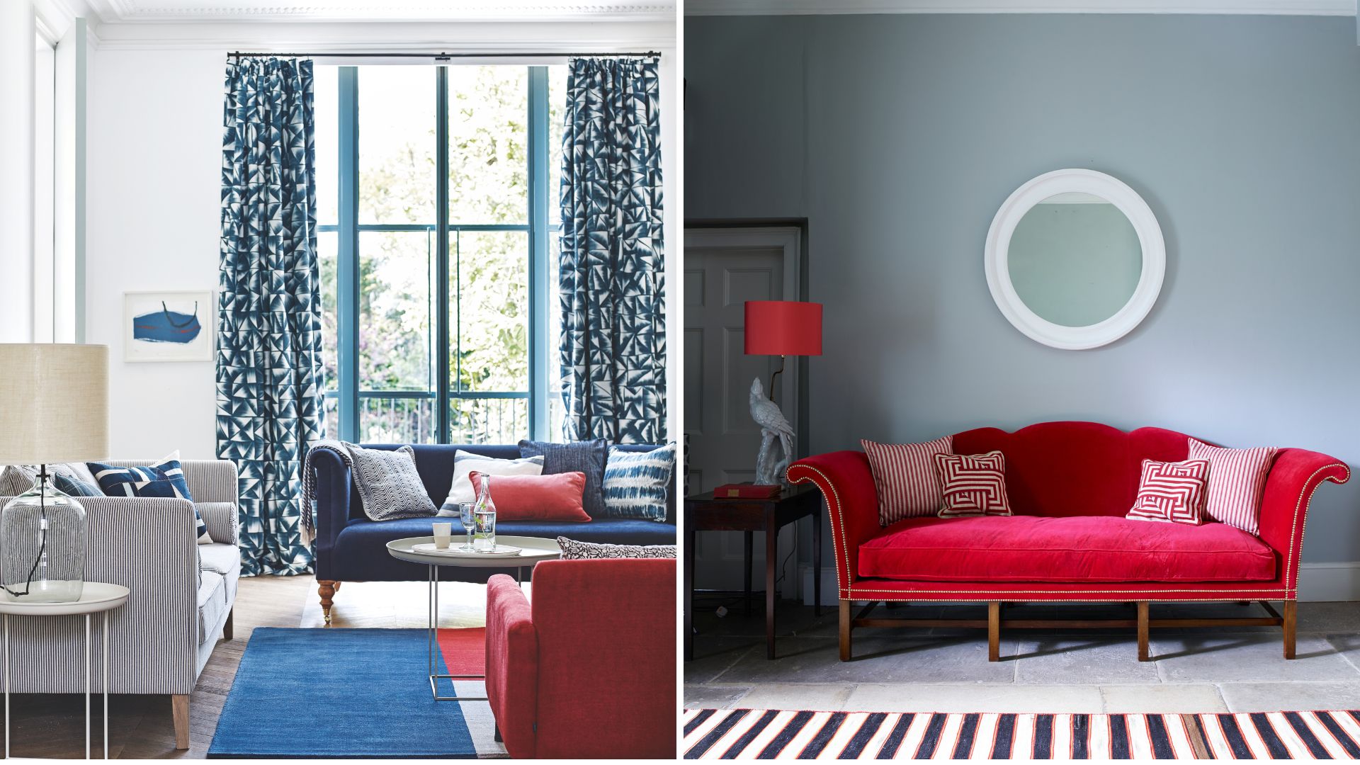
A statement red chair is an easy way to draw the eye, and works particularly well in reading nooks and cosy corners that are otherwise neutral. Dress with a throw and a cushion and position a small table nearby – ideally, with some sort of lighting. This is the perfect way to use the unexpected red theory to make a home feel more cosy.
“I love a red statement chair in an otherwise neutral Scandi, boho vibe room," Lucy from Arighi Bianchi says. "We’ve seen a lot of love for cranberry reds recently, which have a richness and burgundy undertones."
"A chair in this shade will complement lots of existing colour palettes and easily blend into an existing scheme, whilst adding that pop of unexpected colour."
2. Create a bold feature wall
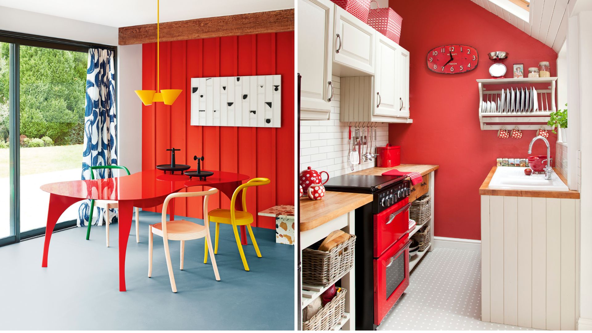
In the spirit of using the unexpected red theory to be bold and playful, you could try adding a red feature wall to a room.
"Think about adding red back panels inside built-in alcove shelving, using wallpaper or paint, accessorised with neutral ceramics," Megan Baker, head of design at My Fitted Bedroom, suggests. "Your eye will be drawn in, and it adds depth to the overall room." A smart way to use paint to make a room look bigger.
Red works surprisingly well as a bedroom paint colour, particularly in its more muted shade. Used tastefully, it can create a warm and inviting atmosphere that many will find welcoming at the end of the day. Stick with one red wall and contrast this with softer shades in the rest of the space, to maintain red as the "unexpected" accent colour.
3. Bring in red accessories
If you don't fancy repainting any walls just yet, there's an easier way to bring the unexpected red theory into your home. Red accessories are the perfect way to refresh a space and experiment with using bold, playful tones.
Accessories offer the chance to inject personality into a room, so there's no right or wrong here. Red cushions are an easy way to accessorise the couch, but you could also incorporate photo frames, vases, and wall hangings in various shades of red.
There are loads of creative ways to decorate walls without paint, so make sure to have fun and play around with different red accessories that suit your own style.
"Even something like a red retro speaker, used to accessorise a natural reclaimed wood sideboard, works to add that pop of red that this design approach is all about," design expert Lucy notes.
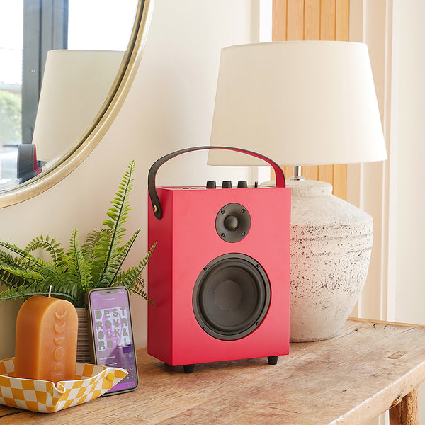
The Redefy Speaker from Arighi Bianchi is very retro chic, and an easy way to bring a pop of red into the home. Combining luxury and vibrancy, the speaker also boasts an impressive audio powerhouse, and has Bluetooth connectivity. A stylish upgrade for your home's audio needs.
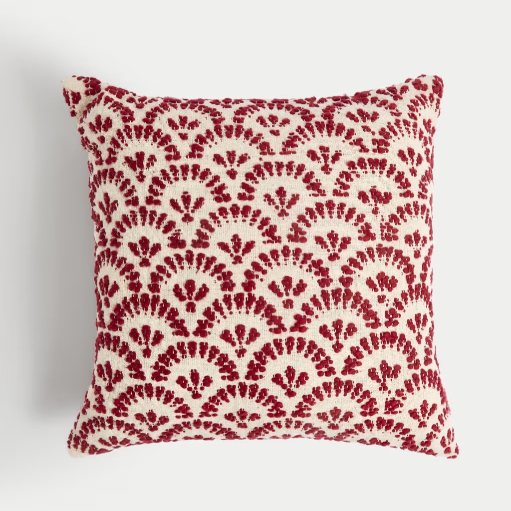
This textured scatter cushion would be a gorgeous addition to a sofa, and the ideal way to experiment with bringing red into a room. I like the contrast of the bright red against the cream backdrop, a perfect example of the unexpected red theory in play.
If you're after a subtle way to use red in your home, this affordable photo frame from Dunelm is perfect. The bobble edging in 'Rhubard' red trim is eye-catching enough, without feeling overpowering. The perfect gateway for trying the unexpected red theory.
4. Make the most of the furnishings
Where accessories refer to the small, decorative items we add to interior displays, furnishings are the larger, more functional aspects of a room. Curtains, rugs, and even bedding sets are the ideal way to make red more of a focal point in the home, if that's what you're going for.
In the bedroom, you might not want to commit to scarlet walls, but you could add a maroon or burgundy rug to the floor. "Layer the rug so it peeks out under the end of the bed – framing the focal point of the room," Megan from My Fitted Bedroom adds.
Updating the window dressings is another option, and one of our favourite ways to make a living room look more expensive on a budget.
"If you’ve got a small window, a textured window blind can be the impactful, unexpected pop of red added to a space," says Matt Thomas, design director at Apollo Blinds.
"Choose a shade of red that works with your existing furniture to make sure all the colours harmonise together, but that still stands out and draws the eye. It could even be a patterned fabric that just has red within the design."
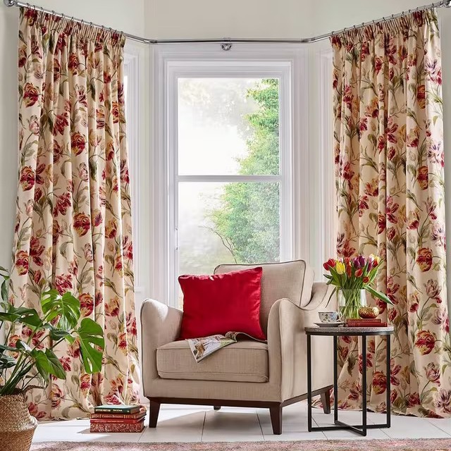
Patterned curtains are a bold choice, but I recently took the plunge in my own living room and it's one of the best interior decisions I've made. This stunning red floral print from Laura Ashley is sure to make an impact.
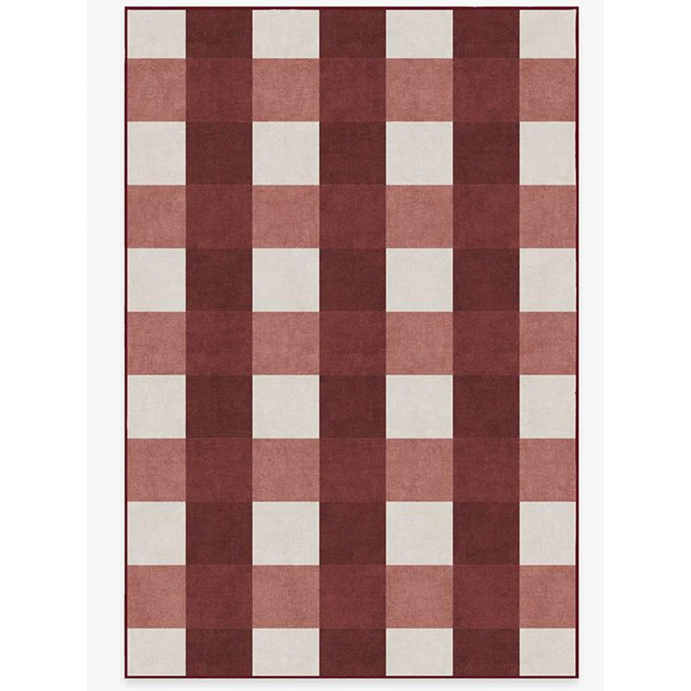
This plaid rug from Ruggable is a fun way to add a touch of both red and playful pattern. The lush red tones would be a nice addition to a bedroom or living area, bringing a warming hue to an otherwise neutral space.
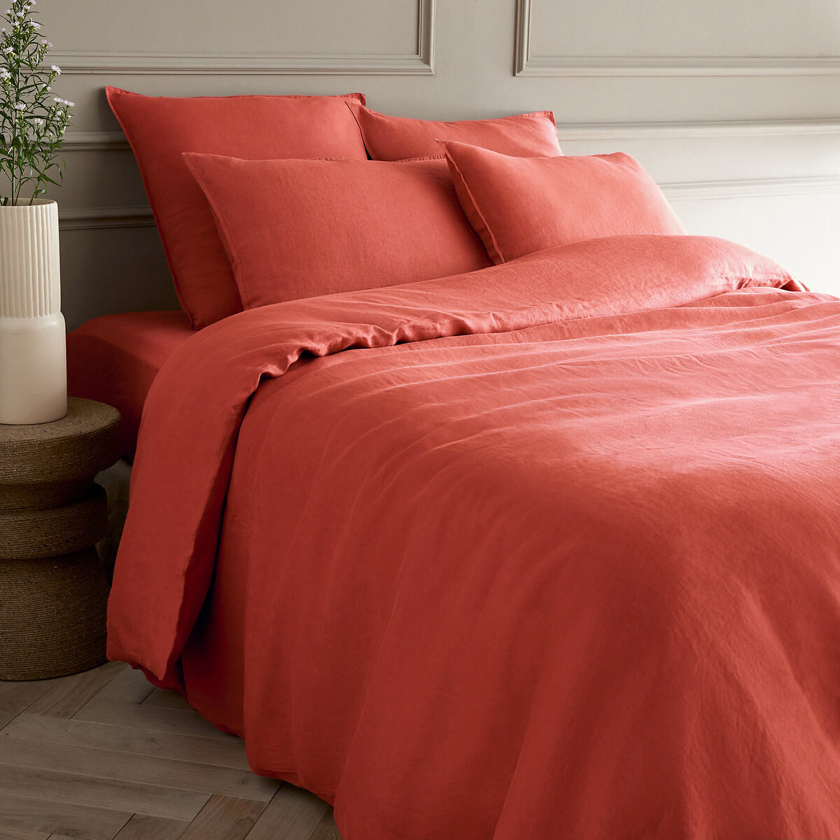
This muted red shade is very cottagecore chic. Linen bedding is a luxury that not only elevates the look of a bedroom, but allows for a restful night's sleep too. It's the perfect set to bring the unexpected red theory into the bedroom.
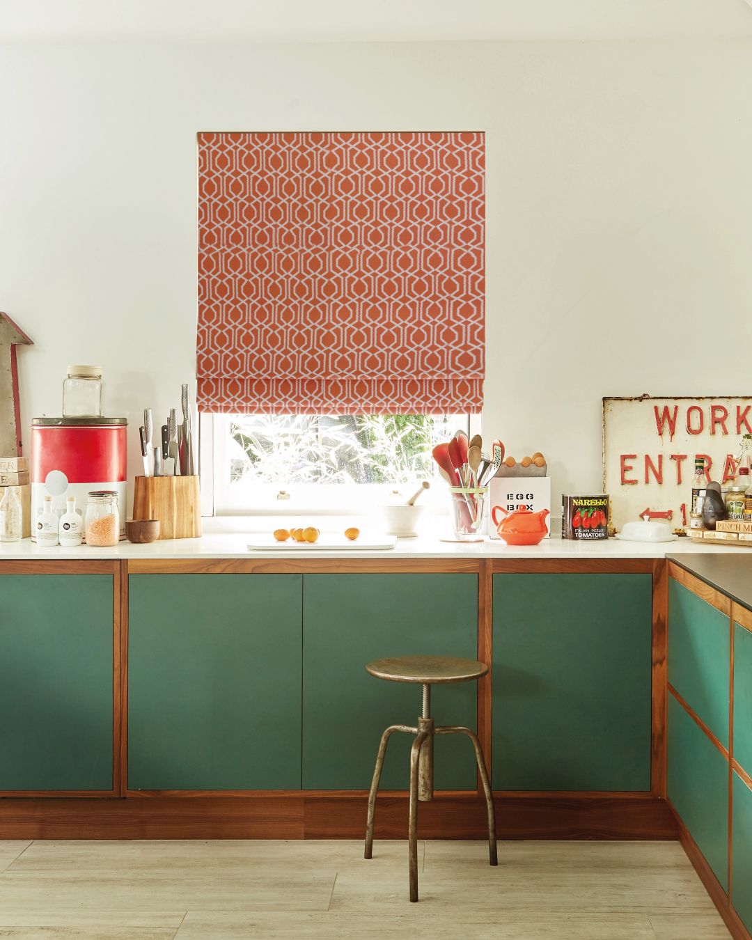
5. Revamp your kitchen cabinets
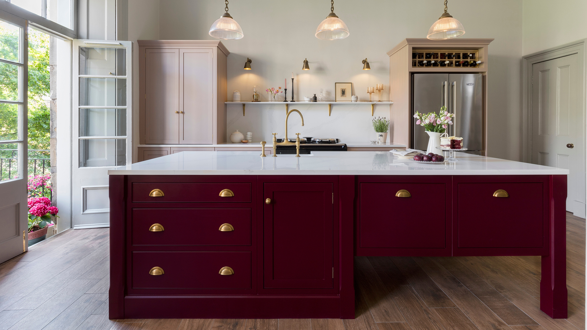
Burgundy red is one of the key kitchen trends of the year, with many people embracing the colour's deep hues for their cabinetry. There's something inherently stylish about red in the kitchen, especially when it's the deeper shades of maroon and burgundy.
“Red is a bold and confident choice, and it brings a real sense of energy into the kitchen,” says Debra Hutt, a kitchen expert at Wren Kitchens. “It’s a colour that naturally stimulates conversation and appetite, making it an ideal choice for sociable spaces like the kitchen.”
If you are revamping your kitchen cabinet paint colours, try contrasting the burgundy with neutrals like grey, cream, or even black throughout the rest of the kitchen. These pared-back hues are the ideal way to bring balance to the space while highlighting the red cabinets as an "unexpected" design choice.
What is the psychology behind red?
But why red? There are plenty of bold colours that can be used in interior design, so what is it about red in particular that works so well?
"The theory behind this concept that ensures it works is that red is psychologically and visually dominant in a way that other colours just aren’t," design expert Lucy reveals.
Red has long since been associated with powerful, uplifting emotions, including passion, energy, and excitement. There's a fierceness to the colour red that translates perfectly into bold and playful interiors.
"It's got this primal, almost visceral quality to it," Lucy says. "Red is the most emotionally charged colour, so even a pop of red carries huge energy and grabs attention like no other."
While neutral colour schemes have brought us some of the most popular interior paint colour trends, there has recently been a shift towards brighter schemes and patterns, with trends like 'dopamine decor' taking centre stage. This also explains why the unexpected red theory is gaining traction.
"The recent popularity of this trend aligns with the larger cultural shift we’re seeing towards people turning away from all-white, minimalist aesthetics, and leaning in to more expressive and personalised interior styles," Stuart says.
"The unexpected red theory is more than just an interior design trend, it’s a movement towards tailoring our spaces to our preferences and making them more enjoyable to live in."
How will you be using the unexpected red theory in your home?