What Is a Candlestick Chart?
A candlestick chart is a popular visualization tool used by investors to analyze the price movement and trading patterns of a stock or security. For each unit of time (e.g., one day) one candlestick appears on the chart.
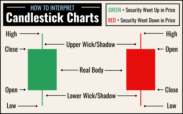
You can visualize a candlestick as a vertical candle that is burning at both ends—every candlestick has a real body (the bulk of the “candle”) and an upper and lower “wick” or shadow. Each candlestick provides five pieces of information about the security in question during the day (or time period) in question:
- Its opening price (represented by the top of the real body)
- Its closing price (represented by the bottom of the real body)
- The highest price it traded at (represented by the top of the upper wick/shadow)
- The lowest price it traded at (represented by the bottom of the lower wick/shadow)
- Whether the day’s closing price was higher (usually green or white) or lower (usually red or black) than its opening price
Diagram: How to Read a Candlestick Chart
Candlestick Charts vs. Line Charts: How Do They Differ?
Normal line charts for stocks and other securities typically show a single line that moves up and down in relation to the Y-axis (which represents price) as it moves steadily to the right in relation to the X-axis (which represents time). In other words, a single line shows how a security changes in price over time. A line chart can theoretically track a security’s price day-by-day, hour-by-hour, and even minute-by-minute depending on the chart’s settings.
Candlestick charts are similar, but instead of displaying a single, unbroken line, they display a single candlestick per unit of time, each of which provides the five pieces of information listed above (open, close, high, low, and whether the security went up or down in price). Candlestick charts can show one or more candles per day, week or month, but they could also show one candle per hour, one candle per minute, etc.
In other words, while line charts simply track price movement over time, candlestick charts provide insight into buying and selling trends over the course of each day (or other unit of time) by showing high and low prices as well as open and close prices.
How to Interpret a Candlestick Chart: MSFT
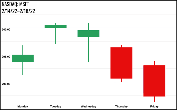
Let’s take a look at a candlestick chart for Microsoft for the trading week of 02/14/2022 wherein each candle represents one trading day.
Google; Canva
On Monday the 14th, we see a green candlestick with a relatively short, green real body and upper and lower wicks of roughly equal length. The green real body tells us that the stock closed higher than it opened that day; in other words, it went up in price. The fact that the real body is relatively short tells us that the open and close prices weren’t that far apart; in other words, the stock went up in price but not by very much. The upper and lower wicks tell us that throughout the day, the stock dipped below its opening price at some point and exceeded its closing price by a similar amount at another.
On Thursday the 17th, we see a red candlestick with a relatively long real body and relatively short upper and lower wicks. The red real body tells us that the stock closed lower than it opened that day; in other words, it went down in price. The length of the real body tells us that its price change was somewhat significant—certainly more so than the price change on the 14th. The short upper and lower wicks tell that while the stock did exceed its open price and drop lower than its closing price, it didn’t do so by much.
What Are Candlestick Charts Used For?
Candlestick charts are used primarily in technical analysis, which is a process through which investors and analysts attempt to predict price changes in securities based on factors like chart patterns, trading volume, and historical data rather than company fundamentals.
By analyzing historical price and trading data across countless securities, technical analysts have identified a number of patterns that repeatedly appear in candlestick charts and often indicate something significant and actionable, like a downtrend, an uptrend, or a reversal in price movement.
While past events do not guarantee future results, the market does sometimes act and react somewhat predictably. For this reason, many traders attempt to identify known candlestick patterns in the charts of various securities they are interested in in order to make buy and sell decisions.
Is Trading Based on Candlestick Patterns a Good Idea?
It’s important to remember that candlestick chart pattern analysis is more popular than ever with both retail traders and higher-powered stock players like hedge funds. Larger-scale investors are often able to execute automated trades extremely quickly based on algorithms that predict what smaller-scale traders are likely to do, so not all candlestick patterns are as reliable or useful as they used to be for the everyday investor.
Candlestick patterns can look a little different each time they appear, and they do not always yield the same results. Before trading based on candlestick patterns, it’s important to practice identifying them and analyzing the results in hindsight. Managing a virtual portfolio (i.e., trading stocks with "pretend" money) is one good way to practice making trades based on candlestick patterns without risking any actual capital.
6 Basic Candlestick Patterns and What They (Sometimes) Mean
Many candlestick patterns exist, and some patterns are more reliable than others in terms of how often their expected outcomes come to fruition. Some are bullish (i.e., they indicate a potential uptrend), while others are bearish (i.e., they indicate a potential downtrend). Below are a few of the most basic.
1. Hammer (Bullish)
A hammer candlestick has a green (white) real body, a long lower wick, and a short or non-existent upper wick. It appears at the bottom of a downtrend and indicates that sellers drove the price of a security down for much of the day, but by close, the security’s price moved back up past its open as buyers took control. This is a bullish pattern that may indicate a reversal (i.e., that the security in question is about to begin going up in price after falling).
Note: Sometimes, a hammer or inverse hammer may be red (black) instead of green. This is still considered a bullish signal so long as it happens at what could be the bottom of a downtrend, but a green hammer is considered a stronger sign of an impending reversal.
2. Bullish Engulfing (Bullish)
A bullish engulfing is a two-candlestick pattern that sometimes appears at the bottom of a downtrend and may indicate a reversal. The first candle in the pattern is red and has a short real body. The second is green, has a significantly longer real body, and opens lower than the previous day.
3. Morning Star (Bullish)
A morning star is a three-candle pattern that sometimes appears at the bottom of a downtrend and may indicate a reversal. The first candle is red and has a relatively long real body. The second candle may be red or green but has an extremely short real body with upper and lower wicks causing it to resemble a star. The third is green and has a long real body, signifying buyers taking control of the security’s direction. The real body of the morning star candle in the middle often does not overlap with the real bodies of the candles on either side.
4. Hanging Man (Bearish)
A hanging man pattern is essentially the inverse of a hammer pattern. It occurs at the end of an uptrend and may signal a reversal. A hanging man candle is usually red and has a short real body and a long lower wick, signifying a notable selloff during the day before buyers were able to push the price back up before close.
5. Bearish Engulfing (Bearish)
A bearish engulfing pattern is essentially the inverse of a bullish engulfing pattern. It is a two-candle pattern that typically occurs at the top of an uptrend and may signify a reversal. The first candle is green and has a short real body, while the second is red and has a significantly longer real body. The second candle in this pattern usually opens higher than the first.
6. Evening Star (Bearish)
An evening star pattern is essentially the inverse of a morning star. It is a three-candle pattern that sometimes appears at the top of an uptrend and may indicate a reversal. The first candle is green and has a relatively long real body. The second candle may be red or green but has an extremely short real body with upper and lower wicks, making it look like a star. The third is red and has a long real body, signifying sellers taking control of the security’s direction. The real body of the morning star candle in the middle often does not overlap with the real bodies of the candles on either side.
What Is a Doji Candlestick?
A doji candlestick is one with a very small or close to nonexistent real body. This indicates that open and close prices for the day (or period in question) were nearly the same. Morning and evening star patterns both occur when a doji candlestick appears at the end of an up or downtrend.
What Does a Candle With No Wicks Indicate?
If a candlestick has no wicks (shadows) this means that the security in question traded between its open and close prices for the entirety of the day (or period in question). A candle with no shadows may indicate strong market sentiment in whatever direction the candle is going (up if green, down if red).

