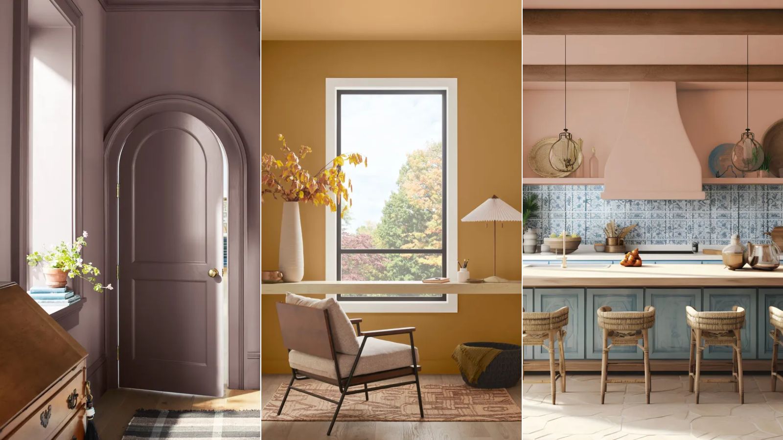
Now that 2025's much-anticipated Color of the Year announcements are wrapped up – with leading paint brands having revealed their trend-setting shades for the coming months – we've got a much better idea of what this means for decorating trends this year.
At first glance of this year's Color of the Years, there are obvious themes to arise: purple is having a renaissance and brownish, earthy tones are the 'new neutrals' for the year ahead. But what exactly do these colors say about how we're going to decorate our homes throughout 2025?
We turned to paint and color specialists as well as interior designers, who share all below. We've summarized five main color trends observed from the Color of the Years which you can expect to dominate this year – from bold and colorful to earthy and warm.
1. Bold and personality-led interiors
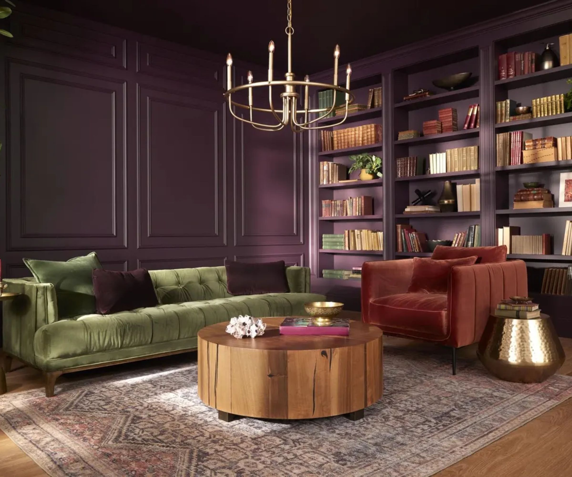
This year's Color of the Year announcements confirm a continuation of personality-led interiors that embrace the boldest colors. While trends such as dopamine decor, which encourages homeowners to ignore the rulebook and decorate with shades that bring joy, have been gaining momentum in recent years, 2025's color trends such as Glidden's Color of the Year Purple Basil, suggest this is only expected to continue.
'Choosing a bold color like Purple Basil indicates a shift towards more personalized spaces,' explains Ashley McCollum, color expert at Glidden. 'Homeowners are increasingly looking to express their unique tastes and preferences through color choices, moving away from more traditional palettes.'
'Consumers are unapologetically selecting colors that bring them joy, worrying less and less about resale value and creating your space because of you,' Ashley adds. 'Consumers are becoming more and more comfortable with color.'
This color trend is further emphasized with Dulux's True Joy, a bright yellow paint, and Minwax's Violet, a bold purple wood stain that nods to maximalist color ideas.
2. Quietly colorful hues
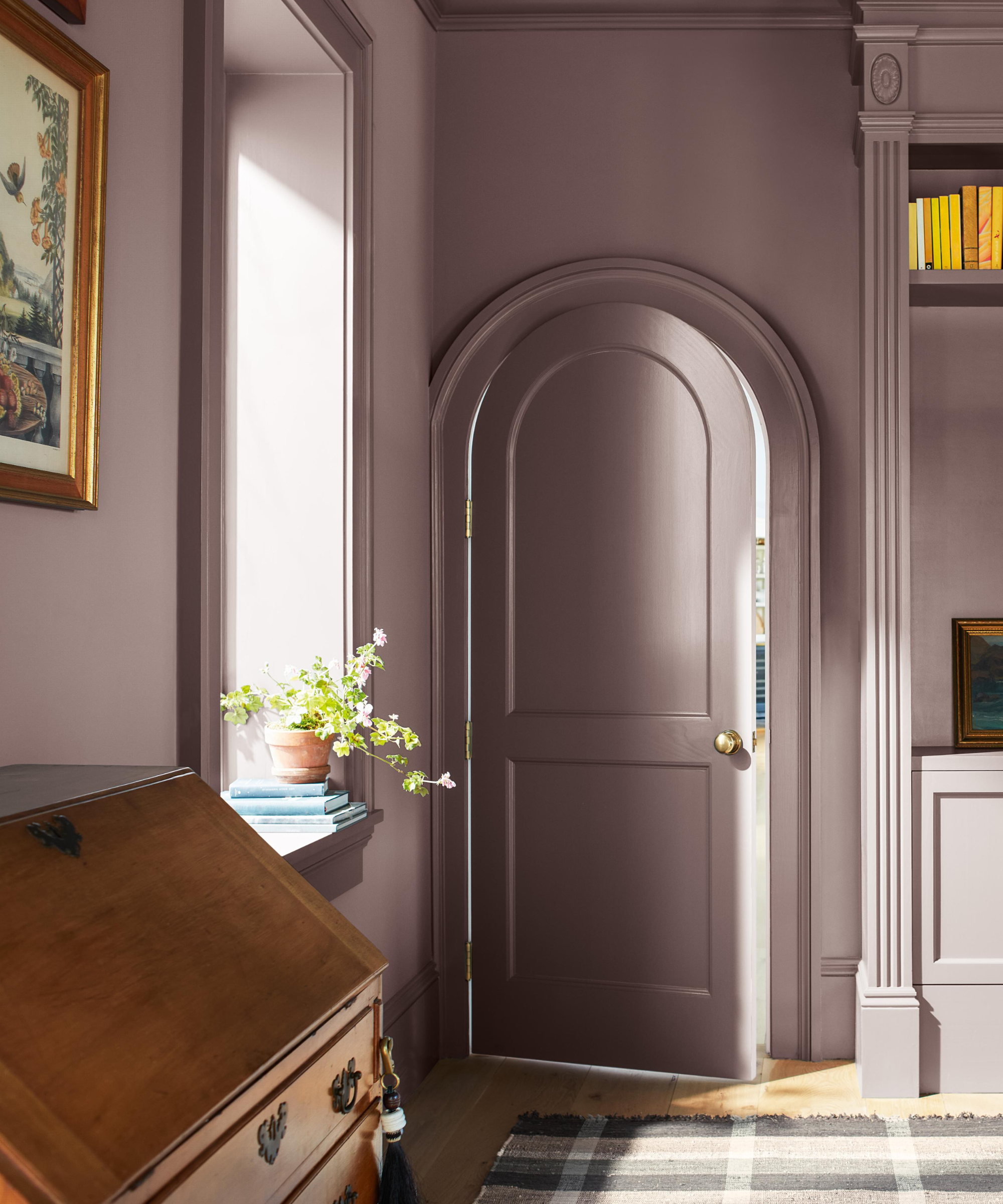
While bold and statement hues have made their mark on this year's color trends, there's just as much to say about 'quieter' colors that focus on comfort in home decorating. Benjamin Moore's Color of the Year, Cinnamon Slate, is one of the best examples of this, a brownish purple that feels relaxed and soothing.
'For us at Benjamin Moore, 2025 is going to be very much about quietly colorful hues,' explains Helen Shaw, Director of Marketing (International) at Benjamin Moore. 'This is a shift from the saturated color story seen in previous years and will focus on a more subtle and comforting take on color.'
'Our Colour of the Year, Cinnamon Slate, perfectly encapsulates this idea of a quietly colorful hue – it has presence without distraction, with its delicate mix of heathered plum and velvety brown undertones,' adds Helen.
'Alongside Cinnamon Slate we have curated a Color Trends palette, featuring nine other ‘in-between’ hues that have the ability to transition gracefully from room to room, exuding an innate sense of ease and liveability. What makes these hues special is that each is rich with undertones that make a statement with relaxed confidence, whether taking a neutral or a moodier approach. The quietly colorful nature of these hues also provides an excellent vehicle to finding color confidence without overwhelming a space or its occupants,' Helen explains.
3. Nostalgia-inspired colors
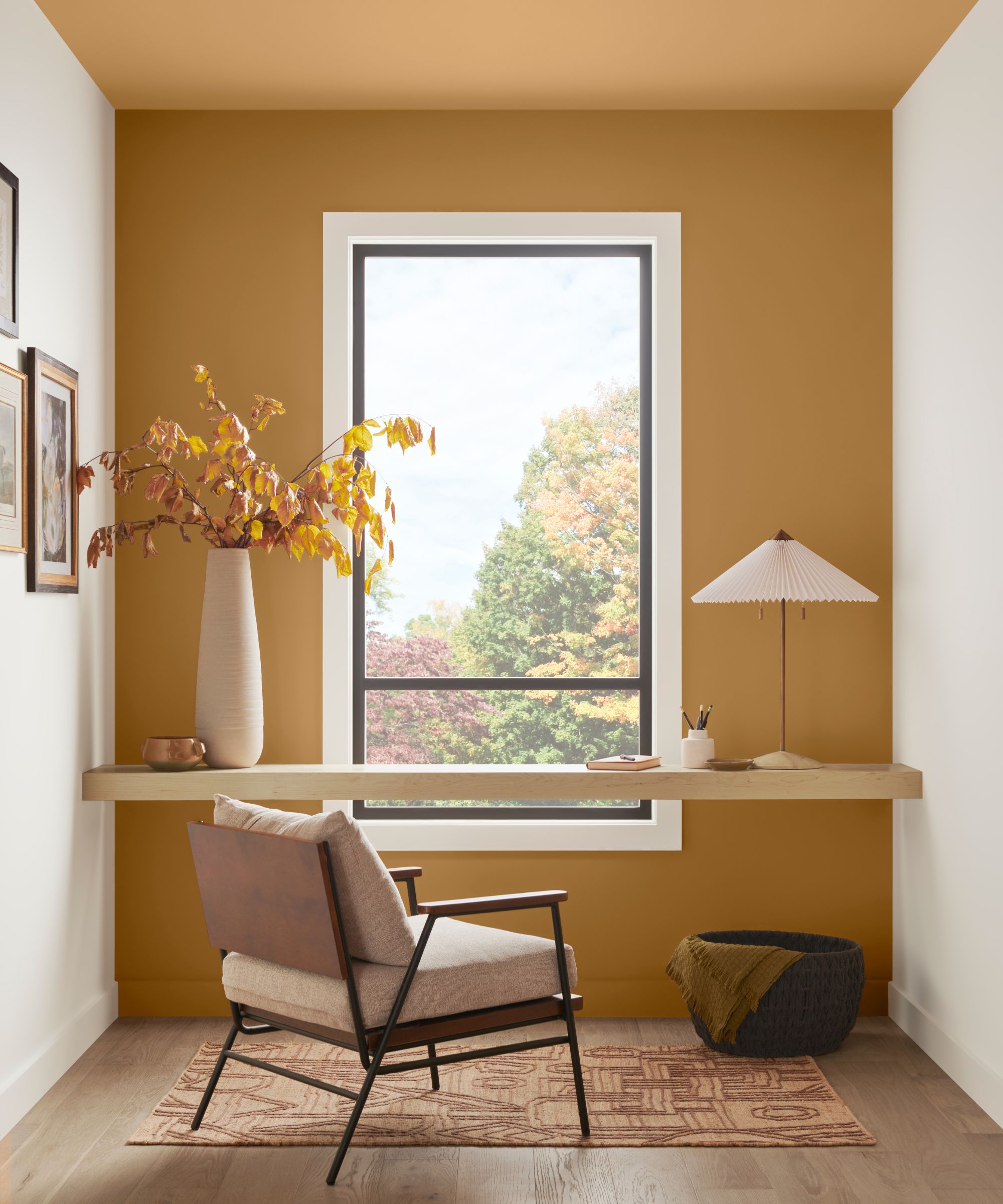
Another color trend expected to inform this year's color choices based on the Color of the Year reveals is a return to nostalgic-inspired shades, as demonstrated by Sherwin-Williams' 2025 Color Capsule, inspired colors of the past and present.
'This year we decided to go with an entire capsule of colors instead of a singular one, and our 2025 Color Capsule of the Year tells a story of our past and our future in regard to trends,' says Emily Kantz, Color Marketing Manager at Sherwin-Williams.
'Nostalgia is having a big impact on design and homeowners are looking for authentic pieces of the past in their homes. This palette pulled influences from those iconic design styles from the past but with a twist. The capsule feels very eclectic and reminiscent of the 1970s, which is making a comeback in home and design, but we added a few modern shades to keep it feeling fresh and fun,' Emily adds.
Interior designers also recognize nostalgia as a key color trend, with Chicago-based designer Andrea Goldman weighing in: 'We have been noticing a return to paint colors that were more popular in the 1980s such as mauve, burgundy, burnt orange, and dusty pink. The same trend is surfacing in fabrics and rugs. The “every 20 years” rule for fashion seems to apply!'
4. 'In-between' shades
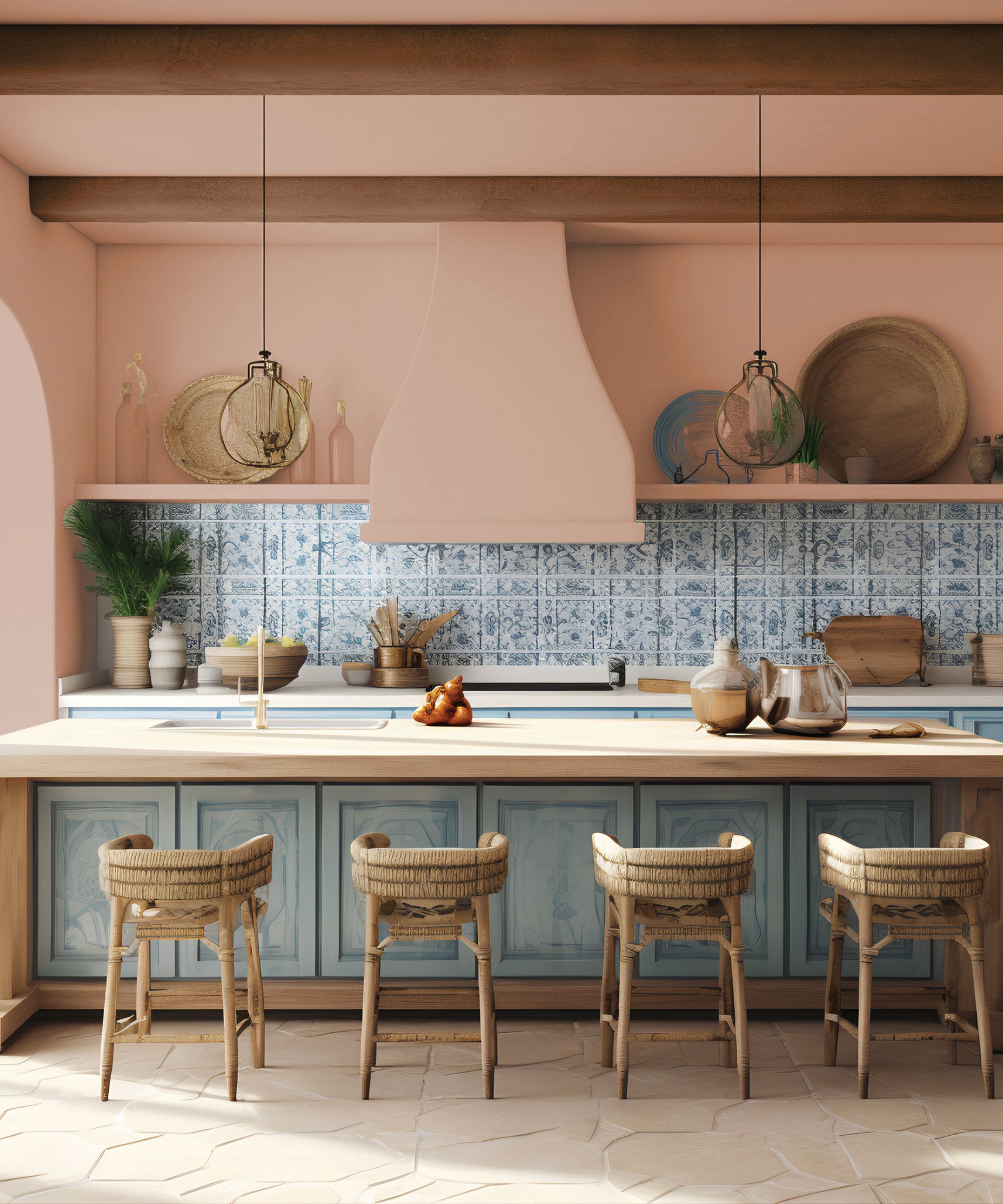
The rise of 'in-between' colors has been cemented with this year's color trends. From Dunn-Edwards' Color of the Year, Caramelized, a terracotta-brown to HGTV Home by Sherwin-Williams' Color of the Year, Quietude, a blue-green, we're seeing popularity for shades that don't reflect one 'true' color but are a mix of different color families. This is a trend that stands out to interior designer Ghislaine Viñas, who elaborates below:
'I’m definitely noticing a theme with muddier, mixed tertiary colors gaining popularity. In the past, we’ve seen more obvious pops of color and jewel tones dominate, but now it feels like the color experts are expanding their palettes and leaning toward less conventional hues. These warm earthy tones are comforting without being too brash, bright, or bold, which I think reflects the complicated world we live in. It feels like people are moving away from the usual crayon box colors we often fall back on and are diving in and discovering new strange hues they love. Call me a lover of the underdog but the stranger the color the better for me!'
'These unconventional colors are also more nuanced and require a bit of introspection to truly appreciate, which could point to a broader trend of people seeking more individualistic and unique spaces,' adds Ghislaine.
5. Warm schemes instead of cool
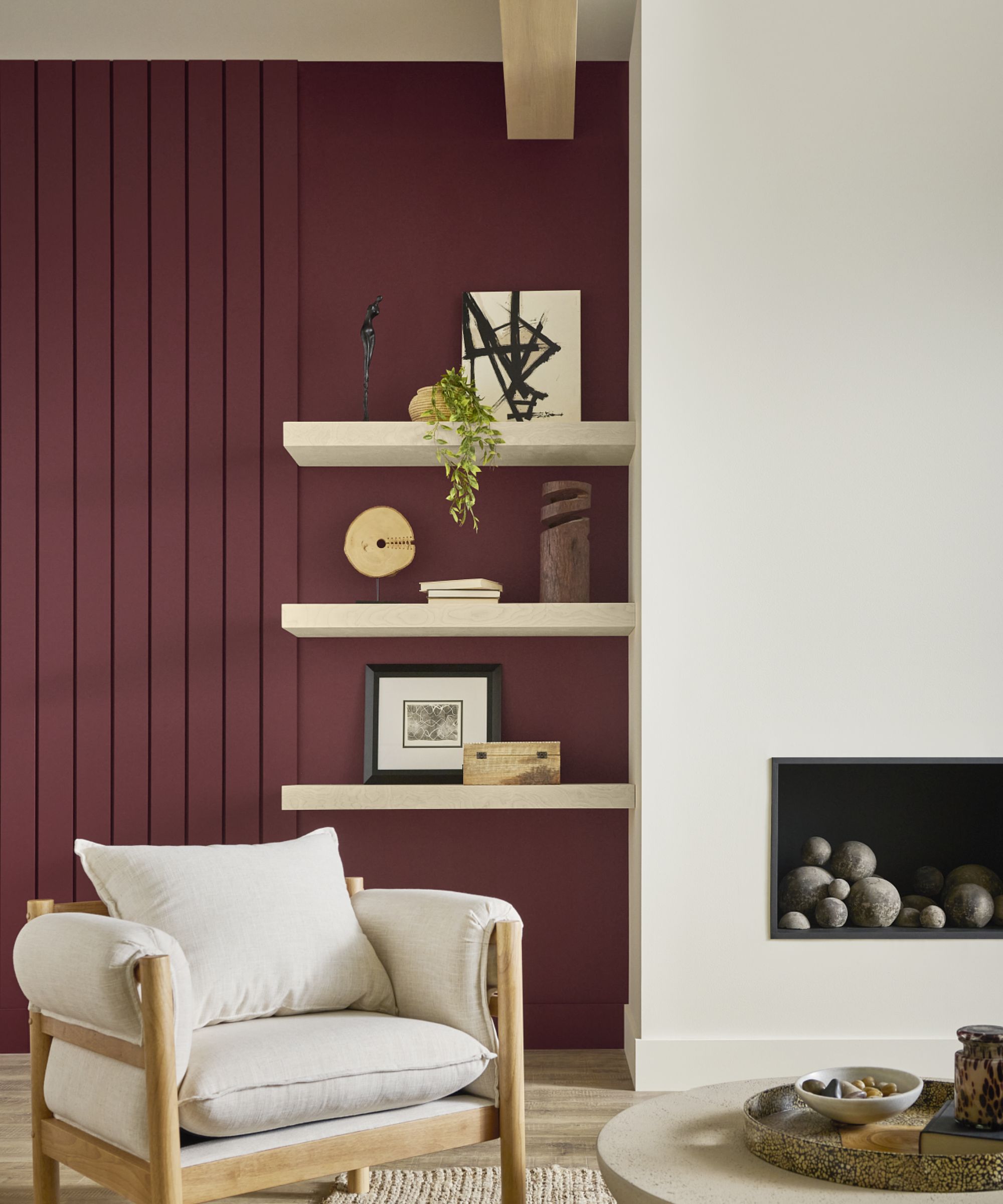
Lastly, we can't overlook the dominance of warm tones in place of cool color schemes. While cooler tones have cropped up with shades like Encore, Valspar's 2025 Color of the Year, a dark blue paint, there's a general shift towards earthy and warm tones, from Behr's Color of the Year, the warming ruby red called Rumors to richer brown and purple paints, warm hues are officially 'in' for 2025.
'After so many years of bright white rooms or high contrast black and white, we are feeling the pull towards warmer, richer colors which I think is what we’re seeing in all the Colors of the Years,' observes designer Rosanna Bassford of Memmo Interiors. 'Various shades of browns and earthy tones are back in a big way so these paint colors work well with those hues. I think we’ll see a lot more tone on tone or monochromatic use of colors, less contrast, and more calm, enveloping design styles.'
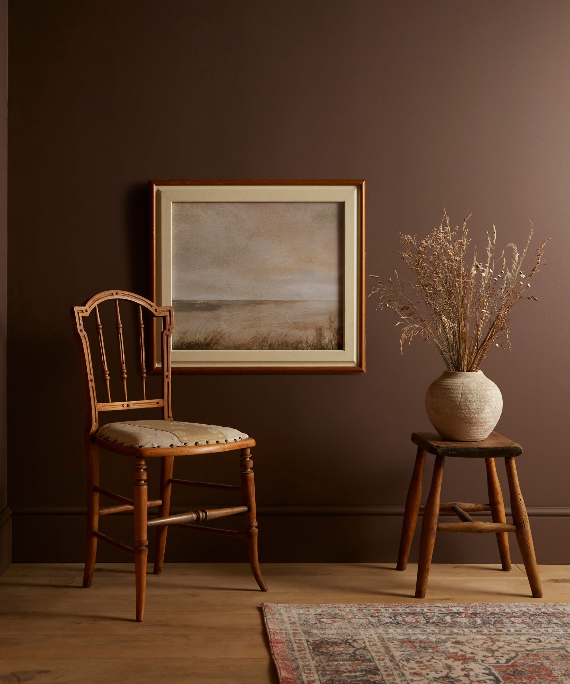
'We’re at the antithesis moment of gray, so we’re going super warm and this is influencing people to use more brown furniture and antique pieces and I think it's a sign that people are embracing a vintage aesthetic and overall warmth,' agrees Chicago-based interior designer Claire Staszak of Centered by Design. 'Compared to the browns of the '90s, which are all cooler, the browns now are warmer and richer.'
Debbie Mathews, founder and principal designer at Debbie Mathews Antiques & Designs, also notes the dominance of warm hues, adding that they can make our homes feel more comfortable:
'I believe these colors, along with Pantone's Color of the Year, Mocha Mousse, are all a bit earthier than what we have seen over the past few years. Warmer than the stark whites and grays that have been trending for many years, they all seem to be muted with brown undertones. Cinnamon Slate is softer than your typical purple and Carmelized is softer than your typical brown. I believe the popularity of these colors means that people are yearning for warmer, richer home environments that literally wrap them in comfort.'
Clear trends have emerged from this year's Color of the Year revels, from warm color schemes that reinstate the appeal for cozy and comfortable spaces to 'in-between' hues that reflect a more adventurous take on color. 2025 is all about using color to reflect personality, moving away from predictable neutrals to those that inspire creativity.
