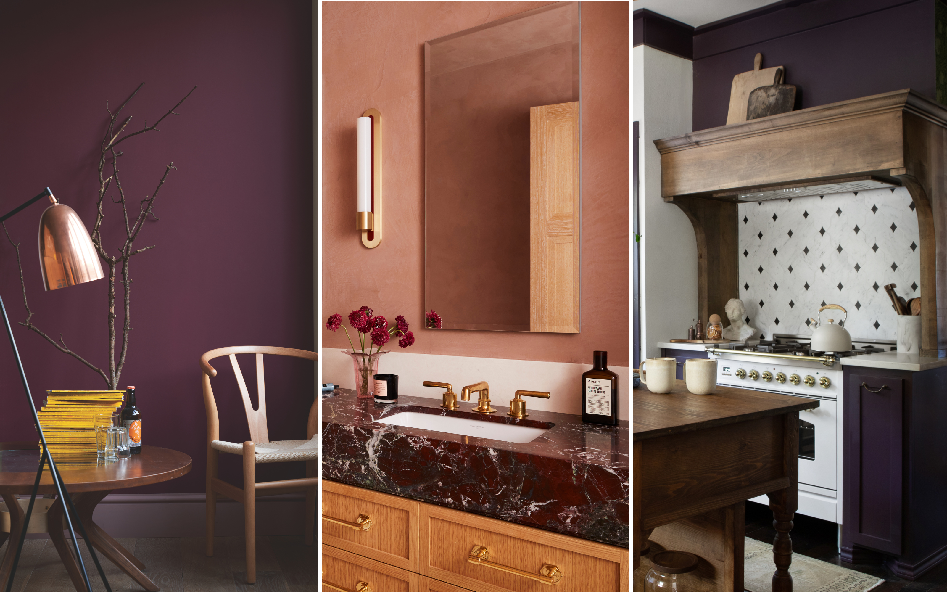
Burgundy is a characterful color choice for the home. Rich, warm, and comforting, it's a great tone for relaxing spaces like the bedroom (where it creates a cocooning feel) or the bathroom (where lacquered finishes feel extra luxe). It's been one of the most popular shades on designers' easels for some time but, as a result, it's now on the verge of overuse.
Decorating with burgundy is still a big color trend, but as we move out of the cozy winter months and into spring, will the love of this rich hue naturally start to wain? If early color trends are anything to go by, it's clear we're still favoring similarly dark and deep shades. These moody tones offer a more sumptuous, sophisticated feel in our homes – a certain 'quiet luxury' that we've all been craving in recent years.
According to designers, the hues set to replace burgundy aren't that much of a marked departure. Think gray-tinged mauves, deep aubergines, and sweet berry tones. They do, however, tend to be more dynamic and nuanced, mixed with an array of pigments from earthy browns and smoky grays to warmer oranges and reds. Here are the seven colors designers say are replacing burgundy, alongside some tips on how to use them in your home.
1. Oxblood
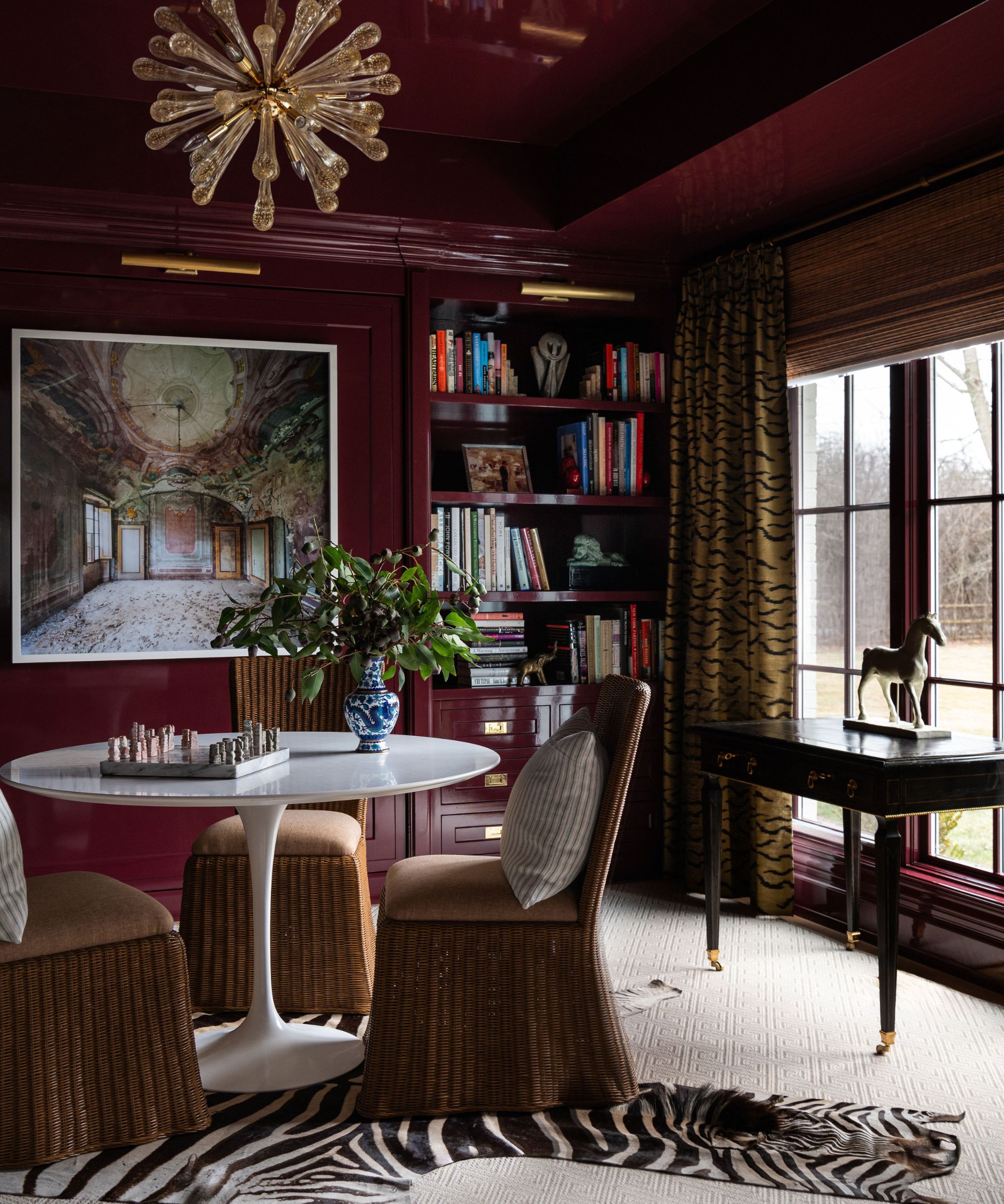
Oxblood and burgundy might be indistinguishable to the average Joe, but not to design buffs. While no doubt close relations, oxblood has more brown undertones with less purple pigment than burgundy, which sits on the cooler end of the spectrum. Oxblood, by contrast, is the perfect balance of warm and cool, sitting somewhere between burgundy and maroon on the color wheel.
It's this extra layer of warmth that designers love about oxblood. 'While burgundy still has its place in interior decoration, we're seeing a slight shift to a more iron oxide, rich earth pigment red,' notes Patrick O'Donnell at paint brand Farrow & Ball. 'These brown-based reds are beautiful to decorate with and love being mixed up with similar weighted burnt oranges for a truly immersive and deeply inviting look.'
As the name suggests, there's something more arresting about oxblood too, making it well suited to bolder paint techniques. 'It offers a moody, dramatic alternative to burgundy, perfect for color-drenching libraries or powder rooms,' says Jessika Gatewood of Gatewood Designs. It's a sentiment shared by interior designer, Elana Mendelson. 'We’ll see it being used for color-drenched rooms, from walls to trim, creating an enveloping, warm, cocoon-like effect,' she says.
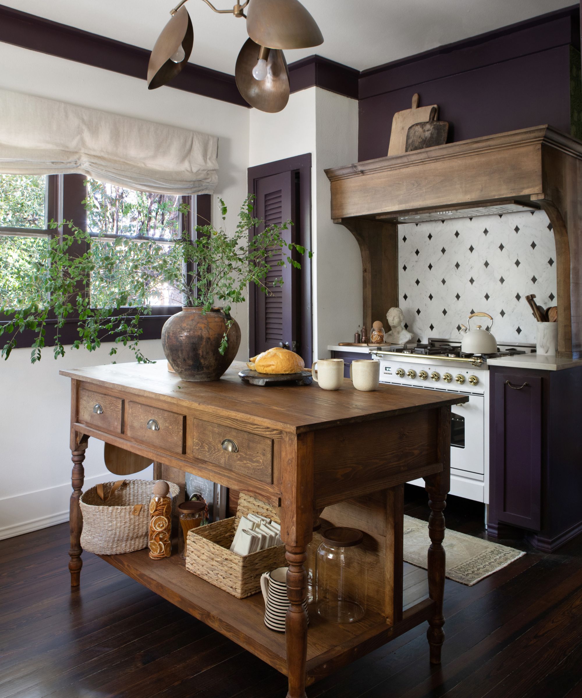
2. Rust
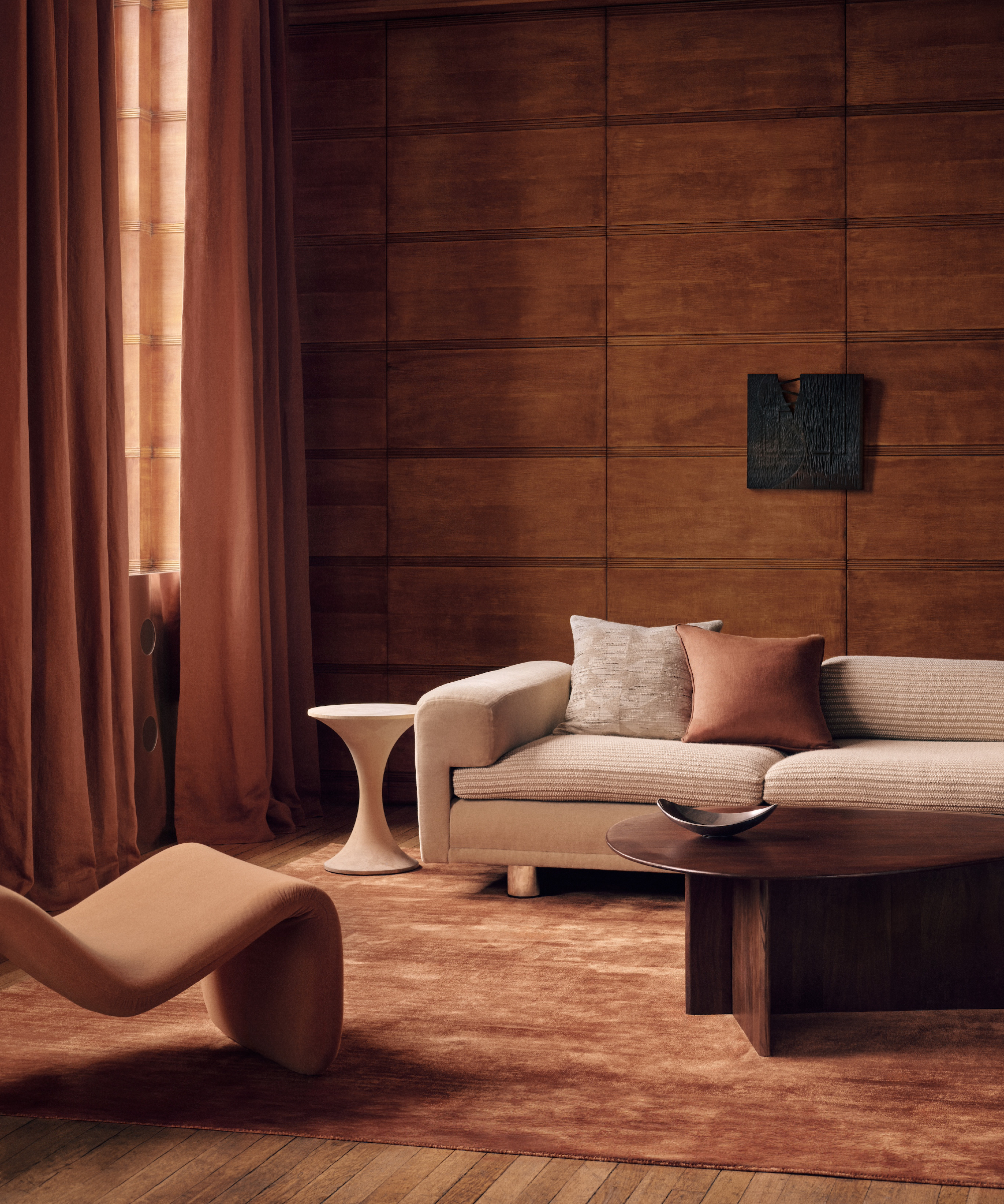
Rust tones are a more delicate alternative to burgundy, with decreased saturation. 'With their warm, earthy appeal, they create a more approachable all-over color, ideal for walls or soft furnishings,' says Jessika. Thanks to its softer coloring, this reddish brown shade is earthier and more liveable, bearing similarity to terracotta or burnt orange.
Elana also notes the approachable nature of rust. 'It's making its mark as an all-over, universal color, especially in modern bohemian and earth-inspired spaces.' Consider pairing rust painted walls with white trim, for example, then peppering the space with rattan decor pieces for an organic feel.
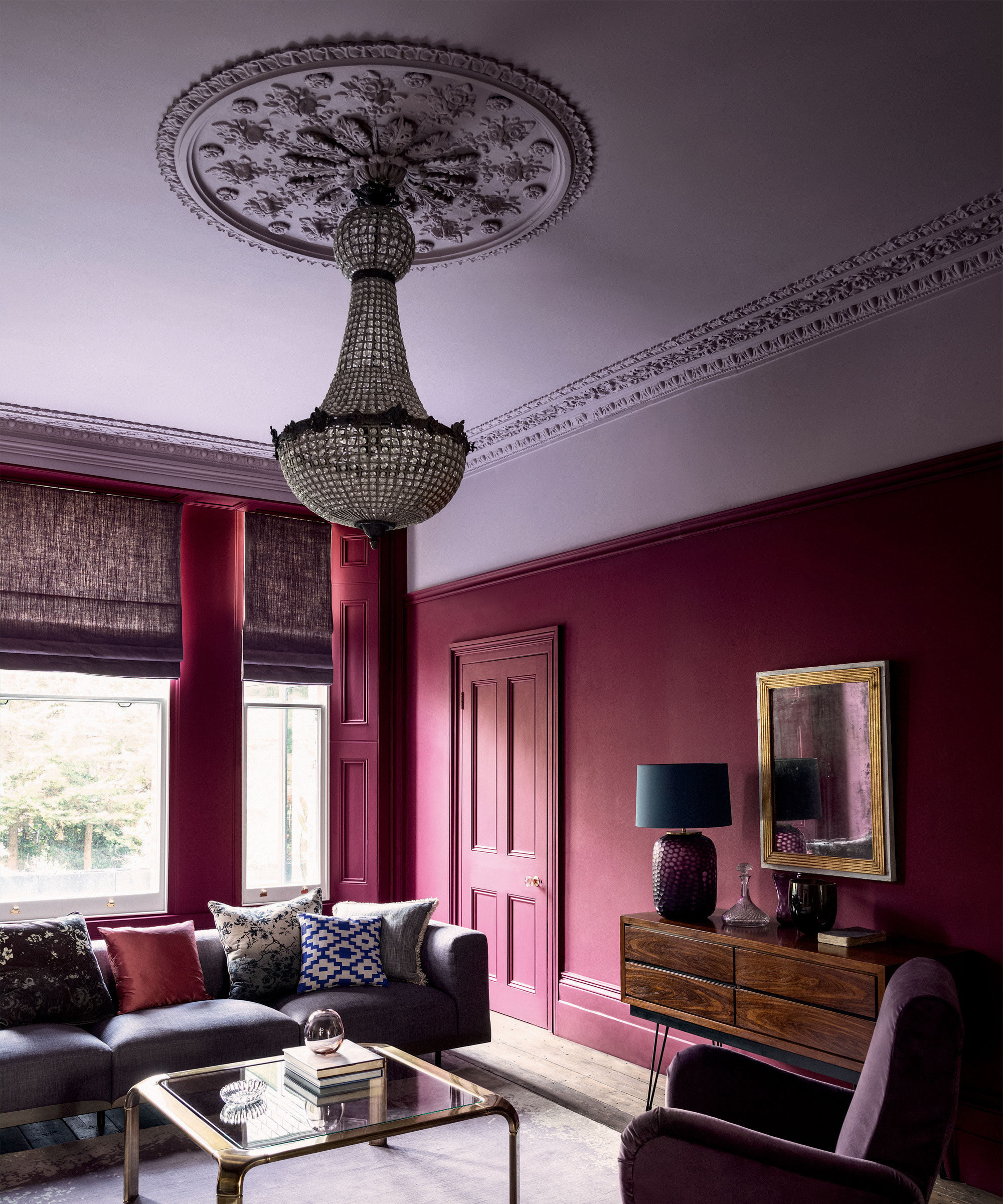
3. Aubergine
If you're still looking for a sumptuous shade with a hint of drama and luxury, try aubergine. This dark, earthy purple has a certain regality to it – heightened by its warm red undertones – so it's certainly a color that will make a house look expensive.
The added purple tint gives aubergine a bit of an edge over burgundy, especially when used as an accent color. 'Deep aubergine will be appearing in statement furniture pieces and accents, offering a more current, yet slightly edgy aesthetic,' predicts Elana.
Think eggplant accent chairs, side tables, or sofas, and remember to give thought to the material, too. 'Aubergine adds a luxurious touch, especially when used in velvet textures,' says Jessika.
4. Mauve
Gentle mauve and lavender hues have been enjoying a moment in the spotlight in recent years. This pale, bluish purple has a softer feel to burgundy, but the two shades work brilliantly as a color combination.
That said, the differences between burgundy and mauve are pretty stark. Why is this pastel-like tone being favored as a replacement? 'People are moving a bit out of red and into softer dark pinks and purples without being overly feminine,' suggests E. Norton of Norton Interiors. 'Instead of overly moody vibes designers and clients are looking for tranquil colors that are not as dark, or mixing the light and darker colors to create more balance in a room.'
5. Plum

For a more true purple, plum offers a great alternative to burgundy. Decorating in 2025 is set to be jovial and convivial, and the uplifting qualities of plum offer exactly that; it has all the sophistication of deep moody reds, but with the playfulness of purple.
And with paint brands like Glidden, Benjamin Moore and Minwax announcing purple tones as their color of the year, we're certain we'll be seeing more of these sumptuous plum shades in the year ahead. The possibilities for decorating are endless, too.
'Rich or muted, this color can work well with various neutral shades of brown or earth tones,' says interior designer Sarah Latham of Latham Interiors. 'It's adding a bit of luxury to your sofa or drapery fabrics without overwhelming a space. Use it in tile, area rugs, or bedding to add depth and character where it might have been lacking in the past.'
6. Pale pink

Rosy pink hues dominated 2024 (many designers have even declared it a new neutral) and despite obvious differences to burgundy, the two colors have more in common than first thoughts would have it. Both are warm, inviting, and chic, plus the two also work wonderfully together, with the strength of burgundy highlighting the subtleties of a dusky pink.
'Burgundy can be softened by the faintest of pinks, such as our Etruscan Red teamed with the perennial classic of Setting Plaster,' suggests Patrick at Farrow & Ball. 'This combination would make for a striking kitchen color scheme, with the darker shade applied to your cabinetry, or bring warmth to a poorly lit sitting room with the darker shade on your trim.'
7. Saturated red
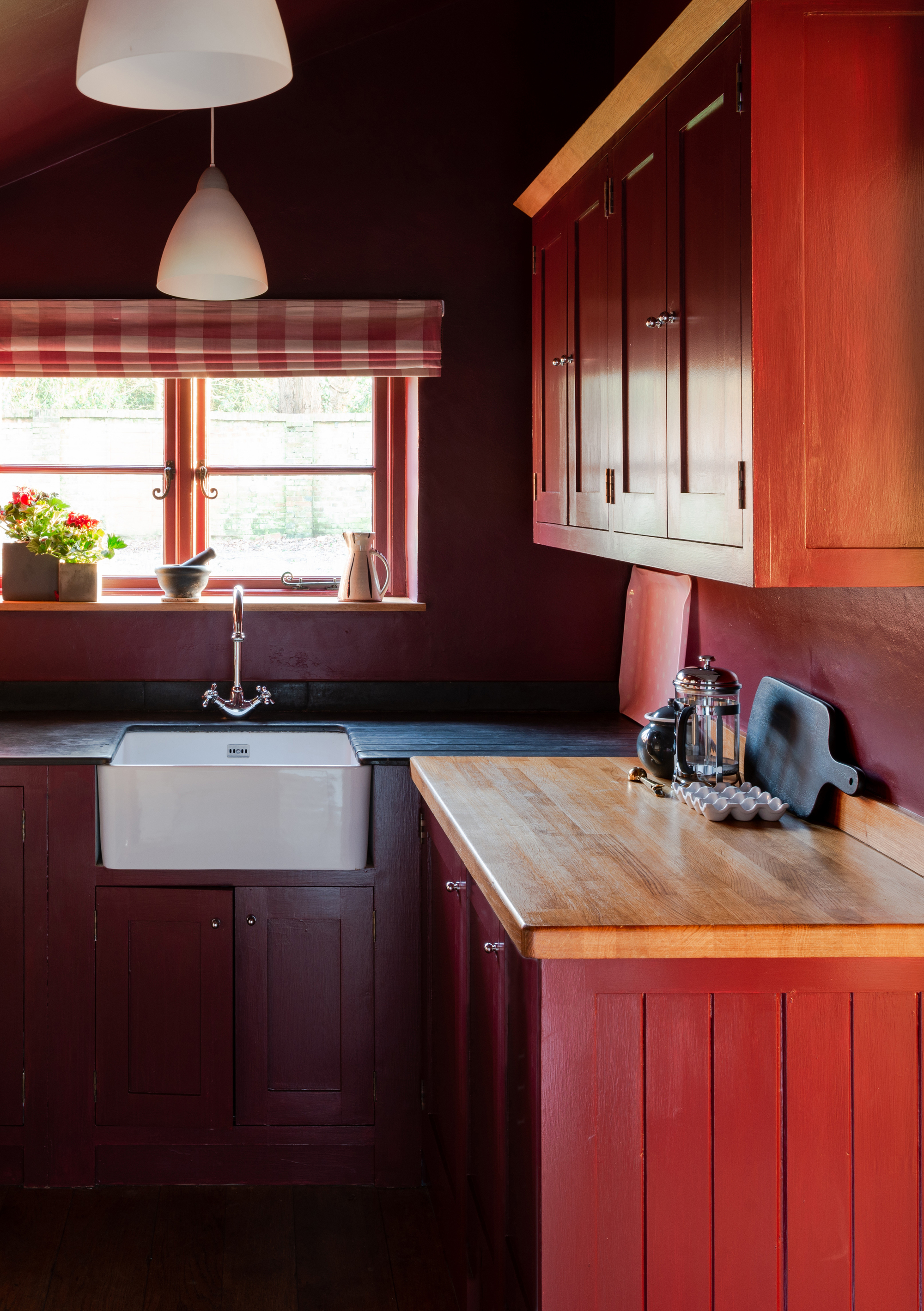
Lastly, designers suggest that a more saturated, sanguine red could be replacing burgundy this year. In 2024, the 'unexpected red' color theory had the design world in a tight grip, with the idea that vibrant, primary tones of the shade peppered throughout a scheme could instantly elevate a space. If you want the romance of burgundy but with more vitality, decorating with splashes of saturated red is the way to go.
Interior designer Cristina Cleveland suggests that the rise of red signals people's desire for expression and personality within their homes. 'For people who dipped their toes into colors like burgundy and browns, which have depth yet still feel neutral-adjacent, I could see them building up into brighter and more saturated tones,' she says. 'Rather than replacing their burgundies and browns, I'd love to see them amped up! I love the pairing of burgundy and tomato red, or brown and cobalt blue.'
Oxblood lends itself well to a lustrous finish, as seen in this Gustaf Westman-esque side table. Use it to add a pop of rich color to an otherwise neutral scheme.
Red marble offers a more understated take on deep moody reds. The white veining in this serving tray softens the color, working especially well when paired with brass accents in a bathroom.
Rust colors have a Mediterranean feel, bringing an element of warmth and vibrancy to a space. Try this modern lamp from Pooky to bring a burst of uplifting color to your scheme.
While burgundy has lasting appeal, the shades above make a great replacement for a more on-trend look in 2025. Or, alternatively, why not use them as an accompaniment to burgundy for a tonal scheme that adds depth and dimension to your space? The choice is all yours.