There are few colors as reliable as brown. This earthy, versatile hue pairs well with almost every other shade, and can be incorporated through natural materials like wood, as well as furnishings, decor, and paint ideas. A stalwart of our decorating, brown will always remain timeless, but in 2025, designers are turning their hand to lighter, more nuanced variations.
Let's be clear – decorating with brown remains virtually infallible, but if you want to keep up with all the latest color trends, you might want to consider replacing brown with something more dynamic in your palette. So far, we're still favoring rich, sumptuous shades in 2025, but brown is being usurped by fresher tones that are more 'user friendly', especially going into the spring and summer months.
What do we mean by that? Well, brown, while undoubtedly sophisticated, tends to feel heavy and dominant when used in our interiors, making it difficult to finesse. Instead, designers are leaning towards more livable shades that feel lighter and fresher, but with similar levels of comfort and luxury. From warm mink and greige to classy caramels and earthy clay tones, here are the shades replacing brown in 2025.
1. Caramel tones
When choosing a color scheme, brown is a great grounding shade. When used in greater quantities, however, it can feel overpowering. One color that makes a great substitute for brown while avoiding that heaviness is caramel.
'Rich caramel hues replace darker browns with a cozy, inviting brightness, ideal for leather furniture or textured finishes,' explains interior designer Jessika Gatewood of Gatewood Designs. Spanning warm, fudge-like browns to silkier golden yellows, caramel tones also make a great choice for monochrome color schemes.
'Ochre, for example, with its golden undertones, offers a nostalgic yet contemporary pop, perfect for accent decor or millwork,' says Jessika. 'Meanwhile, camel and honeyed tones – with their lighter, golden, softer feel – are being used frequently in textiles like boucle chairs or linen drapery to add warmth without heaviness,' notes interior designer Elana Mendelson.
Consider using burl wood furniture alongside suede upholstery and warm, biscuit-y colored walls to layer this shaded. 'These colors reflect a shift toward versatile, personality-filled tones that enhance the warmth and character of any space,' says Jessika.
2. Olive Green
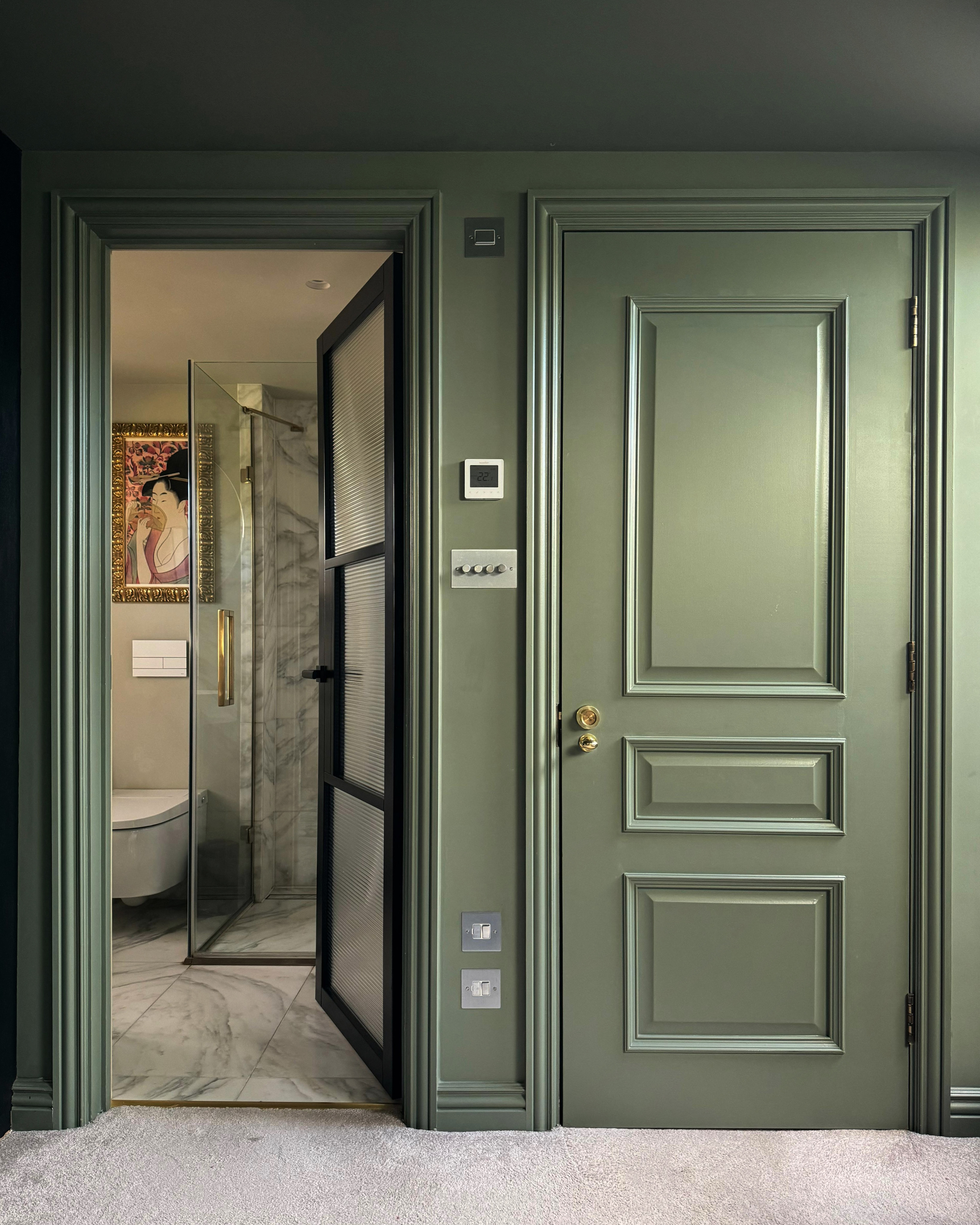
Colors with brown undertones offer a great alternative to using a deep hazel tone on its own, and – unsurprisingly – when it comes to colors that go with brown, they make great pairings, too. Olive green, for example, shares many qualities with brown (comforting, earthy, dependable), but feels more playful and expressive. This makes it a popular replacement for brown, especially on walls.
'The evolution of brown introduces shades that feel both grounded and contemporary,' says Jessika. 'Soft olive green brings an organic serenity, pairing seamlessly with natural wood and stone.'
Khaki or olive green paint colors also have a certain lightness to them that brown often lacks. According to designer Nina Lichtenstein, this gives it a more vibrant feel. 'This muted green offers a fresh alternative to brown, adding an organic, earthy feel to interiors without feeling overly dark,' she says. 'It works well for kitchen cabinetry, accent walls, or paired with brass hardware for a modern twist.'
3. Clay

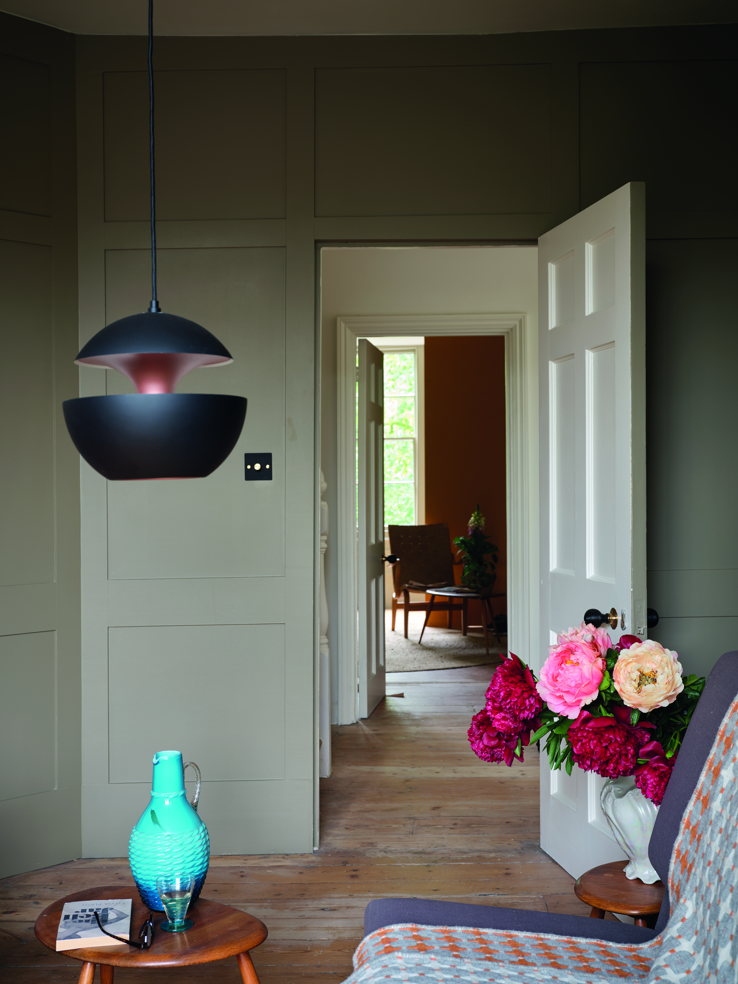
Clay or terracotta tones have all the benefits of brown but with added warmth. Consider a raw plaster or a baked terracotta tile in place of brown walls or wooden flooring. The Mediterranean influences will make your space feel rustic and sun-soaked, aided by the pink tinge of these natural shades.
'Dusty clay tones, with their warm, desert-inspired vibe, provide a fresh take for walls or accent pieces,' says Jessika, who predicts they'll replace brown in 2025. It's a sentiment also shared by Nina. 'This earthy orange-brown is vibrant yet calming, making it ideal for accent walls, ceramic decor, and upholstery,' she says.
To add depth and dimension to a scheme, why not use these shades alongside brown? The space above uses light wooden cabinetry, plaster walls, and brown-painted accent panels to create a clear focal point, balancing the rich chocolatey brown with the clay shades.
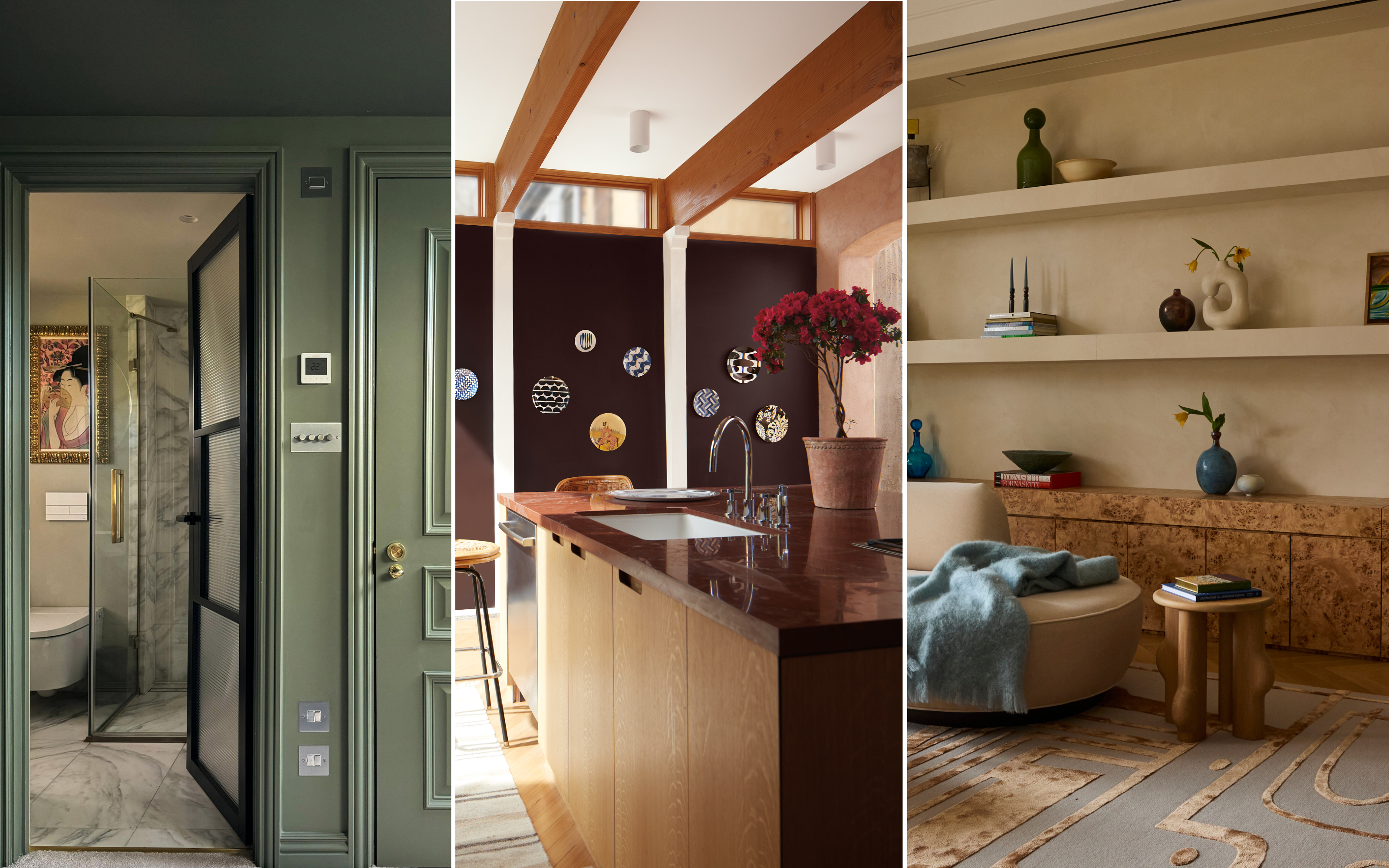
4. Mink
Fancy decorating with neutrals? Mink is a supple, livable shade that sits somewhere between gray and brown on the color spectrum, but it can even have a pink or mauve tinge in certain lights. According to E Norton of Norton Interiors, it's similar to greige but more natural. 'Think more gray, less beige,' she says. 'Mink is soft and ethereal without going into the pure neutrals we see in the standard palette.'
If you want a rich, sumptuous feel in your home but you're hesitant to paint all over using brown, mink is a wonderful alternative. Thanks to the gray pigment, it still bounces plenty of light around a room, but it retains the sophisticated qualities of brown.
Patrick O'Donnell, color expert at Farrow & Ball, agrees that brown tones will be more 'mid-weighted', like mink, in 2025. 'They have infinite flexibility and love being paired with a multitude of colors, from blues to greens to pinks and warm neutrals,' he says. 'They also make for wonderful home office paint colors – something to soothe whilst busy with data or creative ideas.'
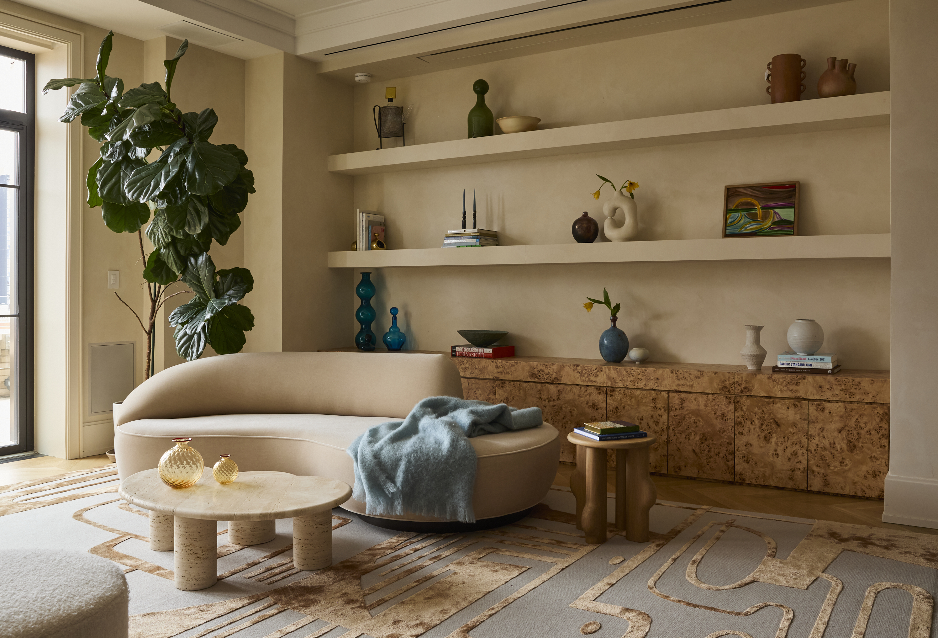
5. Greige
In a similar vein, decorating with greige offers a great alternative to brown. 'Warm greige offers a perfect balance of beige and gray which is an ideal neutral for walls and cabinetry, delivering subtle sophistication,' says Elana. Like brown, it feels mature and inviting, but it's a far more subtle and livable option.
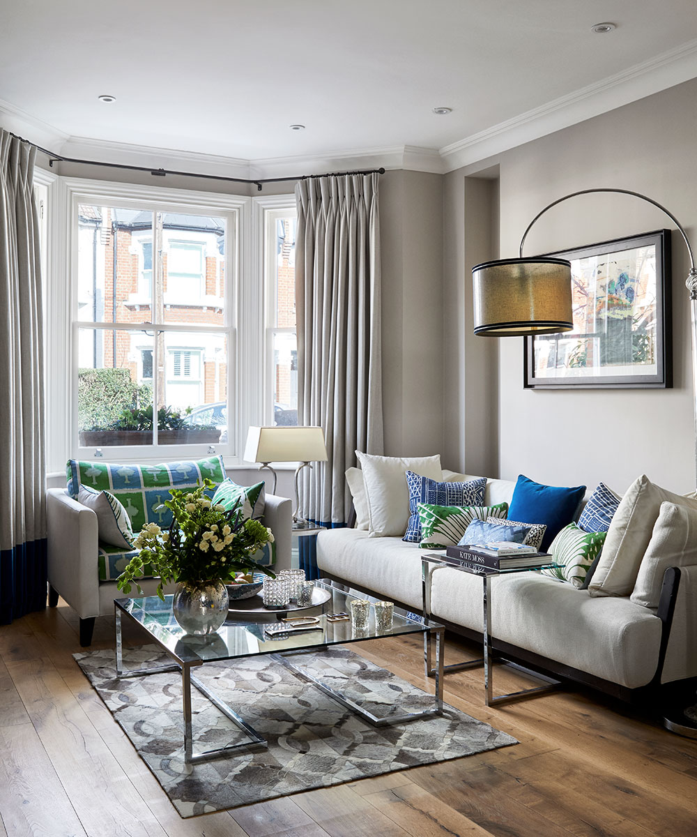
Nina calls this hybrid color a 'lighter, airier replacement' to brown which works especially well in contemporary spaces. 'It’s a favorite for open-plan living areas or minimalistic interiors, offering a clean yet warm backdrop,' she says. Take the space above, for example, painted in Farrow & Ball's shade 'Elephant's Breath'. The walls are much brighter than brown, yet still feel elegant, soft, and clean.
6. Charcoal
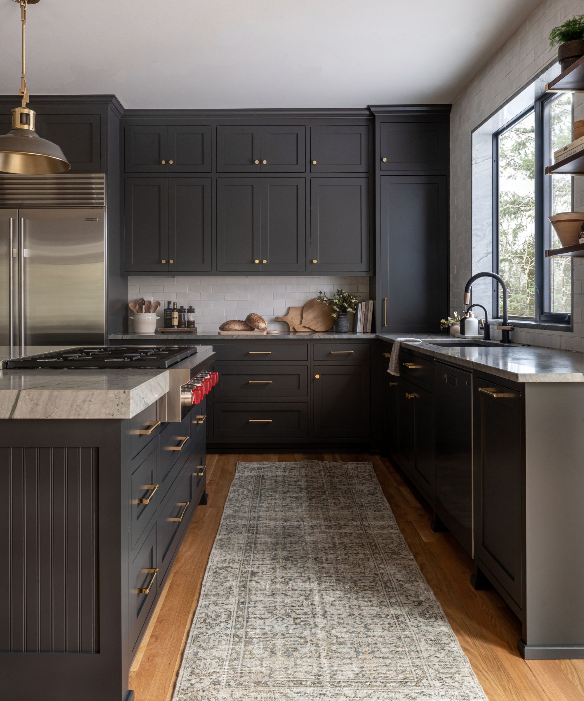
If you still want a moody paint idea with a bit of edge, consider using charcoal in place of brown. Nina recommends the color as a more modern alternative. 'Charcoal gray provides depth and sophistication with a cooler edge,' she says. 'It’s often featured in sleek furniture, moody walls, or as a contrasting trim color.'
If you're considering brown as an accent color, this rich and moody hue can work just as well. Elana even notes that it can offer a more complementary contrast, especially in darker palettes. 'Deep charcoal and blackened browns will replace traditional brown in darker palettes in 2025, lending a modern, dramatic edge to wood finishes or accent walls,' she says.
7. Champagne
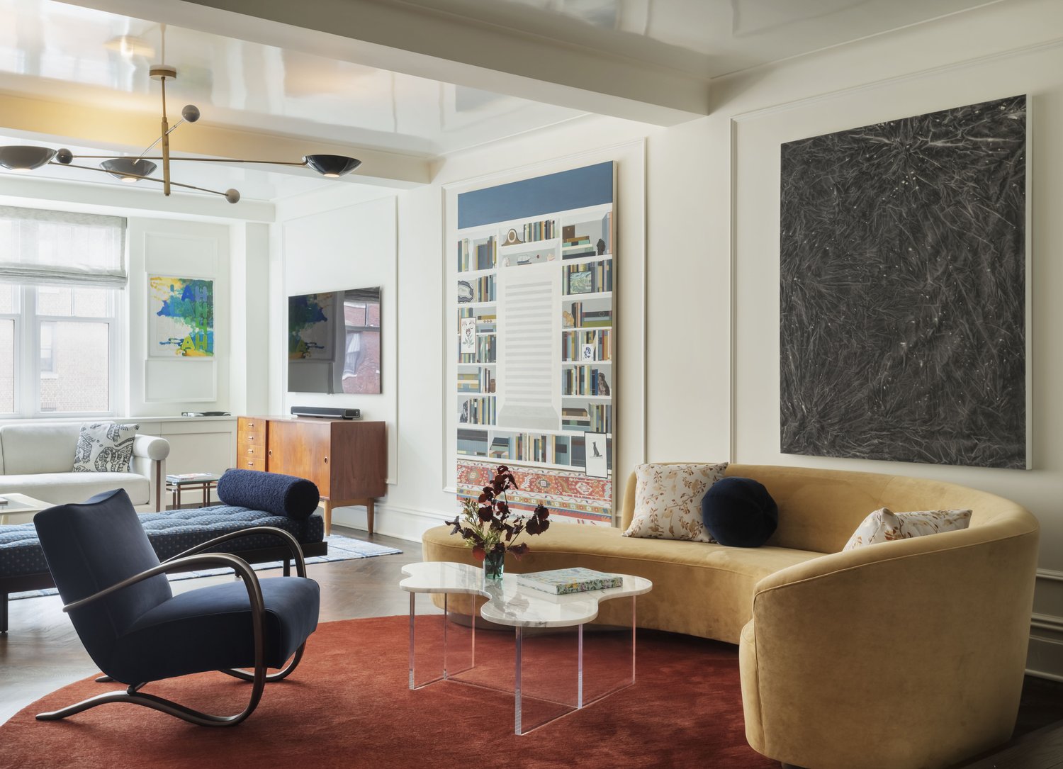
There's something that feels so expensive about a rich, chocolatey brown. If you're looking for something with similar luxe qualities on the paler side of the color spectrum, try champagne. Like the drink, this shade is a blend of orange and yellow tones, with the former mellowing the latter. E warns us to steer clear of the '90s car color' champagne, though. 'Instead, these are soft gold tones that don't read yellow or beige at all,' she says.
As the image above alludes to, champagne is a popular shade among couch color trends, working especially well on upholstery (think materials like velvet or chenille, where it has a subtle luster). 'We use champagne in some of our fabric selections because you get a bit of sheen and a touch of sparkle,' notes E.
This charcoal-taupe throw has the comfort of brown but with an extra bit of edge. Use in a neutral scheme as a bold accent, draping over a light gray or beige couch.
This suede throw has a natural camel color that works beautifully in place of brown. Use it to ground a space, and consider pairing with bouclé for an extra cozy feel.
Olive green feels as sumptuous and rich as brown, but adds a pop of color to a room. It's a great choice for upholstery, especially soft materials like velvet, bringing a touch of elegance to any room.
Brown will always have a rightful place in our homes, but these options offer a brighter, more on-trend look for 2025. If you want to lift your space and add a bit of warmth or color, you can decorate with confidence knowing that these hues have designer's seal of approval.