It's time to ditch the dull white woodwork around your windows and embrace color.
You can go as bold or as paired back as you like. From color drenching so your window frames match the walls, going for a bold shade to add a pop of color, or creating a tonal look as a subtle yet noticeable scheme.
We spoke with designers and color experts to get their insight into which paint colors work best, and how to choose the best shades for your windows.
What color windows should you choose?
Think of this new look like you would an accent color, as essentially that's what it is. All you need to do first is to prep your windows ready for painting and choose your shade.
There are no real hard and fast color rules – it can be a standout feature or they can blend with your walls – it's up to you, but here are some of our favorite, designer-approved shades to add instant interest to any room.
1. Yellow
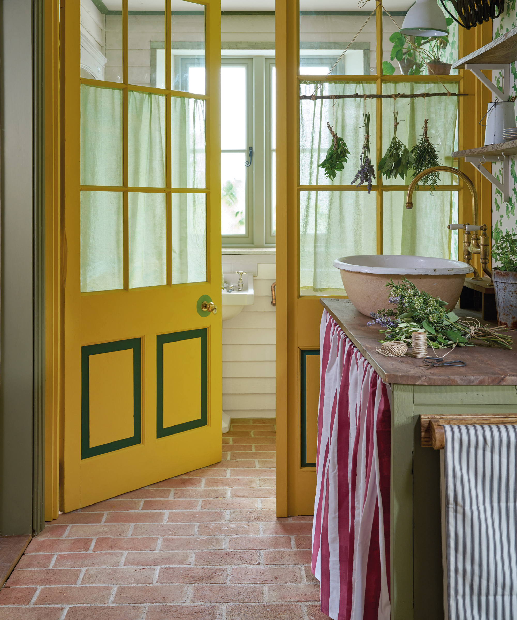
Nothing beats a sunshine yellow and all it invokes. It's the ultimate in positivity and joy and will instantly lift a scheme when used on a window.
'For those seeking a bright, summery atmosphere, Chalk Paint in Arles – a sunny orange-yellow – can bring warmth and joy to any space. This color is perfect for creating a cohesive, cheerful environment,' says paint and color expert, Annie Sloan.
If you adore the window color you've chosen remember you can color drench too, Annie continues: 'Imagine a sunroom where the walls, trim, and even some furniture pieces are painted in Arles. This approach envelops the room in a warm, inviting glow, making the space feel unified and lively.'
2. Emerald
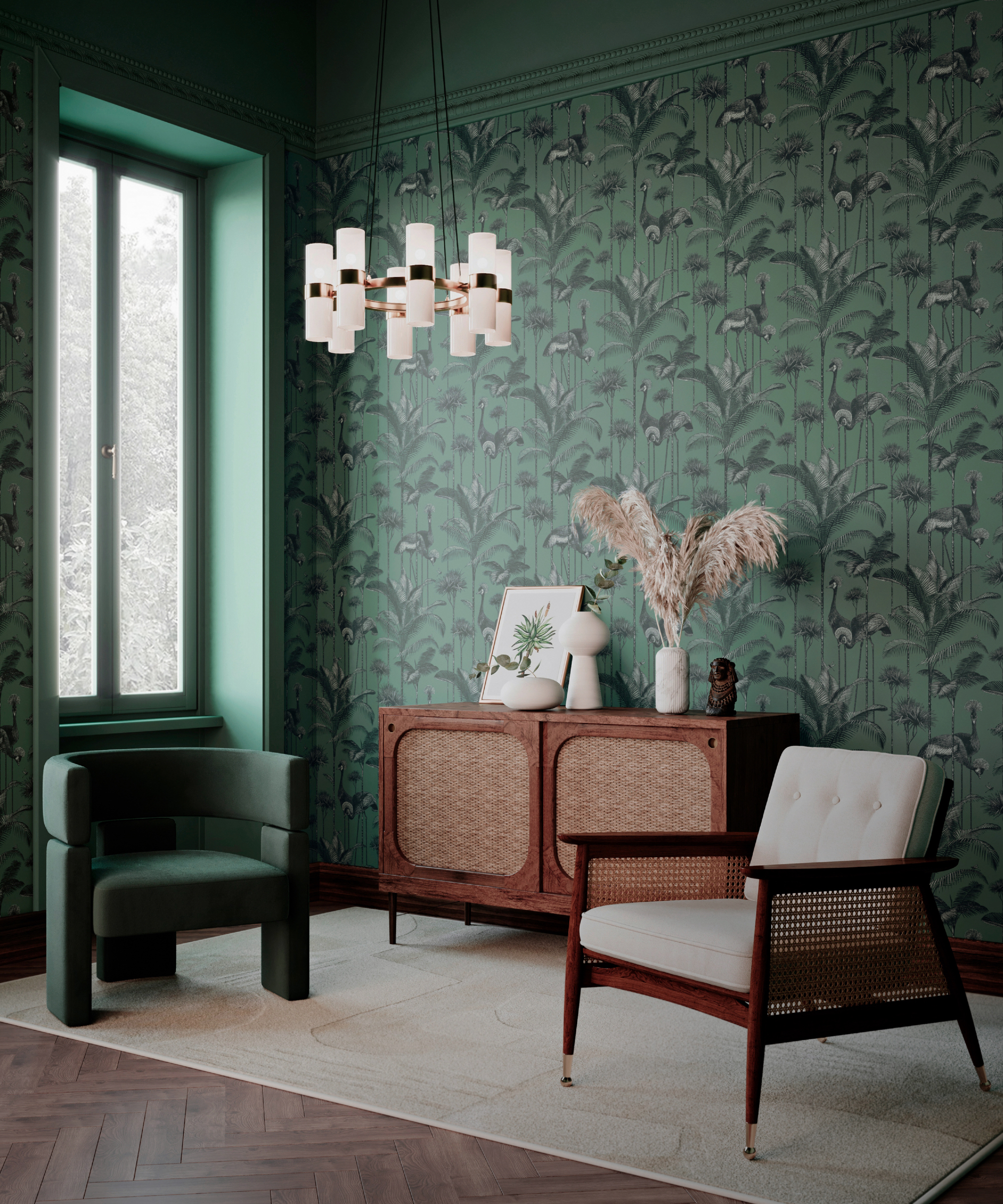
Dark colors recede which can be useful when wanting to create drama in a moody style space. This bold living room has an all-encompassing feel so it makes sense to paint the window frames the same color too – traditional white would be far too harsh visually.
Jamie Watkins, co-founder of Divine Savages agrees, 'When the colors of the window frames are coordinated with other elements in the room it helps to maintain a continuous visual flow throughout the space. You can choose wallpaper as the starting point, everything else can complement or contrast with it through varying tonal hues and textures.'
It pays to match your scheme as much as possible, Jamie explains, 'Matching colors in this way serves as a neutral backdrop that allows for greater flexibility in changing other elements of the decor, such as furniture and lighting, allowing them to stand out more effectively. The overall effect is a space that feels more thoughtfully designed and aesthetically pleasing.'
For a similar shade to this bold emerald check out Lick's Green 20 Matt, a dark green with blue and black undertones.
3. Black
If you love a contrasting look then black is your color, and if you team it with white you've got yourself a bold monochromatic scheme that's chic yet eye-catching.
Soften your window sill a little by placing plants and vases of flowers on it, and use a crisp white blind.
'I love painting windows black on the inside that way the outside truly comes in. When window trim is white you only see white but when they are black you can see the green of the trees and blue sky,' says Cecilia Casagrande, founder of Casagrande Studio.
The jet black finish creates a frame of your outside view as Cecilia mentions, tie it in with the rest of your scheme by choosing some black accessories.
4. Red
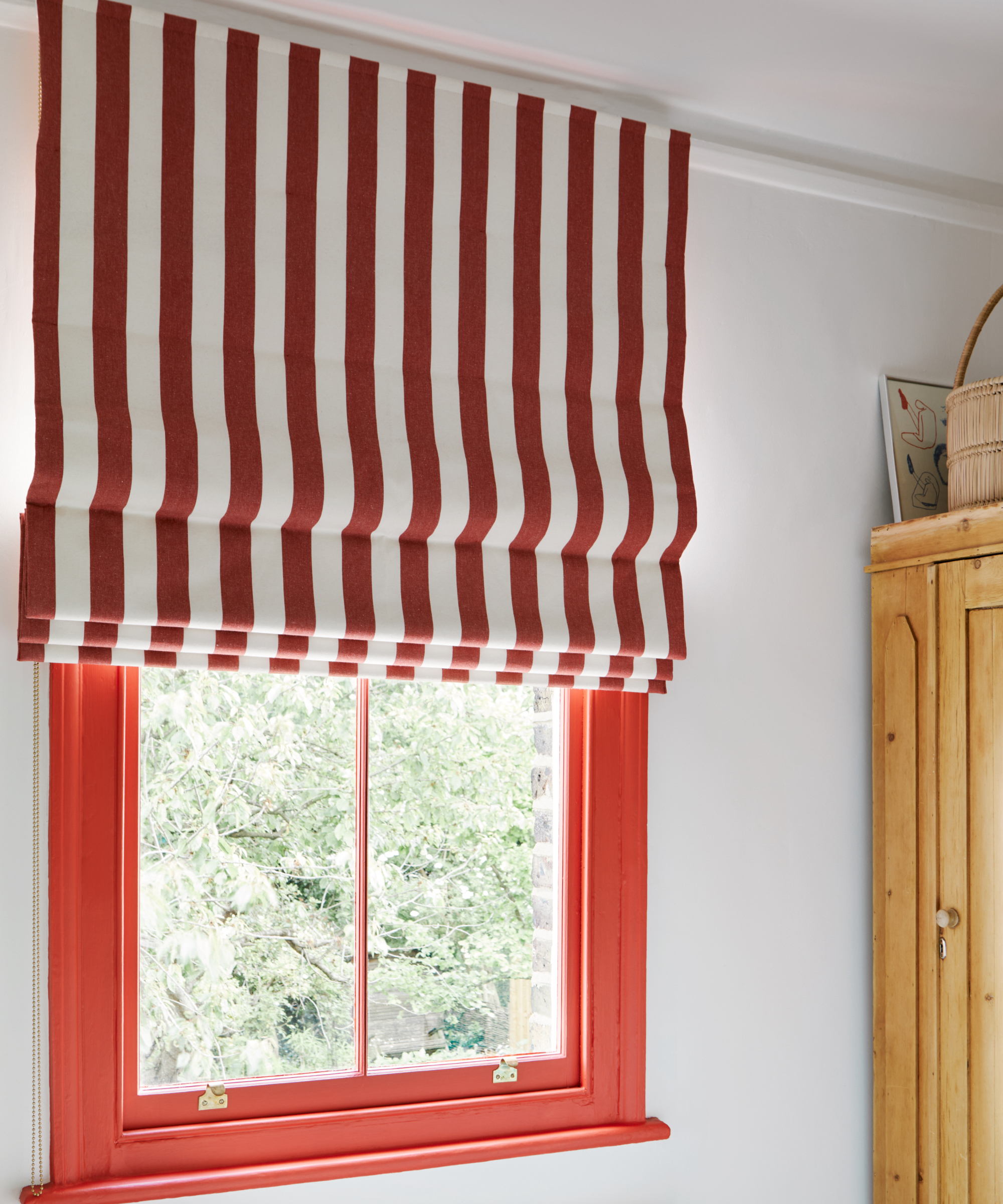
Create a real punch in a room's color scheme by decorating with red, and the beauty of it is that the rest of your scheme could be white and this fabulous window is the focal point. Unexpected red theory ticked off.
'Primary colors can be used to inject color and add a youthful touch to an interior, especially when used in contrast with more pared-back tones. A bold red like FTT-009 – Bright Red can create a graphic accent when used on window woodwork, and pairs well with light, bright hues like Cotton Street No.3 for a striking color palette,' says Dominic Myland, CEO of Mylands.
To complete the look opt for either matching drapes or an eye-catching blind, we love this striped fabric with the red window frame.
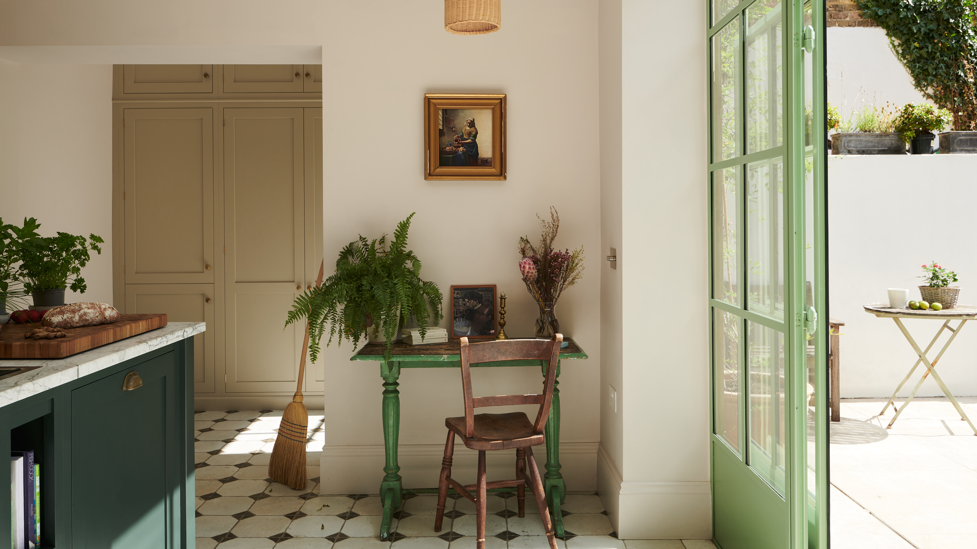
5. Pistachio
Create a soothing view outside with a pistachio – gentle on the eye when your window is big or also incorporates a door, it's a great alternative to white.
Looking good enough to eat this shade will go with white, blush pink and sky blue walls. We asked Helen Parker, creative director at deVOL Kitchens for her thoughts on using this charming shade, 'Let's start with the Crittall windows, the color of pistachio ice cream, they are the most delightfully mouth-watering windows we have ever seen, apparently the first time this color has been chosen for these kinds of windows and doors. We are pretty sure it won’t be the last, it has given people such a thrill to see this daring decision turn out so stylishly.'
We agree! If you want to pop online and order a similar shade check out Benjamin Moore's Scenic View 424, it's both pale and warming to the eye.
Our window frames are a huge part of each room and up to now have mostly been painted in classic white, which does have its place. However, if you fancy changing it up and adding a splash of color then choose a shade that complements the rest of your scheme.