There are so many reasons to eagerly await the start of fall, which is just days away now, and perhaps one of our favorites is the abundance of autumnal colors to come. From the vibrant oranges of the changing leaves to a general move toward richer, darker tones, there's much inspiration to be had from fall colors.
But when it comes to curating fall color schemes inside your home, it often takes a bit of thought to ensure the rich, warm tones translate well to your own decorating style. As such, mastering color combinations is an important step to creating liveable fall color schemes that maintain versatility.
And so, what are the best fall color combinations? We turned to the expertise of interior designers who share their favorites below. From chocolate brown and neutrals to warm blues and mustard, these ideas will no doubt resonate with you, depending on how bold or subtle you want to go.
Best color combinations for fall
'As the nights draw in, we tend to spend more time indoors with shared conviviality around the kitchen table or snuggled under blankets on a squidgy sofa watching our favorite movies,' says Patrick O'Donnell, brand ambassador at Farrow & Ball. 'So, it’s important the rooms we live in soothe us and help us decompress from our day.'
Your room color ideas are one of the most defining elements of the overall feel of a room, and as Patrick says, a cozy feel is what we all desire at this time of the year. The following fall color combinations will soon help you achieve this, replacing summer brights with richer hues.
Rust and teal
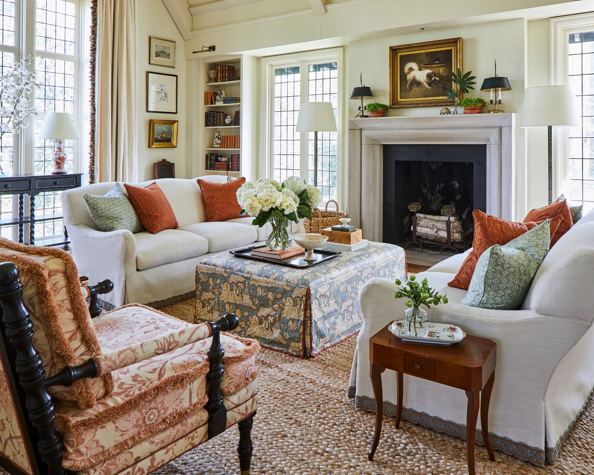
'A palette of orange, deep rust, and teal is my favorite combination for an autumnal vibe,' says Alabama-based interior designer Caroline Gidiere.
In this traditional living room, the room's neutral color scheme is elevated with the rust orange and muted teal sofa pillows. For those who favor timeless colors such as light neutrals, this approach shows that you don't need to reinvent the whole scheme as the seasons change. Subtle accent colors can make all the difference, without altering the main decor elements. Plus, they can easily be swapped out throughout the year to nod to the changing seasons.
Add a subtle nod to the fall months with this dark, muted orange pillow, perfect for a living room sofa.
Gray-green and earthy red
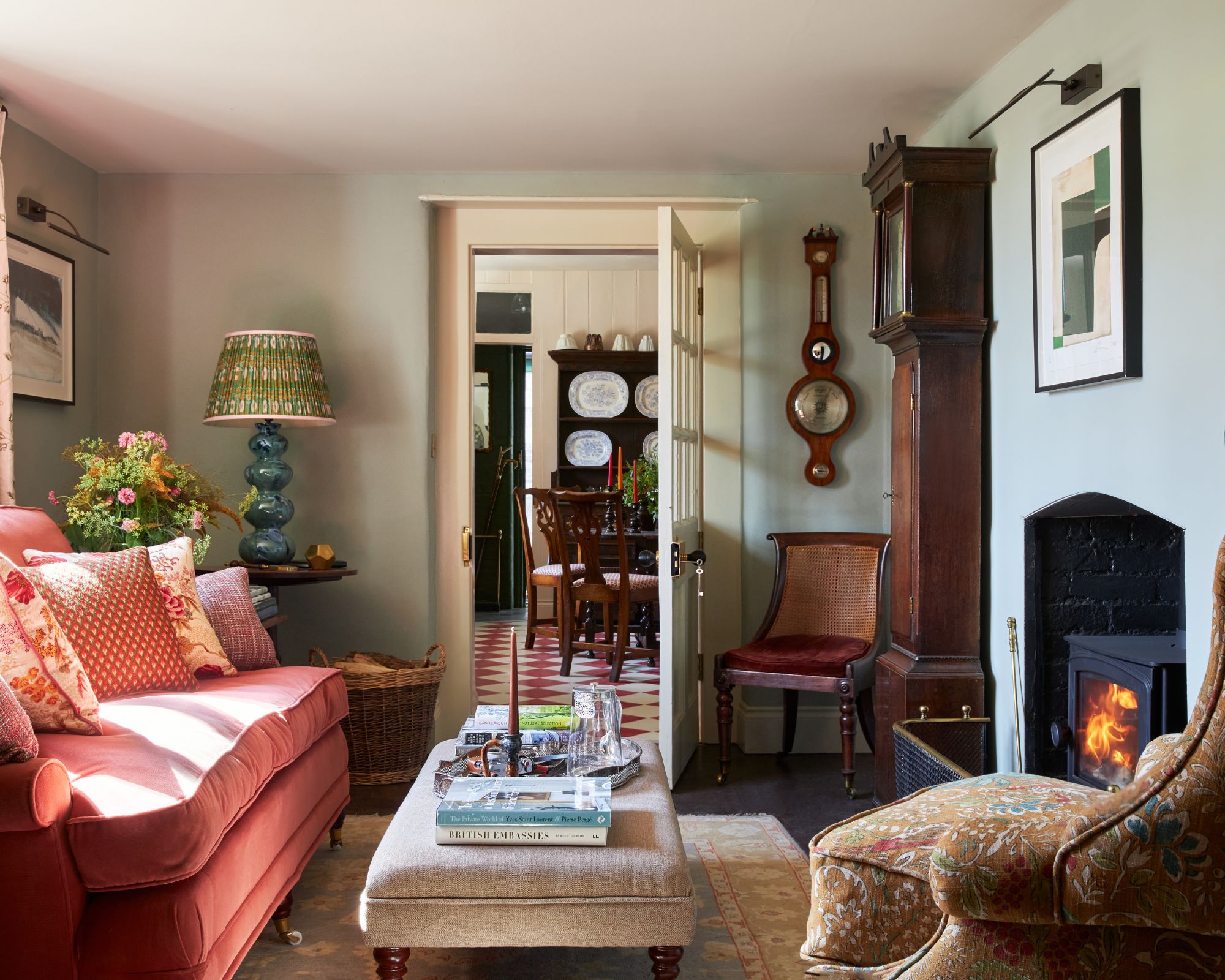
When it comes to choosing a color that creates a warming and relaxing environment in equal measure, Patrick O'Donnell recommends green the most. 'But not just any old green,' he warns.
'Our controversially named Blue Gray is just the ticket – it has just the right amount of color as not to dominate a space and layers beautifully with so many other colors from terracotta tones such as Red Earth or steely blues like Inchyra Blue to elegant, old-school browns such as Tanner’s Brown.'
Warm blues and mustard
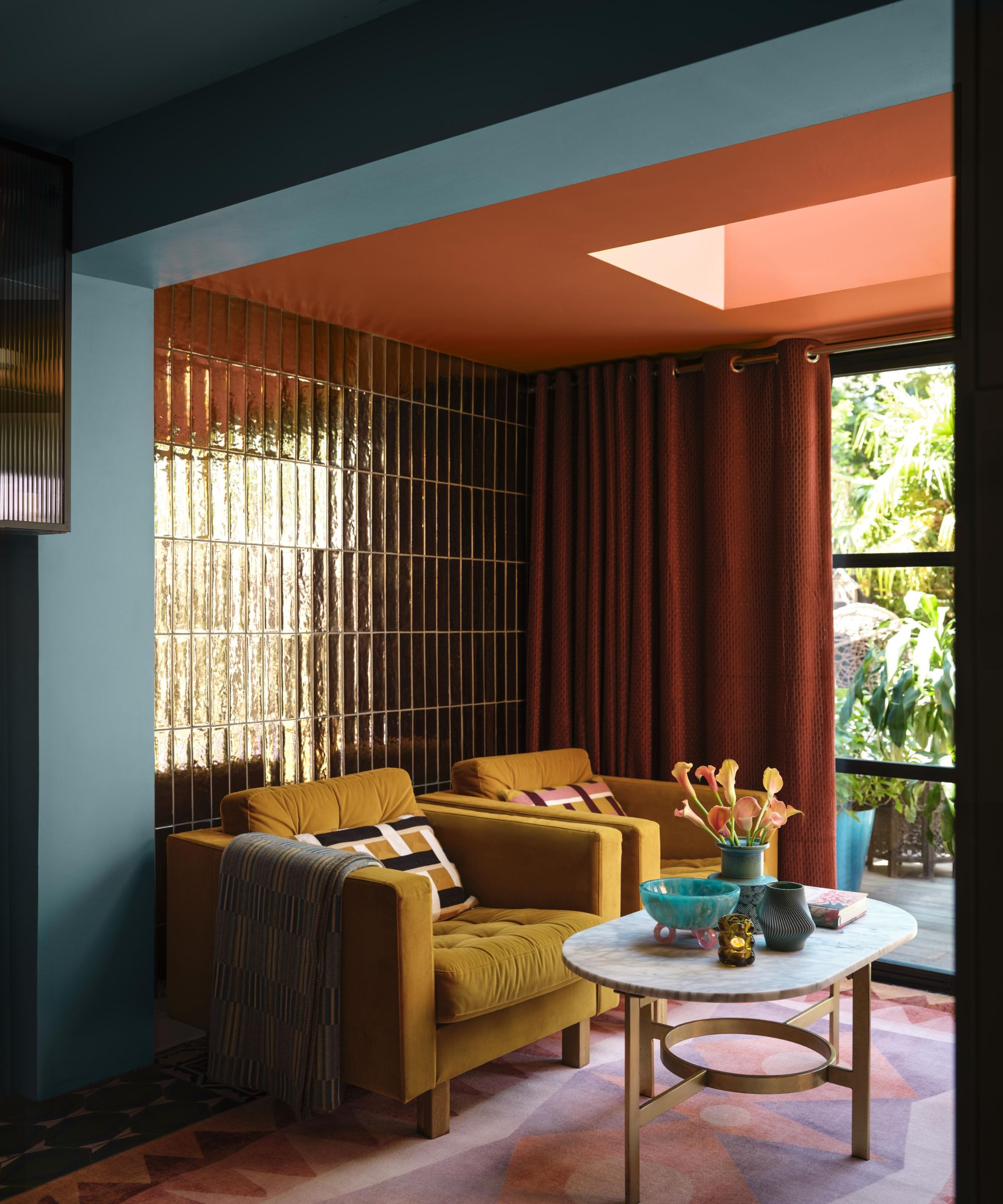
Decorating with blue needn't be reserved for the summer months. Far from it, this soothing hue can work as an unexpected color choice for fall, but the trick is to choose warm-toned blues, such as Benjamin Moore's Salzburg Blue which was used in this moody living room.
'To combat fall's cool light, opt for a selection of mustards, terracottas, and rusts, whose warm undertones add instant coziness,' says Helen Shaw, Director of Marketing and color expert at Benjamin Moore. 'An unexpected note of warm-based blue at a scheme’s entry point enhances the effect, while metallic tile finishes help bounce around light. Add tactile elements such as velvet upholstery and warm throws for the ultimate cozy haven.'
Earthy neutrals and white
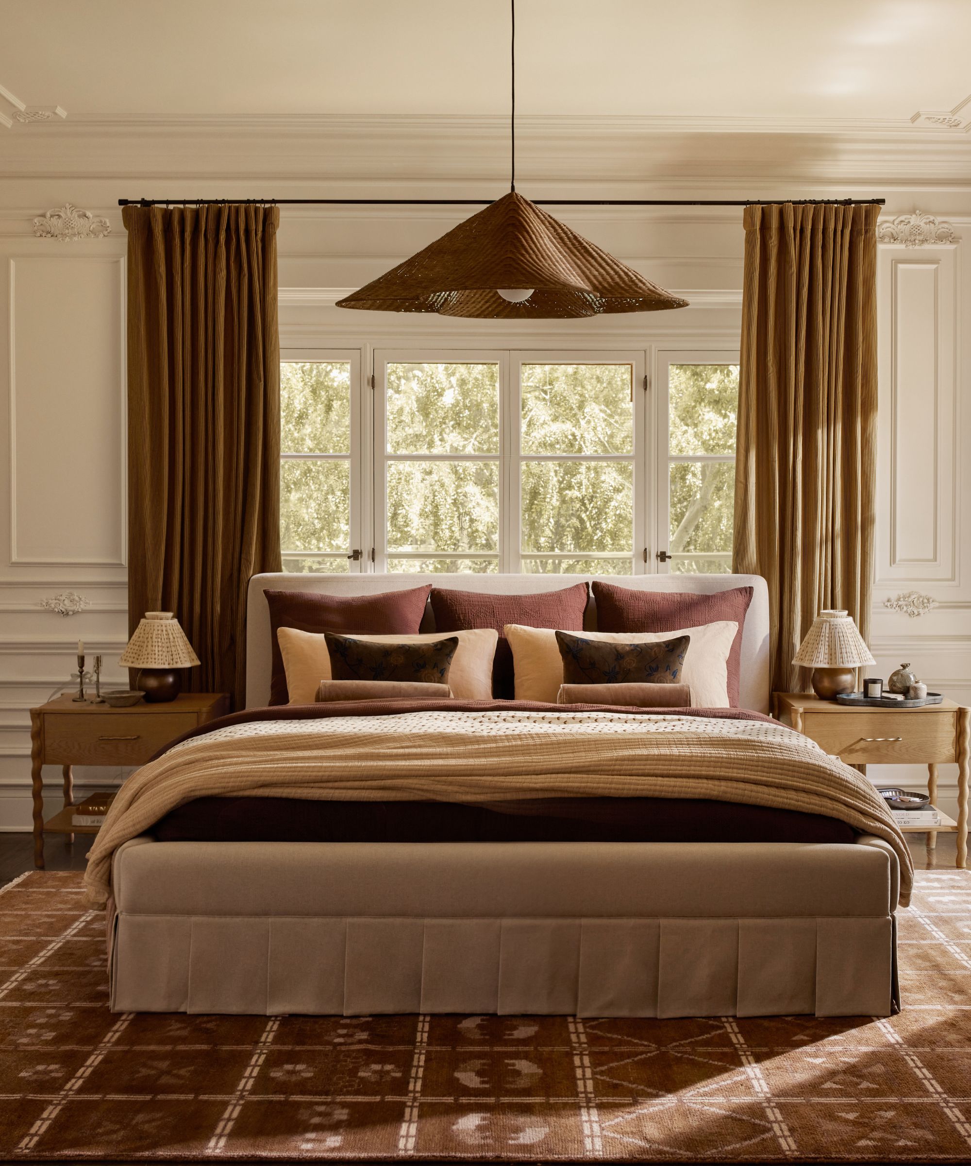
If your style generally sticks to decorating with neutrals, there's no need to venture far as soon as fall arrives. Instead, replace the light and airy neutrals of summer with richer, darker tones that will add depth and warmth to your space, while maintaining a pared-back look.
'In the fall, I love decorating with earthy tones like browns, beiges, and whites,' says interior designer Soledad Alzaga. 'I incorporate these colors into furniture, paint, and accessories, like a cozy caramel brown cashmere throw and pillows. For me, fall is all about layering different shades of brown to create a warm, inviting space. This palette brings an organic, grounded feel that's perfect for the cozy fall months.'
Boost the coziness of your bedroom with this waffle blanket in an on-trend rich brown hue.
Aqua and orange
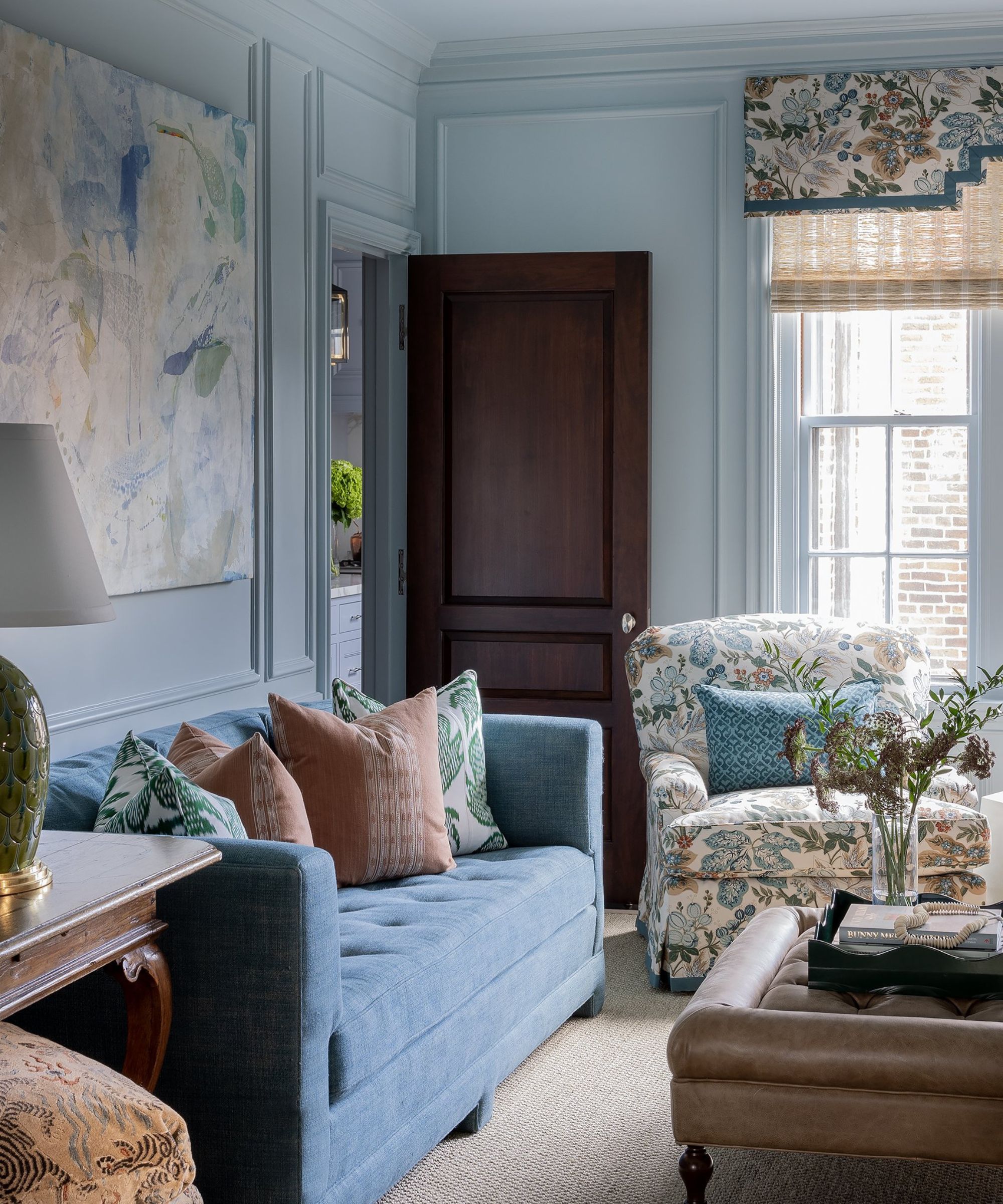
Since blue and orange are complementary colors, meaning they sit opposite one another on the color wheel, it's a combination that naturally works well. For fall, it's worth reaching for muted variations of these two vibrant hues to ensure a restful space.
'I love the combination of blue, green, and aqua with orange hues when looking at unique color schemes for fall,' says interior designer Honey Collins. 'Not only does it bring a sense of cohesion and warmth to a space, but it also works beautifully to create a cozy and balanced aura.'
'Aqua softens the intensity of the orange, giving it a light and airy feel while maintaining its seasonal warmth. This palette offers a great way to modernize fall design by moving away from the traditional earthy tones we know and love and turning to something new and blue.'
Chocolate brown and neutrals
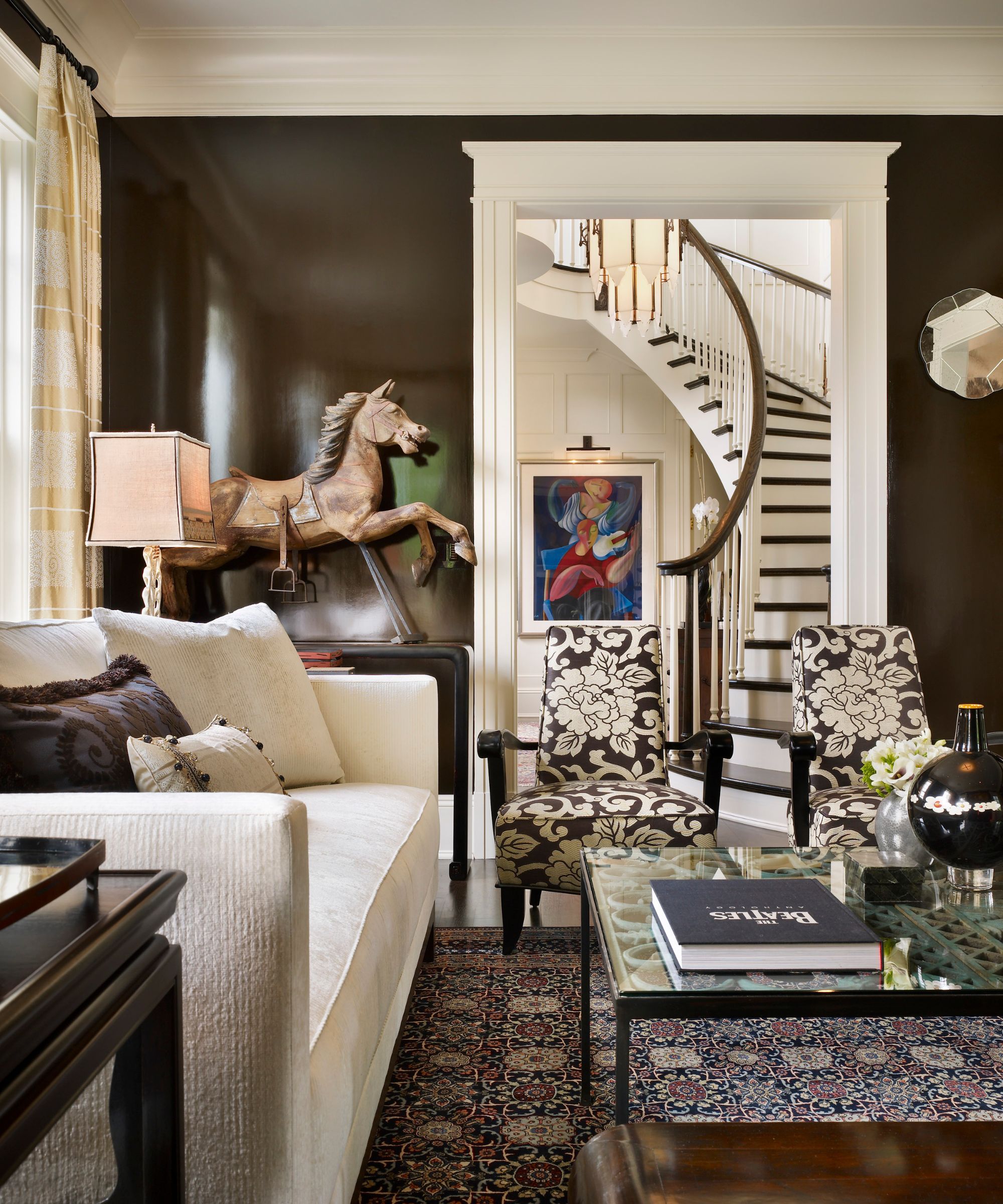
If you're looking for a bold way to welcome the fall months, painting the walls in a deep and dark shade won't fail to make a statement.
'As the seasons shift, we tend to gravitate towards the indoors, embracing a more sheltered lifestyle. Lean into the hibernation by transforming your walls with a deep chocolate hue,' suggests Philadelphia-based designer Marguerite Rodgers.
'For an extra touch of elegance, choose a glossy lacquer finish. Complement this with soft, neutral furniture and decor to create the perfect autumn sanctuary.'
Camel and jewel tones
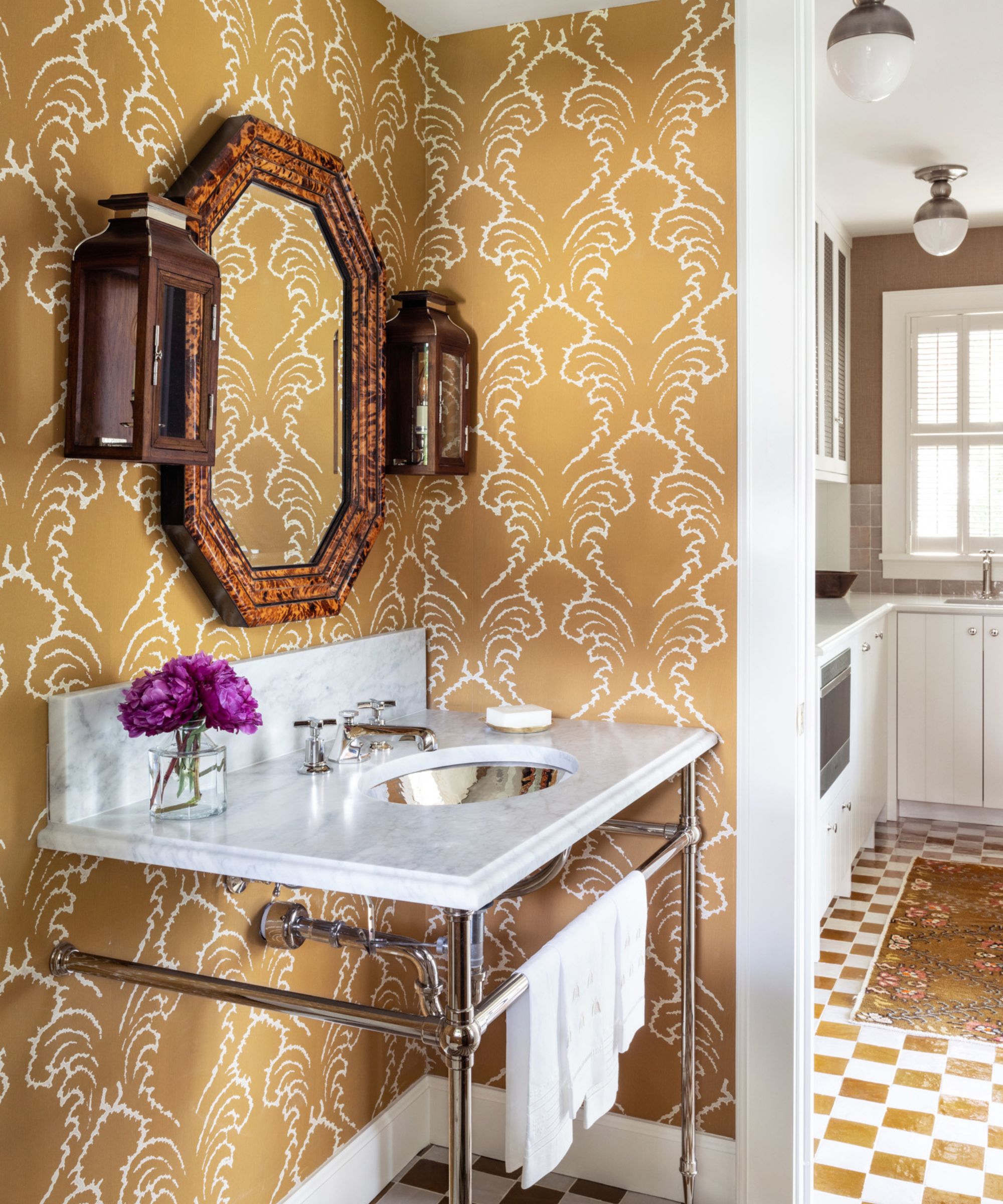
Decorating with jewel tones is always a failsafe choice during the cozy season, filling our homes with warmth and opulence. However, due to their intensity, jewel tones can quickly overwhelm rooms if used in excess, so why not pair them with neutrals to tone things down?
In this powder room, the pop of rich purple is grounded with the camel-colored wallpaper, ensuring a timeless look year-long.
'A classic camel paired with jewel tones is a fall combination we love,' say interior designers Jordan Winston and Tate Casper of Oxford Design. 'It delivers a rich, cozy fall palette while keeping the mood fresh and alive.'
Yellow and wood tones
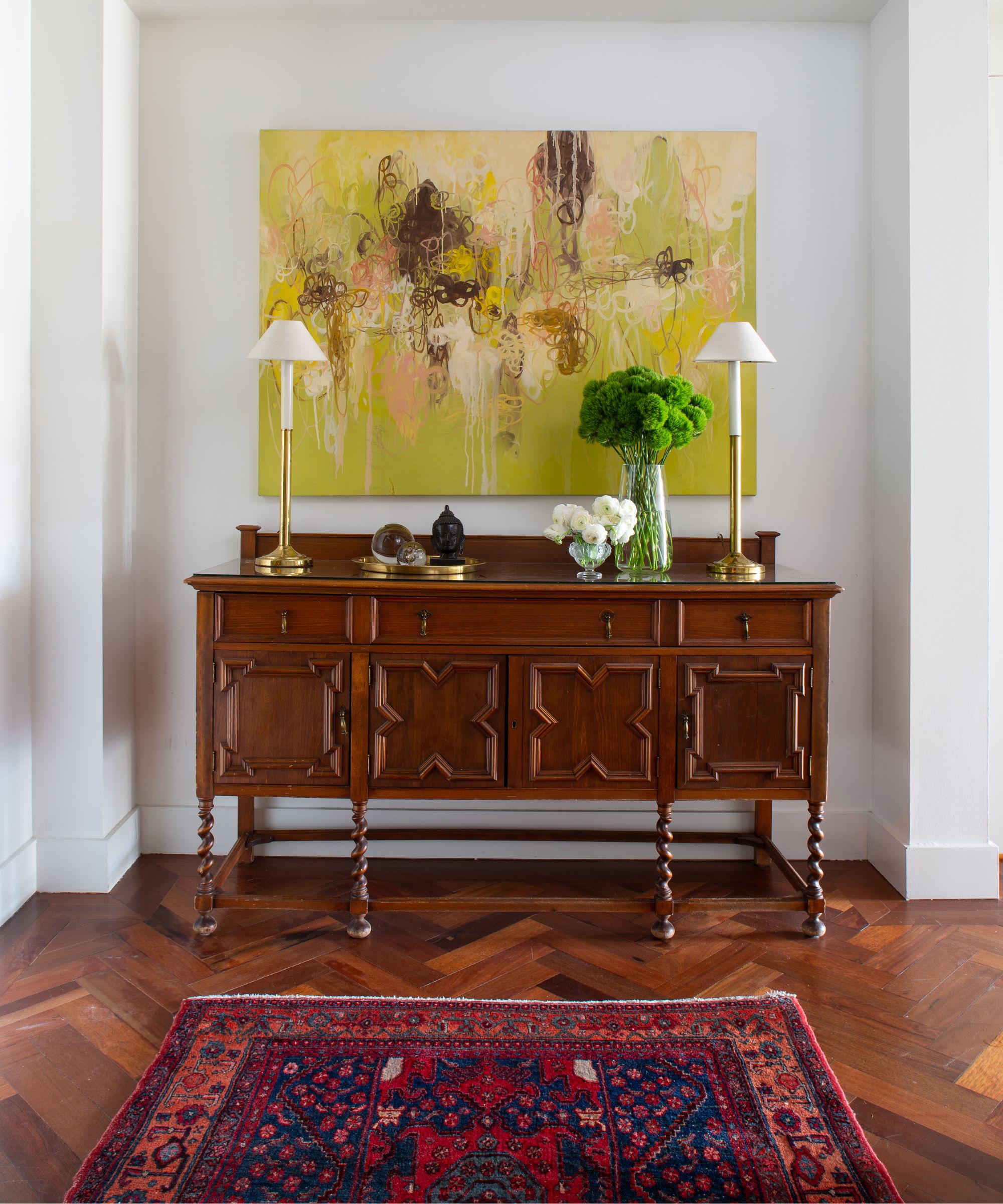
While you may naturally associate yellow room ideas with the summer months, they can work just as well for fall as a transitional color, especially if you live somewhere where the temperatures don't drop until later on.
'I am drawn towards warm yellows and oranges in the fall,' says designer Nadia Watts. 'It’s a transitional season and yellows and oranges help bridge the gap between the brights of summer and the cool tones of winter. Yellow is one of those colors that works with everything, it pairs perfectly with rich wood tones and provides a pop of whimsy and delight. The right pop of yellow can take a room from drab to fab. Bring in your fall hues with art, accessories, rugs, or even furniture.'
Whether you want to stick to a classic autumnal color palette of browns and rich orange tones or embrace slightly more unexpected ideas with blues and greens, these expert-approved pairings will ensure your home is equally cozy and stylish this fall.


