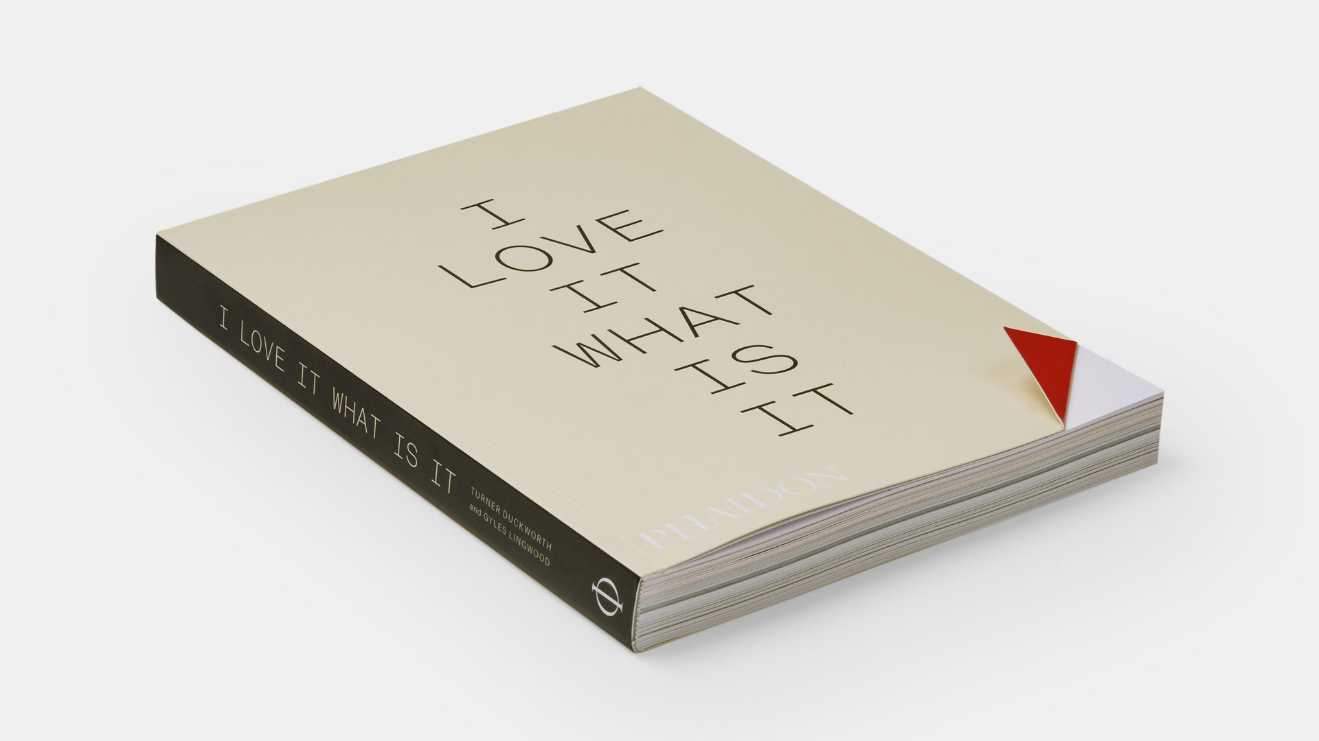
Branding agency Turner Duckworth's new book focuses on the power of instinct in design and branding. It does so through a series of essays that explore the studio's most recognisable work, including Amazon, McDonald's and Coca-Cola.
I Love It. What Is It? was two years in the making, and Joanne Chan, CEO, describes it as a "labour of love, literally and figuratively".
"We wanted to capture the passion we have for creativity and building brands," explains Sarah Moffat, chief creative officer. "Print seemed like the perfect medium to express that in this time of big data and AI, there is still a need for a type of creativity that cannot be reduced to an algorithm."
As part of our How we made series, I caught up with Joanne and Sarah to find out more...
What was the creative process like?
As you’ll learn in the book, the creative process is anything but linear. And having never published a book before we were learning something new about publishing every day. It was important to us, and to our editors at Phaidon, that the book have broad appeal and not be 'just' another design book. Another important consideration was that the essays would be told in the first person, to lean into the individual contributor’s emotions and instincts as they describe 'aha' moments and explain how creativity happens.
How did you work together on this project?
Our agency was founded on the key principle of creative collaboration. When the founders stepped down in 2018, we carried on the ethos of collaboration. We work very well together, even if we don’t always agree. We created clear swimlanes and the two of us divided the management and oversight of the project, but we made all key decisions together.

How did you choose the 'Turner Duckworth friends and family' figures to include?
When assembling our squad, the first call went out to Gyles Lingwood, seasoned author, copy expert and Professor at Lincoln University. We then invited collaborators whom we knew to be champions of creativity, and who would tell a story from a personal perspective. We didn’t need to look far as many of our clients (past and present) fit the bill.
It was also important to us to include voices from outside our agency's immediate sphere, which is why we were very fortunate to include work by photographer Stan Musilek, designer Stefan Sagmeister and, advertising legend Mark Tutssel, among others.
What was Gyles Lingwood’s role?
Gyles was instrumental as a co-author of the book. He worked with the collaborators one on one, helping to shape their essays, carefully curating content as the book took shape. Gyles has already published two books about copywriting, so it was great to have an experienced author on board to guide us through the process. In lieu of an essay, Gyles authored the introduction which is equal parts overture and invitation to what follows.
How did you decide where to focus?
We decided to focus on brands with broad appeal and brand creators with unique perspectives. We were also keen to tell stories that help a broader audience understand what makes creatives tick, and what the actual creative process feels like – messy, frustrating and ultimately rewarding and delightful. If we introduce just one person to the possibilities of a career in creativity it will have all been worth it.

Tell us about the design process
Andy Baron, executive creative director of our New York studio, designed the cover and set the tone for the overall look and feel. We wanted something simple and iconic that could draw the reader in. The moment we saw the initial cover sketch we knew it was the one. The design worked perfectly as a physical experience of the title and the theme.
The upturned corner rewards your curiosity as you delve past the cover. For the interior Andy partnered with Robert Williams to emphasise the snackable nature of the book. They employed a range of fonts and faces to emphasise the variety of voices. Each written piece is able to stand on its own but also sit happily with the others.
What challenges did you come across while creating the book?
As creative professionals, we thought sourcing imagery would be the simplest part of the process, but we couldn’t have been more wrong. We didn’t anticipate the challenges around obtaining rights, copyright and trademark permission for the images and illustrations. Some of the work included in the book goes back 30 years since their original creation. A couple of the brands featured in the book are now owned by a different parent company, and none of the original brand stewards had the authority to grant permission; therefore, we had to do a significant amount of research to track down the people who could grant permission to reproduce images. A few of the original photographers had passed away, so we were dealing with their estates.
We also had to obtain legal clearances from the brands whose trademarks appear in the book, and track down the photographers who shot imagery on original packaging, as well as the photographers who shot the package itself. We must give credit to Katie Monahan and Xavier Drudge who did a mountain of research, image sourcing and asset management.
How did you pick the name of the book?
The title is an expression we’ve used for years. It refers to the unthinking type of thinking that attracts you to something at a glance. The part of your brain that says 'ooh, shiny' and diverts your attention before you’ve even realised. It’s a phrase that exemplifies how design can charm an audience before they realize they’re under its spell.
Which part of the process did you enjoy most?
We love collaboration. As challenging as it was to birth a book, the aspect we enjoyed most was the partnership and collaboration with our Phaidon editors, Deborah Aaronson and Maia Murphy, our co-author Gyles, all of our contributors and artists, our creative and project management team, and each other. Similar to what we do for a living–it was a creative process with many complex tendrils and stakeholders. We love the messy, non-linear process of creation because creating things under pressure ultimately brings people closer together, and there are moments of extreme panic as well as moments of absolute hilarity. The payoff of seeing the final finished product is always extremely satisfying and inspiring.
What’s your favourite part of the finished work?
The fact that it’s finished! Lots of people dream of writing a book, and we’re overjoyed that we were able to make that dream a reality. We set out to accomplish something where we were the client, often the most challenging type of work, but we did it.
Tell us more about the digital content accompanying this book
We had always intended to have a digital component to the book, since some brands and creative outputs are simply not best conveyed in print. The digital content will include contributions from some of our clients and other internal and external collaborators, whose work lives only in the digital space. We expect to have features about brands in motion and the influence of AI in branding and design.
Read an exclusive extract from I Love It. What Is it?. You can also order I Love It. What Is It? via Phaidon.


