Launched in 2013 by the team behind Computer Arts magazine, The Brand Impact Awards (BIA) quickly gained prestige in the design community. Eleven years on, the scheme's branding and trophy were looking a little tired, and Taxi Studio stepped in to create a fresh, future-proofed identity that would serve the awards for years to come.
The rebrand hinges on the scheme's new trophy, the BIA Mallet – for more on that see our How we made the BIA Mallet piece. Here, though, to delve into the process behind the rebrand, I spoke to Spencer Buck, founder and chief creative officer of Taxi Studio, Matt Smith, BIA's lead designer, and Nick Carson, chair of the BIA jury.
The Brand Impact Awards are open for entries until midnight 19 July (BST).
The competition
Spencer Buck: We wanted to create an identity that was so simple it would stand a very good chance of being timeless. What we wanted to try and avoid was the feeling of the need to redesign the branding in five, ten or twenty years’ time. Some of the most successful award schemes that still exist today have had very little alterations to their brand identity over 50-60 years, when you look at some of the really established award schemes, such as D&AD. Their identity was launched 60 years ago, and has remained unchanged ever since, with the exception that now, it's contained within the hexagon shape because the various touchpoints that have evolved since its inception means that you have to meet certain demands, like working digitally, for example.
It was inspiring to try and think about how we could approach the BIA in the same manner. Because one of the really impressive things about the BIA is it’s very young as an award scheme. In a short time, it's quickly become a go-to in the industry. And that's because, to date, the BIA have protected the integrity of the work that's awarded. The reason that the integrity of the work has been protected is because of the calibre of judges that the BIA attract year upon year. So you've got world-class judges, arguably a D&AD cast of judges. That's incredible, and it means the work that gets awarded does represent the very best work.
The need for relevance
This isn't to denigrate anything that's gone before, but the worry that I had was that unless the feeling of the BIA lived up to the kind of work that is awarded, relevance would diminish over time, and the scheme wouldn't necessarily attract the same level of judges. So it felt like the BIA were in a period of potential erosion.
The BIA got to the 10 year point, and the awards wouldn't have felt it yet, because the previous system had only been in place for a couple of years, and it was implemented around the time of Covid. And everyone can kind of understand why things are why they are because of money and everything else, but if the BIA team wanted to invest in itself and the industry, they needed to take a slightly different view on their own, look and feel in order to attract the judges.
The BIA needed a new identity to create a new, impactful force to drive it forwards
Matt Smith
Matt Smith: We celebrated the 10 year anniversary of the BIA last year, and while I don't think stagnant is quite the right word, it didn't have the direction that we felt it should have done. Over the years, it had been neglected, particularly after Computer Arts shut [in 2020]. It just didn't have the impetus behind it, it didn't have the push. So it needed a new identity to create a new, impactful force to drive it forwards.
The logo
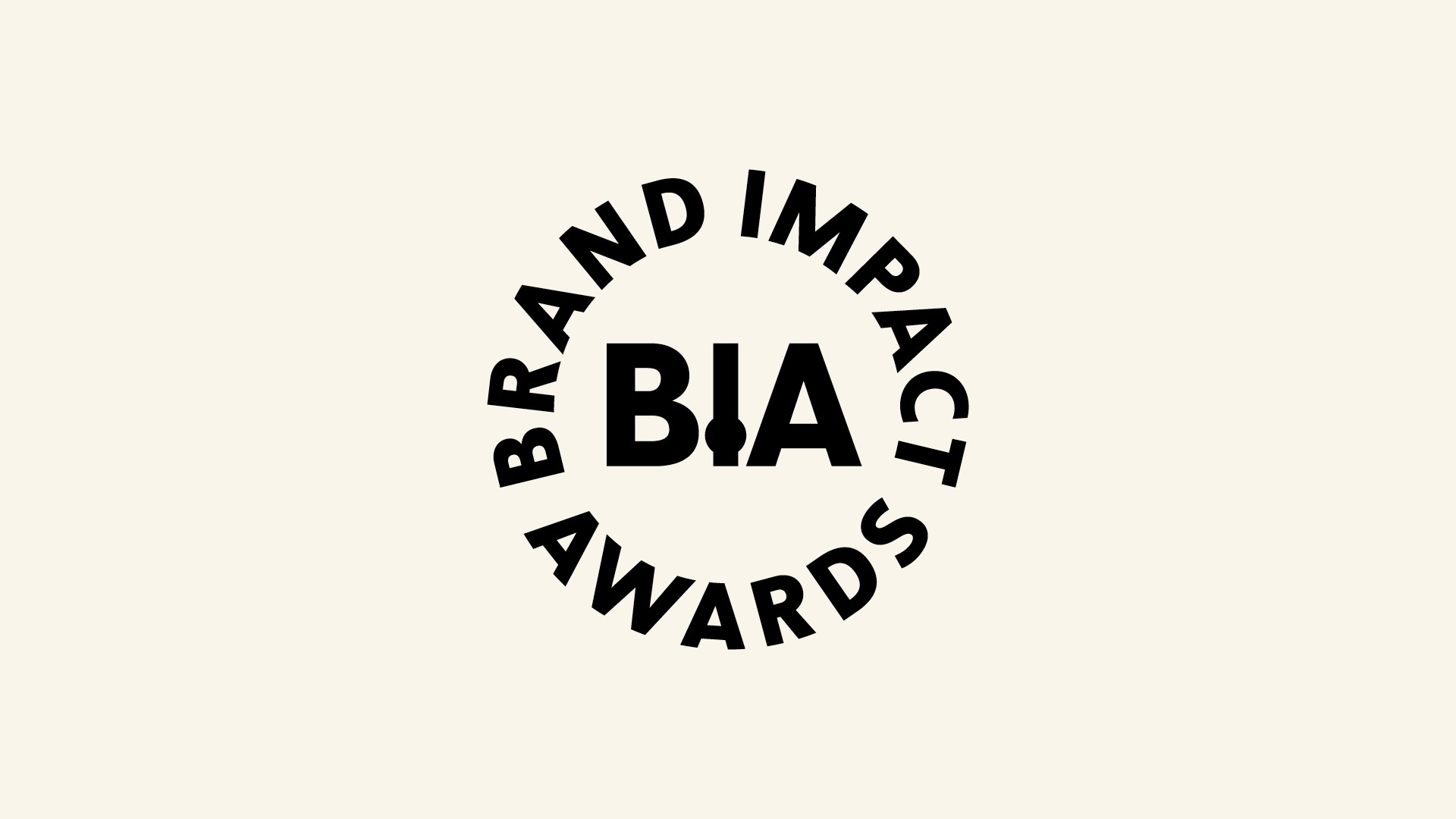
SB: The identity came from an observation of the design of the BIA Mallet – it's side on where you get the branded elements, and it gives you a lovely ‘I’. In the middle of the Brand Impact Awards, or BIA is the ‘I’ of impact; it just happens to work topographically well, because the ‘I’ is a very slender form. And then the two bookends, the ‘B’ and the ‘A’, have got quite a quite a nice whip to them. But the thing that makes it distinct is a little roundel, and that's an oddity. Introducing oddities into design, providing it’s relevant, can give an identity a sense of uniqueness, relevance and interest.
MS: I was concerned about the ‘I’ in the logo initially, as we needed it to work at very small sizes. But I think so far, it’s worked, and having the two alternative logos, one with the roundel and then also just the ‘BIA’ version makes things easier.
The 3D rotating mallet
SB: The ambition I had was to make sure that there was inclusivity from the side of the Brand Impact Awards team, while respecting that I am the target audience of the BIA, so I can bring that rich perspective.
We provided the BIA team with the tools and the inspiration to enable them to take it on and experiment and play
Spencer Buck
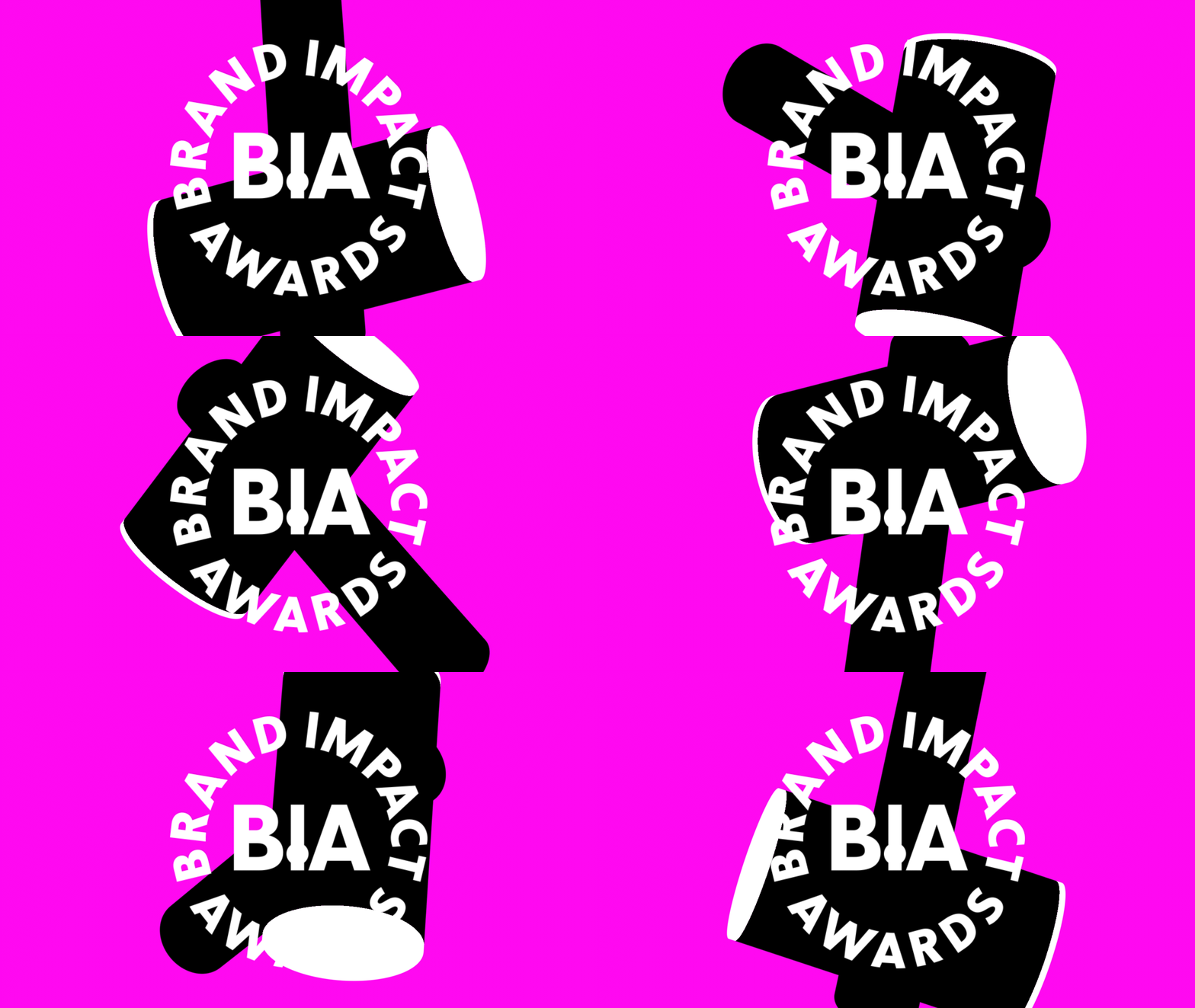
We are used to working with creative entities and internal design talents within existing businesses, and when we do that, my pursuit is always in great work. I don’t care where it’s come from and who had the idea. We provided the BIA team with the tools and the inspiration to enable them to take it on and experiment and play. Matt had some great ideas, the thing that I thought was really beautiful is the 3D rotating mallet. Matt took that 2D form and made it three dimensional and that really makes it for me.
MS: For other awards schemes I work on, the first thing we always look for is the motion side. We want an animated webheader that encapsulates the brand and drives the rest of the scheme. In the case of the BIA, although we had some assets and a logo, we didn’t have an animated web header and we were fast approaching launch. I had already had a 3D model built in Blender to check the wood textures – luckily the shape of the trophy is very quick to mockup and it was simple to create a rotating loop. My MacBook doesn’t have the render power to do anything too strenuous so, as we were under tight time constraints, I used the Eevee engine to churn out the animation as quickly as possible, taking it into After Effects to colour up.
The colour palette

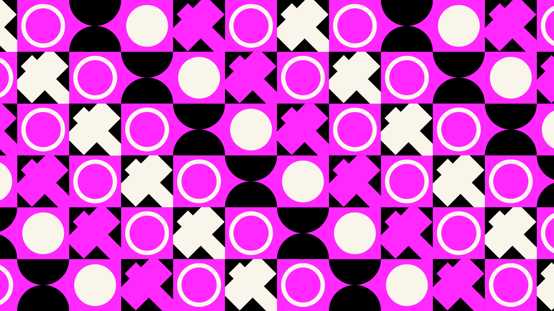
SB: We needed something with visual impact and we wanted to go for the punk aesthetic that the BIA has always encapsulated. We had originally proposed acid green as the main colourway, but the BIA team suggested a hot pink, and maybe hot on the high heels of Barbie, that felt quite provocative.

I think the colour scheme works really, really well. The pink is quite visually impactful and the green works as an accent. The only issue we had with the pink is when we sent the hex code to the BIA team. It was ff00ff. While the code is definitely punk, I did have to clarify that I wasn’t insulting anyone when I sent it over!
The typography
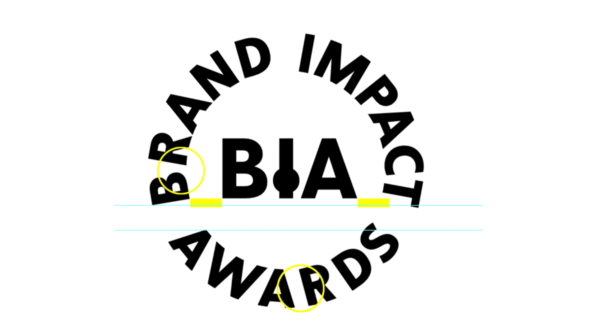
SB: One of the most challenging things to achieve in typography is type around a curve. So we engaged with the great team in Capitalics in Warsaw to add some polish to the roundel brandmark. In order for it to work, it needed to be hand-drawn. We wanted to achieve certain curvatures on the outside forms of the letters, but then the kerning around the mark needed to be very carefully managed, because one slight adjustment on the right hand edge threw the whole balance. In the process of tweaking it, we inverted it, turned it upside down, printed it out small and large to see where gaps occurred. I think where we ended up was the best that we could ever achieve with the letter forms in that particular order.
MS: The typography, specifically the kerning of the ‘BIA’ rondel was probably the most challenging part of the project. It was initially quite tight, and it was just not quite working. We had this huge width at the top and not at the bottom. After a lot of back and forth, I think we found the right balance.
The copy
Nick Carson: As the name implies, the Brand Impact Awards have always been about impact: in particular, how a compelling creative idea, beautifully and consistently crafted, can help a brand punch through in its market. Taxi Studio’s new identity makes the ‘I’ in ‘BIA’ the star, echoing the side profile of our iconic new Mallet in its static form, and bursting off the screen through animation. Our language needed to tie these elements together. But it’s a fine line to tread: we didn’t want to labour the point with relentless hammer puns. Certain words – such as ‘striking’ and ‘impression’ – carry subtle double meanings in body copy, while homepage crossheads enjoy a little more creative license: potential entrants are invited to’ Hammer it home’ and ‘Hit us up’ for more information, while big winners from the past decade are celebrated as having ‘Smashed it’.
The impact
NC: Ultimately, our new Mallet trophy is the star – and all it represents in terms of both craft and impact. As we look forward to the next decade of the BIA, there’s plenty more fun we can have both visually and verbally to bring it to life.
SB: Overall this project was a lovely collaboration with the BIA team to result in something that will hopefully set them up for the next 50 years as the scheme grows. We think it definitely has impact.
Enter the Brand Impact Awards by 19 July (BST)


