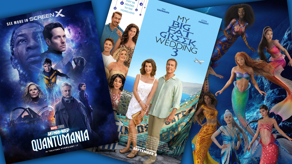
It might seem a bit early to call the worst movie posters of 2023 considering that we're only halfway through the year. But we've already seen four designs that were so bad, we can confidently say that nobody can do any worse... can they?
From terrible Photoshop to... well, even more terrible Photoshop, we've seen posters with odd compositions, mismatched lighting and faces that look like they could have been made using an AI art generator. We'll see if the second half of the year brings even worse design crimes, but, for now, this is our pick of the worst film posters of the year.
01. My Big Fat Greek Wedding 3

Top of our list of contenders for the worst movie poster of the year is this offering for the third installation in the epic trilogy that is My Big Fat Greek Wedding (you mean you missed MBFGW 2? Us too; apparently, it was released in 2016). The design sticks with romantic comedy conventions: the couple in the foreground, and a bunch of floating heads in a column on the left.
But look closer, and you'll see that none of those heads appears to belong to the body it's been slapped on top of. What's more, each face appears to have a different light source, and there's an uncanny, dead-behind-the-eyes quality that's making a lot of people wonder how this wasn't generated by AI.
02. Target's Little Mermaid poster
From the target site 😱😍 sisters!!! #thelittlemermaid pic.twitter.com/OWDX55secIApril 24, 2023
As if the Little Mermaid character designs weren't controversial enough for trying to make humanised sea creatures look realistic, along came this poster with its very bizarre composition. I mean, I get that there could be a caustic light effect in the shallows of Ariel and her sisters' watery home, but every character in this poster seems to have light cast on them from a different angle.
We can't blame Disney for this one though. It wasn't an official poster. It's not entirely clear who created it, but it appears it may have been Target. It was spotted on the retailer's website being used to promote Little Mermaid products. It's since been removed.
03. The Colour Purple poster
i hope all of the posters for this movie are literally any color but purple just to piss people off https://t.co/NDraNLO4qqApril 26, 2023
Sure, this was only a very early minimal teaser poster for Blitz Bazawule's adaptation of The Colour Purple, which is not due for release until the end of the year, and there's not much to see. All the same, it raised many eyebrows for the juxtaposition of the film's title with a colour that was definitely not purple.
"They had one job and they BLUE it," one person quipped on Twitter. Surely the designers know that you can quickly tweak hue in Photoshop?
04. The Ant-Man 3 poster

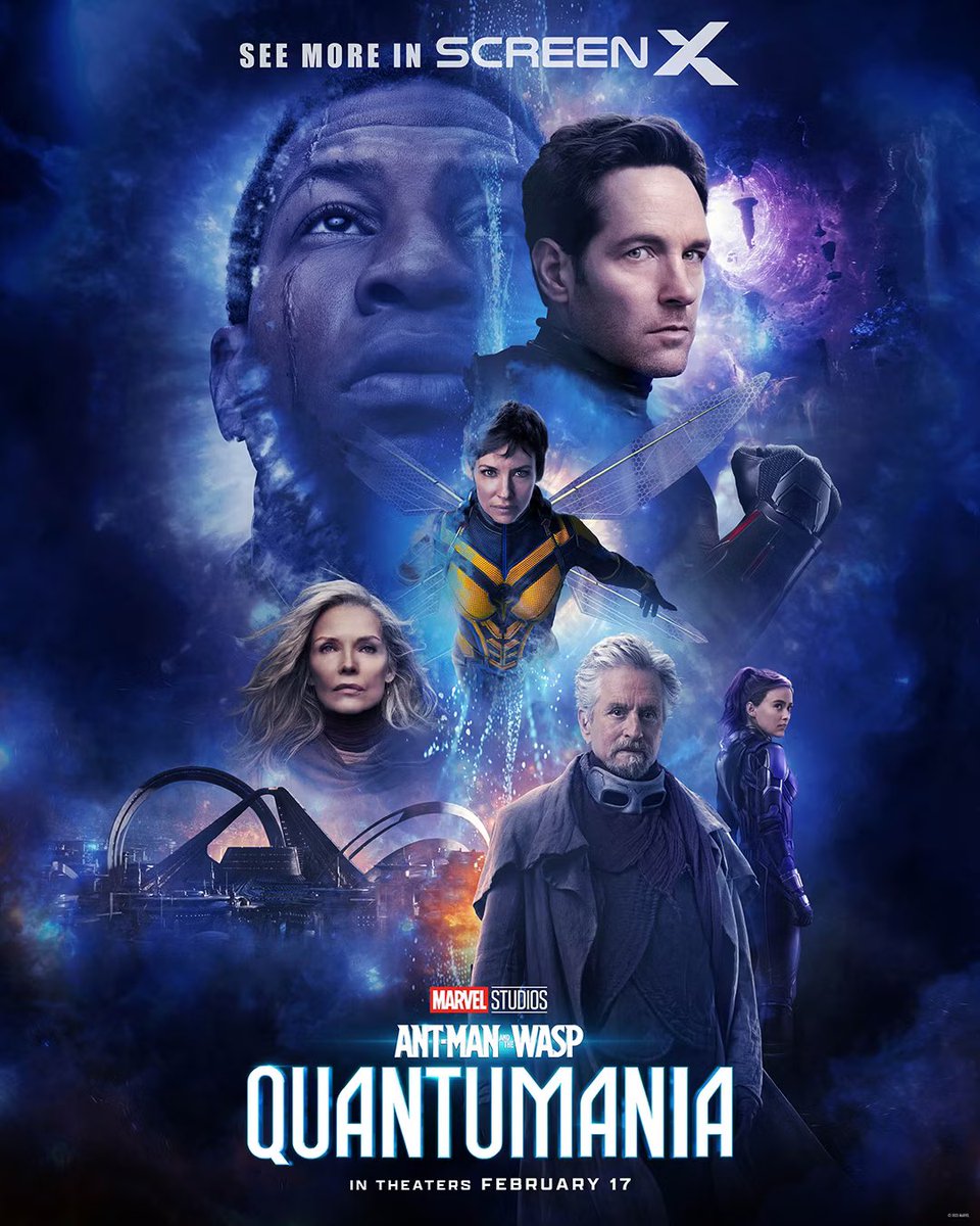
It must be written into every major actor's contract that their head has to appear in the official movie poster. It's the only explanation for why studios keep turning out these overly complicated chaotic floating heads compositions.
Marvel fans were particularly critical of the final posters for Ant-Man and The Wasp: Quantumania. It's like Marvel hurled a pile of imagery from the film at the page with no curation – even a stream of water running down the page and obscuring half of The Wasp's head. "And so the MCU's pattern of "awesome-looking teaser posters followed by hideous final poster" continues," wrote one disappointed fan on Twitter.
Think you can fix these posters? See the best current prices on Adobe's Creative Cloud package, which includes Photoshop, below. You might also want to see our pick of the best poster designs and the best movie posters of the year so far for inspiration.


