NFL, which stands for National Football League, sees American football’s highest performing teams pitted against each other – and all the teams have their own logo. Fans from all over the world enjoy this sport and devotedly wear the official merchandise, adorned by the emblems of their favourite teams. Each one has a significance, and have all also been carefully crafted by a team of logo designers to appeal to the fans.
Whether or not you're an NFL fan, it's fair to say that some of the designs could even rank in the best sports logos of all time (or even the best logos ever). Here are some of the most effective and creative NFL logos we’ve spotted.
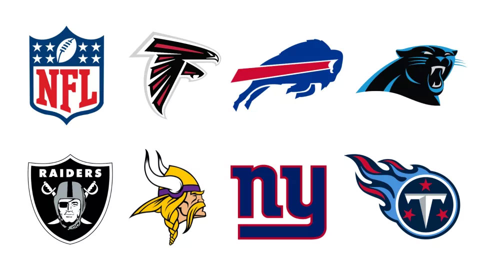
01. NFL logo - 2008 to present
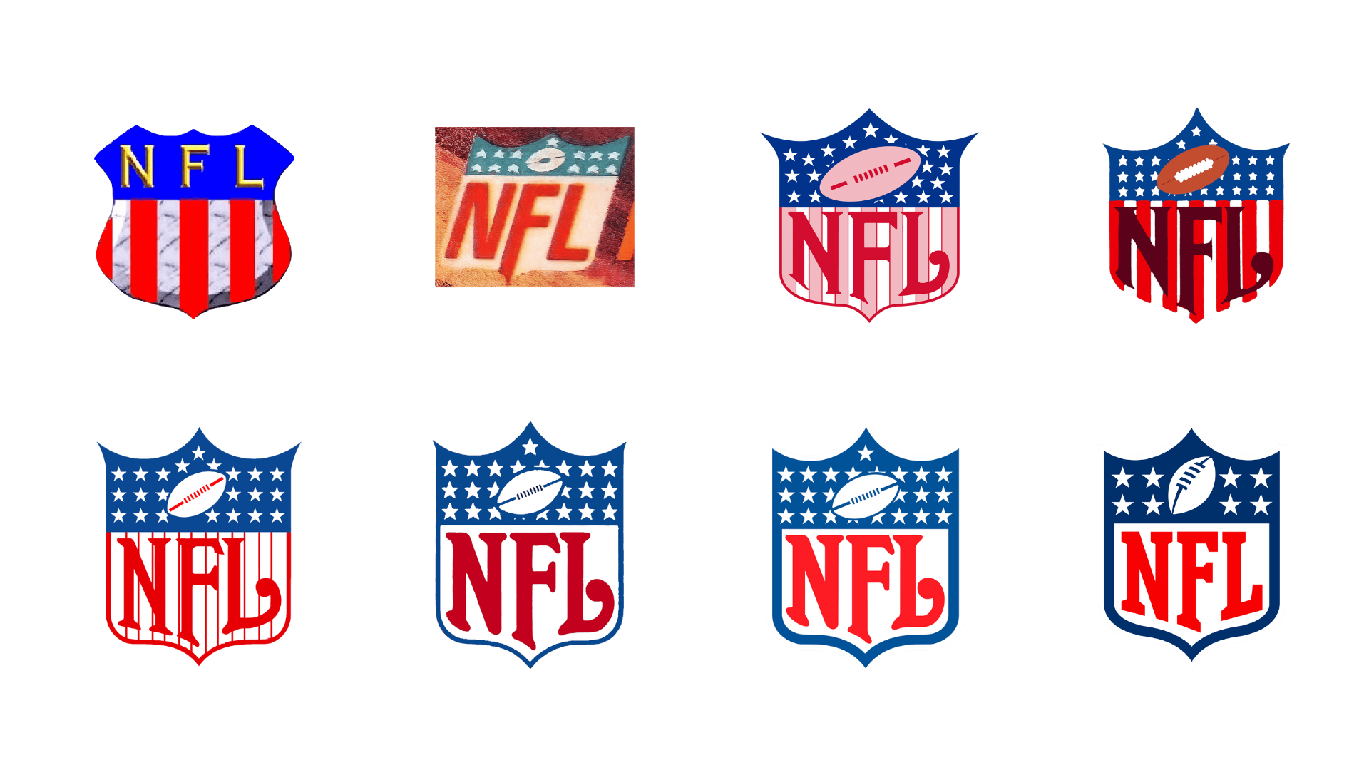
Let’s kick things off with the overall emblem of the National Football League, which has changed many times since its launch in 1920. It’s based on a shield or crest which, since 1930, has contained an American football symbol and a range of white stars on a blue background. Until 1962, the lower part of the shield had red and white stripes: like the stars, these mimic the American flag.
The number of stars has varied over time – currently there are eight, representing the eight divisions in the league, but previous versions had one star for each team. Stripping back the stars gives more balance to the image overall and makes it clear that, even on a small scale, they are stars and not polka dots.
Until 1940, a sans-serif font was always used to spell out NFL, then a much more artistic font was introduced, with the upward tail curve of the letter ‘L’ matching the arc of the shield. The current logo uses varsity-style typography. A secondary crest logo in gold, with glossy highlights and gradient shading, was issued for the 50th anniversary of the Super Bowl, the most important event in the whole American football calendar.
02. Atlanta Falcons – 2003 to present
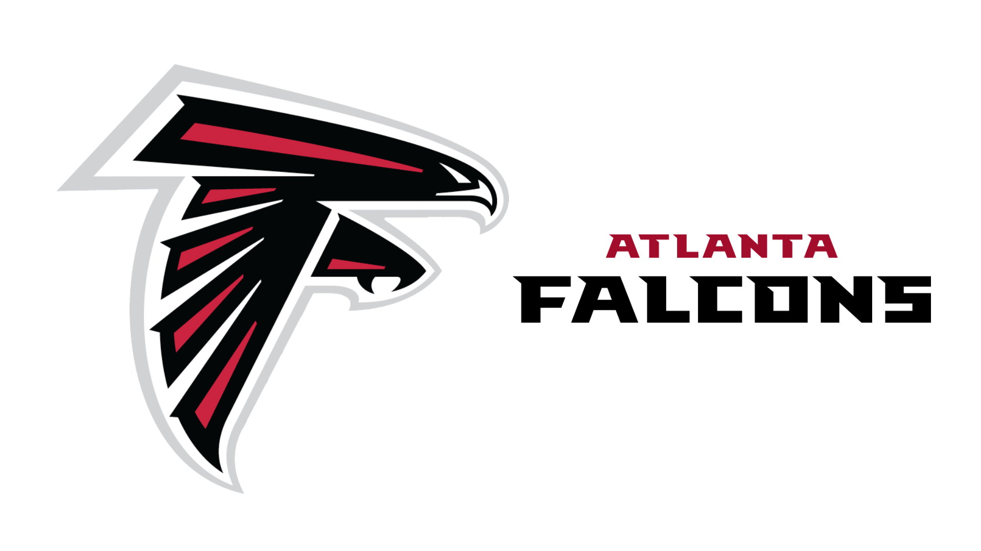
What used to be a monochromatic, flat logo (which looked striking in its own right) of a falcon baring its talons has now become a more modern and distinctive design, introducing the red colourway that already made an impact on the Falcons’ uniforms for so many years.
Whilst the shape of the falcon used to slightly resemble the letter ‘f’, now there’s no mistaking it, and the tilted angle of the wings makes for a dynamic letterform. A grey outline emphasises the whole thing. However, the overall picture gets too crowded when it comes to the wordmark, which also includes the logo in miniature, and uses a very painfully 1980s-style computerised display font. Apparently, this custom design was meant to imitate bird beaks, but it’s an inaccessible choice.
03. Buffalo Bills – 1970 to present
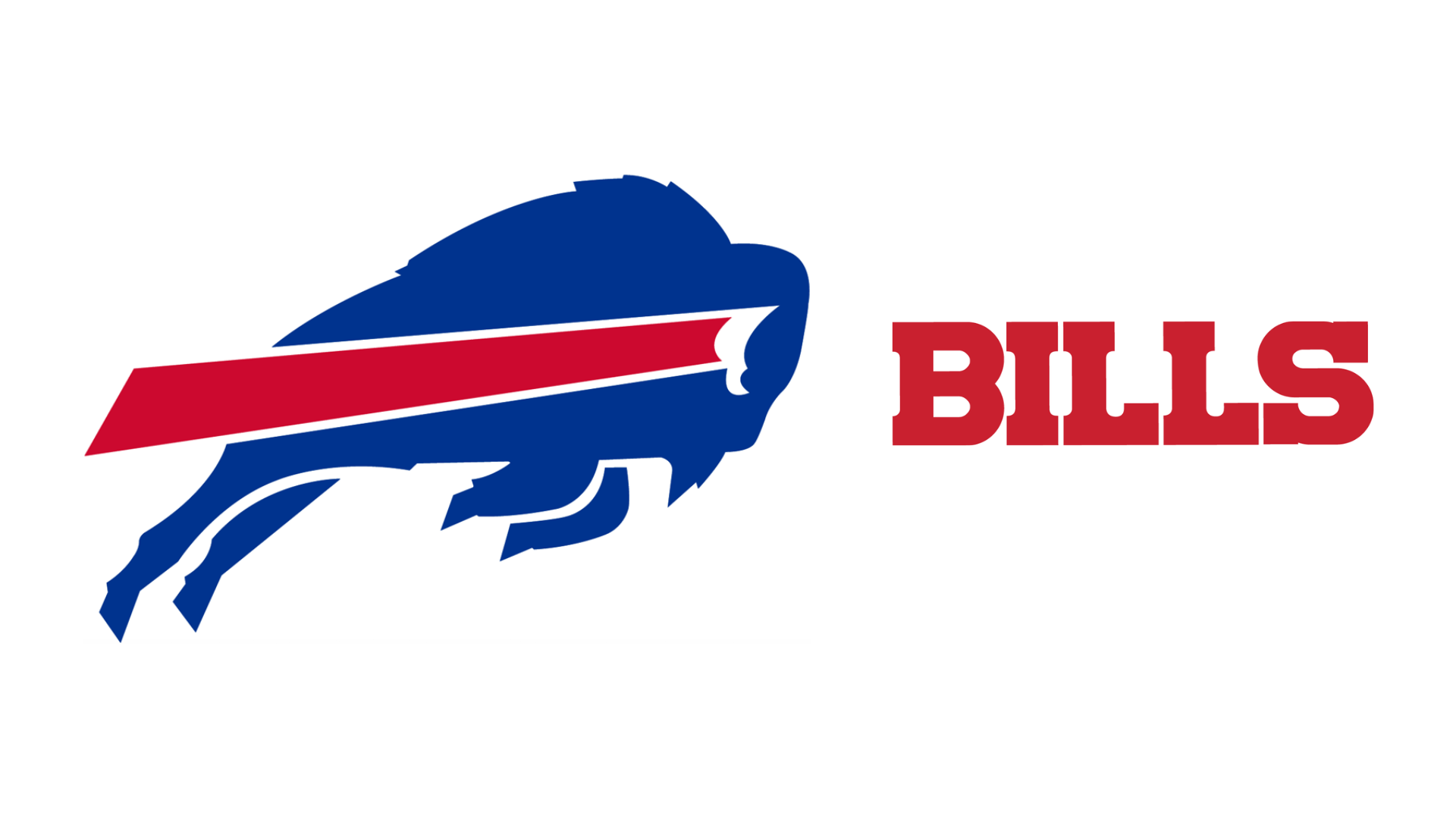
Here’s a minimalist logo that shows dynamism and movement. A charging royal blue-coloured bull, its head down, leaps to the right; a band of red through its centre creates energy, much like the lines of movement you see in cartoons or long exposure night photography.
The separation of the legs from the body, and the band of red from the buffalo’s frame, creates a stencil-like effect with the use of negative space. Earliest versions of the logo were more like paintings, featuring a football player and a buffalo both leaning to the left as they charge. Thankfully, the Bills ditched this approach for something slicker.
The wordmark is no-frills – a chunky piece of text with square serifs, available in red or blue. If you’re wondering where the Bills name came from, it was chosen because the name Bisons was already taken, but it’s a tribute to Buffalo Bill, the 1800s entertainer famous for Wild West shows.
04. Carolina Panthers – 1995 to present
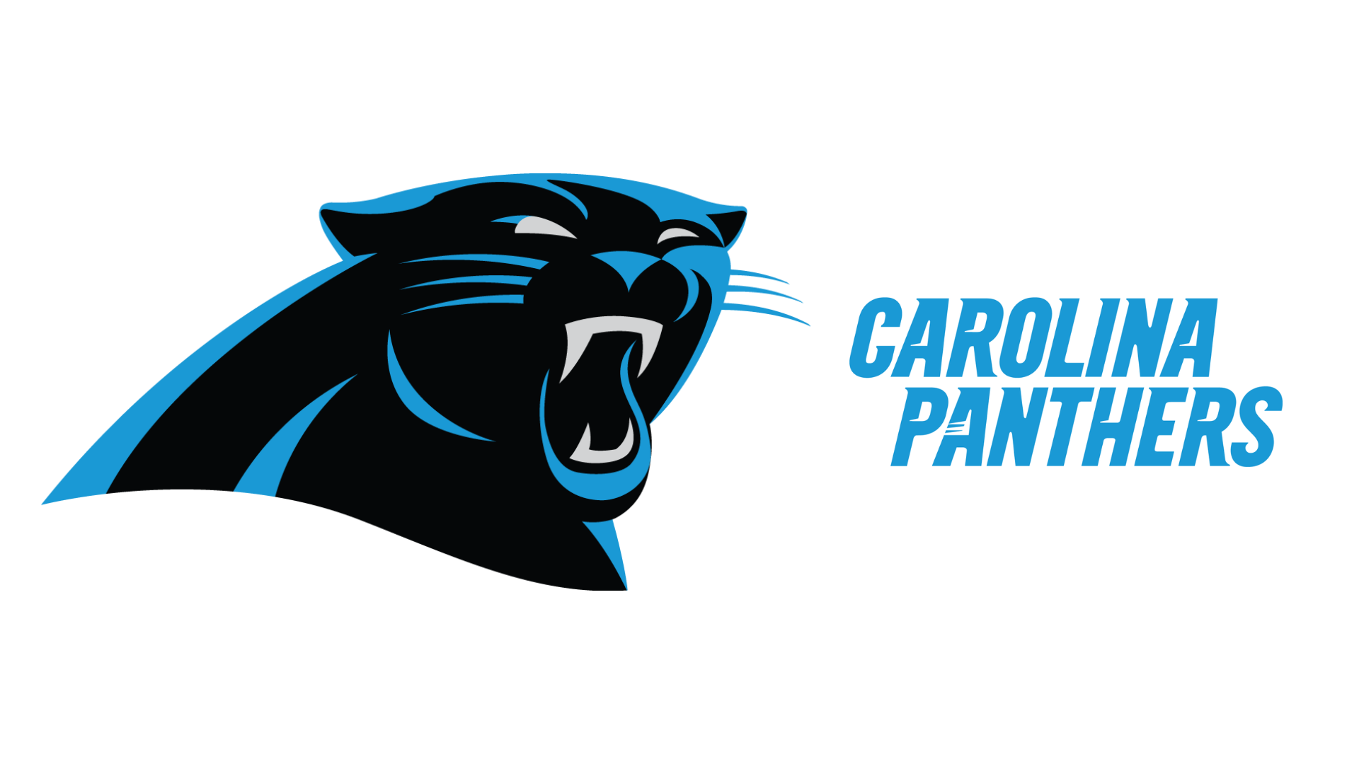
Unusually for a football team, the Panthers are supported by both North Carolina and South Carolina. Their logo feels cinematic and classy, and it’s only changed once since the team was formed in 1995. It also stands out for the use of cerulean blue – a shade that also appears in logos for the Detroit Lions and the Los Angeles Chargers, but is used more effectively here to give definition and shape to the roaring black panther with snarling teeth. The panther also reminds me of the beautiful animation in The Lion King, a Disney classic that was released in 1994, just one year before this logo.
Cerulean italic lettering gives us the team’s wordmark, with a sans-serif font that feels edgy; unlike the logo, this has changed styles several times over the years. The letter bowls of ‘a’, ‘r’ and ‘p’, and the crossbar of ‘h’, include a drag mark sweeping to the left, going against the direction of the italics to create motion.
05. Las Vegas Raiders – 2020 to present
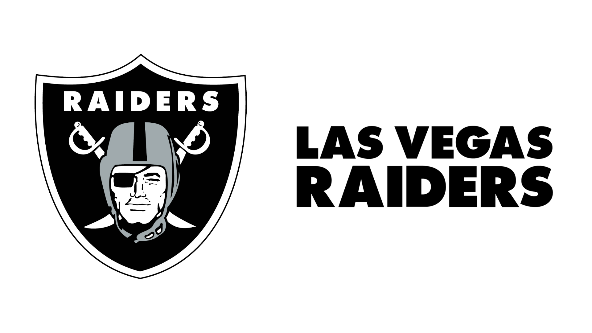
A simple black, silver-grey and white logo, in the shape of a shield or crest, is effective enough for the Raiders; no bells and whistles here. It may not be the most innovative, but it’s easy to replicate and to understand, with the footballer figure and his pirate’s eye patch flanked by crossed swords. The retro feel definitely works, too.
This team started out in California: firstly, as the Oakland Raiders in 1960, then in Los Angeles, and finally moving to Vegas in 2020. Their original team colours were black and gold, before head coach and manager Al Davis changed them to black and silver in 1963. Remarkably, the logo has changed very little since then.
06. Minnesota Vikings – 2013 to present
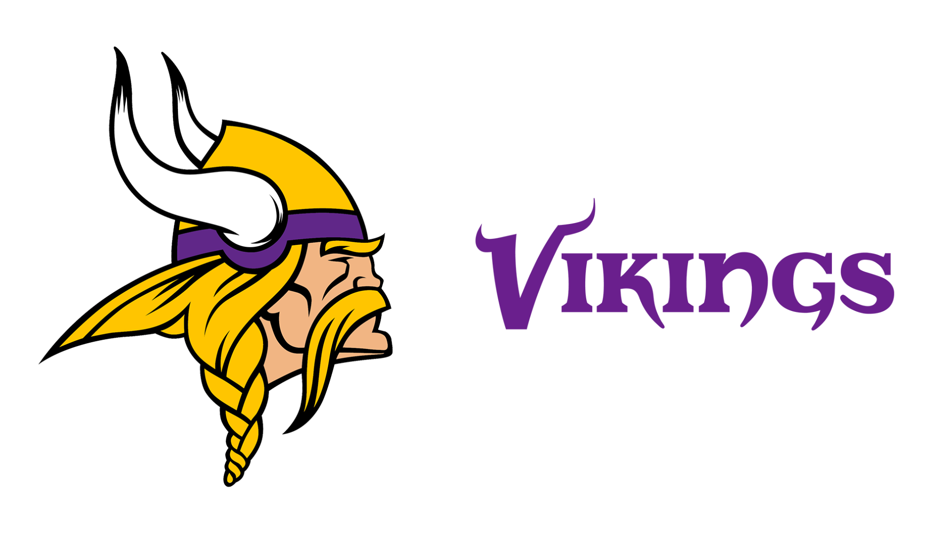
How about an old-school logo that has stood the test of time? Unsurprisingly, the Minnesota Vikings chose a stereotypical Viking man to represent them. He wears the cliched Viking horned helmet, which we now know Vikings didn’t actually use, but that immediately conveys power and history to the viewer. His blond hair is styled in a plait, and he has a curved handlebar-style moustache, topped off by an intense, serious expression.
The earliest logo saw him facing left, but the right-facing current version matches the direction of all other NFL logos featuring animals or people. Only minor changes have been made since 1961, like our Viking getting more defined hair, a chiselled jawline, and a thicker purple band on his helmet.
So, why the Viking thing, anyway? Minnesota has a large population of people whose ancestors came from Scandinavia. The wordmark for the Vikings also fits the Scandi vibe, with a horned letter ‘V’, and the letters ‘k’, ‘n’ and ‘g’ using the curved tails of medieval script. Designers flirted with a stencil-style font from 1982-2003, but thankfully they returned to this more appropriate lettering.
07. It’s back to lettering for the New York Giants.
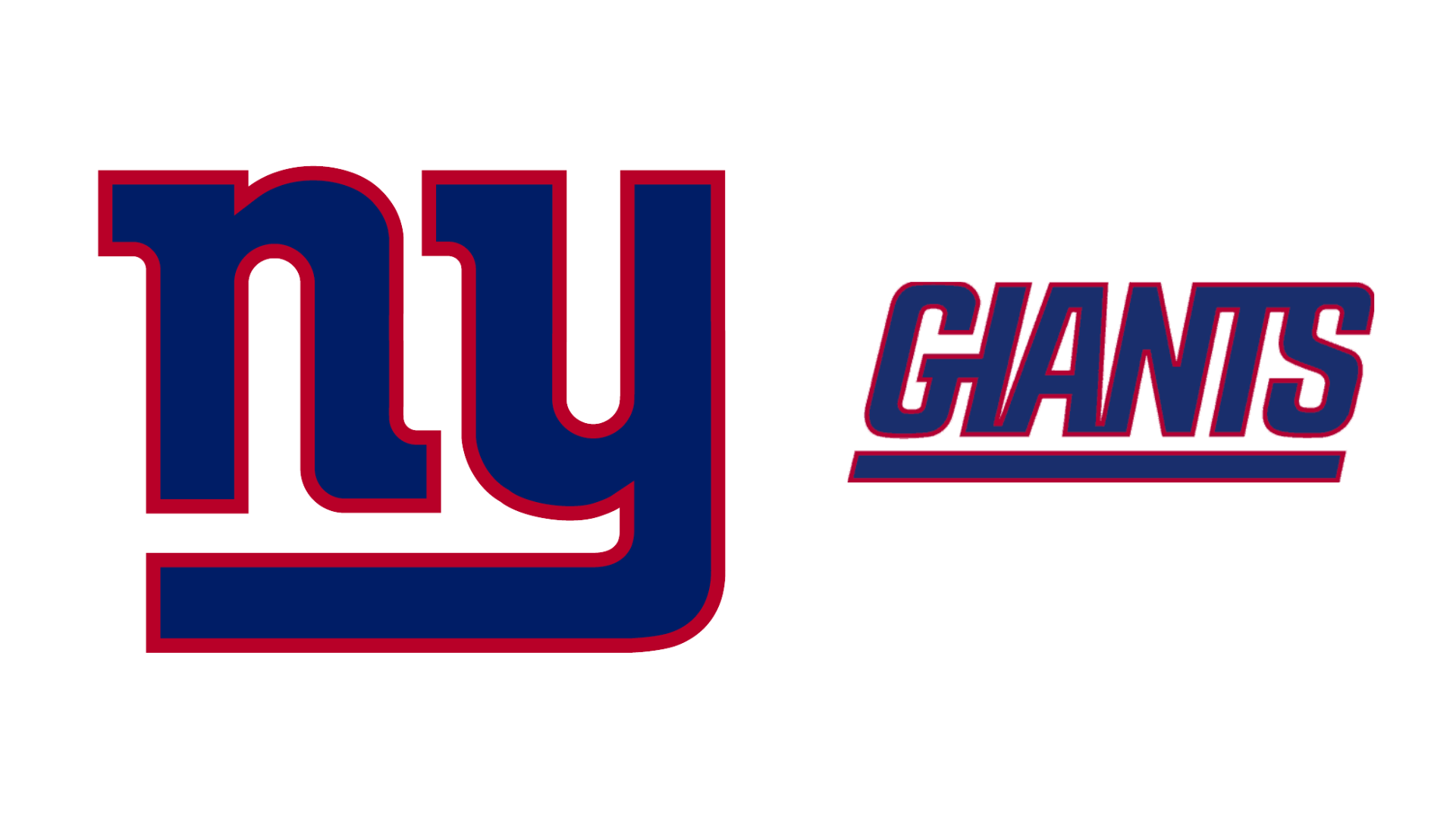
This typography-only logo doesn’t convey the word ‘giants’ but it definitely stands out amongst less polished type-based emblems that have aged badly, like the Green Bay Packers or the Chicago Bears. The Giants logo has evolved over time, featuring a quarterback throwing a ball over the city skyline (introduced in 1945), then moving to the stylised lettering used from 1961-1975. The word ‘giants’ was included from 1976-1999, before the 1961 design was revived.
Simple lower-case lettering spells out ‘ny’: an acronym that’s easily recognisable as New York. The letter ‘y’ snakes round to double as underlining for the letter ‘n’, and the curves of both letters mirror each other, creating symmetry. Colour-wise, the lettering is deep blue with a red outline. Red has also become synonymous with the city, thanks to Milton Glaser’s unforgettable ‘I [heart] NY’ logo (designed in 1976).
08. Tennessee Titans – 1999 to present
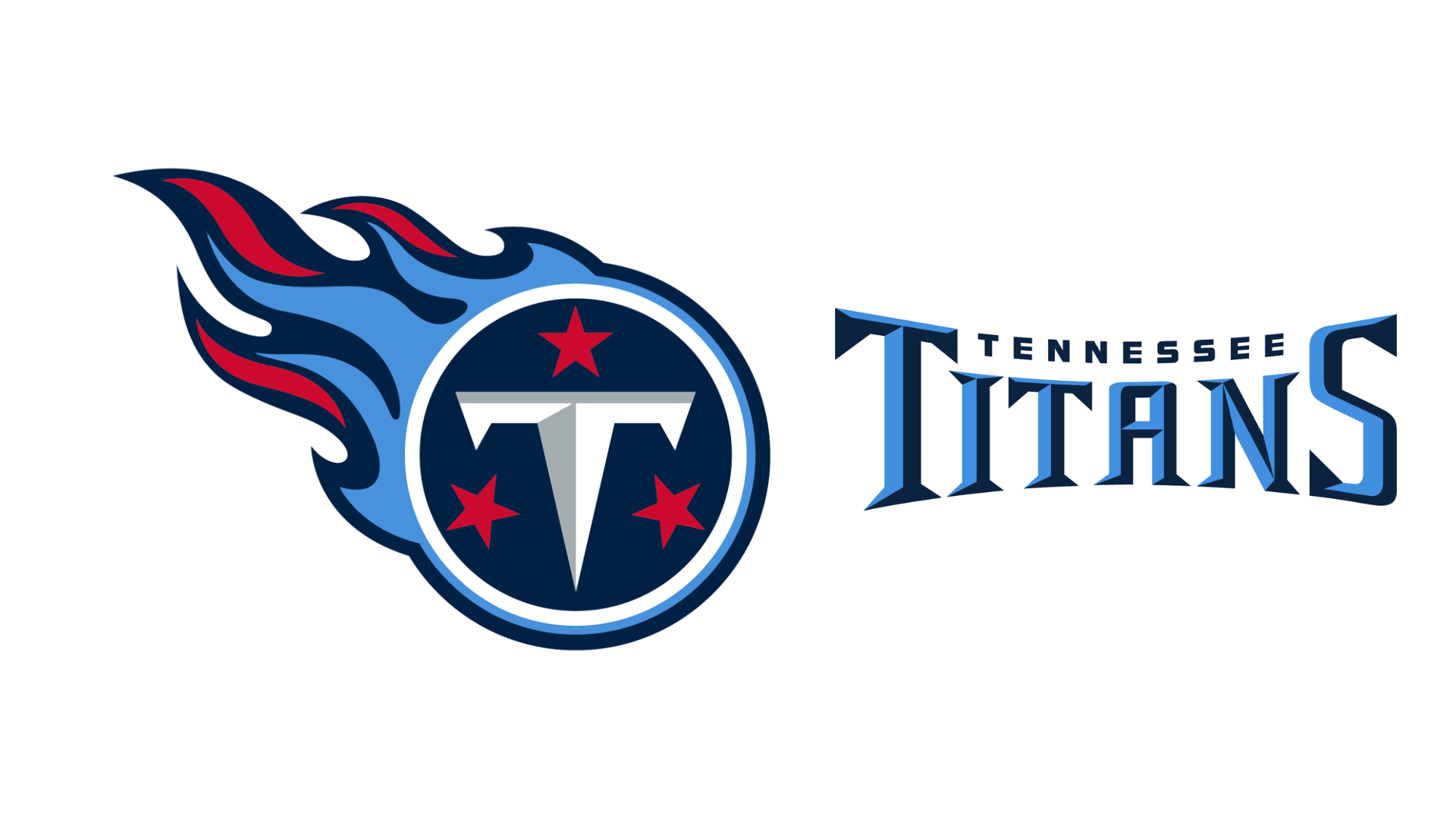
You could be forgiven for thinking the Titans logo belonged to a motorcycle club, a rock band or a tattoo parlour (and, in fact, it would make a great tattoo). Pale blue and bright red flames ripple away from a navy-blue circle embellished with the letter ‘T’, and three red stars to symbolise the state. It feels very rock & roll, sitting nicely against the Raiders, the Tampa Bay Buccaneers and the Vikings.
Like the Raiders, this team has moved around – it began as the Houston Oilers in 1990, relocated to Tennessee in 1997, and switched from Oilers to Titans in 1999, to reflect its new home in Nashville, ‘the Athens of Tennessee’. Titans are a reference to Greek gods that came before the Olympians. The wordmark is a bevel font, which makes it appear like it’s carved in stone – very mythological.
What’s your favourite NFL logo? Tweet us – we’re @CreativeBloq.
Want more evocative logo content? See our post on the best logos of the 1990s.