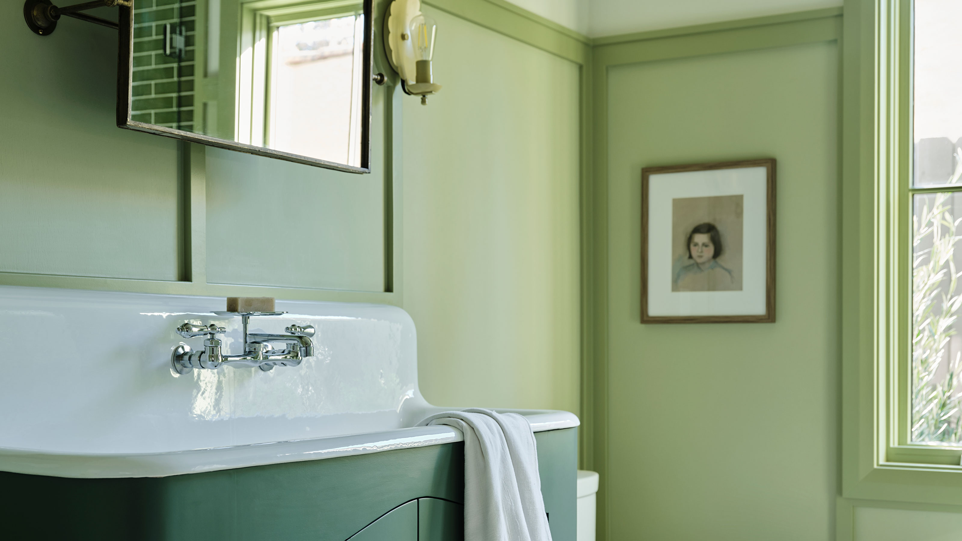
With fall approaching, it's not just the leaves that will start to change color. Fall always comes with a certain itch to re-decorate, whether that's changing up your home's more transitional decor, or doing something more drastic like repainting your walls in a new color.
But, what colors will you be introducing into your home this season if you are thinking about switching things up? While we're not sure there are interior design trends that coincide with the changing of the season so much, as Pinterest's freshly released Fall Trend Report goes to prove, we're definitely all thinking about specific ways to decorate right now. Among the focus on creating cozy corners and emerging obsession with Japanese decor outlined in this report, there's a clear color palette coming through that users of the social media platform are searching for.
Pinterest is calling the trend 'Serene Hues' — based on a few burgeoning keywords the site's users have been looking for in droves. This translates down into three main color trends — green, blue and lilac — in soft, dreamy shades. They're colors our editors have been seeing emerge in interior design projects and new season collections too, so these predictions for fall certainly track with what we're forecasting as the hues that we'll be decorating our homes with for the rest of the year (and into 2025).
We asked them to explain each color trend, and how to decorate with them in a modern way.
1. Green
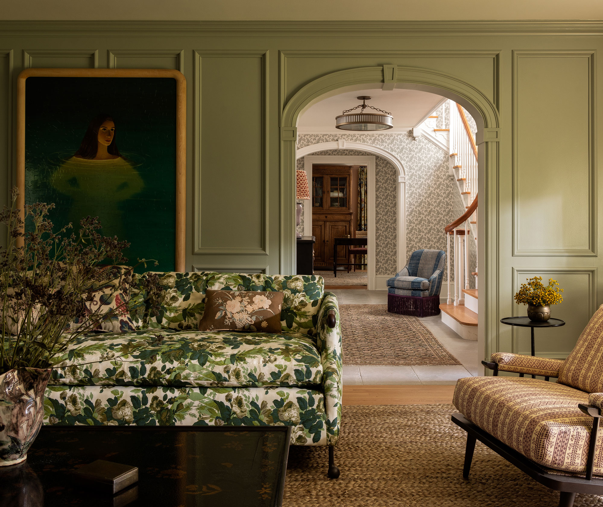
Ask 100 people in a room for the most calm color palette, and we think the vast majority would pick green. According to Pinterest, searches for "Green Home Decor" have spiked some 2,670% since May, but it's an interior design trend that has persisted in homes from our editors' perspective, though with a growing appreciation for 'fresher' tones.
"While green home decor is by no means a new trend (and has year-round appeal), we’re seeing a shift towards more soothing shades like sage and seafoam, which are subtle yet fresh, and help create calming zen-like spaces," Livingetc's Interiors Editor Emma Breislin explains. To avoid schemes that feel too flat and unexciting, these softer colors are also being used alongside more unexpected colors that go with green — think pops of orange and red that add a splash of energy where the room calls for it.
These light greens aren't the only way this color story is being expressed in decorating right now — searches for 'Forest Green House' are also up 220% in the Pinterest report. "Forest green home decor for fall helps create a rich color palette — perfect for cozy spaces that feel warm and inviting," Emma says. "In particular I'm thinking of sofas styled with a mix of orange and green throws and cushions, or a green vase brimming with fall branches."
2. Blue
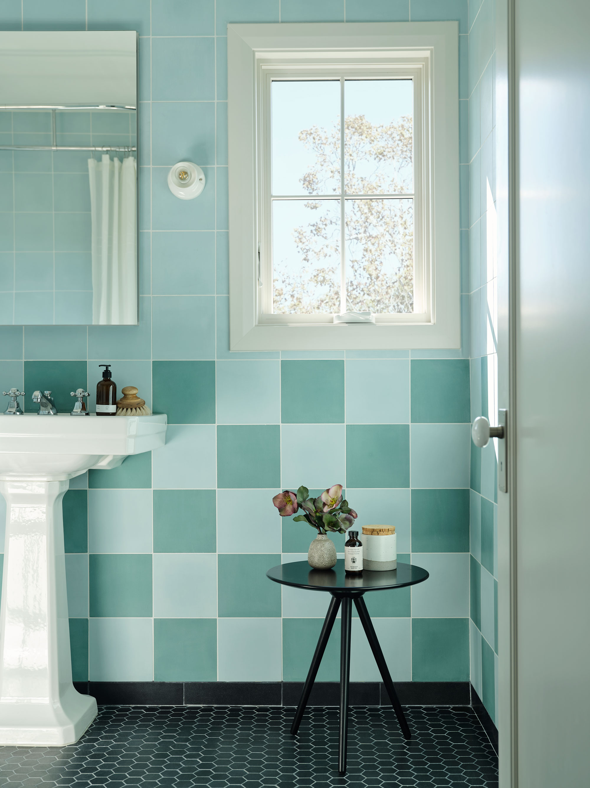
Light blue has been the unexpected Color of the Year for 2024 — a color that we'd ruled out as for nurseries or for cornflower-blue cottages, it's found a new expression this year that's decidedly more modern. The search on Pinterest for 'blue and cream bedroom' is up 200% and 'dusty blue bathroom' up 120% (though these are, perhaps, the more traditional incarnations of how we'd see these colors used).
The big trend our editors are noticing is a color palette that matches those light green shades, named above, with blue. Yes, searches for a 'sage and blue color palette' have increased a massive 570% — answering the question once and for all as to whether blue and green work together. "If there was a color pairing we've seen more of than ever this year, it would be sage green and blue. Individually, they've defined our decorating habits post-pandemic as we seek to create calming spaces that soothe the mind and promote relaxation," explains Trends Editor Lilith Hudson. "But why have one when you can have both? Designers are using these harmonious, serene shades to make calming color palettes as we head into fall — a season where we hunker down and spend more time indoors. A nature-inspired shade like sage green brings the outdoors in, while blue - depending on the hue used - can either uplift the space or play into an autumnal moodiness. Choose punchy bluest to energize your room, soothing gray-blues for a delicate feel, or a sumptuous deep navy to usher in more comfort," Lilith adds.
3. Purple
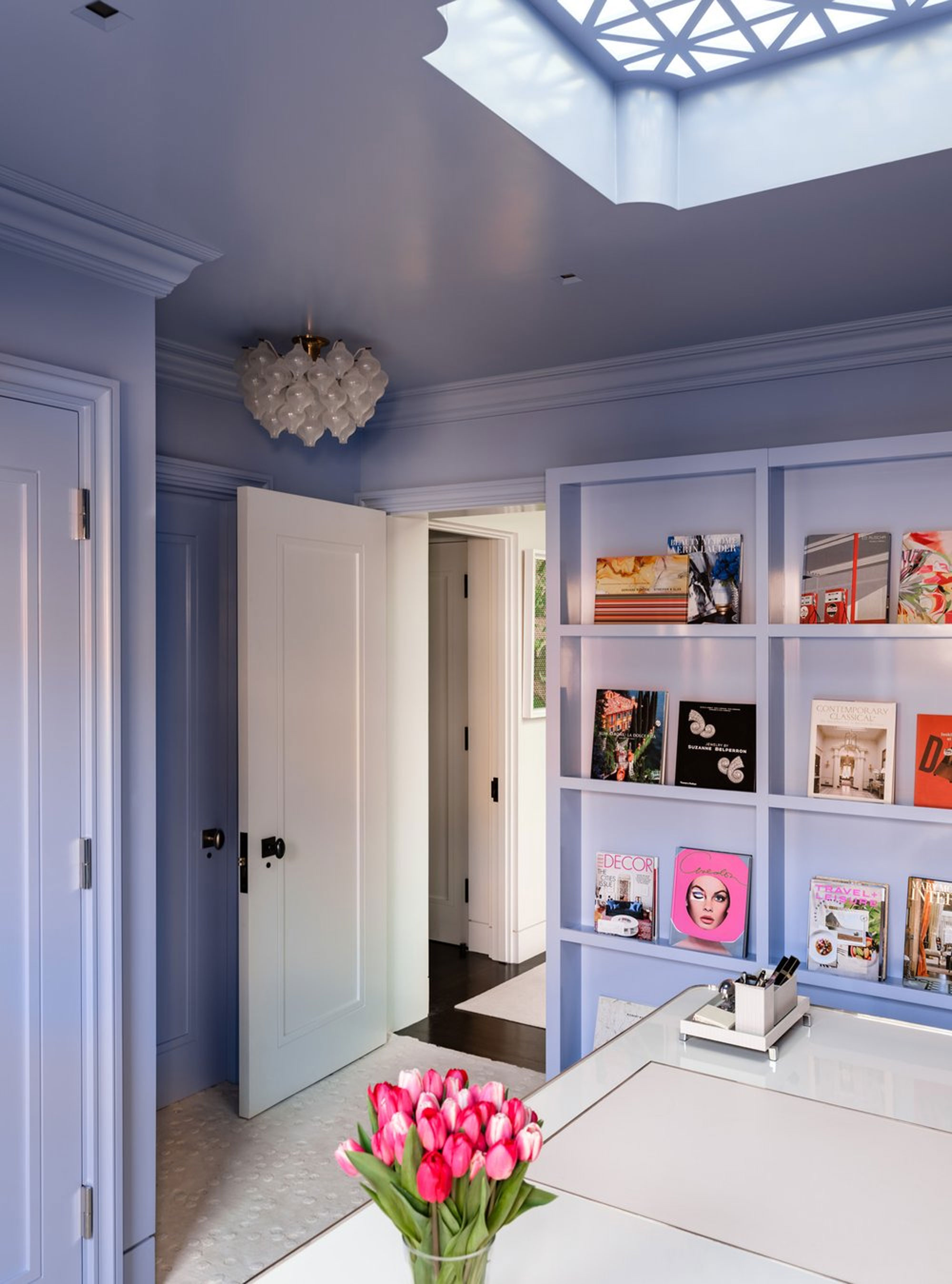
If you thought green and blue might be the obvious choices for 'serene hues', this last entry into Pinterest's Fall Trend Report might be the one that surprises you. "Gone are the days when purple would cause visceral reactions — this color is the new favorite among designers and homeowners and for good reason," says Design Editor Aditi Sharma Maheshwari. "When used correctly and in the right tones, purple can imbue a space with much-needed color and a level of richness very few other tones can achieve."
Think less of pure purple that's a mix of primary red and blue for the ways that this color can be calming, however. It's the trendy Gen-Z-approved 'lavender room aesthetic' that search has increased by 110% year on year, while searches for 'moody purple bedrooms' have gone up by 350%.
"A moody, dark purple has an inherently cozy appeal, perfect for bedrooms or small lounge areas," Aditi says. "Shades such as eggplant or deep violet look especially great on walls or as bedding tones. And you can always use gray, brown, black, or white as colors that go with purple for balance. To enhance the tone more, use soft bedside lamps and dimmable ceiling lights to fully enjoy the effect of the shade in the room."
What else is in the Pinterest Fall Trend Report?
As mentioned, this color palette isn't the only decorating trend Pinterest is seeing among its users. 'Harmonious Japanese Style' is trending with search terms such as 'Japanese living rooms' and 'zen kitchens' growing in popularity exponentially.
The 'floral room aesthetic' is also up 370% while, heading into fall, searches for cozy rooms have grown up to 930% in some cases.


