Living in a three-bedroom flat in south-east London but keen to buy a bigger property with a garden, it took over six months and numerous viewings before the home owners stumbled across this five-bedroom Victorian terrace, on a quiet road just off the high street.
‘Finding a renovation project in our local area of south-east London was the most important factor for us in our search for a new family home,’ says the home owner. ‘We were living in a flat in a Victorian mansion block at the time, but were ready for a new challenge and were keen to buy a bigger property with a garden, that we could do up ourselves in our own style, rather than buy somewhere at an inflated cost, that had already been updated.’
Kitchen extension
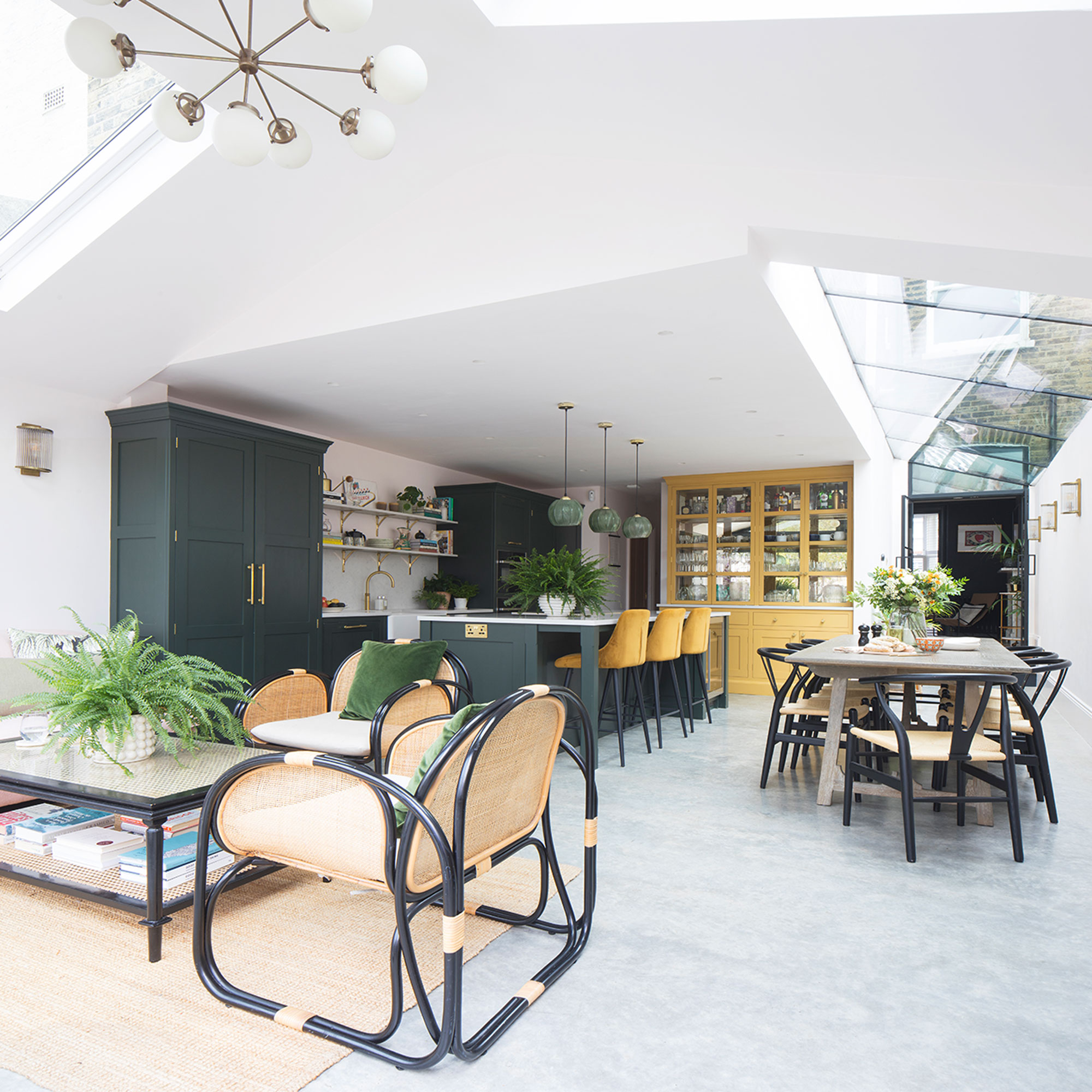
‘After finding the five-bedroom Victorian terrace property in Dulwich, south-east London, we knew immediately this house was an amazing find. It had been a treasured family home for 40 years, and although most of the original Victorian features had been removed and the downstairs rooms felt dark and disconnected, the proportions were great, there was a good-sized garden, and plenty of scope for modernisation.'
'We jumped at the opportunity and after moving in we spent the next six months living in the house while we waited for our plans to be approved.’
‘Living in a house before you renovate gives you a really good idea of how you want it to work for you. We decided the best way to create space was to open up the layout downstairs by adding a side return and knocking through the small L-shaped kitchen, reception room and adjacent dining room to create one, large light-filled space.’
‘We designed the new area with floor-to-ceiling bi-folds across the whole width to maximise the connection to the generous-sized garden, which we planned to landscape. We knew the reconfigured space would have a huge impact on how we used it and, as cooking and entertaining family and friends are some of favourite pastimes, we had visions of warm summer days, hosting with the doors wide open to the garden.’
‘Upstairs we wanted to steal some space from a bedroom and knock through an adjacent toilet and bathroom to create a large family bathroom. Reinstating period features throughout and restoring some of the original Victorian charm and character of the house was also really important to us.’
‘As absolutely everything needed replacing, from the windows and electrics to the boiler and plumbing, we decided to tackle everything at once. The scale of the project was pretty daunting, but we moved out into my parent’s house, while the building contractors set to work, and my husband project-managed the renovation from there, popping in everyday to check on progress.’
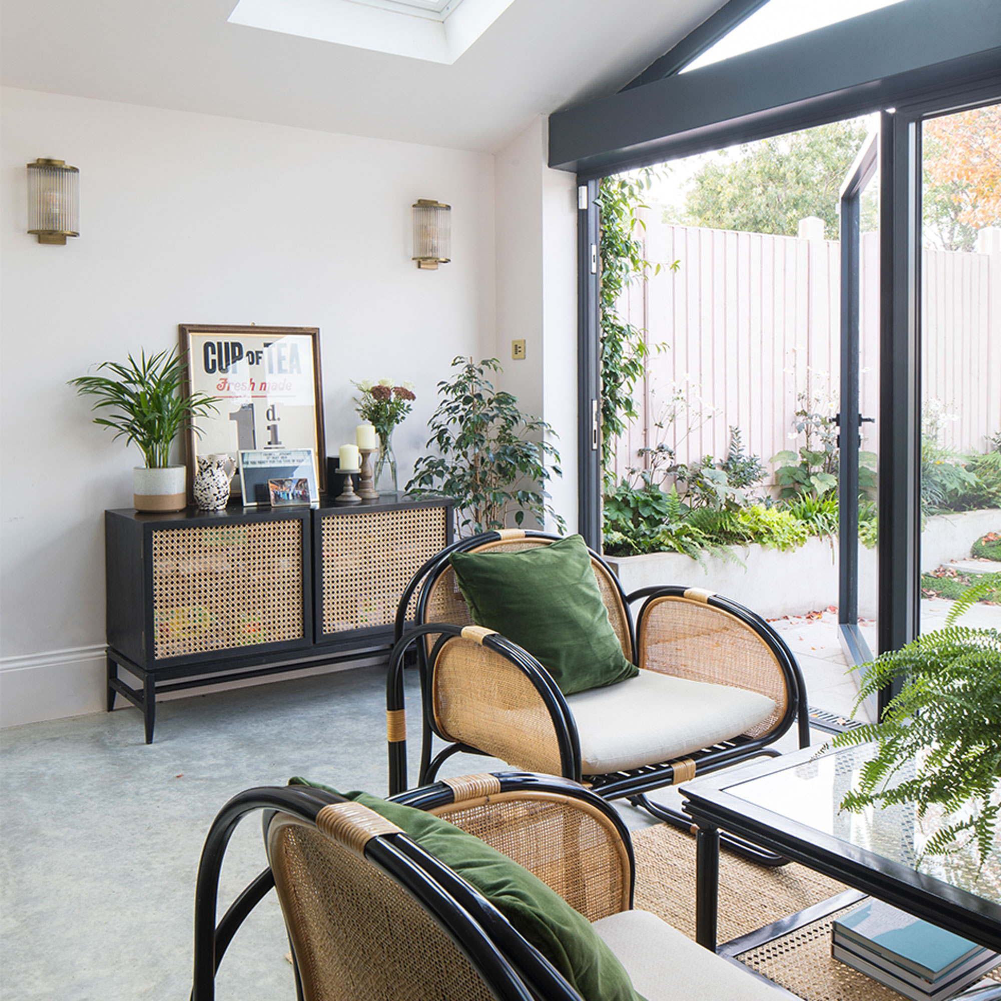
‘At some points, particularly when the house was nothing more than timber frames and brickwork, it was difficult to see an end in sight and trying to stick to budget was incredibly stressful, but we did what we could ourselves to save money, and as walls were reinstated and the extension build was well under way, I remember feeling incredibly excited as our home started to take shape.’
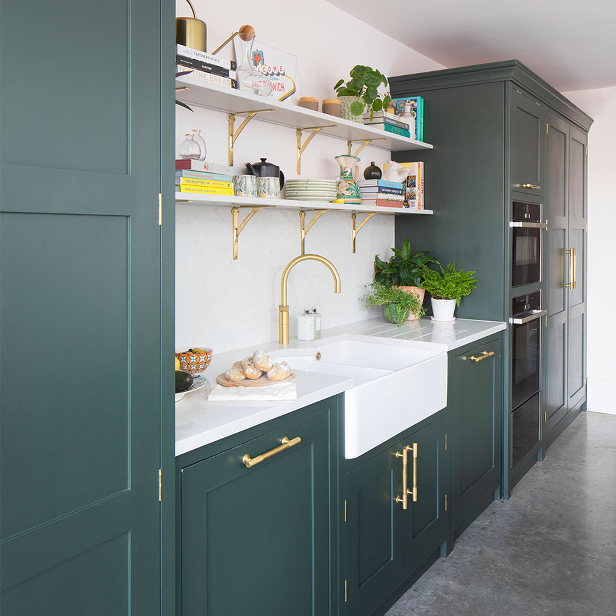
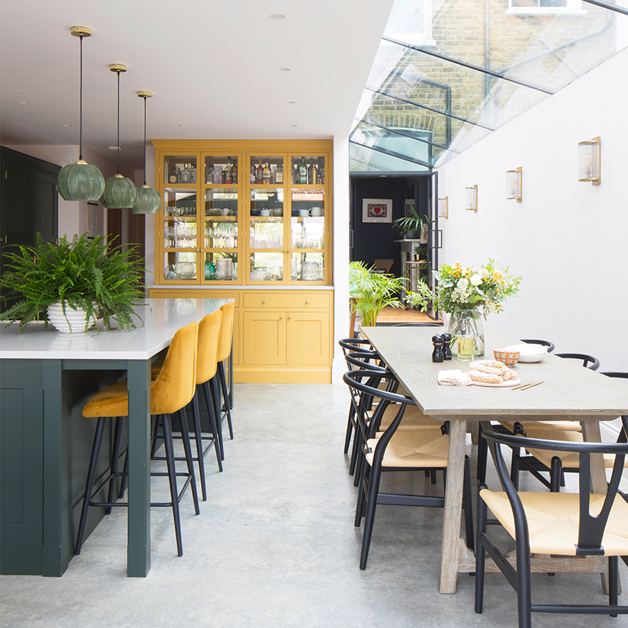
‘Seeing as there was such poor light in the original rooms, we wanted to make sure the new space had an abundance of it, so as well as the bifolds we had a glass roof fitted across the length of the side return kitchen extension.’
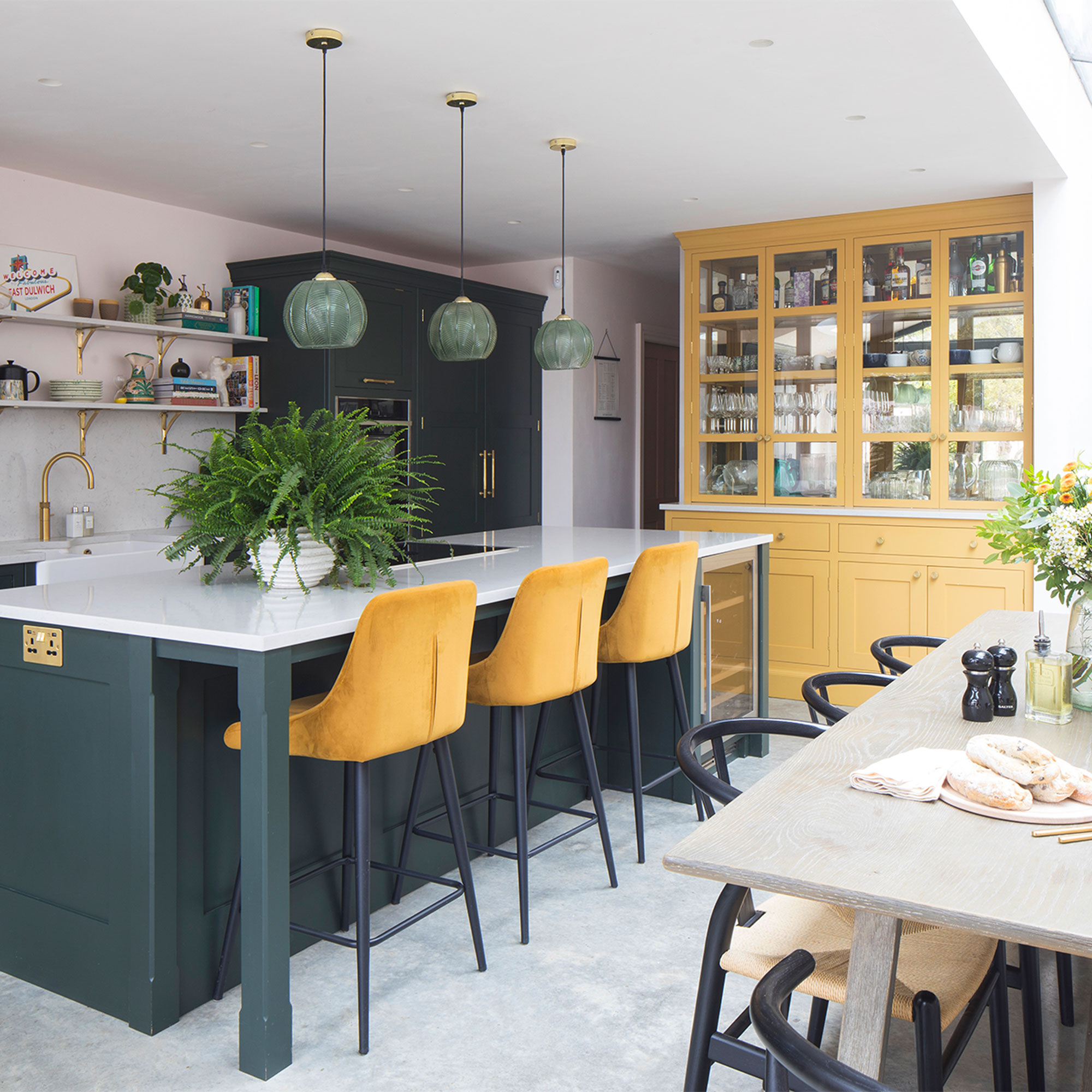
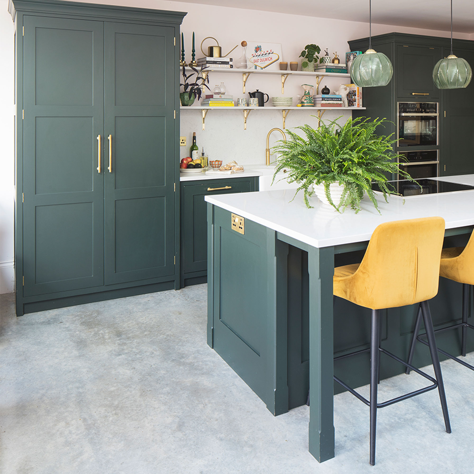
‘We chose a hard-wearing polished concrete flooring, and invested in beautiful wood kitchen cabinetry from Herringbone Kitchens, which we painted in a dark green, along with a gorgeous custom-built dresser painted in a sunshine yellow to create a lively focal point at the end of the room.’
Living room
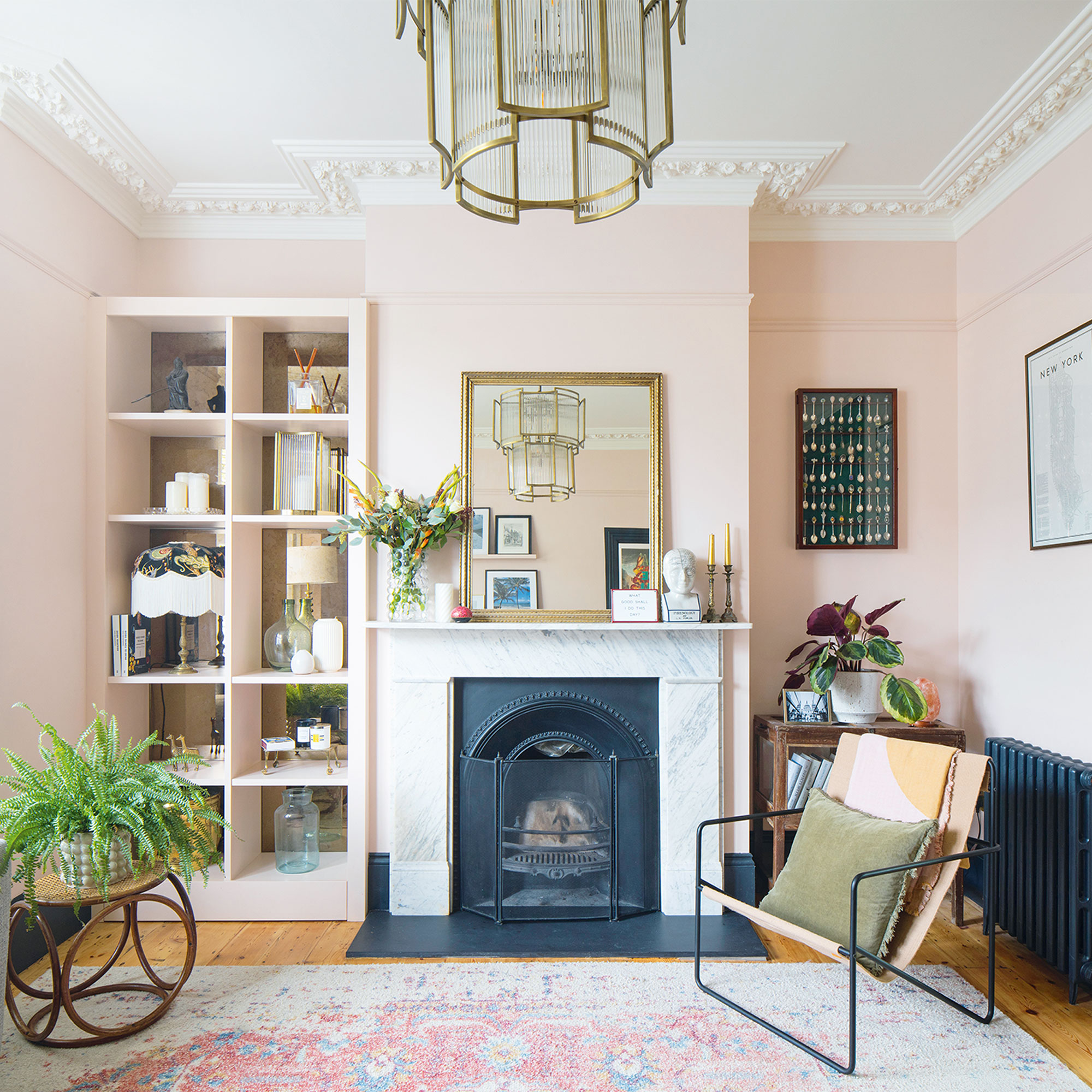
‘We designed each room around how we planned to use it and how we wanted it to make us feel, using colour and working with the available light to create different personalities.’
‘In the snug and guest bedroom, for example, where light is naturally restricted, we’ve embraced rich, sumptuous tones that draw you into the space and instantly make you feel relaxed. In the living room the walls have been painted a pale pink to keep the space feeling open and bright and to accentuate the reinstated marble mantlepiece and beautiful cornicing.’
Snug
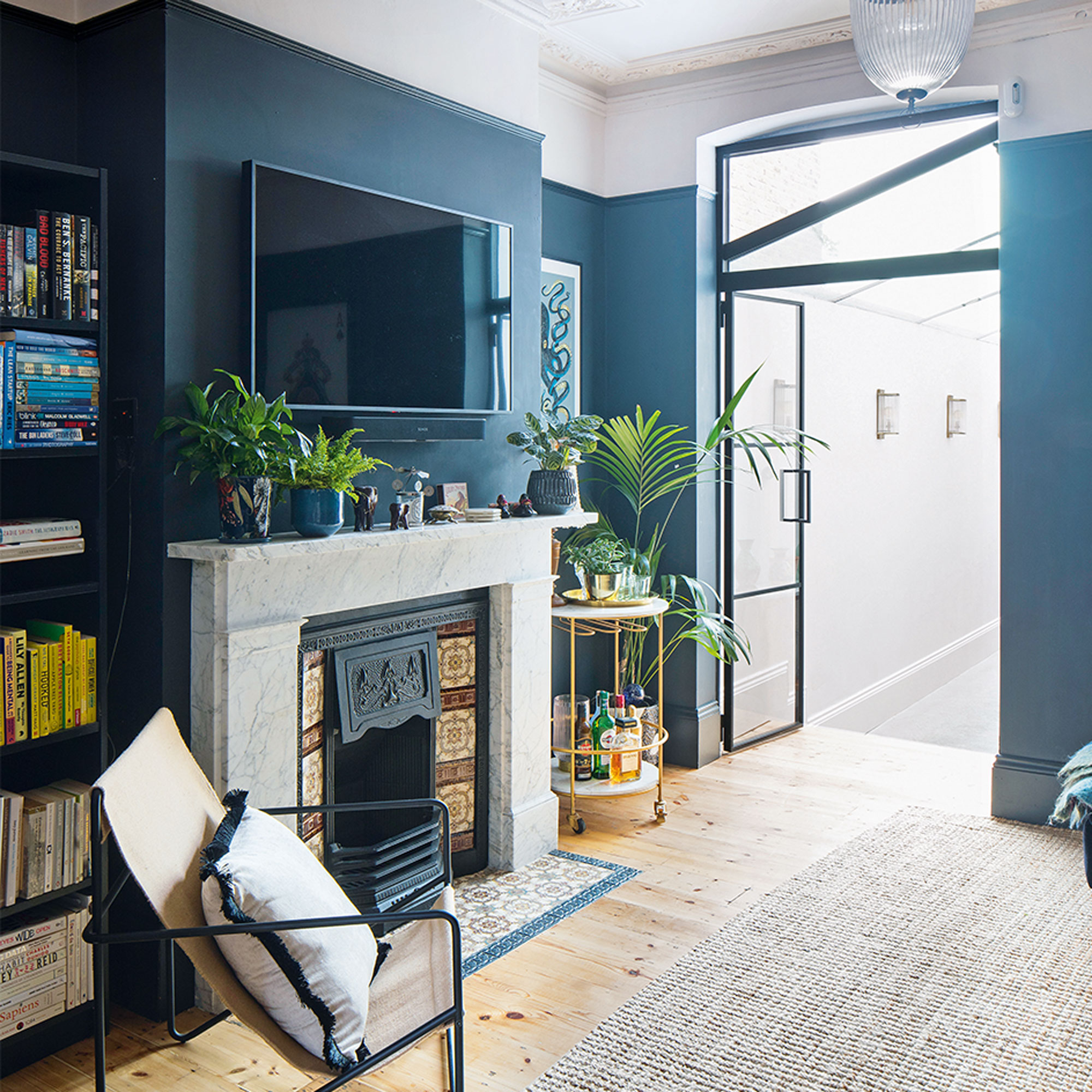
‘We moved back in just before our Christmas deadline and were able to host the first of many celebrations – it was so lovely to finally be able to enjoy the space. Since then, we’ve taken our time with the furnishings, complementing the traditional features with vintage finds mixed in with more contemporary pieces to add a modern touch.’
‘The original window that was here was replaced with a glass internal door when the side return was extended. However, still a naturally dark room it was a perfect space for a cosy snug where the family read and watch films. We love the deep colour combination in here and how the sofa and walls almost merge. It feels quite cocooning as a space.’
Master bedroom
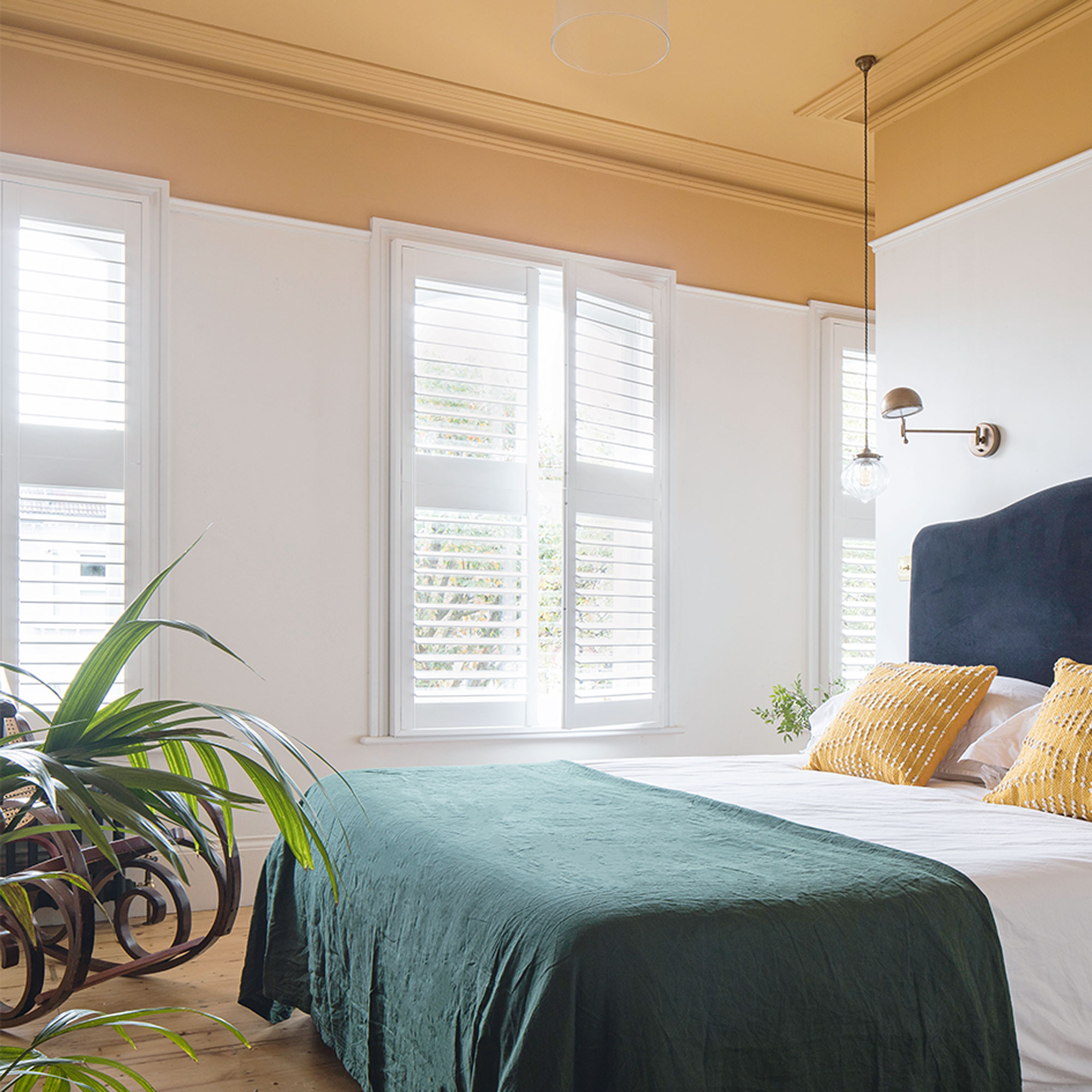
‘We loved the idea of having a separate sleeping and dressing area in here to keep the bedroom feeling calm and clutter free. The space was wide with lots of light and a high ceiling so we knew with some careful configuration we could make it would work.’
‘The ceiling has been painted in Orangery Estate Emulsion by Farrow and Ball. The Luna Kingsize Headboard in Liquorice Blue Clever Velvet is from Loaf.’
Nursery
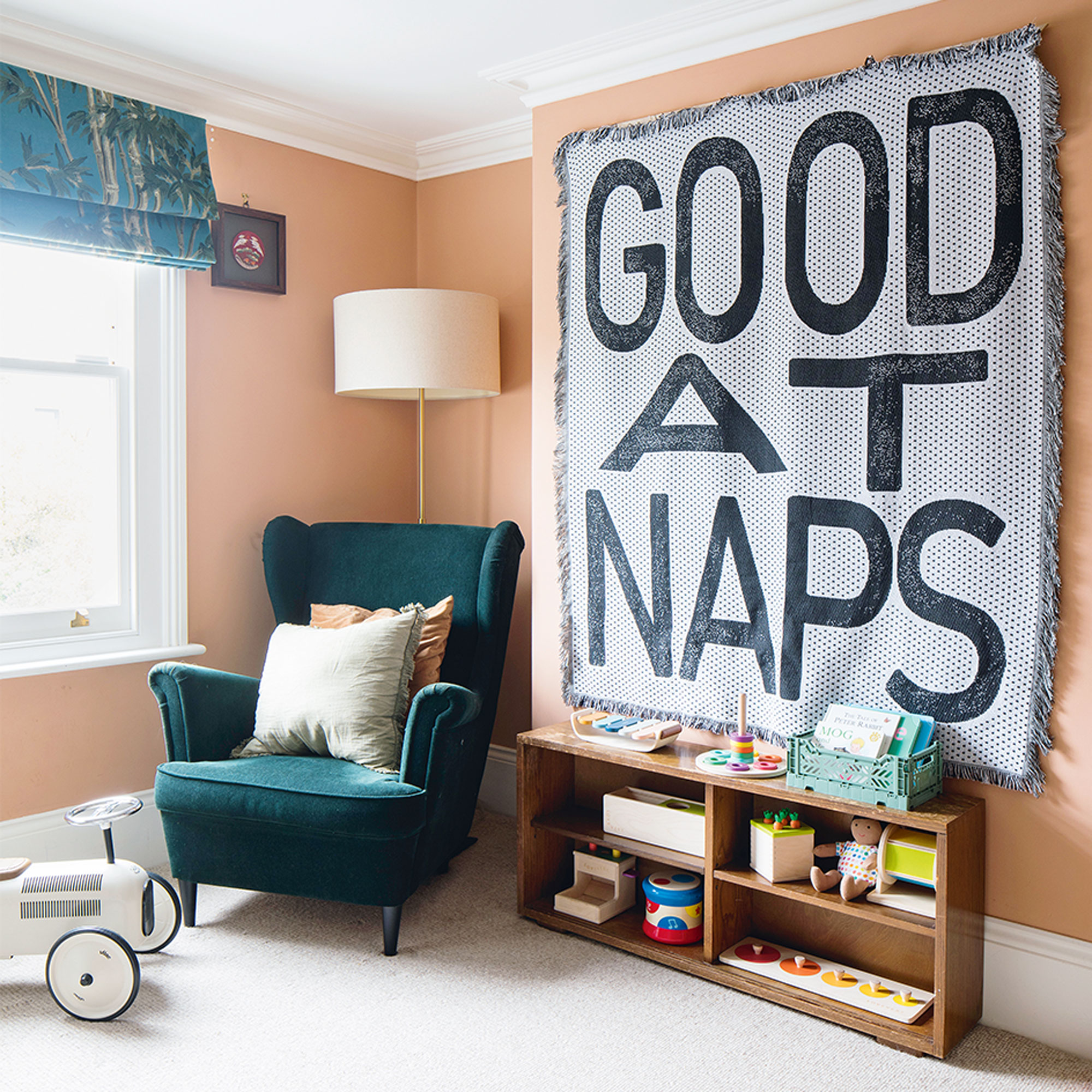
‘This is a happy, calm room with pops of colour and fun – the perfect nursery for our toddler. The ‘Good at Naps’ throw from Etsy I bought when I was pregnant, so it will always be a sentimental piece.’
Guest bedroom
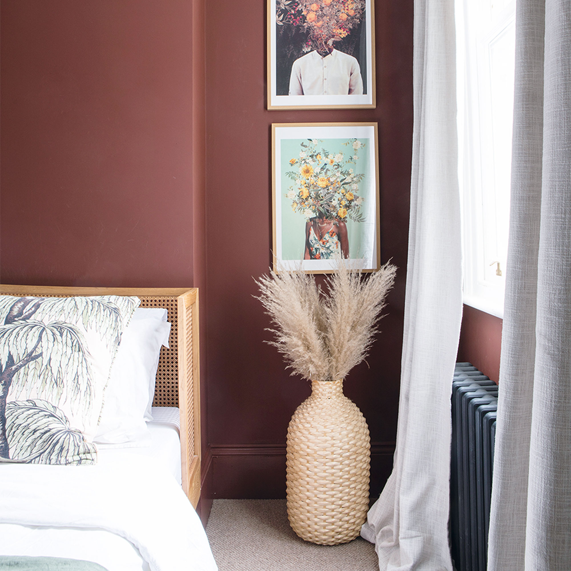
‘We wanted an inviting and relaxing guest bedroom that friends and family enjoy staying in. Painting it a rich red adds warmth and depth, and we added some natural textures and prints that really work with the colour.’
Bathroom
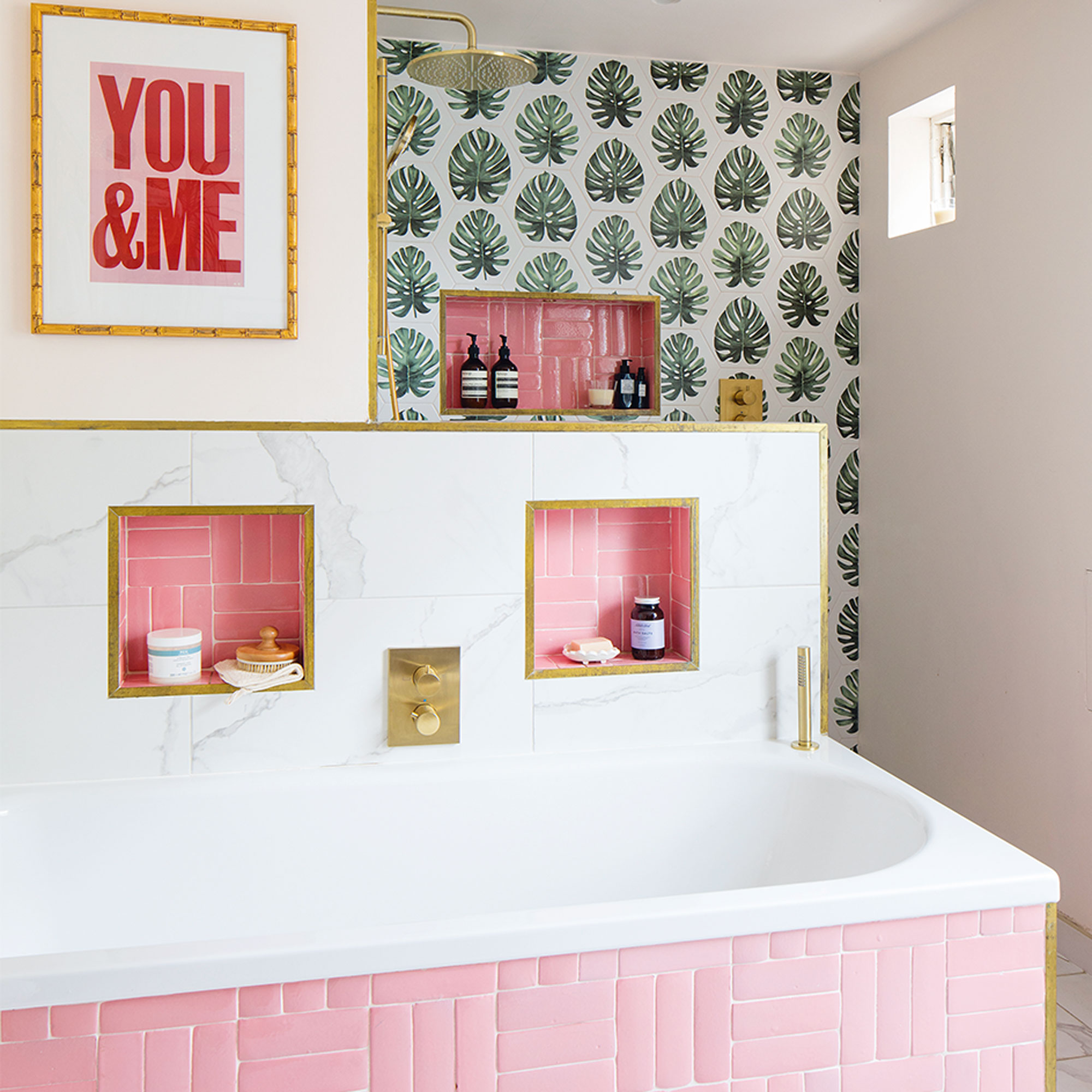
‘The separate toilet and bathroom were knocked through and space pinched from the adjacent back bedroom to create a bigger family bathroom. Sometimes bathrooms can look a little functional and bland and we wanted to go bold in here with a mix of fun colours and tiles.’
Downstairs loo
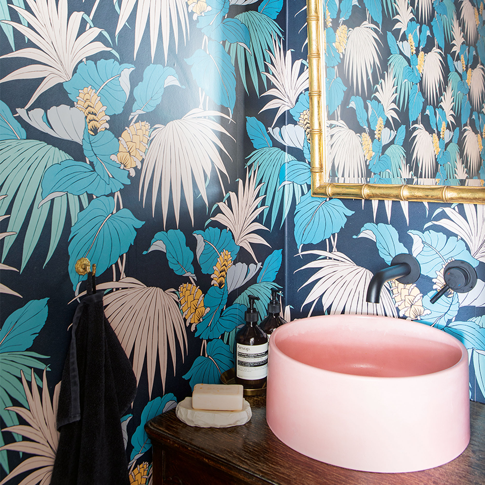
‘The downstairs loo is the smallest room in the house has been decorated in a vibrant wallpaper and has a candy pink basin which has been matched to the pink palms in the design. It’s a small space but I still wanted it to pack a punch.’
‘Five years on and we couldn’t be happier. We get so much enjoyment from our home, we now rent it out as a location house (you can find it on Instagram at @228locationhouse) and love sharing it with our family and friends. We’re so proud of how much we have achieved – it’s better than we could ever have envisaged.'


