If you've been inspired by the interior trend for statement ceilings, you might be looking beyond standard white paint colors for your room's "fifth wall"; however, pulling together the right combination for a bold new look isn't for the faint of heart.
While it's great to be adventurous with your interior palette, certain caution needs to be exercised, say experts. Some color combos may sound great in theory but can feel jarring. It's best to stay away from them.
To help you identify those pairings, we asked experts for help. Take a look at these paint ideas for walls and ceiling which, they say, are to be avoided — and the ones they recommend to use instead.
1. Deep red and black
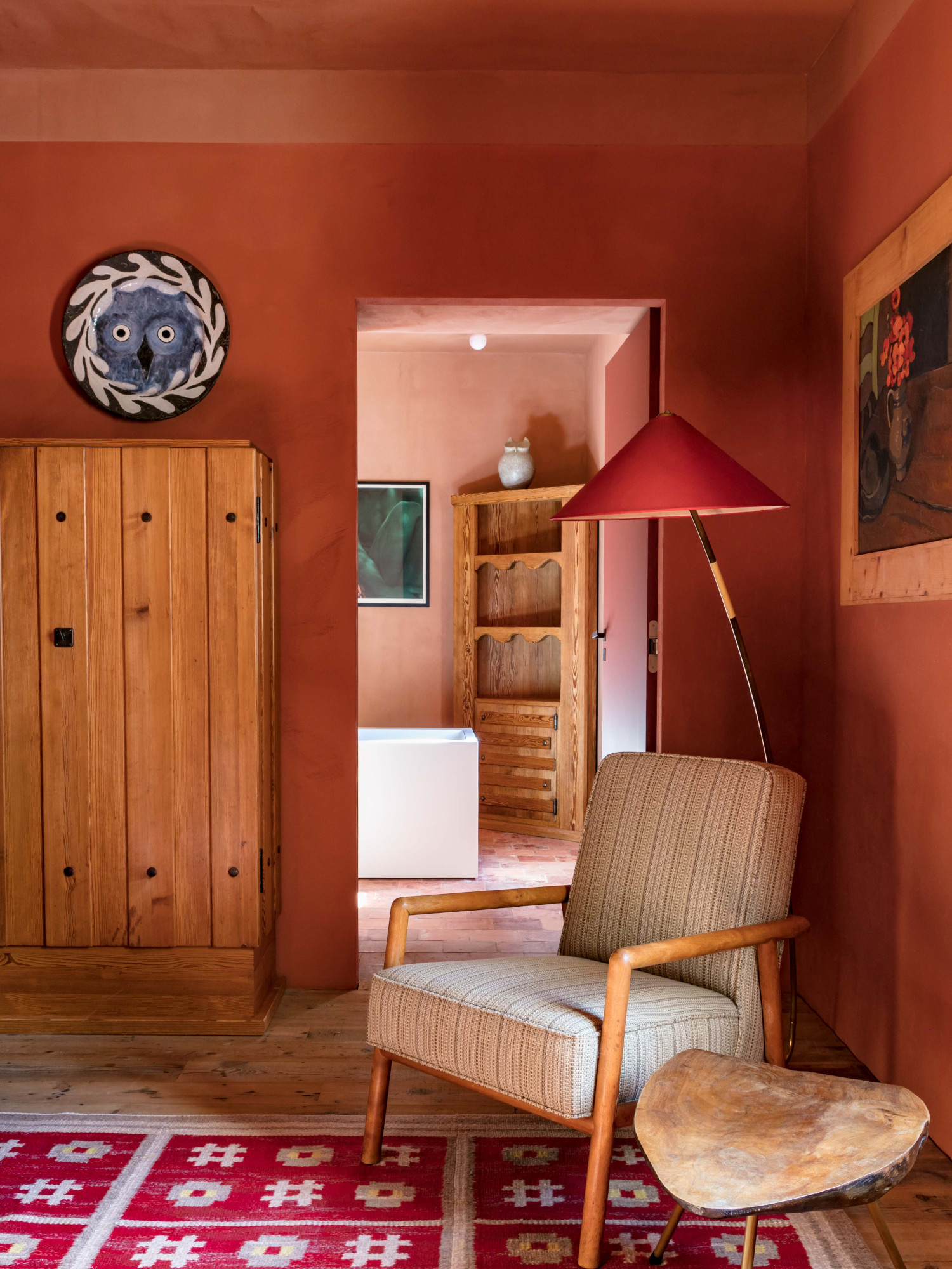
It might not be a surprise that this color combination isn't a favorite of designers. Red is an overstimulating color and when combined with black can create an even more triggering effect. This combo should be especially avoided in small rooms.
'Bright or very dark colors on both walls and ceilings can overwhelm a space, making it feel smaller and more confined,' says Seattle-based interior designer Nishtha Vashist. 'For example, deep red walls with a black ceiling can create a suffocating atmosphere, which is generally not conducive for most spaces.'
However, if your heart is set on red, then there are ways to use this tone is more livable way. Consider a warmer or more toned-down red like terracotta. Then many colors go with red of this temperature.
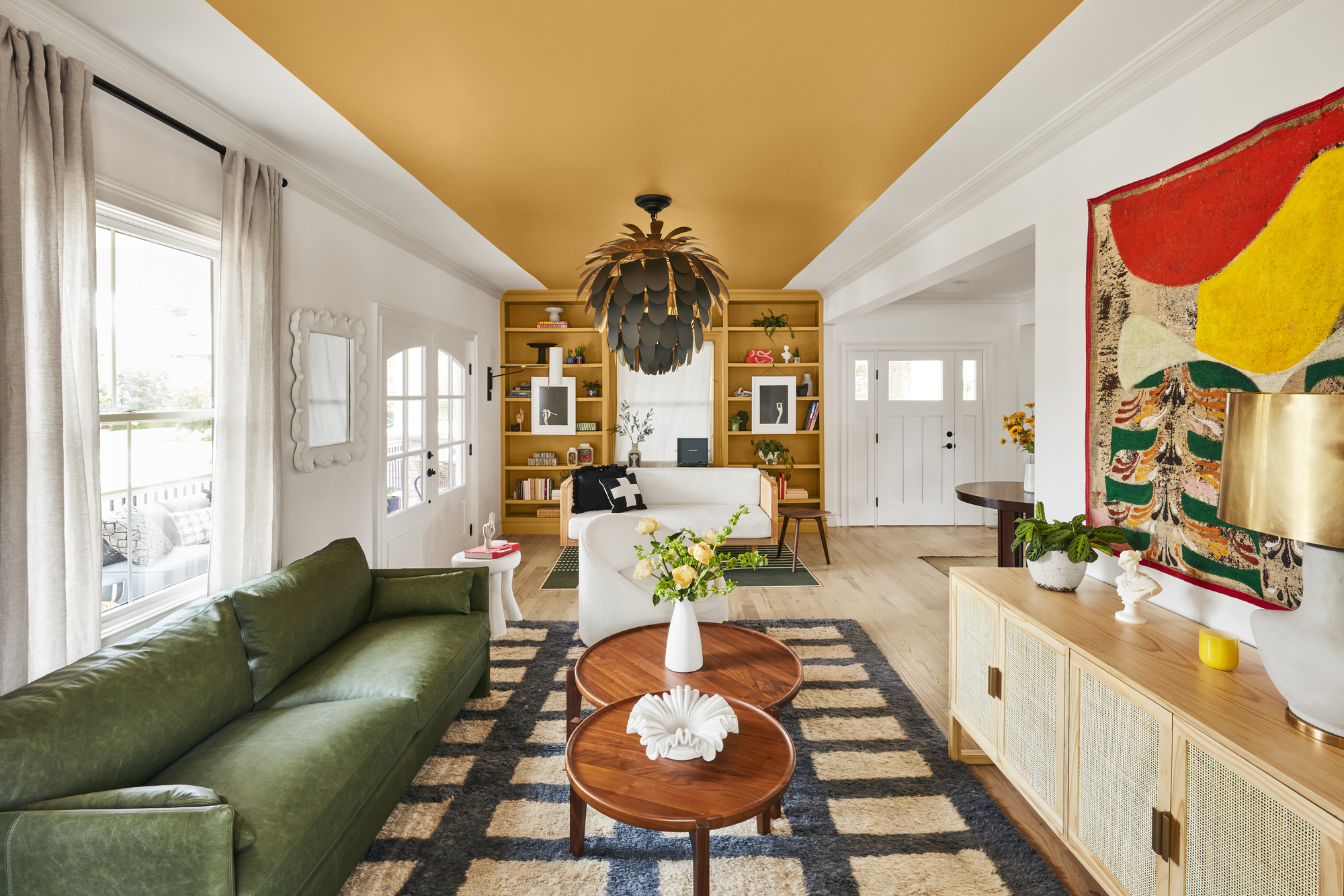
'Darker red tones can give living rooms a magical quality, especially in the evening light,' says Patrick O’Donnell, color expert at Farrow & Ball. 'Brick reds and rich mustard yellows to earthy browns look beautiful together; use empathetic whites to balance the tones and stop the room from looking too cloying.'
2. Yellow and green
Who doesn't love a combination that is fresh, lively, and fun? But in an attempt to do so, you may end up using clashing colors that clash a bit too much, and create visual disturbance. Yellow and green are one ceiling and wall color combination you might find too overwhelming.
'Yellow, despite being one of the most popular colors globally, when combined with green can be visually overwhelming,' says Saba Kapoor, co-founder of Nivasa. 'The intensity of these colors clashing can strain the eyes and create an inharmonious visual experience. The intense combination might overwhelm the senses, leaving your design or setting feeling a bit disjointed.'
There are many colors go with green, so yellow and green is one of those combinations experts don't, necessarily, think it's worth pursuing. Think green walls and gray ceiling. Or green walls and a cream ceiling. These will create a lovely verdant vibe and give the home a more peaceful look.
3. Red and gray

'Gray can appear cool or warm, so when selecting colors that go with gray, it is important to consider whether the gray leans cool or warm,' says Burcu Garnier, co-founder of Color Atelier. 'Due to its versatility as a neutral, most colors go with gray. That being said, we generally do not love the combination of red with cool gray, nor do we find green paired with warm gray visually pleasing.'
Experts suggest, that for a more timeless interior that doesn't feel dated, it's best to choose more earthy combinations.
'With warm gray, we love pairing it with pinks, taupes, and light yellows,' says Burcu. 'With cool greys, we prefer inky blues and crisp whites. As gray complements many shades, it can also be effectively paired with various textures such as plaster, wood, and marble.'