Amid the success of Sonic 3 in cinemas, I've been pouring over old Sonic the Hedgehog character designs recently. Our favourite blue Erinaceidae has evolved over the years, from the original 1991 platform game to the comics, games and movies of today. But I'm stunned to learn that back in the late 90s, Sonic could have looked very different.
A major watershed in Sonic history was Sonic Adventure, which was released in 1998. And early designs for the 3D game show that Sonic could have looked kinda scary – and could even have been a different colour (see our pick of the best game development software if you're working on designs for your own indie title).
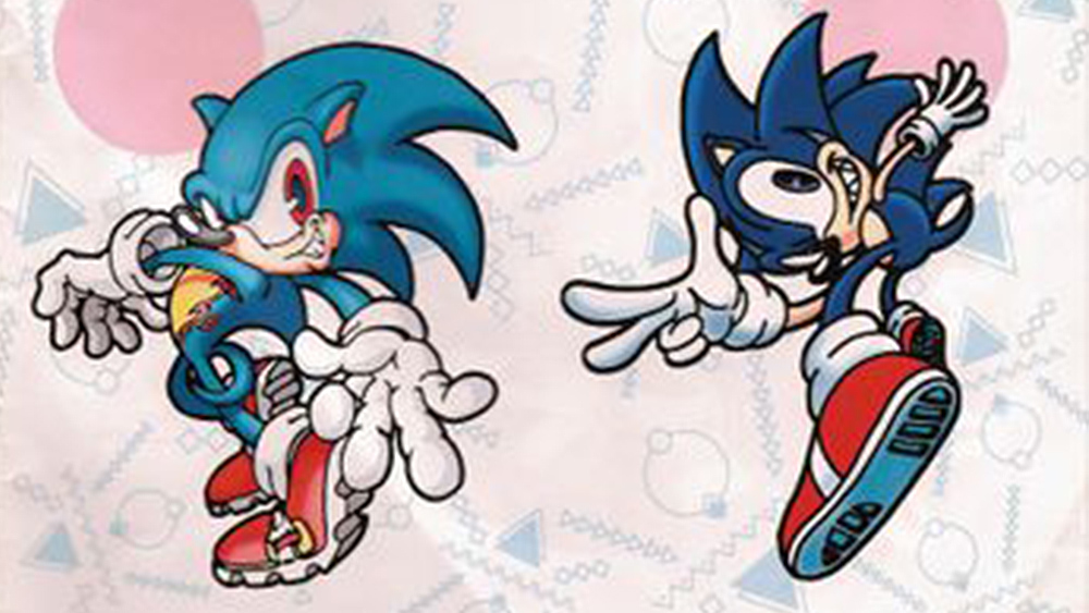
Original redesigns for Sonic in Sonic Adventure 1 from r/SonicTheHedgehog
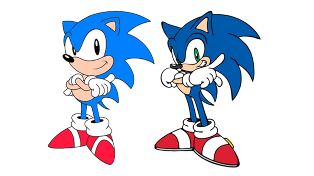
Sonic Adventure marked the transition from 'Classic Sonic' to 'Modern Sonic', as he's often known. The new character design was cooler and meaner, a darker shade of blue and had green eyes.
As I see it, there were a couple of valid reasons for the change. One was simply to refresh the brand to keep sonic cool and relevant for new audiences. But there was also the change to 3D to consider. A taller profile helped Sonic stand out better in 3D, as did grey soles on his shoes.
But the early explorations above shared on Reddit show that even more radical designs were explored. In the bottom two iterations, Sonic looks kind of monstrous. The one on the bottom left is the biggest departure, showing a sharp-fanged Sonic in teal with red eyes and a yellow chest and over-sized gloves. And surprisingly it seems that Number 3 was designed by Naoto Oshima, who made the original Sonic design.
The bottom designs remind me of Extra Life and Scourge, the evil sonics from the Sonic comic series. It seems that Sega decided the bottom two designs were a step too far and had them toned down, which was probably wise considering that even the more reserved final modern Sonic design still causes controversy among fans even today. In hindsight, I think the new design for Sonic Adventure made sense, but I don't think I'd feel the same if we'd got a red-eyed zombie hedgehog.
See our character design tips for inspiration for your own work. For more Sonic inspiration see the surprisingly brilliant Sonic x DC collab.


.png?w=600)

