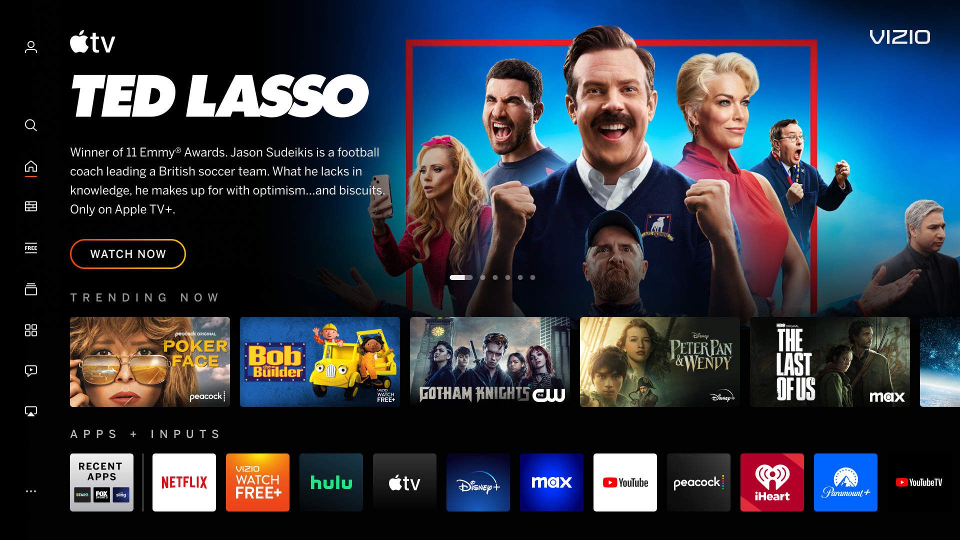
Vizio TVs offer serious value thanks to their combination of performance and price. And now, they’re getting even better thanks to a complete redesign of the SmartCast user interface. In fact, it’s getting rid of the SmartCast interface altogether.
Starting today, Vizio is rolling out its new smart TV user interface called the Vizio Home Screen. This upgrade will gradually roll out to all SmartCast TVs, which means TVs as far back as 2016 could get this upgrade to Vizio's revamped smart platform.
And when I say upgrade, trust me — I mean it. While the older SmartCast user interface was by no means unusable, it wasn’t the most aesthetically modern user interface. Now, traditional poster graphics have been replaced with immersive backdrops, sometimes with video content rather than a static image. There are also clear call-to-action buttons to take you to a movie trailer, add something to your watchlist and more.
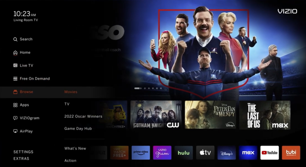
Vizio Home Screen: Side menus > Top menus

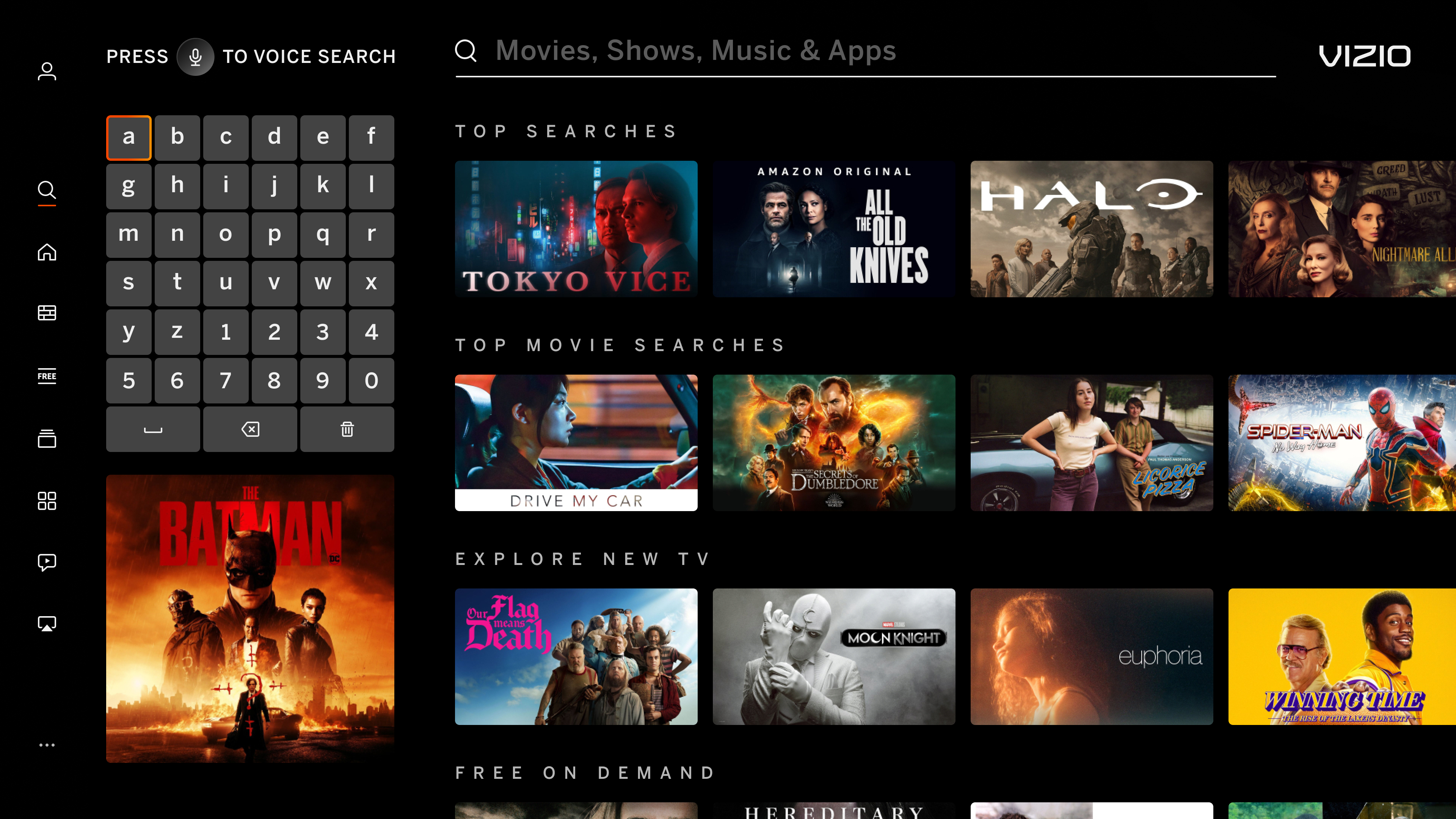
The aesthetic changes are nice, but the biggest upgrade with the change to the home screen might just be the shift from a top menu navigation system to a left-side navigation menu. Search also is getting a shift to the left, with the user interface’s keyboard shifting from a central row to a left-side keypad so more relevant options are visible while you search.

The new menu should be a bit easier to access than the SmartCast menu, thanks to requiring just a few clicks to the left rather than scrolling all the way back up to the top. And everything is cleanly laid out from Live TV to Search and more. The Settings menu is more readily accessible as well.
Finally, the Browse section gives you a curated list of categories for TV shows and movies that allow you to more easily find what you’re looking to watch. This includes everything from rotating curated categories to family-friendly kids content.
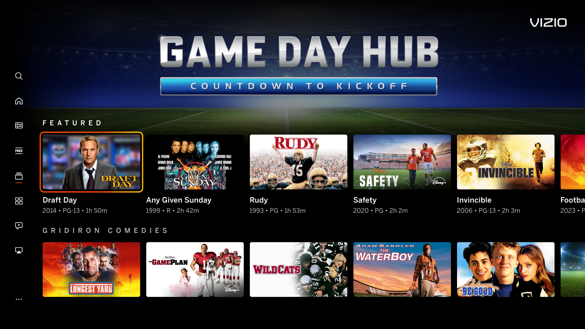
Curation is more integral to Vizio Home Screen

Speaking of categories, Vizio is heavily focused on curation with this redesign. Not only are there the classics like action movies, comedies, etc. but there are also seasonally curated categories around more narrow categories. These Collection pages aren’t entirely new to Vizio — they were a part of the SmartCast smart TV platform as well — but they’re now a more prominent focus, even getting their own tabs in the main left menu for quick access.
So if you have a Vizio TV with SmartCast, keep an eye out for the new Home Screen user interface in the coming months. And if you don’t have a Vizio TV, this redesign is a great time to consider getting one. If you can still find one, the Vizio OLED TV is a great option for getting a budget OLED TV that still looks great, and the Vizio M-Series Quantum X is a great option for gamers thanks to its 240Hz gaming mode. Both models will get upgraded to the new Vizio Home Screen in the coming months.


