New logo redesign concepts can be a great way for graphic designers to showcase their skills, and now and again one comes along that becomes a viral hit on social media. That's the case of this concept for a Chicago Bulls logo redesign, which has triggered a design debate among fans of the team.
Perhaps one reason the design concept has generated so much interest is that the Chicago Bulls is only NBA team to have never changed its logo design. That's quite something these days, when some sports teams seem to change logos almost as often as they change their kits (see our pick of the best NBA logos).
Emily Morgan is a graphic designer who specialises in sports branding. She's shared dozens of logo redesign concepts on her social media accounts, and that's included tackling the logos of some of the US's best known basketball, baseball and American football teams.
At the centre of her idea for a new Chicago Bulls logo is the incorporation of the 'Michael Jordan shrug' to form the base of the bull's nose. She also tweaks the bull's forehead so the lines more obviously resemble the markings on a ball.
A lot of fans love the design with its subtle references and beefier bull, and it's even won over even some cynics. "The Bulls logo is so iconic and timeless that it feels like a crime when someone tries to change or redesign it. But the shrug that's very clever," one person responded on Instagram. However, not everyone's convinced by the addition of a thick neck on the bull. Others note that perhaps there's a reason why the Chicago Bulls have bucked the trend for regulator logo redesigns in sports.
The history of the Chicago Bulls logo
The Chicago Bulls take their name from Illinois' historic connection with bulls and meatpacking. The team's first venue, the Chicago Amphitheater, was close to the Chicago Stockyards. The Chicago Packers also had a bull logo.
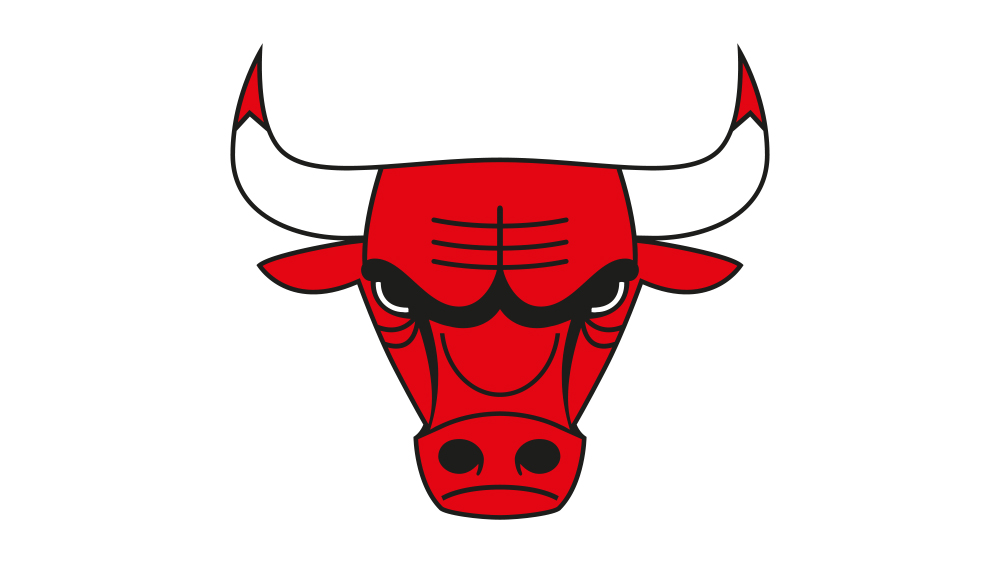
The graphic designer Dean P. Wessel created the Chicago Bulls logo way back in 1966 when the team first began, making the bull look focused and angry with eyes half-closed. The red and black colour palette was proposed by founder Dick Klein.
Why has the Chicago Bulls logo never changed?
The main reason the Chicago Bulls logo has never changed is probably because there was no need to change it. It's simple, effective and recognisable; it stands out and it has a domineering energy. The team's success in the early 1990s with Michael Jordan probably helped ensure the logo's endurance, making it iconic not just in the US but also worldwide as the NBA became more popular internationally. The association with Jordan's performances means there would probably be an outcry among fans if an attempt was made to change the logo today.
See our pick of the best sports logos for more examples of winning designs.