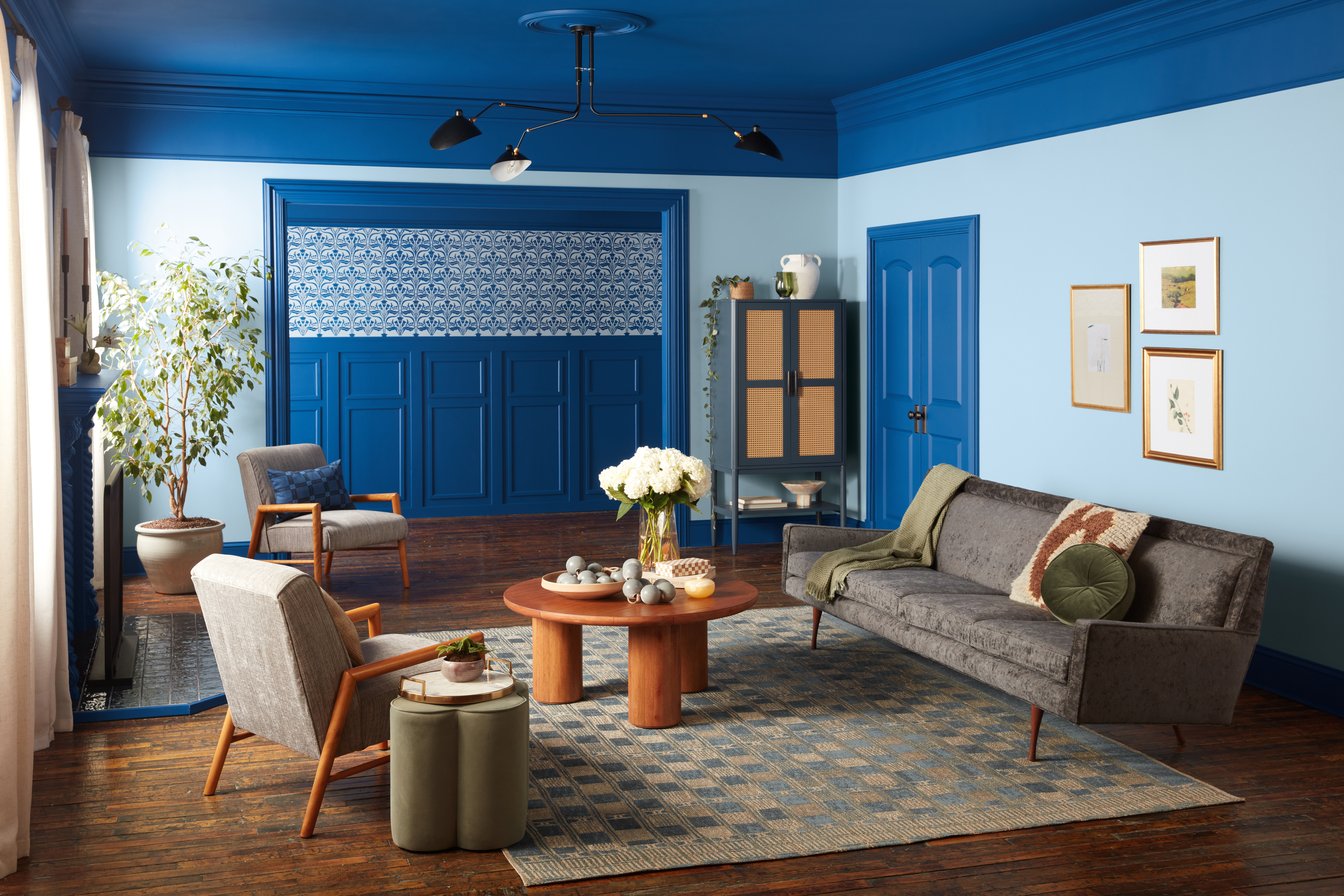
The final days of summer can only mean one thing - the onset of color forecasting season. As we gear up to welcome in a new year, our favorite paint brands are naming the shade they predict will dominate homes during our next circle around the sun, and Valspar has set the tone with a bold and bodacious shade that proves primary tones are one to watch out for.
The brand has announced Encore 8002-45G as its Color of the Year for 2025, a punchy primary blue that's deep, inviting, and energetic. This anchoring, honest blue hue feels classically timeless, and yet it speaks to so many color trends we've seen throughout 2024. Blues have been the mood of the moment this past 12 months, with Valspar naming Renew Blue - a light and uplifting tone - their color of the year for 2024. And, with trends like bold trim and the "Unexpected Red" theory proving so popular lately, pops of surprising, saturated color are on everyone's radar right now.
A true blue like this one is also extremely versatile. "Encore is a color for any space or application," says Sue Kim, director of color marketing at Valspar. "Its atmospheric deep blue tones emulate both the elusive luxury of Old World design and the futuristic blending of our physical and digital world, making it a color that feels familiar and unexpected at the same time. This makes it an ideal backdrop to ground a room, leaving space for spirited pops of complementary colors." Here's everything you need to know about the shade and how to use it in your home.
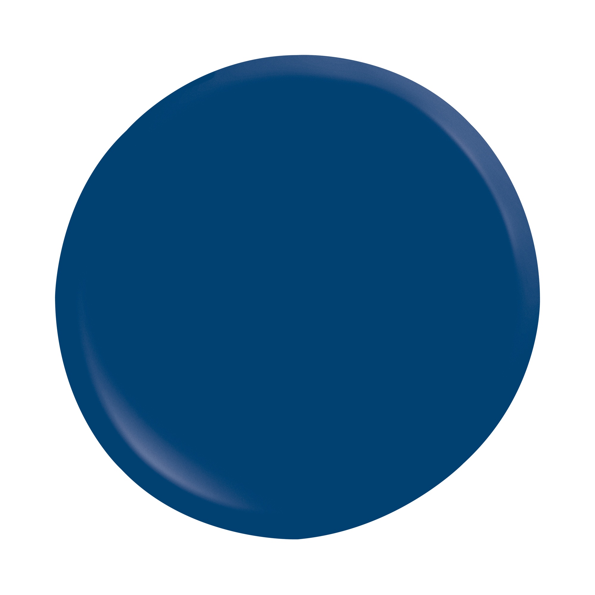
Price: From $39.98
Quantity: 1 Gallon

With blue paint ideas sweeping interiors in 2024, Valspar's color of the year didn't come as much of a surprise. It was only a matter of time before we saw a new iteration of this year's zesty light blues take center stage, and this saturated primary blue looks set to take the crown.
This year has been all about fusing classic colors and shapes with contemporary decorating techniques. Whether pairing traditional hues with bold new applications such as color-drenching, or peppering rich timeless shades like crimson throughout the home as accents, the resulting interiors feel fresh and reminiscent. Blending futuristic sensibility with a nod to the past, the spirited nature of Encore also works in a similar way.
After a brief turn towards decorating with calming and relaxing shades post-pandemic, decorating with color is now a top priority. And to emphasize that, primary shades are now at the helm. With the butter yellow trend and the "unexpected red" theory emerging this year, the appearance of a primary blue felt almost inevitable.
Rather than appear child-like and immature as one might imagine, these foundational shades are being used in sophisticated ways while still carrying an element of playfulnness. “Encore allows us to reach for more as we reclaim our imaginations and embrace a more joyful version of adulthood," explains Sue Kim at Valspar. "From form to function to color, our home is a place where we rejuvenate and find happiness with our family, friends and community.”
How to Decorate with Valspar's Color of the Year 2025, "Encore"
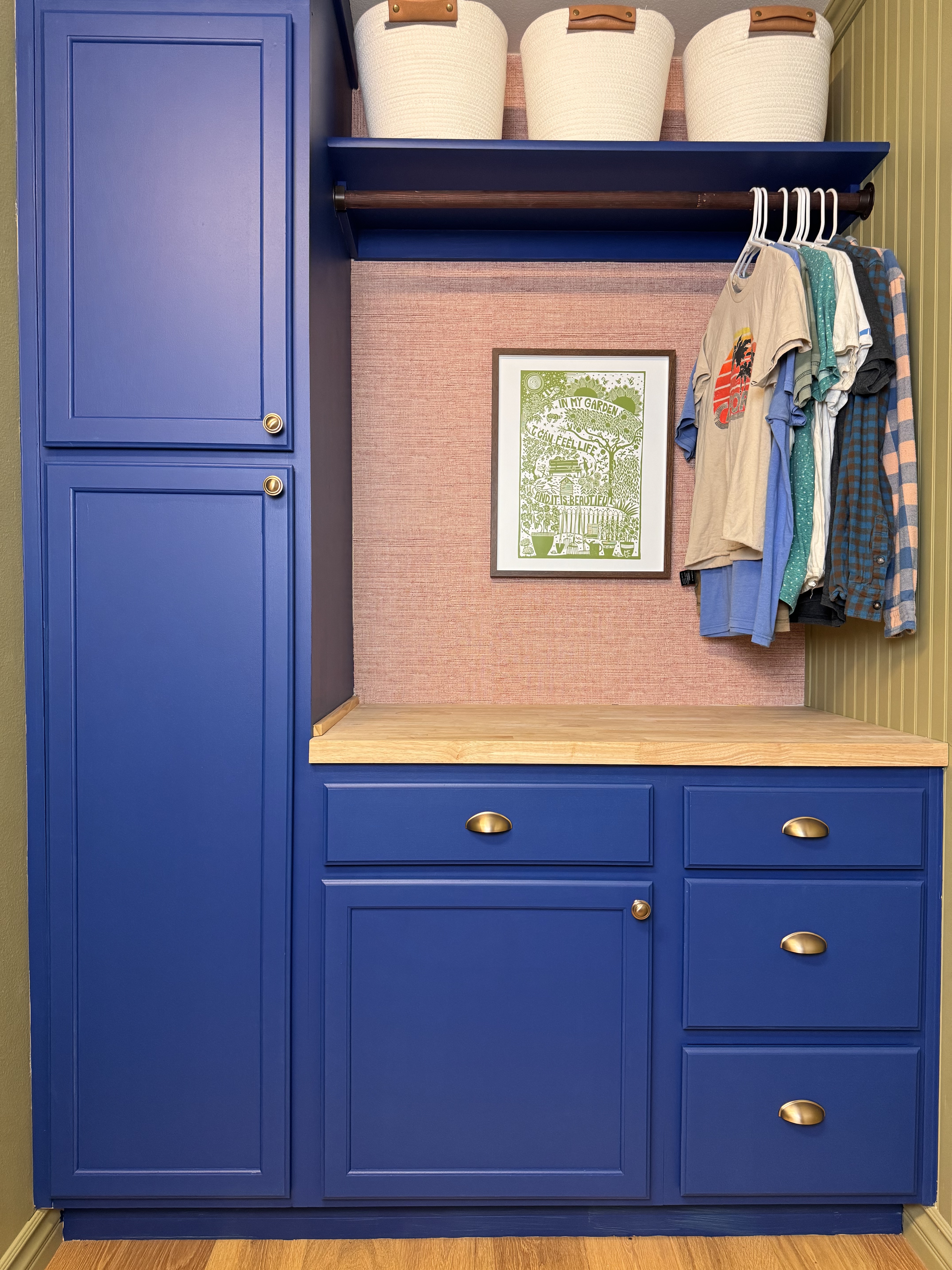
With so many colors that go with blue, building a scheme around Valspar's color of the year is relatively easy. You could layer in other Valspar shades that share its enduring qualities like Lavender Escape 4002-7B, Sprig of Sage 8004-28D, and Graceful Gray 8006-2E, or make Encore the focal point by pairing with off-whites and neutrals. For an on-trend application, you could also try color drenching to really make this inky blue the star of the show. Swathe "Encore" across the walls, ceiling, woodwork, plus any cabinetry for a truly transportive effect.
The navy tone also lends itself well to a nautical theme if you want to play into coastal decor trends. "I’m not sure whether it’s just the time of the year and weather at the moment, but it’s giving me some serious coastal ‘Amalfi’ blue vibes — reminiscent of the cobalt shade that was everywhere back in 2022," says Livingetc's Interiors Editor, Emma Breislin. "Just imagine how energizing it would be paired with a crisp white, or contrasted against a vibrant orange or zesty yellow."
Our favorite use, however, has to be for trim. When used as an accent to contrast with neutral tones elsewhere in the room, this bold and playful shade really has a chance to sing. "Using Encore on details like cornicing, baseboards, and doors can look really dramatic, or even smaller pieces of furniture could be fun, like dining chairs or a side table," says Emma.
Decorating with primary colors looks set to be the big design trend of 2025, and Valspar's Color of the Year for 2025 is the perfect shade to get you started. We can't wait to see how "Encore" finds its way into our homes in the year ahead.

