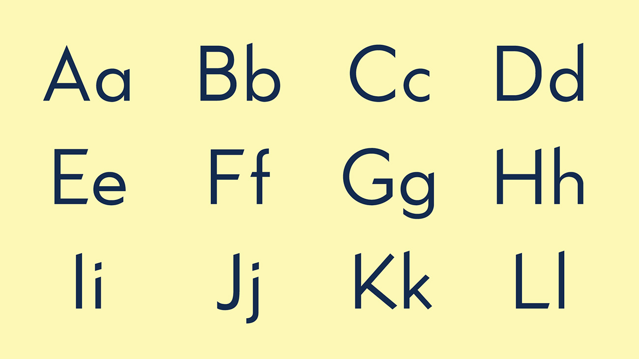
Figuring out the different types of typography can be as confusing as trying to say 'types of type' quickly. In this guide, we'll go through the categories you need to know, the defining features you should be looking out for, and how to use them. It might seem like there are loads of different font types, but the key ones to start with are: serif, sans-serif, script, monospace and display (plus a few sub-categories we'll get to in due course).
Typography is a creative discipline focused on the design of characters for alphabets around the world – Roman, Cyrillic, Arabic… the list goes on. Being such a technical discipline it seems to have developed a language all of its own. Moreover, with software developments making it possible for anyone to design their own font, the number of fonts, in particular, free fonts, available is proliferating like never before.
Not all are beautiful, many might never find a use. But here we're going back to basics and looking at the main font types you need to know, as well as the main uses for each type (bear in mind this is a very rough guide – designers can and do use different font types in all kinds of ways), and which classics to consider. The next step is matching pairs of fonts together, and for advice on that, see our post on font pairing.
Serif
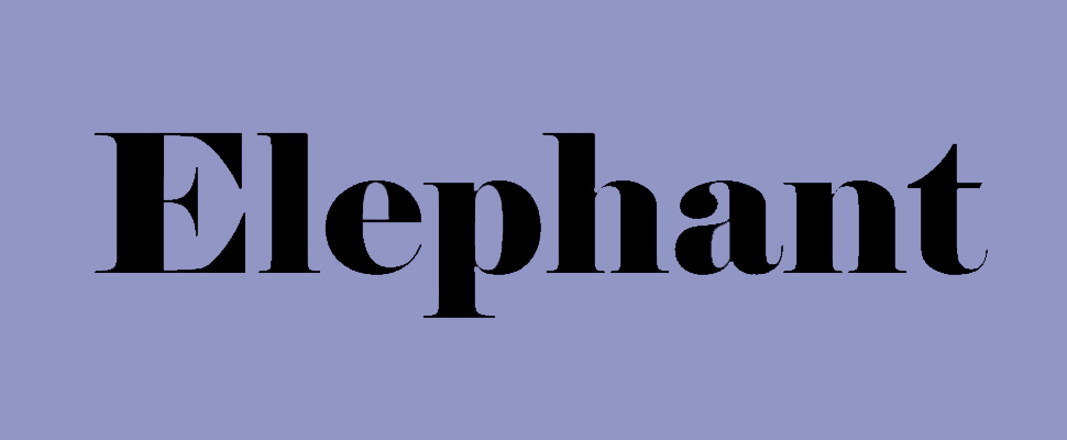
- Defining feature: Extensions of the end of the character terminals
- Main use: Print
- Classic examples: Bodoni, Caslon, Trajan, Eames Century Modern
A classic typeface has serifs – those delicate little points that extend from the terminals of most of the strokes that make up the letters. The serifs form feet at the bottom of a lower-case L, for example, grounding it and giving it a sense of structure along with a flourish.
Although serifs are suggestive of the strokes connecting cursive handwriting, they actually date back to the engraved lettering of the Roman period. As such, serifs are intrinsically connected to the Roman alphabet itself.
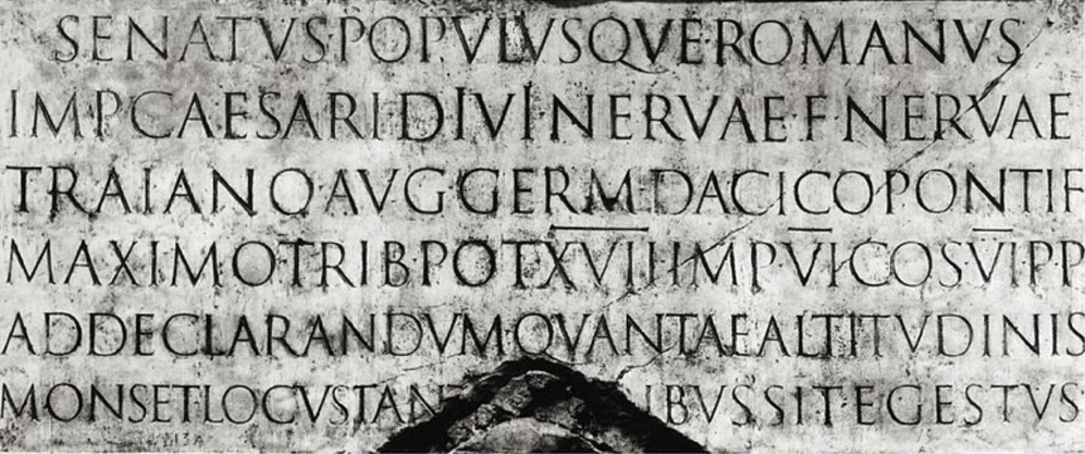
What typesetters and typographers have discovered over time is that a well-designed serif typeface can make a big difference to legibility and economy of space. Serifs aid the eye in flowing from one character to the next, one syllable to the next, giving printed words an instantly recognisable form.
They are considered excellent for body copy in books and magazines. Trickier has been the transition to digital, where the legibility of a serif depends on the display quality.
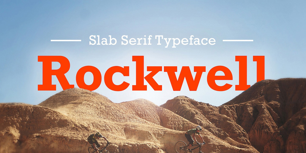
Alongside the X-height, proportions, contrast (thickness of the vertical and horizontal strokes), serifs offer typographers a fantastic way to give their creations character. The rapier-thin serifs of Bodoni are a feature that excite type designers who use it. Copperplate's serifs are sharp, stubby and distinctive, while Rockwell is the archetypal slab serif – in which there is very little contrast between the thickness of the serifs and the main strokes.
Aside from Bodoni, classics include the 18th century typeface Caslon; Trajan, which takes inspiration directly from Roman letter cuts; and Eames Century Modern for a 20th century design-informed feel.
See more examples with our free serif fonts guide
Sans serif
- Defining feature: No extensions on the end of letter strokes
- Main use: Screen-based type
- Classic examples: Helvetica, Gotham, Akzidenz Grotesk, Futura
As the name suggests, sans-serif typefaces are without serifs. Originally designed for display purposes, sans-serif typefaces have been refined to work well as body copy and other layout elements such as captions and annotations. The absence of narrow and fiddly serifs mean they function better on screens, making them excellent for websites, apps and on-screen identities.
They’re popular in a corporate context, often regarded as the typefaces of ‘big tech’. Designers find them particularly useful for posters, signs and digital screens. The famous Hope poster promoting Barack Obama uses one of the world's most popular sans-serifs: Gotham.
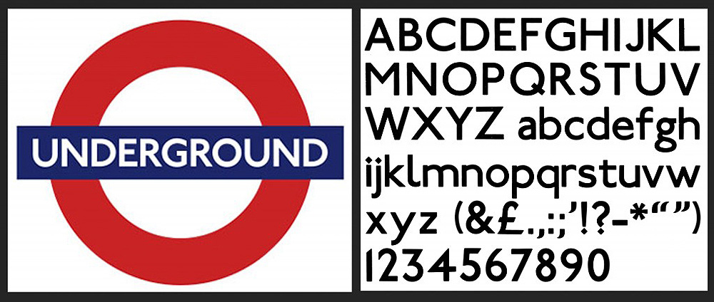
In fact, politics is a running theme in the development of sans-serif fonts. The first ones, such as Akzidenz Grotesk, were designed in the late 19th century with the rational objective of creating clear signage and legible headlines. That may not seem revolutionary, but the idea of improving readability alongside literacy was an ideal of utopian and socialist movements across Europe.
Discarding serifs as the regalia of the past not only presented design challenges for early 20th century typographers, it brought them into conflict with the right. For example, Paul Renner, who designed the typeface Futura, was arrested by the Third Reich in 1933. His modernist philosophy was not welcome under a regime favouring fierce old blackletter typefaces.
Renner and later Jan Tschichold believed that clean, efficient typefaces could be engineered using the basic building blocks of geometry – circles, triangles and squares. Humanist typographers like Edward Johnston softened this approach by introducing width variation and conceding that, for instance, an 'O' did not necessarily have to be a perfect circle and could be more readable and efficient as a narrower oval.
After his arrest, Renner fled to Switzerland where he influenced Swiss modernism, a movement that produced the mightiest sans-serif of them all: Helvetica. Erik Spiekermann's Meta is considered to be a Helvetica with personality, while Frutiger was an instant bestseller when introduced in 1977. For modern, minimal and accessible design, sans-serifs are the way forward.
For more examples, see our free sans-serif fonts guide
Script
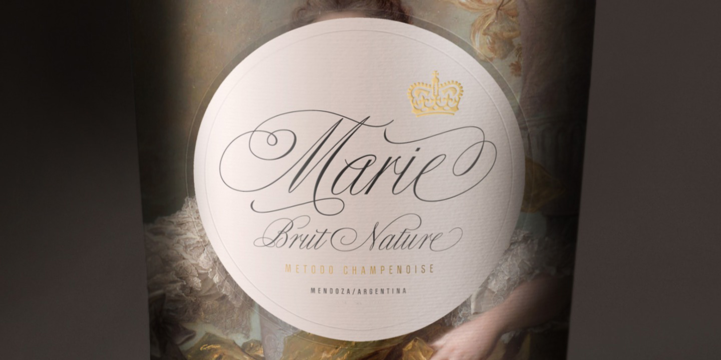
Script fonts mimic the features you'd find in handwriting. As a result, there are many different styles. Some contemporary script fonts attempt to replicate the natural flow of writing in a very elegant way, with swooshes and end strokes that swing back underneath the letters for emphasis. They are very much display typefaces.
Others take the authenticity in the other direction, depicting more honest handwriting styles – scrawling, scratchy and practical-looking. Meanwhile, older script fonts reflect the handwriting style of trained scribes or calligraphers, going right back to Claude Garamond’s 'grecs du roi' typeface designed in 1541.
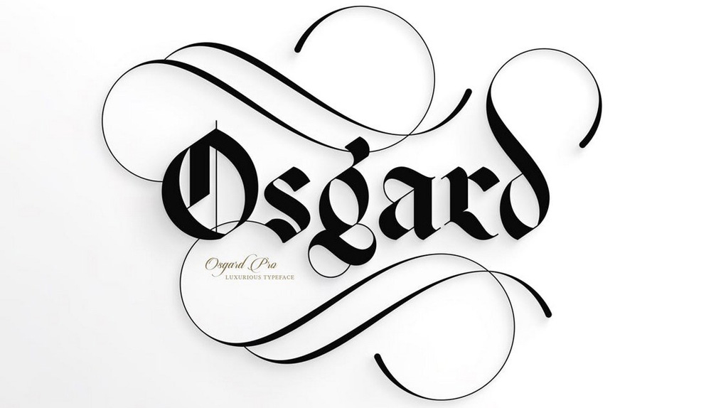
It's worth emphasising that not all script typefaces mimic cursive writing. For example, many old-fashioned blackletter or gothic typefaces are made up of calligraphic lettering but don't attempt to join the letters together like the work of a scribe.
In the machine age – mechanical and later digital – script fonts offer an antidote to geometric perfection and the mass-produced look and feel of sans-serif typography. Ironically, however, it is the intelligent and adaptive computer code of the digital age that has made it possible to create typefaces that replicate the foibles and flow of handwritten text that is entirely joined up.
When looking for script fonts, designers usually seek a unique look and feel, and consequently this genre of typeface doesn't contain any big hitters. No script typeface has the profile of Times New Roman or DIN, for example.
However, Shelley and Bickham are ranked among the classics and are both very elegant. Bellissima is light and airy, and has been a hit for type studio Sudtipos. For a more masculine scrawl, try Christopher Hand or Black Jack, while Adventure has a grounded and contemporary feel to it.
Most script fonts fall into the display category and are commonly used in identity work, for book covers and projects where a unique and authentic look is desired.
Explore more in our best script fonts roundup.
Monospace

- Defining feature: Each character occupies the same horizontal space
- Main use: Coding
- Examples: FF Trixie, Inconsolata
The vast majority of typefaces are proportional and afford a different amount of horizontal space for each letter. A lowercase 'L' is the narrowest, an 'O' takes up more room and a 'W' is even wider. Similarly, an uppercase letter typically needs more space than a lowercase one. However, monospace fonts give each character a uniform amount of space.
Initially, monospace fonts were developed for typewriters and other printing machines for mechanical reasons. Courier, designed by Howard Kettler for IBM typerwriters, is the most famous typeface in this category and is a slab serif. Like IBM, Olivetti created a whole range of different letter types for its machines. When typewriters capable of proportional lettering were invented monospace fonts became an anomaly that somehow stuck around for nostalgic and aesthetic reasons.
However, they saw a resurrection with the rise of early computers. Memory and code limitations meant that once again a set amount of space was allocated to each letter. To this day, many coders work in a monospace environment.
Designers, on the other hand, adopt monospace typefaces when they want to go for a naive, undesigned or retro look. Typefaces like FF Trixie and Chapter 11 mimic the rough outcome of a typewriter key hammering the ribbon to leave its impression on the paper. Cleaner and more elegant options include Inconsolata, GT Pressura Mono and Nitti. In addition, monospace versions are available of many popular fonts such as Helvetica and DIN.
See our favourite monospace fonts for more examples.
Display
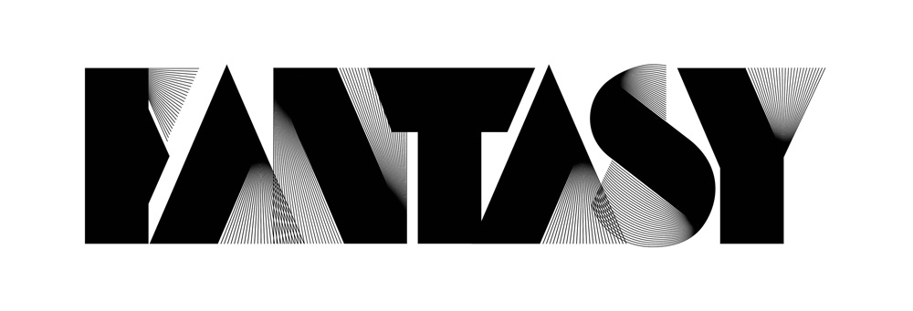
- Defining feature: Not designed for body copy
- Main use: Statement headlines and signage
- Examples: Bella, Karloff, Neu Alphabet, Impact
A display or header typeface is one specifically designed for signs, advertising and headlines rather than body text. It can be serif, sans, script, mono or from one of the many specialist subcategories of type.
Most display fonts are designed for maximum legibility at large sizes, and some are big, brash and shouty though this isn't always the case. Increasingly, display fonts are created to provoke an emotional response. For uncompromising elegance there's Bella, which flaunts its extreme contrast. Try Karloff, with its reversed contrast, for a jarring response – the opposite of elegance. Neu Alphabet speaks of classic futurism. Impact is a postmodern sans that was so punchy when it was introduced in 1965 that it just about killed its own, well… impact… for future designers.
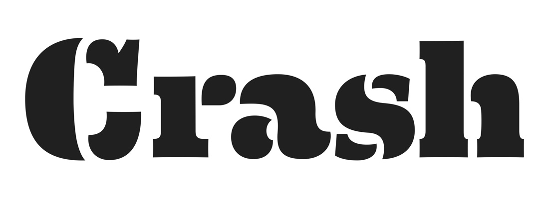
The digitisation of typography has seen lettering designers push the boundaries – see Neo Deco for example, which incorporates huge, thick upright strokes with dozens of fine lines. Inline typefaces, which literally have lines within each letter, have blossomed in their variety and appeal, no longer looking like a 1970s anachronism. Three-dimensional fonts offer a whole new range of possibilities with not just extrusions and shadows as possibilities, but lettering that looks architecturally constructed. See Idler, for example.
Of course, there are numerous traditional display typefaces to spread the retro message, from Cooper Black and Avant Garde to Metropolis and Old English Text. Interestingly, while sans-serif fonts were initially developed as display typefaces, and still function as such, many have been refined for body use while the palette of display typefaces has filled up with some truly insane serifs and slab serifs.
See our list of the best display fonts for more examples.


