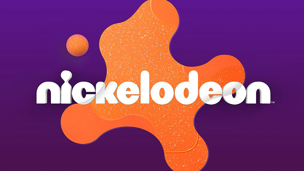
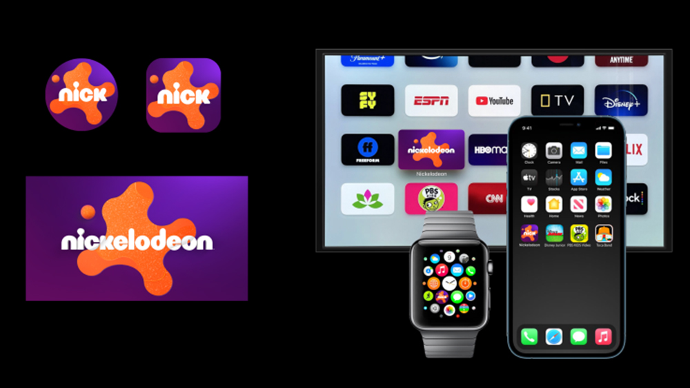
Kids TV channel Nickelodeon made a bit of a splash, or rather a splat, with its new logo design this year. The channel's first rebrand in 14 years design brought back its famous splat shape from the 1990s but with softer, more rounded and textured for a warm modern look.
Now the branding and design agency Roger has revealed how it approached the project (see our pick of the best logos for more inspiration).
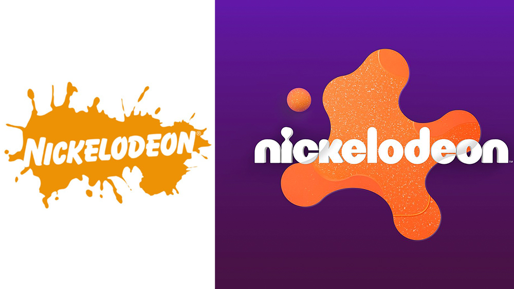
As we noted in our original story, the new Nickelodeon logo is close enough to the 1980s design to be immediately recognisable while still feeling fresh. Rogers says the rebrand was conceived to unify the brand across on-air, digital, and social and to create an identity that could grow and evolve with new creative output. And that meant thinking like a kid.
Roger creative director Braden Wheeler said: “We love a brief that asks us to tap into our weirdo kid brains. Kids are all about trying everything out, so we wanted to make a brand that allowed for revisionism, randomness, and irreverence. That said, the design language needed consistency across every touchpoint of the Nickelodeon brand, from on-air to digital and social media to the product packaging and resort experiences, so we knew we needed a very accessible core to the visual identity.”
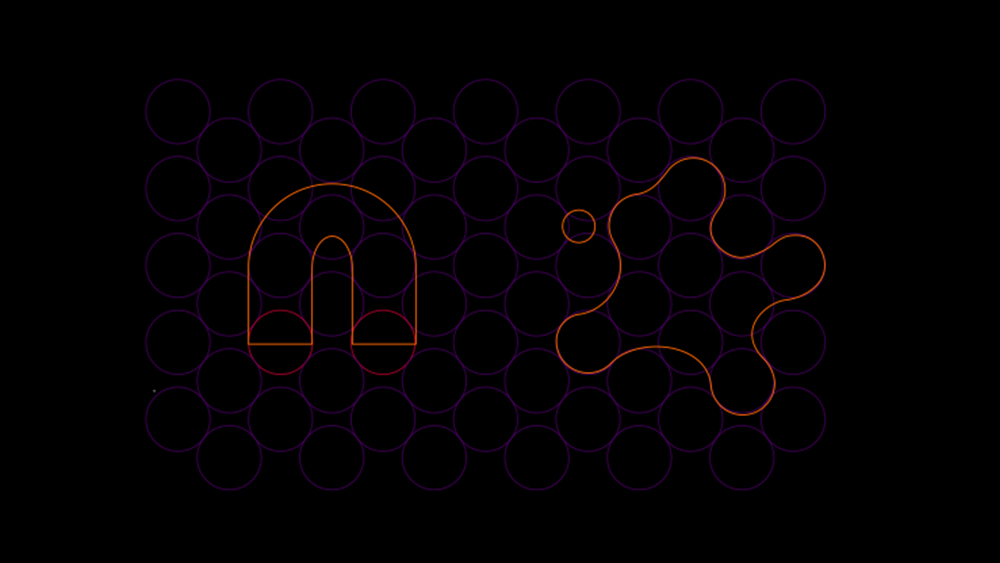
Roger designed the new Nickelodeon Splat using a circular grid system, allowing a secondary set of splat shapes to be built on the same grid to complement the main mark. Meanwhile, they used motion language that harks back to Nickelodeon’s classic animated style with a blend of traditional cel animation and modern 3D design.
The colour palette was based around Nickelodeon’s existing signature orange but adds complementary gradients of purples, yellows, and pinks. Meanwhile, bold and clean typography is layered on top for a contemporary look. Roger says it chose ROC Grotesk due to its subtle irregularity and paired it with Neue Plak, which created contrast between a more playful and more condensed style. They noted that both types offer extensive style options for future evolution.
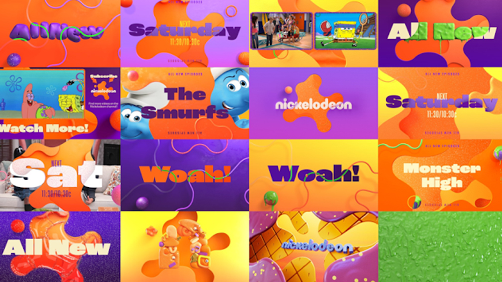
“We aimed to infuse a sense of imagination and exploration into every deliverable and design choice in a quite literal sense, with elements reinventing themselves in real-time,” Wheeler says. “It was a tightrope balance between eclectic and cohesive, but the modularity built into the system gives Nickelodeon the flexibility to play in their sandbox and build upon the brand for years to come as new IPs and initiatives are introduced. Flexibility was always at the forefront of our thinking.”
Roger founder and executive creative director Terry Lee said: “As a kid, Nickelodeon was my go-to, and that went a long way in shaping my sense of humor and expanding my creativity. From Rugrats to SpongeBob and Big Nate, they continue pushing the boundaries of kids’ entertainment. We’ve been working with Nickelodeon since our early days as a studio.
“There’s a shorthand that only comes with a longstanding relationship, and that ease of communication kept us in lockstep while brainstorming the new identity. It truly was a collaboration that couldn’t have happened without the strength of their in-house team. The Nick crew is top-notch, and that gave us full confidence that we could push the boundaries both creatively and technically. Above all… IT. WAS. SO. MUCH. FUN.”
For more fun, see our pick of the best drawing tablets for kids.