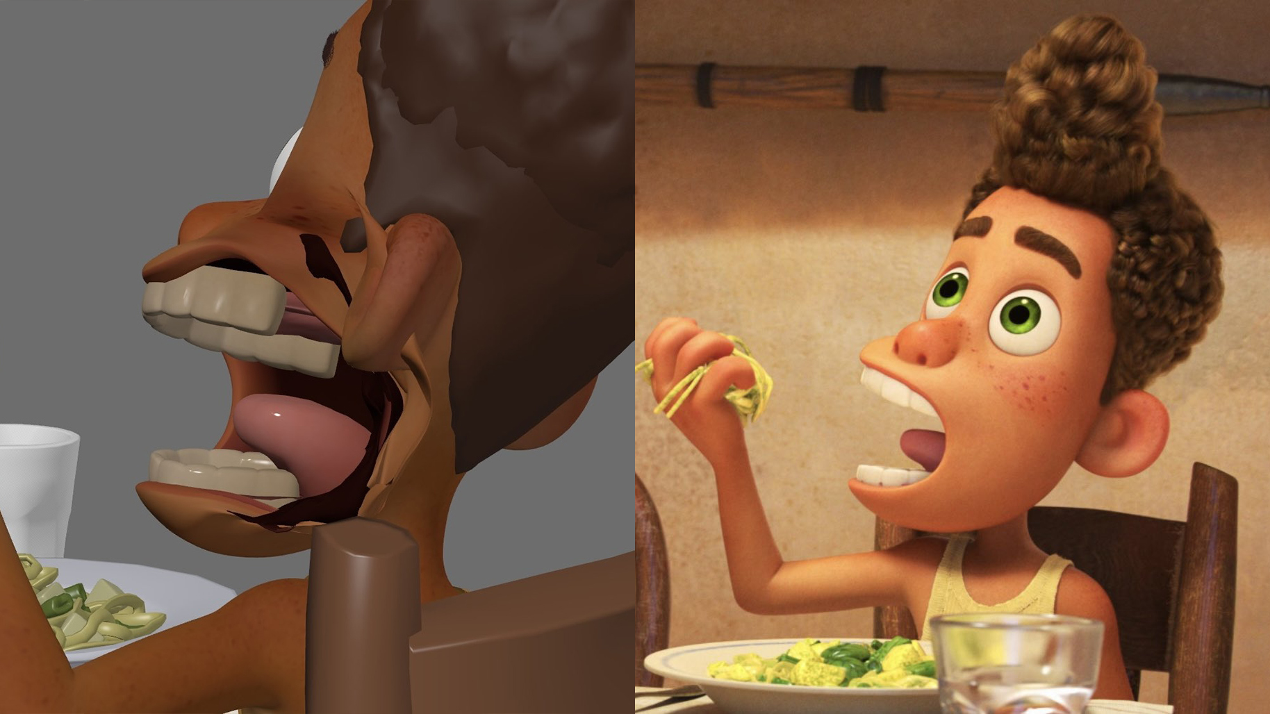
Ever wondered what a Pixar character's mouth looks like from different angles? Us neither – but now we've seen it, we'll be filing this one under 'can never be unseen'. A Pixar animator has shown what various mouth shapes in 2021's Luca look like from various angles, and it's a fascinating glimpse into the complexity behind what looks, on the face of it, like an effortlessly simple design.
Like those anatomical posters in the doctor's office, the faces shared by Cody Lyon appear as though sliced down the middle, with teeth, gums and more exposed. Suddenly the PS1 logo from behind doesn't seem quite so shocking.
Here are some alternate angles of the mouth shapes in Luca. It takes a lot of work to get it to look that simple! pic.twitter.com/q8FNx2Ac94March 24, 2024
Luca and Alberto's faces appear grotesquely deformed in the alternate views – but this strangeness is what accomplishes the cute, almost two-dimensional look that the characters often enjoy in side profile.
"I love when 3D animators have to make ungodly creations for something to look good on camera," one Twitter user comments, while a fellow animator adds, "Can confirm cheating poses and graphic shapes to camera is always entertaining to rotate around at the end - I was definitely doing some Luca mouths after it came out because it's such a fun stylistic decision."
one of the biggest things i learned after graduating and actually working in the industry, if the end product looks good it doesn’t matter what tricks you used to get there! I had to unlearn so much perfectionism from college https://t.co/hhjpd0IPVFMarch 24, 2024
Indeed, it's always fun to see what cheats and hacks designers and animators employ to create an effective end result. But weird and wonderful alternate angles aren't just limited to 3D character design – take a look at Mickey Mouse from above at your peril. And if you're looking for design inspiration, don't miss our character design guide.
.png?w=600)
