Happy Oreo Day! No, I didn't really realise this was a thing either. But I'm delighted I've found out about it because it's led me to a beautiful graphic design moment, full of retro joy that beautifully charts design across the decades.
It turns out the Oreo logo has been around since 1912, and since then has taken on some stunning logos that encapsulate the design of the time. Though today the logo is quite minimal and, dare I say, bland (certainly not one of our best logo picks) that hasn't always been the case. Some of the old ones were fabulous. Stand by as I show you some logos (almost) as delicious as the cookies themselves.
01. 1912-1923
02. 1923-1931
03. 1931-1936

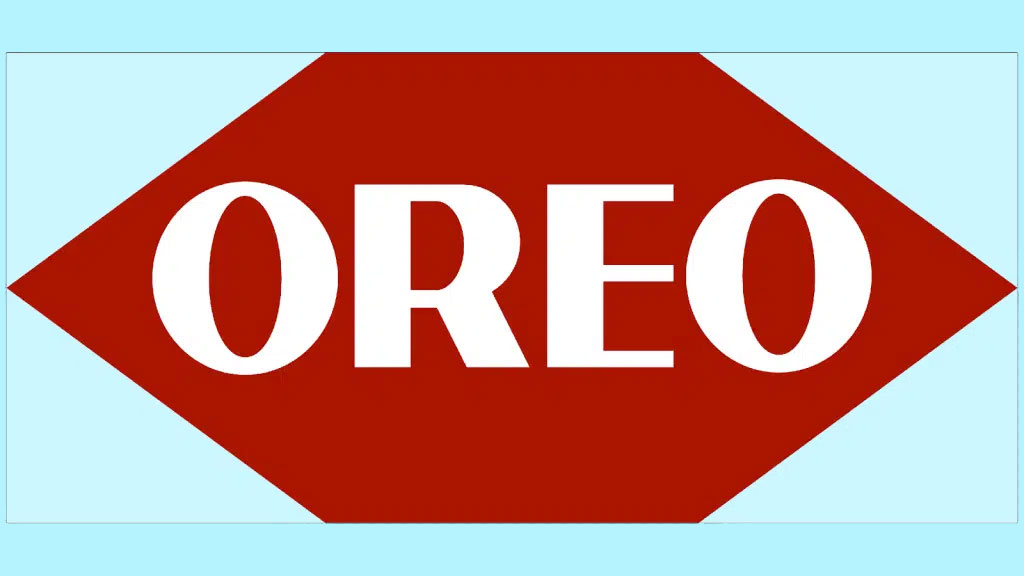
04. 1936-1940

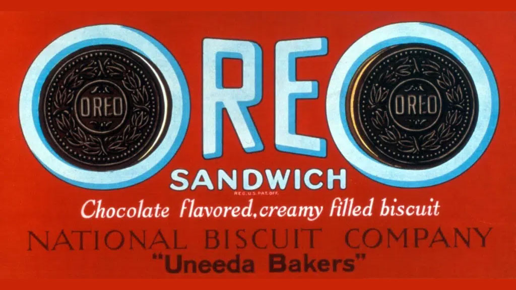
05. 1940-1949
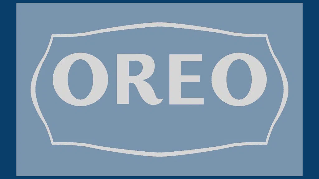
05. 1949-1952
06. 1952-1960
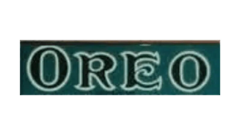
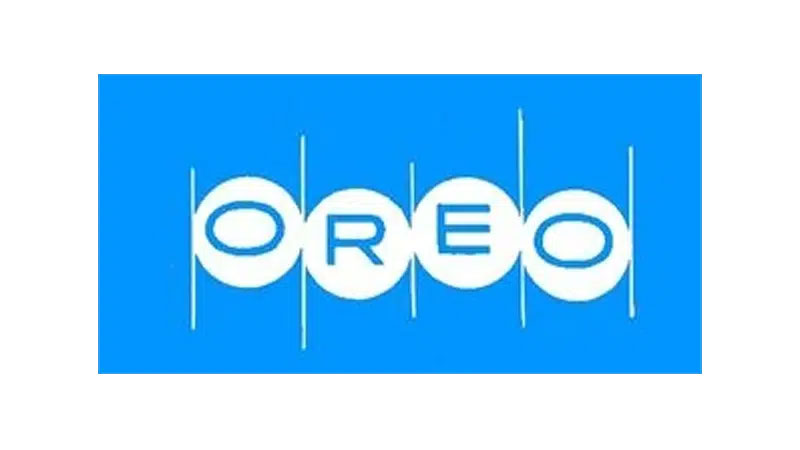
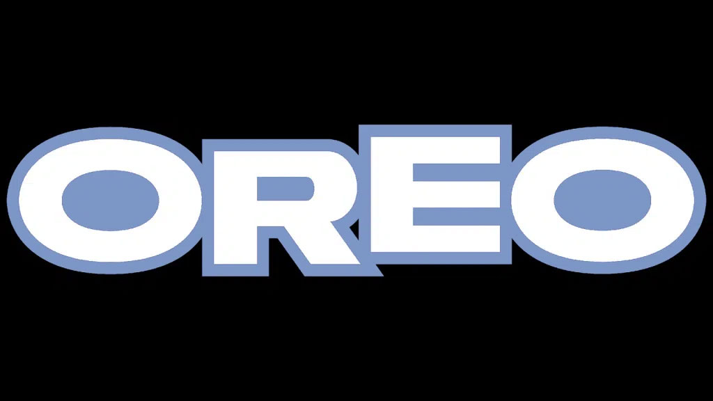
07. 1960-72
08. 1972-1990

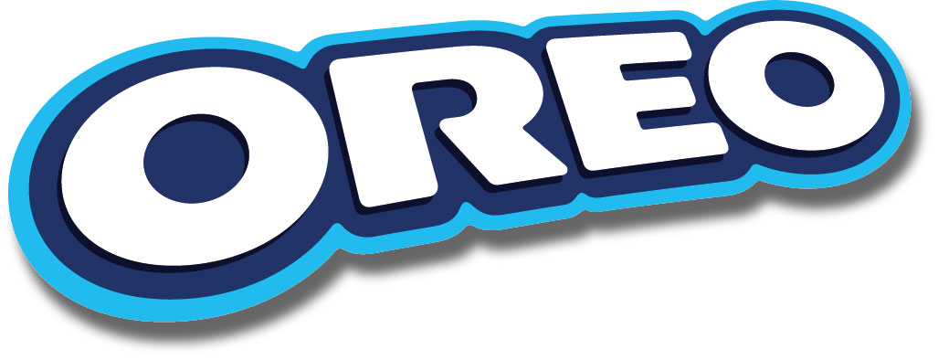
09. 1990-1995
10. 1995-2001
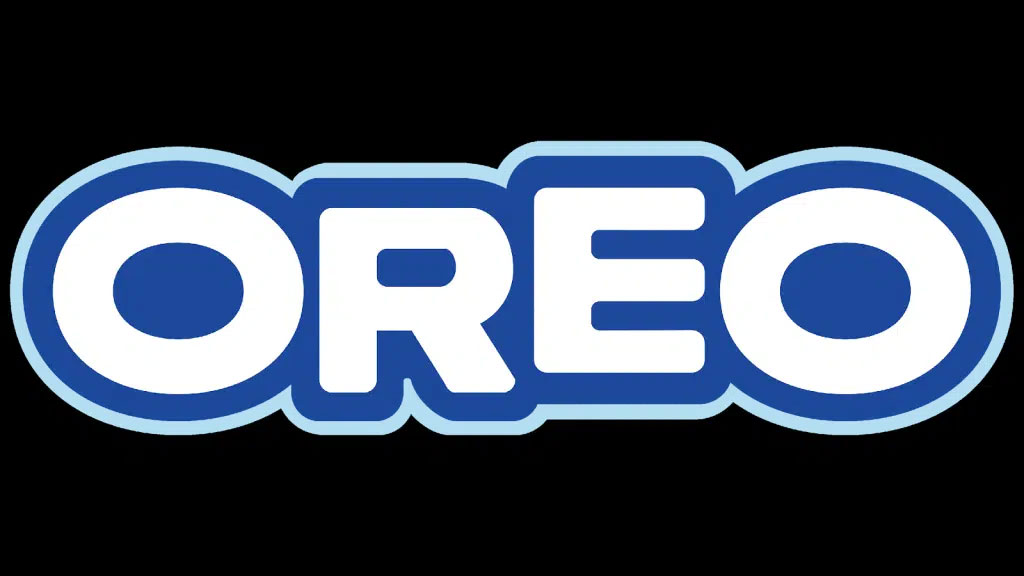
11. 2001- present
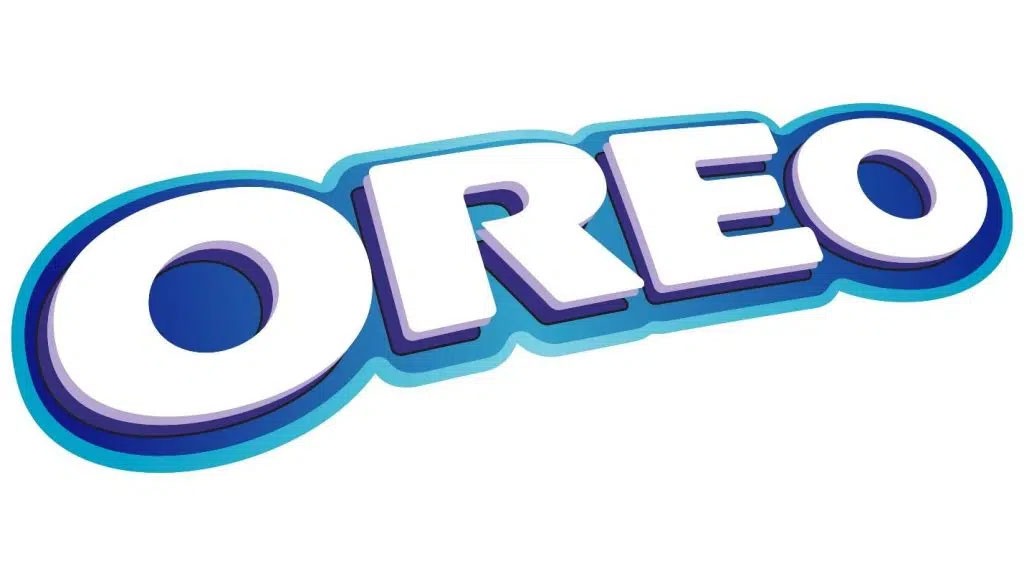
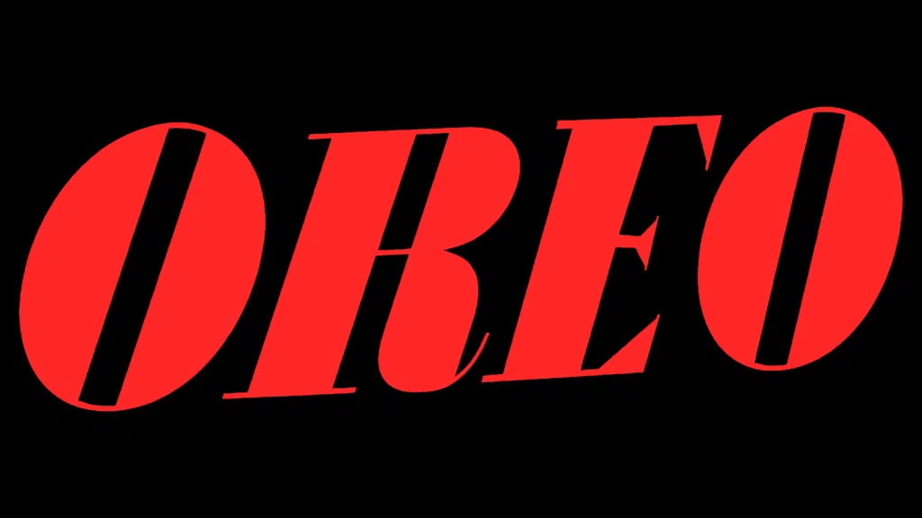
12. 2024-present
There aren't many brands that have had quite so many very different logo designs across their lifetimes – but it's an evocative journey through consumer history. Of course, it hasn't changed much in recent decades due to new understandings of and best practices around consumer habits and brand recognisability. It makes me yearn for a time we saw dramatic design shifts in the world's biggest companies.
For more, see our logo histories page – full of logos past from the likes of Coca-Cola, the NBA, Apple and more.
Which is your favourite? Would you like to see design be more agile or do you think big brands always need to keep their logos the same?