
Mac – Free
Want more apps? Check out our hand-picked lists:
- Best iPhone apps
- Best iPad apps
- Best macOS apps
- Best Apple Watch apps
There was a time when I used to download every productivity app I could find, buying into the promise of an easier and more enjoyable working day. But that, inevitably, lead me to even more overwhelming habits rather than added clarity. This year, I’m going for a less is more approach – and I know I’m not the only one.
One app that’s incredibly minimal but has quickly become invaluable is Tot. It’s an innovative little text management app that seamlessly integrates into your Apple ecosystem. I think it’ll make the biggest difference to the way you use your Mac, but you can also use it on iOS and the Apple Watch, too.
But what does it actually do? I like to describe it as the digital equivalent of a little notebook by your side. A simple tool for both collecting and editing text.
Simple yet packed with features
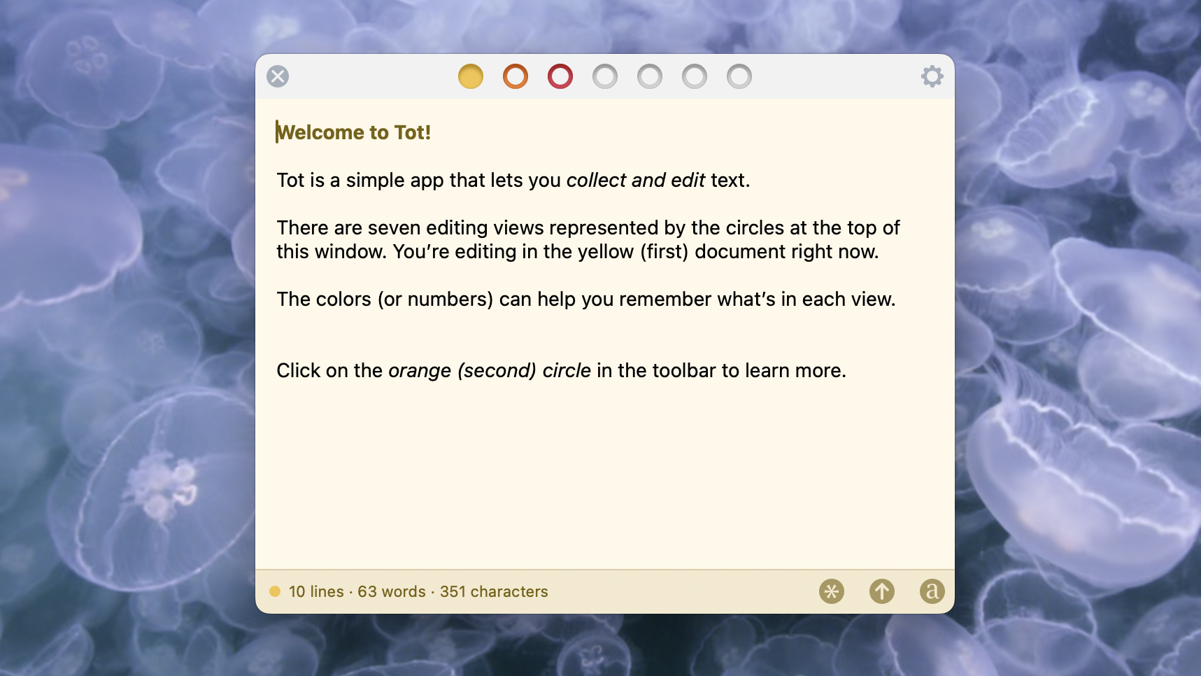
Tot has a single window design that can be kept tucked away in your menu bar or dragged to wherever you need it. There’s also a ‘floating window’ setting that ensures Tot is at the forefront of whatever you’re working on, ideal for taking notes.
You’ll find simple and intuitive formatting controls, like italics, bold and a single font – although you can change that default font whenever you like or even work in plain text.
One of my favorite things about Tot is you don’t need to hunt through scattered text fragments to find what you’re looking for like you would with an offline notebook. Instead, Tot works on a simple organization system with seven color-coded dots.
These dots are present at the top of each note, but one is shaded in to show you instantly how you’ve categorized it. I like that this isn’t a prescriptive system, but instead gives you an elegant way to keep things arranged how you want them. For example, you might choose to mark job lists blue and brainstorms red.
Another feature I love is that you never have to hit a save button. Everything you enter into Tot is captured when you stop typing and then available across iCloud and accessible from your other devices where you use Tot.
There are a surprising number of features and customization options available in Tot considering it’s such a minimal app. But that’s the whole point. There’s plenty you can tweak and change to ensure it works well for you, but all you see is a clean design that works incredibly well. If you only download one new app for the new year, make it Tot.


