What you need to know
- Threads has pushed a change to its desktop UI that wastes a lot of space in the app's view.
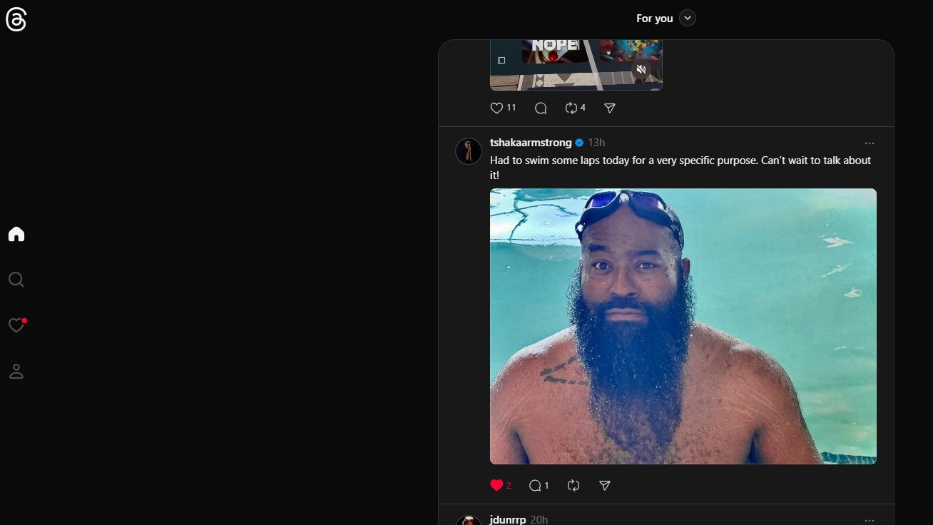
- The feed is still centered, however, users can only change the type of feed in a drop-down menu nestled above it.
- The remainder of Threads' UI is thrown off to the left side, mirroring the likes of Instagram on computers.
Threads has pushed an update to its user interface on the desktop and is giving us Instagram vibes.
Android Central's Nicholas Sutrich spotted the change earlier this morning (May 31) and made note of the sheer Instagram callbacks. For one, Threads on PCs now looks like it's designed purely for the vertical screen, such as Android smartphones. Sutrich noted the increased amount of wasted space surrounding the Threads feed, which can be changed from "For You" to "Following" and more.
Users can quickly rediscover content they've "liked" or "saved" through that drop-down menu.
The feed is still centered, however, those feed settings are now the only piece of UI remaining at the top in a drop-down menu. Other options, like Home, Search, Activity, and your profile are now off to the far left side vertically.
The new post button is nestled on the bottom right of the screen.
Threads has also implemented some slight color alterations, with the primary feed becoming a little lighter than the background in light and dark mode.


Instagram has looked like this for a while now on desktop, with its primary feed centered, stories on top, and other UI elements tossed to the left side. While Instagram's version offers a lot of space, it's taken down a bit due to its written-out feature names and a box of suggested profiles on the right.
The old Threads view was much more confined, featuring everything one would need in the center of their screen on a PC.
Additionally, there's a chance Threads is trying to appease foldables and other tablet UI devices with this change. How Instagram's desktop UI functions for such devices fits perfectly, so maybe we should've seen this coming. Threads' new UI for computers seems widely available now.
In other news, Threads rolled out a feature that allowed users to limit who could quote their posts on the platform earlier in May. After posting, the owner can select a few options: Anyone, Profiles you follow, and Mentioned Only. What's more, X (formerly Twitter) users will recognize this.
Instagram's head, Adam Mosseri, stated the change is designed to let users "restrict others who look to demean or troll them, a safe space to share thoughts..."


