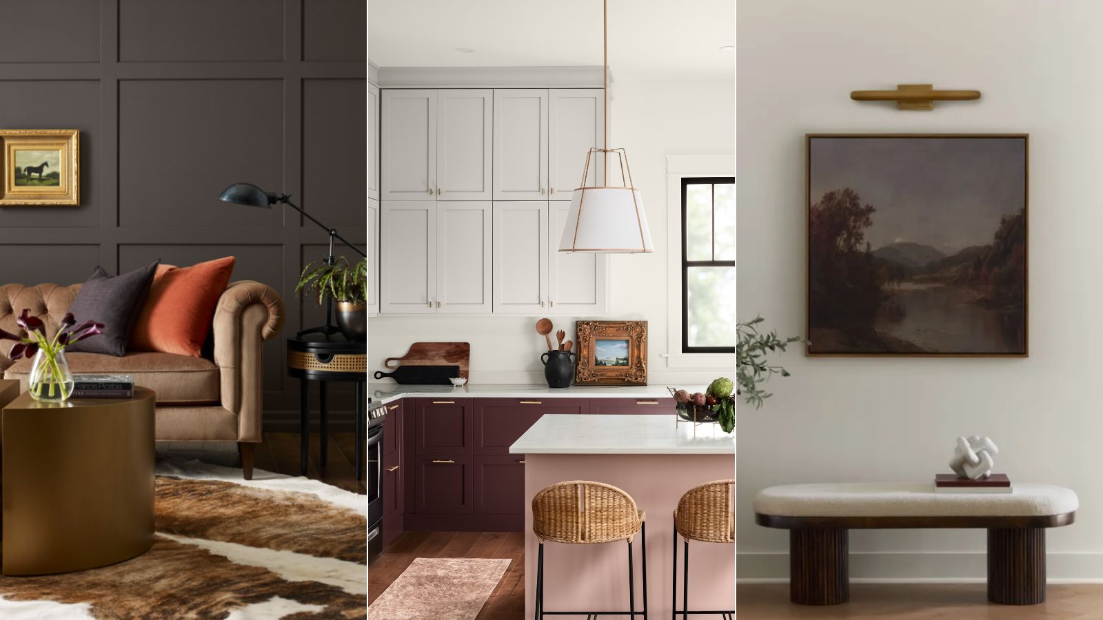
The world of paint colors can soon become overwhelming, with trend-topping hues continually evolving. However, turning to timeless paint colors is a great way to create a sophisticated home that holds its own amid quickly passing trends.
Sherwin-Williams has just revealed the perfect paint palette to embrace timeless room color ideas, named 'Quiet Elegance'. Spanning five sophisticated, enduring shades, this palette offers longevity and lends itself to many design styles and house types.
We spoke to a Sherwin-Williams color specialist to round up all you need to know about each of the subtly sophisticated shades, from warm whites to darker hues.
Creamy SW 7012
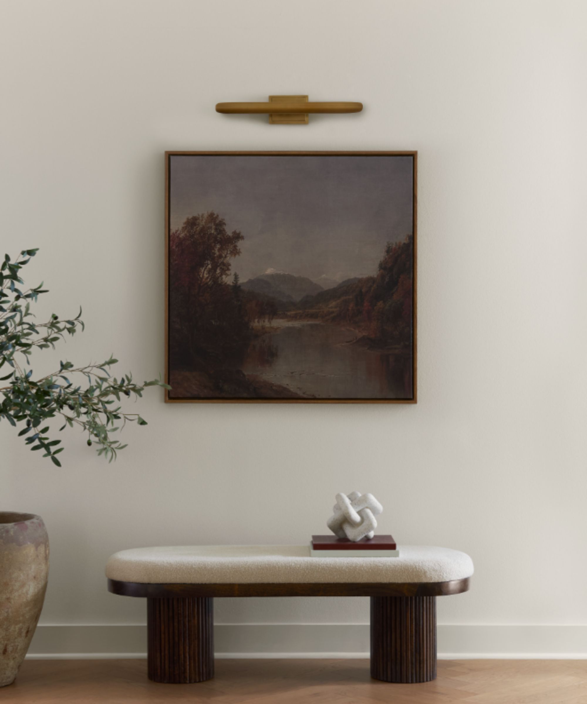
'Creamy SW 7012 tells a story of quiet elegance as a bright and inviting white with a delicate yellow undertone, creating a subtle warmth in any space,' explains Emily Kantz, Color Marketing Manager at Sherwin-Williams.
'It’s a beautiful foundational shade for homeowners looking for an upscale palette, timeless or modern. Creamy SW 7012 is a chic shade that can be carried throughout the home to connect each space while still adding deeper tones or unique furniture pieces. Also, consider layering the other neutral hues for a style that feels comfortable and yet sophisticated,' says Emily.
Creamy was also named Sherwin-Williams' January Color of the Month, making it a go-to warm white paint for the year ahead.
Keystone Gray SW 7504
While cool gray paints can feel cold and drab, the world of warm gray paints offers a welcoming feel with a modern edge, such as Sherwin-Williams' Keystone Gray.
'Keystone Gray SW 7504 balances out the quiet elegance palette as a warm gray,' explains Emily. 'It pairs well with lighter neutrals like Creamy SW 7012 and Minimalist SW 9611 while acting as a foundational shade for deeper hues like Sealskin SW 7675 and Carnelian SW 7580.'
Neutral paints like this one are versatile to use in almost every room, but Emily adds that it makes a perfect choice for social spaces: 'I’d love to see this shade in a dining room, carried into a kitchen or living room with accents of deeper shades.'
This gray paint is far from cold. With plenty of warmth, it appears as more of a greige paint color.
Sealskin SW 7675
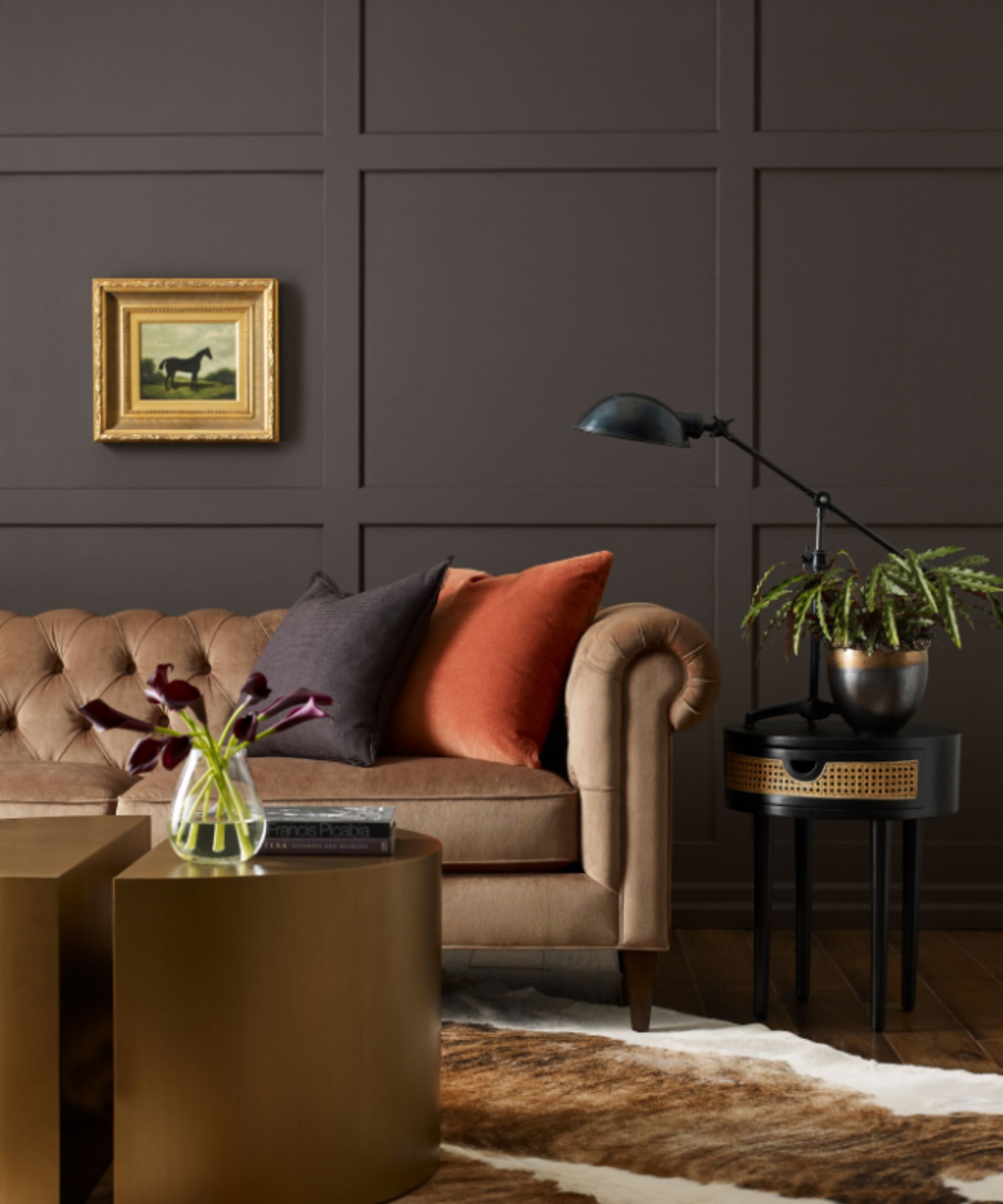
A dark brown paint, Sherwin-Williams' Sealskin is a sophisticated way to make a statement with your paint ideas. Whether you use it as an accent color or to color-drench a space, it's bold yet liveable for a timeless look.
'Sealskin SW 7675 is a deep and bold brown that is sleek and refined,' says Emily. 'It creates a sophisticated and warm environment that is bold yet understated, making it a perfect fit for the quiet elegance palette. Dark shades like Sealskin SW 7675 are gorgeous in smaller rooms like studies, or TV rooms to create that cozy environment.'
Minimalist SW 9611
Another light neutral paint by Sherwin-Williams is Minimalist, a warming neutral that provides more depth and interest than white paints.
'Minimalist SW 9611, a part of our Designer Color Collection, is a creamy and earthy neutral that is rich and decadent but grounding for any space. I love this shade in a bathroom or bedroom for a cozy and comforting atmosphere that is upscale and elevated. With hints of natural accents and pops of gold, this color brings to life quiet elegance,' explains Emily.
If you're looking for an all-around neutral paint that's not too yellow but still warms rooms, Minimalist should be on your radar.
Carnelian SW 7580
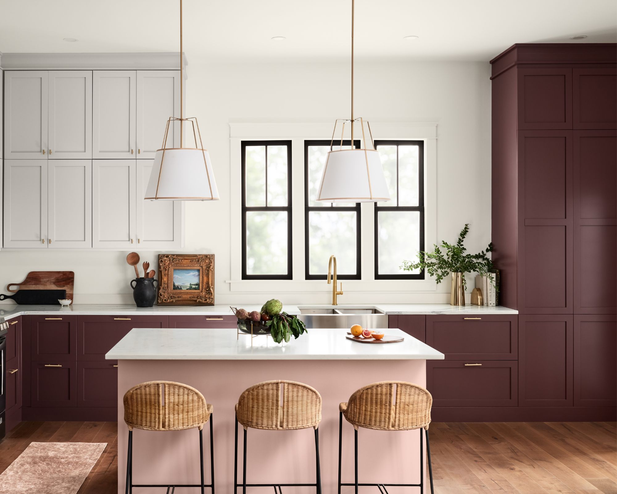
Lastly, if you're looking to add a more colorful, bolder hue to your scheme, Carnelian is an elegant and moody maroon paint that adds sophistication to your space, as seen here on the kitchen cabinets.
'Carnelian SW 7580 is a deep maroon with hints of red, purple, and brown undertones that give a rich and vibrant feel to any space. I love this shade for a kitchen because it is a daring and mysterious hue, but the deep saturated violet really pops on cabinets. Consider incorporating Carnelian in a home office or powder room to create a more dramatic dose of understated elegance,' shares Emily.
Together, and alone, these shades both lean into the current trends but also feel totally classic too. The blend of bold, rich, deep hues with contrasting liveable warm neutrals is a color palette that's never going to date.