Their house search was four years in the making. But one rainy October afternoon, this couple walked into the charming farmhouse of their dreams. Nestled in the Somerset countryside and with sweeping views, the property is a five-bedroom 280-year-old farmhouse, complete with an annex. Previously a small farmhouse cottage with outbuildings, it has now all been sympathetically merged together to create one home.
‘It just felt like home the minute we stepped through the door,’ says the owner, who makes and restores furniture.
The couple had been living in London, but wanted the benefits of city life with the peace of the countryside. The rural outskirts of Bath seemed to be the perfect fit. ‘We were looking for a change of pace in life,’ says the homeowner. ‘This house has given us so much more than we ever hoped for. It has brought us happiness and a better balance with family, friends and work.’
Renovating and future-proofing the building
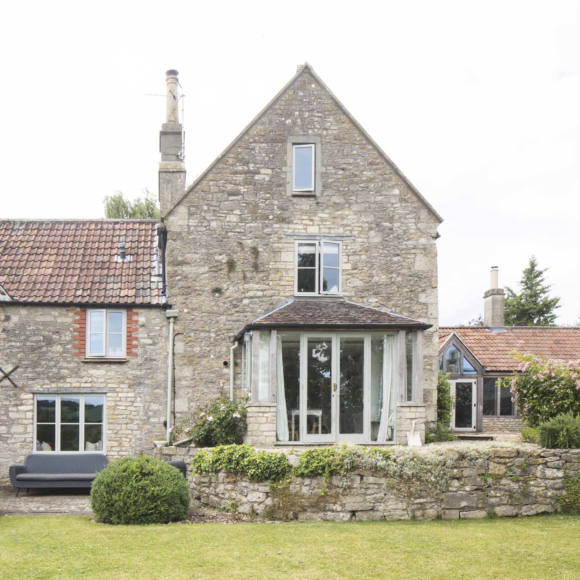
Renovations began in the summer of 2018. ‘The house had been well lived in but was starting to look tired and needed some updating, as well as better cohesion,' says the homeowner. ‘We wanted to improve the flow and make it feel more like one property rather than a number of buildings being put together.
'The previous owners had done lots of the heavy renovating for us. But each room needed a complete overhaul from skirtings, plastering, doors, radiators and windows, to the usual cosmetics. We have restored beams and original features but also tried to future-proof it. We’ve packed it full of insulation and we found out how to pick the perfect windows for energy efficiency, as well as hanging thick curtains.’
Planning the decor and colour palette
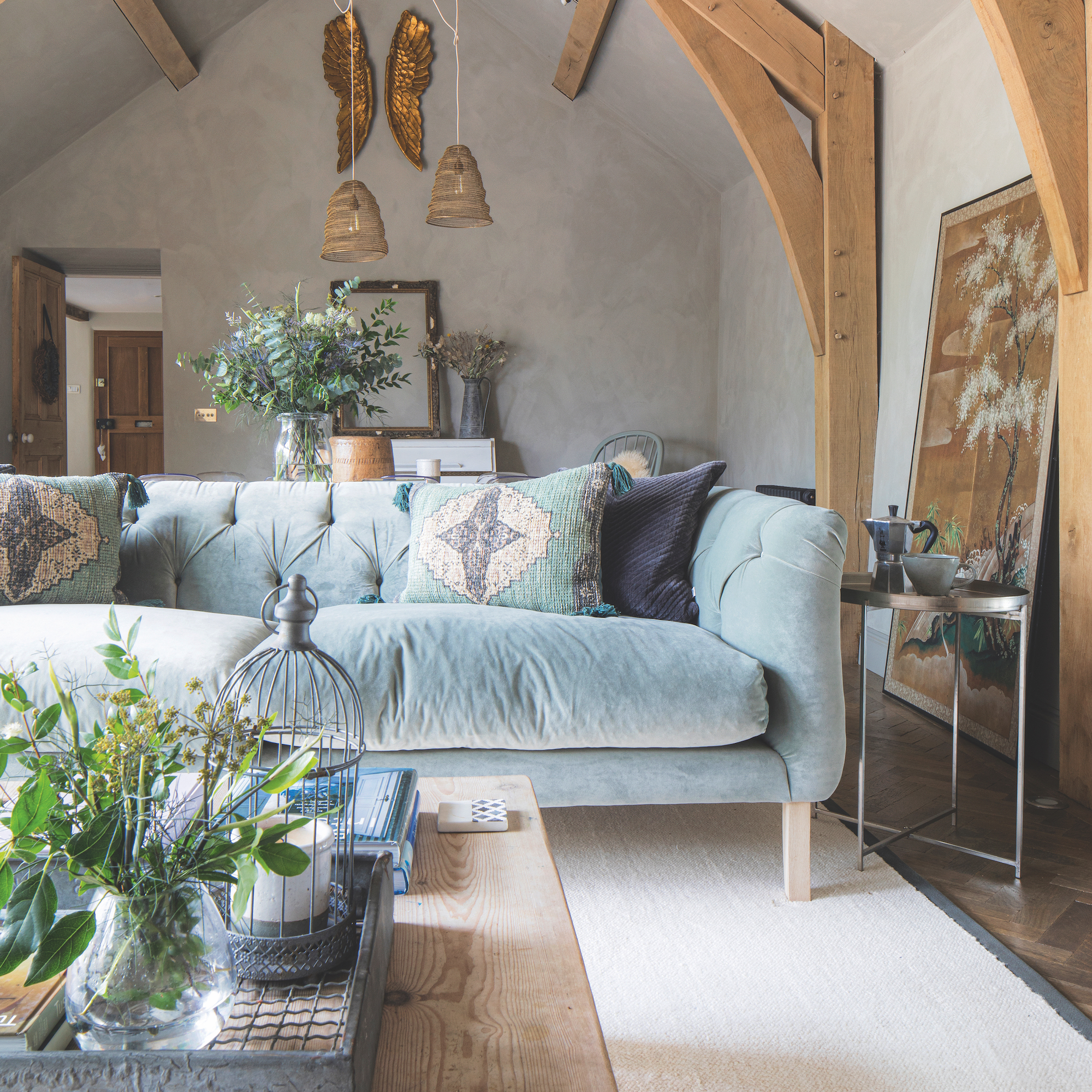
The owner established a primary colour palette of calming white, black, green and neutral hues to create living room colour schemes that also work for every space.
‘The house needed synergy,’ she explains. ‘I made an initial plan before I started anything, moving from blues and greens downstairs, to washed pinks and warmer neutrals for a pastel colour scheme upstairs. I always use the same white and off-black throughout to create a memory of colour as you move from space to space.
'I then set a tight palette of four colours of paint – white, black, green and neutral, then expanded on it as I understood the flow and the spaces that peel off the central zones. It’s important to move seamlessly from one space to the next, and for colours, tones and patterns to link.’
Open plan living and dining room
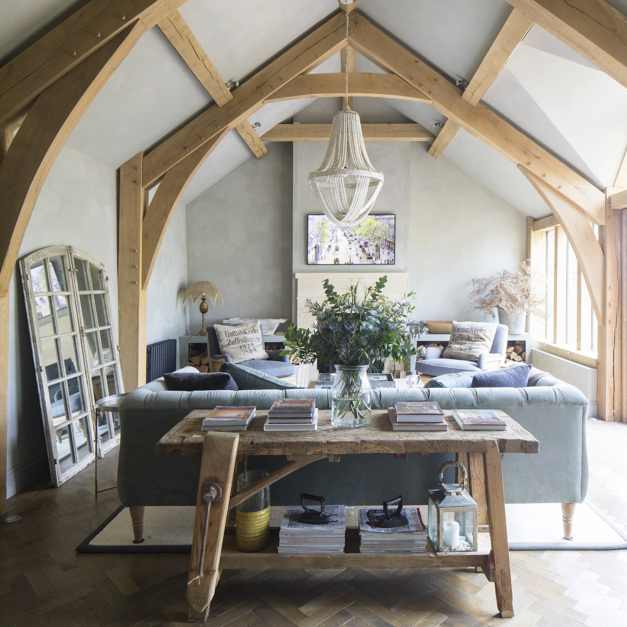
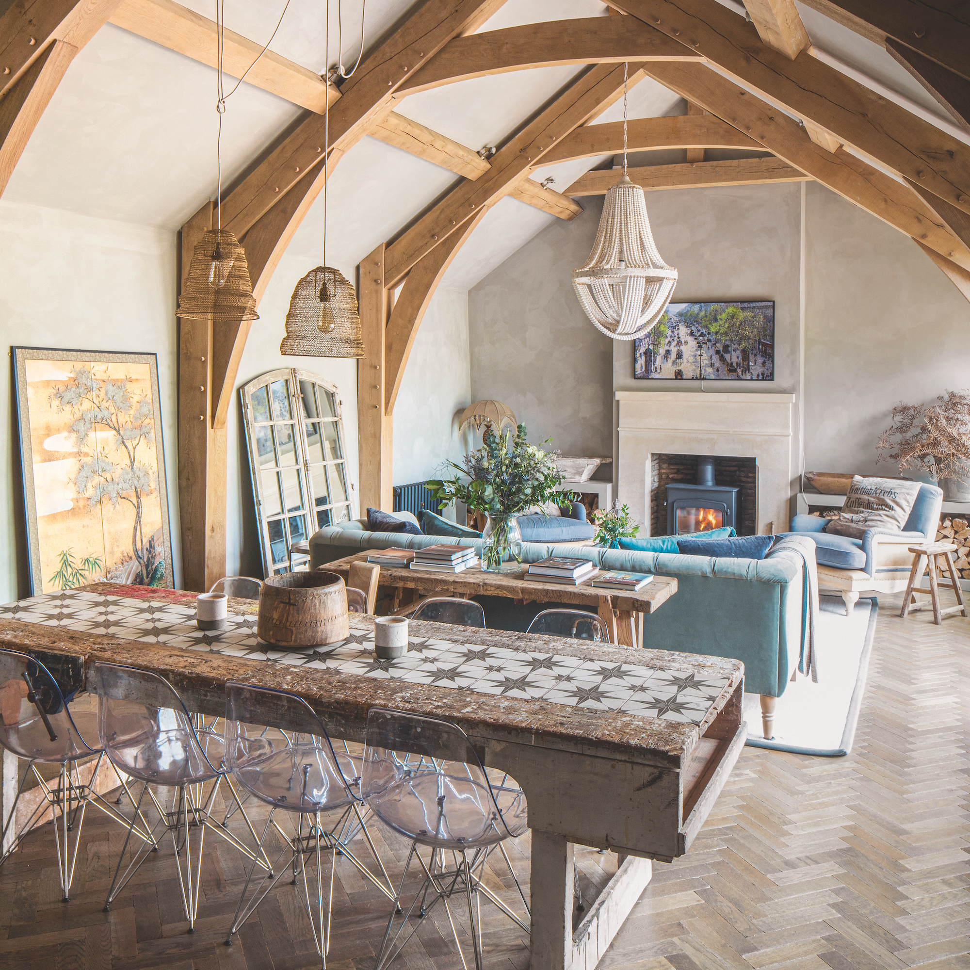
Light streams through the windows and French doors, giving this former milking barn a new lease of life. To create this living space, the timber frame inside was replaced, the roof and walls were replaced, add the fireplace and new windows added. Even the beams were replaced for ones that looked more in keeping with the style and age of the house.
By raising the beams and timber frame to follow the angles and slopes of the ceiling, the owners have created a chapel-like effect that draws the eye up and across, as well as echoing the design of the parquet flooring.
A blue sofa brings softness to the neutral living room.

The owner bought this workbench on a whim, with the aim of upcycling and selling it, but the 3m beauty stole her heart and now lives in the living room. Cut down to the height of a standard table and with repaired joints, she then chiselled out a runner and added tiles for a bespoke feel.
The large mirror balanced against the wall bounces the light around but also creates a secret garden feel to an otherwise plain wall.
Snug
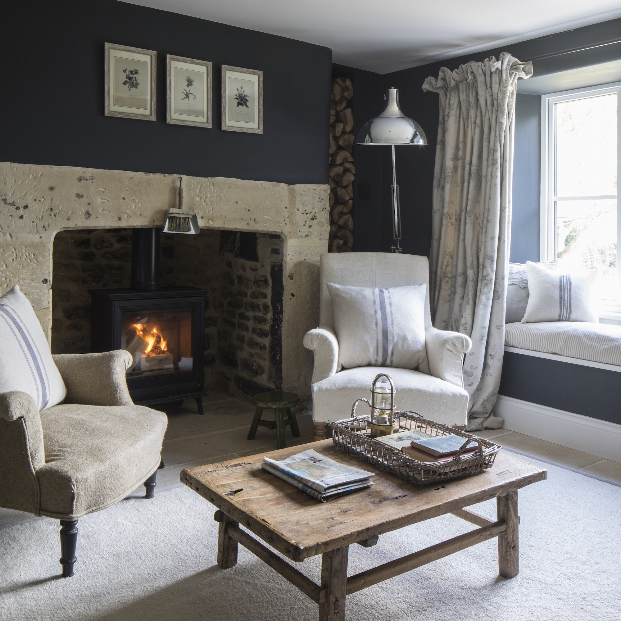
The snug is both Alice’s favourite room in the house and the most used. The original fire was recently replaced by a log burner to generate more heat – one of the advantages of a wood-burning stove.
The room benefits from plenty of natural sunlight throughout the day and so the dark and dramatic wall colour balances the intensity of the sun. The owner picked up on the trend for black living room ideas in this space.
'The snug needed a deep dive cosmetically but now we spend huge amounts of time in here as it's cosy and near the kitchen,’ she says.
Kitchen
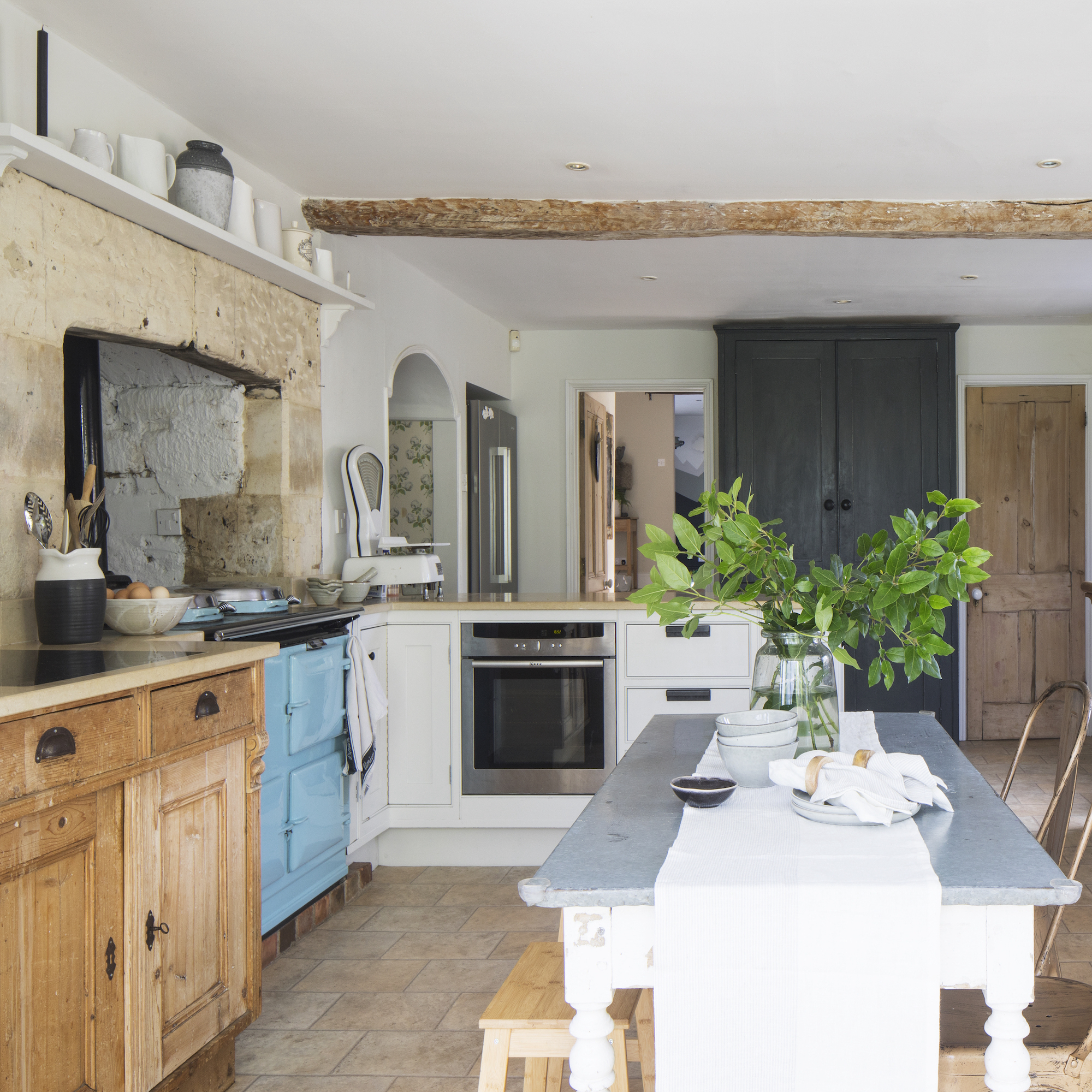
A mismatch of country cottage colours and textures creates a homely and welcoming feel that's typical of the best farmhouse kitchen ideas. Although there are plans to redesign and overhaul the kitchen, for now the owner has painted the units and added shelving to make the room work harder for the family.
The Aga was inherited with the house – the fresh blue contrasts against the crisp white of the kitchen units and the natural texture of the stone tiles. The mellow colour palette is emphasised by the wooden kitchen worktop ideas and darker kitchen floor tile design. Open shelving instead of wall units makes the space feel bigger and encourages light to fill the room – a great example to consider in the open shelves vs wall cabinets debate.
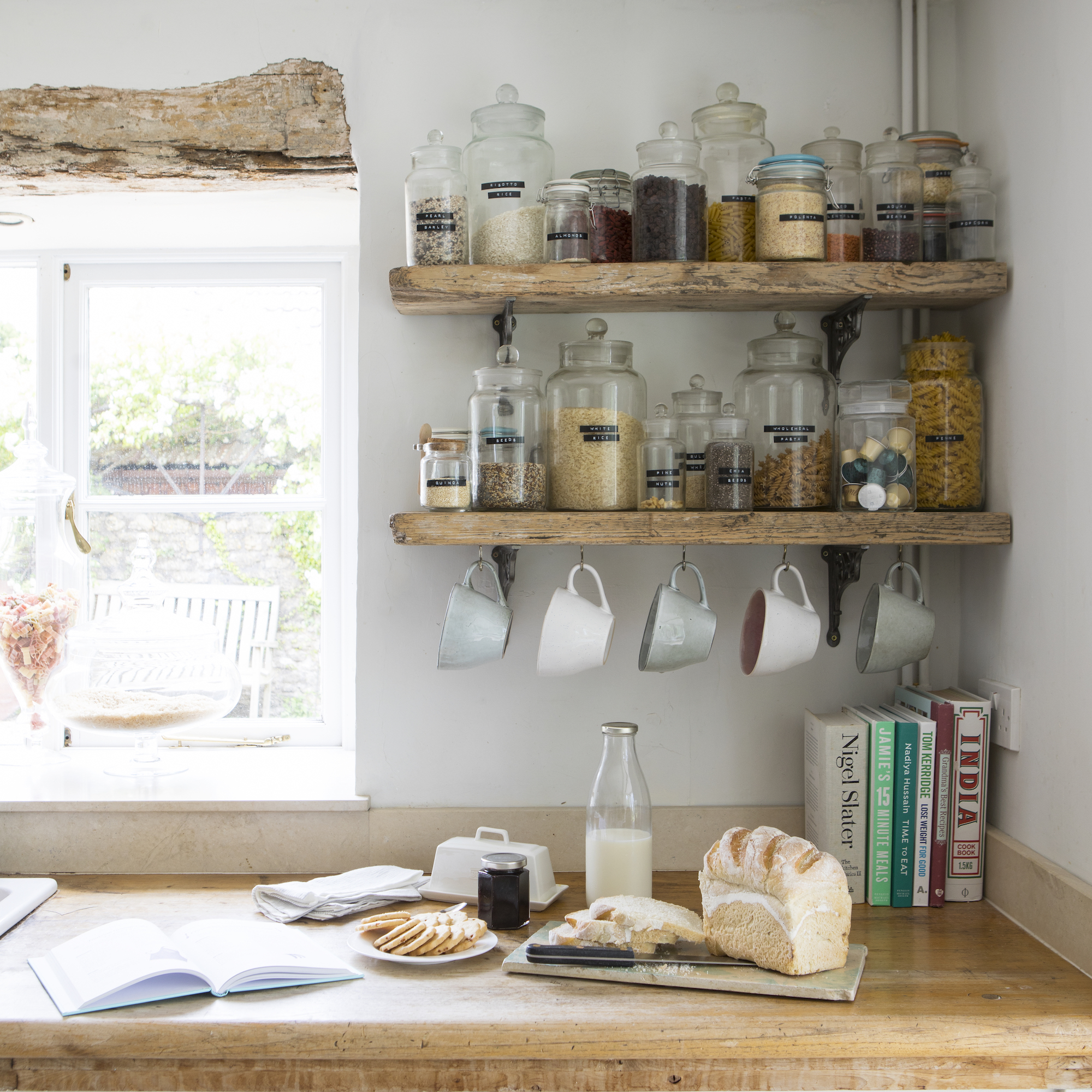
The wooden kitchen shelving was made from boards that the owner's builder left behind, with brackets sourced from eBay. Regularly used ingredients are clearly displayed and labelled in glass jars – one of the most simple but effective kitchen storage ideas – saving time when cooking for a busy family.
Staircase
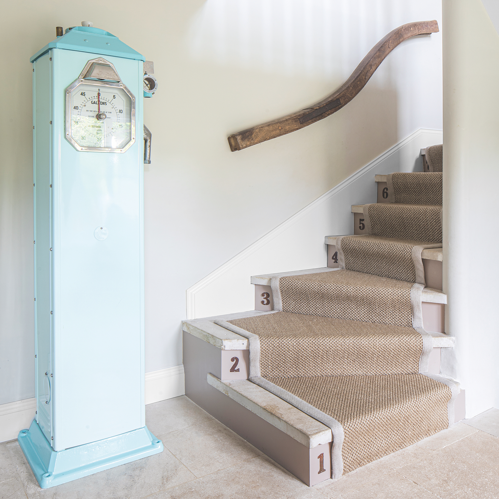
The owner added interest to the restored staircase by drilling metal numbers she found in a market onto the steps and screwing them on. The 1930s petrol pump was lovingly restored by her dad.
Main bedroom
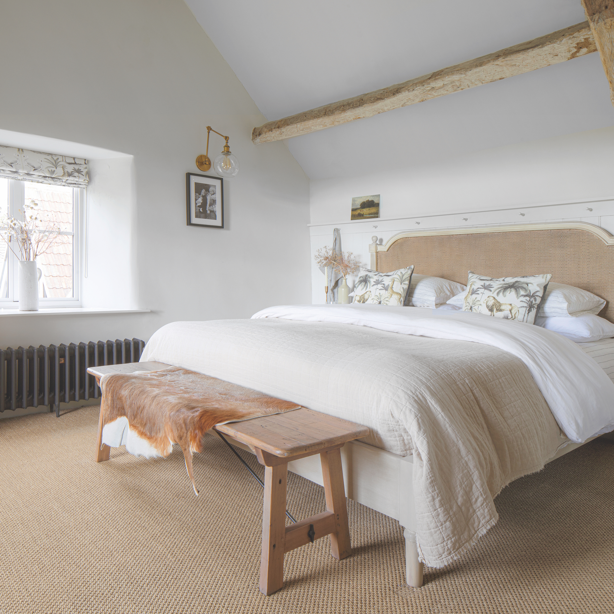
The gentle tones teamed of this cream bedroom create a calming retreat for the couple. Apart from the beam roof structure, Alice felt that the room was lacking in texture and so decided to introduce a wall panelling ideas behind the bed for interest. Adding pegs to the panelling not only serves a practical purpose but introduces a little flair to the traditional panels.
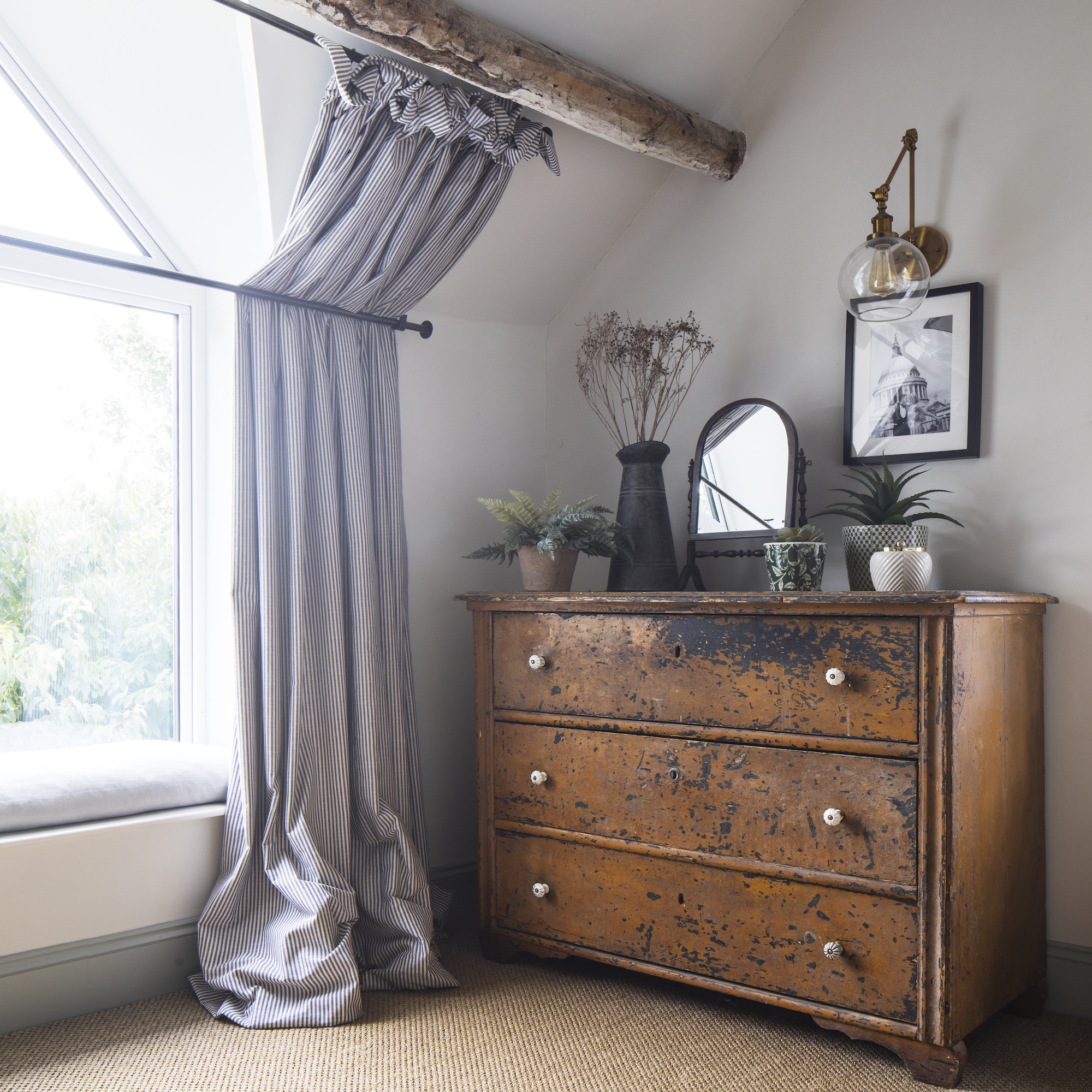
As well as choosing blackout fabric, the owner's bedroom curtain ideas include bars that hold the curtains back, created by a local blacksmith. This unusual tiered effect allows the couple to benefit from their blackout curtains fully. The curtain poles were made without joints in the centre – it is one continuous pole without a centre bracket. The top acts as a ‘normal’ curtain pole, whereas the second pushes the curtain back behind and follow the shape of the walls.
En-suite bathroom
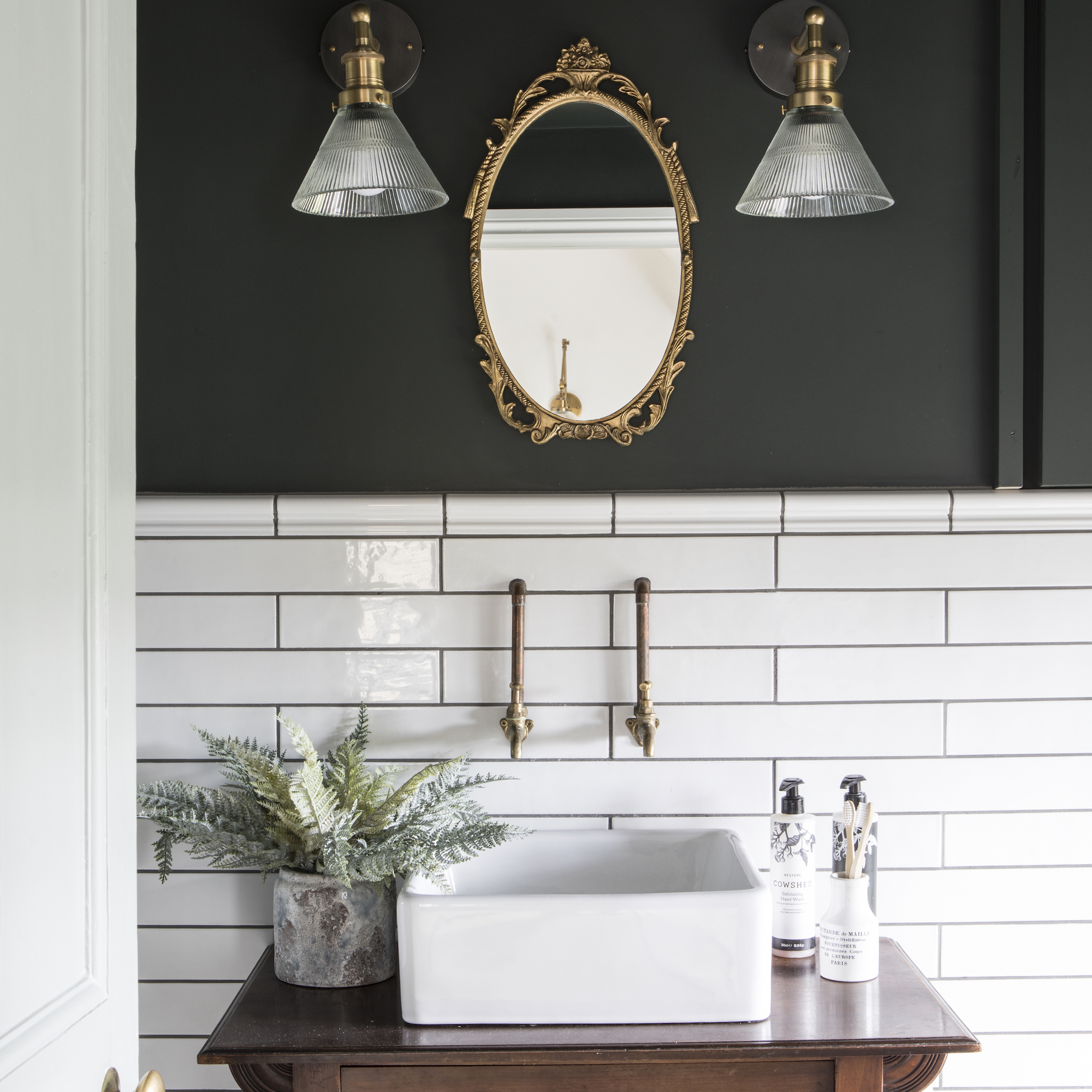
The owner removed the bath in the en-suite and moved the door to create a larger space. Handily, there is a secret cupboard and shower shelf tucked away in a nook to hide bathroom essentials. The white bathroom tiles were chosen for their timelessness, but the painted walls allow for flexibility with the colour scheme.
Guest bedroom
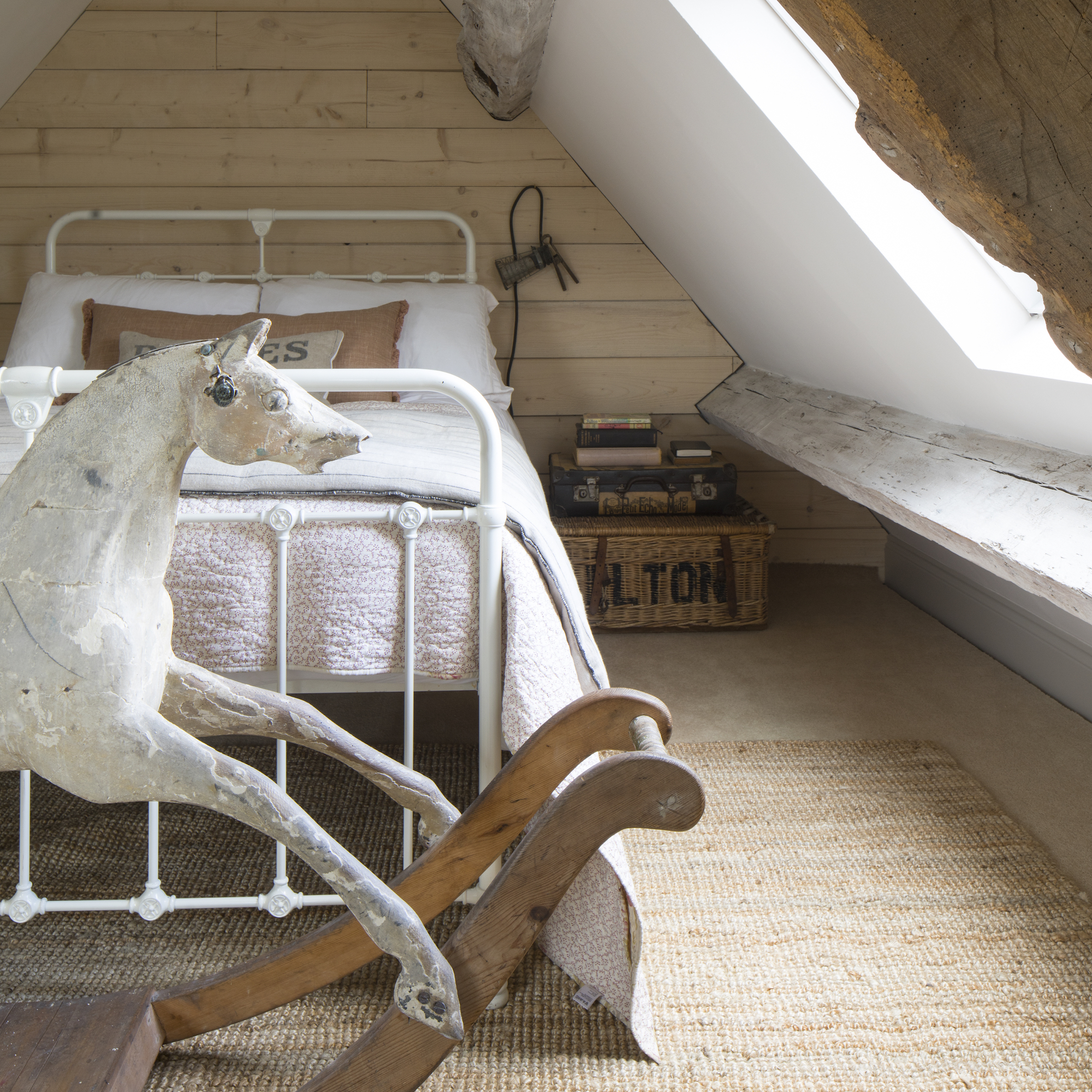
A warm colour palette creates a welcoming and cosy spare room for guests. The wooden feature wall draws the eye upwards and mimics the shape and structure of the room and beams. The rocking horse is a family hand-me-down which the owner is currently restoring.
Children's bedroom
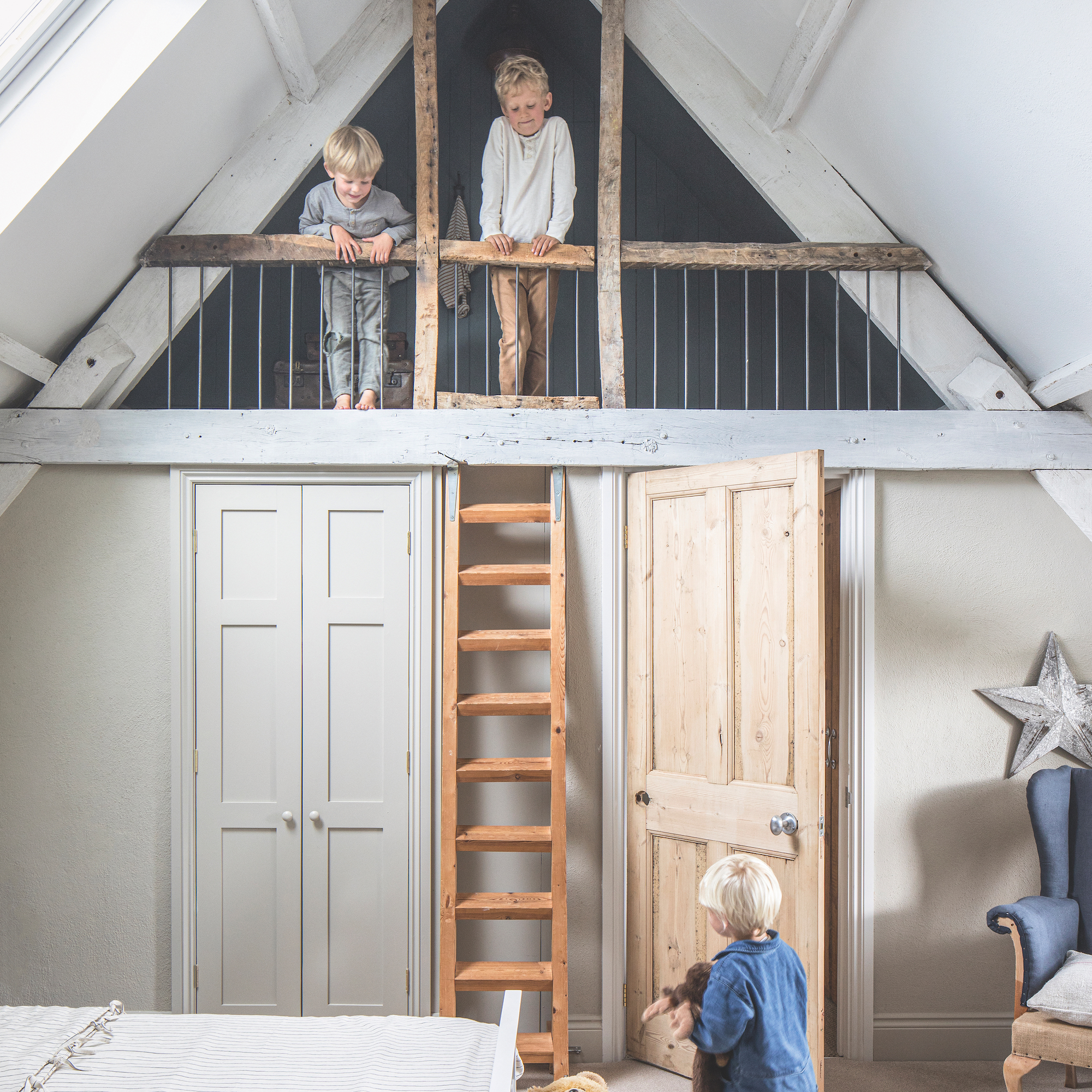
The mezzanine feature is the star of the show in this room – it was constructed by the previous owners, but the couple added in some essential safety elements and fitted carpet.


