San Francisco may be famous for its painted Victorian Ladies but less ostentatious, early 20th century Edwardian architecture lives here too. This Pacific Heights residence serves as a pied à terre for a couple with three young children whose primary home is in nearby Atherton, the poshest zip code in the nation.
Brought in together, MEMarchitecture and Studio Volpe interior design collaborated to reconfigure warrens of rooms and the patchwork renovations of previous owners to create a modern interior. It accommodates a tight-knit family, amps up the quality and coherence of finishes, and creates a canvas for the client's extensive collections of furniture and art, mixing old and new acquisitions.
Change began with MEM's reactivation of the central stair and the home's natural verticality by more than doubling the size of an existing skylight. It illuminates the core and emphasises the path upward to social spaces at the top. They also opened large portals across the top floor to create a luminous series of open rooms pointed toward magnificent views in four directions.
While making the house feel whole, consistent and connected, Volpe's office still gave rooms their own identities and mapped out functional zones within open spaces using vintage and custom furniture groupings. Volpe's team also united historical and modern elements, while inserting the office's own bespoke furniture and millwork, including sleek wood panelling. They created a sense of comfort and balance by creating a consistent imbalance - an ecosystem of eclecticism - that is applied with engaging texture throughout.
Inside Green Street Residence
The Entry
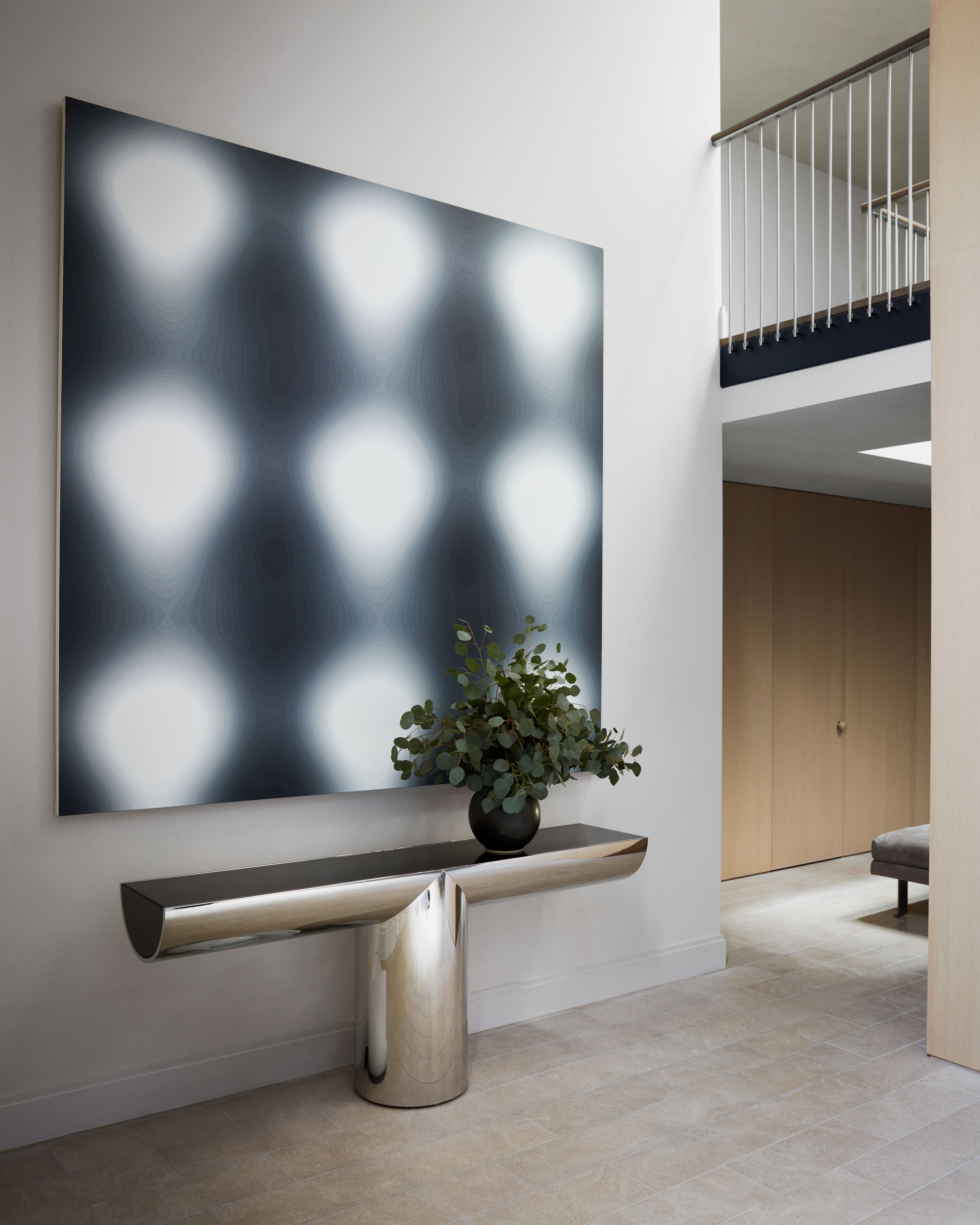
The entry at ground level is vertical and voluminous, with MEM's skylight drawing visitors quickly to the house's social spaces on the fourth floor. It unifies three volumes: private rooms at street level, the stairwell, and living space at the top. The entry once felt disconnected. Now it announces a new coherence and clarity of finishes and establishes the palette and tonality that appear throughout. 'It no longer feels like a space you want to move through quickly to get somewhere else,' Volpe says. Millwork unites three crowded doors to feel orderly instead of disjunctive. Today, says Design Director Ralph Dennis, 'It looks traditional from the street, but you walk in and you're struck by the clean, modern feeling inside.'
Pocket Office Abutting the Playroom
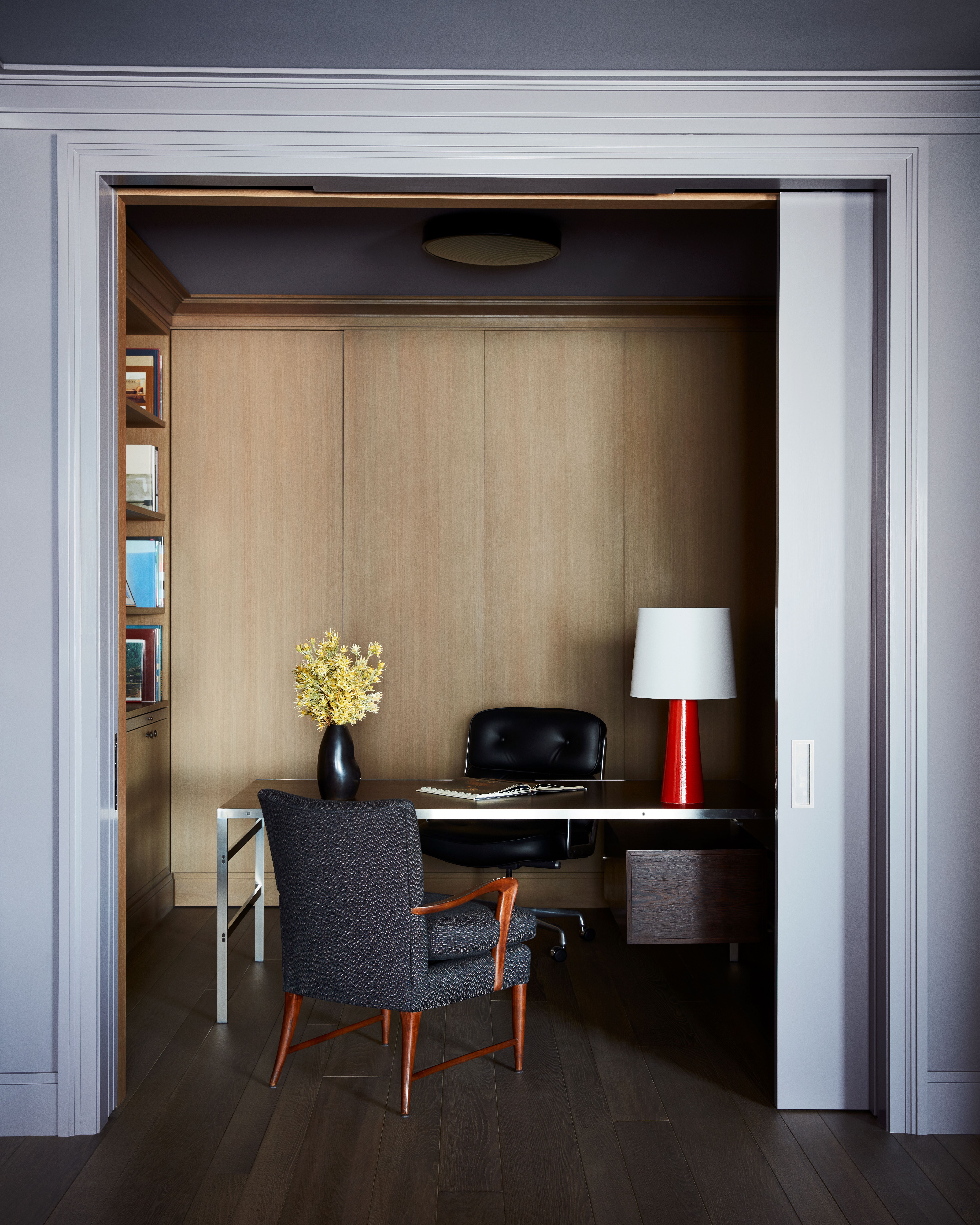
'It's a small space that feels cocoon-like, but is still very much part of the room,' Volpe says of the second floor alcove office, which is connected to the playroom by pocket doors. It can be closed off from the rest of the house and used for calls or privacy, however, it's usually open. The space is about togetherness, not disconnection.
It's also a studied composition framed by custom fumed oak flooring, built-in, bespoke panelling, and a hidden closet. A midcentury executive desk by Preben Fabricius & Jørgen Kastholm sits beside a chair from Milan's Dimore Gallery and a 2015 table light designed by Belgian Jos Devriendt. "It's a simple gesture but the brightly coloured lamp is unexpected," Dennis says. 'It makes the room.'
Playroom

The playroom is not overtly childlike, but is still playful. One overt nod to youth is the boxy Champion foosball table, a reproduction of a 1955 French model. More subtle but just as full of moxy: the Michael Boyer Tube lounge chairs, moved in from the living room, Dennis says: 'Recontextualizing them in a playroom emphasises how fun, low and louche they are.'
Usually 'we look for things that transcend the time they're made in,' he says. Other times, conspicuous (but enduring) style is a good thing, like Ettore Sottsass' 1970 Lampros 3 chandelier here. Picked pieces can speak across time to each other in dynamic ways.
Enfilade through the 4th floor

The fourth floor was originally a warren of rooms. 'The idea was to blow that up and make it more loft-like,’ Dennis explains. Honouring the client's habit of spending time en famille, MEMarchitecture and Studio Volpe simplified the plan and created a series of portals through the floor, leading from the kitchen through the dining and living rooms, where three sets of French casement doors open onto the southern terrace, inviting the outdoors inside. While the teams primarily subordinated Edwardian elements to make the house more modern, this enfilade of openings of the same size and proportion, says Sharif, was ‘a classical treatment of a very modern space'.
The Kitchen
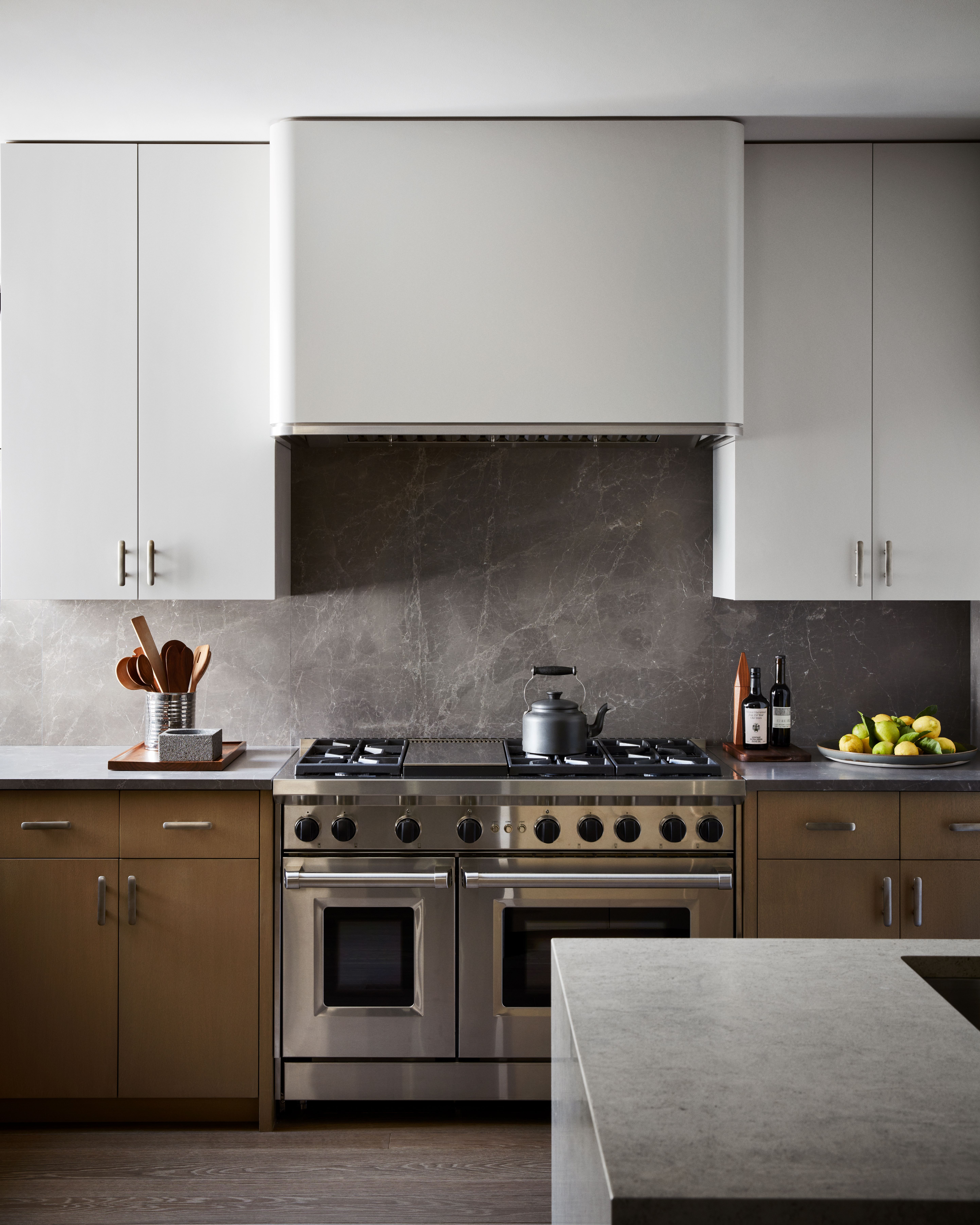
MEM and Volpe's team opened the kitchen to the new, unimpeded flow of the fourth floor. The studio is known for its hands-on approach, designing its own millwork and developing its own finishes. Volpe created a sculptural island that forms a subtle corridor, dividing the kitchen gently from the path of circulation. Instead of dropping pendant lights over the island, they kept fixtures close to the ceiling to preserve sightlines through the floor. Bleached oak cabinetry and limestone floors coordinate with finishes throughout the house, linking disparate spaces and creating a sense of calm.
Living Room West

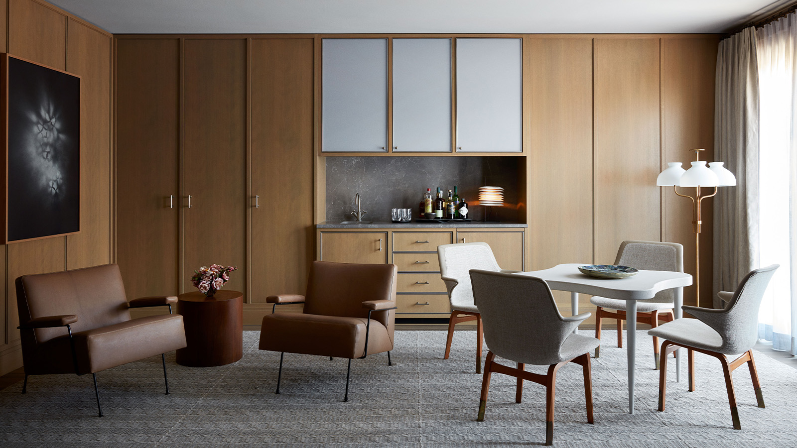
On the east side of the living room, a built-in bar and game table lend order to the open room. The whitewashed cork table, by Paul Frankl (1960), is where the client works on his laptop, sitting in Ilmari Tapiovaara's Lulu chairs. The Arenzano floor lamp by Ignazio Gardella is from Nilufar in Milan. A second seating area features Milo Baughman chairs in goat leather and his drum side table. Floor-to-ceiling millwork sets a swank tone, giving the whole space a playful formality. Throughout the house, panels serve as a neutral canvas against which an almost eclectic display of design and art is unified.
The Primary Bedroom
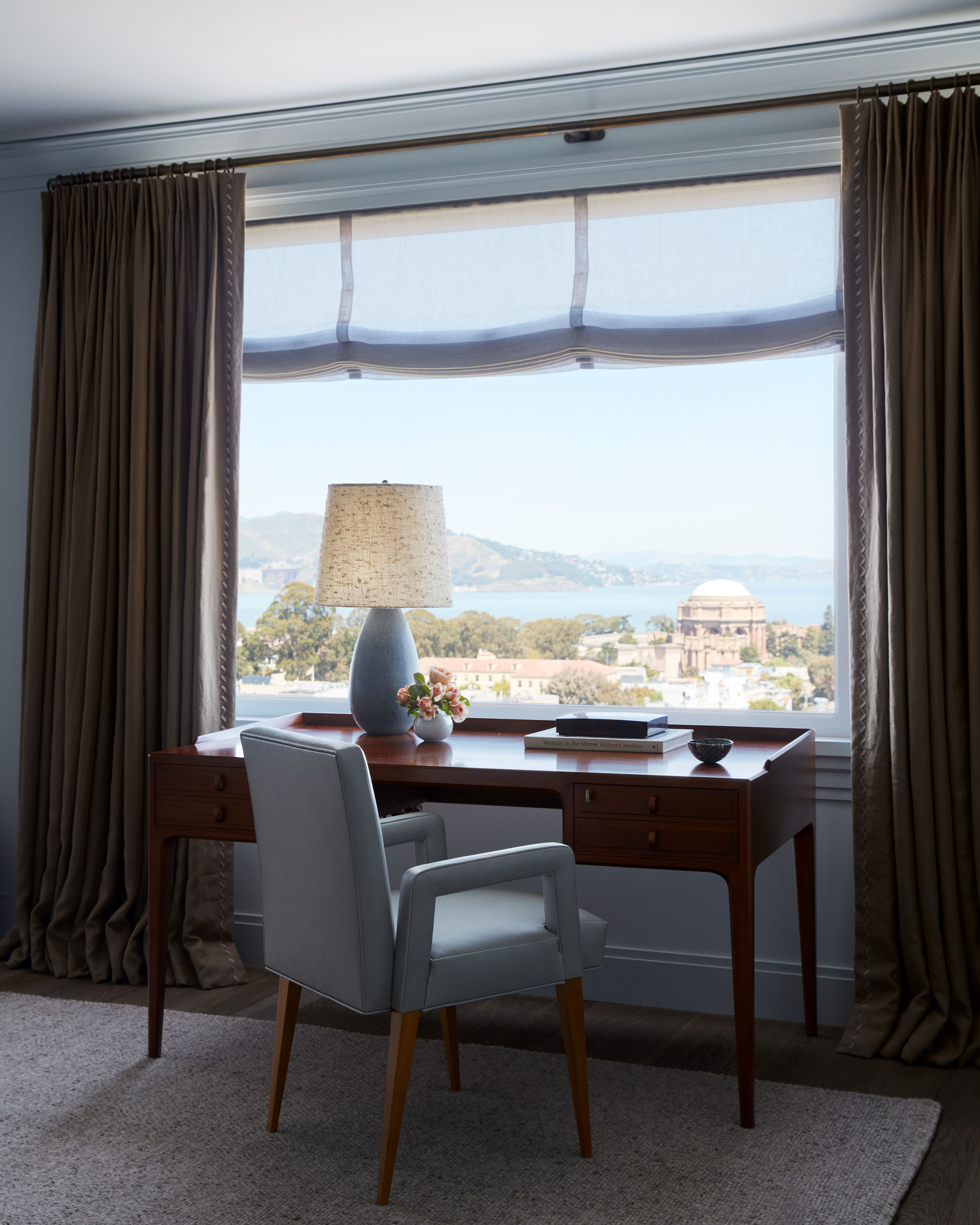
The teams joined two rooms to create the main bedroom. A midcentury Swedish Bertil Fridhagen desk anchors a seating group and fireplace, with the bed on the other side. The desk looks at the Bay and Palace of Fine Arts, a 1915 World's Fair site. Framing views and letting light pour in connects the house, and those in it, with uniquely local vistas and history. Pale blue hues resonate with the colours of water and sky outside, a palette that recedes, says Dennis, 'so you have an opportunity, rather than noticing all the furnishings, to observe the view and just feel where you are.'
Kids' Room

'Our client likes to provide experiences for his family and that helped drive our inspiration for the bunk beds,' explains Volpe, who designed the oak beds with porthole cut-outs that open sightlines and brighten. 'We punched holes through the frame to create window-like elements, which felt interesting without feeling traditional or closed off.'
The room has playful details but feels grown-up: A vintage Swedish sofa by Kerstin Horlin-Holmquist sits beside a Pierre Chapo cocktail table and a Studio B.P.P.R Elettra chair. The client acquired Danish designer Poul Henningsen's midcentury PH5 pendant light at auction.
Dining Room
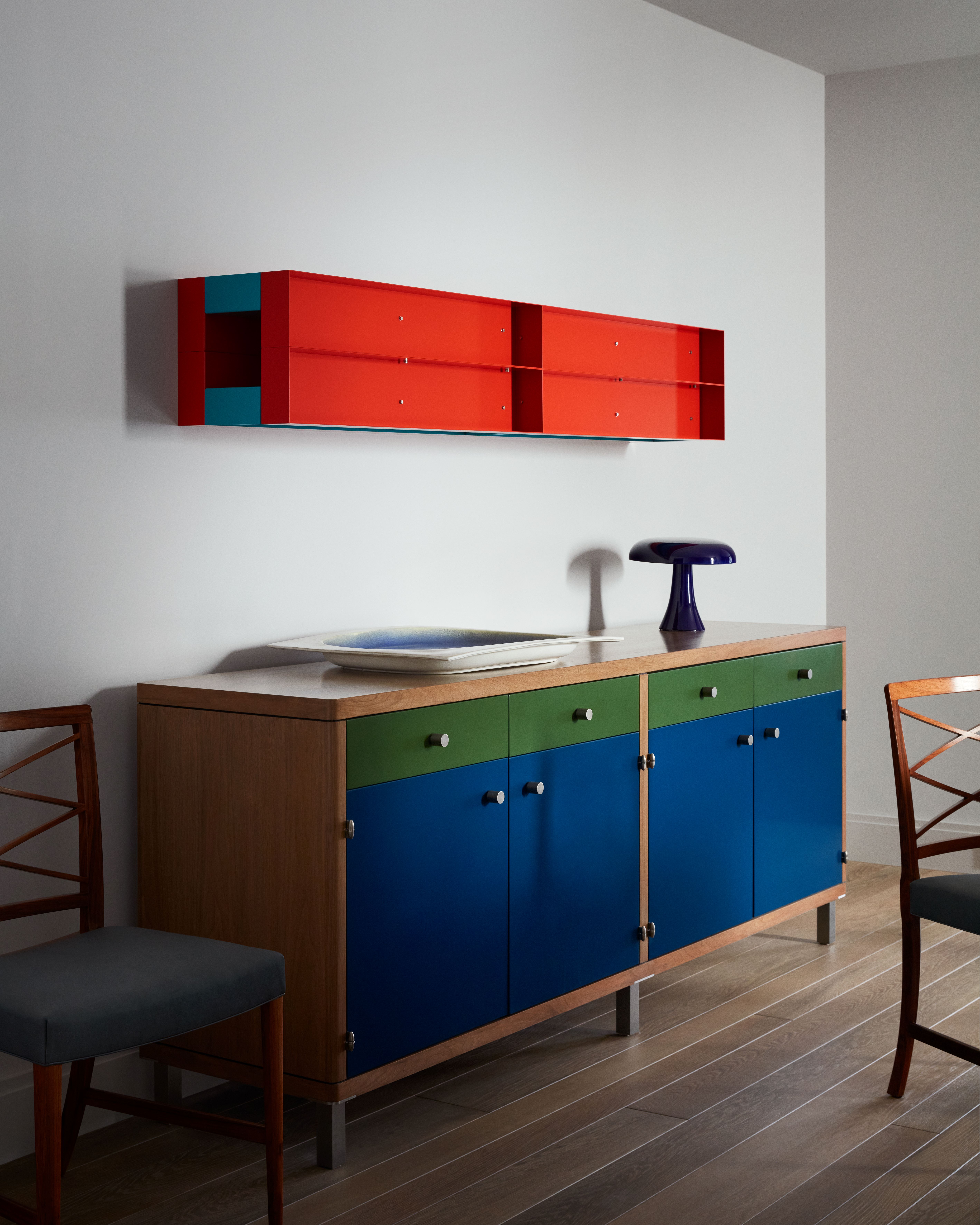
The design team used colour to animate the dining room. A purple glass cabinet by Roberto Rida and a Volpe-designed console were added on either side of the room. Placement of the scarlet sculpture by Donald Judd over the console was unplanned, a result of moving pieces between multiple homes to find a strong fit and to ‘reinvigorate’ the way the client views the art.
To do this deft remixing of old, new and custom design throughout the house, the team remains vigilant at all times. 'We're constantly weaving things together,' Volpe says. 'We're anti-formulaic, whether it starts with a single piece of furniture or an overarching concept.'


