We're used to being able to customize the UI on our phones and other devices as well as on individual apps, but our experience of the internet remains pretty standardised. With a few exceptions like dark mode and the ability to change sizes, we tend to all view websites in the same way. Perhaps until now.
A Mac-only browser is aiming to turn 'the' internet into 'your' internet, letting users change everything from colours and fonts to removing whole sections of individual sites. In theory, it will let us 'remix' any website to get the look we want – whether its owners like it or not (see the best 404 pages and best parallax scrolling websites for more web design inspiration).
The Browser Company's Arc browser aims to reinvent a tool we've been using for years, and it throws out several conventions. The familiar tabs at the top of the browser are replaced by a sidebar – a change that should feel fairly intuitive since it mirrors the style of mobile apps. Instead of bookmarks, you can organise the sites you use for particular tasks into 'spaces'.
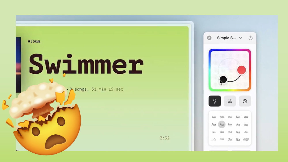
But perhaps the most radical aspect of Arc is its Boosts feature, which has been updated this week to make it much easier to use. Arc says it allows users to take control of the websites they visit, letting them quickly and easily customise the visual appearance of the site.
We should clarify that this isn't quite as revolutionary as it might at first sound. You can't completely redesign a website. You can, however, use the colour picker to change the background colour of most sites from the standard white or black as well as change text and button colours. In many cases, you can also change the fonts on the site. Perhaps not massively useful for many people, but it could improve the user experience for some. It could also simply be a lot of fun to play with. You can also share the Boosts you create with other users so they can use a site in the same way.
Perhaps the most useful Boosts feature is the “Zap” tool. This lets you highlight an element on a page that you don’t want to see and simply zap it away. It appears to be a little haphazard in its effectiveness, but it's a potentially powerful tool for streamlining our experience of sites and hiding annoying widgets or other elements. Those that know something about web design and code can use Arc's original Boosts feature to tweak things more accurately through CSS and Javascript.
Arc Browser "My Boost" feature is lit🔥🔥🔥 pic.twitter.com/oPZVc5MUzEMay 30, 2023
Muito interessante esta funcionalidade do Arc browser para personalizar o look & feel de qualquer website! pic.twitter.com/7Ch4WQqfb6May 29, 2023
Loving playing around with @browsercompany boosts 2.0 ..... Arc browser team taking the browsing experience to next level everytime.#arcbrowser pic.twitter.com/2ky0Z2md0lMay 30, 2023
The browser's approach reminds me of how fans are having fun modifying, and breaking The Legend of Zelda: Tears of the Kingdom, and I wonder what brands will think about people meddling with their carefully chosen colours and fonts.
The organisational features might prove to be the most useful contribution of Arc, however, making it one of those products that take a leap forward by questioning the conventional way we've been doing things for years. There's currently a waiting list for access.
For more web design news, see the stunning Minimoog website and the AI website builder that can apparently design a site from just a text prompt.


