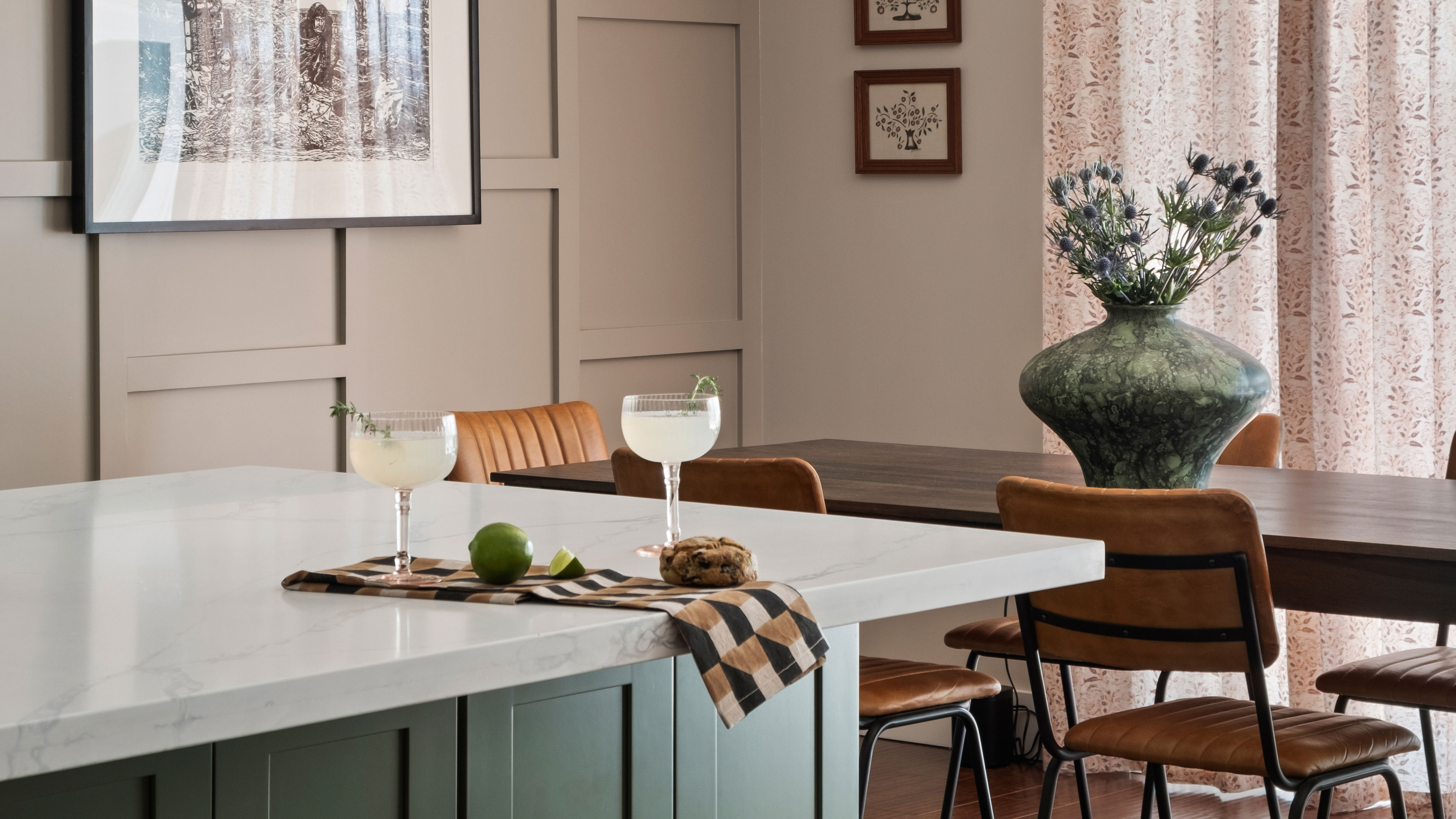
'On the day we first met, Michael had a large, very modern navy sectional from a major retailer that was scheduled for delivery,' recalls Los Angeles-based interior designer Victoria Holly. However, having only known her newest client for less than half an hour, Victoria knew she had to intervene to help him realize his style dreams in his builder-grade home in the Pacific Palisades.
'It was a bold first meeting move but after 10 minutes of meeting him, I said, “Please don’t kill me, but you have to cancel that order." He knew the home style he loved but had no idea how to make it happen,' she says. 'We promptly canceled that sectional delivery and started from scratch! From there, we did a deep dive into understanding his style.'
This process led to a modern home that makes bold strokes with its design, but that, above all, feels undeniably mellow. From the interesting yet calm approach to color to sourcing furniture and decor that brought history and patina to the rooms, here's how Victoria brought charm and character to what was once a largely non-descript property.
Defining the style
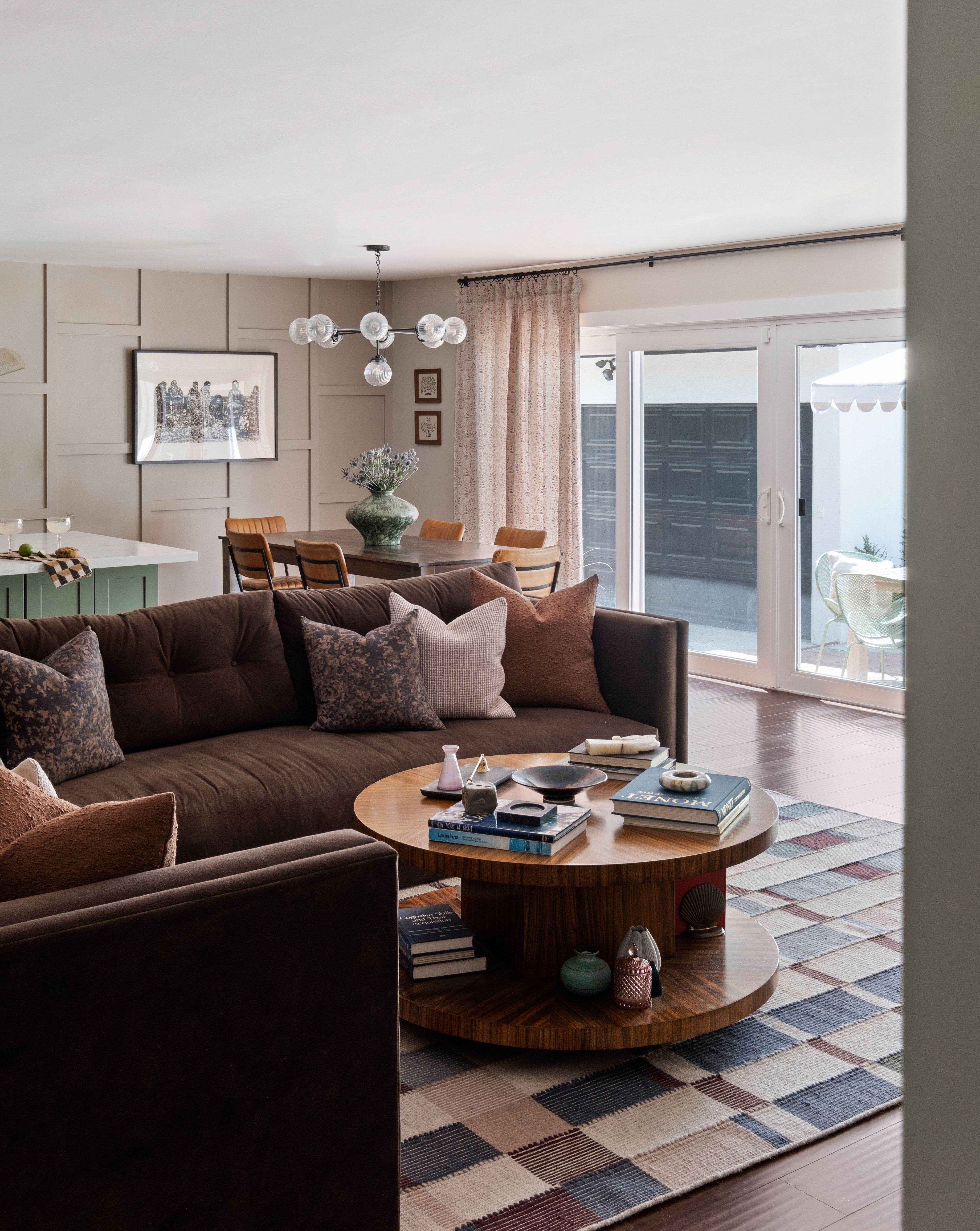
Michael's interior design style turned out to be a lot more eclectic and interesting than his choice of navy blue sectional first suggested. 'It’s hard to pinpoint his style exactly — it’s a little grand millennial, a little postmodern, a little antique, and a little unexpected,' Victoria tells us. 'He also loved a dark and moody vibe — emulating cozy winter days.'
'There were so many stylistic directions we could take the house — and so we came up with the idea to do a little bit of a different version of his style within each room,' she adds.
Sourcing the soul
The client's brief also asked for a home that felt unique — where you would look around and not be able to spot things from well-known stores. This led to Victoria curating the space hand in hand with the client from places like estate sales, auctions and sites like Chairish, eBay and Etsy.
'I will be honest, as an interior designer, this was stressful at first,' Victoria says. 'We like to manage the entire process and that includes sourcing too! But when it comes to vintage items, usually a client has to be way more involved, and you’re looking for the right piece, as opposed to going by store or manufacturer with ready-made or custom items.'
This meant shifting Victoria's usual sourcing process to a more involved model. 'It meant a lot of weekend text messages of photos from estate sales; Facetimes while vintage shopping. We even went to the same estate sale once (and missed each other by an hour), where we spotted the same great x-bench now in front of his fireplace.
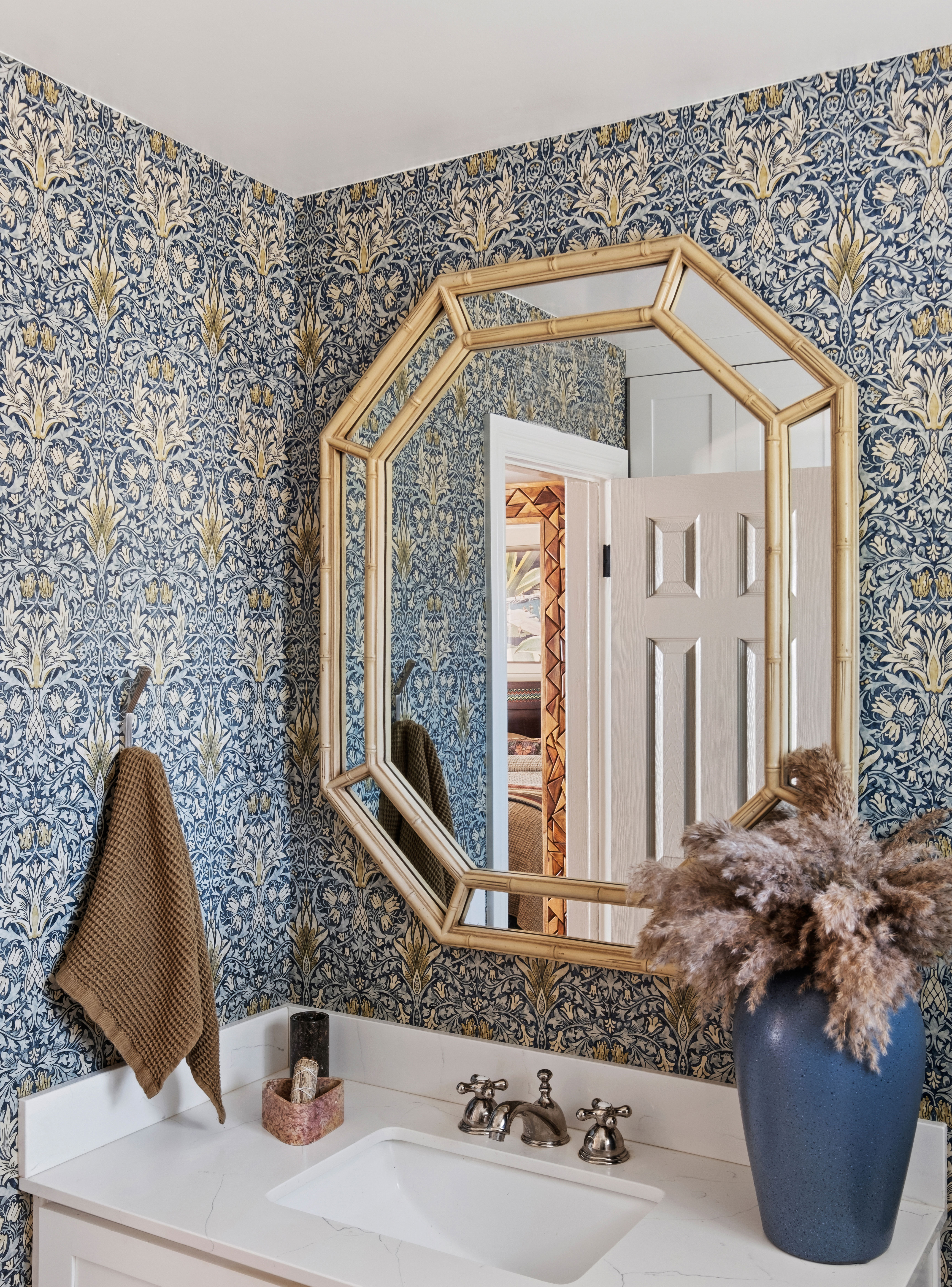
'We also utilized eBay and Etsy a lot, where you have to be fast otherwise things can be sold quickly,' Victoria recalls. 'There were so many amazing pieces and so many great stories behind each one. I still love the primary bathroom mirror which he found on Facebook Marketplace and legitimately asked the young woman selling it if it was haunted!'
Instilling character
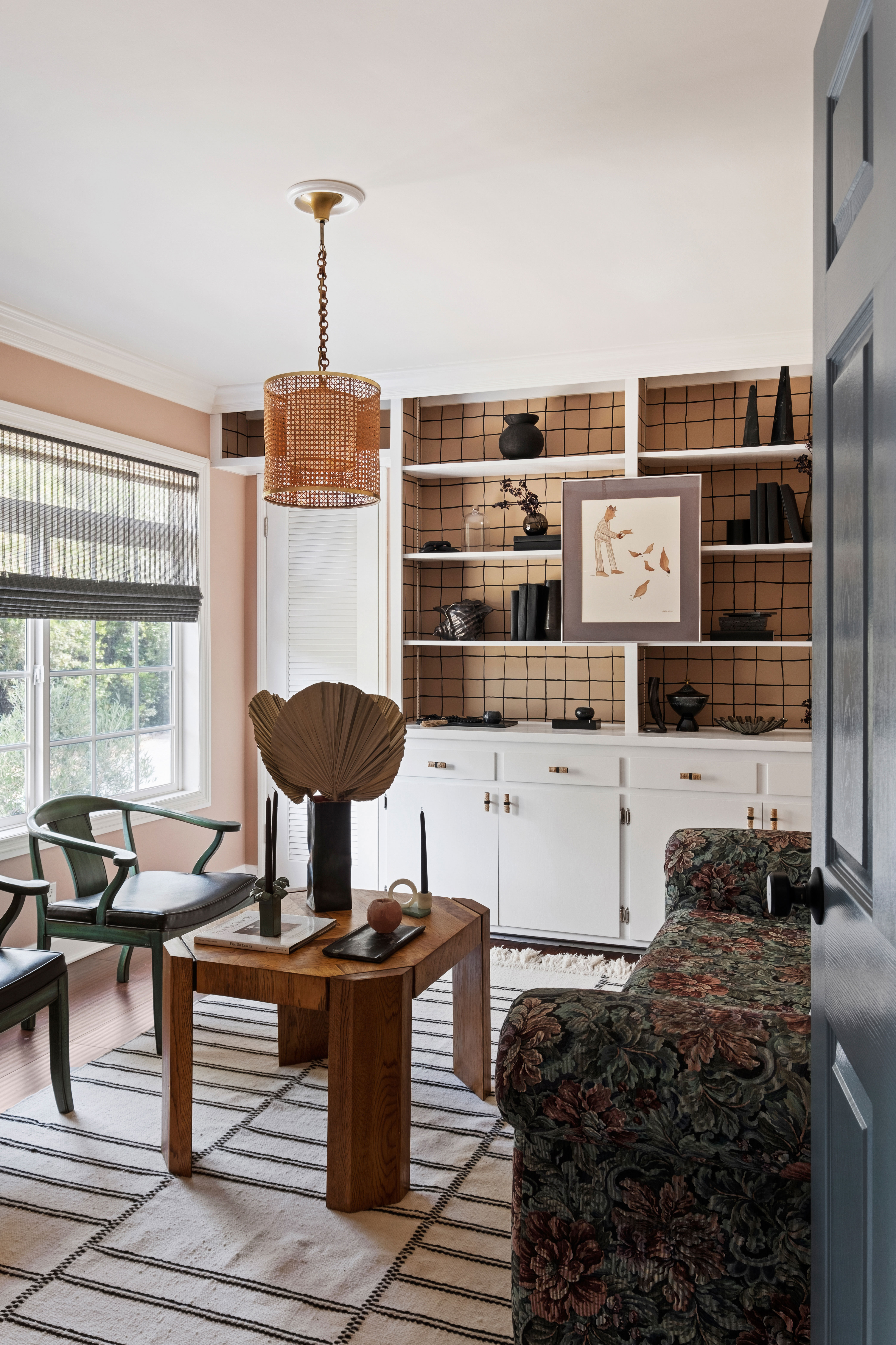
While this painstakingly sourced furniture brings soul to the home, its backdrop also needed a little love to bring it in line with the client's style ambitions. 'It was a builder-grade property that needed some love and soul,' Victoria says. 'He wanted a fun and whimsical home that was great for entertaining. Something where fun is found in every corner.'
From paint to wall paneling, decorative touches make this once-plain space come alive, and clever design additions make the existing features now really pop, such as the shelving in the home office. 'These shelves were existing and they were just outdated and boring,' Victoria explains. 'We swapped out the hardware and decided to wallpaper the backs with a fun and playful wallpaper. Then to further dramatize the wallpaper, we went with all-black decor. And we wanted to have pink shine in a moment in the house.'
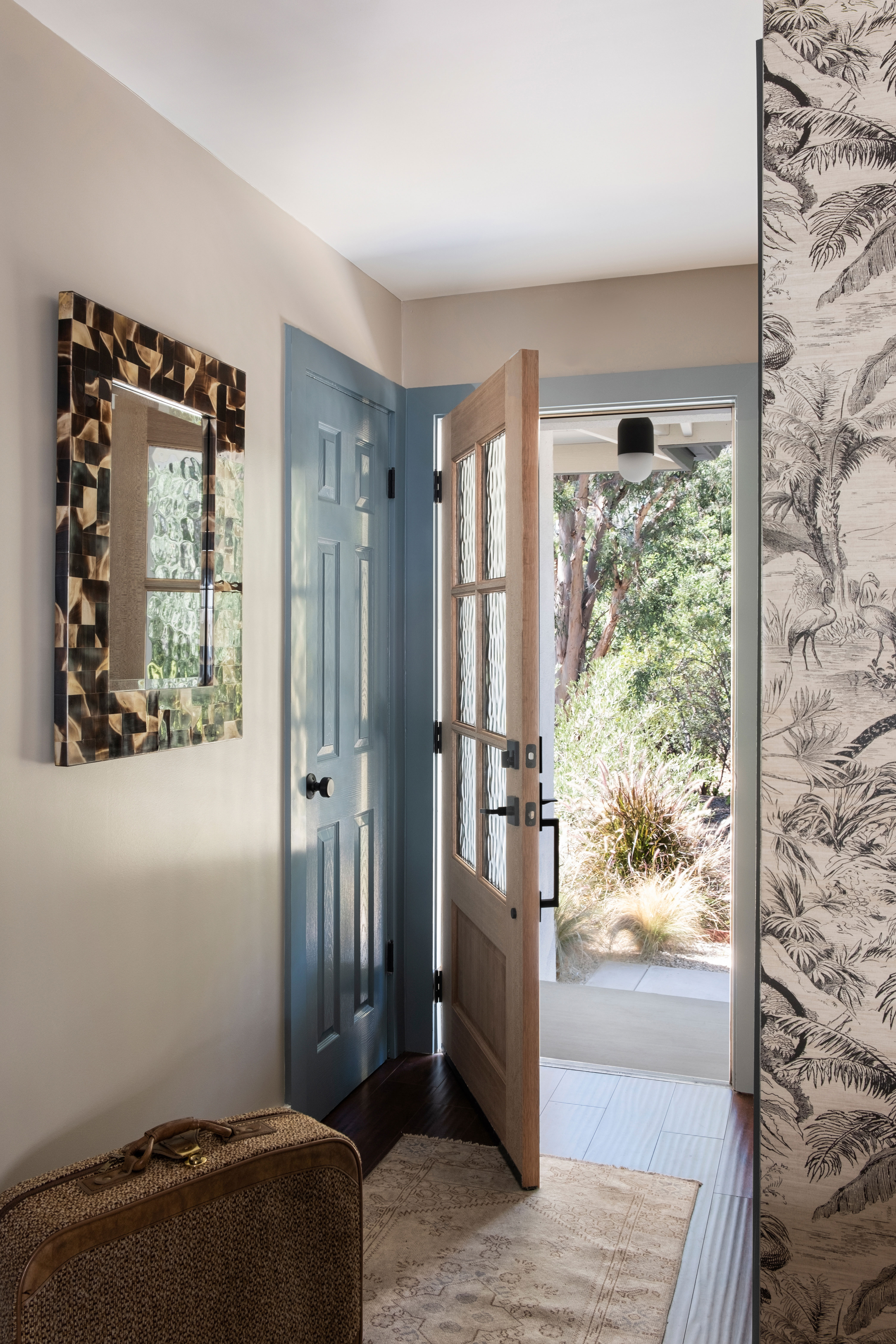
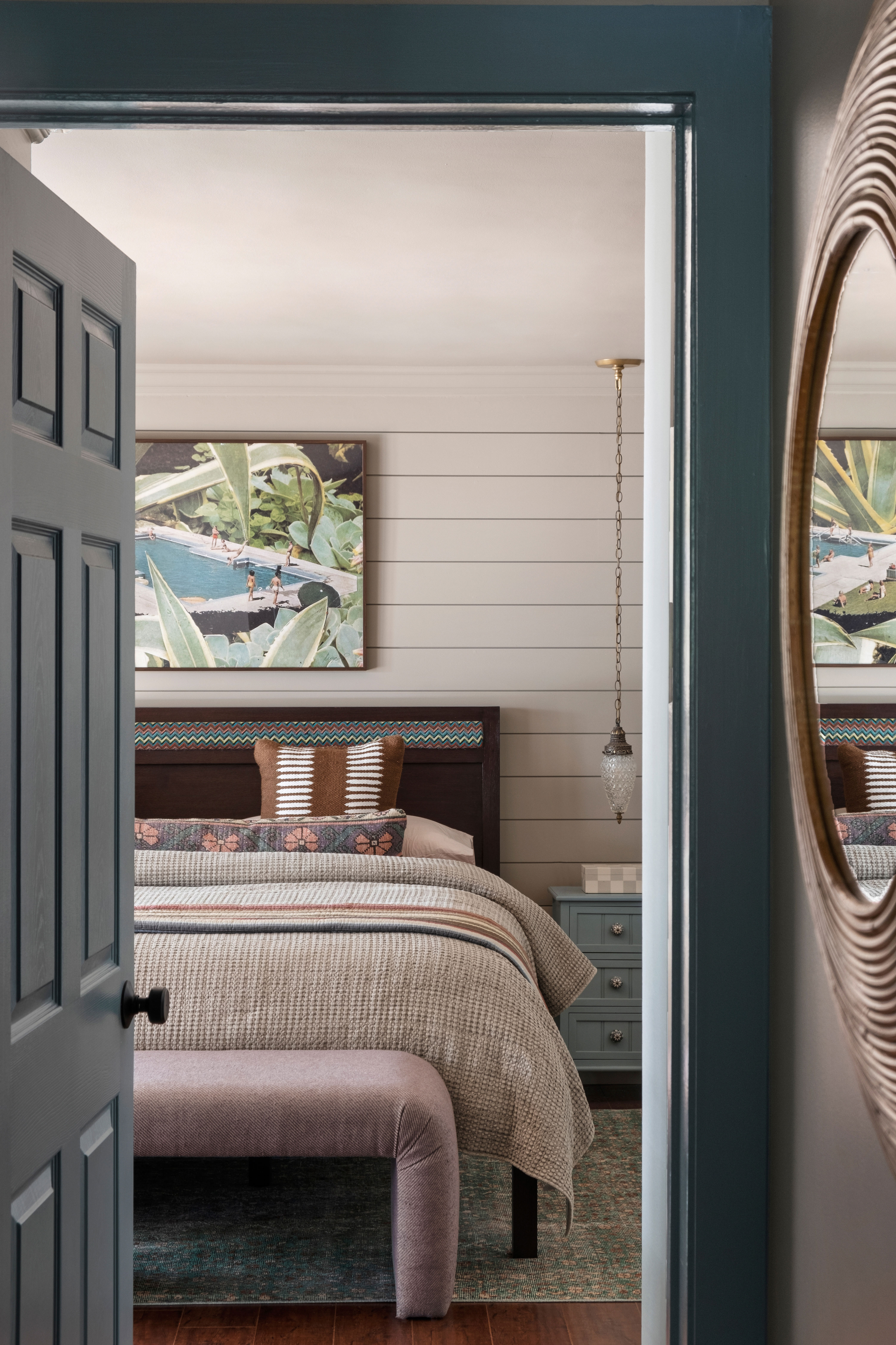
The blue door trim is another great detail that makes standard interior doors feel special. It's painted in Benjamin Moore's Aegean Teal.
Creating with color
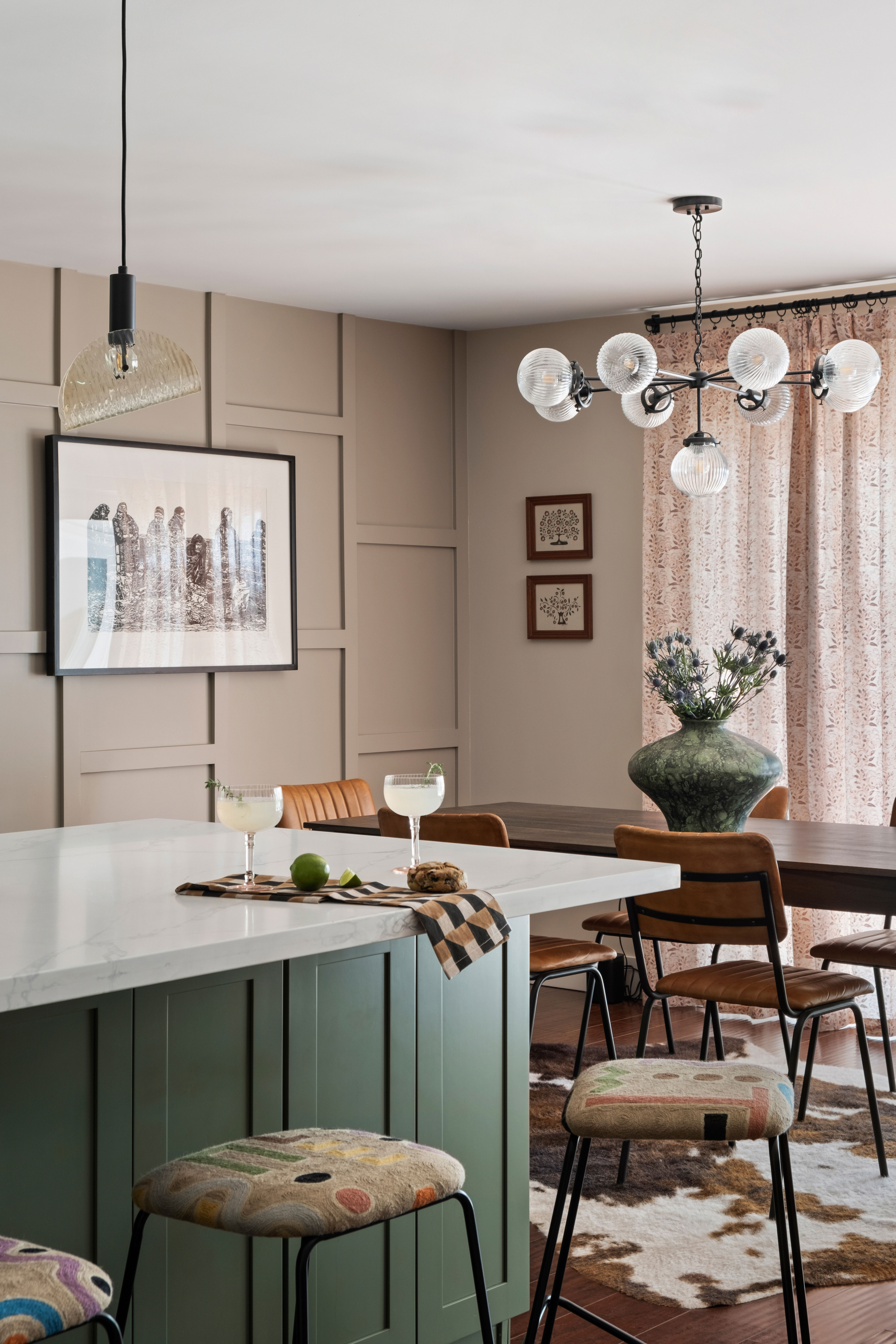
It's not the only way color has been implemented in uniquely interesting ways, from textiles and wallpaper to the paint ideas for walls, the designer has taken bold swings with the palette. 'We just had fun and picked things we loved, and we did break a few design rules here, like mixing different paint colors on different walls,' Victoria says. 'There are three wall paint colors in the living room and a wallpaper. And we mixed a lot of different competing fabrics in the plaid guest bedroom for something fun and unexpected — it matches because it doesn’t match!'
'The barstool fabric had so many fun patterns and colors in it,' Victoria adds. 'Also the rug with tones of purple, mauve, and teals. We wanted it moody but not black. So we opted for gem tones.'
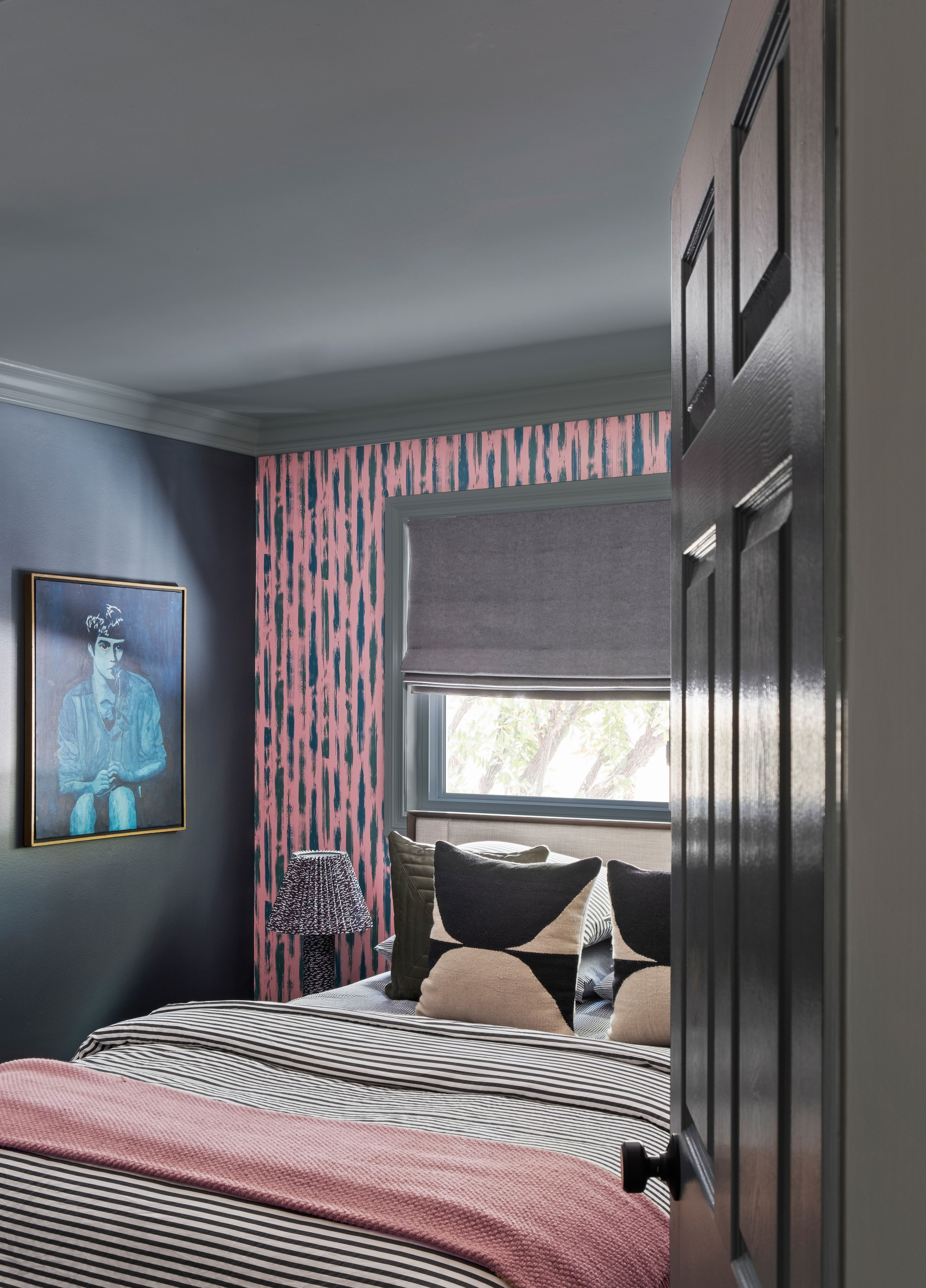
It's an approach that feels cohesive but organic — less a precisely designed interior, and more like one that feels like it's developed over time. 'We didn’t worry too much about the overall theme but rather focused on what we loved in each specific room and then designed around it.'
'And in the end a theme ran through the house that worked out well. I don’t know if I could tell you what that theme was! Maybe blues, pinks, and greens. Maybe a love for pattern and unique vintage pieces. Sometimes if you design around things you love, a theme appears and the house doesn’t feel like the house of a million wallpapers or fabrics!'


