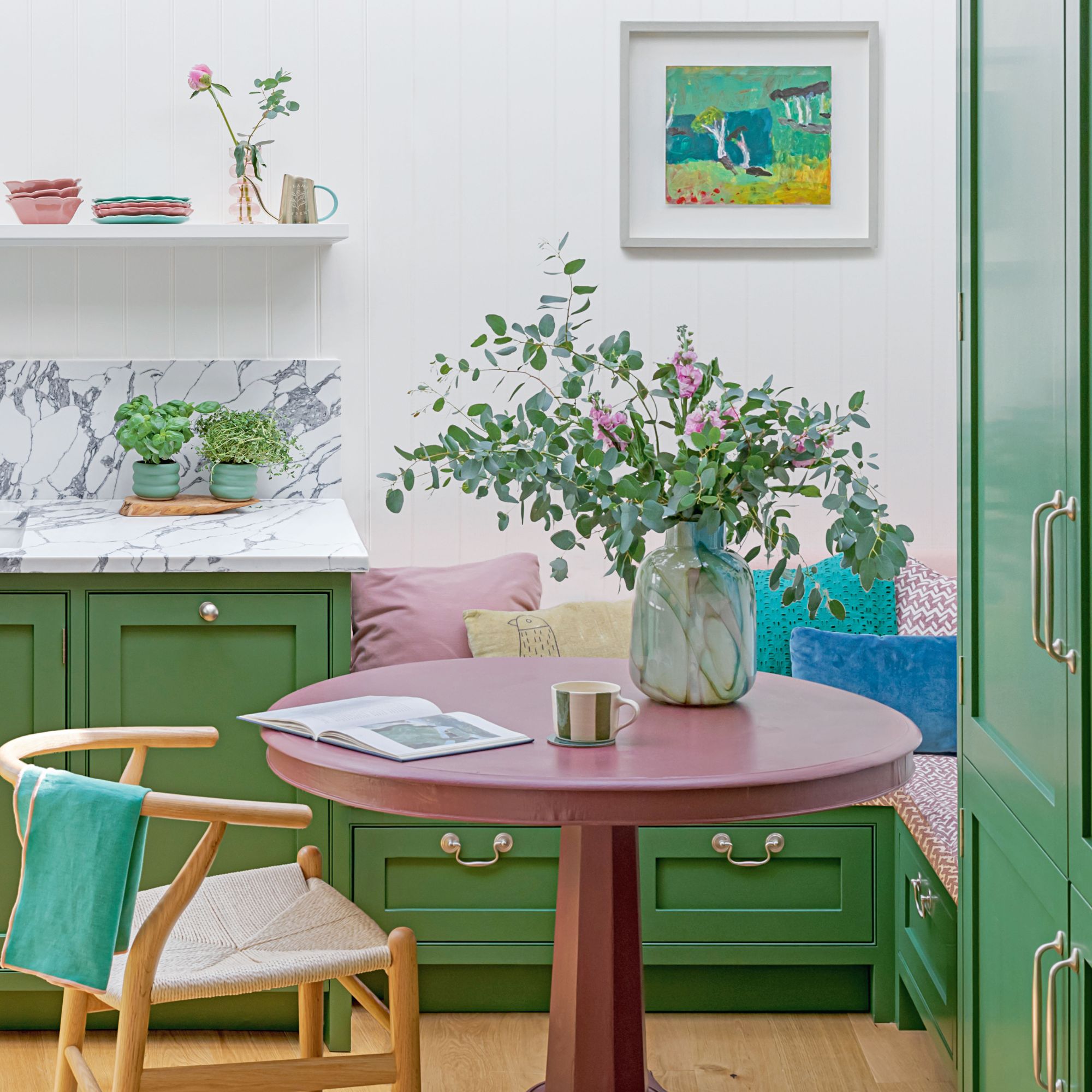
Just because a kitchen is small, there is no reason for it to lack character, as this beautiful space packed with small kitchen ideas, created by Kate Feather Kitchen Design, proves.
‘The brief from the owner, Alexandra, was very simple: to create a cosy yet functional kitchen, incorporating clever ways to maximise storage and conceal essential appliances,’ says Kate.
Designing to a small footprint
Located in a beautiful mews house in the heart of Notting Hill, the previous small kitchen was very compact, with everything running along one wall – a design that resulted in a lot of dead space. To make the room work harder, Kate slightly relocated the room’s archway entrance, which opened up the possibility of having spacious, full-height kitchen cabinet ideas.
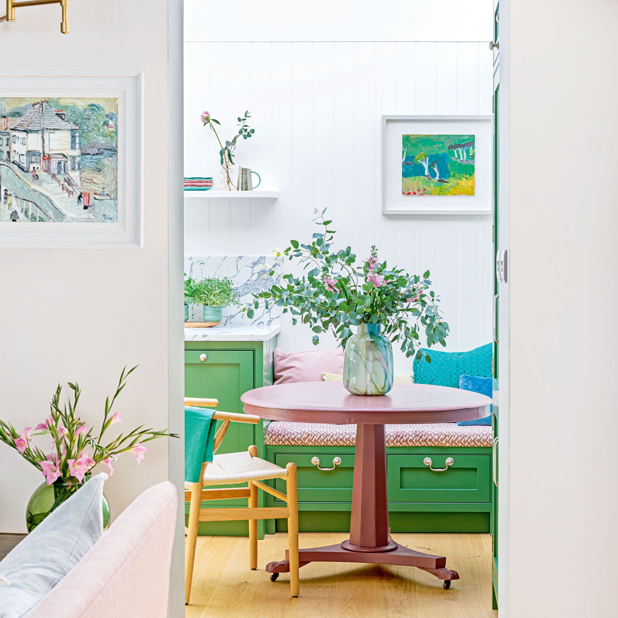
Moving the entrance also enabled the introduction of a dining area into the petite kitchen. ‘Banquette-style seating is much more compact than traditional tables and chairs, making this style of kitchen-diner ideas perfect for this small space,’ explains Kate.
‘To further capitalise on its footprint, we added drawers beneath the bench, which are used for storing baking tins, plastic containers and extra teatowels. The banquette is definitely my favourite part of the new kitchen, it works so well and brings a much-needed lifestyle edge to the room.’
Efficient design
Kate’s design prioritised efficiency, with the classic ‘golden triangle’ kitchen layout determining the placement of fridge, sink and oven.
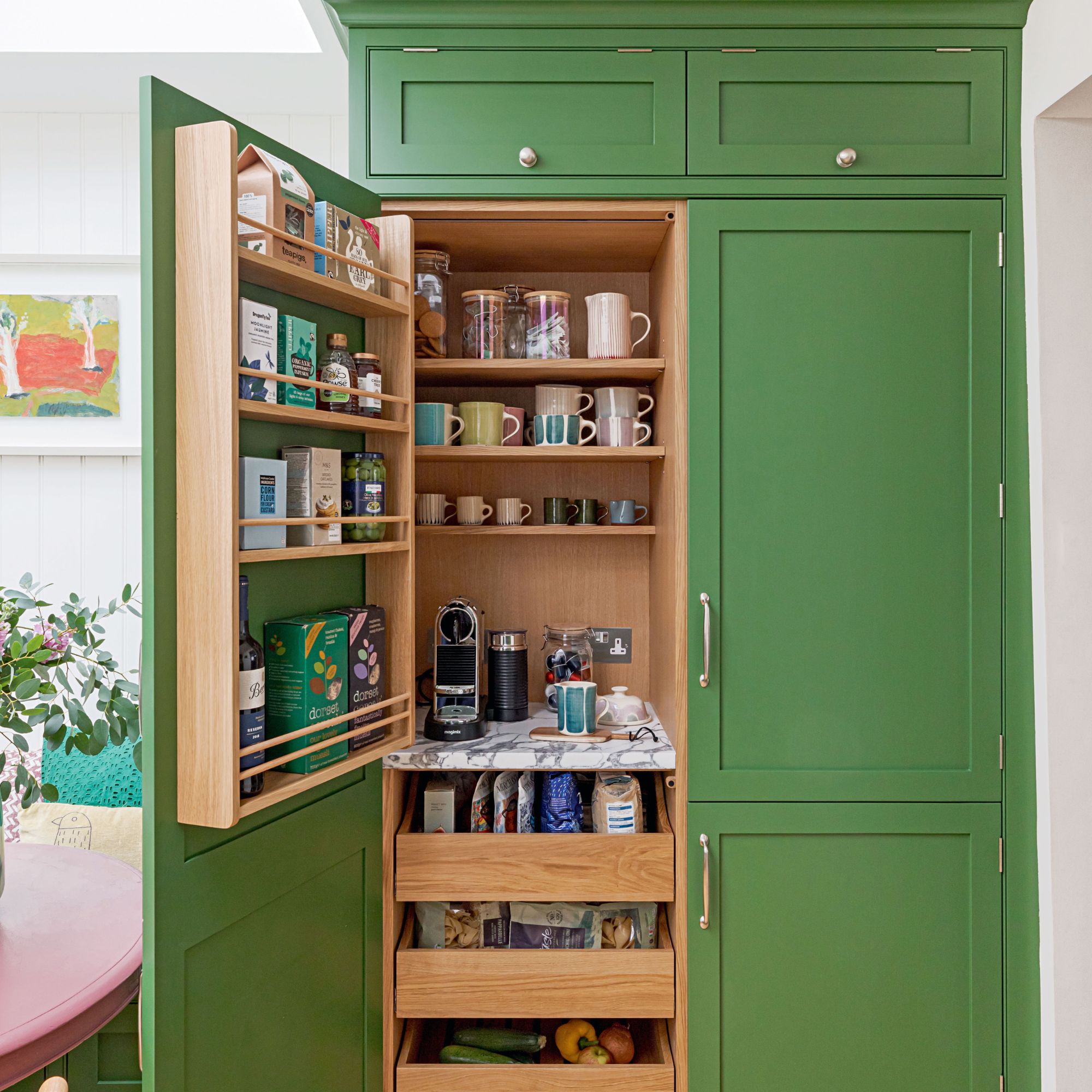
‘We also organised the kitchen storage ideas so it was logical: dry food next to the fridge; cereal, coffee and tea-making supplies in a versatile breakfast station, and narrow spice and condiment shelves housed within the extractor wall unit, above the hob,’ explains Kate.
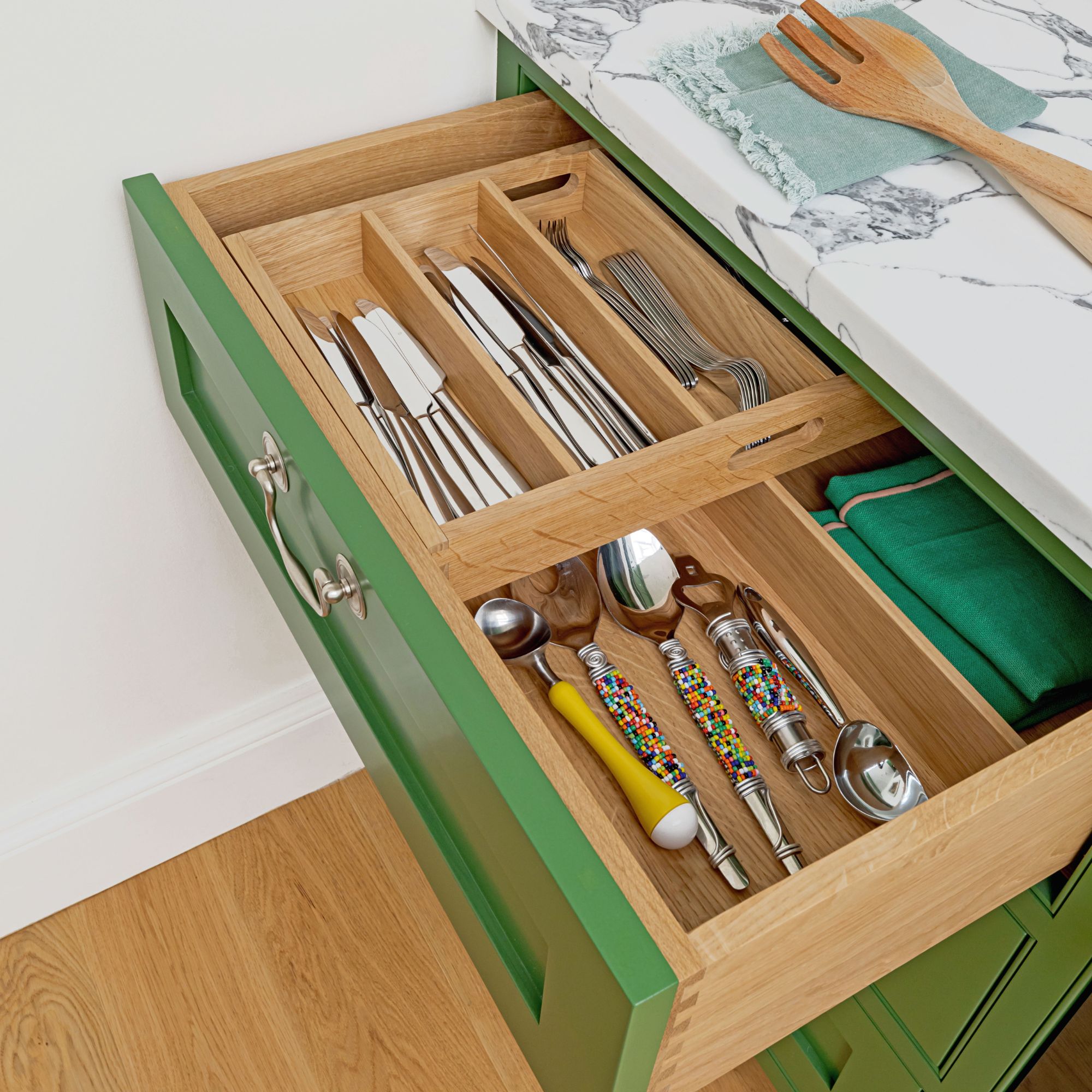
‘Saving space in this way enabled us to opt for a generous double-door kitchen sink unit. It is 65cm wide, which is large for such a compact kitchen, and allowed us to use a double pull-out unit behind one door while fitting a Quooker Cube system and a small shelf behind the other.’
Colourful impact
With the backbone in place, it was time to finalise the look. ‘The house has a traditional feel, however, Alexandra’s style is bold and colourful, which allowed us to create a fun yet functional space for her to enjoy,’ explains Kate.
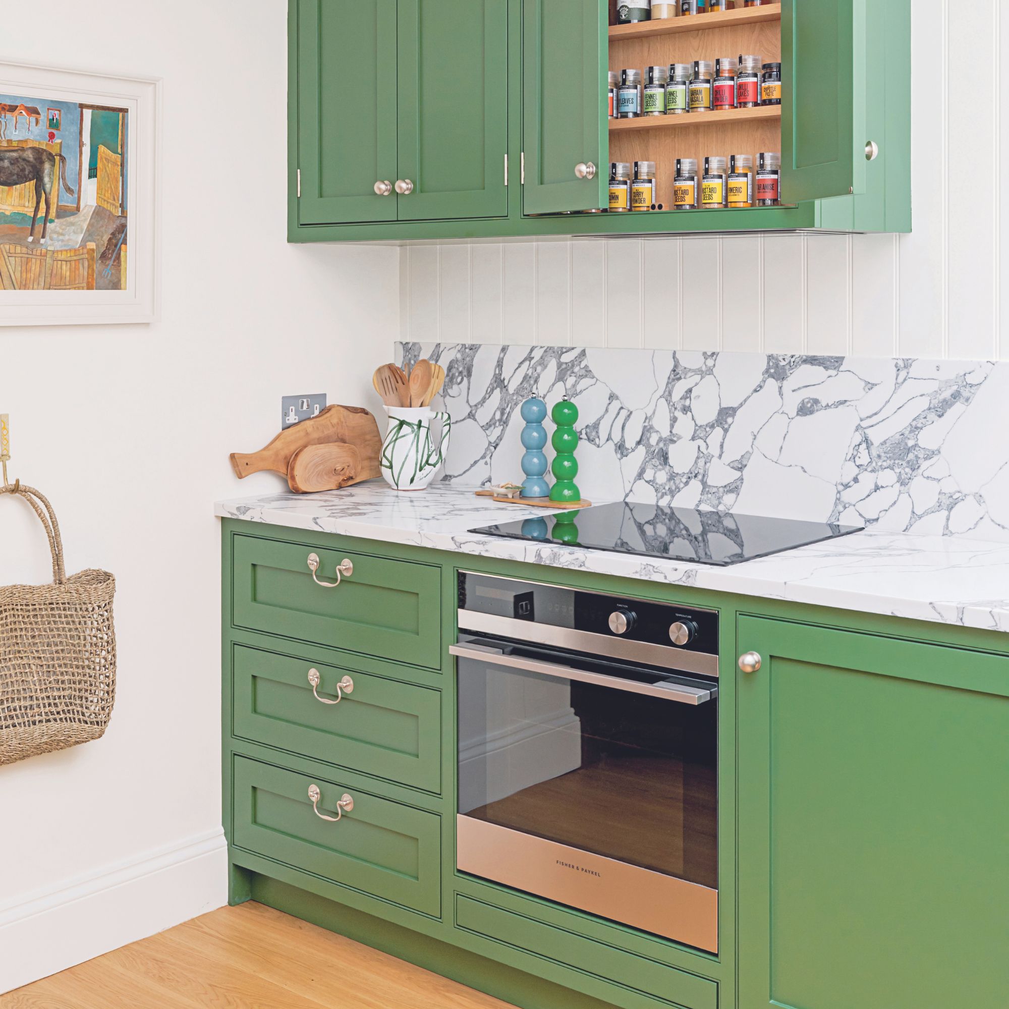
The kitchen was always going to be green, but this still left a whole range of hues and tones from which to choose. After flirting with an olive green shade, they eventually settled on the vibrant Hopper by Little Greene.
‘This specific hue was chosen to complement the beautiful artwork that Alexandra wanted to display here,’ explains Kate. This was paired with contrasting accents of pink, seen on the banquette’s patterned seat pad and cushions.
Let in the light
To balance the bold, leafy green cabinetry, the walls were dressed with white tongue-and-groove panelling and pale kitchen splashbacks, both of which reflect the natural light from the skylight above and bring texture to the space. ‘The panelling works to neatly define the walls, helping to keep them separate from the extended roof height of the skylight,’ adds Kate.
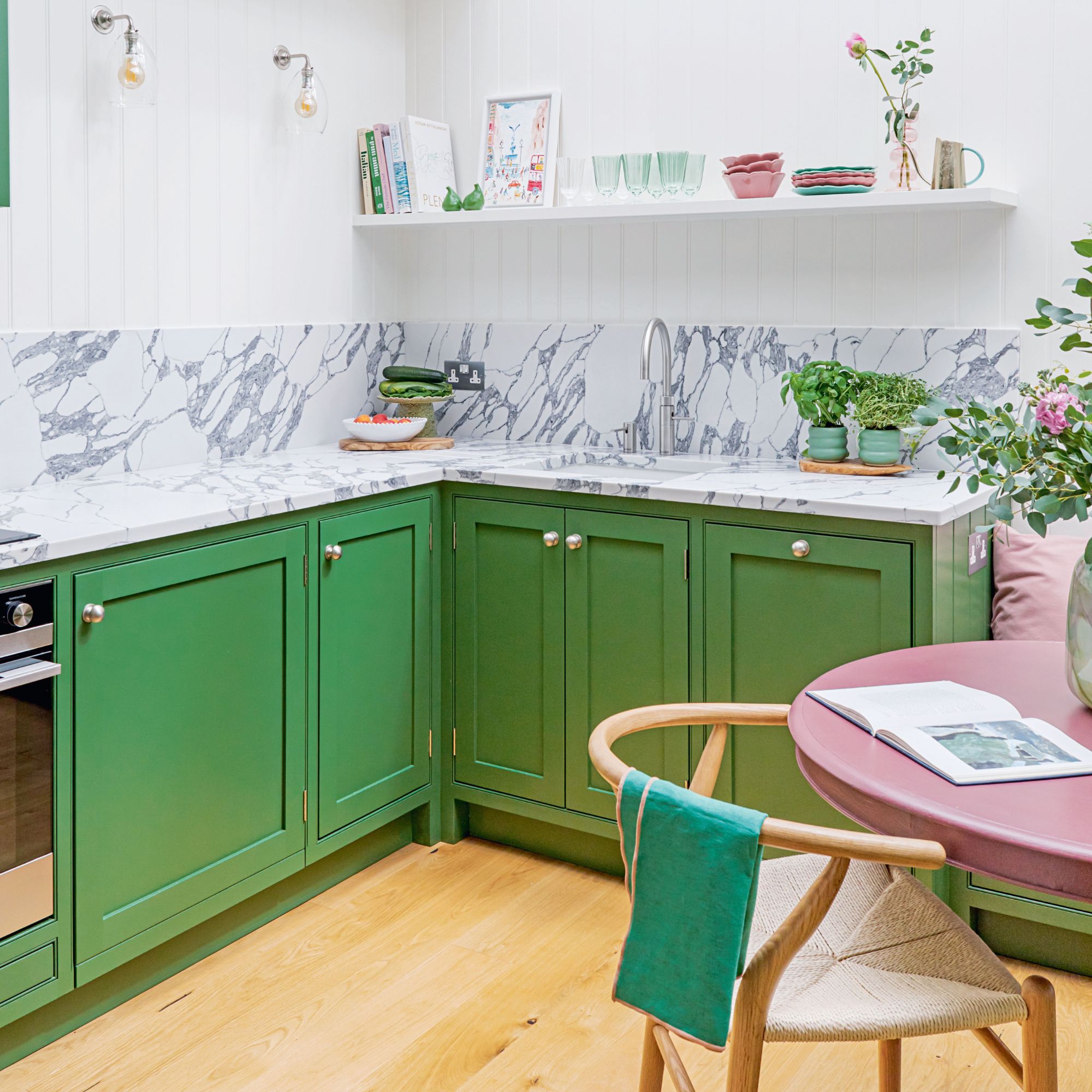
The skylight, which was already in place, has a massive effect on what would otherwise be a very dark room. Opting for roof glazing meant that there was no need for windows, providing greater flexibility in terms of design and cabinet height – invaluable when you lack a large footprint.
Finishing touches
Little details, such as the composite Arabescato stone, seen on the worktops and splashbacks, have an even greater visual impact in such a small space.
‘We chose composite Arabescato stone as it is extremely hardwearing and, unlike traditional marble, it is virtually maintenance-free. However, it still packs that same aesthetic punch as traditional stone, instantly elevating the entire design and adding a valuable air of sophistication to the overall look,’ explains Kate.

Despite only measuring 3.3x3m, the finished kitchen ticks every box – from a cosy dining area to the larder cupboards – and is brought to life with vibrant colour and rich textures.


