One thing that has captured my attention (and heart) lately, it how more and more people are starting to embrace saturated neutrals in their home. Gone are the days of crisp whites and dull grays — now people want neutrals with character and pigment. They want Benjamin Moore's Hale Navy.
With moody, characterful interiors on the rise, so too is the amount of people using this shade to decorate with. While the shade found itself (perhaps unfairly) type-cast as too 'coastal' or 'preppy' not so long ago, those days are well and truly over. And I'd argue Benjamin Moore's Hale Navy paint shade has a lot to do with that.
Listed as one of Benjamin Moore's most popular paint colors, Ella Baker, interior designer at Element Design Studio, describes it as "navy blue in its truest form — deep, rich, and balanced." Where you might have reached for black or dark brown, Hale Navy may just be the elegant and more expensive-looking alternative.
Not convinced? Below, I've broken down how to best bring this paint shade into your home, as well as shared designers answers to the internet's biggest questions about Benjamin Moore's Hale Navy.
What Makes Benjamin Moore's Hale Navy So Popular?
Many designers attribute Hale Navy's prosperity to its deep charcoal undertones that give it a comforting intensity. "Hale Navy has this rich, moody depth that feels both grounding and sophisticated," describes Marie Cloud, founder and principal designer at Indigo Pruitt Design Studio. "It has the ability to be bold yet calming, making it a go-to when designing spaces that need a strong yet inviting presence."
Its deep blue tone offers a perfect balance — it has enough saturation to add drama but enough neutrality to remain classic. "While navy blue is timeless, Hale Navy feels especially relevant today as it seamlessly aligns with the rising fisherman core trend, which celebrates the rugged beauty of coastal interior design through weathered textures, natural materials, and a deep connection to the sea," adds interior designer Ella Baker.
You can also find decorating with navy blue at the heart of more modern interior aesthetics like the 'Castlecore' design trend, where the grandeur of rich materials and sophisticated spaces are wholly celebrated.
And finally, Benjamin Moore's Hale Navy has a hint of gray that makes it particularly versatile and elegant, allowing it to adapt to different lighting and pair beautifully alongside all the colors that go with navy blue.
Where Should You Use Benjamin Moore's Hale Navy?
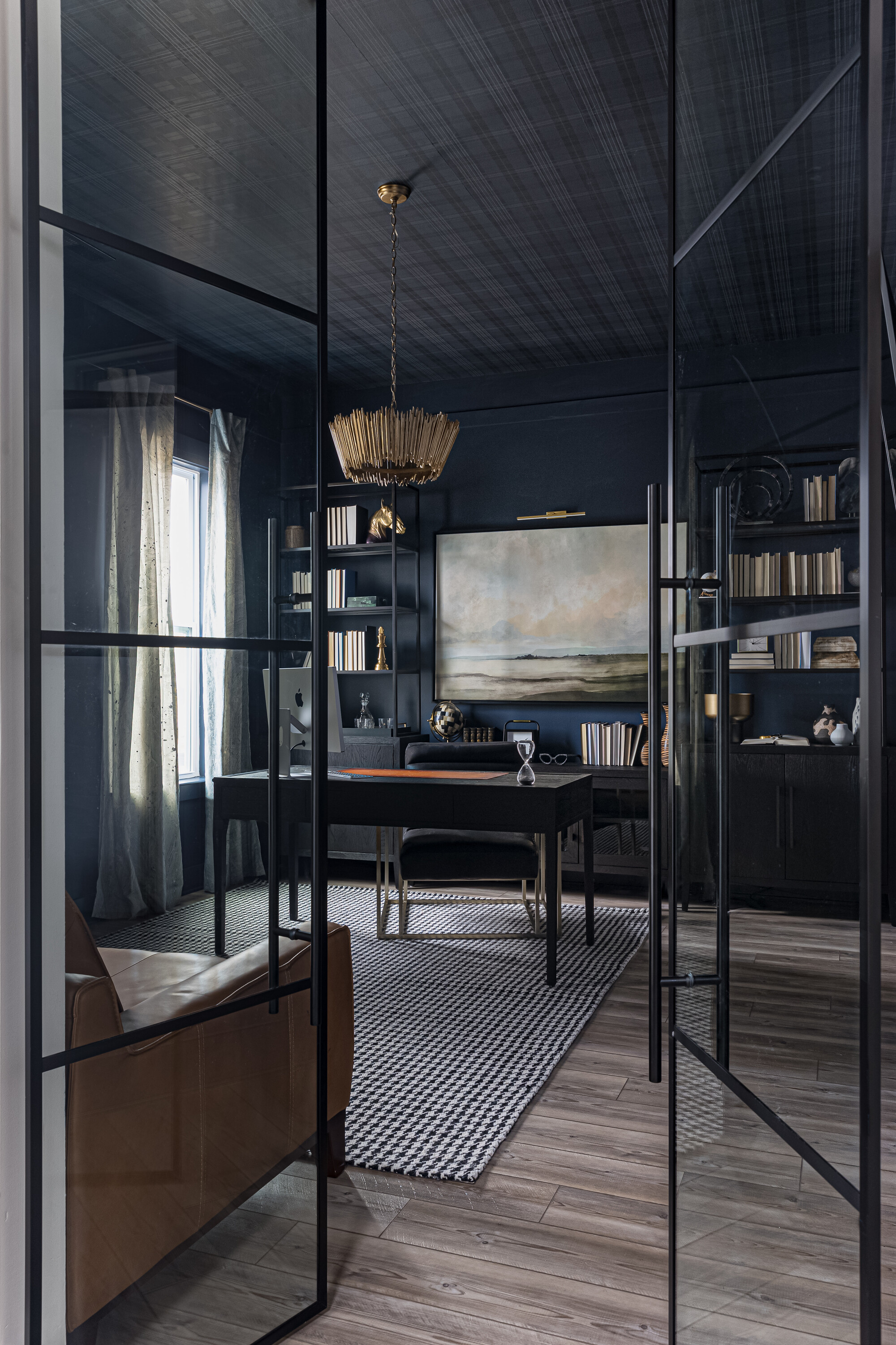
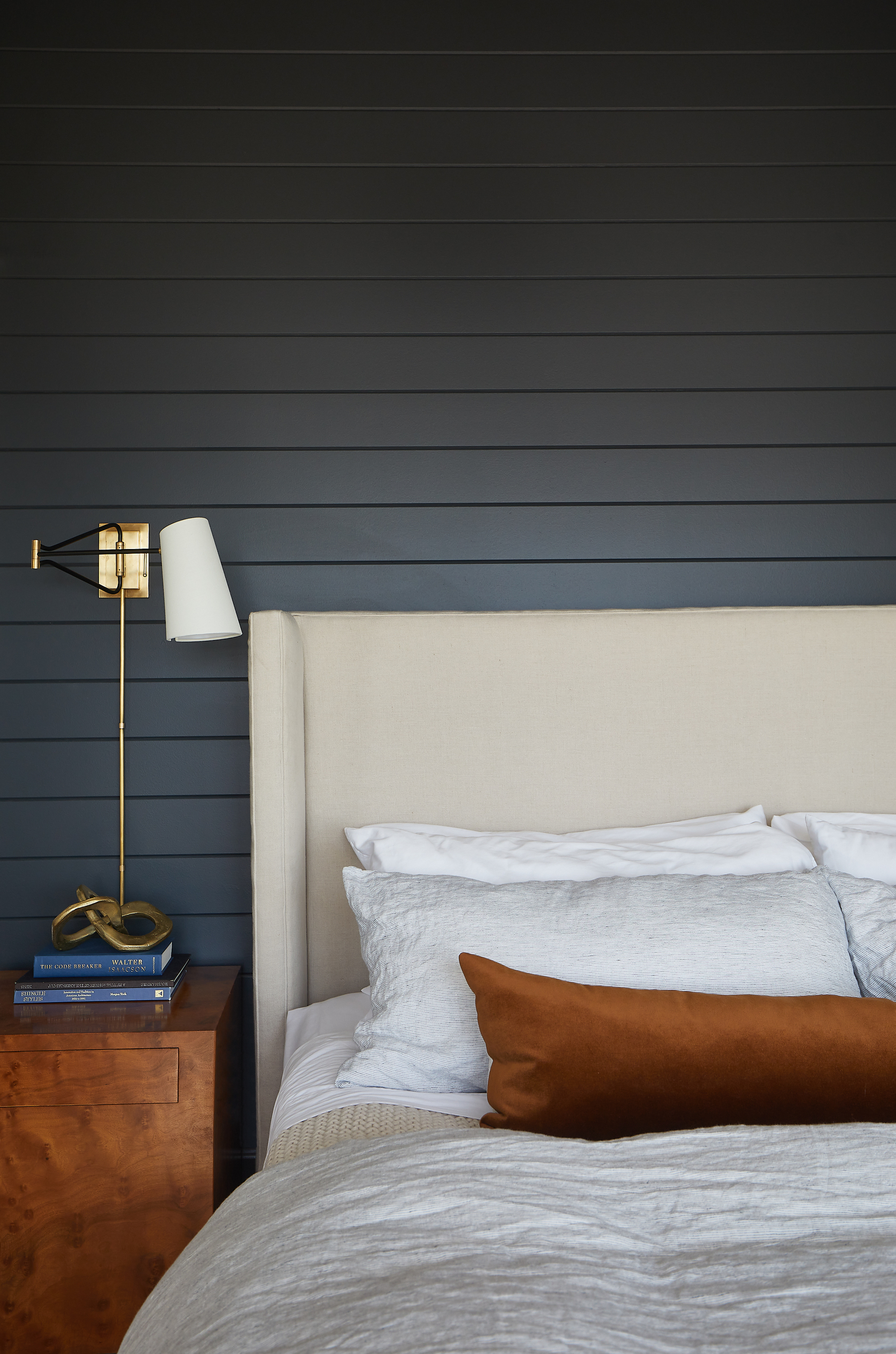
Depending on how it’s styled, Benjamin Moore's Hale Navy can feel crisp and coastal or deep and moody, making it adaptable across a range of design aesthetics — traditional, transitional, and modern spaces alike. "Whether used in a stately study, as a navy living room idea, or even a cozy bedroom, it lends itself to both refined and casual aesthetics," explains Marie.
She goes on to explain how the shade plays particularly well with natural light, "creating shifts in mood throughout the day, which makes a space feel dynamic and layered." This is what prevents it from making a space feel dark or constricting, provided there is a light source — natural or artificial — to bounce off the color's undertones; the perfect way to create dark color schemes that aren't overwhelming.
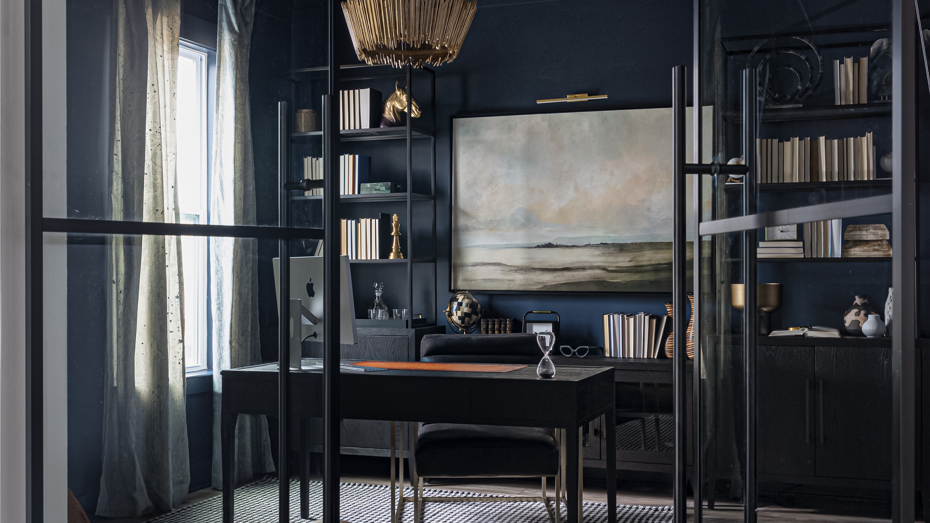
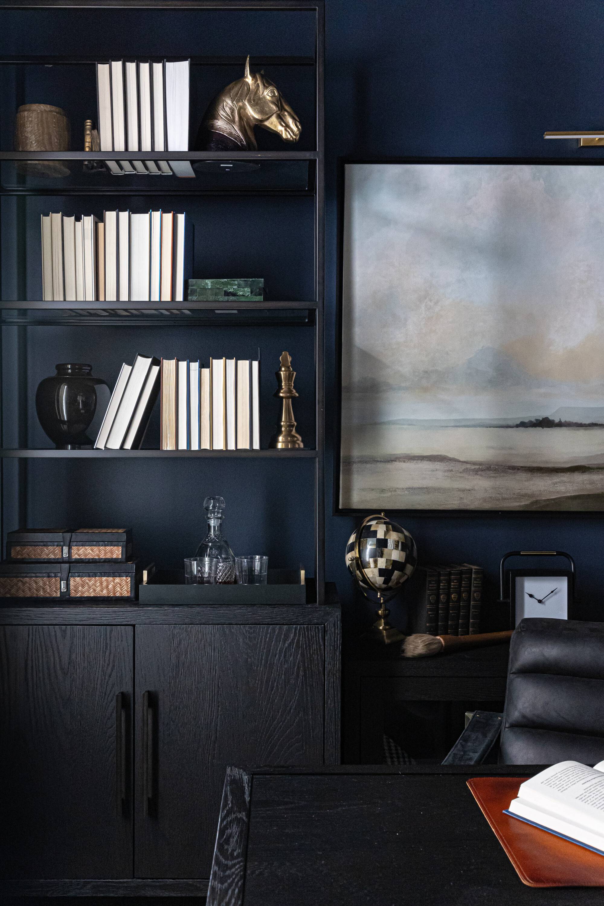
In particular, Benjamin Moore's Hale Navy works well in home offices (seen above), bedrooms, dining spaces, and even on cabinetry or millwork. "In smaller spaces, it can create a jewel-box effect, while in larger rooms, it adds a strong architectural presence," says Marie.
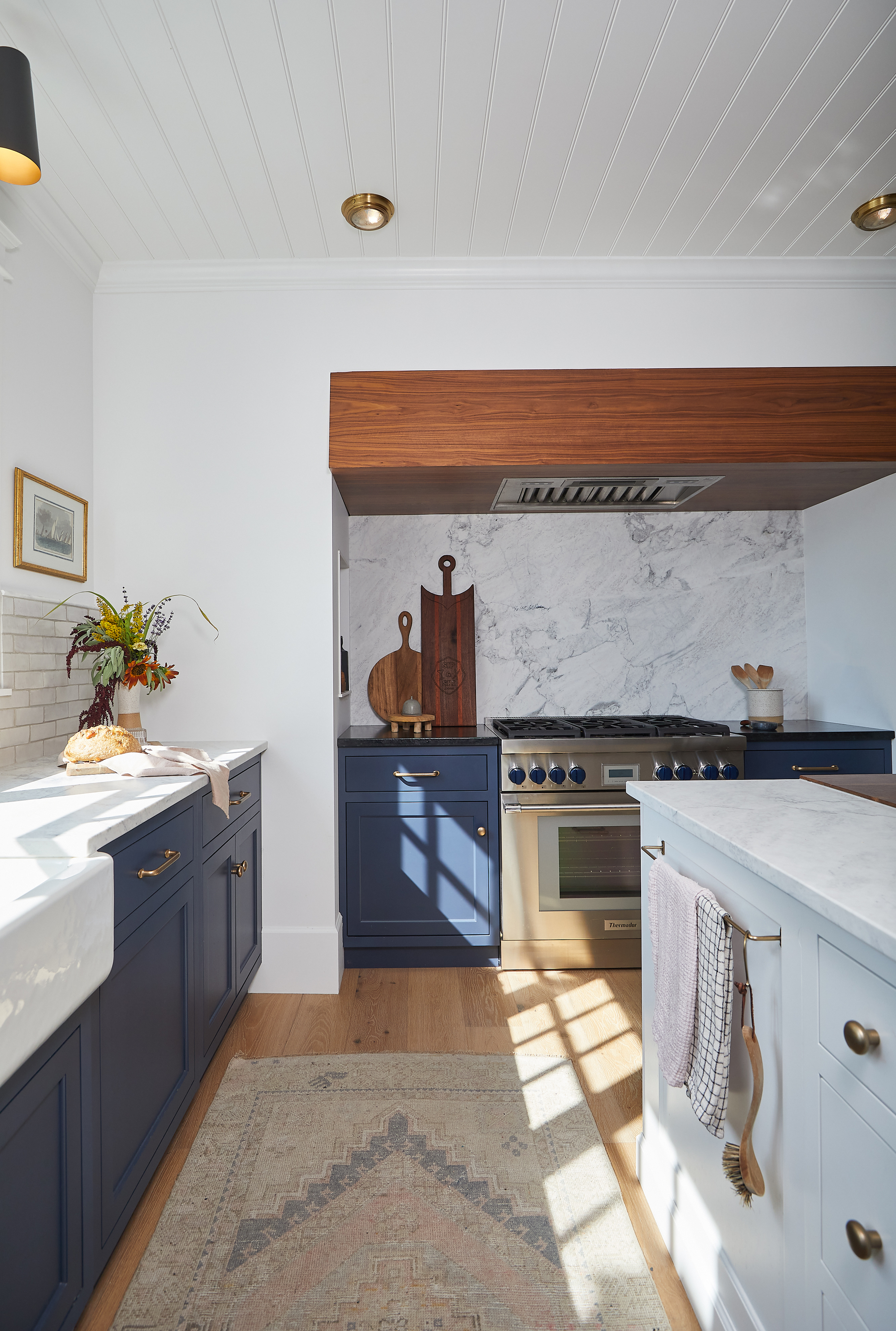
As for Ella's favorite application, she says she can't go past Hale Navy as a kitchen cabinet color, especially "paired with a warm walnut, antique brass, and an intricately veined marble." The contrast of materials is bold, striking, and yet still timeless.
What Colors Go With Benjamin Moore's Hale Navy?
Whether you are already planning a navy blue color scheme for your living room or envisioning this shade in a luxurious bedroom, understanding the shades that complement it will help you create a more harmonious space.
"I love pairing Hale Navy with warm neutrals like soft taupes, creamy whites, and camel tones to create contrast while keeping the look inviting," says Marie.
The subtle warmth of these shades plays off of the cool, charcoal tones of Hale Navy. Looking to color theory, blue's natural complement is yellow, and Hale Navy has a tinge of purple in it, which makes orange a lovely complement to that shade as well. Selecting neutrals with these undertones is also an easy way to create a cohesive palette.
"For a bolder approach, mustard yellow or deep olive green can introduce an unexpected pop," says Marie, while decorating with jewel tones such as emerald green, deep plum, and burgundy adds depth and luxury to a Hale Navy base.
And speaking of luxury, "Texture-wise, it pairs beautifully with natural woods, brass, and textured textiles like velvet or linen for added depth," adds Marie.
Benjamin Moore's Hale Navy is a paint color you honestly can't go wrong with — so it's not surprising that it continuously tops the charts of the brand's best-selling shades.
However, if you aren't quite ready to make the plunge, you can always try experimenting with the shade by painting smaller accents or styling navy decor in your space.