Photography is a big part of my life, and so naturally my handset is packed with all manner of apps to support this passion. Spoiled for choice, Snapseed is the app that I instinctively gravitate towards for edits on the fly.
Nik Software originally developed Snapseed many moons ago and was consequently acquired by Google in 2012. Along the way, a huge number of editing tools have been added to Snapseed since it first hit iOS and Android app stores as a completely free download; options that are split into styles, tools, and export menus, and that tow the line between beginner-friendly single-click looks and smart selective tools like its Photoshop-style healing brush.
This is the fifth in a regular series of articles exploring the apps that we couldn't live without. Read them all here.
My preference for Snapseed speaks volumes when you consider that I have free access to the mobile version of Lightroom with my expensive paid-for Adobe Creative Cloud subscription – software I regularly use on desktop for powerful photo editing of my mirrorless camera photos.
Snapseed updates have shown signs of slowing down, but it remains a smart editor with clearly navigated yet wide-ranging tools for users of all abilities, creative needs, and stylistic preferences. I spend the right amount of time editing each of my photos in the app, and no more. So what exactly is it that keeps pulling me back to Snapseed?
Single-step styles
Most photo editors built into smartphone cameras, and the likes of Google Photo and Instagram, are super-basic. You get a limited choice of styles, and it can be hard to find a look that you like. Conversely, I find that Snapseed’s 11 styles cover a broad range of looks and there’s usually one that I like for any photo; Accentuate pumps up the clarity to make photos pop, Portrait adds a severe vignetting that helps your central subject stand out, Bright gives a light and airy feel, plus there’s a range for black and white lovers, too (although tools is better for black and white, I’ll get onto that).
The styles menu is a great starting point for your edit, and then you can go on and add more complex edits via tools. And if you are editing more than one photo with the same look, you can simply hit the ‘Last edits’ option that will apply all that hard work from your previous photo edit to your next one with a single click. There's no batch edit function, but it's smart stuff, and we haven’t even got onto tools yet.
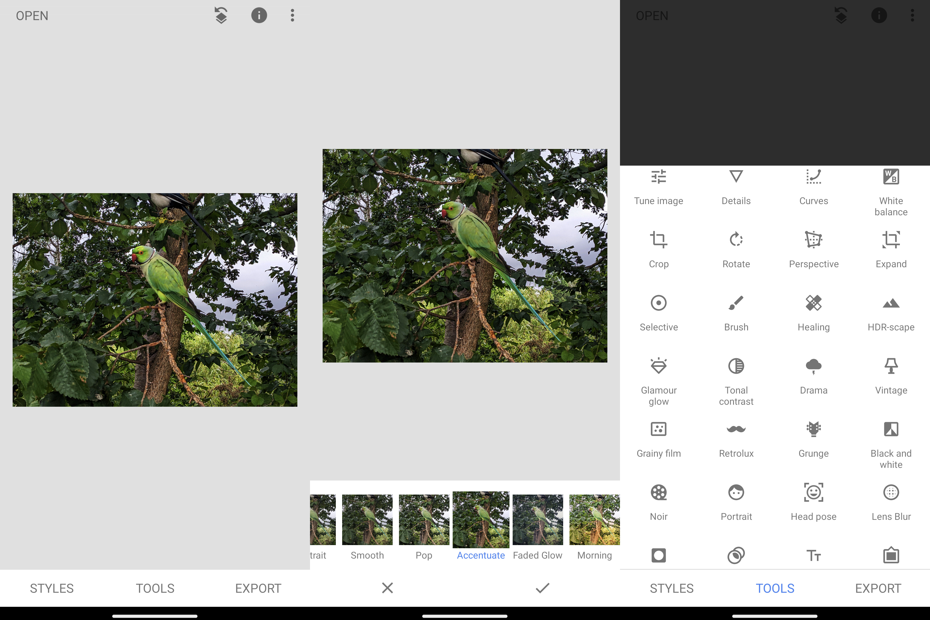
Smart tools
If you think single-click styles are basic on a phone, wait until you see what’s possible with Snapseed’s tools. Tools unleashes a whole other level of creative editing beyond styles, and it’s what truly keeps bringing me back to Snapseed. There are too many tools to sensibly cover here, so I’ll run through my personal highlights and I have to start with the Selective tool.
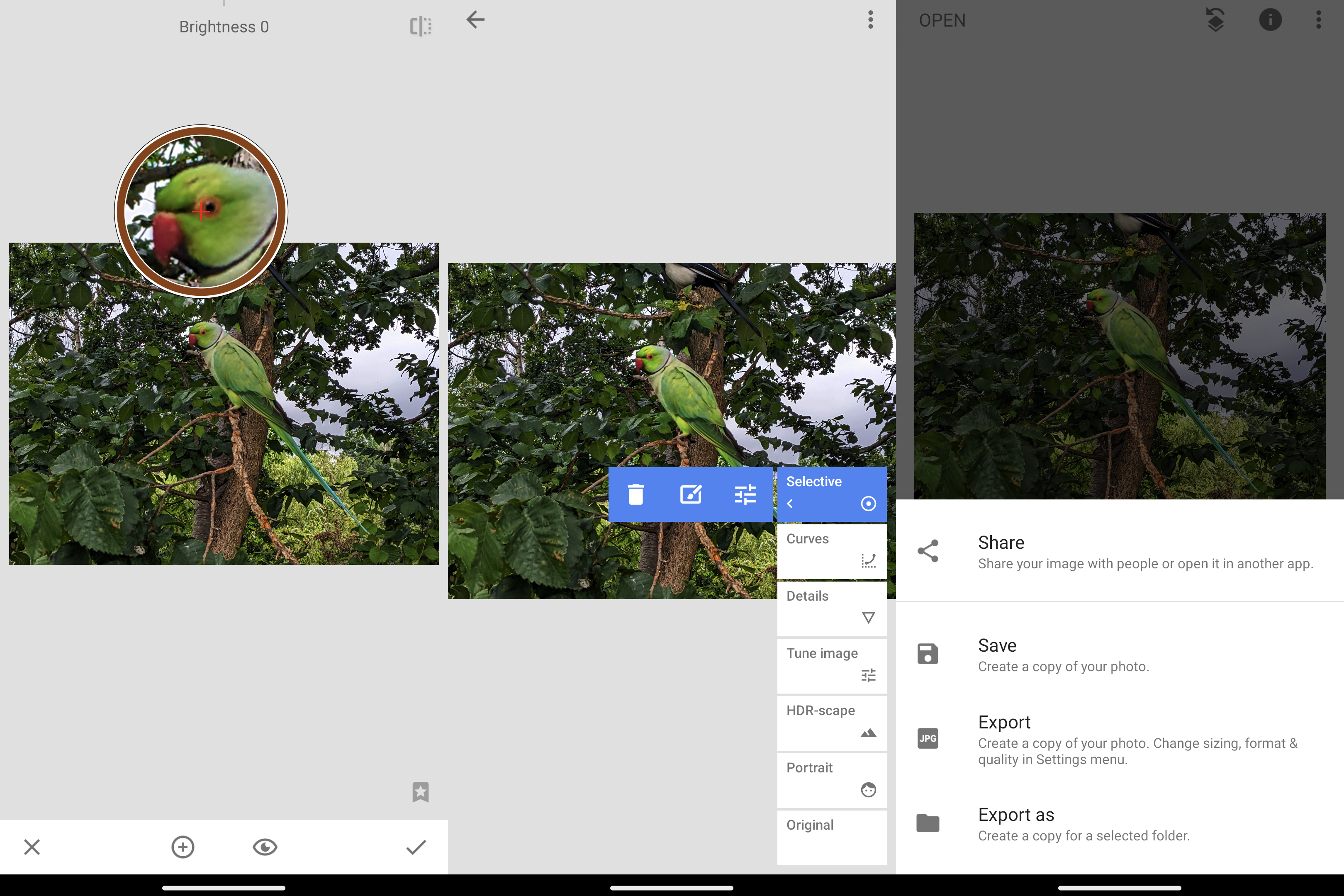
Selective allows you to make changes to a specific part of your photo. In the example below, I have tapped and held on the Parakeet which brings up a close view to simplify picking a very specific part. I then release the screen and apply adjustments to brightness, saturation, and structure (clarity) to make it stand out more from its surroundings.
Next up is the healing brush, simply called Healing. This smart tool does its thing using content-aware fill (you might know that term from Photoshop). If you want to remove something from your photo you can brush over it with the Healing tool. It’s a little bit like Google’s Magic Eraser tool and it's pretty effective.
If I’m going to convert to black and white, I’ll use the option in tools because it offers the industry-known black and white filters; red, orange, yellow, green, and blue. Each of the filters gives a different effect. Green, for instance, brings out tonal detail and is great for portraits, while red and even orange are great for landscapes because they accentuate the contrast in the sky and look especially great for those sunny blue sky days with fluffy clouds.
Versatile type-to-text offers a ton of styles and the option to invert so that your picture is only seen within the text. You can also use Tune image to make basic edits to color and brightness, with an auto option (that I rarely agree with). There are further basic edits covered that aren’t in many other editors, too, like crop to any aspect ratio.
Double Exposure is a neat option, allowing you to combine two photos with the second overlaid so you can align it perfectly. Much of the rest of the tools menu is like styles on steroids; a bunch of Vintage looks, HDR effects, film styles, and more.
Throughout the whole process you can hold down on your screen to compare the before and after, plus any step of your edit can individually be removed no matter what stage in the process that step was, via the toolbar in the top right of the UI. All in all, Snapseed handles seamlessly.
Time and again, I've been able to give my photos the little extra lift that they needed. There’s little wanting from Snapseed for edits on the fly and I’m pretty sure it’ll remain my go-to mobile photo editor for those final tweaks to images – even 'proper camera' images – before I share on social, for some time to come.

