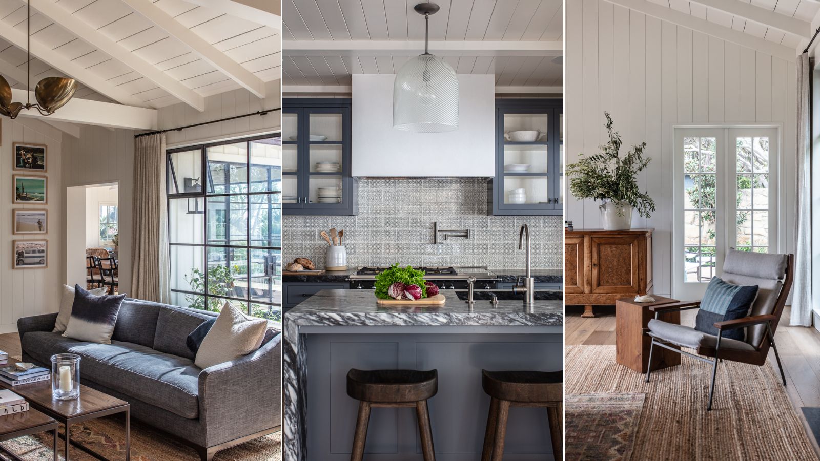
It's hard to imagine it, looking at it now, but until recently this cool, calm and collected ocean-front vacation home was dated and in a bad state of repair.
The original house design dates back to the 1980s, a classic California coastal ranch in an idyllic spot overlooking Butterfly Beach in Montecito. The setting couldn't be bettered. The house, however, had to be stripped to the studs to put right the damage from previous leaks, wood rot and lack of insulation.
Undaunted, and excited to be working with a fresh canvas, interior designer Jennifer Miller worked alongside Two Trees Architecture and Unander Construction to rebuild, update and refine the home. 'The team began by cleaning up the outdated architecture and centering doorways and window openings to give the house discipline and cohesiveness,' says designer Jennifer. 'Finding inspiration from the ocean views and native landscape that surrounds the property, we focused on creating a clean, updated design that keeps with the spirit and soul of a Montecito beach house.'
Take the tour, as Jennifer picks her highlights and explains how she went about bringing this special home to life again.
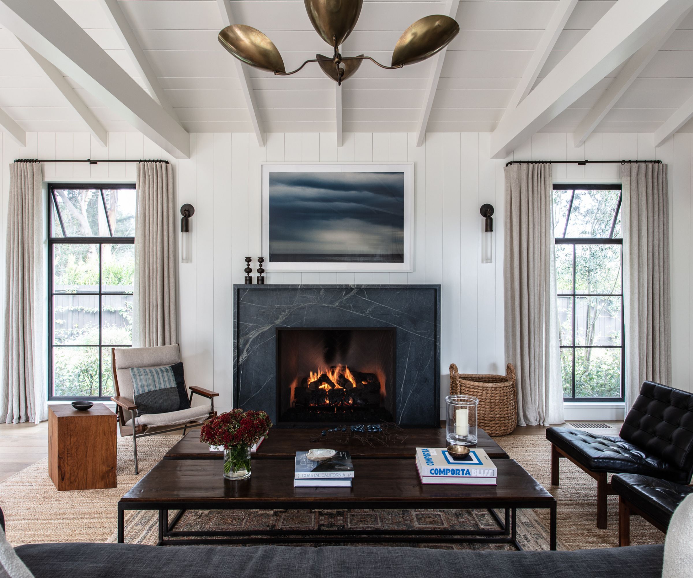
Living room ideas for the new-look space were devised to complement the existing ceiling with its exposed boards of varying widths, and one of the only original features kept from the original house.
'This living room with the fireplace that sits opposite the steel windows is special,' adds Jennifer. 'Stone anchors the room and balances the water experience with the cozy indoor, where the homeowners can enjoy fires on cooler nights and days.'
The new living room fireplace surround is a clean and modern, bluish-gray soapstone with a minimally raised edge that echoes the trim around the doors and windows. A seascape by Mary Ellen Bartley completes the scene, with sconces from Apparatus and a vintage ceiling light from L7 in Los Angeles. The wood block side table is from Rose Unaicke.
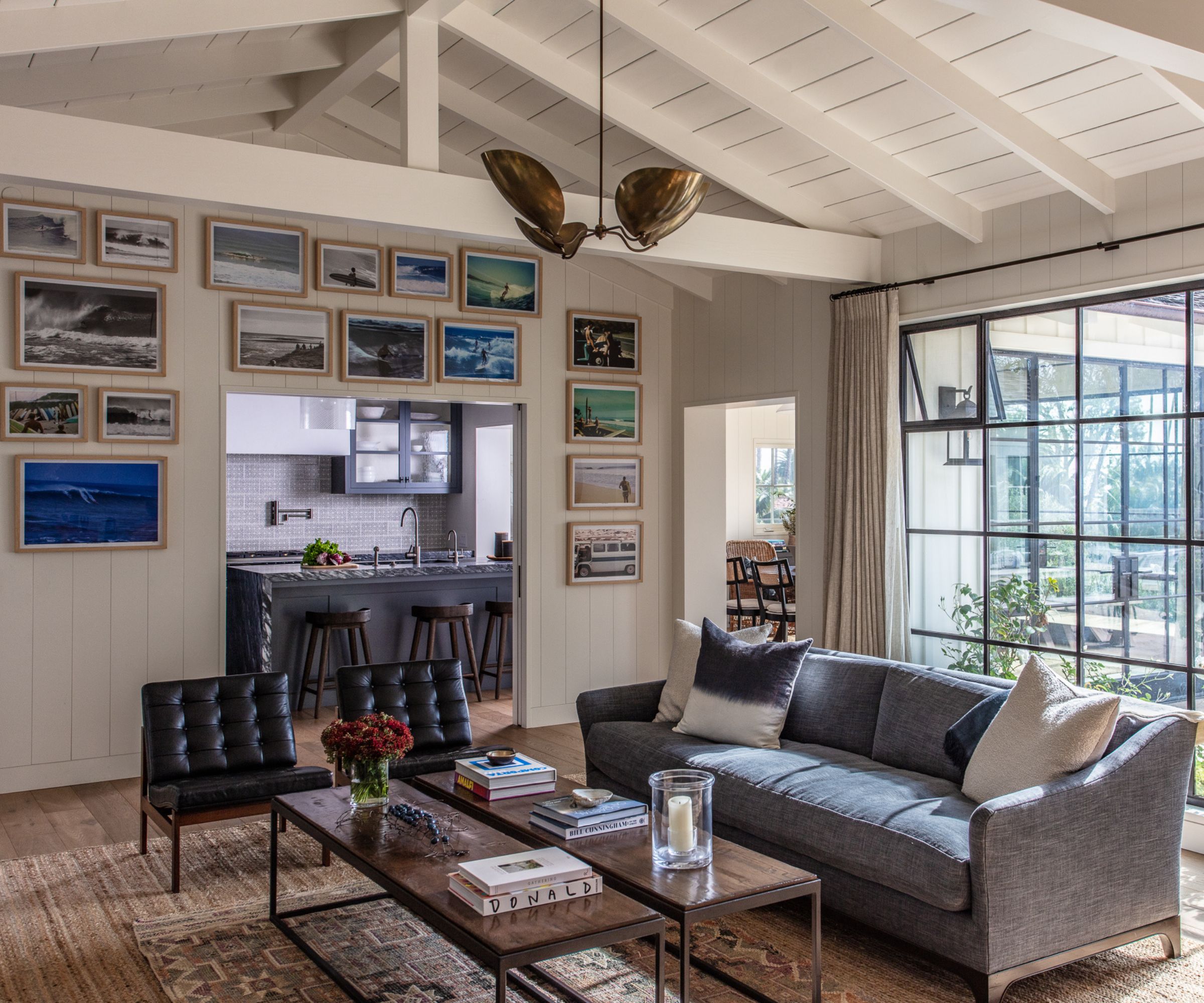
Almost all of the rooms have an ocean view, so highlighting that and connecting the inside to the outdoors was important.
'A big part of the plan was to make the windows and doors as big as possible, while keeping in line with the architecture,' says Jennifer. 'Black steel windows/doors were installed in all of the public rooms to blur the lines between indoors and outdoors.'
Artwork throughout the house is used to focus on various aspects of the ocean and watersports, and here, vintage surfing photographs from the local beaches frame the wall between the living room and kitchen.
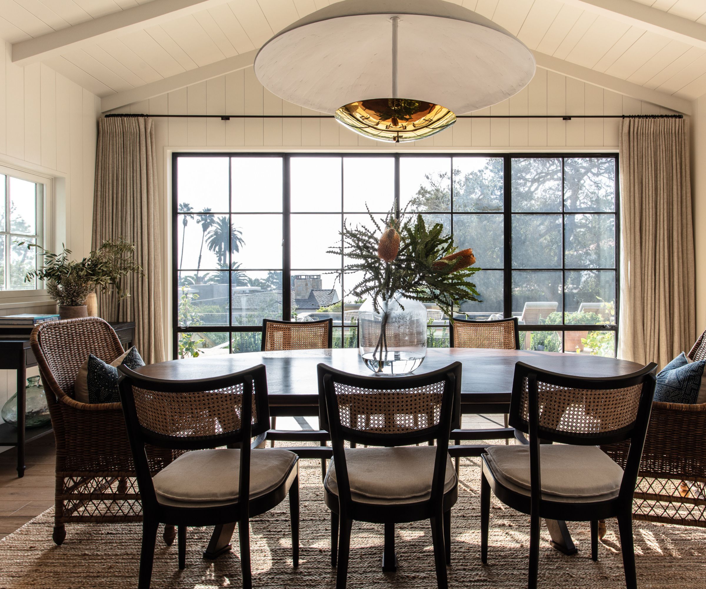
The mixed width plank ceiling was replicated in the dining room to unite it with the living room. 'In fact, we used wood paneling in all the common rooms, and painted it white for a light, beachy feel,' says designer Jennifer.
'The trim around doors and windows is linear and simple with a 1⁄4 inch raised edge, similar to a modern picture frame. We centered the dining room with an oversized custom plaster pendant. The room has a ton of natural light as there are windows/doors on three sides and a beautiful view of the backyard and ocean.'
The table and console are custom pieces. The dining chairs are from Crate & Barrel, with wicker chairs from William Laman Furniture Garden Antiques.
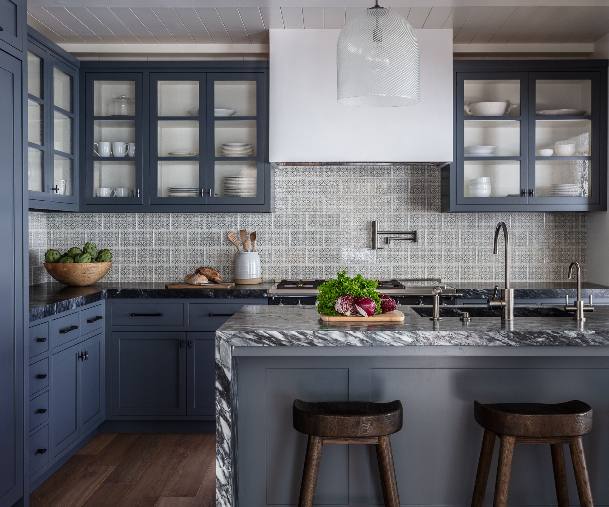
The beautifully designed compact kitchen contains everything needed in a vacation house, particularly one where much of the cooking and eating take place outside.
Kitchen ideas for this indoor space reflect the coastal colors of the location. 'Gray-blue upper cabinets with soft, textured glass fronts, and white interiors create visual depth and layers in this smaller space,' says Jennifer. 'The dark blue marble countertops have a leather finish that pulls out the veining for a textured feel and a vintage Murano pendant with updated bronze hardware finishes the space.'
The bar stools are from Restoration Hardware, tiles from Country Floors and plumbing by Watermark.
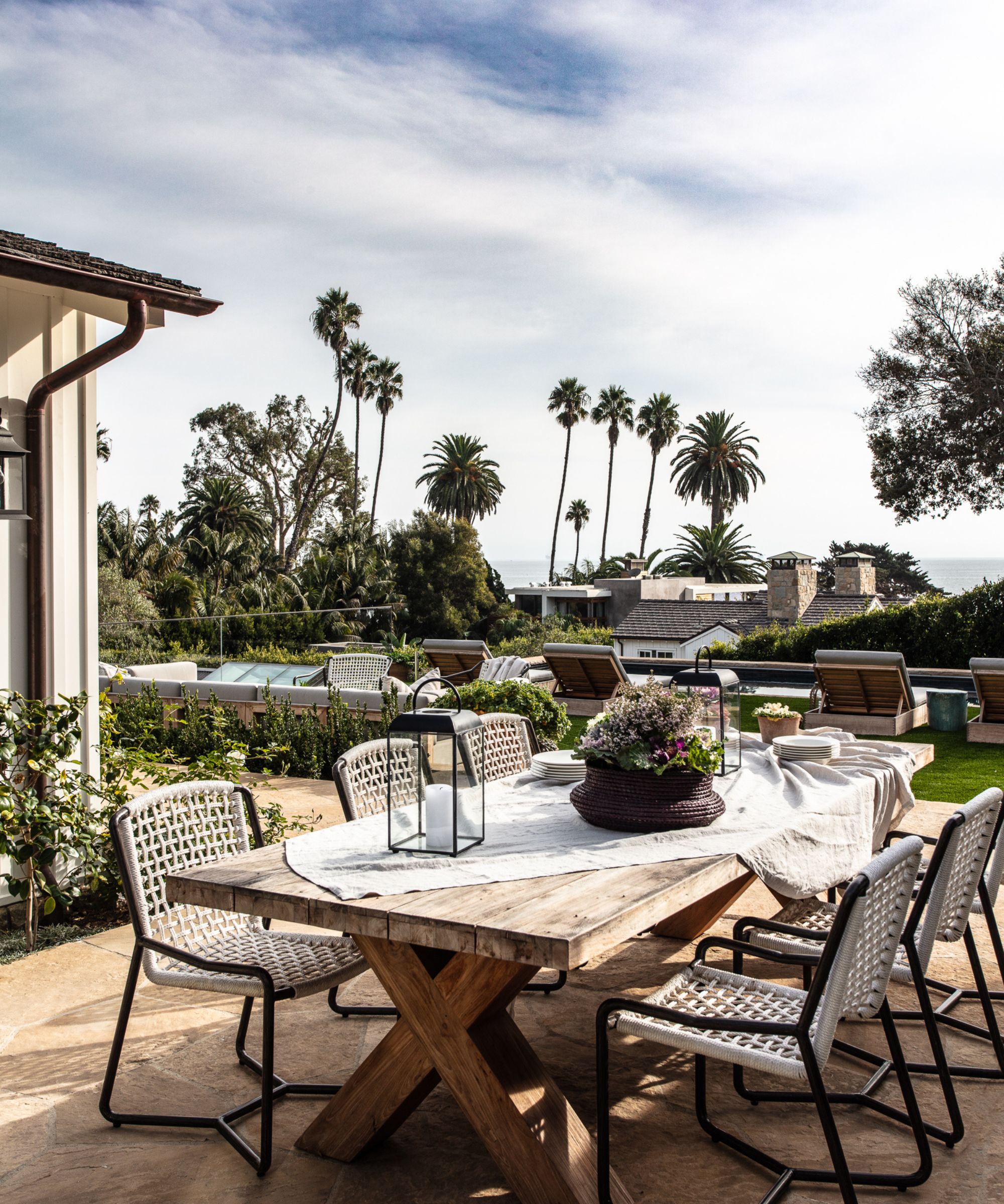
The exterior spaces were so important in this house as, given the climate, location and views, the owners spend a lot of time outdoors.
'We worked to create many outside areas for relaxing and entertaining, and fixed some architectural elements too,' says Jennifer. 'Small pathways, big boulders and treads transformed an awkward and unusable hillside, and created balance and a sense of importance. Natural materials like teak and wovens were chosen for the seating to balance the glass and steel architectural elements.'
The chairs are from Palecek, the outdoor tables, sofas and chaises are from Teak Warehouse.
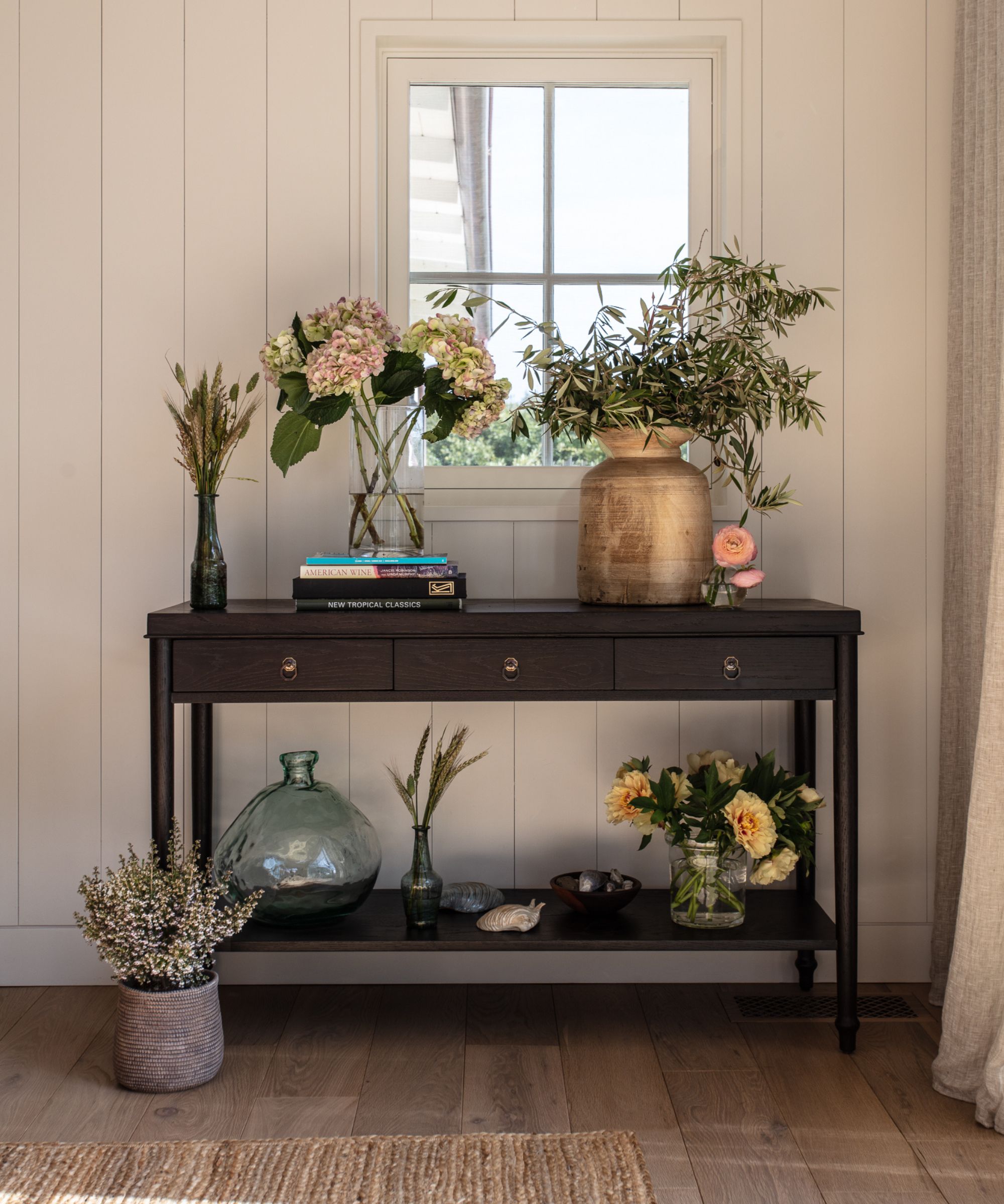
Just inside the front door, these simple entryway ideas create a calm transition space between the home's front yard and the heart of the home. A vintage console, topped with a selection of flowers and greenery sets the tone for the rest of the home, where the furniture is a highly curated mix of existing pieces from the client’s previous homes and new custom pieces. To counterbalance the straight lines and harsh angles of the house, the design team wanted to bring in softness and curves.
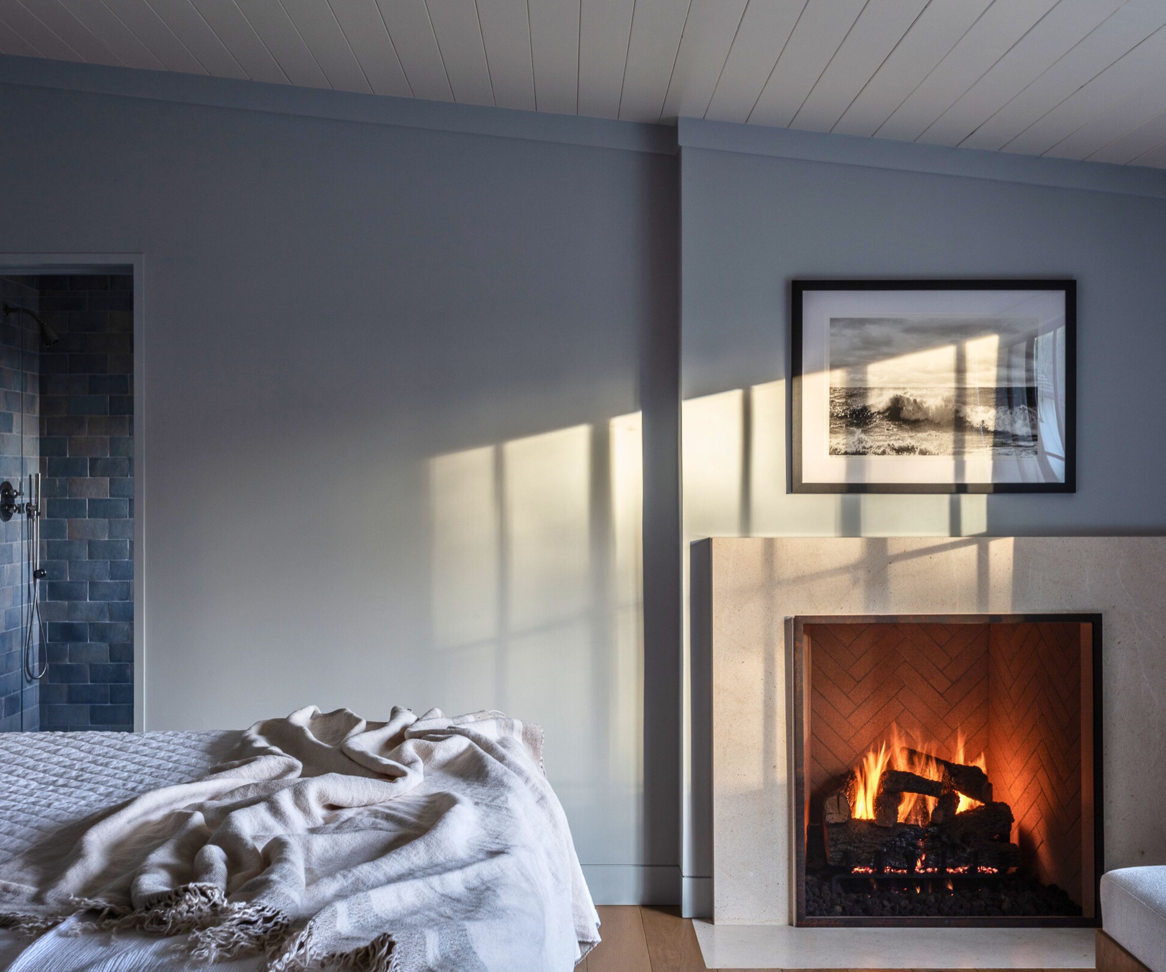
Bedroom ideas for the primary bedroom are focused on creating a calming sanctuary. Soft gray walls, with a hint of pattern in the soft furnishings for interest and texture, but keeping it restrained and refined. A fireplace and smart new surround add a touch of luxury and deep comfort.
'The team created a sloped ceiling to replace an odd step that was in the original design,' says Jennifer.
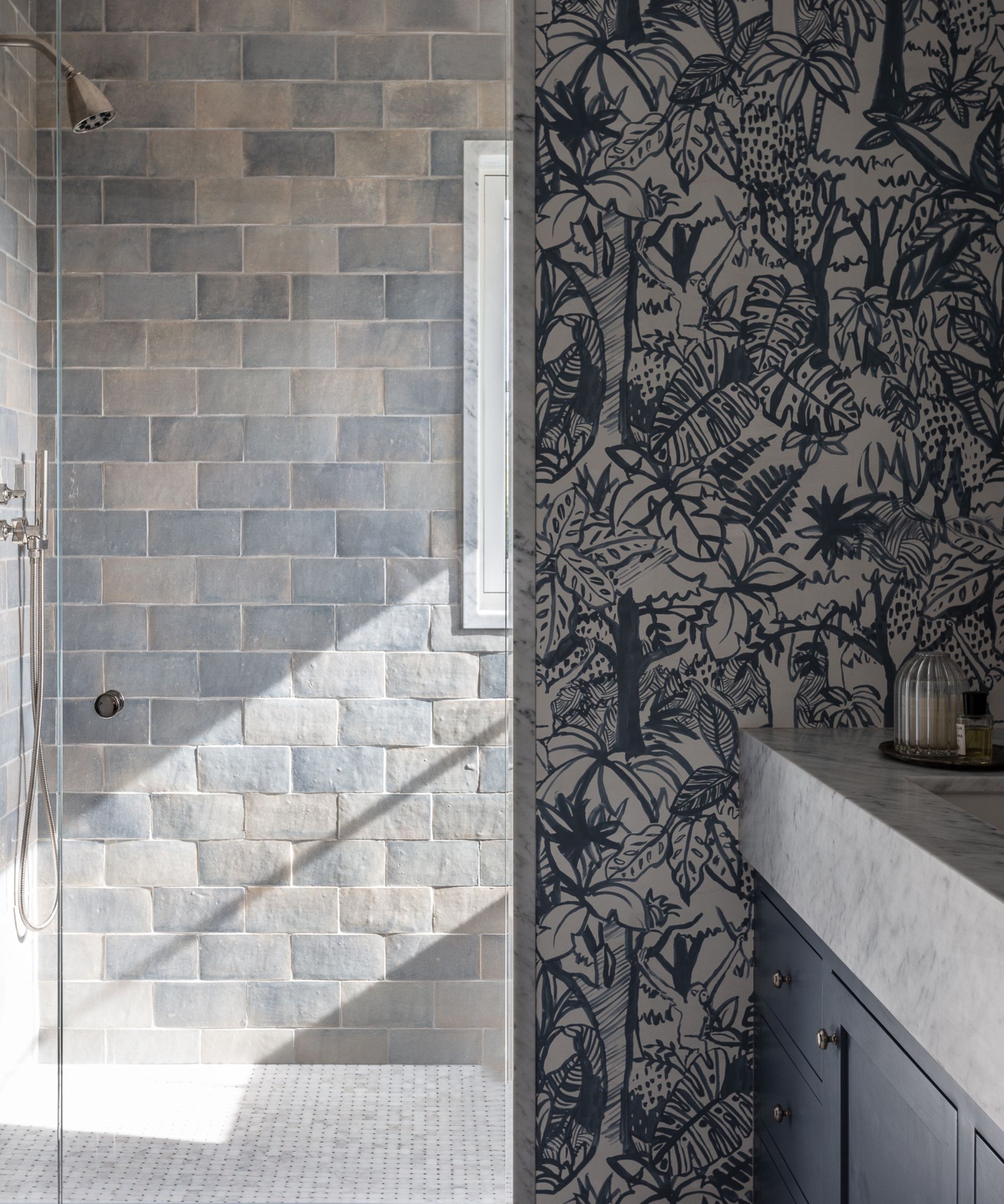
Bathroom ideas in the primary bathroom are all about contrast. 'We decided to use a bold patterned wallpaper, complemented by a marble vanity and window trim, textured tile, and high-end fixtures and lighting,' explains designer Jennifer. 'The wallpaper adds a beachy, playful accent to the sophisticated fixtures.'
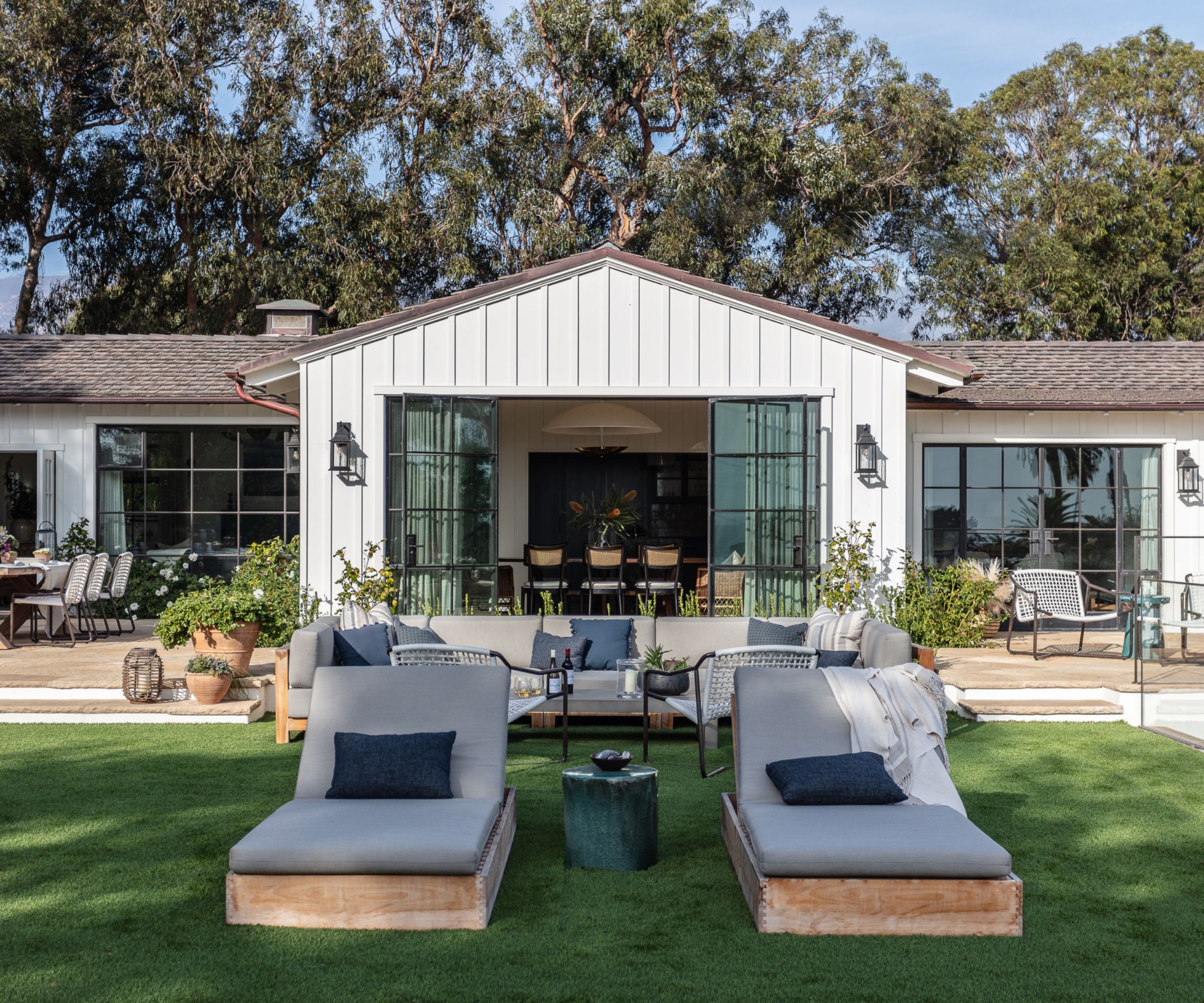
As can be clearly seen from this angle, all new windows and doors were added, with an intentional mix of steel and wood. The steel windows emphasize the ocean views and give the house a more modern look rendering it almost unrecognizable from the shell of the ordinary 1980s house the design team took on at the beginning of the two-year transformation. 'It really was a case study in how much you can transform a mediocre home and give it new integrity with subtle/meaningful architectural detailing,' says Jennifer. 'We're delighted with the finished look.'
Interior design: Jennifer Miller Studio
Architecture: Two Trees Architects
Construction: Unander Construction


