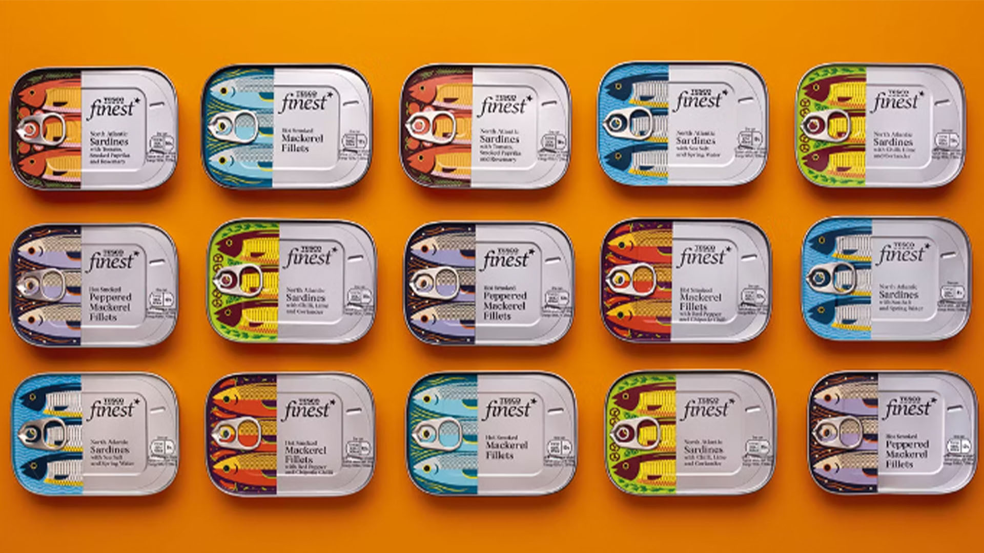
Ingenious design can crop up anywhere, but nothing has pleasantly surprised me as much as this humble tin of fish. Design fans on Reddit have been praising the creativity of this integrated design, which blends a pesky packaging feature into the tin's stylish artwork.
As we've seen with other standout packaging designs, sometimes simplicity is best and Tesco's tinned fish design is a perfect example of function and style. With its engaging illustration and classy typography, it gives the ordinary product a welcome touch of elevated elegance.
The ring pull blends into the fish from r/DesignPorn
The highly praised packaging is part of a design project by Jones Knowles Ritchie (JKR) for Tesco's Finest range. With intentions set on a more 'premium' appearance, JKR gave the roll-back tins a colourful makeover that feels contemporary and stylish – a surprisingly difficult feat for such a mundane product.
With structural features sometimes proving a pain for designers, the integration of the pull tab into the design shows ingenious creativity shaped by thoughtful illustration. For more delightful design take a look at these stylish eco-friendly shampoo bars or check out the Hermès envelopes that are slightly ridiculous, yet oddly stunning.


