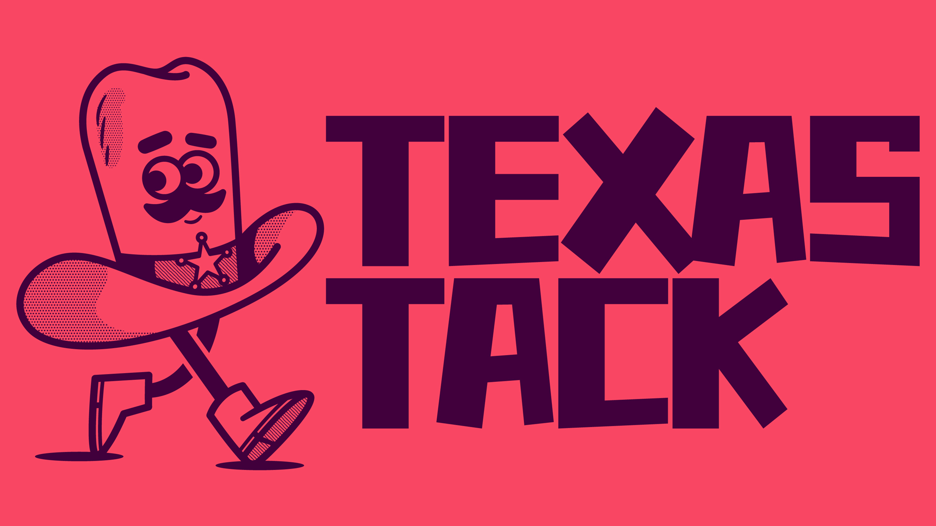
I was scrolling through LinkedIn the other day when I came across a post about a giant hat character. It really caught my eye, and turned out to be part of an identity for Texas Tack, a tape brand.
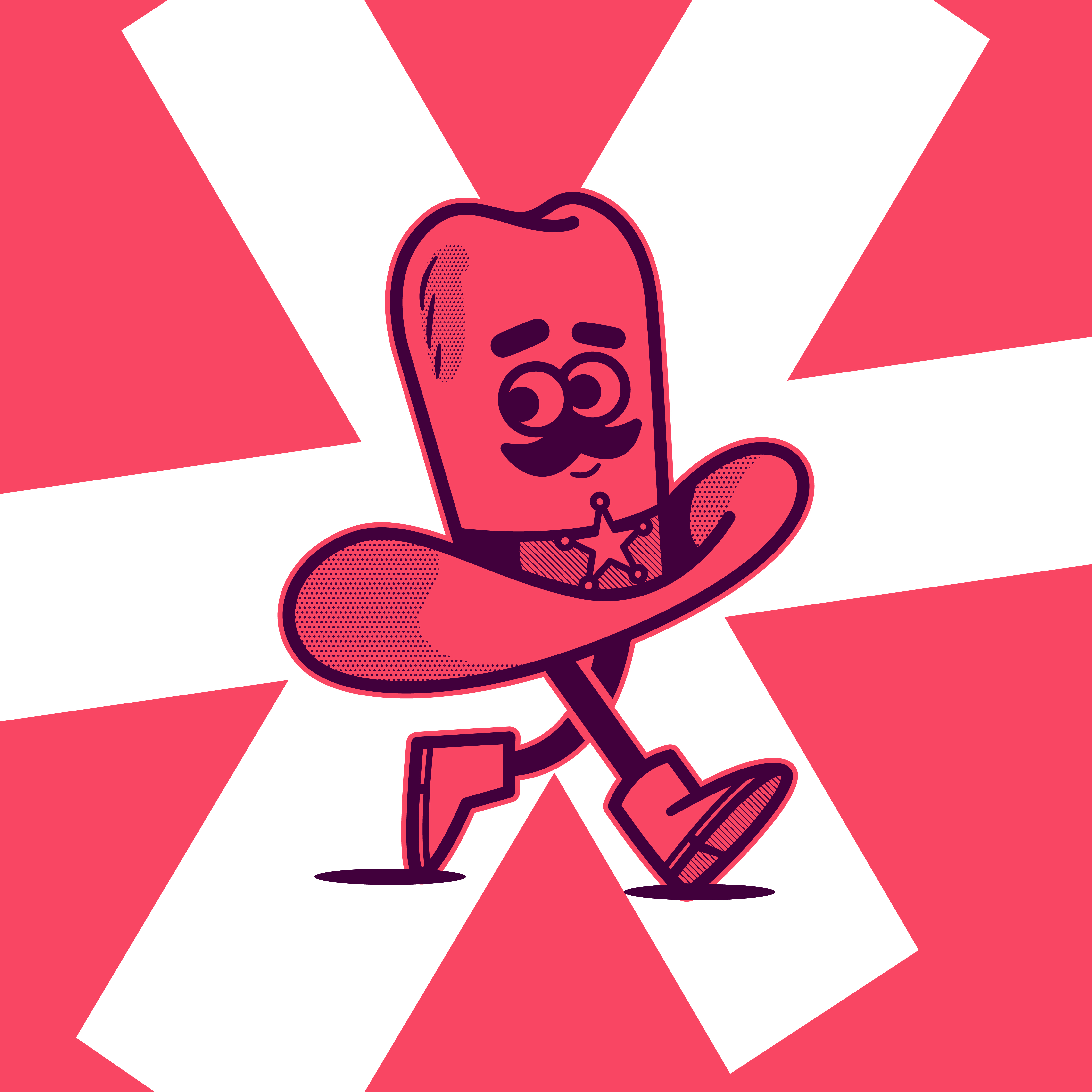
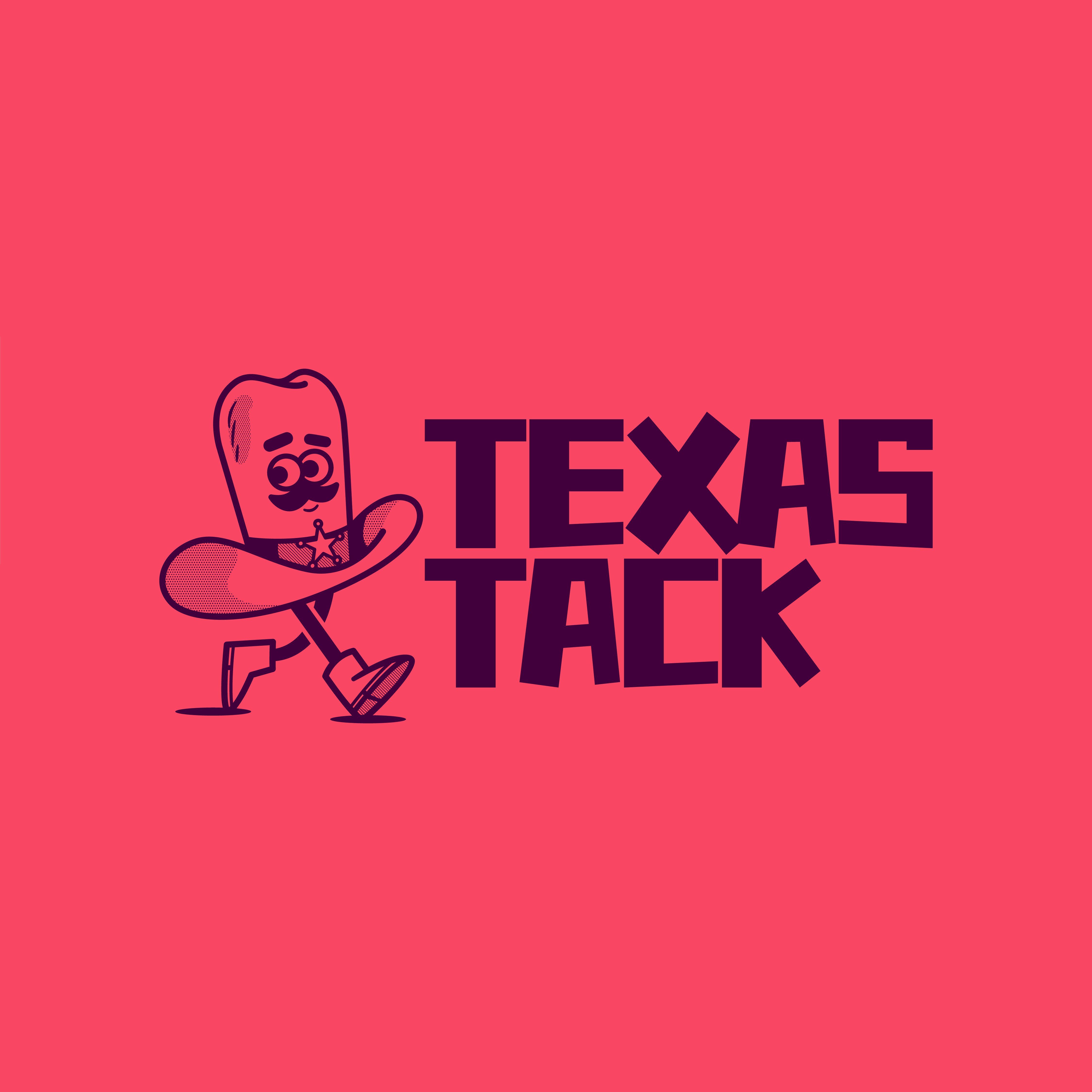
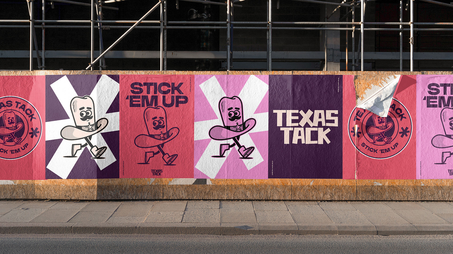
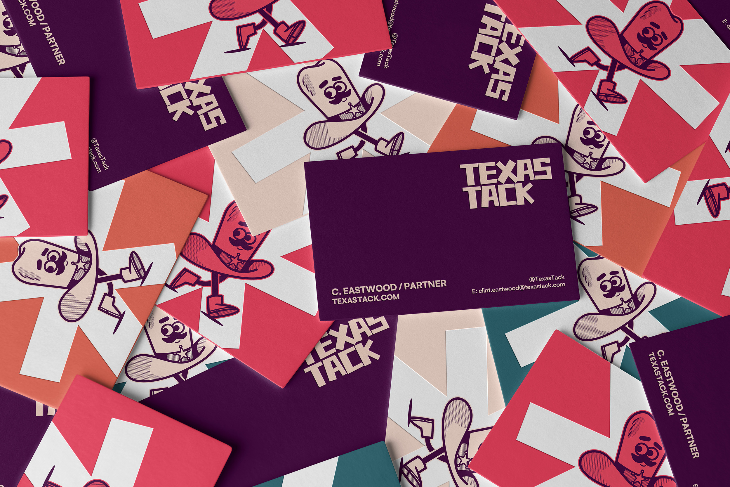
Dan Bailey, the creator, was asked to inject character and personality into the brand from the offset, as well as celebrate and lean into the brand's Texan routes. He's certainly done so, crafting a fun and colourful character, Clint (the giant hat), and a vibrant and bold identity to support him, which really has market standout. After all, most tape brands are pretty sterile in appearance.
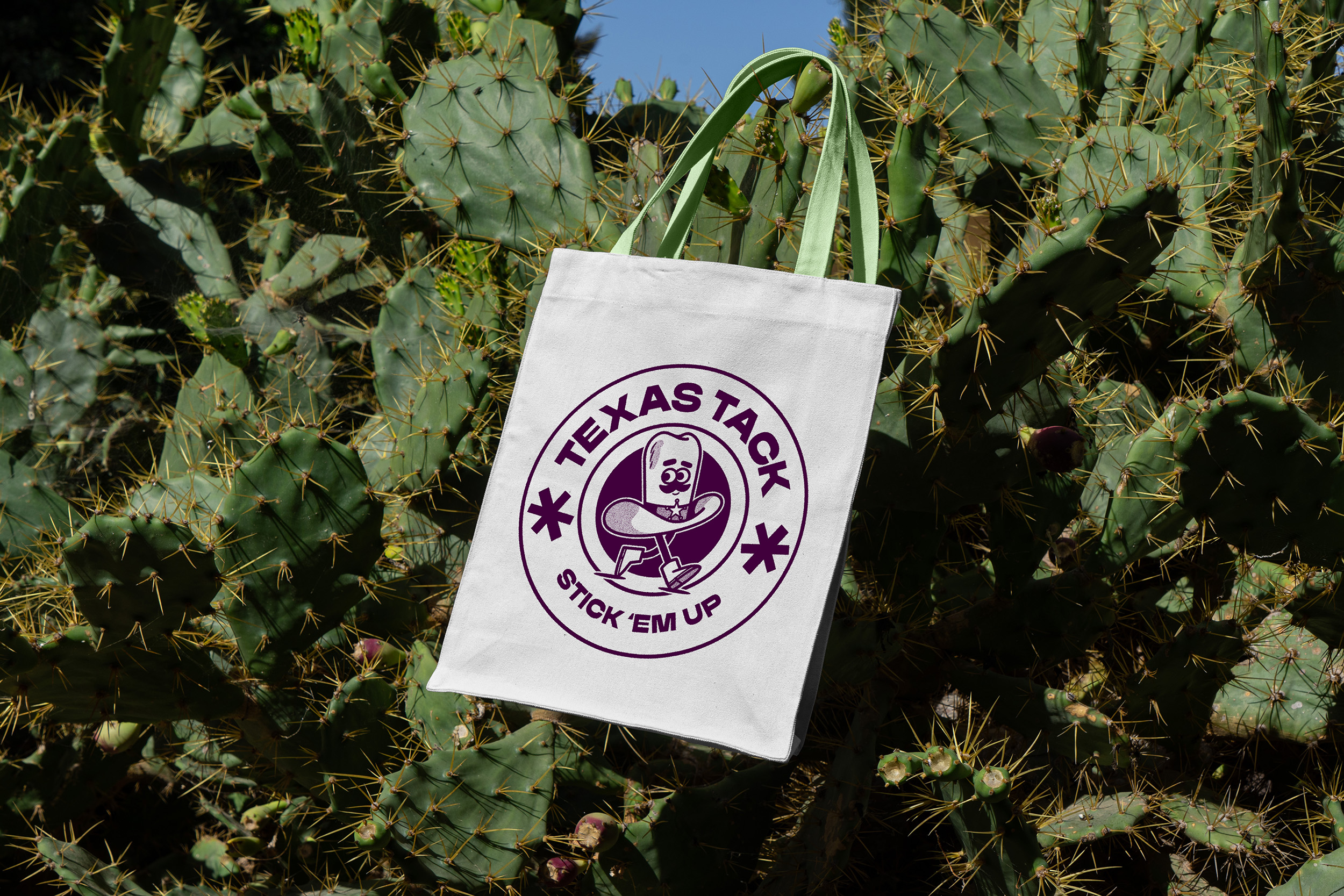
The addition of the tagline 'Stick 'em up' draws on the cowboy theme and adds yet more fun to the identity, making it even more memorable.
I caught up with Dan to find out more about this project, you can read our chat below. If you're after more branding inspiration, see our best rebrands of all time or best logos of the decade series.
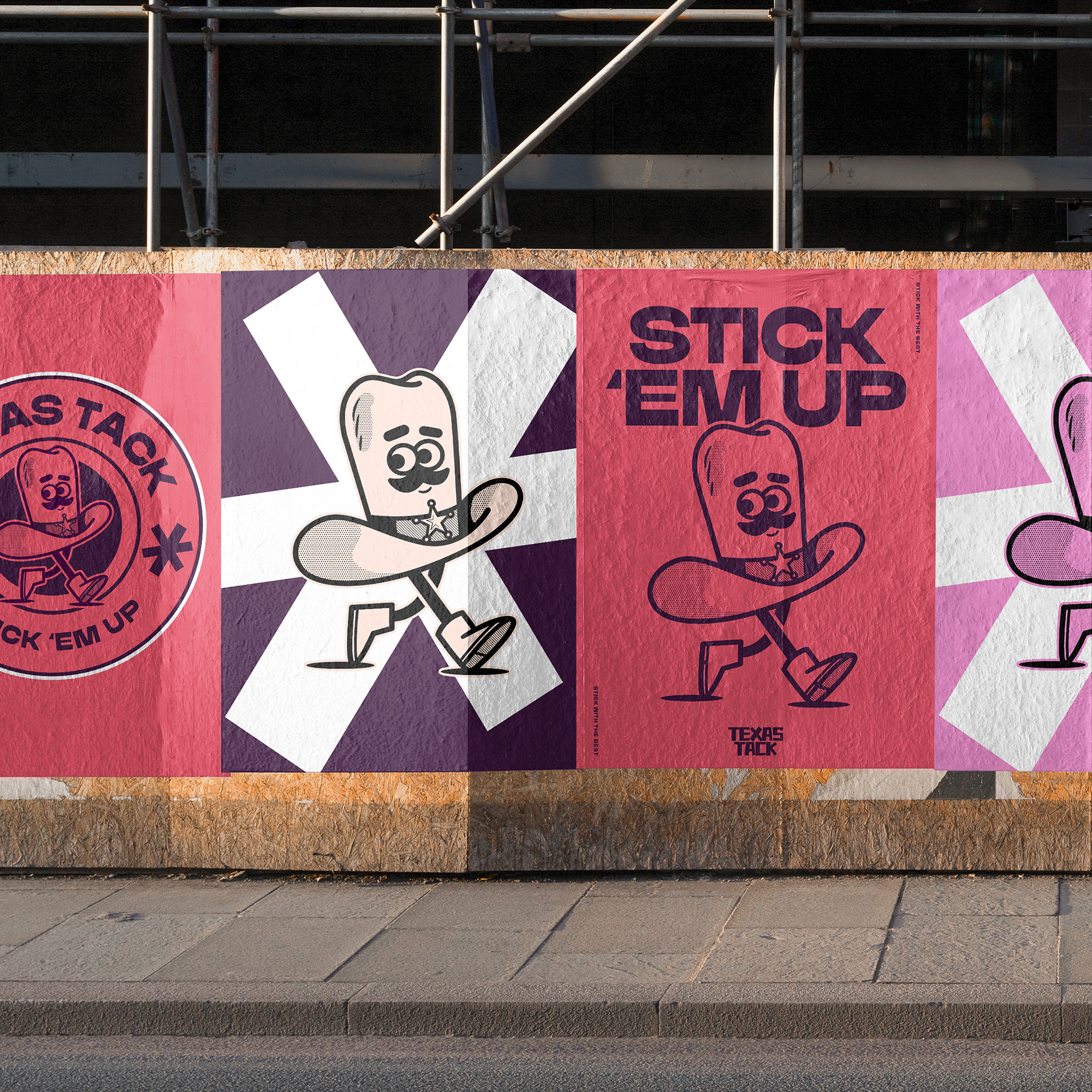
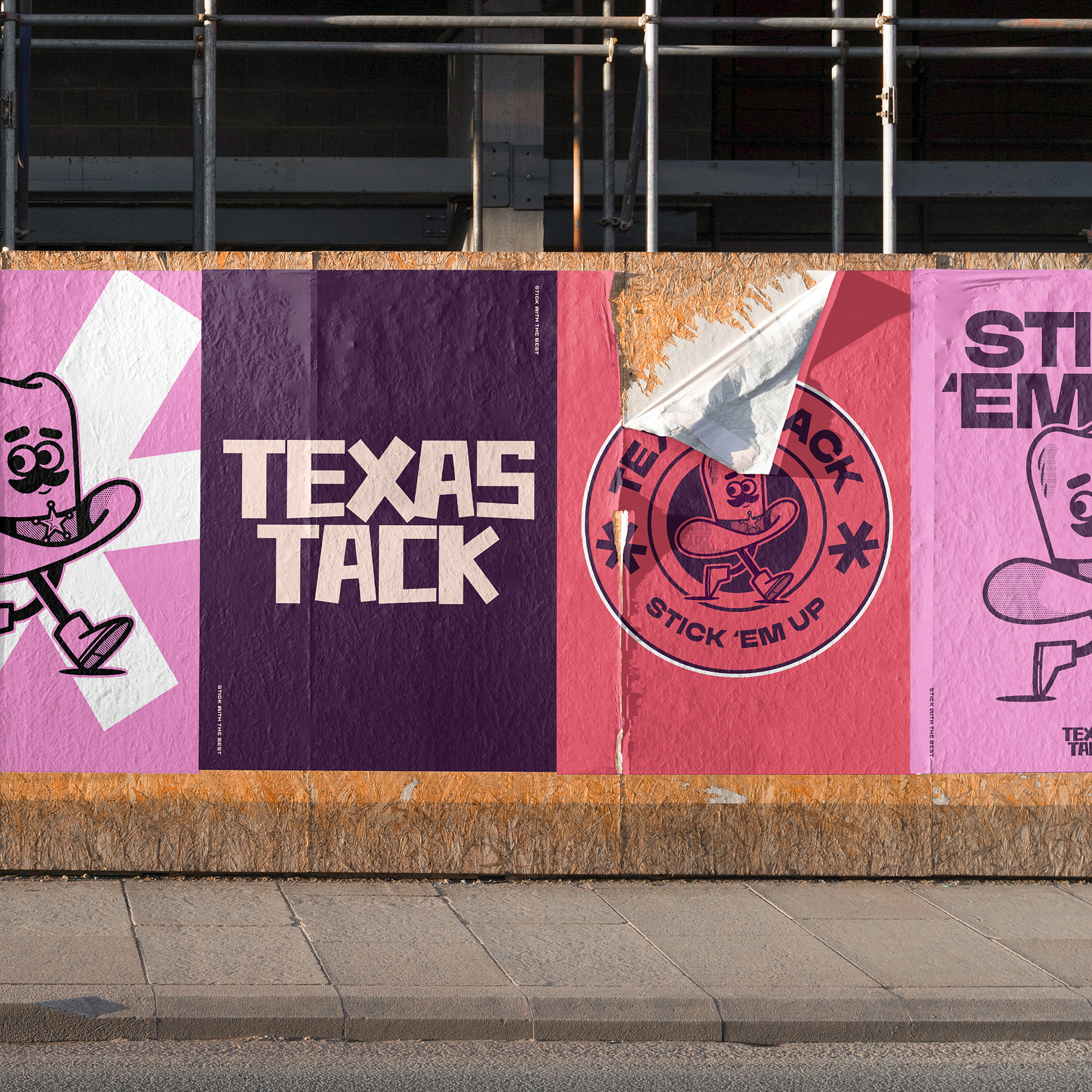
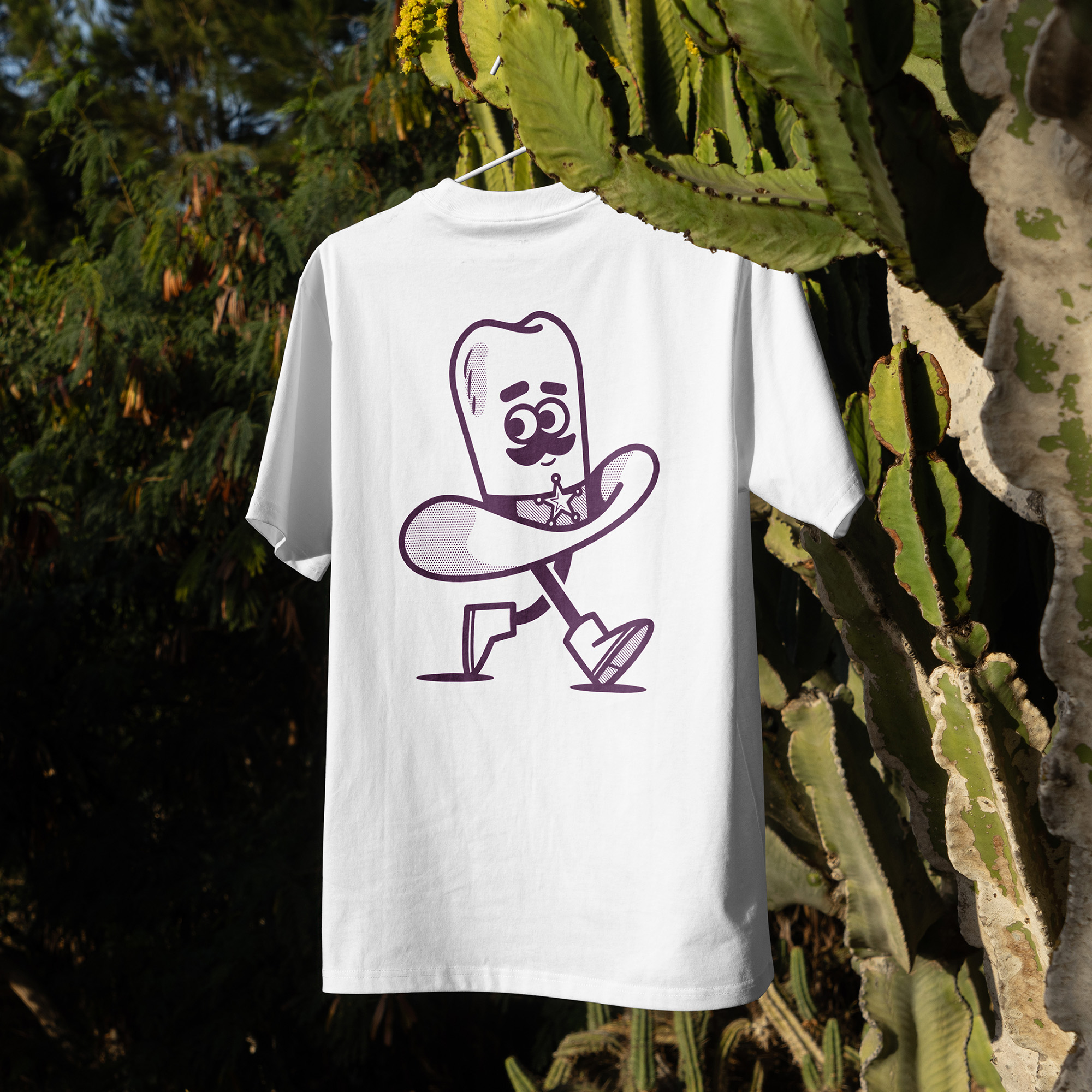
What inspired the character Clint?
Texas and its rich western heritage lie at the heart of what we’ve created. The passion and pride for their heritage fuelled my clients desire to reflect that charm through their visual identity.
The obvious way to bring this passion and personality to life was through a mascot. We knew that if done well, it could create a meaningful connection with their potential consumers.
Initially, we explored a variety of mascot concepts. A cowboy felt like a natural fit, but we were also drawn to the idea of using an animal synonymous with Texas. While the cowboy idea stood out, I was determined to avoid something overly predictable.
After discussing a range of ideas and styles, we discovered a shared love for the classic Looney Tunes cartoons and the animation era they represent. I began diving into the works from some of the animation legends like Chuck Jones and Tex Avery for inspiration.
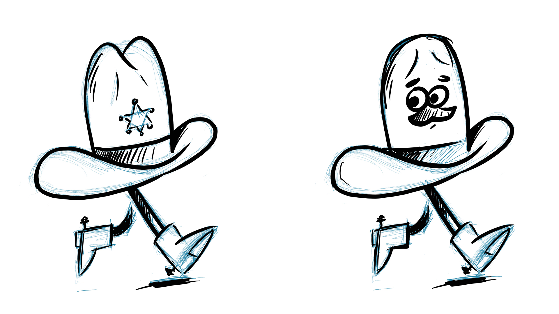
Classic cartoon characters from the 1940s and 1950s, such as Droopy, Yosemite Sam, and the Ant Hill Mob, provided inspiration for Clint and sparked the idea of making a giant hat the centrepiece of our mascot – but with a twist.
The initial concept featured a massive cowboy hat perched on a human figure with no distinct facial features. However, the more I considered it, the more I loved the idea of the hat itself becoming the character. This allowed for greater expression and gave us the opportunity to include playful details, like our iconic cowboy moustache.
The moment I started sketching Clint, I knew we’d found the perfect fit. By incorporating a retro aesthetic, we gave the mascot a nostalgic charm that complemented the brand beautifully.
Were there any challenges in this project?
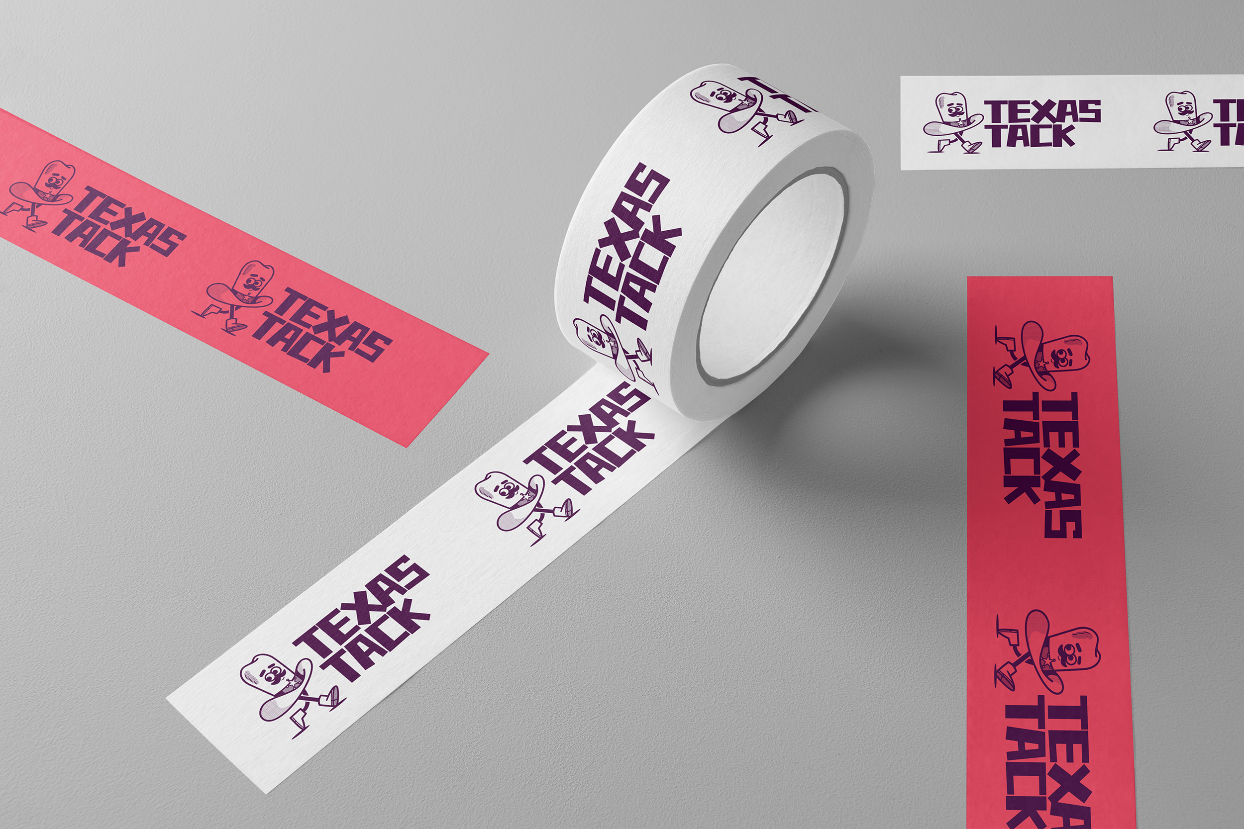
This project was so much fun to work on, and overall, everything came together pretty smoothly. The biggest challenge for me personally was designing a wordmark that complemented Clint, our mascot, and did him justice.
I wanted to subtly reference the product within the wordmark, but it was important not to create an element that would overpower Clint, clash with his character, or complicate the overall design. I experimented with various typefaces and concepts before stumbling upon the idea of creating a wordmark that reflected the tape itself. After some exploration, I found a typeface that provided a great starting point, and with a bit of tweaking, I was able to craft the design you see today.
Striking the right balance was key – I wanted the wordmark to have personality without feeling too cartoony or childish. I think we achieved that, creating something that adds to the charm without detracting from Clint’s presence.
What's your favourite part of the finished work?
It’s a tough call between Clint and the strapline ‘Stick ’em up’, but I think Clint just edges it for me. I’m really pleased with how he turned out and the response he has been getting, although I have to admit, I was secretly very proud of the strapline.
Follow Dan Bailey on Instagram.
