The fun thing about color trends is that they can help define the mood of a moment. No one is suggesting we try every single trend that comes our way, but it's interesting to spot patterns in the shades designers are using – and work out exactly what it is that the resulting spaces make us feel.
When it comes to 2024's interior design trends, it's safe to say that the vibe is largely cozy and calm. Moody, enveloping burgundy speaks to our desire to create intimate spaces; warm beige is comforting and soft, everything we want from our homes right now. And then there's cool, pale blue – a calm, restful shade, a little bit dreamy, a little bit ethereal. If the outside world feels too busy right now, this shade can help create a sanctuary in which you can decompress.
That doesn't mean you can't be playful with pale blue, and as these spaces show, there are plenty of ways to employ this color trend if you do want to give it a try. Read on to see how designers are using this shade.
1. Use as a base for bright pops of color
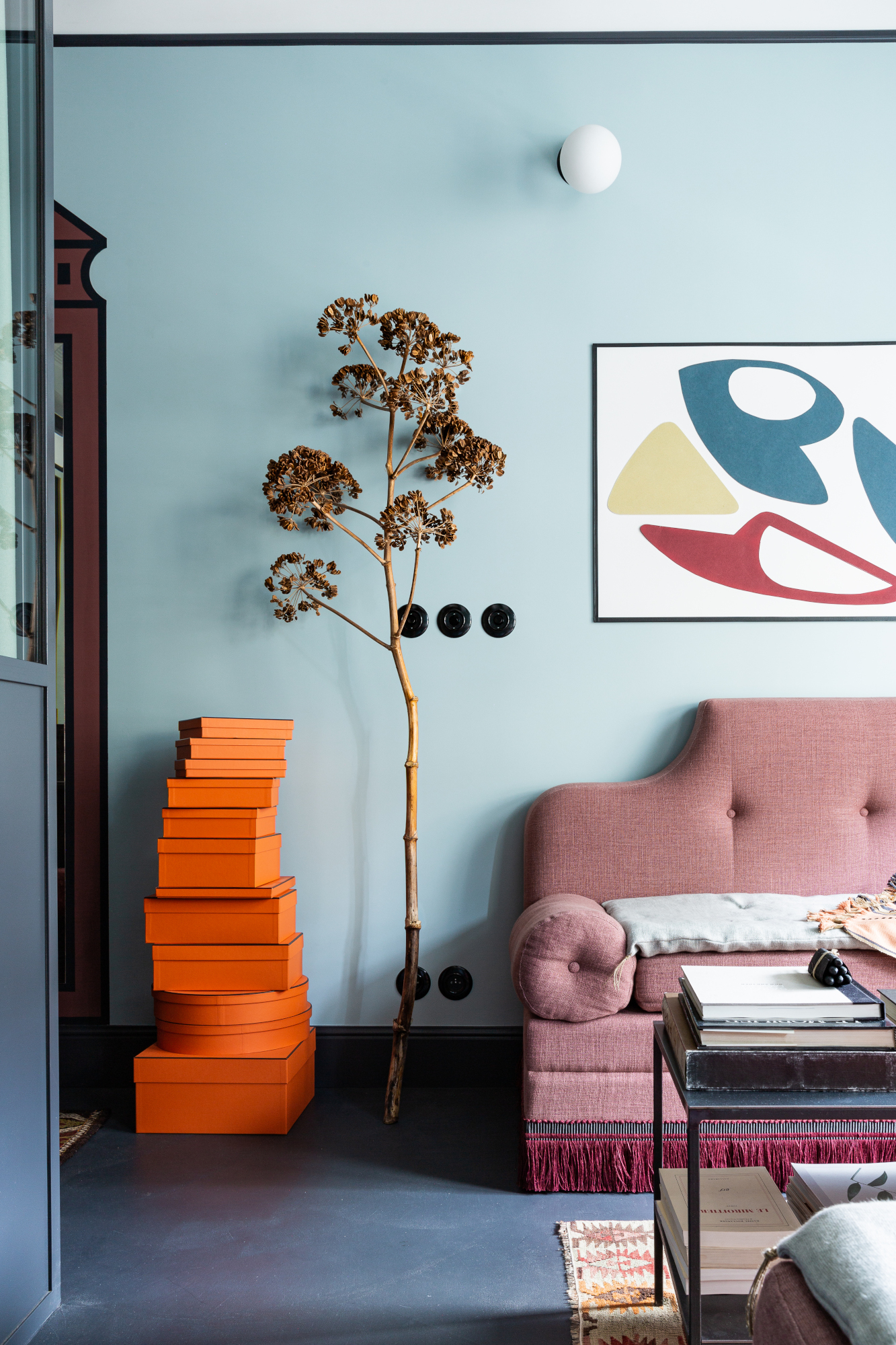
A Parisian flat by French interior designer Marianne Evennou showcases the versatility of pale blue as a base color: it holds its own paired with a muted pink loveseat, burgundy border and bright orange accessories, taking its place as a neutral, of sorts, in a room of unexpected color combinations.
The walls are painted in SC284 by Ressource Paints. ‘I wanted a soft color for a peaceful atmosphere,’ says Marianne. ‘It [creates the] sensation that a piece of sky got into the apartment. It fits with a stronger red color in the entry.’
2. Apply a wash over the entire space
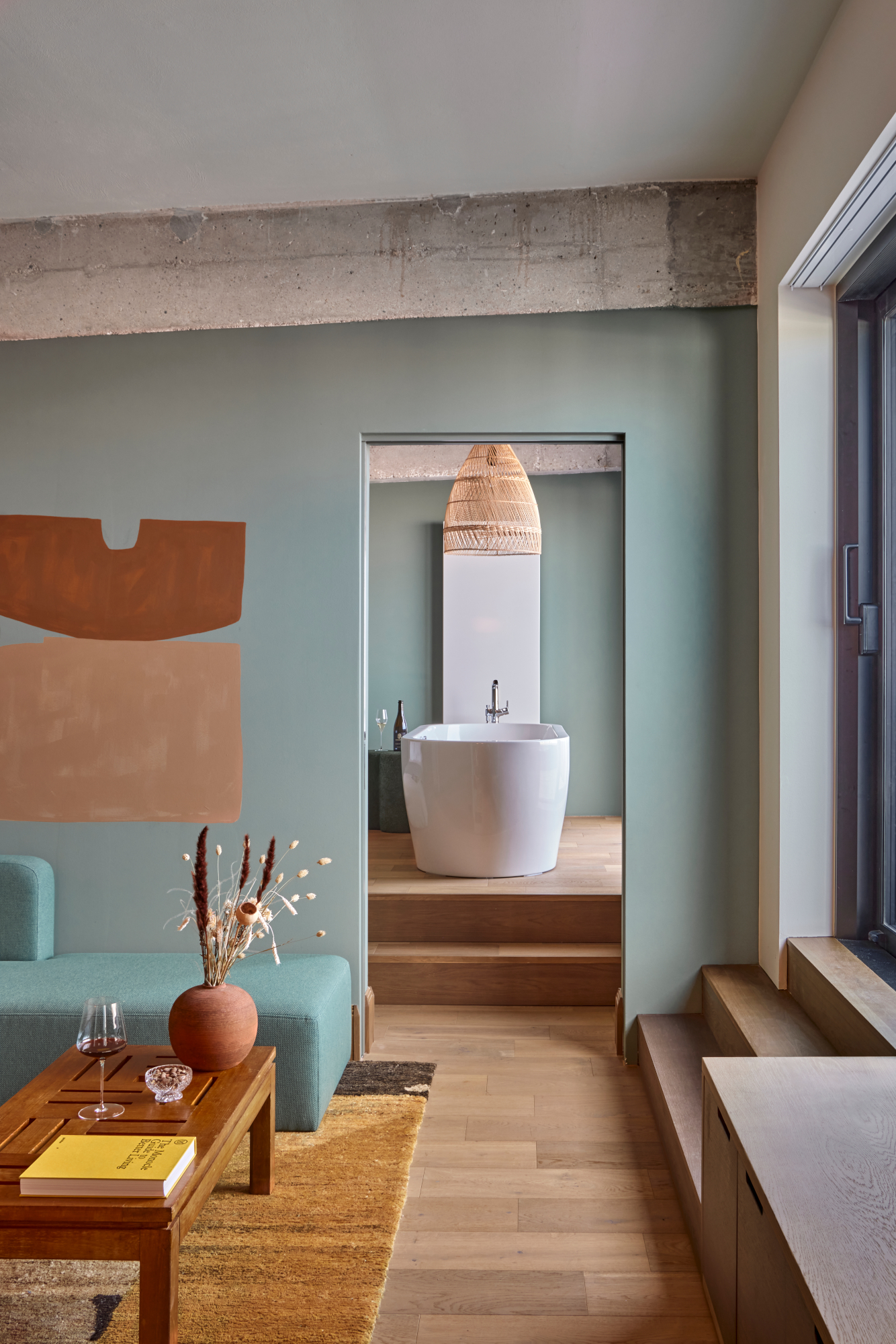
Paired with woods and earthy tones, there’s something beachy about the blue in the penthouse suite at WunderLocke, the stylish Munich aparthotel designed by Holloway Li. Picking up the wall color is a daybed in a slightly more intense shade, but the whole thing feels grounded, relaxing and sophisticated.
To get the look, opt for a matt or textured paint – a limewashed wall in a pale blue shade would look particularly dreamy – and pair with natural materials like woods, jute, rattan and sisal. It's a more natural and earthy approach to this trend compared with some of the other ideas in this feature – perfect for those who prefer a pared-back approach to using color.
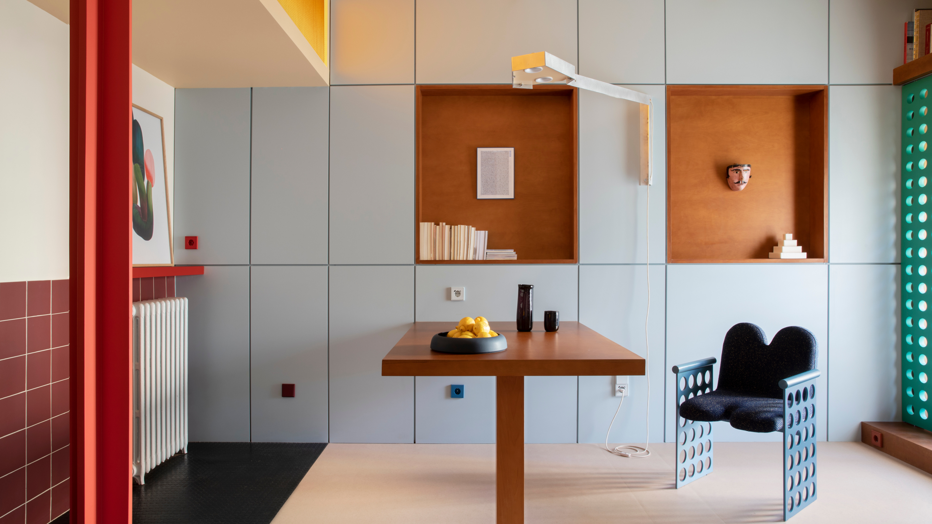
3. Balance out dark or warm shades
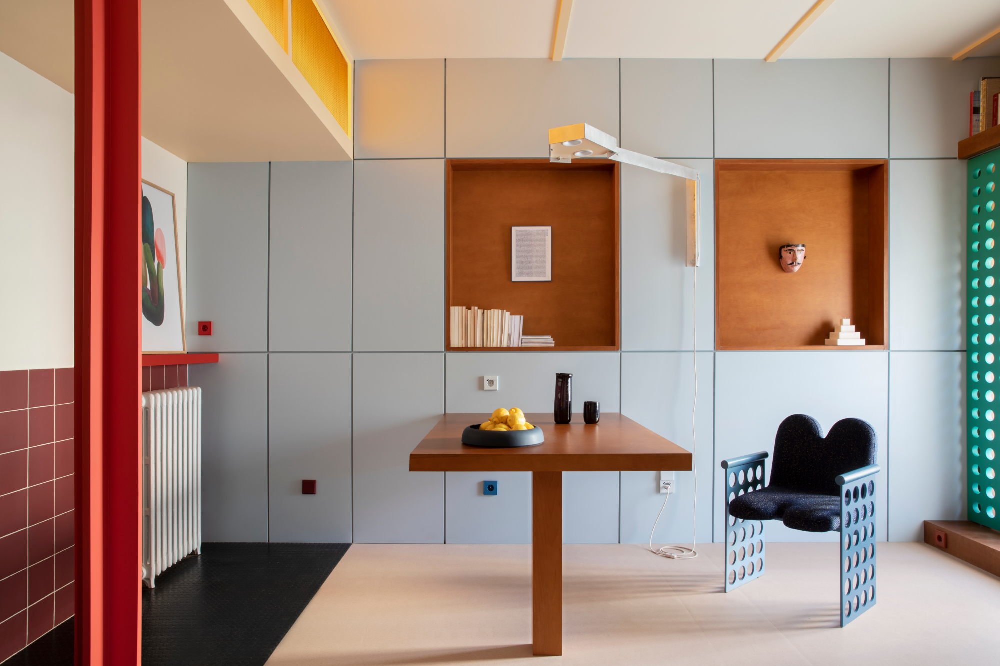
Operating within the boundaries of the Le Corbusier Palette from 1931 – a naturally harmonious collection of colors proposed as a tool for architectural color design – Madrid-based studio Plutarco chose a pale blue (32023 Outremer Pâle) as the base for this space, jointly created with EstudioReciente.
‘It’s the perfect balance to darker colors and wooden materials,’ says Plutarco’s Enrique Ventosa. ‘In order to “neutralise” the super warm colors, this pale blue works as a catalyst that softens the red and brown colors, creating the perfect atmosphere and balance between the rest of the palette.’
4. Try the dreamy pairing of pale blue and coral
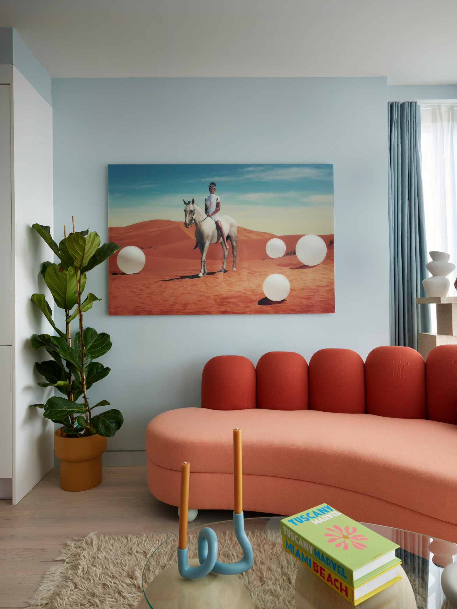
This scheme by Owl Interior Design picks up on a key 2024 palette: pale blue, coral and terracotta. With walls painted in Little Greene's Drizzle and a bespoke sofa designed by the studio, the space is fresh, yet understated. ‘We designed this apartment to be playful and engaging,’ says co-founder Simone Gordon. ‘We were inspired by the views of the London skyline and the tones of the architecture.’
Other red tones such as terracotta and burgundy are all colors that go with light blue, meaning you can adapt the scheme to suit your style. Tempering darker, bolder reds with a mid-tone, like Owl have done here, will help ease it into the rest of the scheme.
5. Pair with accents of yellow
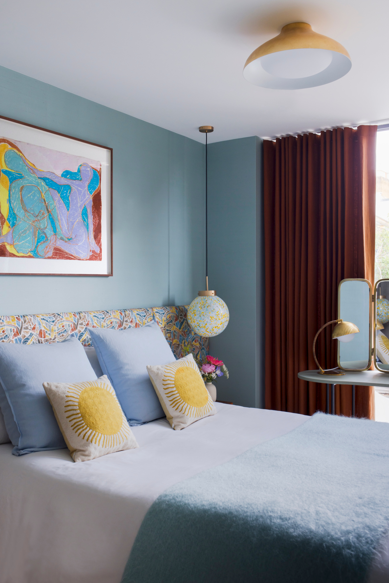
This low-key approach to blue is perfect for a bedroom color idea – the shade is generally associated in color psychology with a sense of calm. Make the most of this by painting walls and ceiling in a light blue – it will create a cocooning effect that could aid in making the room feel more restful.
In this space by London design firm cúpla studio, there’s something summery about the scheme, with the walls covered in Slub silk wallpaper from de Gournay. We know there are many colors that go with blue, but isn't yellow just perfect? ‘The warmth of yellow pairs really nicely with the cool tones of the wallpaper,’ says founder and creative director Gemma McCloskey.
6. Bring in the color through subtle details
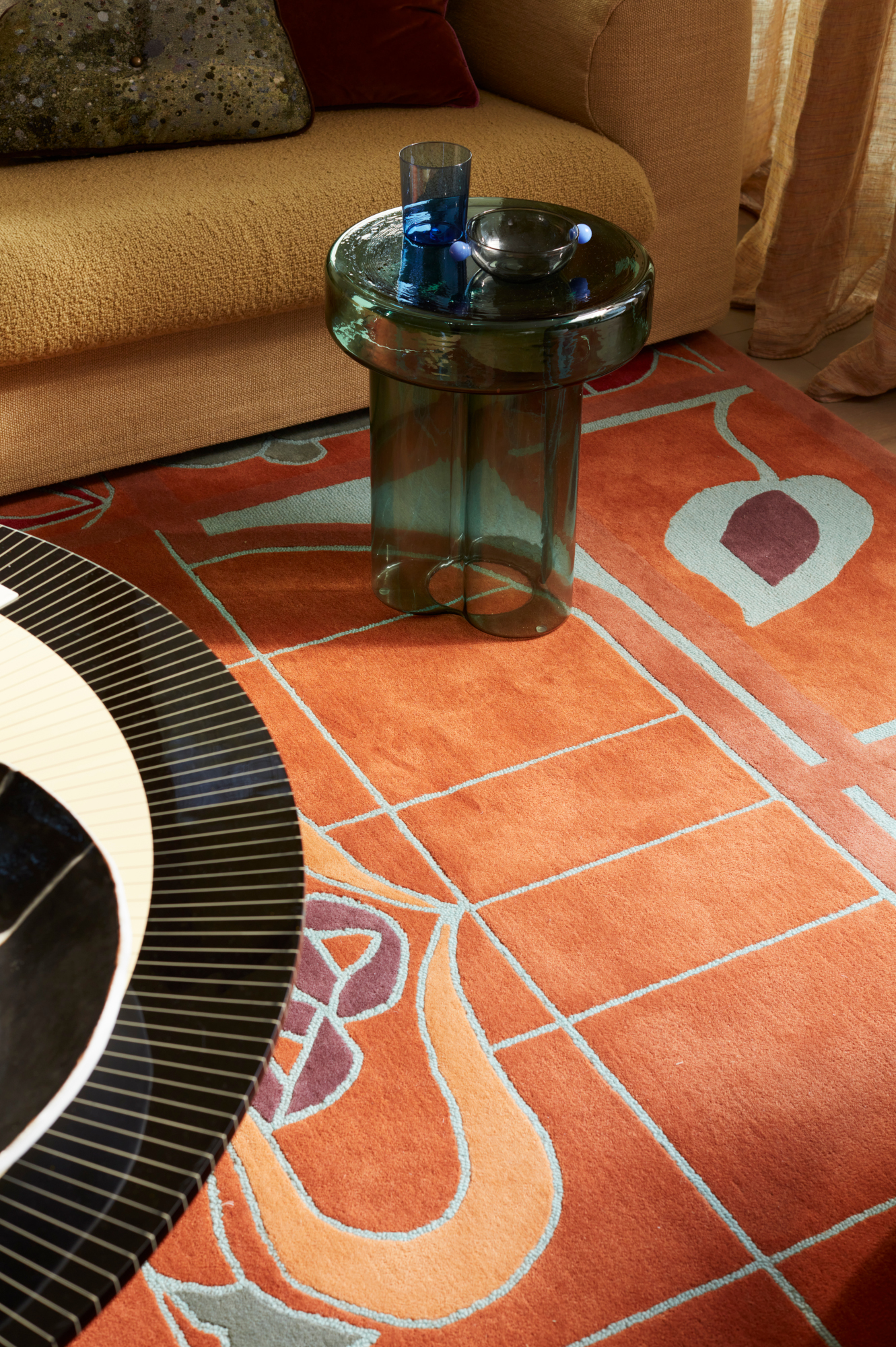
Pale blue takes a supporting role in a scheme by Australian studio YSG, running through this bespoke rug in straight lines and botanical forms. It’s a great example of how to use the shade in a quiet way; it takes the place of black or white in its graphic form, offering a more muted contrast – and a lot more interest to boot.
And of course, if you want to give pale blue a try without cracking open a tin of paint, you can introduce the color through accent accessories: think candleholders, cushions and artwork, as well as the best rugs.