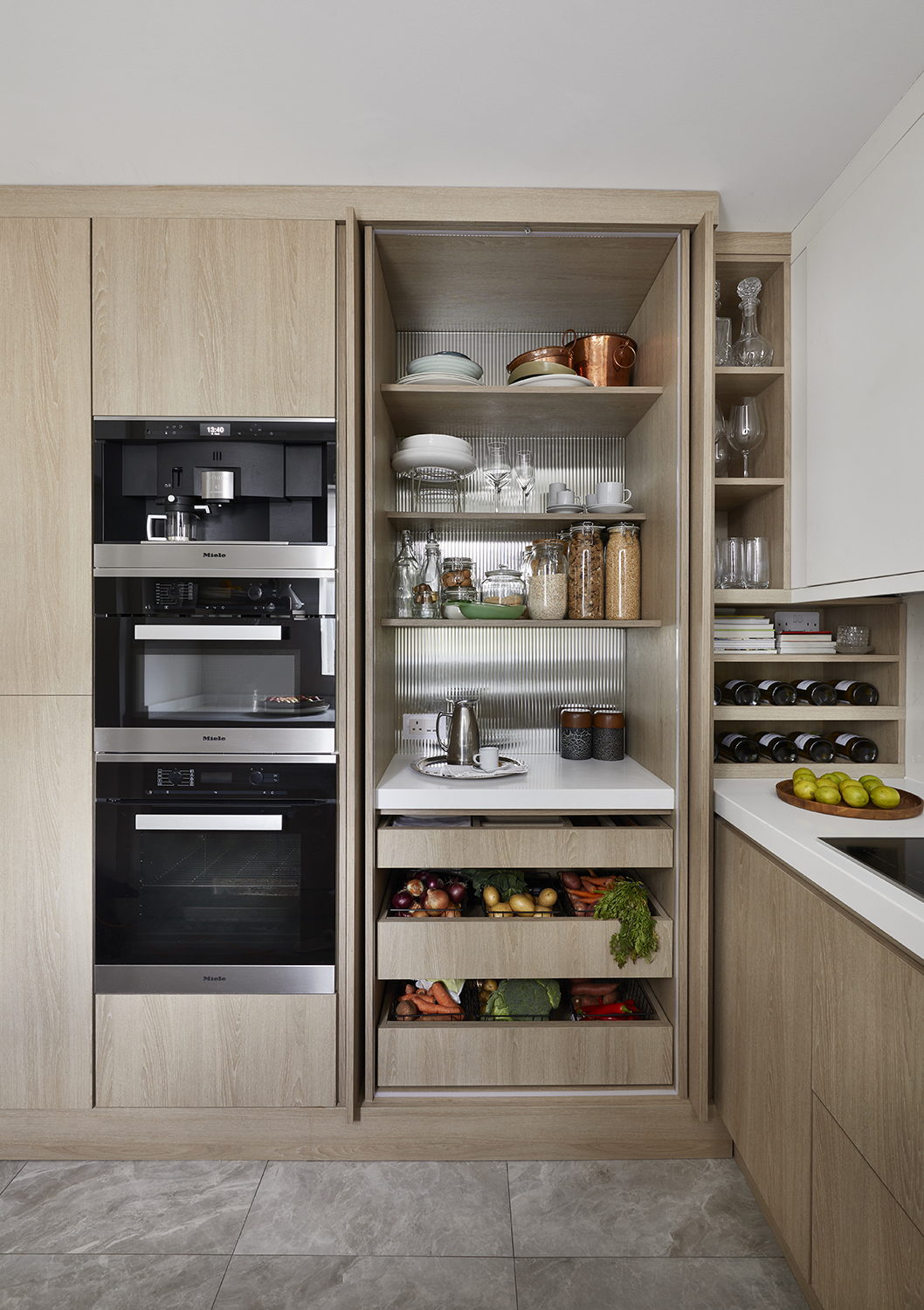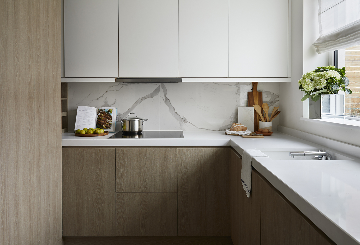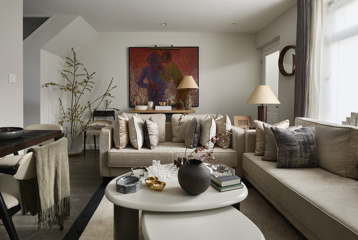
We've been talking a lot about minimaluxe on Livingetc recently. The joy of letting your favorite things breathe and being able to truly appreciate them, unhampered by clutter and visual noise. But the look tends to be used in larger spaces, where there is room to put individual pieces on display.
But what if you want to embrace this interior design trend, and have a lot of favorite things, and live in a fairly small apartment? How do you stop all your treasured objets looking cluttered while still having them out to be viewed? That was the tightrope walked successfully by the British designer Tolù Adẹ̀kọ́ for his own home, a calming space filled with plenty of decor pieces, but still no sense of being hemmed in.
'When styling and dressing a space, it’s important to consider the full visual interest and creating focal points – especially with display shelves or library walls,' he says, of how he stopped his apartment from looking full. 'As I dress the shelves, I consider a visual triangulation, by position the largest objets in the centre, and work on two side by sides with a ca central focus. As well as compartmentalising or zoning each shelf with different items from books, ornaments, picture frames, to vases, trays and fresh flowers.'
Take a look at the other ways he managed to achieve the minimaluxe ideal in a fairly compact home.
By picking the perfect palette
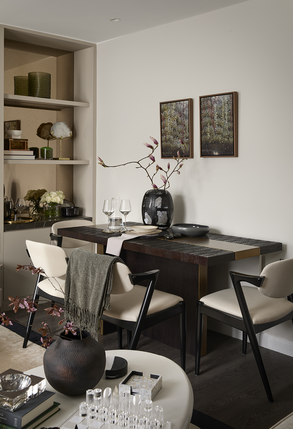
Although Tolù hasn't held back on arranging his decor on display, they seem airy thanks to the very deliberate and well edited color scheme. 'The interior was designed to be a plain canvas that can tell the stories and shared memories of my family, rather than using stark white,' he says. 'We handpicked complimentary tones of taupe from the Farrow & Ball colour chart.' He settled on Ammonite No.274 and Strong White No.2001.
What these shades did was a allow a calm backdrop that wouldn't encroach on the beauty of his decor, wouldn't fight against his furniture and ornaments.
'We wanted to choose a color that has a combination of grey and taupe tones, that would be ideal for a neutral setting and allow endless possibilities,' Tolù says. 'I find that subdued color palettes can work perfectly with natural light and add a touch of warmth to an evening setting. That said, it's important to consider the entire room when selecting a paint color to avoid creating an impersonable. Therefore, the use of bold artwork at different scales is crucial to injecting character into a space.'
By prioritizing comfort
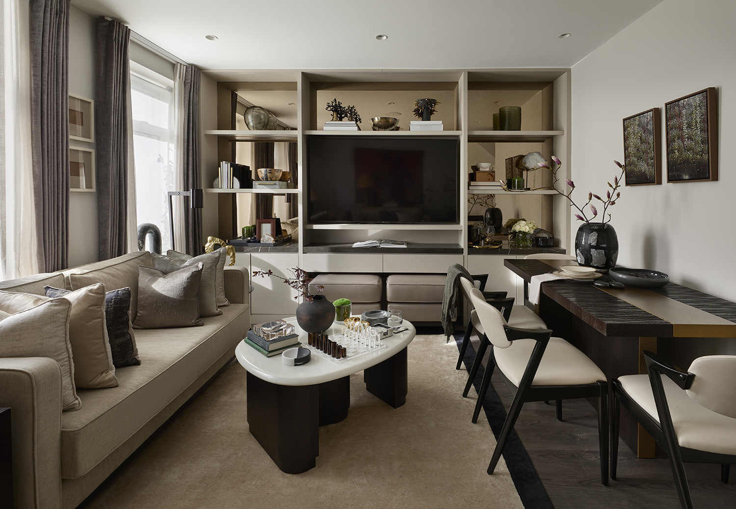
It helps that many of Tolù has purposefully focussed on soft funrnishings, making the space super-comfortable and relaxing (a key tenet of minimaluxe living rooms).
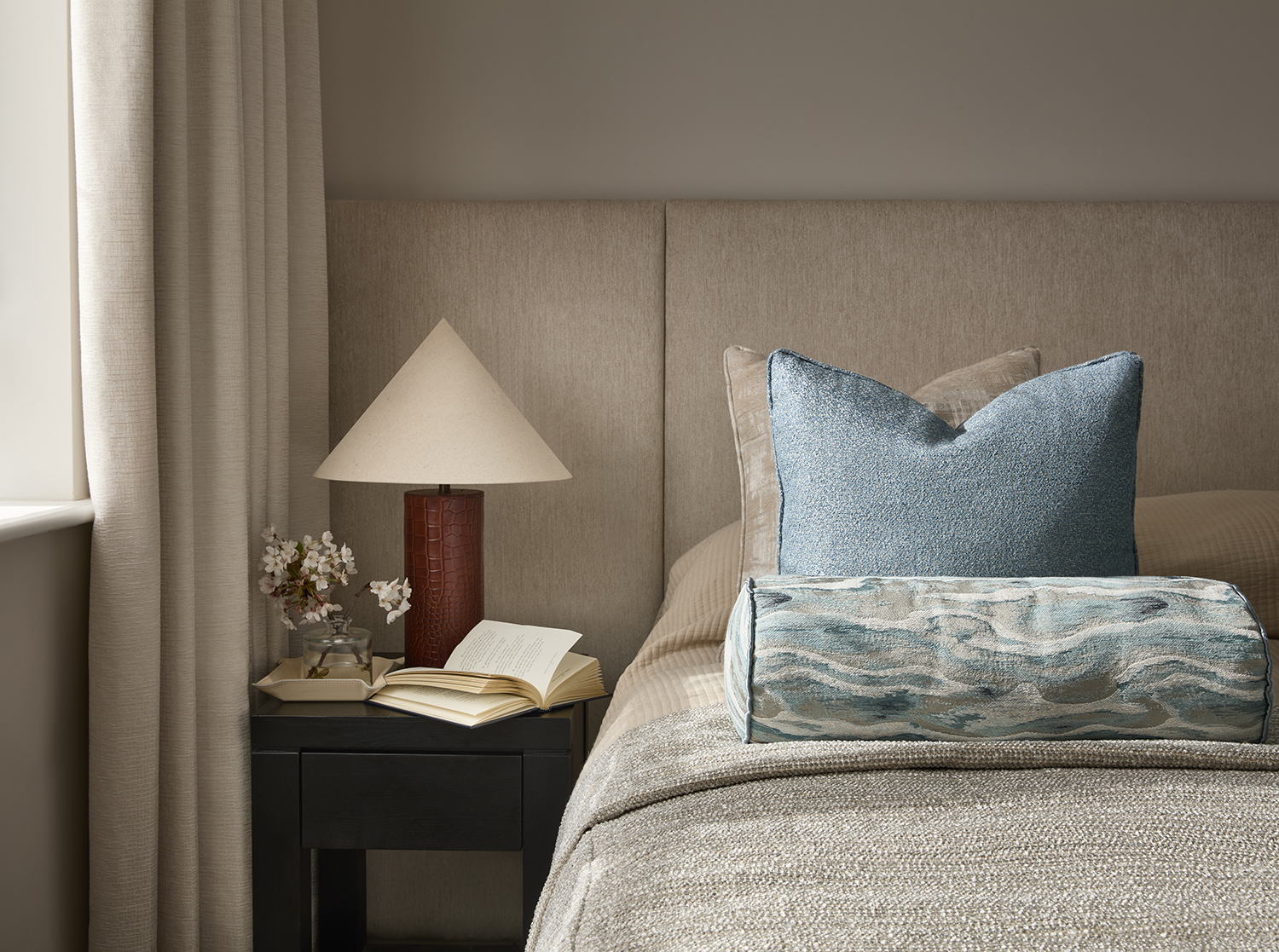
'Pillows are a big love of mine – they are key to successfully accessorizing a home,' Tolù says. 'Part of the joys of finishing a room is the cushion arrangement. All the pillows for our home were handmade, using an array of fabrics from Dedar, Sacho and Casamance to name a few.'
The key to selecting them is in the contrast, but in not too much contrast. 'Often, I prefer selecting two contrasting textiles, maybe a woven or jacquard fabric to the front of the pillow and a silk or soft velvet material to the back with leather or corded contrast pipping to the middle,' Tolù says. 'To make pillows not appeared cluttered, it’s important to not only consider the fabric textures but select a limited collection of colors as well as ensuring the sizes are consistent. From experience, pillow sizes of 17.5 inches x 17.5 inches are perfect for lounge settings and can provide enough back support. Choosing a firm pillow infill allows your cushion to remain in shape for a longer period.'
By adding character with art
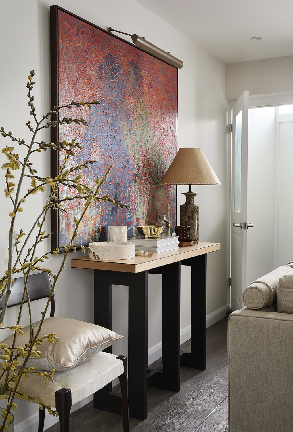
Not that Tolù's entire apartment is neutral, though, and his well-chosen art is a surefire way to add character. 'An impactful feature in a home is the artwork, which doesn’t need to be costly to be credible,' Tolù says. 'Adding artwork to an interior not only gives charm and personality but can be a great way to support upcoming talent in our local communities.'
For modern homes that aren't blessed with period detailing, Tolù also suggests decorating with mirrors. 'The best way to add warmth and comfort to a featureless apartment can be done through a central mirror, or two, to the left and right wings of the room, as this automatically, creates reflection and bounces light,' he says. 'The result is a lighter and more airy feeling space. The mirror can be elevated with some artisan technics such an eglomise or antique mirror or laminated textured glass.'
By mixing the materials
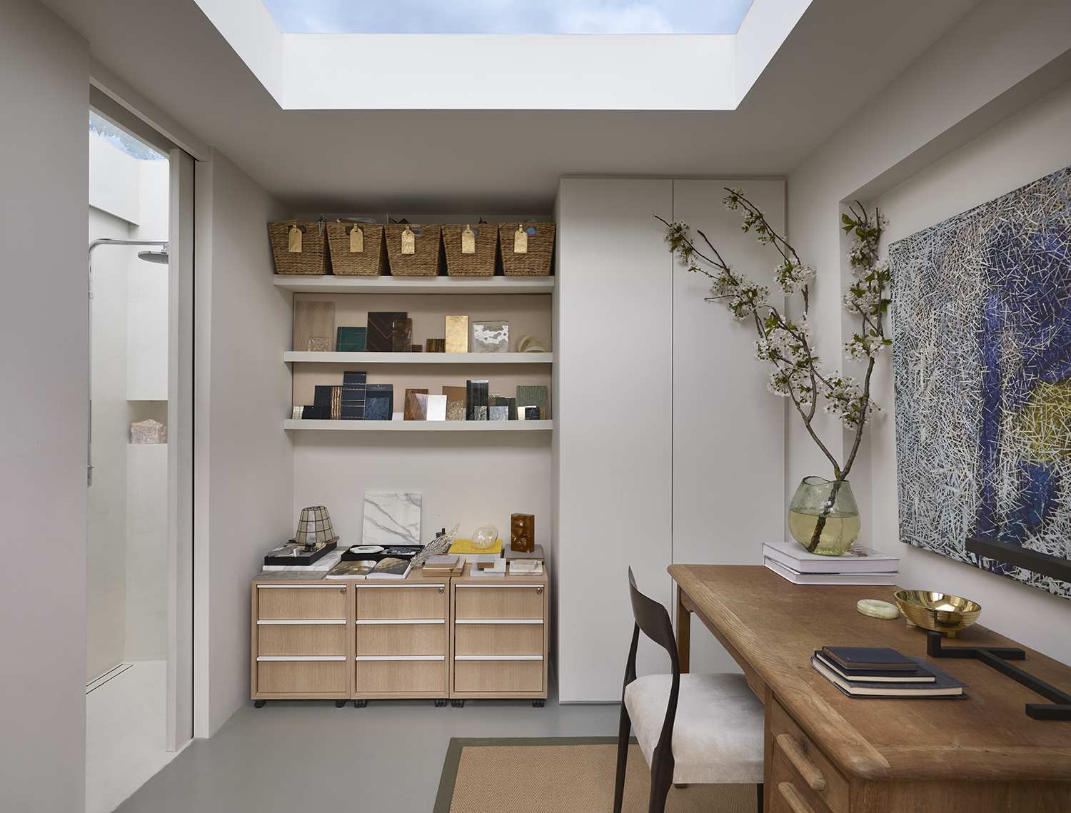
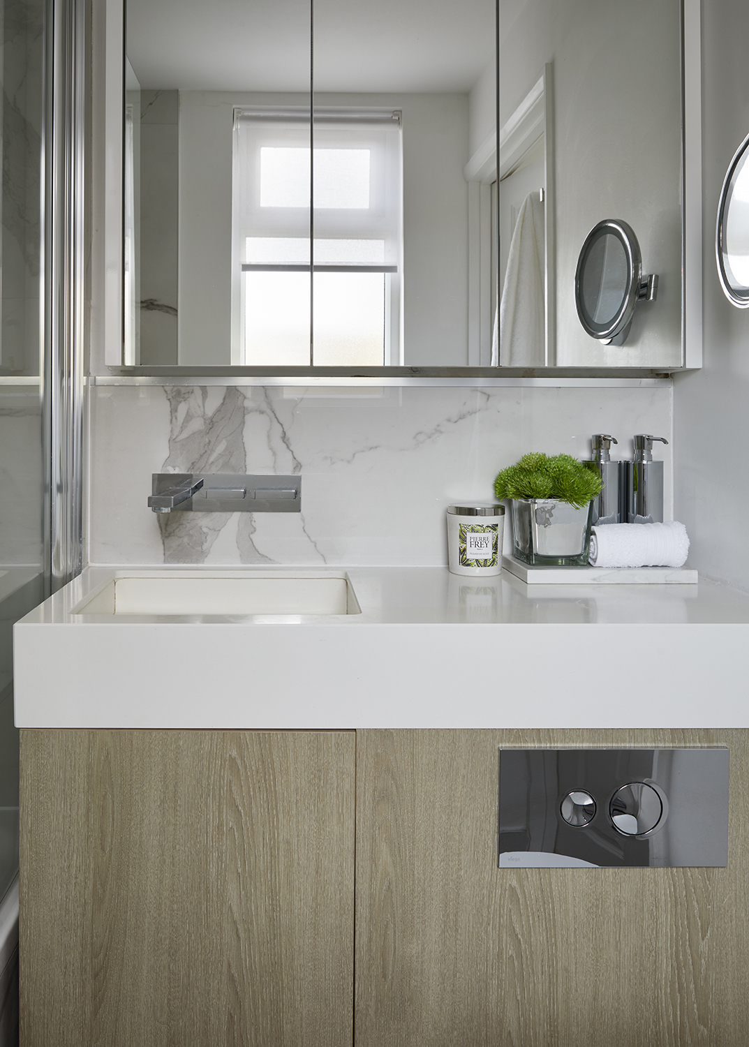
Another key tenet of the minimaluxe aesthetic is the blend in materials, so that even if the color palette is neutral, there is still interest in the texture. 'I enjoy working with contrasting textures to materialise an interior,' Tolu says. 'From the organic grain oak textures opposing the polished Pietra grey marble, mixed with handwoven leather, layered up with a soft mohair, suede and sleek velvets. Layering materials at the heart and is the art of interior design. It's a key part of designing and highlights the design principles.'
See the rest of Tolù Adẹ̀kọ́'s apartment
