As the days keep getting shorter and sunlight becomes a precious commodity, seasonal affective disorder, also known as SAD or winter blues, creeps up on many of us. But while you can’t do much about the absence of natural light, it turns out you can combat SAD with strategic use of paint colours in your home.
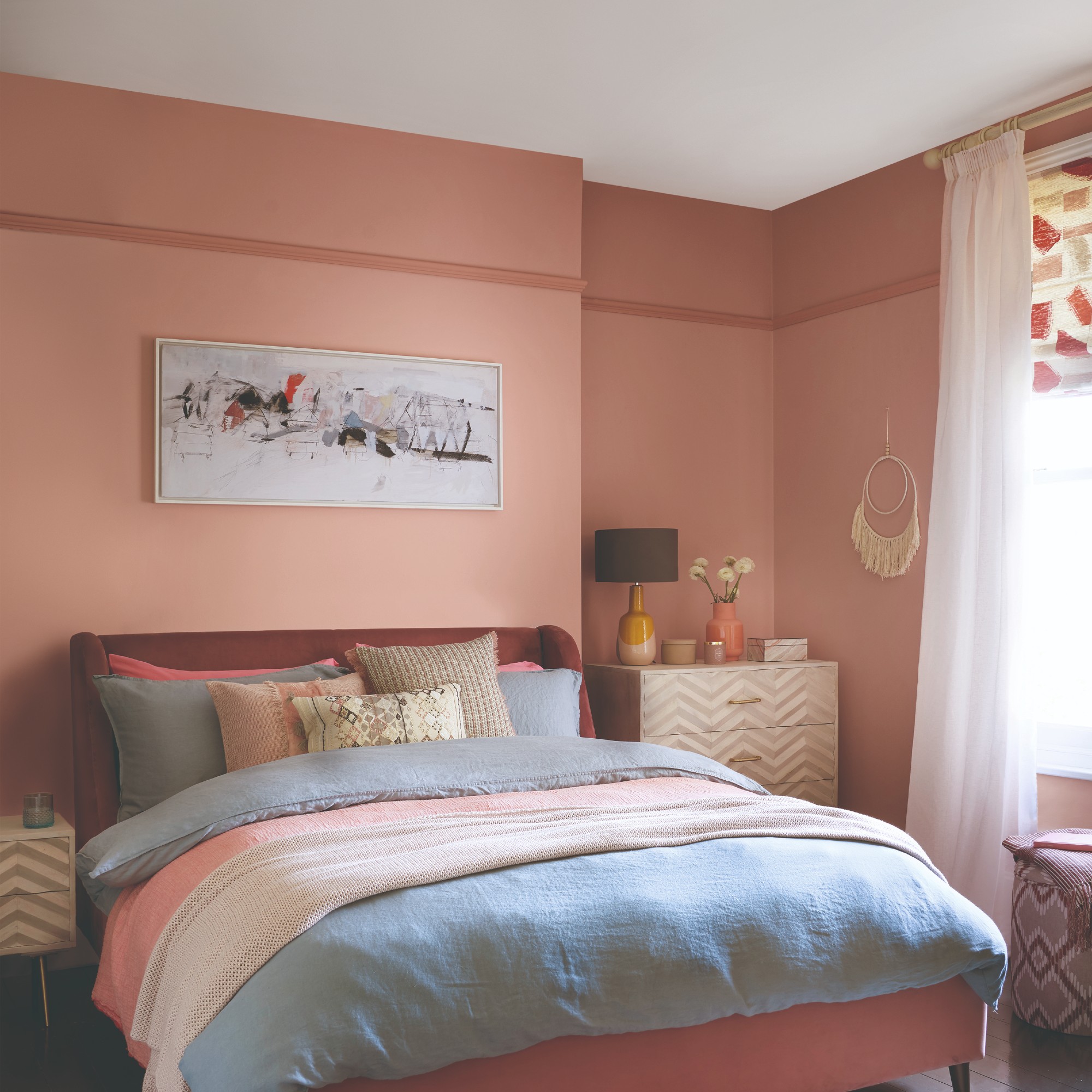
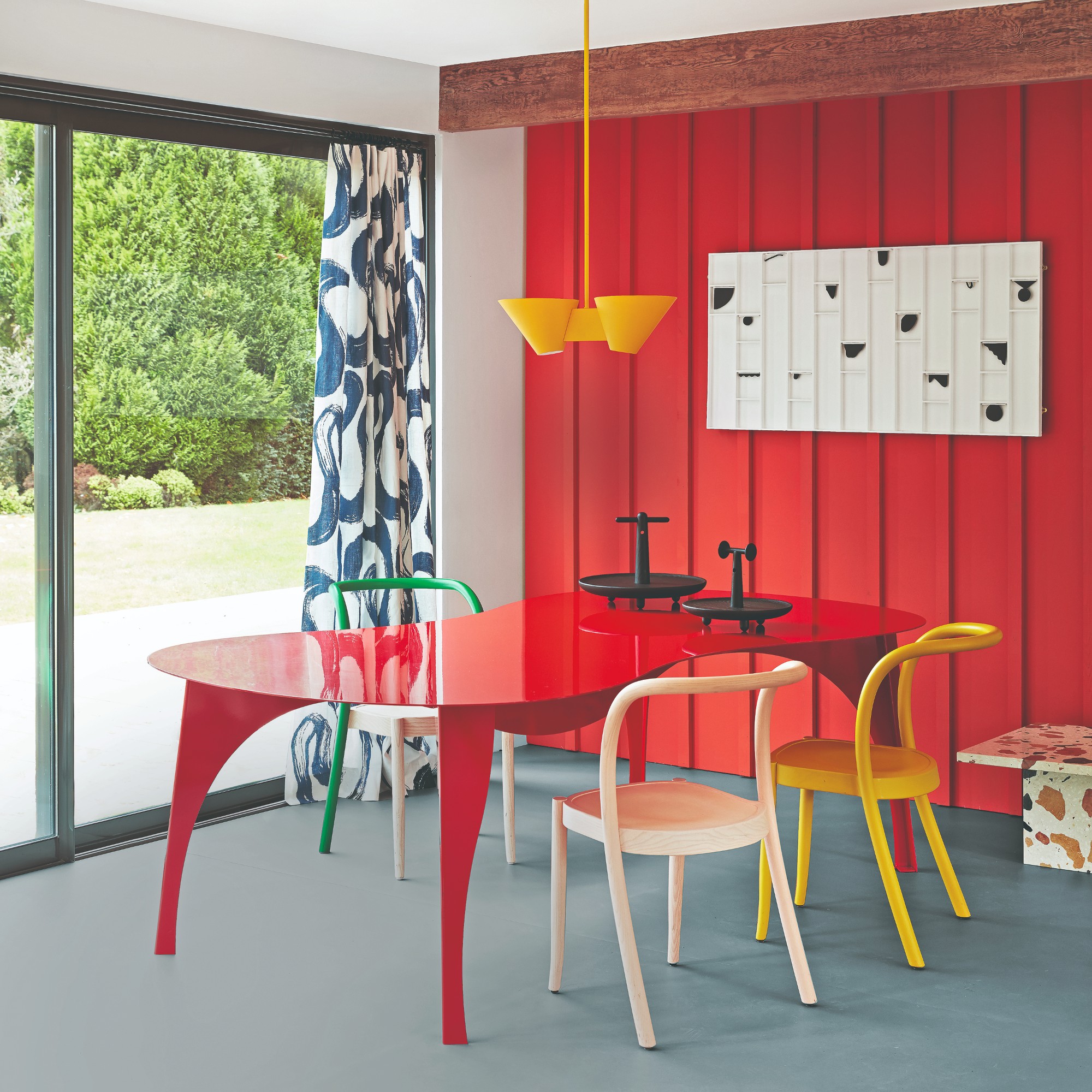
This syndrome is more common than you might think as one in 20 people in the UK become affected every winter. And while there are certainly shades and colour palettes to go for, there are also trendy colours that you should avoid if you are prone to depression or SAD. One thing to skip on is colour drenching in popular autumnal dark and moody colours.
So instead of the cherry mocha paint trend, experts recommend light and bright shades that are both uplifting and will reflect the small amount of natural light you do get to its maximum potential.
The best paint colours to combat SAD
‘SAD is also known as the winter blues, and even if you don’t regard yourself as a “sufferer” you may notice yourself feeling low or a little more moody than usual as the longer nights and shorter days take hold,’ says Suzanne Roynon, expert interiors therapist.
Similarly to the popular patterns that can subconsciously stress you out, colours too can have a powerful effect on your mood and wellbeing.
‘The colours you choose for your home can have a huge impact on the way you feel, especially in relation to Seasonal Affective Disorder (SAD),’ explains Dr. Ree Langham, psychologist at Impulse Therapy. ‘Bright and cheery colours can create a sense of comfort and warmth, especially in the dark and cold winter months which can help to combat low-energy and depressive moods associated with SAD.’
So if you are feeling low or have a tendency to feel down during the darker months, then perhaps set damson room ideas aside for now.
What are the best colours to go for?
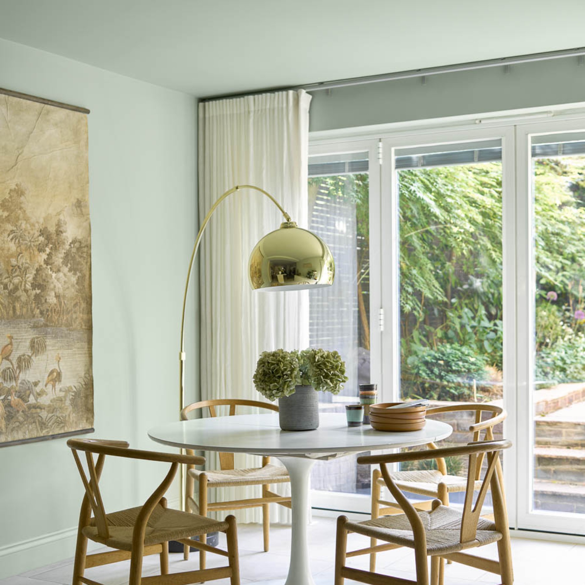
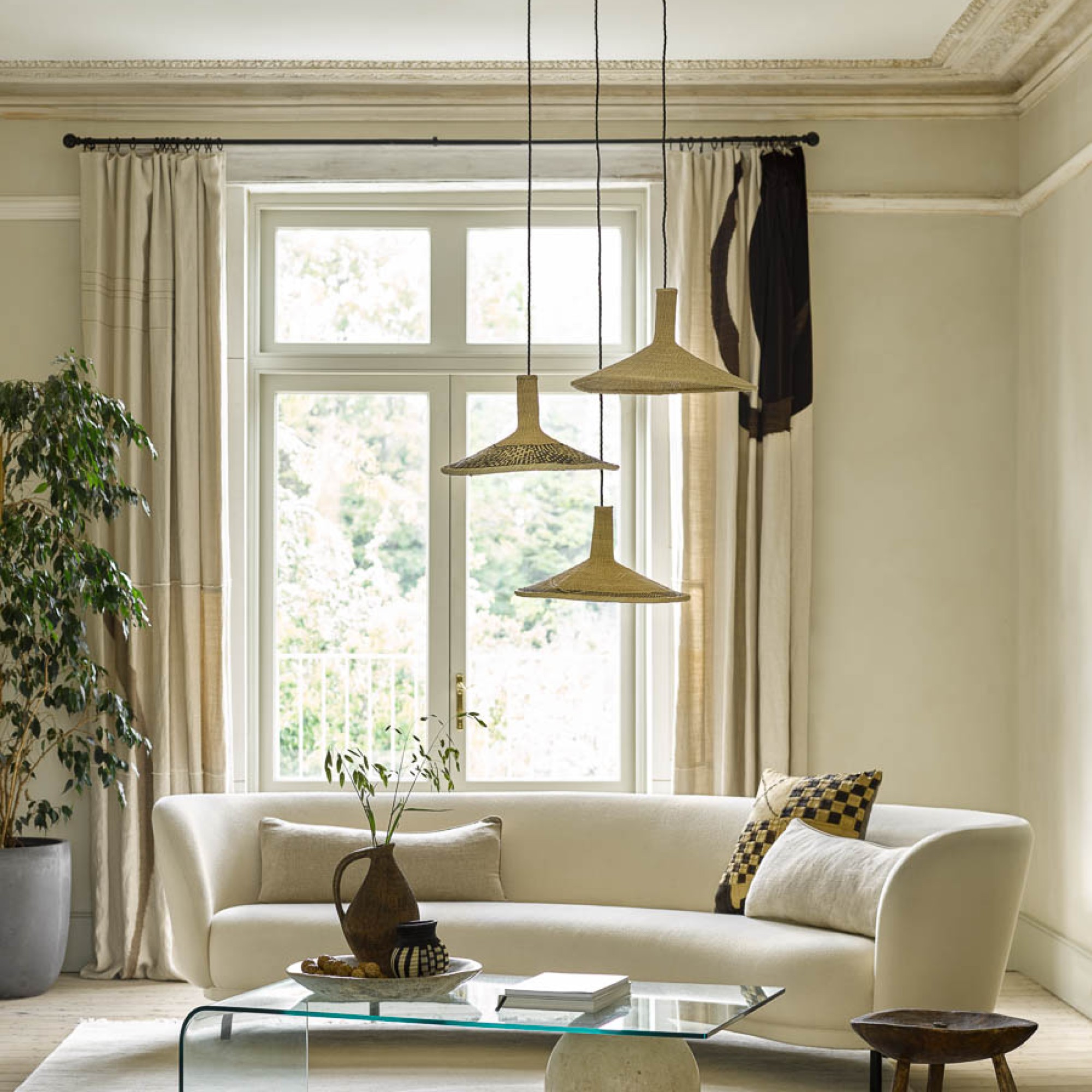
As previously mentioned, light or bright shades that reflect light well are the best to opt for.
‘An effective way of boosting your mood is using bright colours when painting living spaces,’ says Michael Rolland, managing director at The Paint Shed. ‘These colours give off a feeling of warmth and also reflect light, giving your home a spacious, well-ventilated feel and a positive atmosphere.’
These colours include ‘white, beige, greige, pale grey or pastel shades such as pale yellow, green and blue can help you stylishly decorate a room without giving it a plain, boring appearance. Lighter tones bring with them the added benefit of making the room seem bigger,’ Michael advises.
Soft Focus is a soft yellow that comes specifically recommended by Valspar as one of its paint colours that helps with SAD. 'A few years ago Valspar released a range of colours which were regarded as mood enhancing, these included a teal shade, blush orange and yellows which had something of a ‘summer’ feel,' Suzanne notes.
In collaboration with CALM (Campaign Against Living Miserably), Lick has released a series of paint colours with calming effects, carefully chosen by the brand's in-house colour psychologist. Green 09 is one of those shades.
Earlier this year, sustainable paint brand Frenchic partnered with Samaritans, the mental health and suicide prevention charity. As part of the collaboration, 10% of sales from five chosen shades, including the neutral and chic Cool Beans, is donated to the cause.
The paint’s finish is also not to be forgotten as that has a lot of impact on how it reflects light. If it does at all. ‘Different paint finishes can reflect light in different ways. For example, a glossy paint will reflect more light than a matte paint. Generally, an eggshell finish reflects more light than satin paint, although this can differ between brands. Using a mix of finishes within the home can add depth to the space,’ Michael concludes.
This topic is very personal and subjective though. So what might make someone feel one way might make you feel another. So always pay attention how a particular shade makes you feel before you cover your walls with it.
‘Of course everyone’s taste is unique! Therefore, start by choosing a paint colour which makes you feel good whenever you see it, regardless of the time of day,’ Suzanne recommends.
What colours should you avoid?
Dark shades, as beautiful as they may be, are widely agreed to best be avoided if you a sufferer of SAD.
‘Very dark grey, blue, black and purple are best avoided in homes where there is a track record of SAD or occupants are prone to feelings of hopelessness and overwhelm during the winter,’ Suzanne says.
She continues, ‘Without exceptional lighting they can be very bleak. It’s no surprise to discover teens with gloomy rooms are at greater risk of being withdrawn and anxious. We would always avoid using strong, dark colours except in completely enclosed spaces with no natural light like an internal bathroom.’
FAQ
What colour is best for depression?
Most bright paint colours are recommended for those suffering from depression. As well as calming shades such as green and blue.
‘Studies show that exposure to bright colours can even increase dopamine levels, boosting mood and energy. It can also help to regulate the circadian rhythm which is essential for those who are suffering with depression,’ Dr. Ree explains.
What colors are good for seasonal affective disorder?
Neutral, pale shades are recommended for combating SAD for their light-bouncing benefits. Bright and pastel shades are also great if you’re looking to inject a bit more colour.
‘I routinely recommend light neutrals along with soft whites, creams, and pastels as the most auspicious basis for layering in the positive energy which comes into a home. Choose paler shades and more neutral colours to maximise the ability of light, especially natural light, to bounce around the home,’ Suzanne advises.
Winter blues, begone!