The world of moody paint colors has something to offer so many decorating styles and room types. Adding plenty of depth to rooms while boasting a liveable quality, moody hues are amongst the most stylish paint colors for 2025.
And if you're as much a fan of this color trend as we are, then you'll be interested in Benjamin Moore's recent Moody Midtone paint color palette. It spans six sophisticated and moody hues – from rich purples to dark neutrals – all of which are the right balance of deep but not overly dramatic.
Below, we've rounded up each of the paint colors as explained by a Benjamin Moore color expert to give you useful advice on how to create your own moody color palette.
1. Barberry 1244
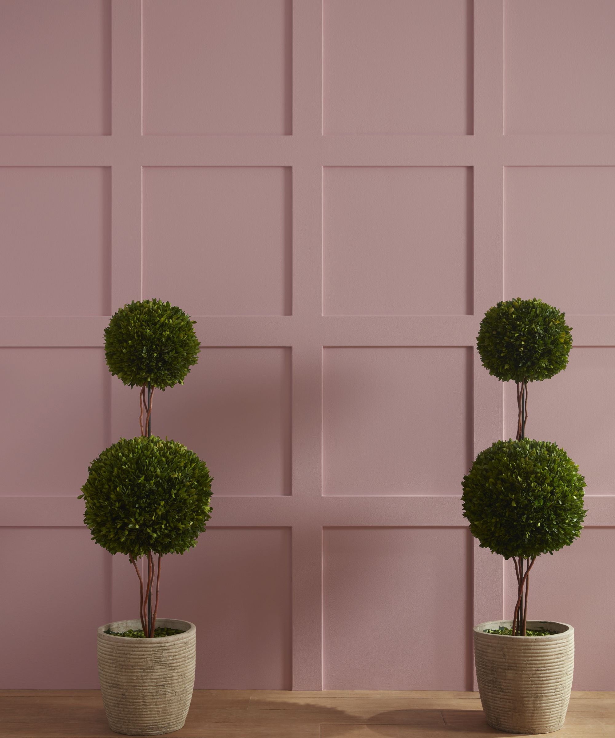
If you're looking to embrace the popular in-between color trend into your home, Benjamin Moore's Barberry 1244 makes a stylish choice. Falling somewhere between pink and purple paint, Barberry is a warming hue with a muted quality that gives it a moody edge.
'This dusty red-violet brings a warm but sophisticated touch to a space,' explains Arianna Barone, Color Marketing Manager at Benjamin Moore. 'Opt for a monochromatic look by pairing it with like-hues such as Morristown Cream 1241 or Sequoia 1245. For a more modern touch, pair it with deep emerald hues like Deep Sea Green 735.'
2. Blue Danube 2062-30
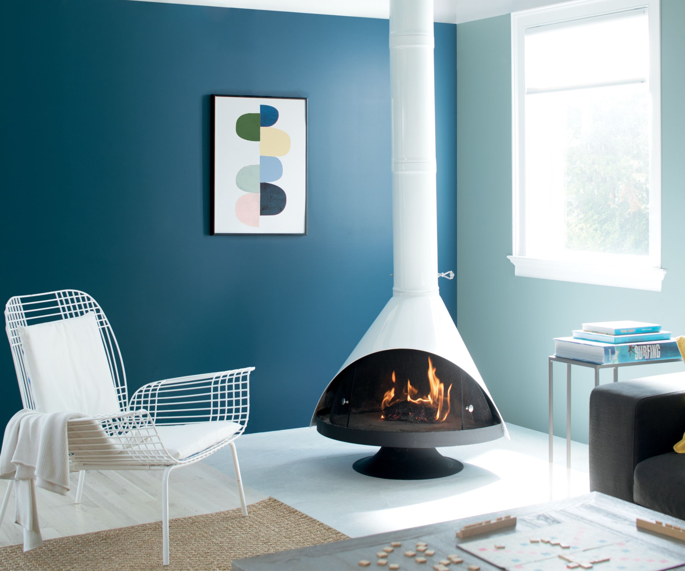
Blue paints aren't typically regarded as the most moody, but Benjamin Moore's Blue Danube 2062-30 has a richness that adds drama to the home. Arianna describes it as 'a teal-toned blue that can be classic and elegant or modern and bold.'
When decorating with this dark paint, you can either go for a modern look by pairing it with similar tones and white paints, or you can go bolder with color-drenching for a statement look, as Arianna suggests:
'For a contemporary look and added brightness, pair it with crisp off-whites like White Heron OC-57, and buoyant blues like Buxton Blue HC-149. Or, lean into a moody look by painting it on the walls and pairing it with weathered woods.'
3. Forest Floor 1498
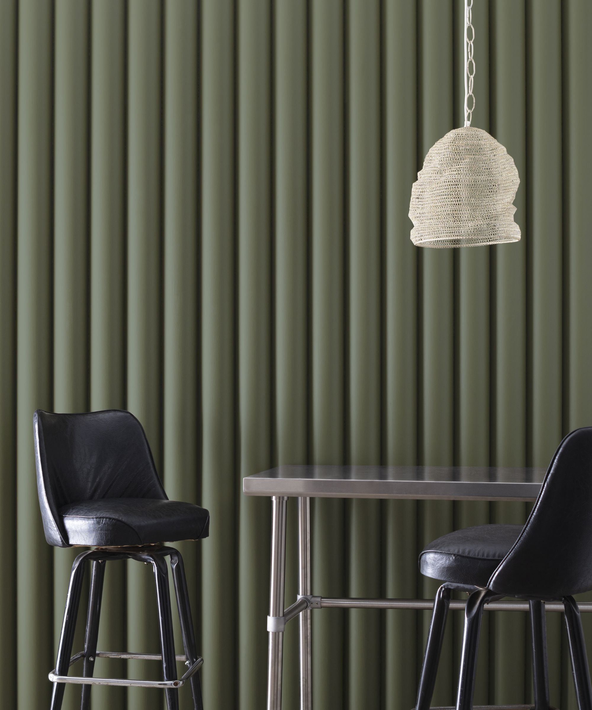
Dark green paints have seen so much appeal lately, and for good reason. Adding plenty of depth and drama while feeling warm and sophisticated, dark green is one of the most stylish ways to embrace a moody color palette.
Benjamin Moore's Forest Floor 1498 is 'a versatile olive green with a moody charcoal undertone', according to Arianna. 'Paint it on kitchen cabinets and pair it with light marble countertops for a classic look. Or, create the ultimate cozy space by color-drenching it in smaller rooms like home offices and bedrooms.'
4. Beaujolais 1259
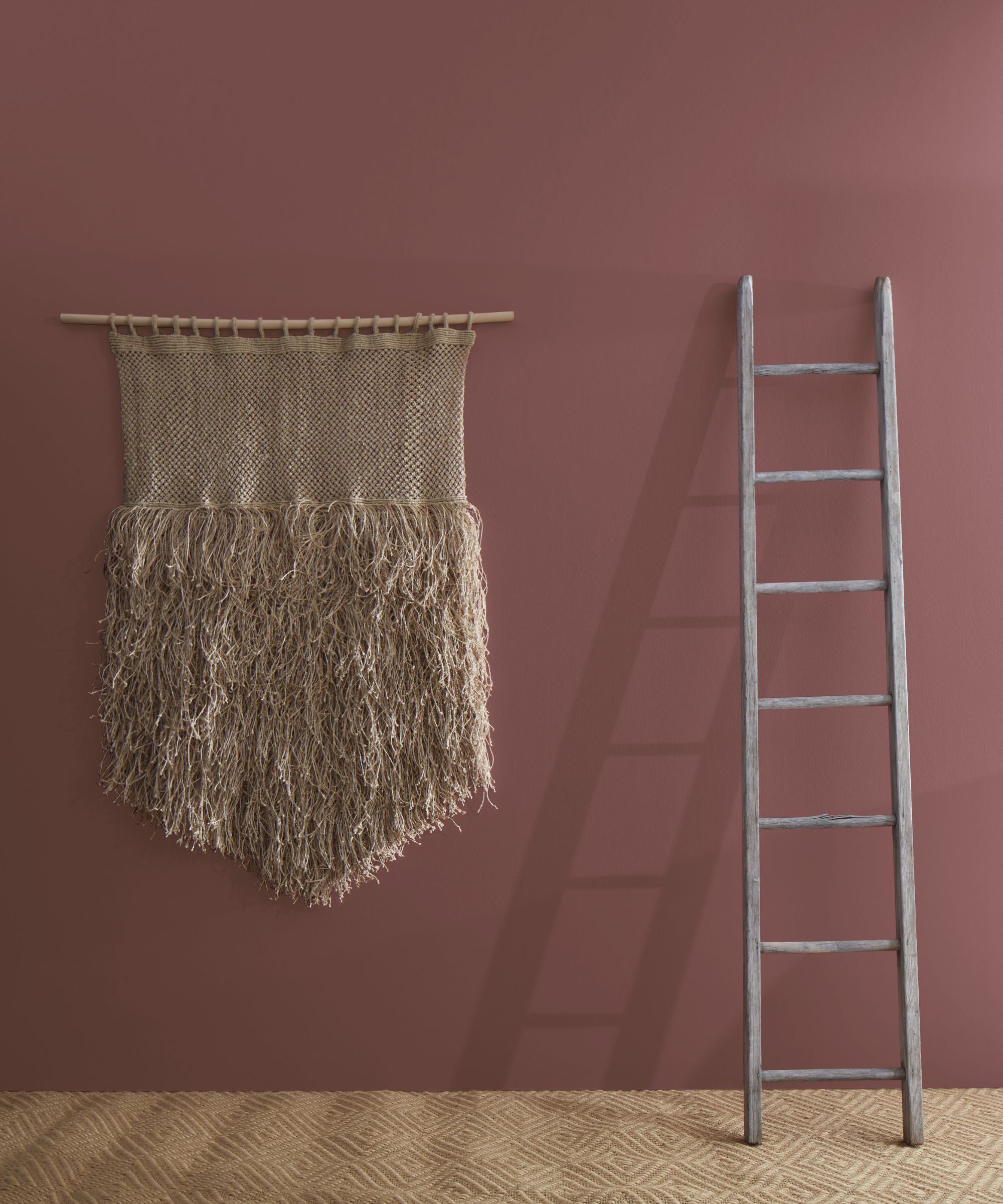
Another way to master a moody color palette with plenty of warmth is to opt for red paint colors. But instead of vibrant orange-reds, reach for rich and warming wine reds or even brown-toned reds for a subdued and timeless feel, such as Benjamin Moore's Beaujolais 1259.
'This sumptuous hue has elegant notes of red, violet, and brown,' explains Arianna. 'Bring a more earthy, boho look to a space by pairing it with organic browns, like Wenge AF-180, natural fibers, and warm wood tones, or create a more sophisticated and classic look by pairing it with marbles and soft velvety textures.'
5. Shadow 2117-30
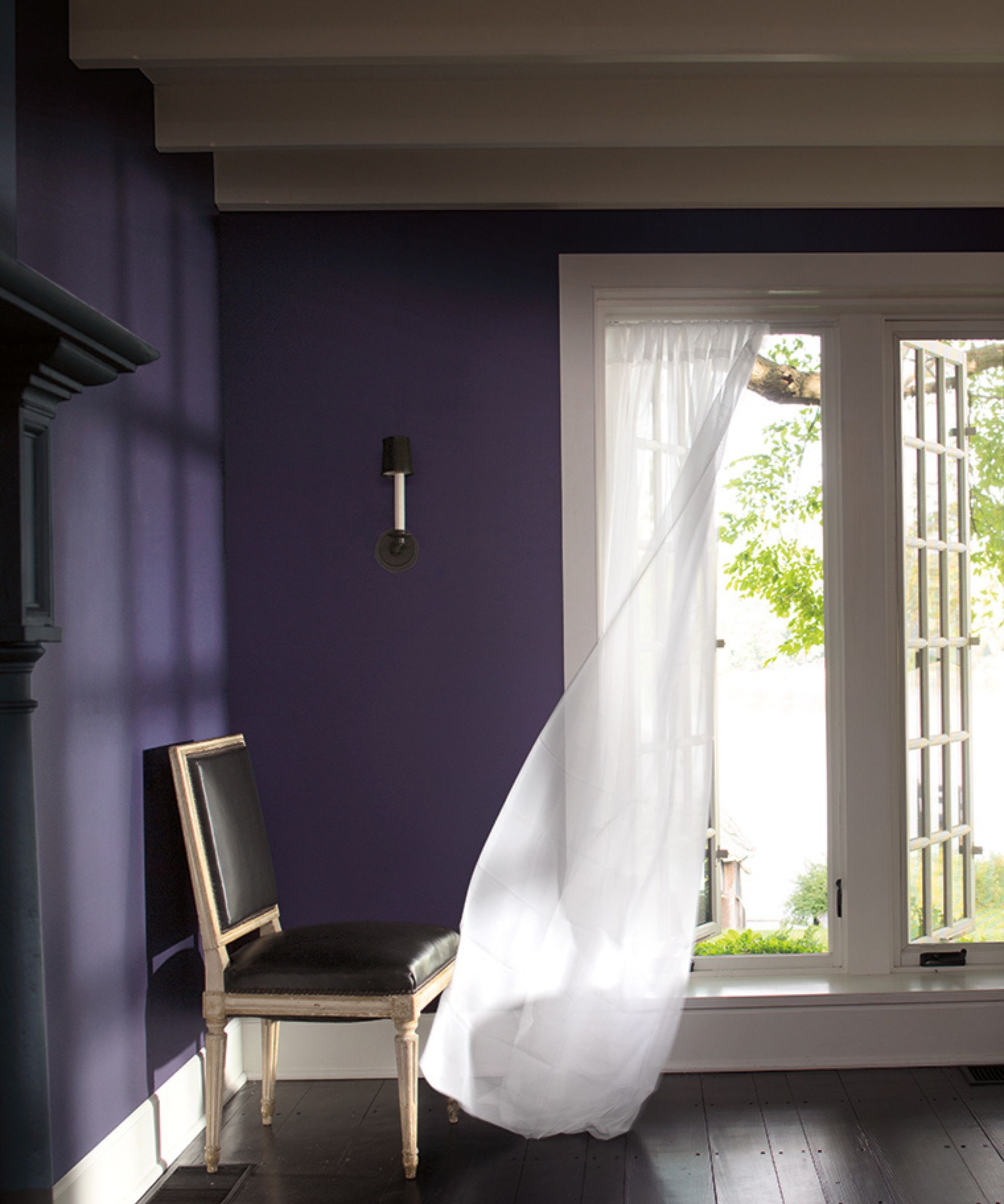
If you want your moody color scheme to boast an opulent feel, explore the world of dark purple paints, such as Benjamin Moore's Shadow 2117-30. 'This rich, royal amethyst has a subtle touch of gray that brings an added layer of versatility and depth,' shares Arianna.
'Bring out its violet undertone by pairing it with yellow-based accents like golds and warmer neutrals. Or, lean into a dark glamour look by layering in other jewel tones and glossy, reflective surfaces,' Arianna adds.
While this rich paint color is bound to make a statement in many rooms, we think it would make an especially good choice for powder rooms for an unexpected hit of color.
6. Stone Brown 2112-30
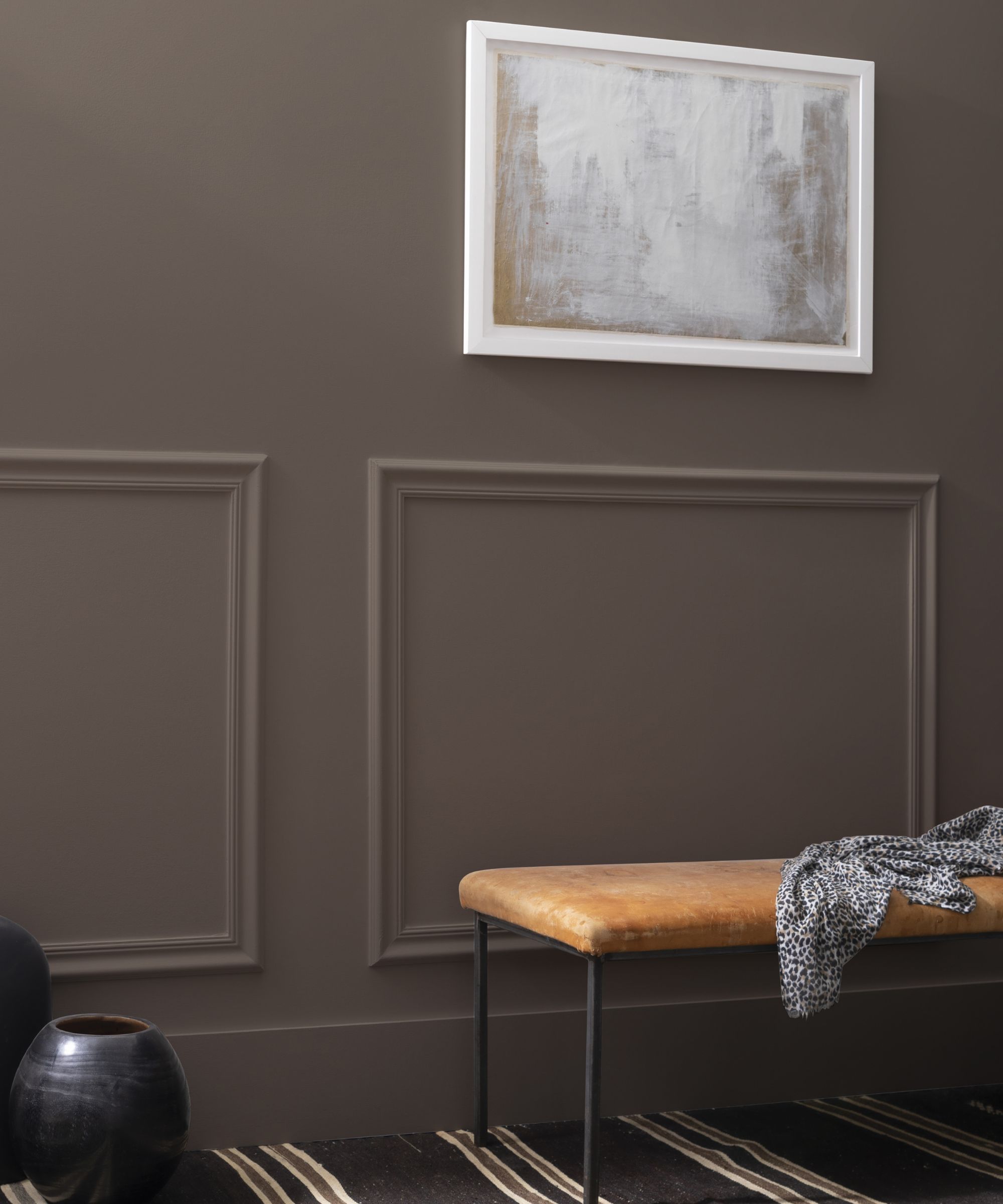
Decorating with brown is arguably the most on-trend way to embrace moody colors in the home. This nostalgic color has seen a resurgence in modern homes as a bold and sophisticated neutral. If you're a fan of this comforting color, Benjamin Moore's Stone Brown 2112-30 is worth exploring, which Arianna describes as 'a charcoal brown that breathes a soothing sophistication into any design.'
'With just the right amount of warmth, this moody hue works with a variety of colors as a softer alternative to the always chic black color family,' Arianna adds. 'Create an enveloping respite by painting it on the walls, trim, and ceiling, or bring a smaller dose of moodiness to a space by painting it on just the ceiling or trim with softer walls in Cloud Cover OC-25 or London Fog 1541.'
While these moody paint colors will work well in plenty of rooms, it's worth sampling them as swatches before committing so you can see how they look as the lighting changes throughout the day to avoid making any costly interior design mistakes.