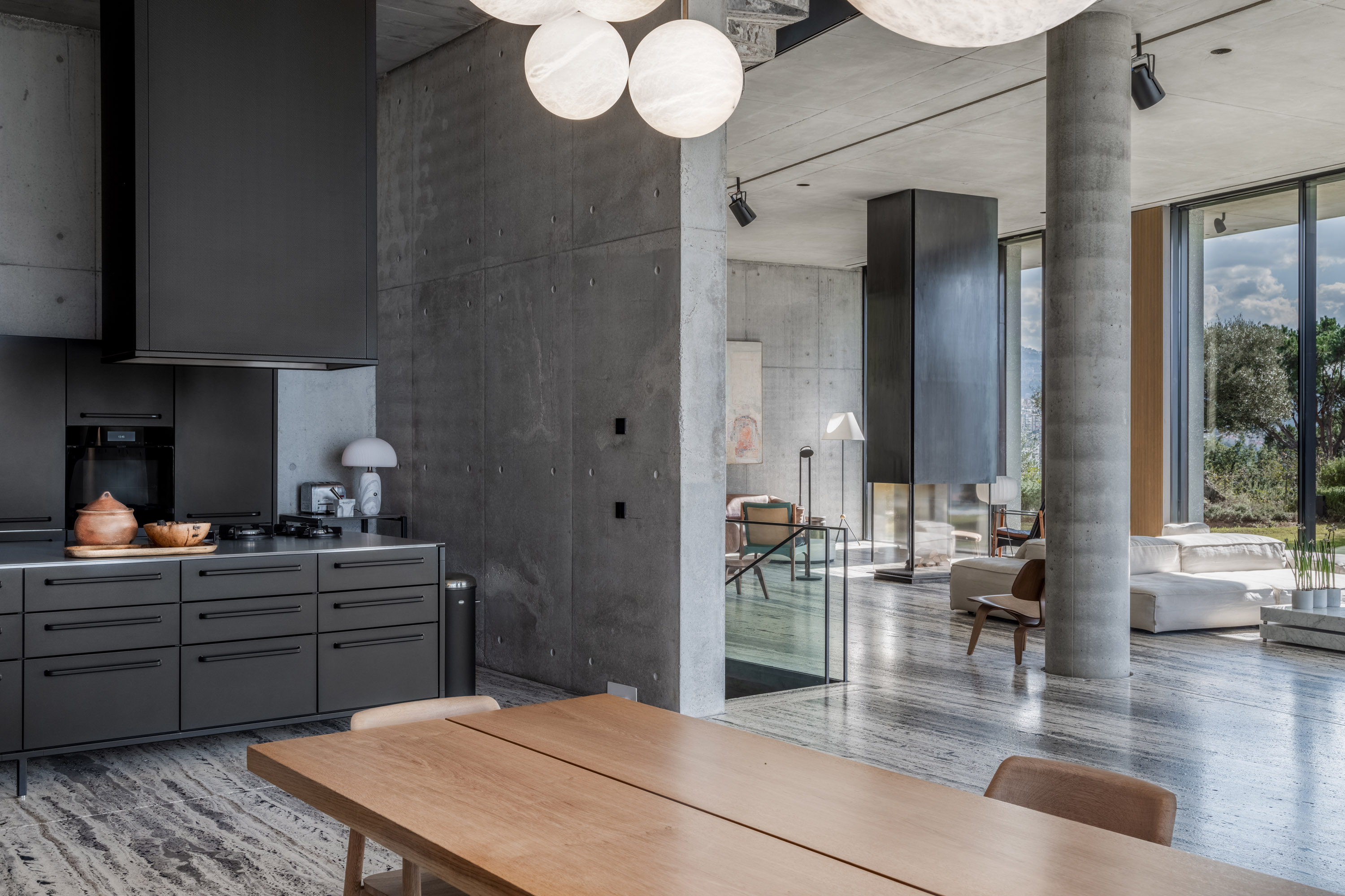
Monochrome, minimalist, and matte - three ultra-modern design features we love at Livingetc, but all notoriously difficult to perfect. Each has individual challenges in its own right, let alone when combined, as they have been so exquisitely in this stunning stone-inspired home in Beirut.
Designed by award-winning architectural firm Raëd Abillama, this five-story coastal villa - owned by Raëd himself - combines exquisite stone and sublime minimalism to create a space that's daring in its design, but still warm and comforting as a family home. With interiors complimented by Danish design company Vipp, it's a masterclass in perfecting Brutalist interior design style.
'The villa is very technical in its construction, and with it being an architect’s home and personal project, we took advantage of this to experiment with new building techniques,' says Raëd, founder of Raëd Abillama Architects. 'We decided to work with concrete for its pure expression of structure, and the main aesthetic of the villa was generated by the practical: the openness to the garden, the views, and the shading from the Middle Eastern Sun.'
From a more aesthetic point of view, the star of the show is the monochrome kitchen in matte black. In fact, if you're a skeptic of the black kitchen trend, it might even be enough to convert you to the dark side. Ready to find out if a dramatic black kitchen could be your calling? Here we take a closer peek inside the main floor of this unique modern home.
Entryway
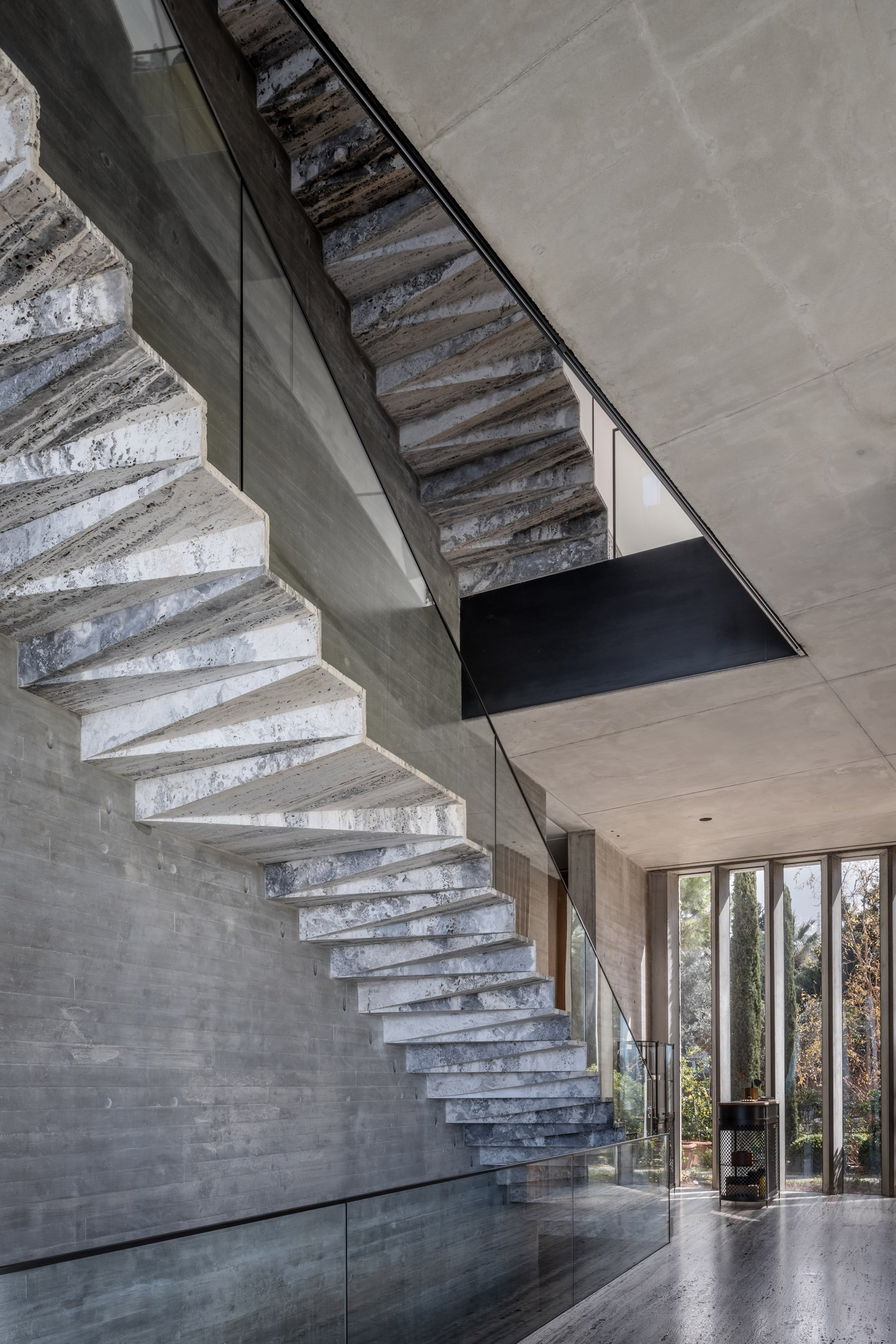
Upon entering the home, you're met by an impressive floating staircase in the entryway. Raëd was able to source a rare titanium travertine which is repeated in the flooring, the beautiful sculptural staircase, and the outdoor deck that continues to the infinity pool, setting the scene for the stone theme and brutalist interior.
'Our main goal for the stairs was to reinforce the link with the vertical,' explains Raëd Abillama. 'We achieved the design by minimizing the total volume of each step element, removing the part that is not working, in this case, the bottom, similar to a structure force diagram.' This minimalist mentality - to get rid of anything that doesn't serve a purpose - is something he recommends to anyone wanting to embrace a more pared-back design.
Living room
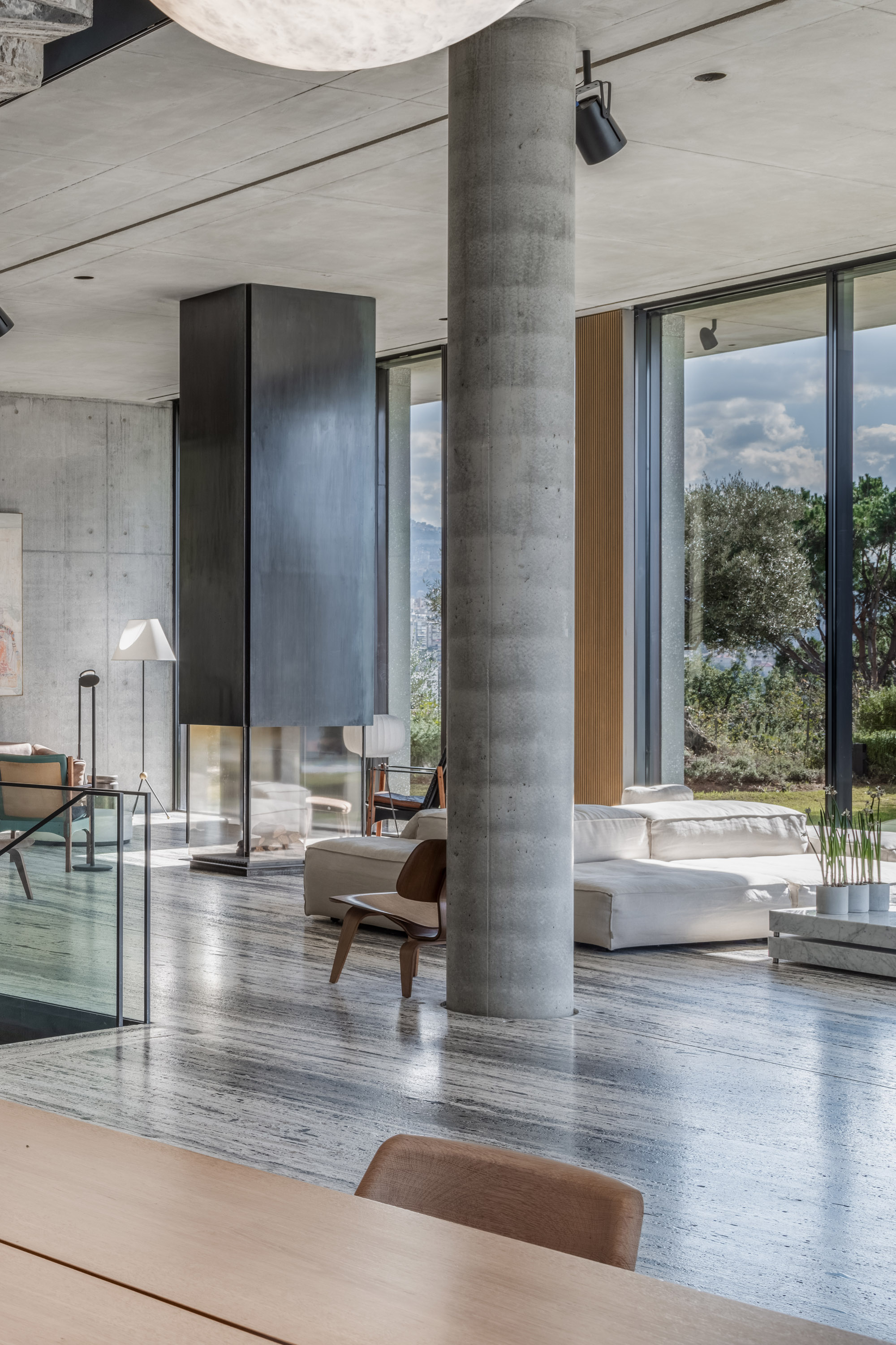
Despite the greyscale scheme and stone architecture in the living room, the space still feels warm and bright, culminating in a 'cozy' minimalism. According to Raëd, it's a variety of textures that helped him achieve this. 'With the grey tone, there is a mix of tonality with three different finishes,' he says. 'Plywood finish concrete, plank wood fair-faced concrete, and a ground down surface concrete to show the white marble aggregate (with a terrazzo finish).'
Even though stone is a consistent material throughout the home, both inside and out, it's these subtleties to the finish that makes the difference in tonality. 'Each material starts to draw the boundary of the main volume of the house, and from the inside you start to have a relationship with the façade,' explains Raëd.
Situated right on the hillside edge, the large floor-to-ceiling windows offer views of the backyard and the Mediterranean Sea beyond. Helping to blur the boundaries between outdoors and in was also important in this sense. As Raëd notes: 'We wanted to push the villa as close to the neighboring north lot to maximize the garden space, which becomes integrated with the living area of the villa and part of our daily use.'
Kitchen
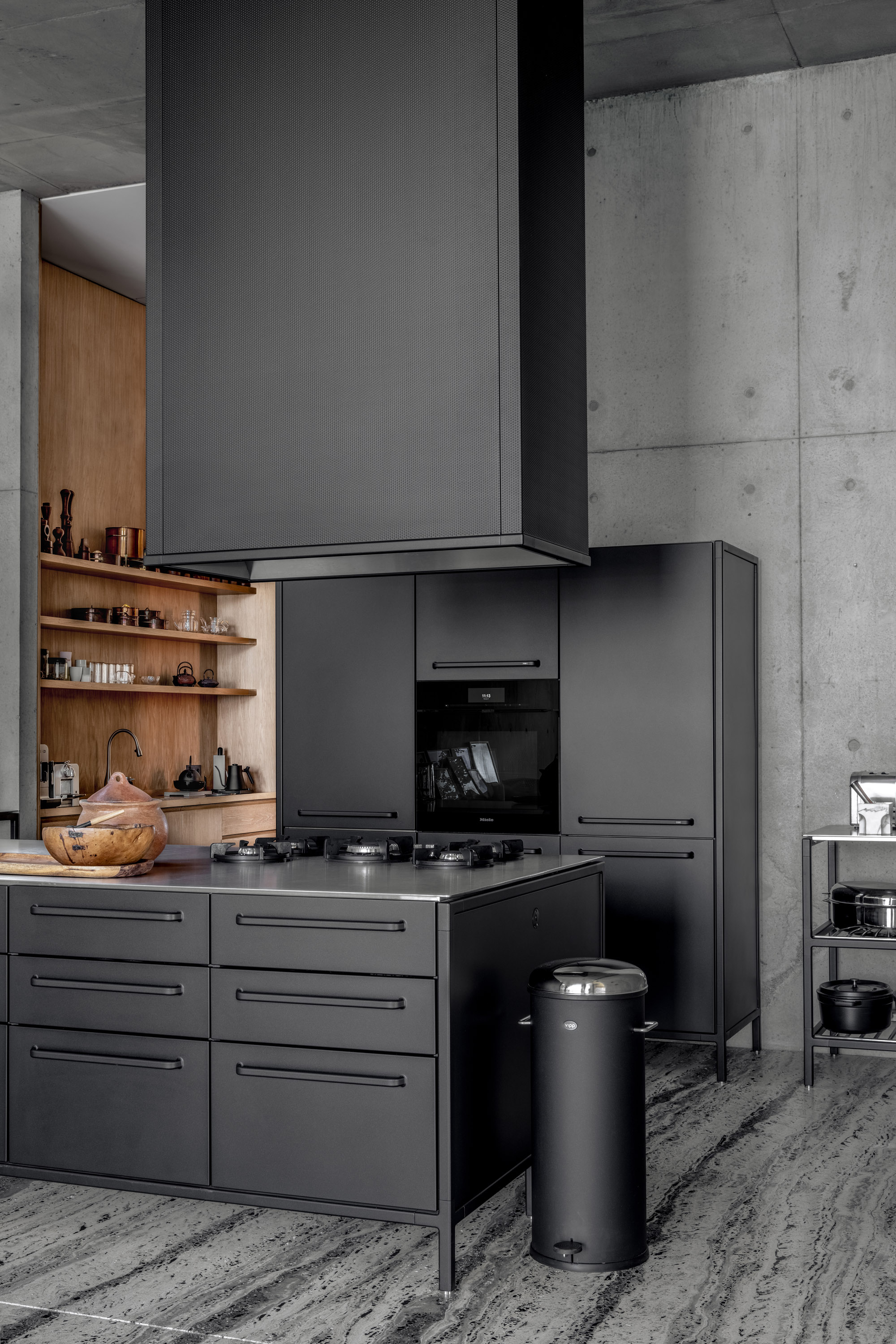
Move further into the home and you're met with the black kitchen, the real talking point of this home. Lately, we've seen a growing trend for darker, monochromatic kitchens, but they're notoriously hard to master. This is because monochromatic color schemes run the risk of looking too one-dimensional if care isn't taken to introduce some nuanced tonality, something Raëd and his team paid careful consideration to.
'The kitchen for us is a piece of furniture in and of itself,' says Raëd. 'It inhabits the space differently, especially this VIPP island, so it creates a sense of lightness. We believe there is a maturity in the black color, and the top is brushed stainless steel, an inherent material that is true to its function and, similarly to concrete, ages well.'
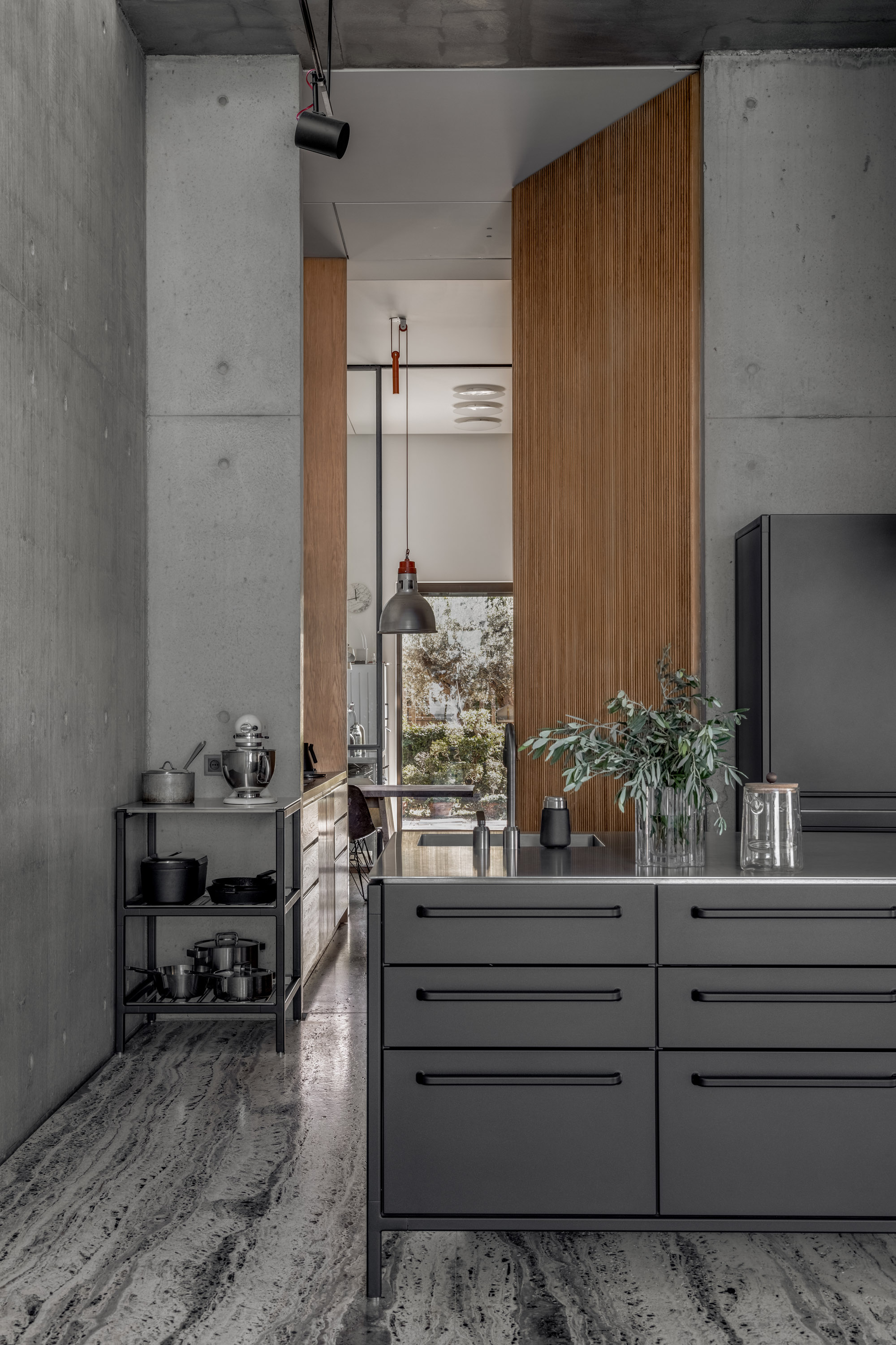
The matte black kitchen units, grey walls, and dark flooring are all interspersed with the warm wooden tones of the dining table and open shelving. This helps to cut through the charcoal kitchen, offering a visual break from the grey.
A change in color, though, wasn't the main focus here - instead, it was a change in texture and quality of the material. 'We chose the wood more for its sensorial aspect which was a driving force for the decision to go with it,' Raëd notes. 'The table was custom designed by RAA and cut from a solid piece of oak, resonating with the same theme of material that's true to form.'
Clearly, dramatic mattified monochrome can make a serious design statement when you know the tricks of the trade. Enough to convert you to a black kitchen? We're certainly tempted.


