COAT's new paint colour range is set to make choosing the perfect shade for your home easier. Not only are they designed to be warm and inviting, but each shade is crafted especially to complement the UK's cool-toned natural light.
Picking from the most popular interior paint colour shades is no easy decision because it's important to prioritise longevity and versatility. This means finding a shade for your space that is more than a trend you're loving, it's a colour that complements the rest of your home and how you want it to feel.
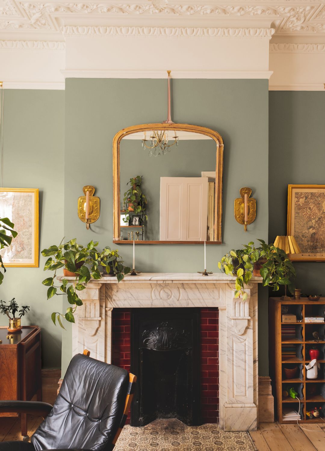
This is exactly what COAT had in mind when designing their newest colour range, which launched this month. With each shade made to react harmoniously with natural light, you won't be left questioning your colour choice, not even on the gloomiest of days.
COAT's new colour range for UK homes
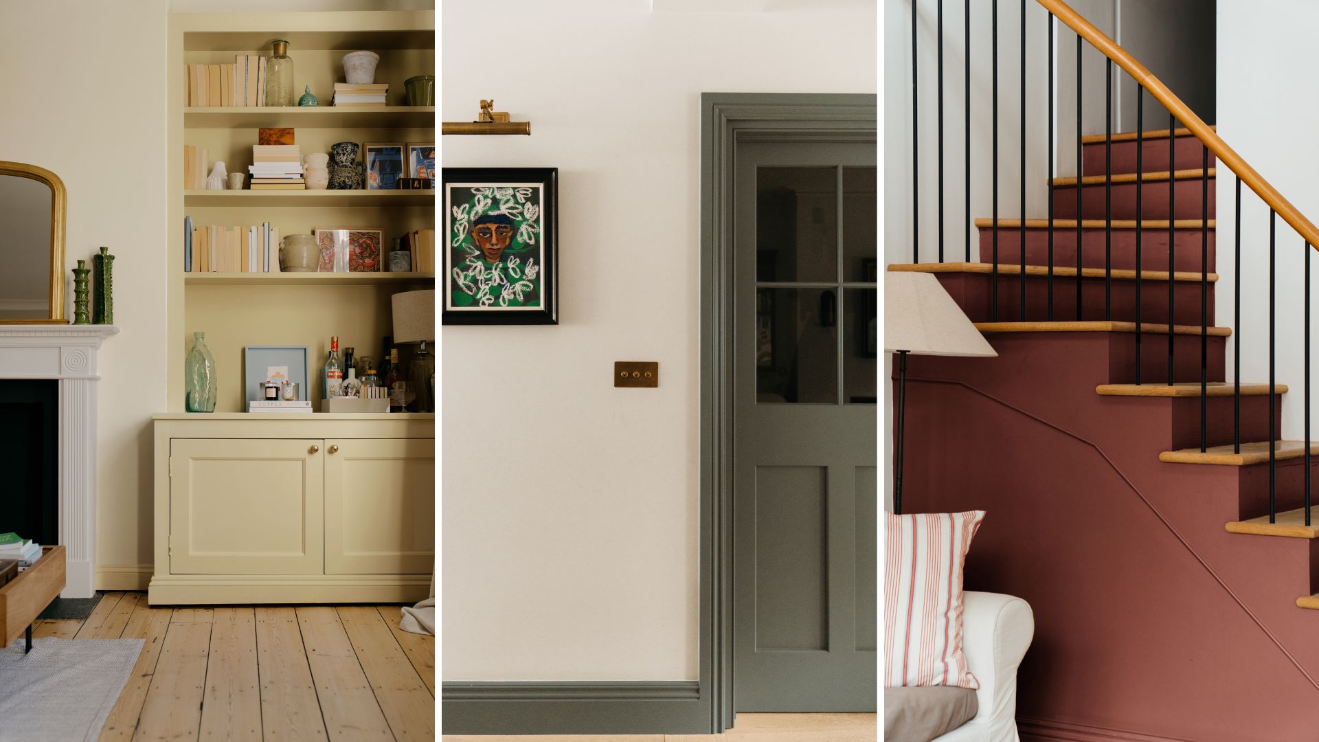
Whether you're looking for the perfect living room paint colours or need a happy paint colour for any room, COAT's latest collection has something for everyone.
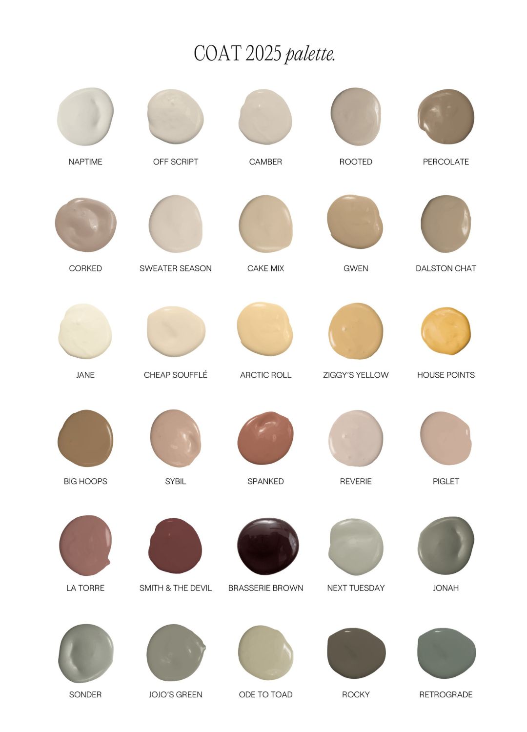
With 19 completely brand-new shades and 11 reintroduced bestsellers, the range is centred around more muted classic hues, aiming to work in harmony with UK lighting.
"At COAT, we craft colours that feel as good today as they will in years to come," explains Rob Abrahams, the co-founder of COAT Paints. "We don’t do fleeting trends, because no one wants to repaint their home as often as they refresh their wardrobe. Instead, we focus on timeless tones that elevate spaces, working seamlessly with natural light and UK architecture."
So whether you're a fan of the dopamine decor trend or the maximalism look, there's something about these less saturated shades that works incredibly well in all areas of the home.
The range's palette features deeper warm tones like 'Arctic Roll' and 'Piglet' while offering more contrasting colour shades such as 'Brasserie Brown' or 'Rocky' (see below).
Each shade has been designed to go above and beyond the trends, to feel effortless in the home while also intentionally providing a colour that elevates the space.
"Highly saturated shades can feel overstimulating and fleeting – their novelty wears off fast. That’s why we’re championing earthy, muted shades that feel effortless and natural," says Rob.
"Our warm tones are carefully balanced with a touch of black, ensuring they work harmoniously with the UK's blue-grey light. They shift subtly with the daylight, feeling both grounded and refined," he adds.
Although we're seeing brighter, bolder colours rise to the top this year, Dulux's Colour of the Year 'True Joy' being one of them, it's undeniable that subtle earth tones are a clear favourite throughout many of the key interior design trends of 2025.
The core of the collection is the three new colour families: Plaster, Yellow, and Sand. The brand has incorporated these colour families into its colour chart. All of them are intentionally desaturated, offering a soft alternative to what COAT refer to as 'traditionally overpowering colours'.
If you're not looking to make a bold statement, and instead want to opt for a more relaxing, zen oasis look to your space, these made-to-order paints are available exclusively on the COAT website.
As with their other collections and colours, this range is offered in a selection of high-performance finishes from Flat Matt to Claypaint. So you can truly find the right look for you, no matter what your vision is.
Shop our favourite shades
RRP: £56 | This terracotta shade is ideal for adding some deep warmth to a space without overwhelming it. Their Flat Matt finish is easily cleaned, has low odour, and hides imperfections, making it perfect for a busy household.
RRP: £56 | There's no escaping the butter yellow trend this spring/summer and we're more than happy to hop on board. This shade from the new collection is the perfect hue to achieve that look without it being to sickly sweet.
RRP: £56 | If you've been looking to experiment with some pinkish hues but are worried about the oversaturated look this shade is a great choice. It's described as a plaster pink thanks to its powdery colour.
It's a great year to try out some of the interior colour trends as there's never been so much variety and versatility on offer. From grounding brown shades for decorating with brown to uplifting plaster pink, there's a shade to inspire all decorating projects.
.jpg?w=600)