Movie posters are often criticised by fans for following a formulaic approach these days. Clever minimalist designs tend to get reserved for very early teasers, with the main posters tending to follow the 'floating head' format.
That leaves graphic designers to envision other possibilities. We've seen lots of clever proposals over the years, but so far none have been quite as minimalist as the approach of one Polish designer. Can you identify the films in the video below? (See our pick of the best poster designs for more inspiration).
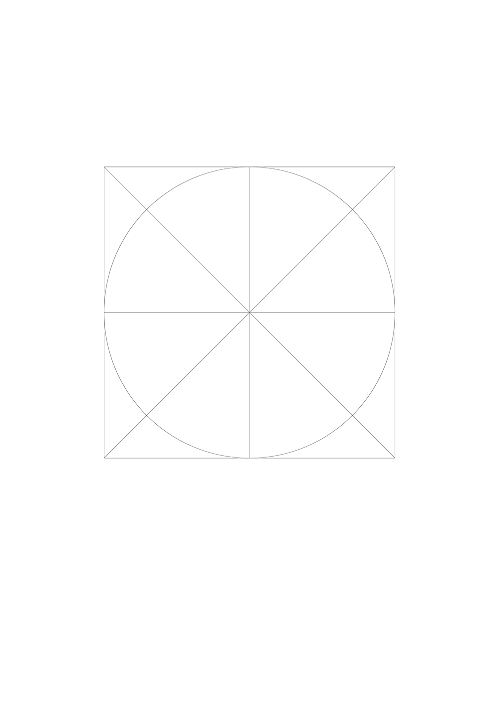
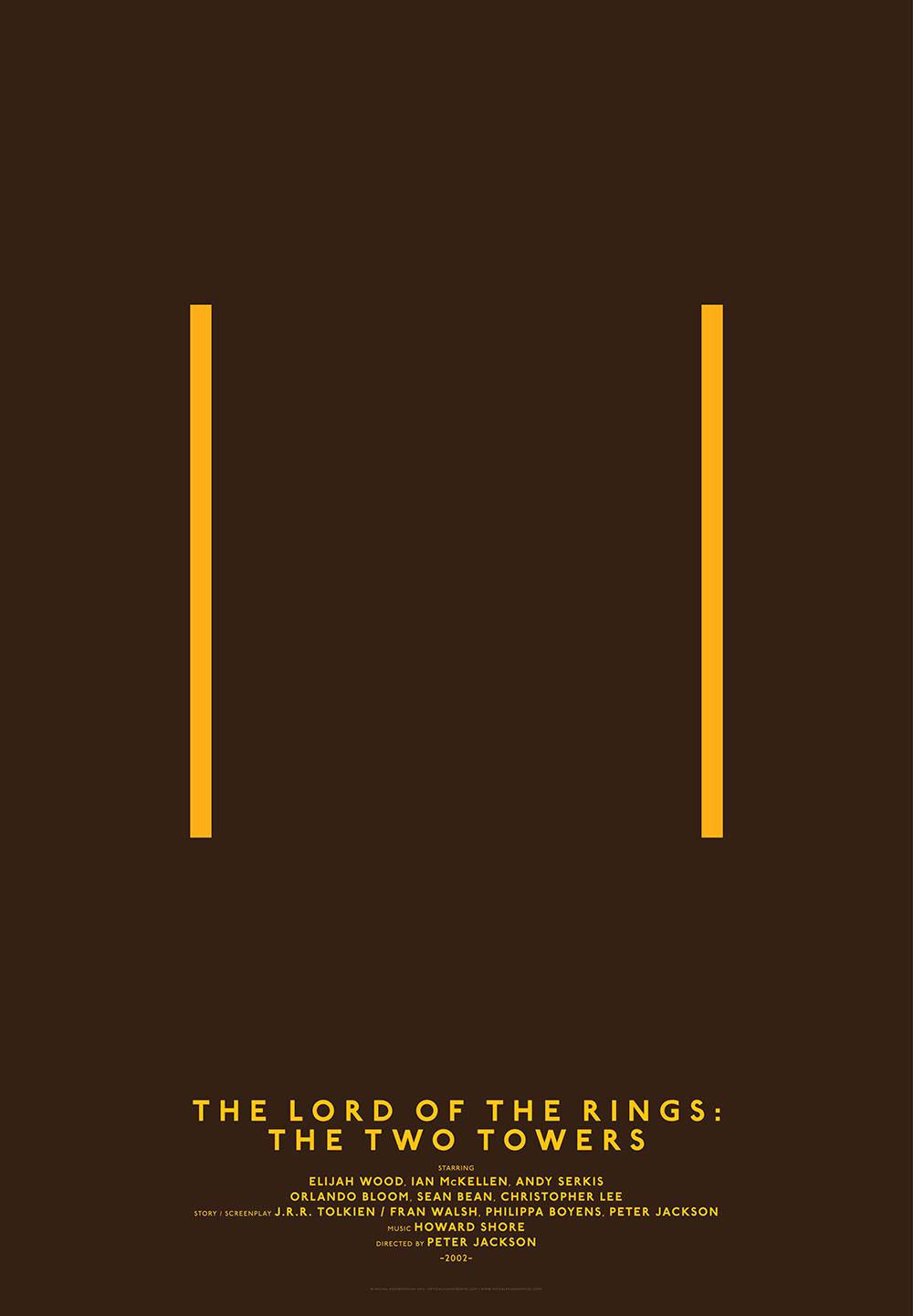
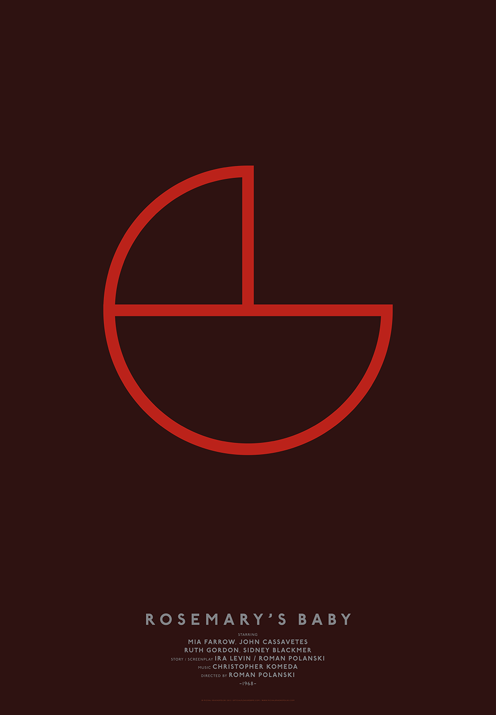
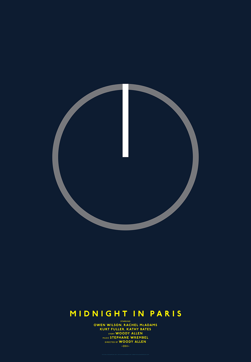
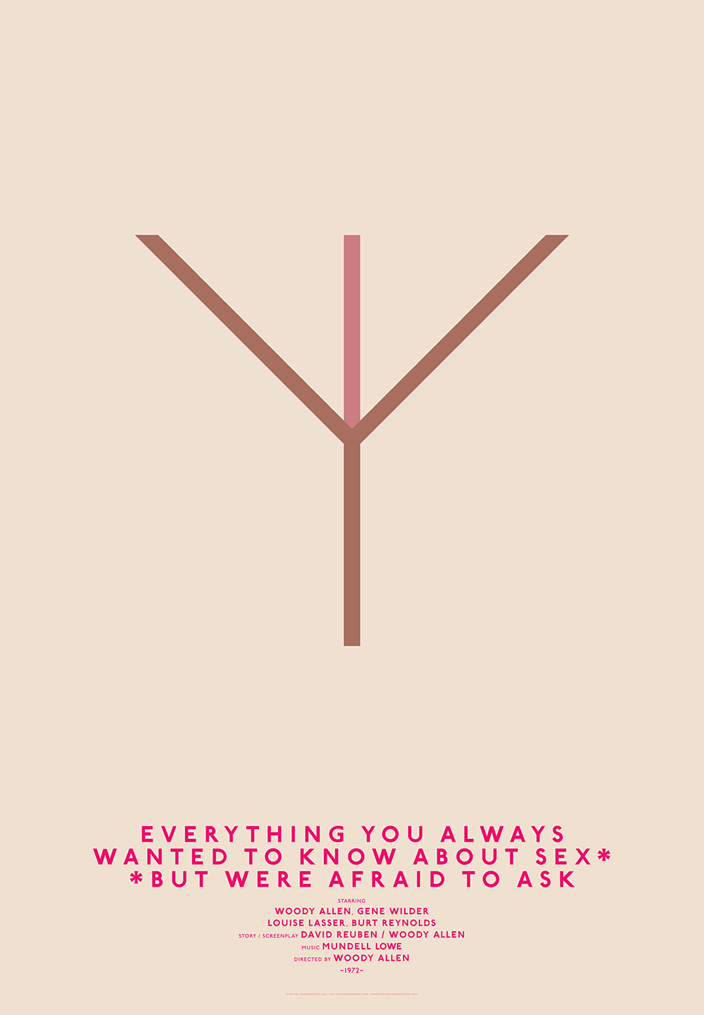
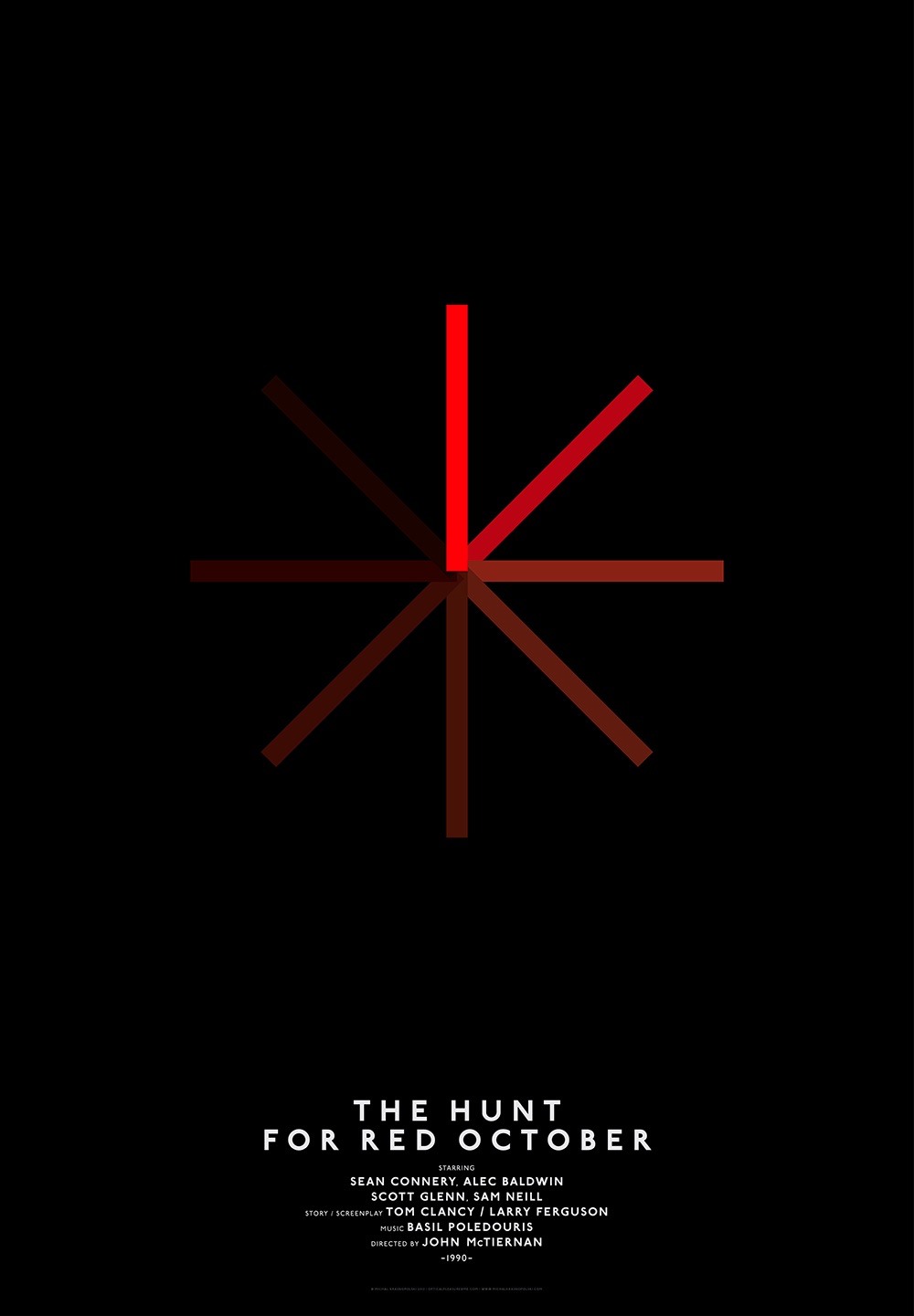
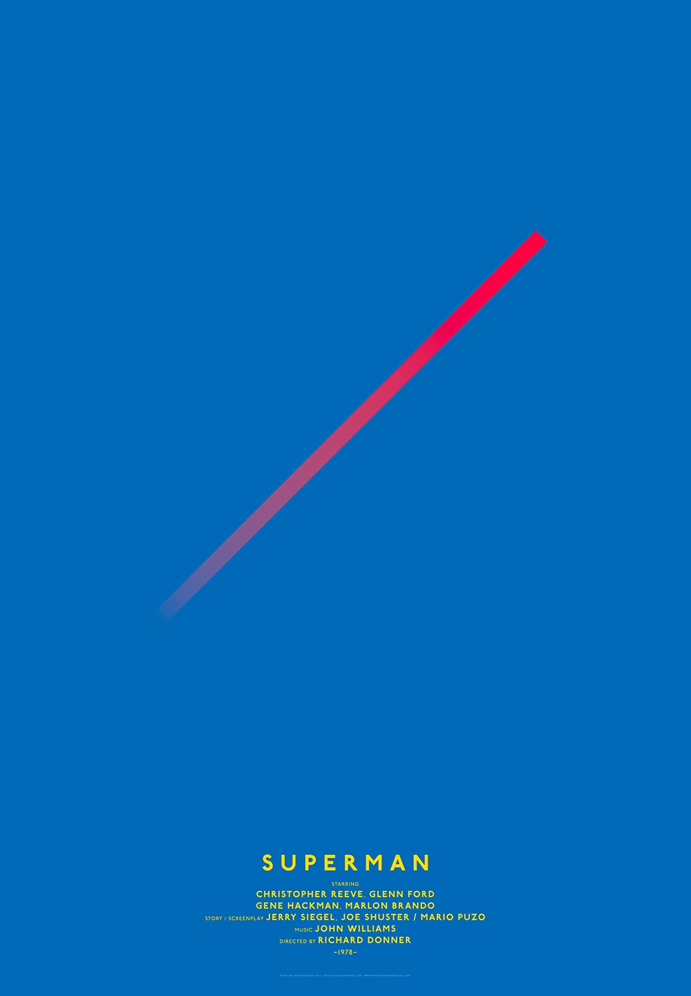
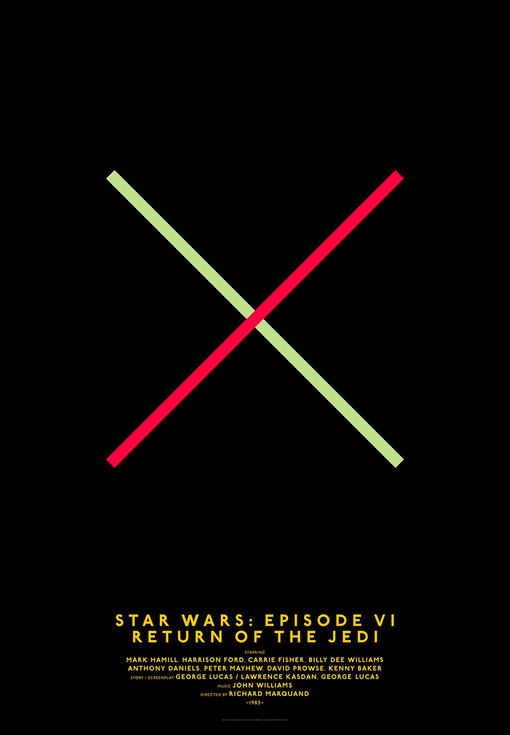
Ten years ago, Michal Krasnopolski set out to create a series of movie posters that serve as an antidote to the common, some would say boring, floating head approach. He created extremely minimalist designs all based on a single template: a circle overlaid by two diagonals, all inscribed in a square (see the template and some of the finished posters in the carousel below).
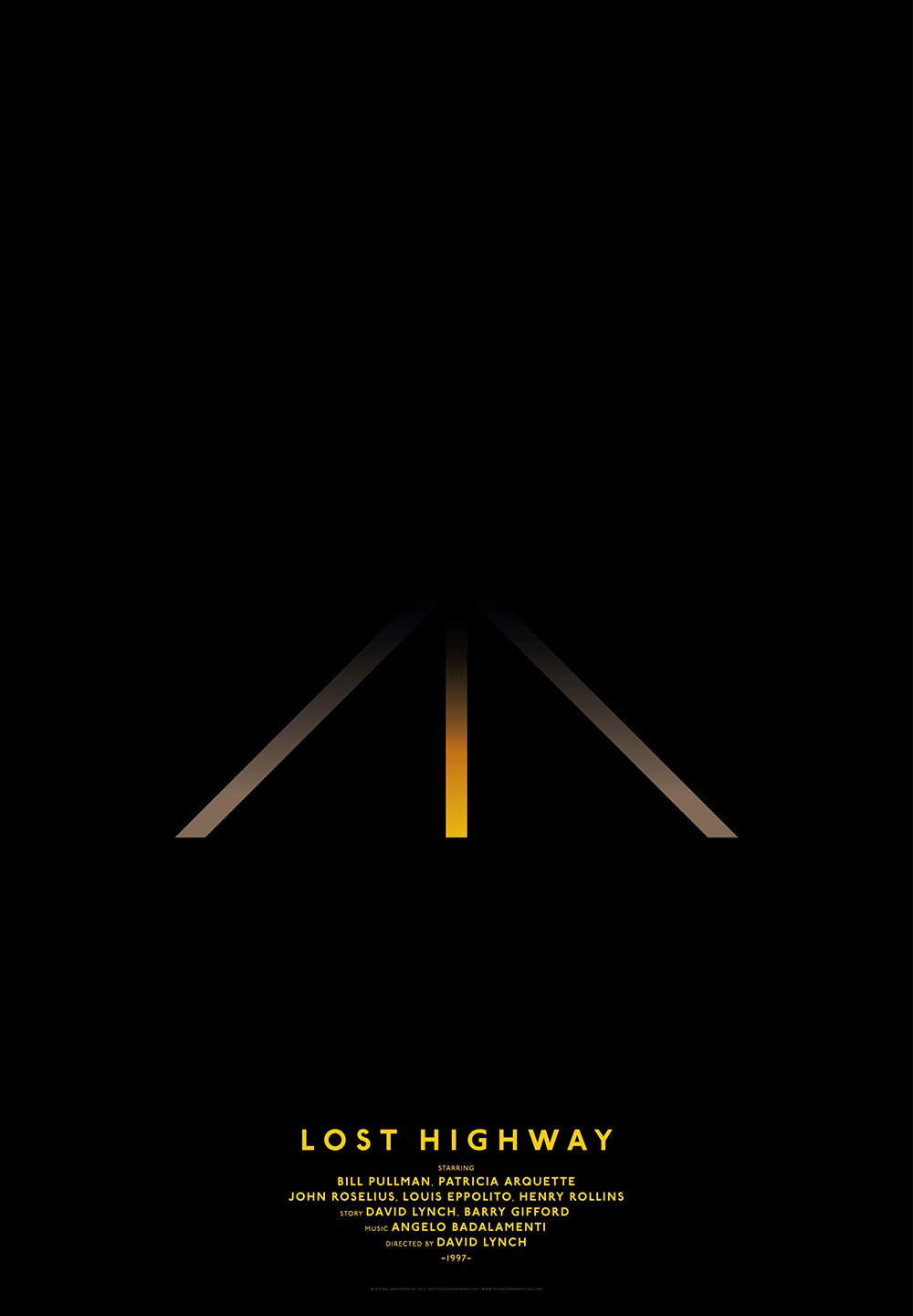
For some of the movies chosen, the approach works very well and the film will be recognisable to many even without the title. This is most notable in the poster for David Lynch's Lost Highway, which shows the road at night used in the official poster.
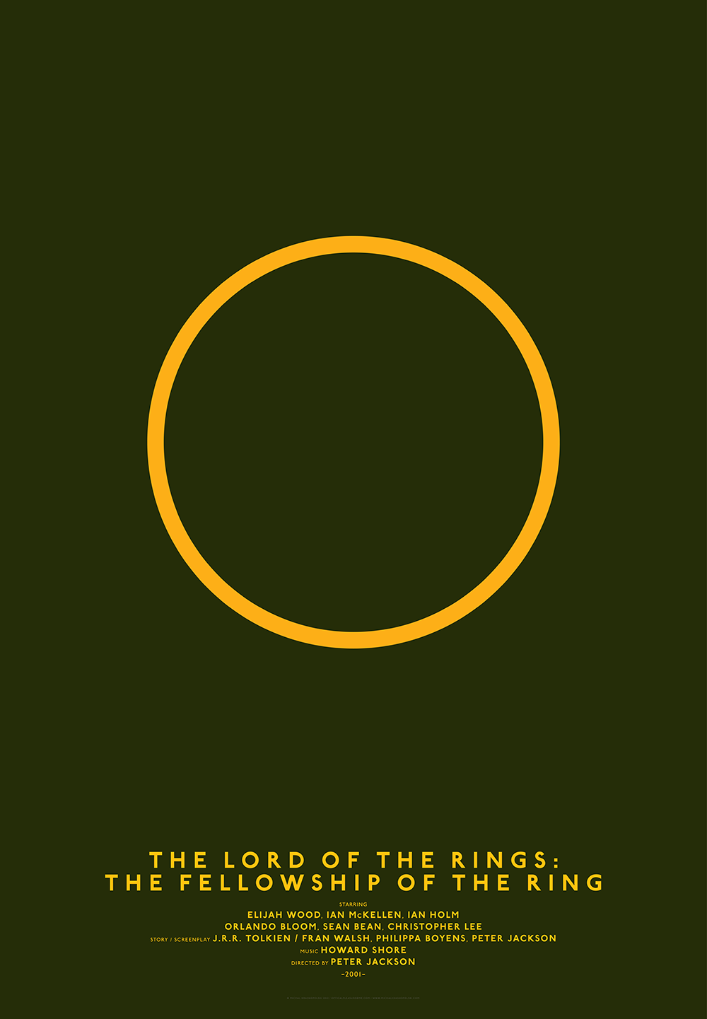
The Lord of the Rings posters are also very clever, and the design for Rosemary's Baby feels suitably creepy. Others are so abstract that it takes a moment to understand the connection to the film, but all in all, the project remains an intriguing demonstration of the power of simple shapes in communication and design.
For more inspiration, see our pick of the best movie posters of 2023 (and the worst movie posters of the year too). If you're looking to upgrade your own design tools, see the best current prices on Adobe's Creative Cloud suite of design apps below.