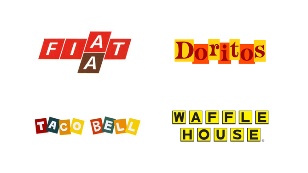
Contained type logos have a classic, perhaps even retro feel. After all, wordmarks that have their individual letters contained within shapes (typically squares or rectangles) had their heyday back in the 1960s
Some of the most famous logos of this style have since been redesigned, but there are some that are still used. The BBC logo, for one Over on Twitter a creative has asked invited people to vote on their favourites from a series of gems (see our pick of the best logos for more classics).
Contained type! Huge hit in the 60's and still used today with the BBC and Waffle house. Here's some logos from that era, who did it best? pic.twitter.com/GcshvrdX3hMay 18, 2023
Jordan Jenkins, creative director at unfoldco started a thread on Twitter asking people to choose their favourite contained-type logos. The options are Fiat, Waffle House, Cartoon Network, Taco Bell and Doritos. Others have chimed in with more examples of the genre, from Cinerama and Carfax to, more recently, Breaking Bad.
But which is the best? So far Doritos seems to be getting the most votes, although Fiat is getting a lot of love Waffle House has its fans – one person noted the logo design looks like Scrabble tiles. Either way, the response shows that certain logo trends from the past shouldn't be written off. See our guide to how to design a logo for more inspiration.
