When a trend first emerges on the interior design scene, it's hard to tell immediately whether it will have real staying power, or whether it's going to be one of those trends that simply falls by the wayside after a couple of months.
At Livingetc, we're always on the lookout for emerging trends to flag to our readers, but that doesn't mean that every trend we write about is right for you. So how do you know when to invest and when to abstain when you spot a trend that calls to you? Consider if you can see the trend withstanding the test of time in your home and whether it works for its occupants and the way you interact with the home. You might love the curved sofa look, for example, but it might not be the most practical if you have a busy and smaller family home.
Crucially, navigating trends comes down to really being truthful with yourself and working out if you actually like it, or if you're just being influenced by your Pinterest feed. To help get to grips with what trends are hot and what's not, we've spoken to interior designers to find out what interior design trends they regret having bought into and why.
1. Bouclé upholstery

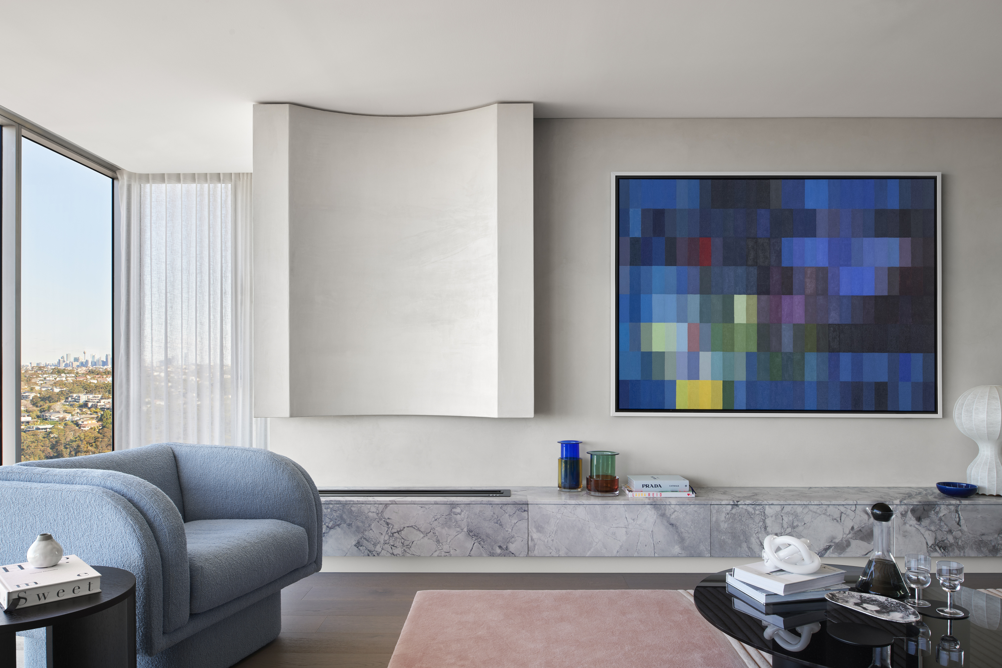
We first reported on the evolution of this specific woolen texture back in July when we covered predictions for what's replacing boucle, and since then, bouclé has fallen more and more out of favor. It's not to say that we're fully over this fluffy, sheep-like upholstery, indeed, texture is still a huge interiors trend in the home. But it's more that we're looking instead at how the bouclé fad is changing and developing in the home.
We're seeing uber-fluffy and luxurious textures and lots of layering for a high pile, shaggy look, and we've seen upholstered armchairs and sofas favoring large looped fabrics instead of bouclé's tight curls. Bouclé-mania has paved the way for something fleecier and fluffier. ‘We're seeing a shift to a more exaggerated direction with larger loops or strong texture,' says Tania Chau, director of interior design at New Zealand-based Alda Ly Architecture.
For Melissa Anderson of Brooklyn-based OAD Interiors, bouclé presents a problem practically, which is why she'll be leaving the trend behind. 'I will leave behind the 2023 trend of bouclé furniture because steals a lot of attention in a space and has an unappealing quality to them. It's a notorious dirt catcher too!'
If, unlike Melisssa, you're still a fan, consider updating the boucle with a different pop of color like The Stylesmiths have done here in their Sydney Harbour penthouse project (above).
2. Boxy couches
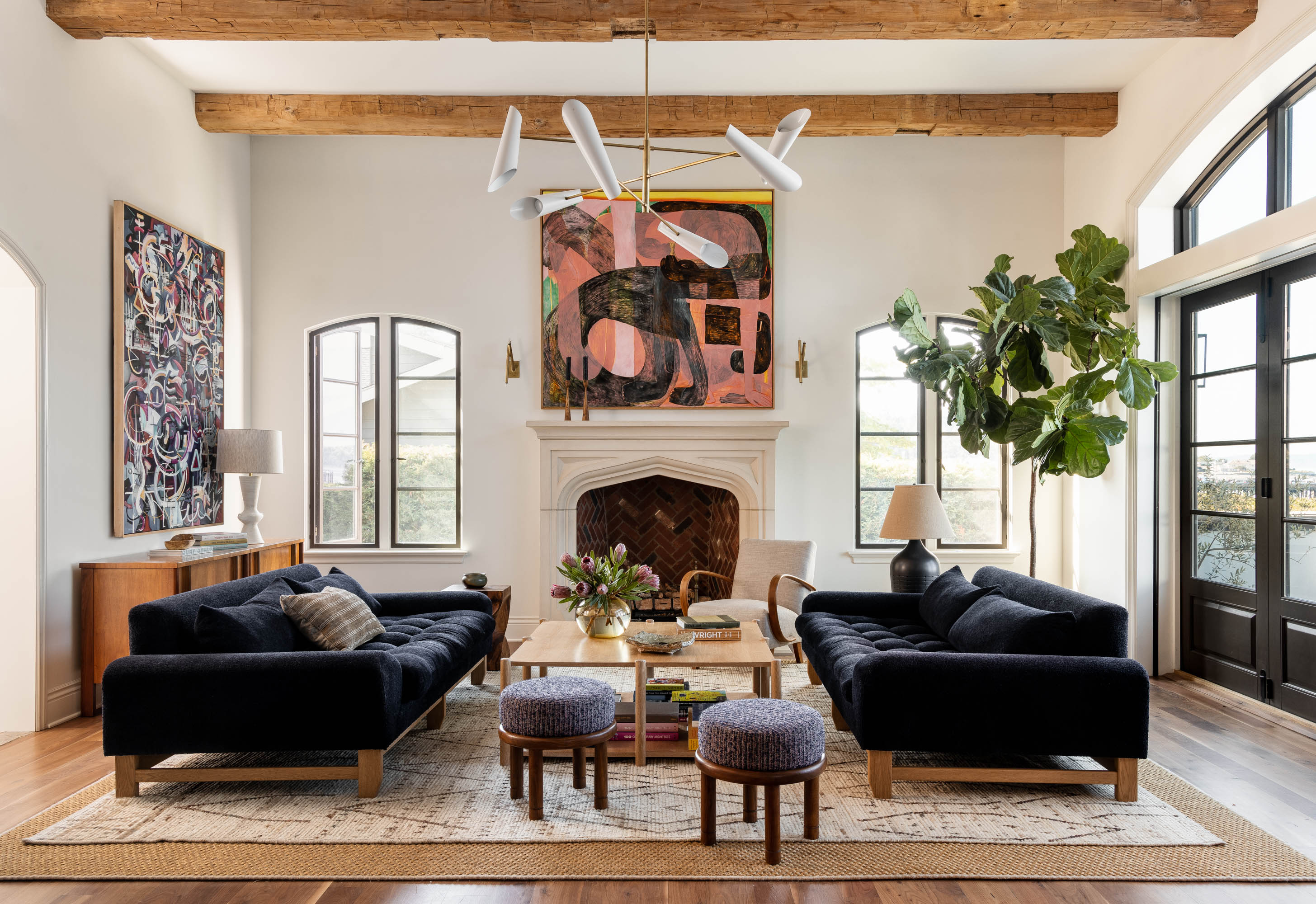
I am so over formal-looking couches, instead, we've noticed sofa trends evolving to become bigger, cozier, and slouchier, perfect for lounging. We're noticing big, deep, and cushy couches with low arms and perfect for sinking into. What's more, we want the layout to feel conversational and relaxing. In this example by Tim Pfeiffer and Peak Petersen, the designers opted for deep Lawson Fenning sofas in the center of the living room.
'When it comes to sofas for 2024, I believe that it is comfort that is the focus,' says Marc Bherer of Montreal-based design firm, Desjardins Bherer. 'Without sacrificing aesthetics, several large manufacturers have put forward significantly more comfortable models. For example, the Grande Soffice from Edra is the perfect combination, with a memory foam base, paired with a down surface covering, which gives the whole structure, comfort, and a casual and chic look at the same time.'
3. Oversized, arched headboards
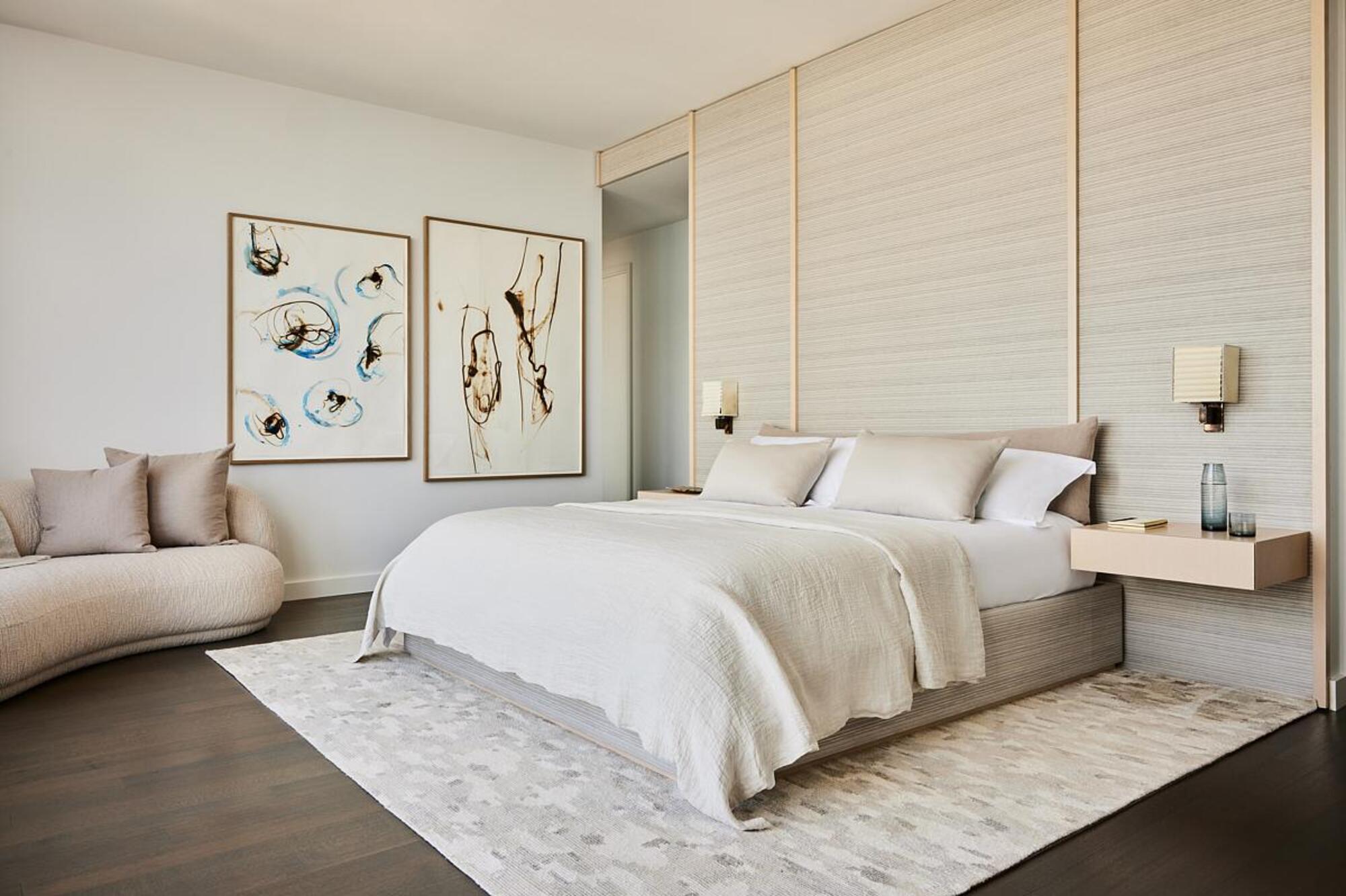
2023 has been the year of the low profile, with low-profile sofas reigning supreme in the living room. But the low profile look has also reached the bedroom. No longer are we seeing large, oversized arched-shaped headboards, instead, we're embracing the low-profile, rectangular look with soft curves. This shape feels cooler and not so traditional. Instead colorful and heavily patterned upholstery, we're going for more simple colors. Subtlety is key.
While upholstered headboards might not be as fashionable as they once were, they're still a classic and timeless option, instead, they're sleek and simple, without too much bulk or fuss. This example from Jessica Gersten Interiors is a wonderful example. 'A low profile headboard wall was a custom element designed in-house, produced using Toyine Sellers fabric and pale oak paneling.' Jessica opted for this low-profile shape to help the space feel calming. 'The master bedroom has an ethereal feeling,' she says.
4. The open storage 'shelfie'
Open storage has had its moment in the spotlight, and the designers that rallied around this interior design trend are certainly retreating away from the look. 'Open shelving has never been the most practical storage option,' admits NEAT Method's co-founder, Ashley Murphy.
'In recent years the rise of the "shelfie" led to shelves composed of items that were bought specifically to look good; that left open shelves feeling both impersonal and impractical,' agrees Heather Peterson of the eponymous interior design studio.
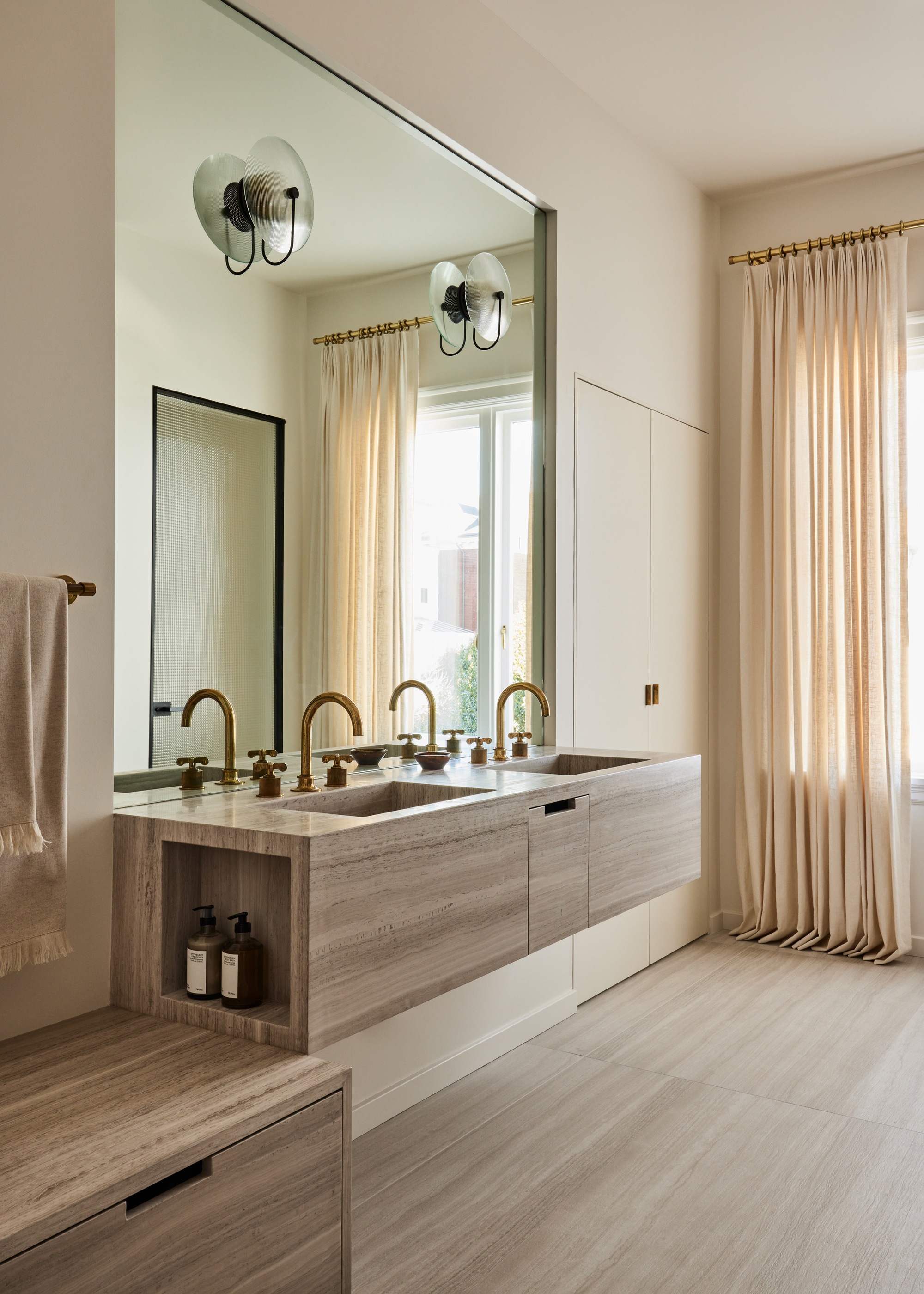
It has its selling points - you can use the surfaces to display your keepsakes and decorative items, and can certainly be incorporated on a small scale, but we're saying goodbye to the artfully curated 'shelfie', opting instead for furniture that incorporates closed storage instead. Unfortunately, homeowners have found that open storage only works if you are a minimalist to your core, with little possessions, otherwise, your open storage only ends up looking cluttered and untidy. Say goodbye to the floating shelf look in your kitchen or bathroom, and try and keep your storage concealed and streamlined.
'Looks are deceiving, this modern bathroom indeed has quite a bit of storage, though hidden,' say Susan and Ben Work of Homework, who designed this impressive master bathroom. 'We created a rather large built-in closet to the right of the sink next to the window that acts as a medicine cabinet, but it's perfectly concealed.'
5. Oversized media units
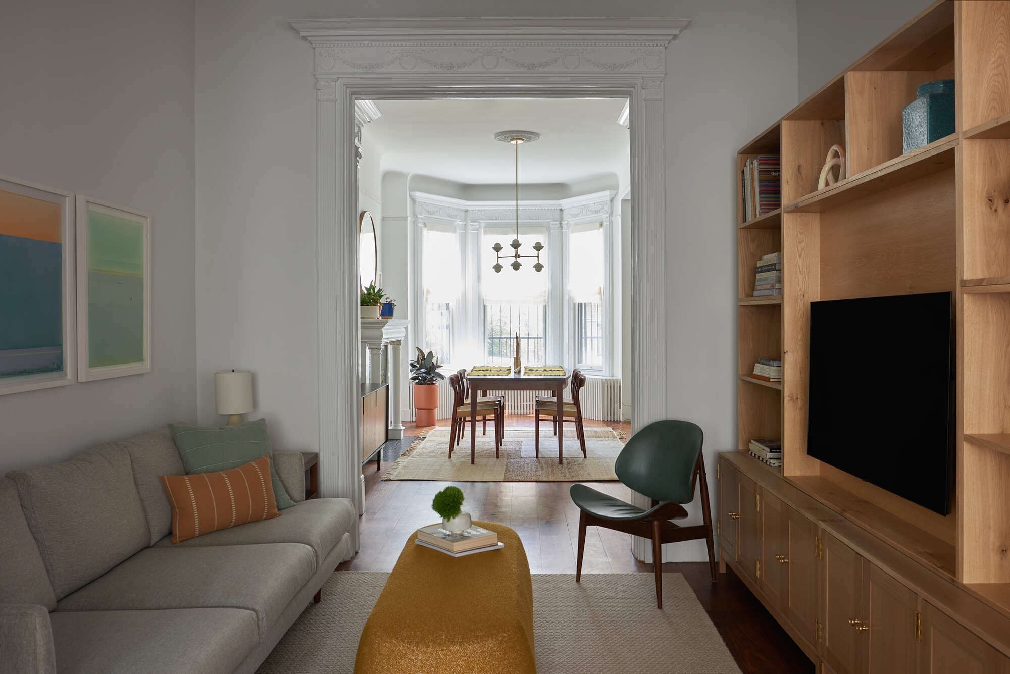
Finally, a pet peeve of mine is too much focus on the television in the living rooms, so media units have always been out as far as I'm concerned, but there was a phase where designers were creating great, bulky custom-made media units to house the television.
This TV stand trend is becoming a little outdated as we seek comfort and relaxation in our living rooms. ‘Oversized media units are so outdated,’ says Ashley . ‘These can feel overpowering in a space and provide ample shelves for clutter to collect.’ Instead, we're moving away from bulky TV furniture towards slim-line console tables that house slimmer and sleeker televisions.


