It’s at times difficult to decipher if the kitchen is a science or an art form. These spaces are rooted in function, storing food, and providing a stage upon which to feed and entertain family and friends. But they are also driven by their form. From sleek all-black kitchens with island structures to small peninsulas colored in bold hues, there is no shortage of finishes or layouts when it comes to designing your kitchen. We asked designers and kitchen crafting specialists if the ideal kitchen layout exists, and in contrast, what the worst layouts would be. Each of them agreed that the best layout for any kitchen and in turn its worst counterpart is entirely dependent on the architectural footprint of the space.
It is paramount to understand the interior architecture of the room as well as the client’s preferences, uses for the kitchen, and lifestyle. Designers then create a layout that allows the client to maximize the potential in a modern kitchen, offering greater functionality, storage, and ease. Whilst there is no definitive layout to condemn, designers do offer their key tips and tricks to bear in mind when drawing up your dream kitchen. Our list highlights the importance of a proportional kitchen layout as well as the kitchen working triangle. Each piece of advice echoes the idiom, the devil is in the detail.
1. Disproportional spaces
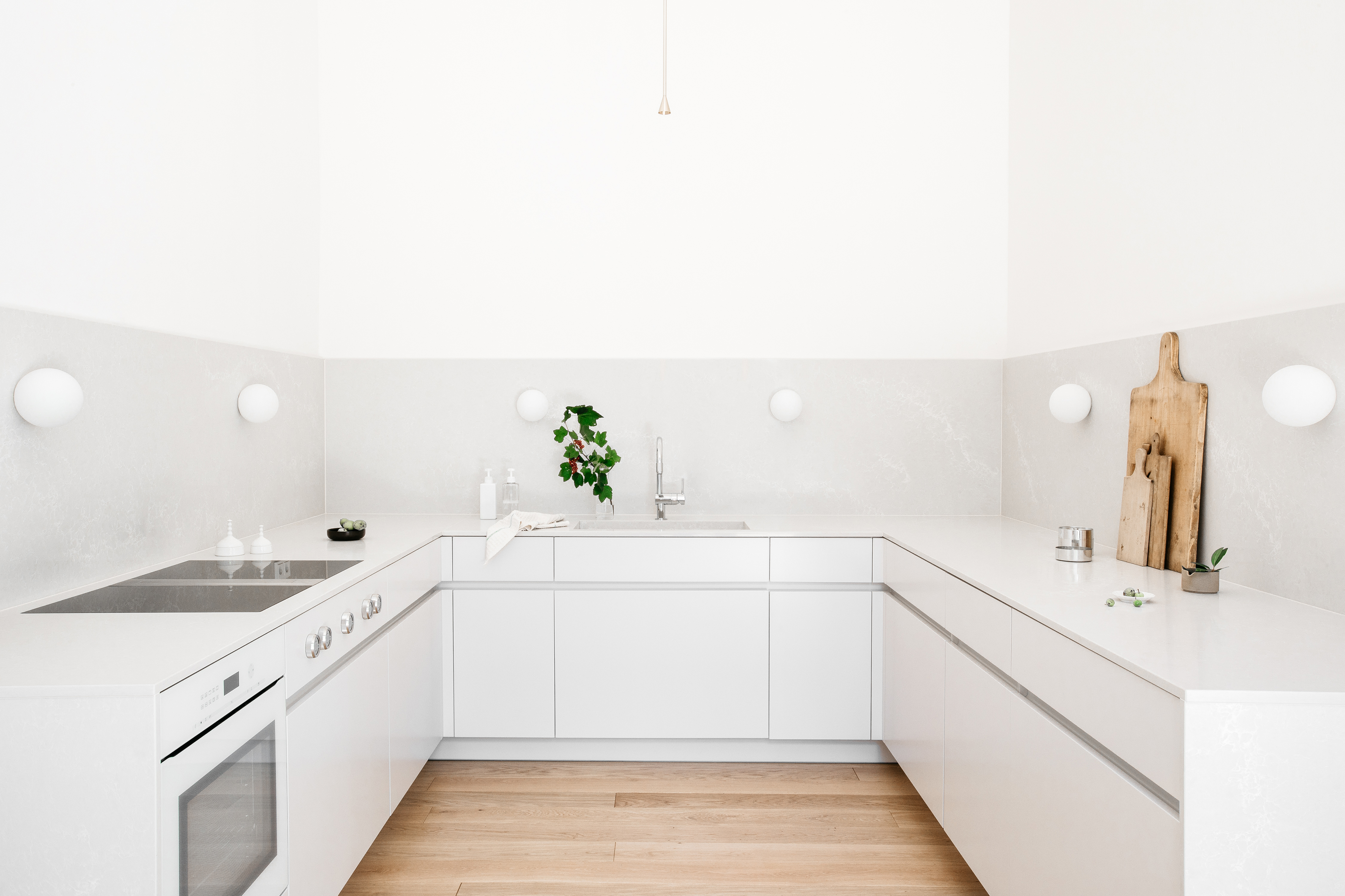
It can be very tempting to try and squeeze in as much cabinetry as possible when designing a small kitchen, but this doesn’t deliver the best kitchen experience.
Interior designer, Constanze Ladner cleverly utilizes this small kitchen space with a U-shaped design in a clean and crisp white color palette. 'I love to create the best out of a small kitchen, you can find a cozy space to sit in the tiniest space,' says German interior designer, Constanze.
The result is a small kitchen that keeps everything within arm’s reach but doesn’t feel suffocating or impractical. By eliminating the upper cabinets and adding small wall lights, she further opens up this space and introduces a clear path of movement to the kitchen.
With the left side dedicated to appliances and the right for food preparation, more than one cook can operate within this kitchen at the same time.
2. Awkwardly placed appliances
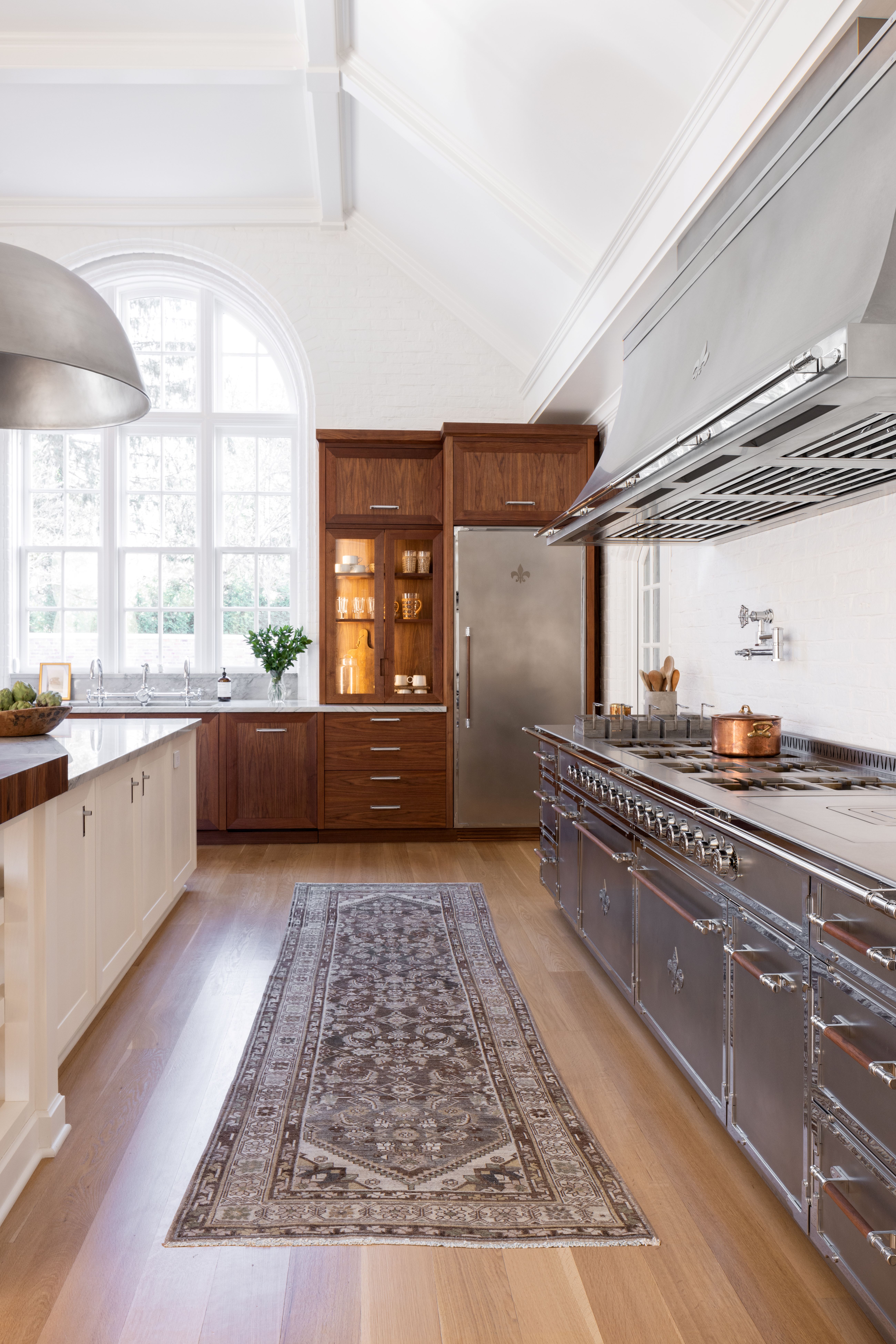
Kitchen appliances are an everyday essential when it comes to your kitchen. Mornings are made with coffee machines and toasters but all too often, we forget about the role that appliances play in our kitchen designs.
'When a kitchen places all appliances too close together, it causes bad circulation and doesn’t leave enough space to work with each appliance. This causes the kitchen to look and feel cramped and disorganized,' shares Maria Moraes, creative director for L’Atelier Paris.
The kitchen expert emphasizes how important it is to cultivate the best kitchen layout that allows each appliance to shine but also evokes harmony within your space. The best way to avoid this downfall when it comes to your kitchen layout is to plan and roleplay within your room.
When doing so think about your daily rituals and your pattern of movement, consider everything from making a cup of coffee to cooking dinner for family and friends. Furthermore, do not neglect the measurements. 'Designing a layout without taking appliance specifications into account: not being able to open a fridge that hits a wall if it's placed too far in the corner, or a drawer that doesn't open completely because it hits the oven or fridge handle, for example,' says Marie Ingrid, founder of French design studio, MIID.
3. Kitchens without adequate storage

It’s always best to avoid any layout that prioritizes form over function and the same rule applies to your kitchen.
Kitchens need to work hard and offer enough kitchen storage for their clients to avoid countertops becoming overly cluttered. 'Failure to take into account storage possibilities and capacities in a kitchen where cupboards are not thoughtfully installed, and storage space is lacking,' says Marie of MIID.
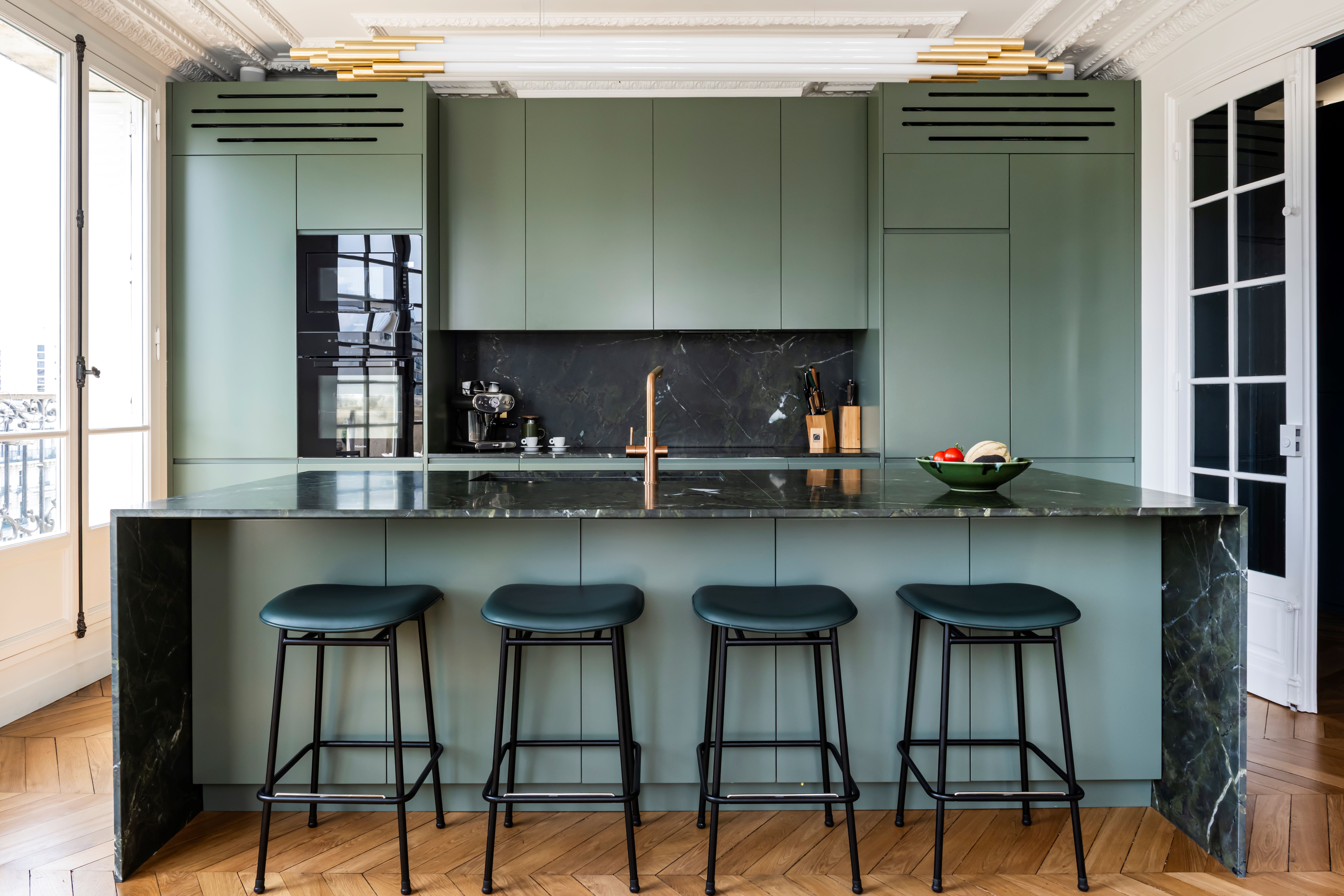
By building bespoke cabinetry from floor to ceiling, Marie Ingrid’s Rue Mizon kitchen project offers her clients the best of both worlds. The island adds to the storage and creates a focal point for the sink as well. When designing your kitchen, rather than taking a one-size-fits-all approach, consult specialists to see what storage solutions can be maximized in your space.
4. Spaces that disregard the working triangle
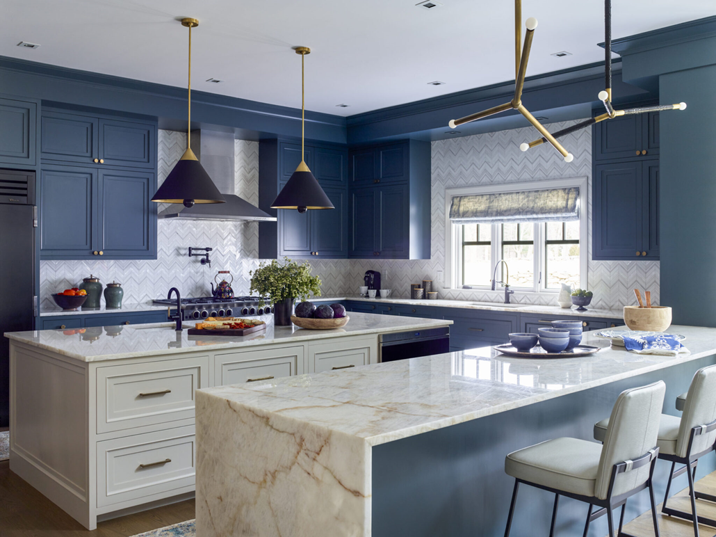
The work triangle is a biblical rule for designers and kitchen specialists when creating these interiors and is the go-to way to design a kitchen that is better to cook in. 'The work triangle, which connects the refrigerator, sink, and stove, should be clear of obstructions. A poorly placed island or furniture that interrupts this triangle affects efficiency and ease of movement. When designing a kitchen, it's crucial to avoid certain layout mistakes that can hinder functionality,' explains Kati Curtis, founder of Kati Curtis Design.
For her colorful Rye home project, Kati cleverly utilizes the depth of space with an island and breakfast bar. The working triangle is placed and perfected and connects the island to the kitchen. This layout is perfect for those with lots of space and a passion for entertaining as your guests or family aren’t interrupted by food prep, they are involved but not overwhelmed.
5. Uneccessary islands
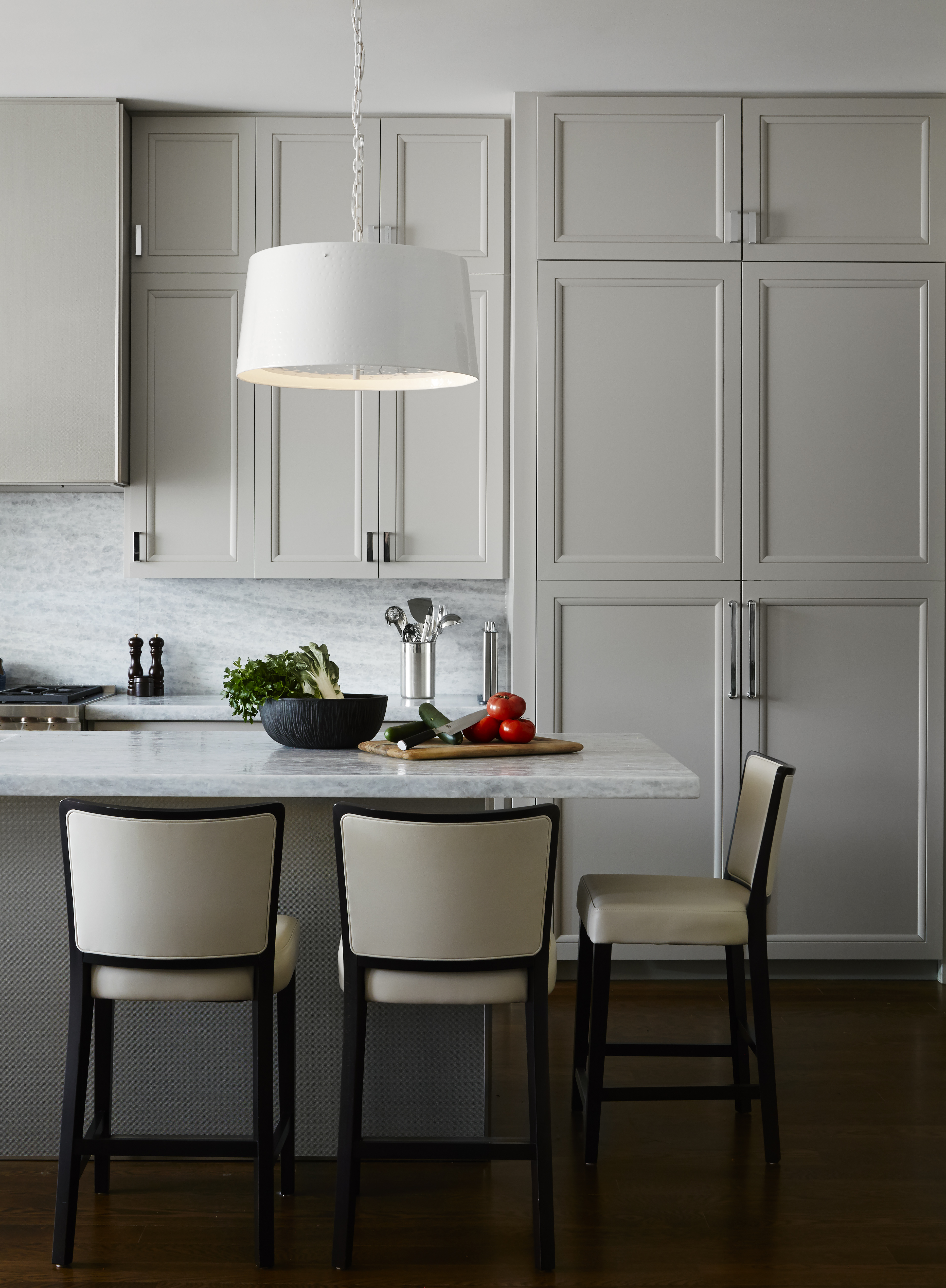
The kitchen island has been in vogue for a while now and it can be oh-so tempting to add it to your kitchen design but take a moment to consider if it's right for your room. 'When the island is too large for the space, or there is no room for an Island, do not include it, these can make a small kitchen feel cramped,' says Tom Stringer, founder of Tom Stringer Design Partners.
Many other alternatives to an island can help you create additional storage and establish a working triangle that utilizes the center of your space. Consider a kitchen trolley or antique kitchen table with casters to add character and function to your small kitchen.
Not only are these pieces visually and physically lighter, but they can be moved in and out of your kitchen at a moment’s notice. In turn, you will have saved yourself time and money but also benefit from a kitchen layout that doesn’t make you feel hemmed in.


