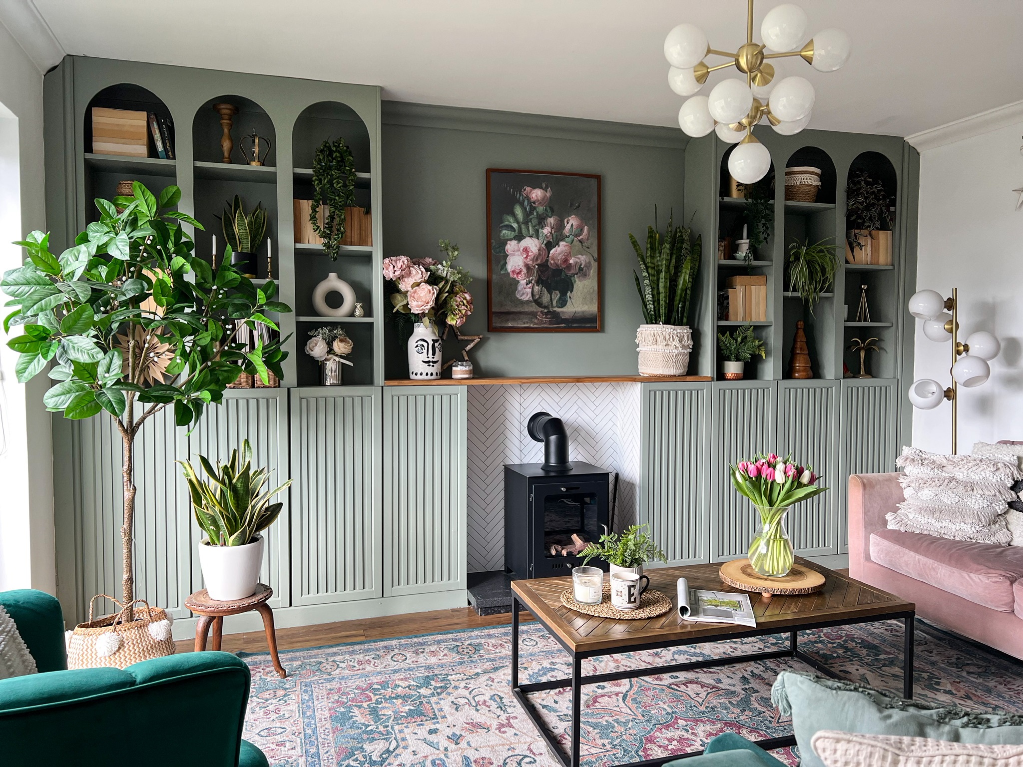
Few things impress us more than a super stylish IKEA hack. For bespoke built-ins and custom furniture pieces, a clever DIY can be the best solution - as long as you know your way around a few power tools.
With everyone's favorite Swedish homeware brand offering some of the most versatile and affordable flatpacks, there's plenty of scope to get creative. From the BILLY bookcase to the PAX closet system, these items offer a clean slate to mark with your own stamp, and there's a host of seriously clever IKEA hacks out there to inspire your designs.
This year we came across some of the very best, and they're bound to spark your own creative DIYs in 2024 and beyond. Here's a round-up of our very favorites.
1. These monochrome arches made from BILLY bookcases
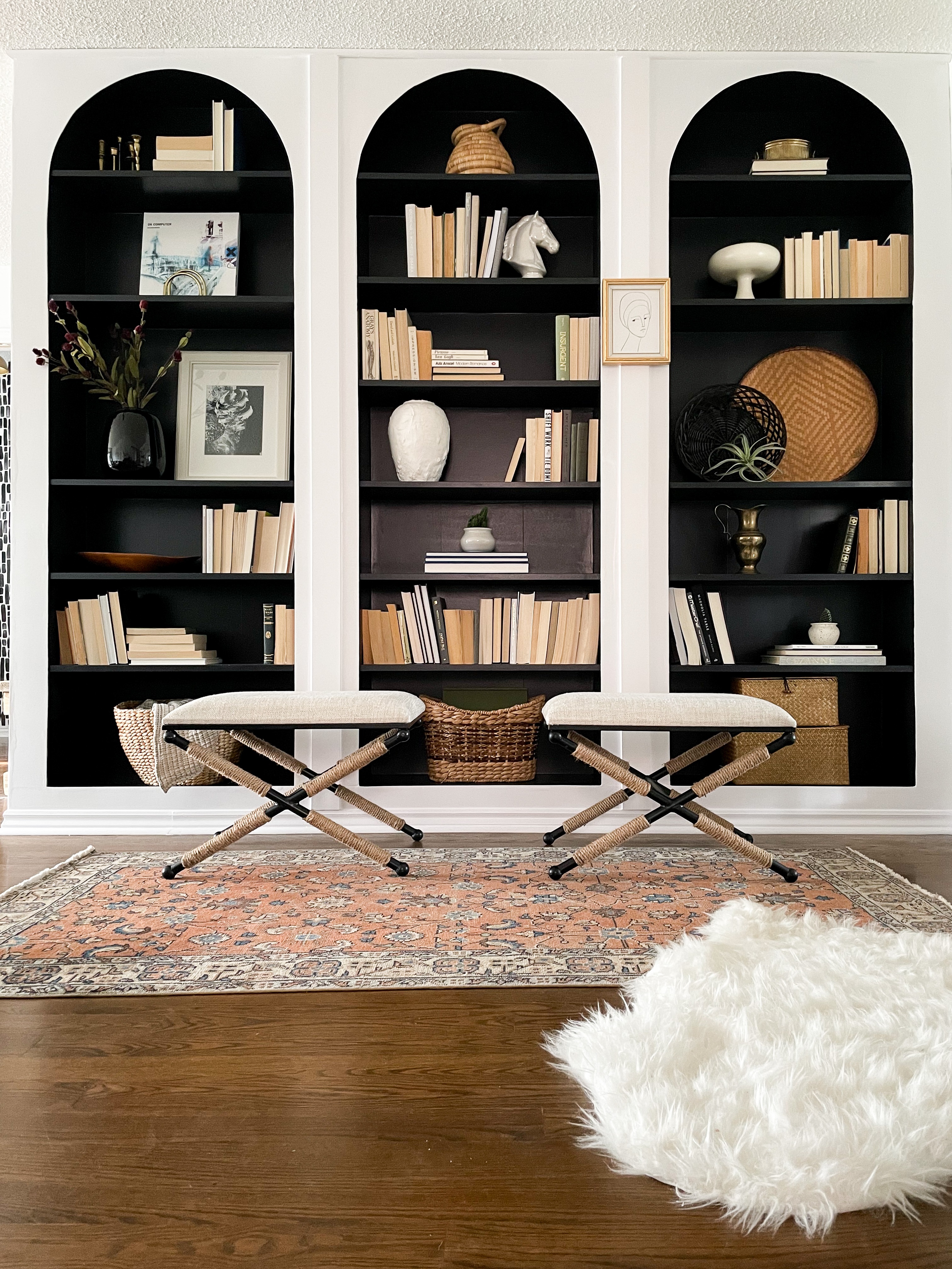
There's a reason the BILLY is IKEA's best-selling piece of furniture. These beautiful arched alcoves are made from three humble flat-pack units, and they showcase the untold possibilities of an IKEA BILLY bookcase hack when in the right hands.
There's no reason why you can't do the same, either. Here, home renovator Tamara Smith (@mygrandparentschair) knew she wanted an elegant built-in look on a budget, so she opted for three white BILLY Bookcases measuring 31.5 x 11 x 79.5 inches for her living room shelving which she fixed on top of some height extenders which act as a base.
For Tamara's living room DIY project, she reinforced the units by nailing directly into the sides and back to make them as sturdy as possible, then created support braces for the sides using timber frames. Once the foundations were all fixed into place she made the arches out of tempered hardboard using a length of string anchored to the center of the arch to draw the shape's outline and a jigsaw to cut.
For the finishing touches, Tamara added baseboard to the bottom and primed MDF planks between each unit to complete the look. She then decorated the bookshelves, painting the recessed shelves black and adding backward books and natural woven baskets for a neutral look. You can read her full method here.
2. This Art-Deco inspired wall unit
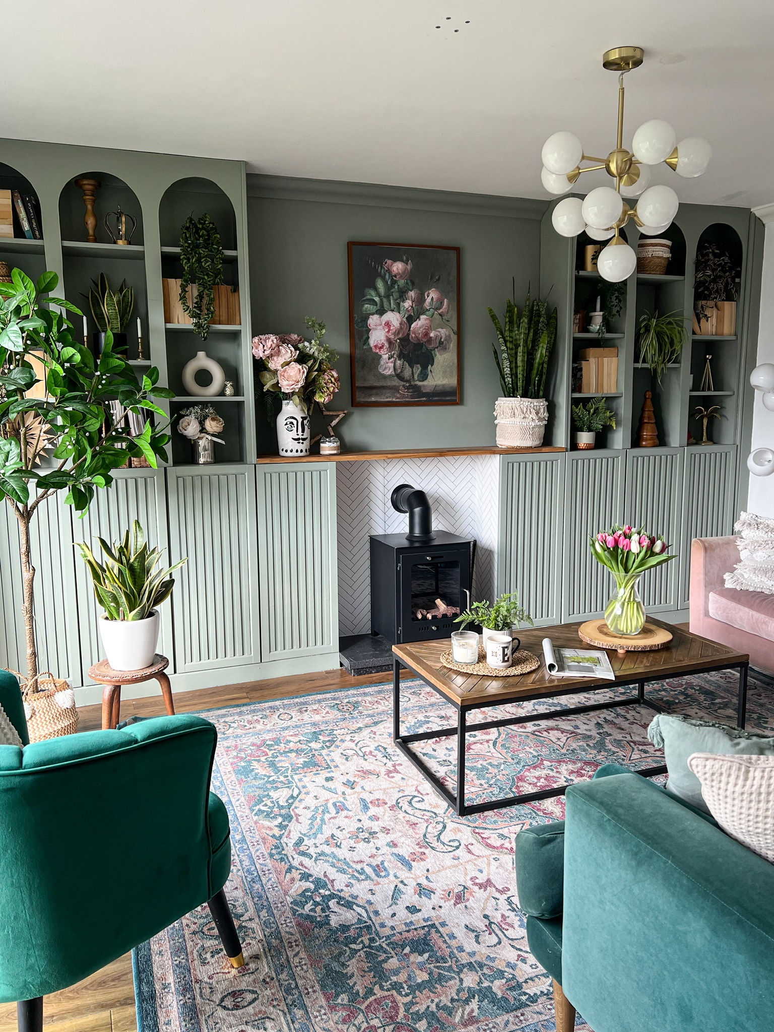
Art-deco arched built-ins were certainly the theme of 2023, and this sage green shelving unit, courtesy of Melanie Boyden (@melaniejadedesign), is a real showstopper.
Again, BILLY units were used for the shelves, and OXBERG cabinet doors were also added to provide cabinet space at the bottom. Melanie then used MDF sheets to cut the arches and strip wood to give the doors their ribbed effect. 'I also used an old worktop from our kitchen as a hearth and a large shelf to act as a mantelpiece,' Mel adds. Once glued, she used caulk to fill in any gaps and fixed skirting boards to the bottom of the cabinets for a truly built-in appearance.
'I used Zinsser shellac to prime the bookcases and painted all the bookcases, trim, and doors in Valspar Thames Fog,' Mel explains. 'I love how it makes the room look like a fireplace has always been in that position and the features make it look bespoke and professional. It's the color that really finishes it off, though - I love green and get so many questions and compliments about it.'
You can read the full instructions for Mel's IKEA built-in hack at the link here.
3. This pink PAX closet that looks authentically turn-of-the-century
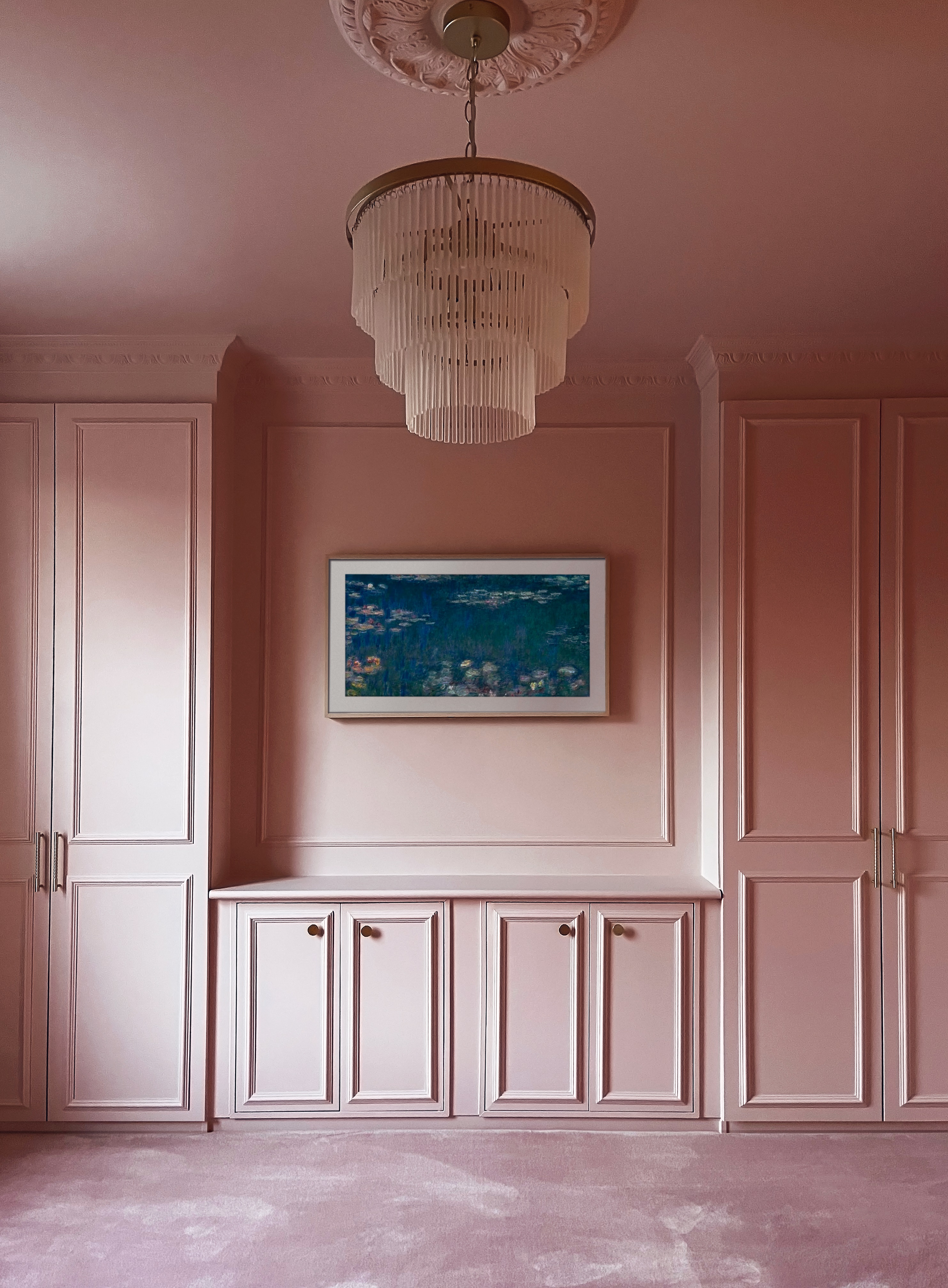
IKEA closet hacks are also an excellent way to make the most of every inch of space, and we were totally besotted with this pink color-drenched bedroom back in January. Barbiecore certainly had its moment in the spotlight this year thanks to the blockbuster film, and we're so pleased it's made its way into the design world, too.
Homeowners Frances and Benjamin who share the renovation of their home over Instagram (@itsnotsogrimupnorth) - wanted a built-in wall closet that fitted seamlessly into their turn-of-the-century space so, to bridge the gap between the closets in each alcove, they bought two EKET cabinets with double doors.
'We used a jigsaw to cut the back of one of the PAX units to fit perfectly into the shape of the alcove and also slimmed down the EKET units so that they fit in line with the PAX frames,' Ben explains. They then built a frame out of timber to lift all the units off the floor, using MDF boards to fill the gaps between each section. 'Afterward, we plaster-boarded from the ceiling down and lightly skimmed everything in.'
After the frames were complete, Ben and Frances used a window board with a bullnose edge as a DIY shelf on top of the EKETS. To create a traditional paneled look, they also added pine wood molding to all the doors. Once dry, it was time to paint. Ben and Frances knew they wanted to color drench their space by painting their fifth wall the same shade for an elegant bedroom with a modern twist. 'For the color, we loved Lick’s Pink 03 - we were aiming to create a room that had the feeling of a Parisian boutique hotel,' says Frances. Now it's the pink bedroom of our dreams!
Read more on Ben and France's closet transformation here.
4. These floating, Japandi-style BESTA cabinets
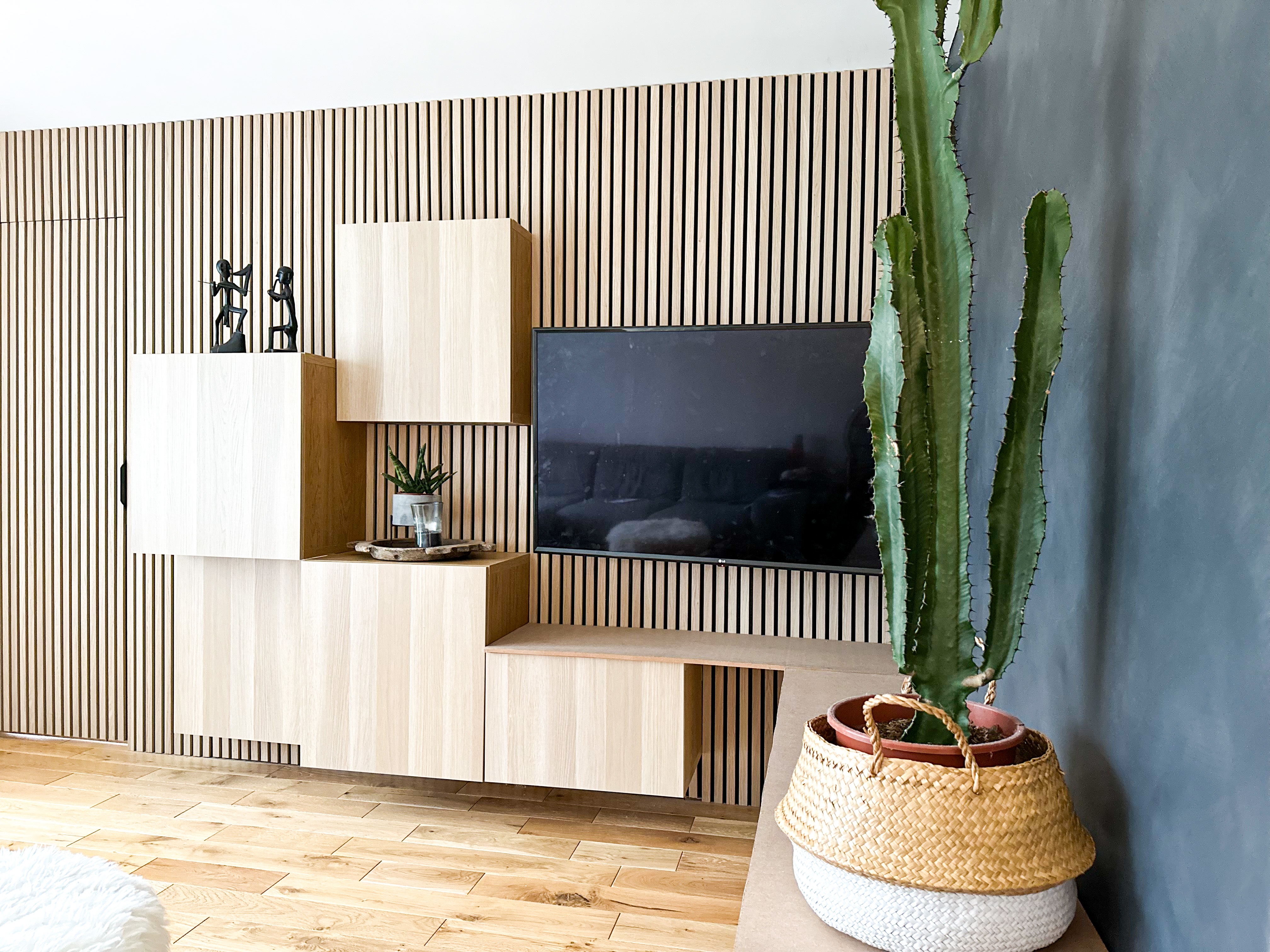
For something a little calmer and more serene, be inspired by this clever media wall by home renovator and interior designer Anne Elliott (@anne_interiors_). With some intense planning and her design prowess, it offers a quirky storage solution for her small space.
To start, Anne cut a rectangular hole on top of the BESTA unit for all the wiring to pass through. 'A neater way of doing this is to have all the wires chased behind the drywall and then install the slatwall over it with a small hole to access again if needs be,' Anne explains. Of course, this is more expensive and time-consuming, so you can decide how committed you feel to undertake this task!
Next, Anne cut and installed slatwall panels according to size, removing all architraves and skirtings. Because all the units were designed to be floating, Anne found it tricky to have them all leveled and aligned to each other, especially in the L-shape. 'IKEA’s BESTA suspension rail was a huge help, especially when we needed wall studs to support the total weight of the units and its future contents,' Anne explains.
The result is a soft, calming space that's at once minimalist and comforting. 'The main inspiration for our overall scheme is my Filipino roots,' Anne notes. 'This is manifesting in my choices of Asian materials in color, tones, and textures, but there will be Japandi, wabi-sabi and Scandinavian influences here as well as I also worked as an IKEA interior designer in the past.'
You can follow the steps involved in completing this storage idea here.
5. This pole wrap media wall
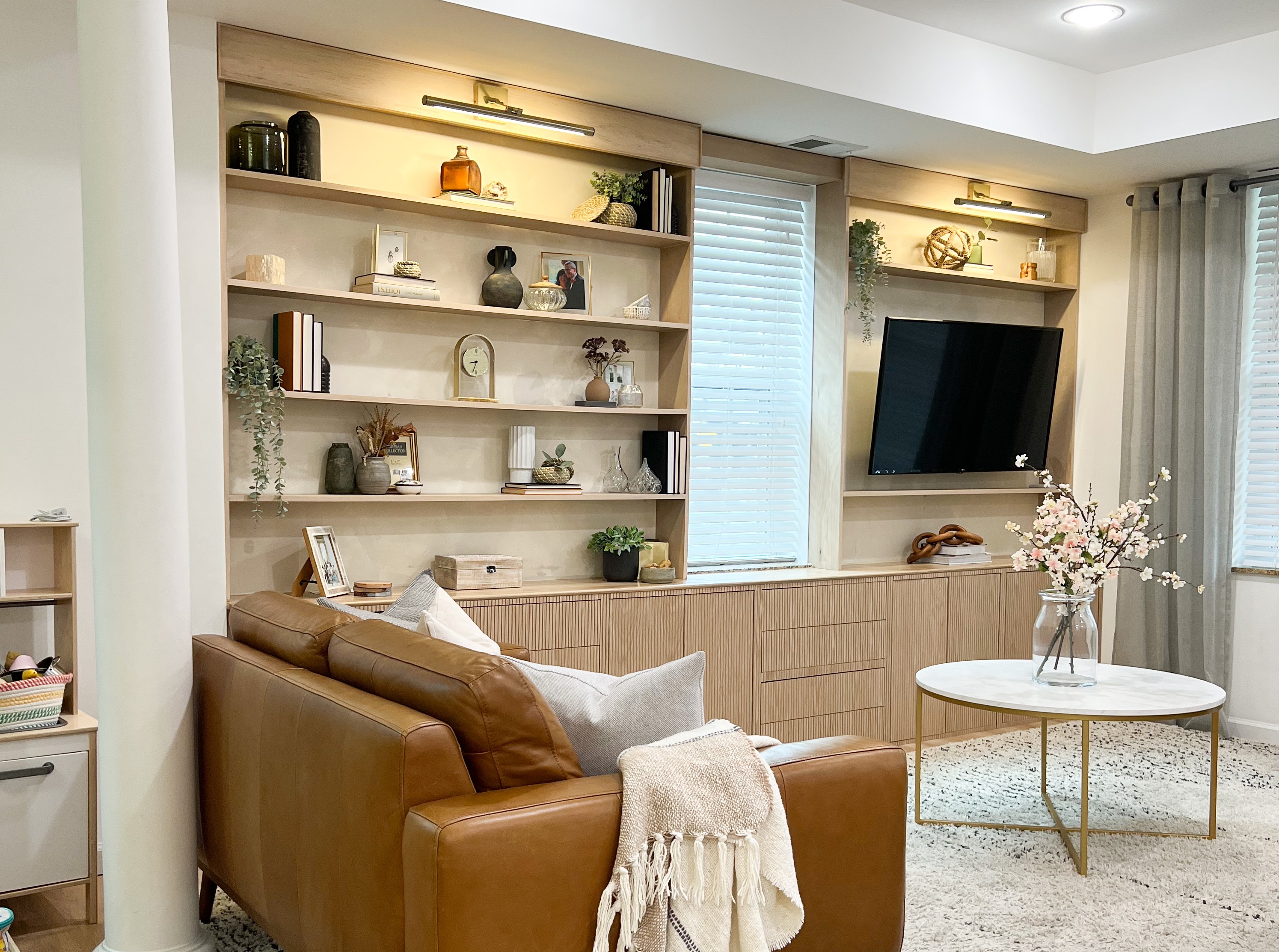
Last but not least, another media wall, this time Linsey Learmonth (@thedcdiyer). With some timber, some pole wrap, and a pair of beautiful sconce lights, this multifunctional storage system has been given a modern organic makeover, and it's easier than you'd think to complete the look yourself.
Lindsey used three EKET cabinets with double doors, one single-door cabinet, and four sets of EKET double drawers to really maximize storage and make the most of every inch of space. 'Washington DC Row homes are historically long and thin so these slim 13 ¾ deep EKET cabinets and drawers were the perfect solution to not encroach on our limited space but still house all of the kids' toys that were previously just scattered over the floor,' she explains.
To give all the units a natural look, she added a pine top to the surface. 'For this I used pocket holes, attaching from the underneath inside the cabinets,' Lindsey explains. Then, to get the all-over wooden appearance, Lindsey used pole wrap to mask the fronts using glue and brad nails. 'I also built the upper shelves using ¾ plywood and dado joints, and attached the whole structure to the wall with floating shelf pins,' Lindsey adds.
For a rustic appearance, Lindsey used her own DIY Roman Clay paint effect for the wall backdrop and then installed custom headers and picture sconces from Amazon to the top of her shelves, which are powered with a wireless switch. The super cozy space makes the perfect chill-out zone for the whole family.
Get all the details here to recreate the look.


