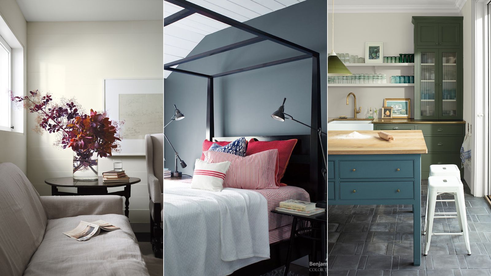
The paint colors we use in our homes have a big sway on how a room feels, and serene is one mood plenty of us wish to achieve. Providing respite from the busy pace of day-to-day life, a calming color scheme feels more important than ever.
But what specific paint colors can help our homes feel relaxing? We're turning to the expertise of Benjamin Moore, who just shared six of its most serene paint colors.
Read on for some room color ideas that feel serene and calming – a timely refresh ahead of the start of the new year.
Cloud Cover OC-25
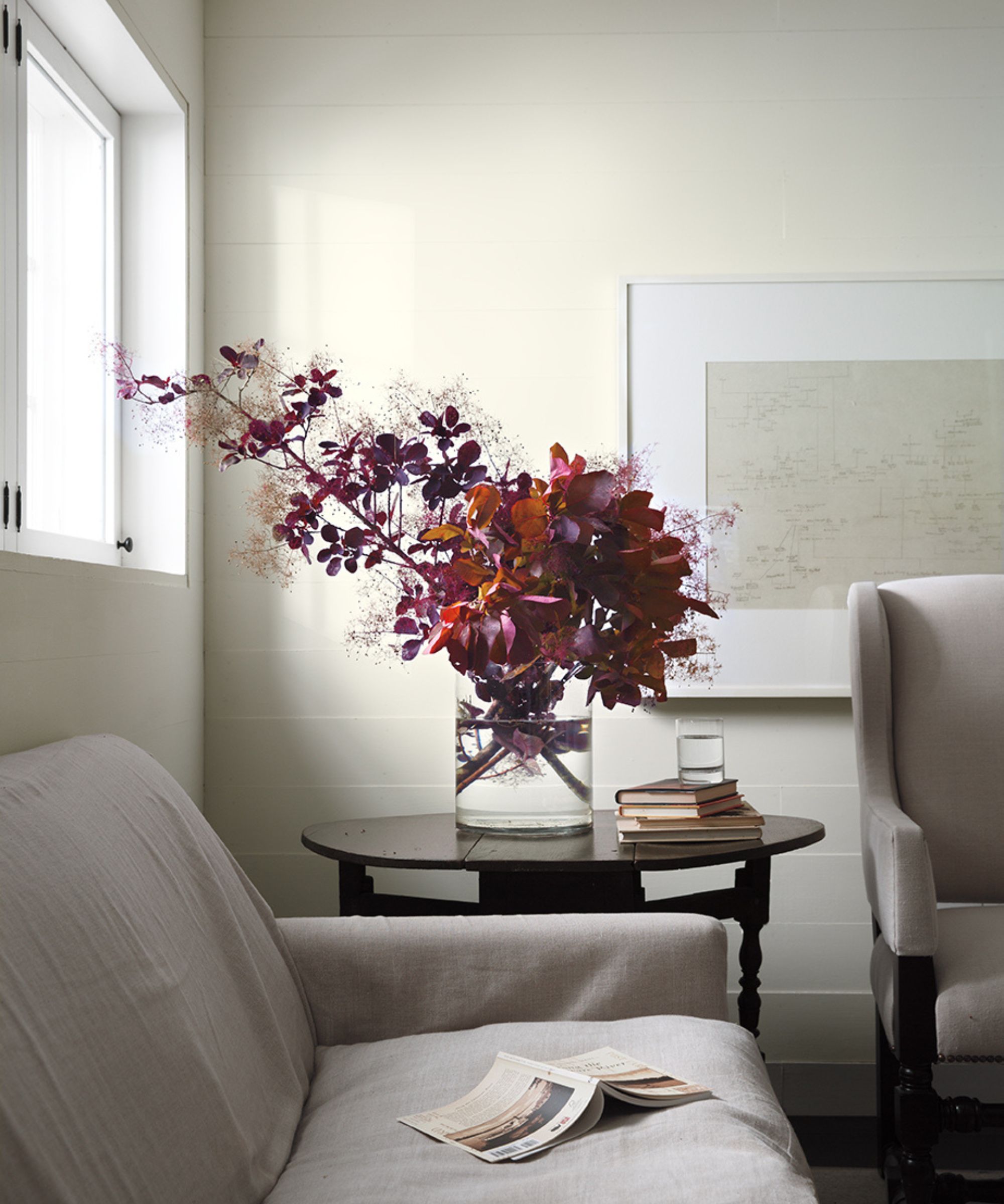
'Cloud Cover is a go-to white that is subtly shaded with a touch of gray, making it a delicate and elegant base color for any room,' says Helen Shaw, Director of Marketing at Benjamin Moore.
If you're looking for a classic, clean white paint that provides a quiet backdrop to your home, Cloud Cover makes a great choice. With its gray tones, it doesn't feel stark as can be the case with some white paints.
'Elevate this hue with layers of texture – dark woods, tactile bouclé textiles, and sleek stone surfaces such as marble and quartz – for a refined, quiet luxe look,' advises Helen.
Featherstone 1002
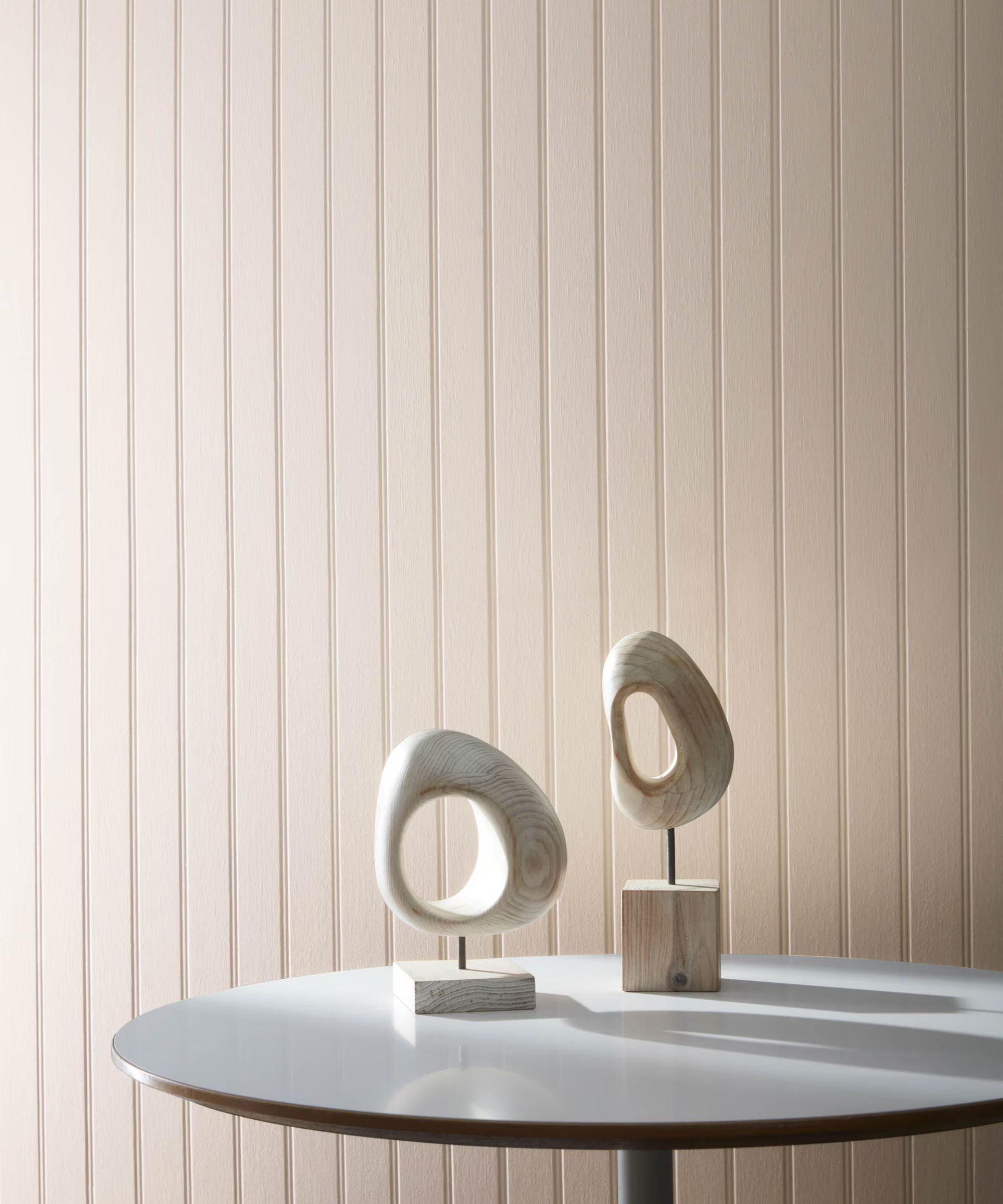
'A stony beige anchored by a hint of taupe, Featherstone boasts warmth that brings surprising depth and texture to a space,' explains Helen. 'It offers subtle shading that plays beautifully with light, making it a popular choice, especially for south-facing rooms.'
You can get creative with your color combinations with this neutral paint if you want to add more depth and interest to your space, too: 'Due to its earthy undertones, it's a color that pairs well with deep mustard or spicy red, resulting in an energized space. Alternatively, pair it with a dusty mid-tone to reinforce an effortless feeling of calm,' says Helen.
Cake Batter CSP-215
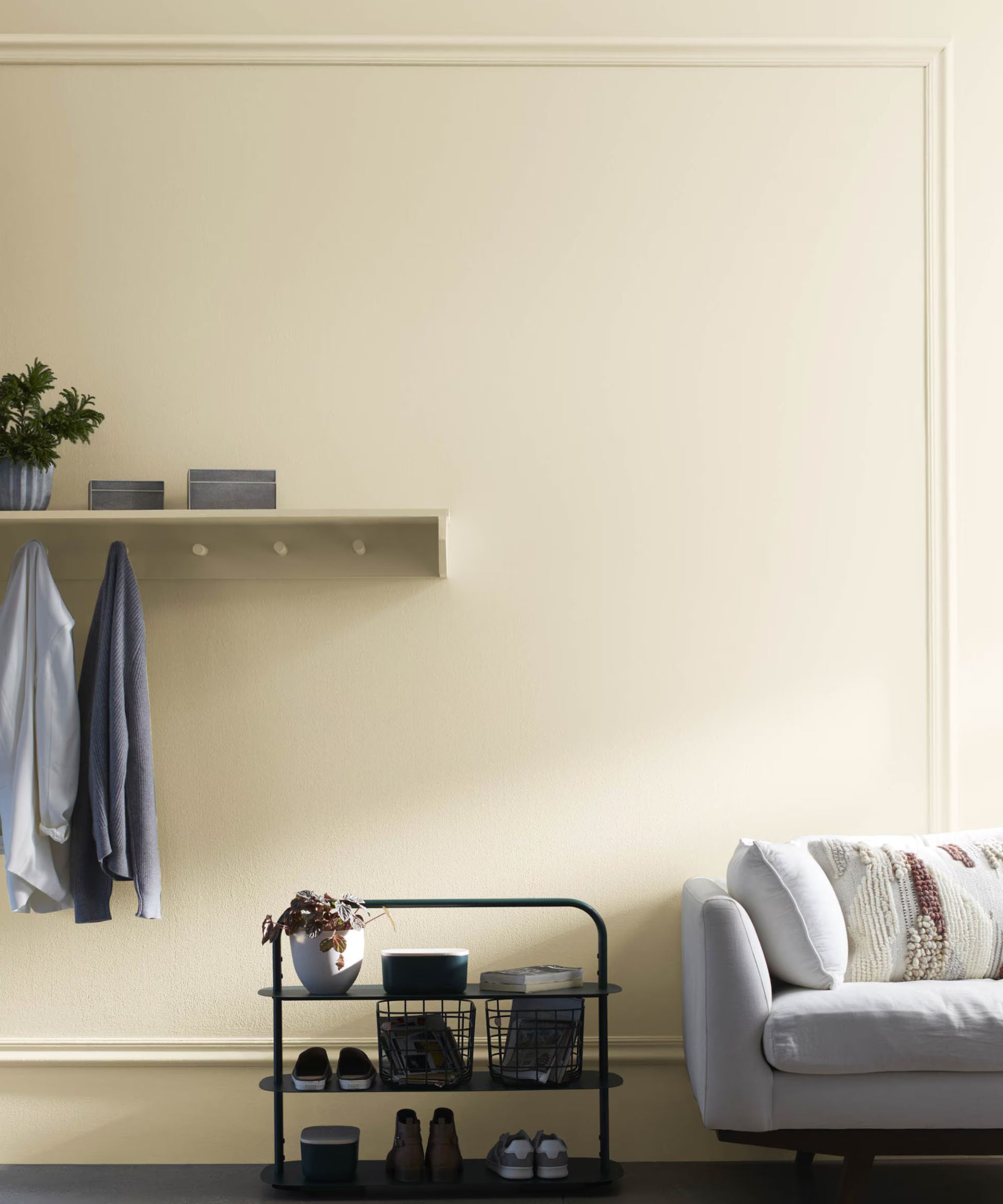
Cream paints are a go-to way to add warmth to a space, without veering too far into the yellow category. Cake Batter, for example, brings a soft warmth into the home and Helen says that it makes an especially good choice for rooms that receive limited natural light:
'Sweet, creamy, and decadent, Cake Batter is an eye-pleasing off-white that verges on beige. The warm undertones create a soft glow making it a perfect choice for north-facing rooms that often feel colder.'
Seattle Gray 2130-70
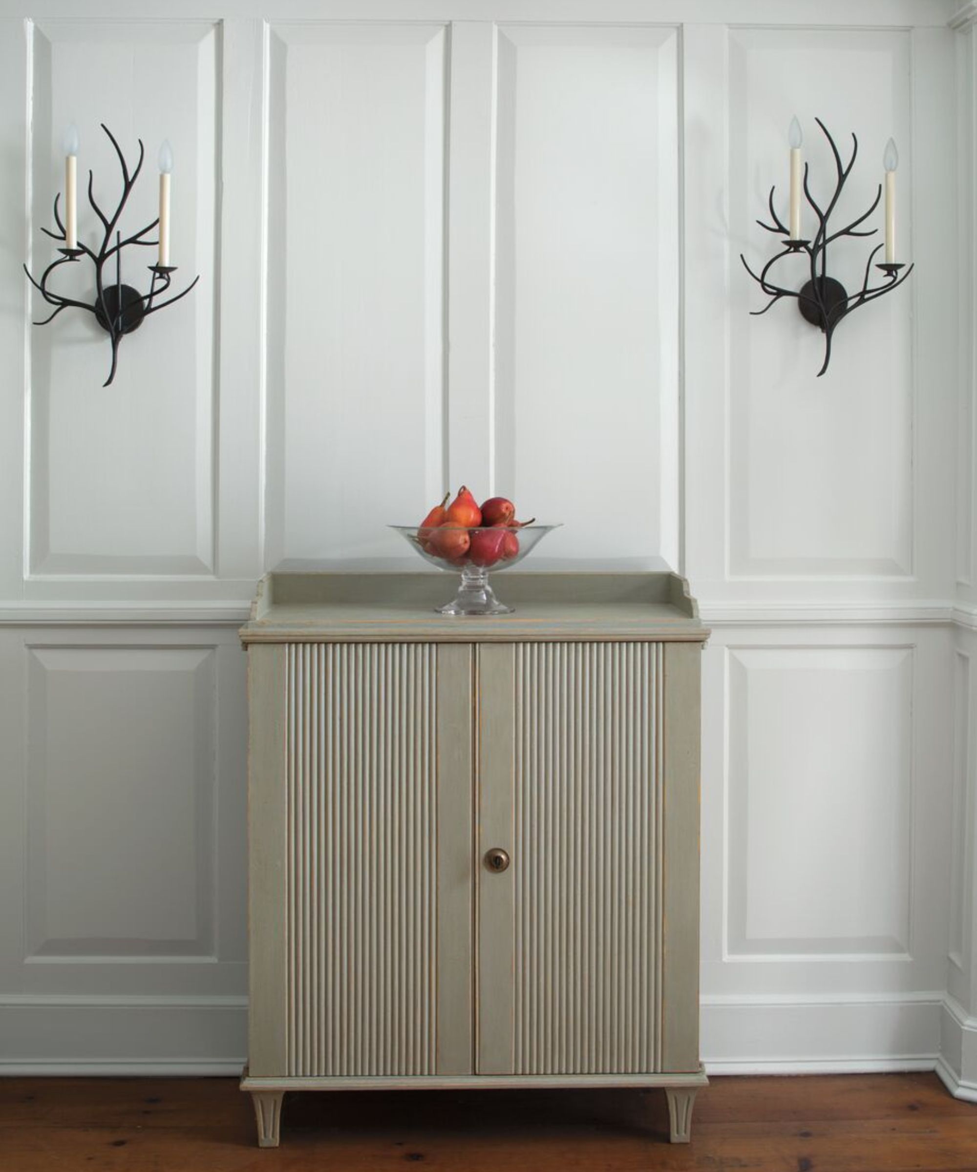
Blue is known to be one of the most relaxing colors, and light versions of this cool hue can help achieve a soothing, airy feel throughout the home, such as Benjamin Moore's Seattle Gray.
'Seattle Gray is a pale, muted silver-blue paint evocative of misty skies,' says Helen. 'This hue works particularly well in south-facing rooms filled with natural light which helps balance cooler undertones. Pair with an icy, mid-tone blue such as Comet and a pop of red for an unexpected element of drama.'
Paris Rain 1501
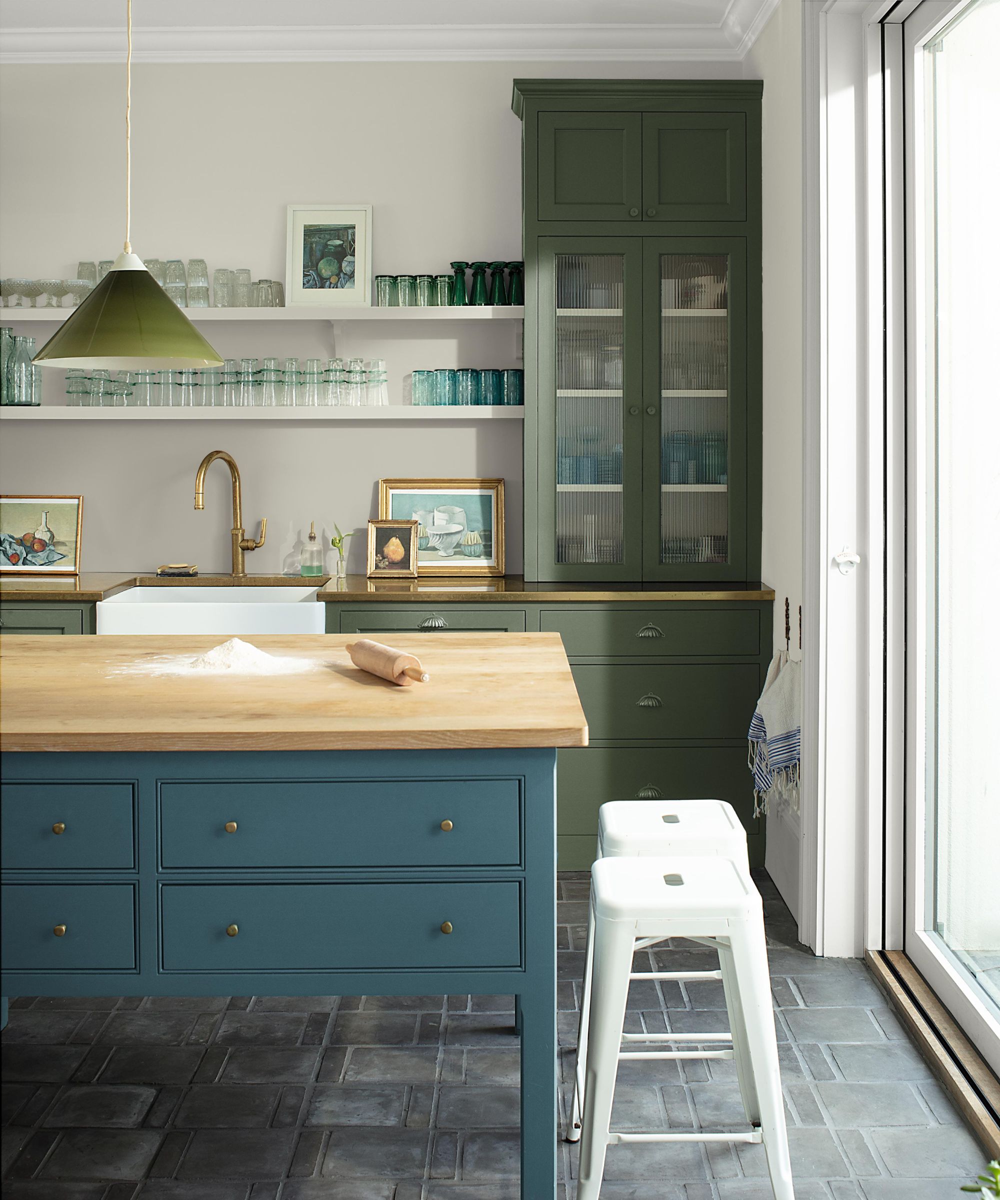
'Part of the Color Trends 2025 Palette, Paris Rain is an "in-between hue" that celebrates a more nuanced approach to color. The softest touch of green invigorates this gray hue, creating a quietly confident impact in a space. As a foundational color, it transitions gracefully from room to room, exuding warmth, comfort, and a sense of ease,' says Helen.
This gray-green paint was used in this kitchen on the walls – teamed with Rosepine and Stained Glass on the kitchen cabinets – working as a softer alternative to white which can cause too much contrast against rich hues.
Wolf Gray 2127-40
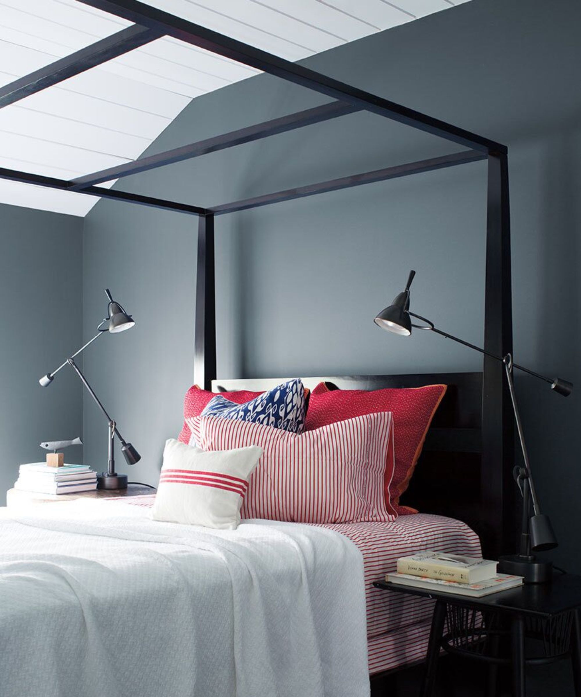
'Rich and dark, Wolf Gray is a blue-gray that has a commanding presence. Create a monochromatic scheme that uses varying levels of saturation of one color and pair this hue with a light blue-gray such as Iceberg and Baby's Breath. This can be a great way to add depth to the room by instantly shifting the dimensions,' advises Helen.
In this relaxing bedroom, Wolf Gray adds a cozy feel to the space, while feeling just as serene as lighter neutrals more typically used in sleep spaces.
Which of these serene paint colors is your favorite? Whichever you choose, these paint colors all have a timeless feel so they'll look great across many design styles for years to come.


