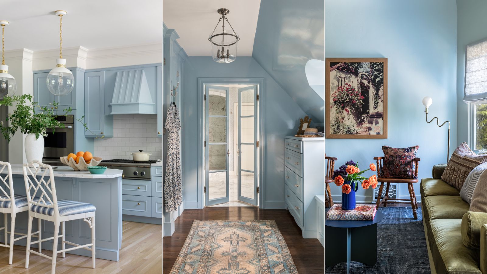
Decorating with pale blue is having a moment in the world of interiors, and for good reason. Known to be one of the most calming colors, light variations of blue evoke a tranquil feeling throughout the home.
Incorporating pale blue paint ideas into your home decor can be a great way to embrace the soothing quality of this cool hue, and it's a decor choice interior designers are championing more and more in 2024.
Far from appearing cold, the best paints for decorating with blue feel fresh yet inviting for a truly cozy interior scheme.
6 of the best pale blue paints
To help narrow down the best pale blue paints, we spoke to interior designers to uncover their favorites which they've tried and tested in projects, from living rooms to kitchens.
If you're on the hunt for the perfect soothing paint to channel the popular blue color trend, these options from leading paint brands will no doubt have you covered.
1. Lulworth Blue, Farrow & Ball
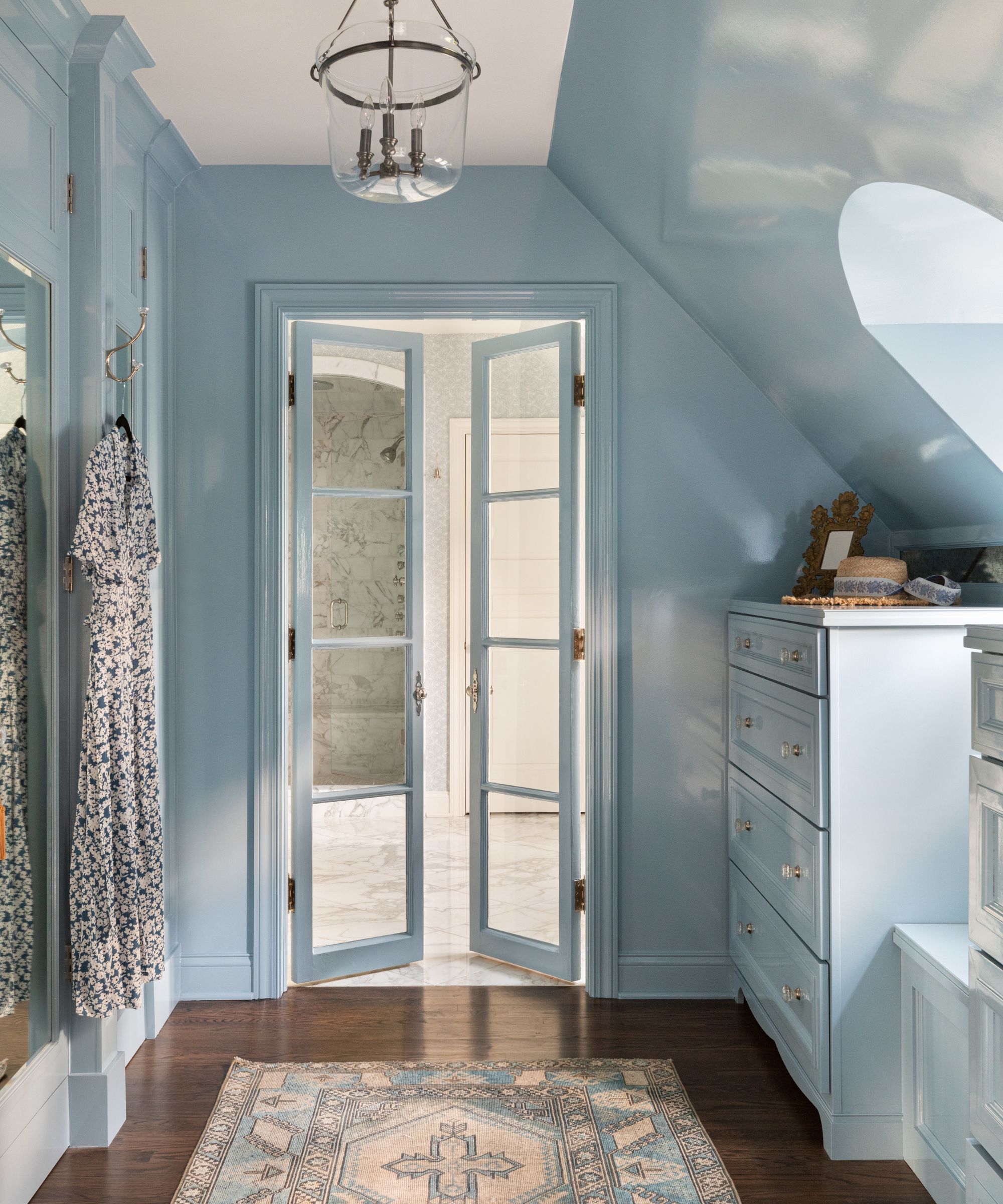
'Lulworth Blue by Farrow & Ball is my favorite shade of blue,' says Illinois-based interior designer Alexandra Kaehler. 'It is a really fresh, crisp blue that still has a lot of warmth in it.'
The designer used this pale blue paint in this walk-in closet, showing how effective color drenching a room in blue can be for a soothing look and feel that nods to coastal decor.
2. Winter Lake, Benjamin Moore
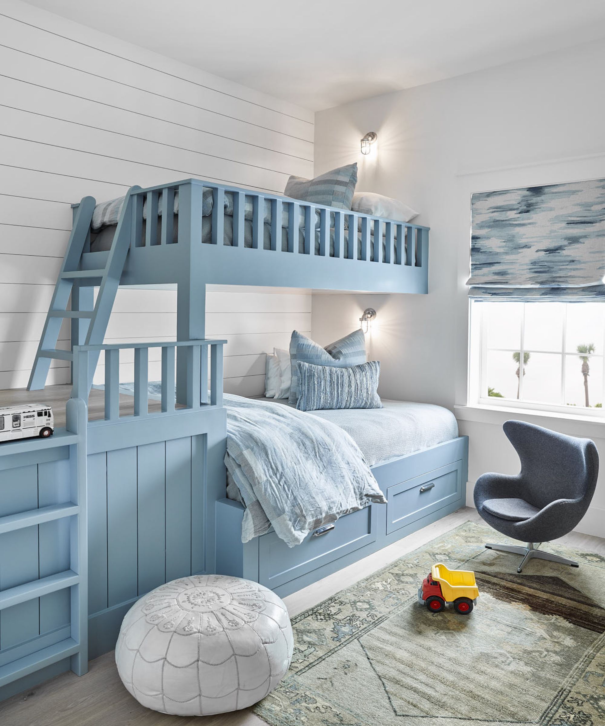
Benjamin Moore's Winter Lake is a restful blue paint with gray undertones, and it's a favorite for interior designer Anne Grandinetti of Ashby Collective, who explains why it was chosen to create a restful atmosphere in this children's bedroom:
'I had the opportunity to bring in an ocean hue into this boy’s bedroom, as this home is on the coast. The color is crisp, without being too cool, and works as a great contrast with other colors. I like to use it when I am creating a calming and serene atmosphere in a space.'
3. Palladian Blue, Benjamin Moore
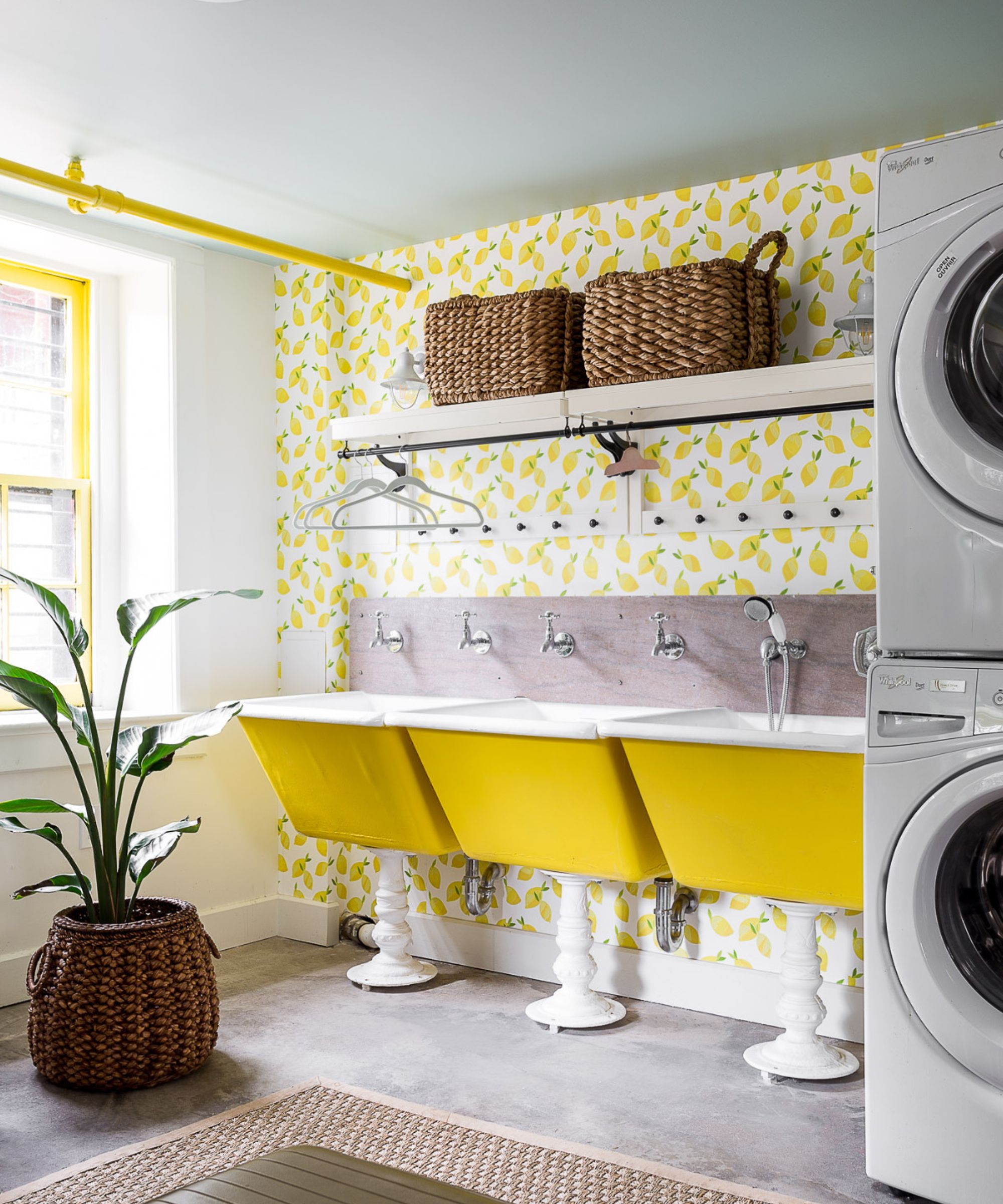
Appearing almost as white, Benjamin Moore's Palladian Blue is an incredibly subtle pale blue paint with a turquoise tint. Interior designer Bethany Adams used this shade on the ceiling in this laundry room, providing more interest than stark white.
'I love to use Benjamin Moore's Palladian Blue on the ceiling,' says Bethany. 'It has that perfect greenish-blue tint that lifts the space so it is especially good for small bathrooms, low-ceilinged basements, or porch ceilings.'
4. Blue Ground, Farrow & Ball
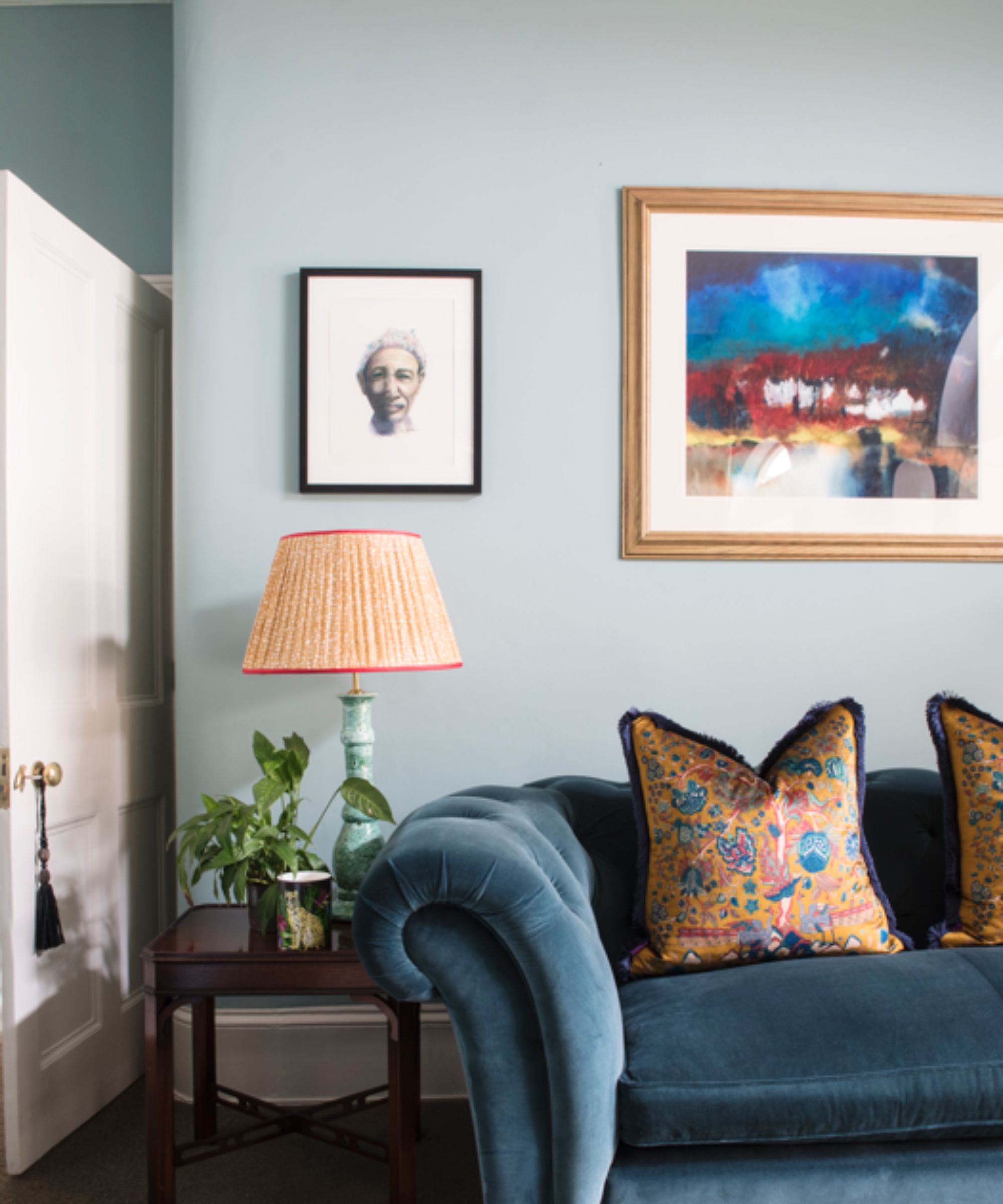
For interior designer Matthew Williamson, Farrow & Ball is a go-to brand for some of his favorite pale blue paints. More specifically, Farrow & Ball's Blue Ground is a standout color, which he says appears both relaxed and timeless when used in interior schemes:
'I don’t tend to use blue on walls all that often, but when I do, it is usually a classic color like Blue Ground. There is a timelessness to it – unlike some other shades, its relaxed feel will not tire or date.'
5. Cromarty, Farrow & Ball
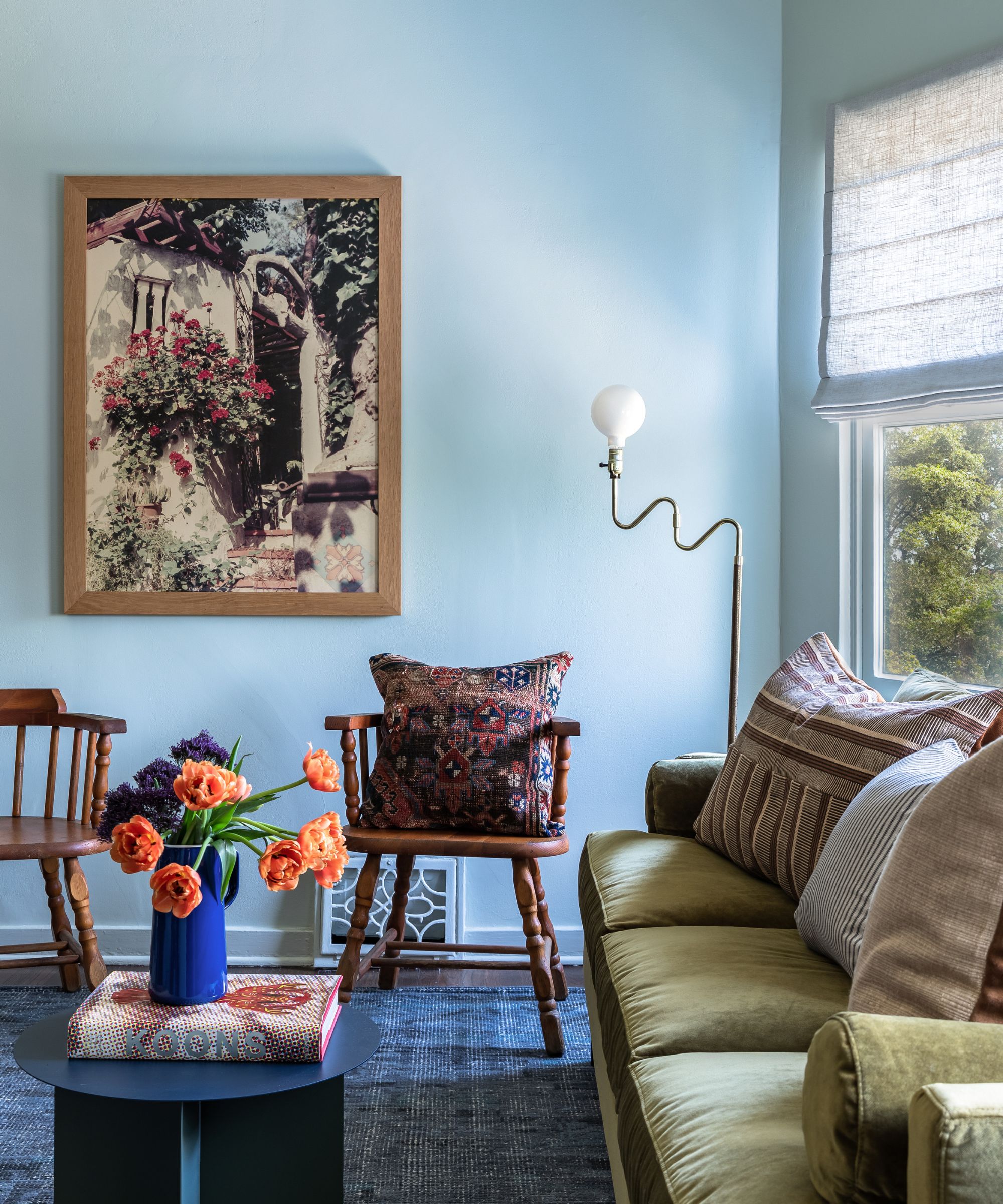
A true chameleon color, Farrow & Ball's Cromarty is officially a green-gray paint, but interior designer Jillian Kliewer explains that it appears as a light blue in this living room:
'This shade transforms from light blue to light green on walls where loads of light is reflected from the exterior landscape. This room reads very blue for this color, which I love. It's a perfect backdrop for a space filled with colorful furniture and vibrant accessories.'
6. Parma Gray, Farrow & Ball
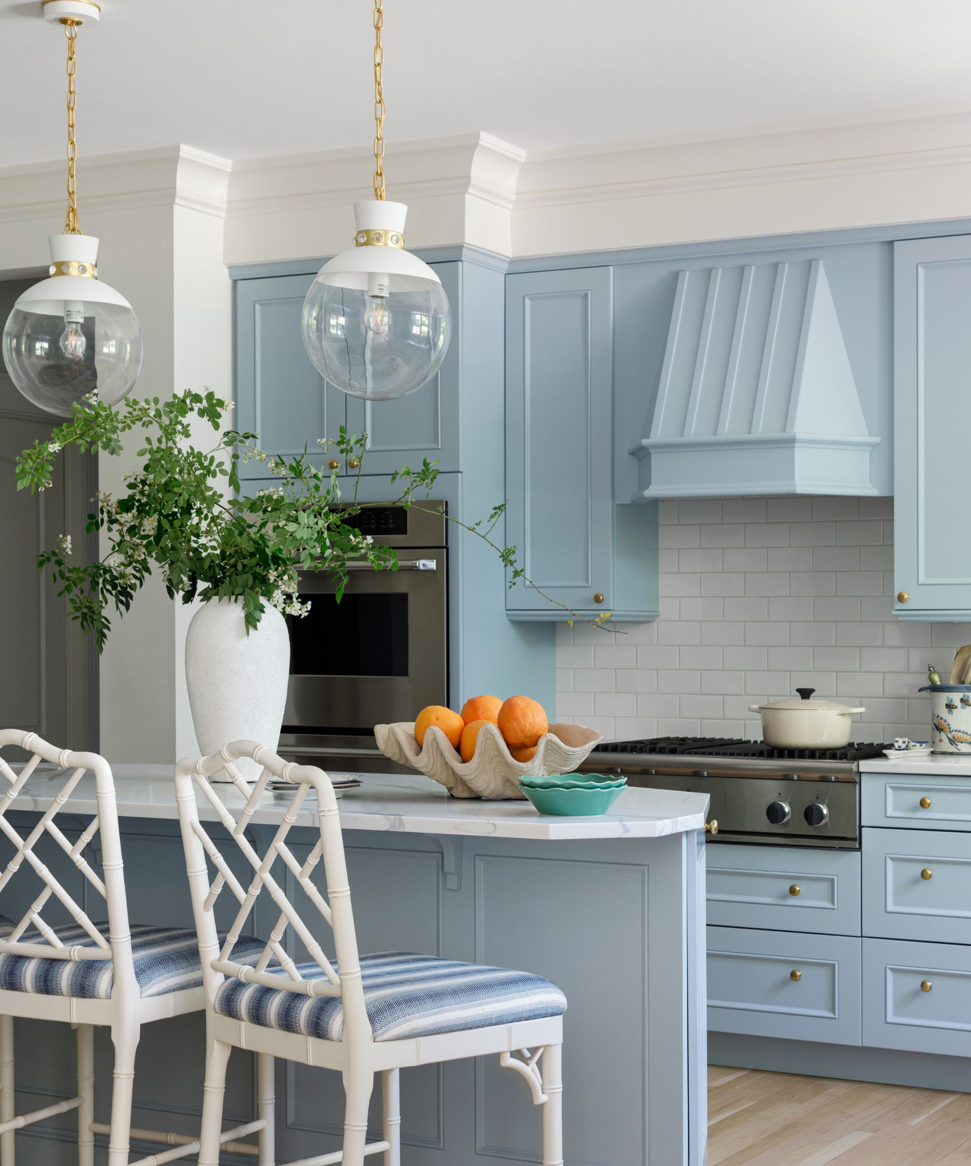
Farrow & Ball's Parma Gray is another favorite among designers. A clean and cool light blue paint, Parma Gray feels relaxed and is versatile enough to be used throughout the home.
Alexandra Kaehler opted to use this shade in this blue kitchen on the kitchen cabinet ideas, giving the room a coastal feel. 'I love Parma Gray by Farrow & Ball because it is such a versatile blue,' the designer explains. 'In some lights, it is a true French blue, but other times it can read a bit muddier and warmer.'
Whether you color drench a room in pale blue or use it more sparingly as an accent color, it's an expert-approved way to create a soothing feel in your home.
If you're feeling inspired to dabble with this popular color trend, these top picks of pale blue paints make for failsafe choices.


