In the run up to the release of The Legend of Zelda: Tears of the Kingdom, Nintendo's latest instalment in the Zelda franchise, we're taking a look back at the ever-changing logo design. With consistent typography and a plethora of different illustrations, each logo perfectly represents the game style – but which one is the best?
Fans have historically had a lot to say on which Zelda logo is the most successful – as proved by a Reddit post from last year, which sparked a fierce debate. Here, we take a look at some of the standout logos, and share some of the debate surrounding the controversial issue. Want more logo inspo? See our favourite places to get logo design inspiration.
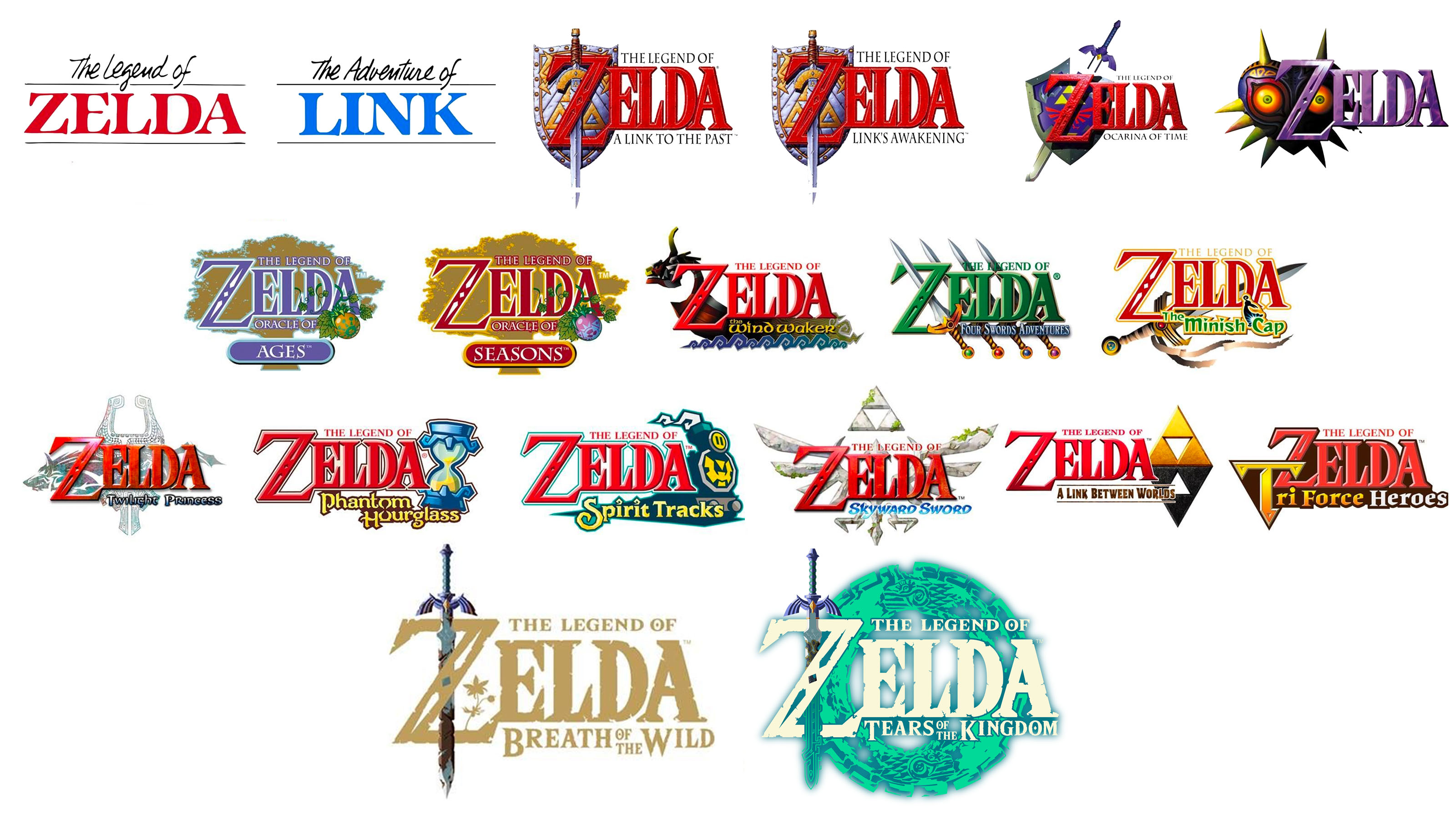
As shown in this graphic, the series has had consistent logo design since the release of the original Legend of Zelda game back in 1986. The name of the titular princess sits front and centre in bold letters with elegant serifs, with "The Legend of" sitting neatly tucked above the name. The sub-header of the specific game then sits below that, slightly offset to the right to snugly fit in the crevices of the word. It's a simple design, yet the sheer variety of game titles available today proves just how versatile this formula is.
The varying game styles of the Zelda franchise have a big impact on the logo design. From the ultra cartoony Wind Waker to the gritty darkness of Twilight Princess and Majora's Mask, Nintendo certainly isn't afraid to experiment with the tone of its games. With such a wide range of themes and styles on offer, each logo needs to quickly inform potential players what kind of game they're about to play.
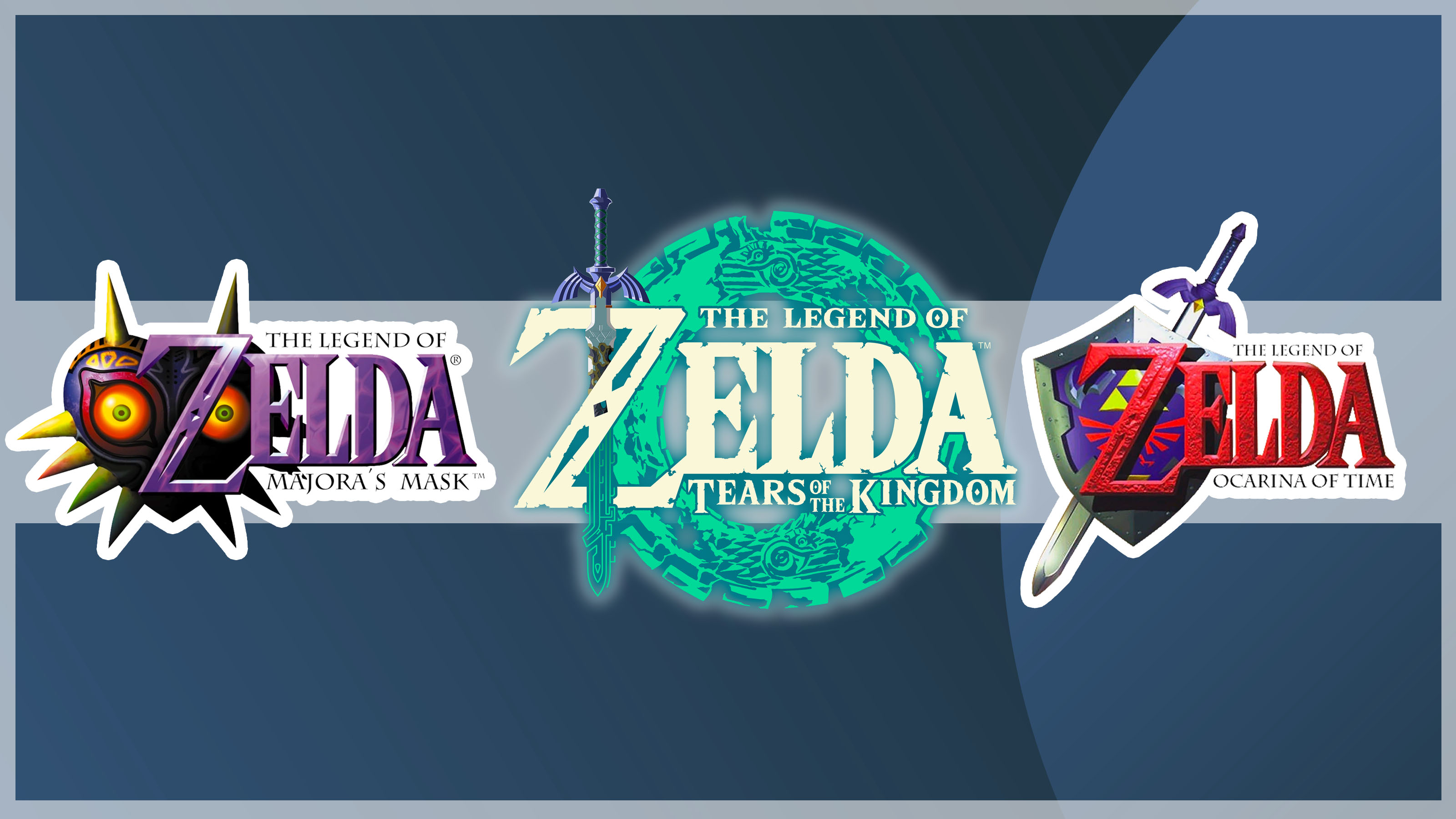
In a thread shared to Reddit by user r/Mabroon last year, fans were divided on which is the best logo overall and many shared their personal favourites. Lots were hooked on the Majora's Mask version for it's sheer spook-factor (see it above). "Majoras mask has the best one. It’s super ominous with the mask in the back" one fan commented.
It's definitely one of the more unique logos of the bunch, with the lettering coloured a rich shade of purple and the menacing mask peering out from behind it. Whilst the majority of the mask itself is in shadow, those piercing orange eyes boldly stare at the viewer. It's certainly unsettling.
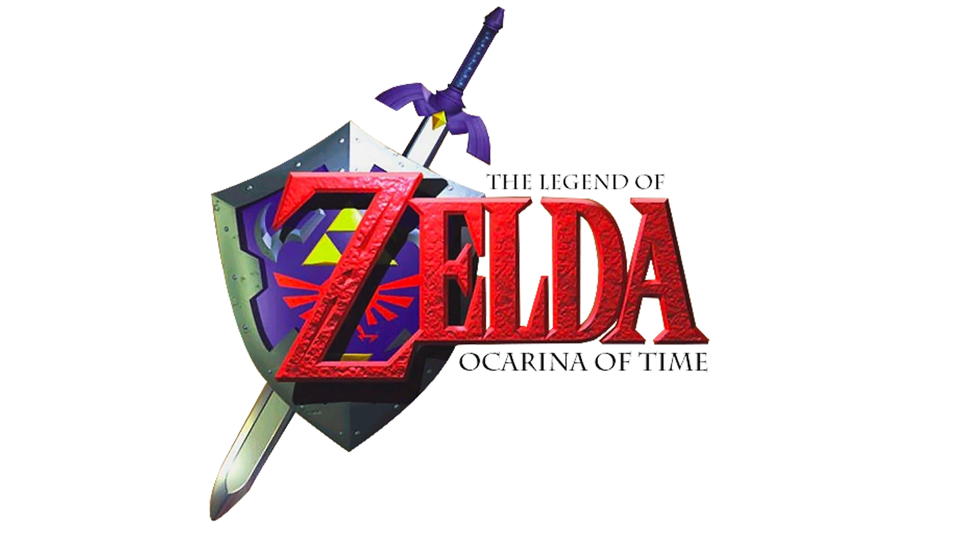
Another favourite was the Ocarina of Time logo, mainly because of the nostalgia it invokes. Originally released in 1998 for the N64, The Legend of Zelda: Ocarina of Time was the first major 3D Zelda game and paved the way for action adventure games as we know them today thanks to the rich open world and detailed story. One comment admitted "I really like Skyward Sword’s ngl. But Ocarina of Time… you just can’t beat the classics…". I love the rough texturing on the letters and the shining sword and shield.
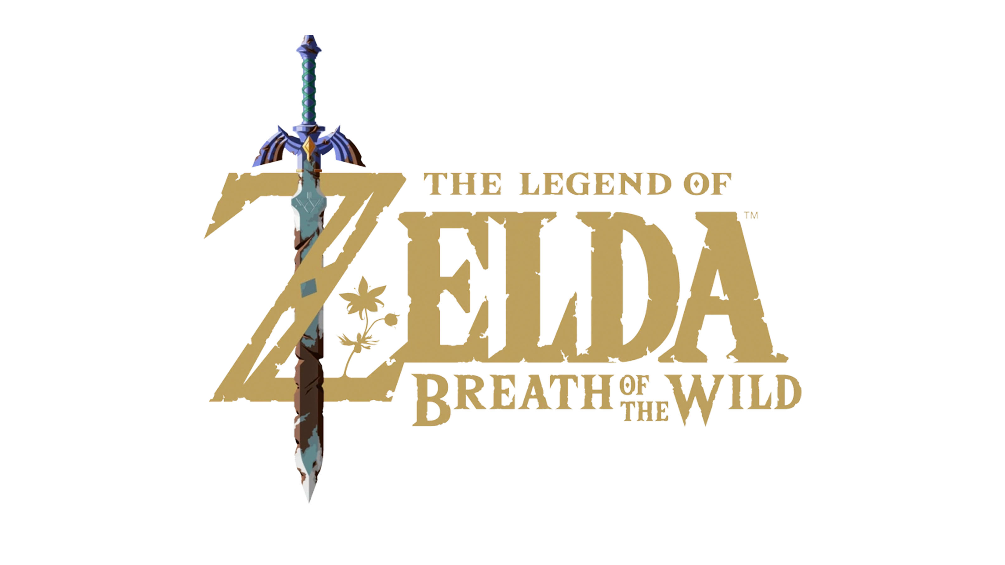
Of course, I can't write this article without talking about Breath of the Wild logo. A few fans in the above Reddit post stated that the Breath of the Wild offering was their firm favourite. "It's so simple, yet says a lot about the game, whilst also adding a layer of mystery. The master sword is old and rusty looking, the flowers emerging from it add to the games title. Gives everything an ancient feel. So good!". The rusted Master Sword that boldly contrasts the royal gold lettering is a great touch of visual storytelling.
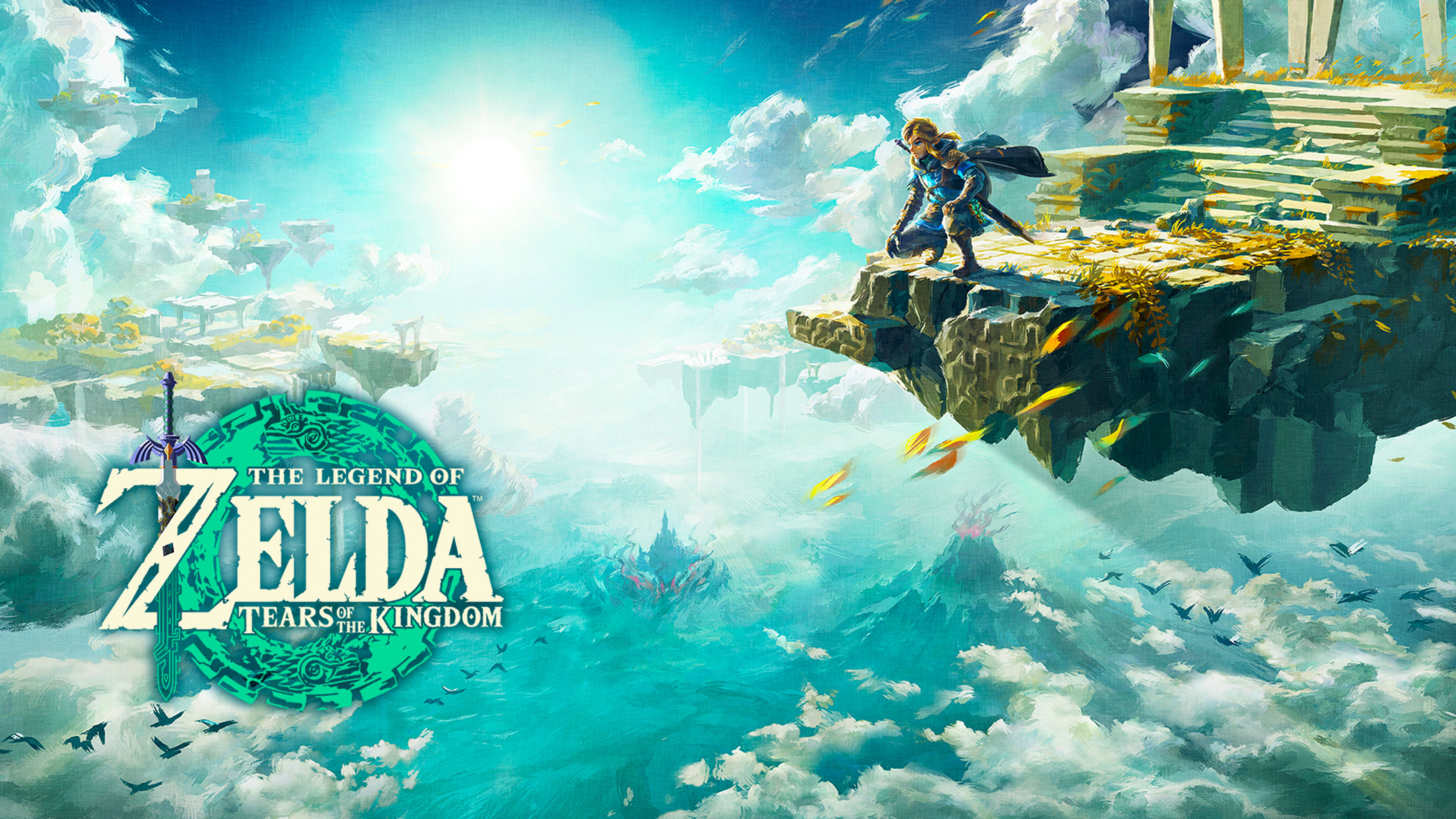
And as for the Tears of the Kingdom logo, I guess I can't say too much until we know the context of the game (which releases this coming Friday). However, I already know that this is one of my personal favourites (although Twilight Princess still takes my top spot).
The way the Master Sword dissolves into the intricate patterning to match the rest of the logo is a subtle yet beautiful detail. This is also the first all-white Zelda logo and I love how it perfectly blends into the main box art. If the game is as well thought out as the logo, I know we're in good hands when it comes to this brand new story. I certainly feel like we'll be adding it to our list of the best Nintendo Switch games of all time.