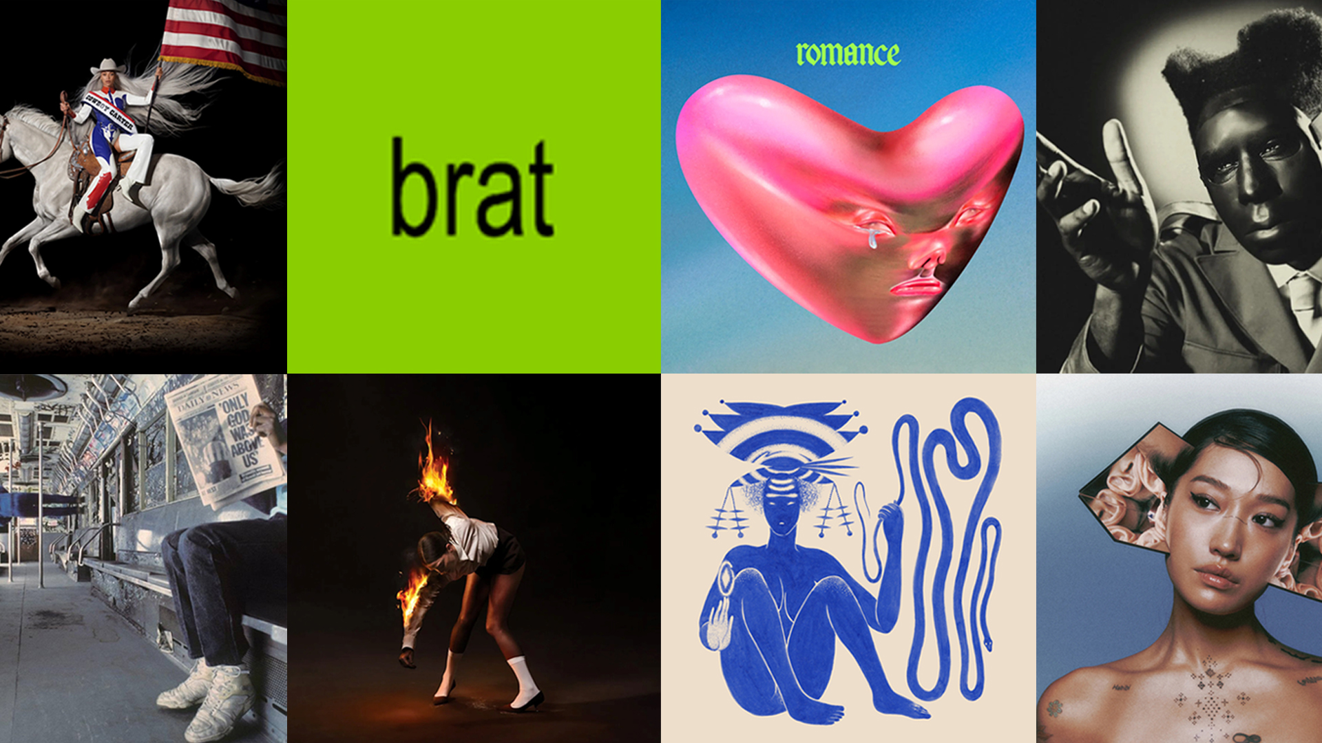
From bare-bones minimalism to boundary-pushing leaps outside of the box, the aesthetic of some of 2024’s most important albums has been as much of a talking point as the music contained within them. Proving that, even in an age of digital music consumption and miniscule Spotify thumbnails, great artwork can elevate a record and help to build a whole world, we take a look at 10 of the most inspired album covers from the last 12 months.
Charli XCX - 'Brat'

Designed by artist Brent David Freaney of Special Offer Inc., the artwork for Charli XCXs cultural behemoth sixth record Brat consisted of little more than a title, written in low resolution Arial font, and placed atop a now omnipresent lime green background. For it, Freaney tested 500 shades of green to find one that, as XCX told Billboard, was 'quite disgusting… unfriendly and uncool', eventually landing on the Pantone 3507C hue that would become the defining colour of 2024. The artwork’s lack of traditional appeal became precisely its selling point, underlining the singer’s original missive: 'I'd like for us to question our expectations of pop culture—why are some things considered good and acceptable, and some things deemed bad?'
Primal Scream – 'Come Ahead'
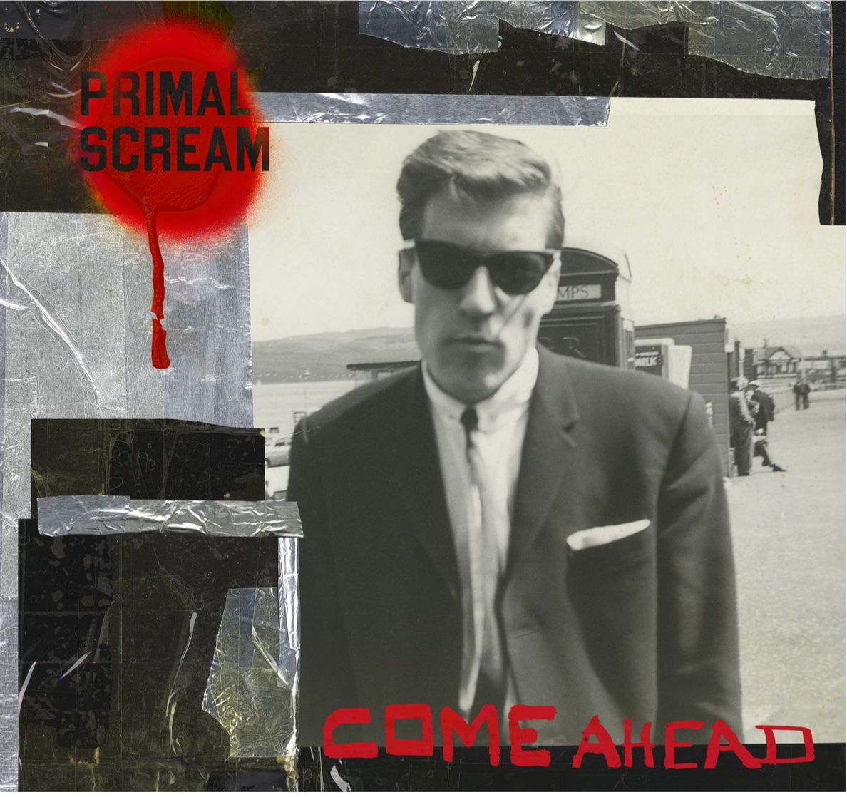
For Primal Scream’s 12th studio album, the Scottish alternative stalwarts enlisted Turner Prize nominated artist Jim Lambie - shortlisted in 2005 for his installation Mental Oyster - to create a collage. Based around an image of singer Bobby Gillespie’s father Robert, a trade union activist who passed away in 2023, Lambie crafted an eight foot wide art piece, later digitising and manipulating it to create the album’s eventual cover. The result was both a tribute to his father and a collaboration between two pillars of Glaswegian creativity.
St Vincent – 'All Born Screaming'
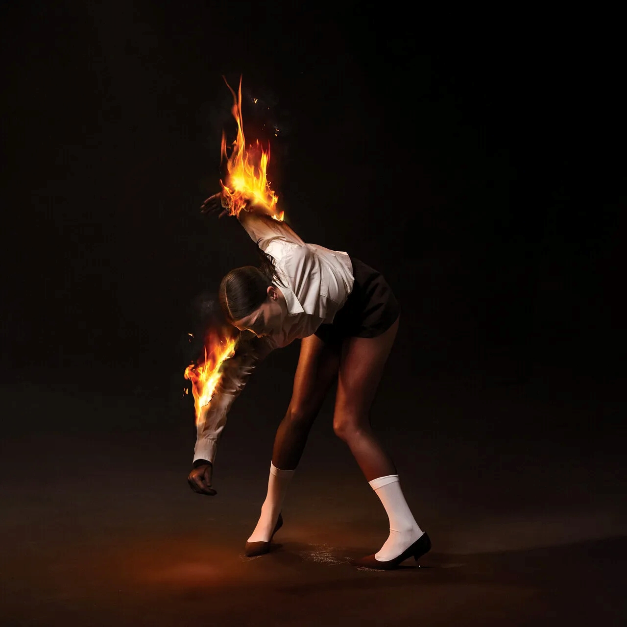
A collaboration between musician (and recent Wallpaper* guest editor) Annie Clark and conceptual artist Alex Da Corte, the striking image that adorns St. Vincent’s All Born Screaming came as a result of conversations and sketches. “There was no mood-boarding. I remember very clearly one drawing I made – of a person on fire – and it just clicked,” Da Corte told Wallpaper* earlier this year. Inspired by great works of art including Goya’s Black Paintings, their aim was to create an image with gravity and a timeless weight. In the words of Clark: 'Between the subject matter in the album, which is black, white and all the colours of the fire, you’re alive and then you’re really fucking dead, and the rest is a dance with chaos.'
Vampire Weekend – 'Only God Was Above Us'
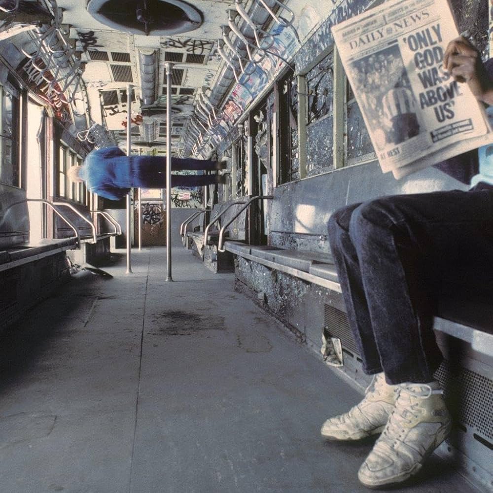
When Vampire Weekend frontman Ezra Koenig discovered a collection of photos taken in the ‘80s by New York photographer Stephen Siegel, he was so taken by one – entitled Subway Nightmare 11 – he decided to change the name of the band’s new record to work around it. Captured in a scrapyard containing dozens of abandoned subway cars, the perspective-altering shot features a newspaper headline reported after a plane crash, bearing the phrase ‘Only God Was Above Us’. When there was no space on the image to insert the band’s name and a new title, Koenig decided to simply change course and use the phrase instead.
Billie Eilish – 'Hit Me Hard and Soft'
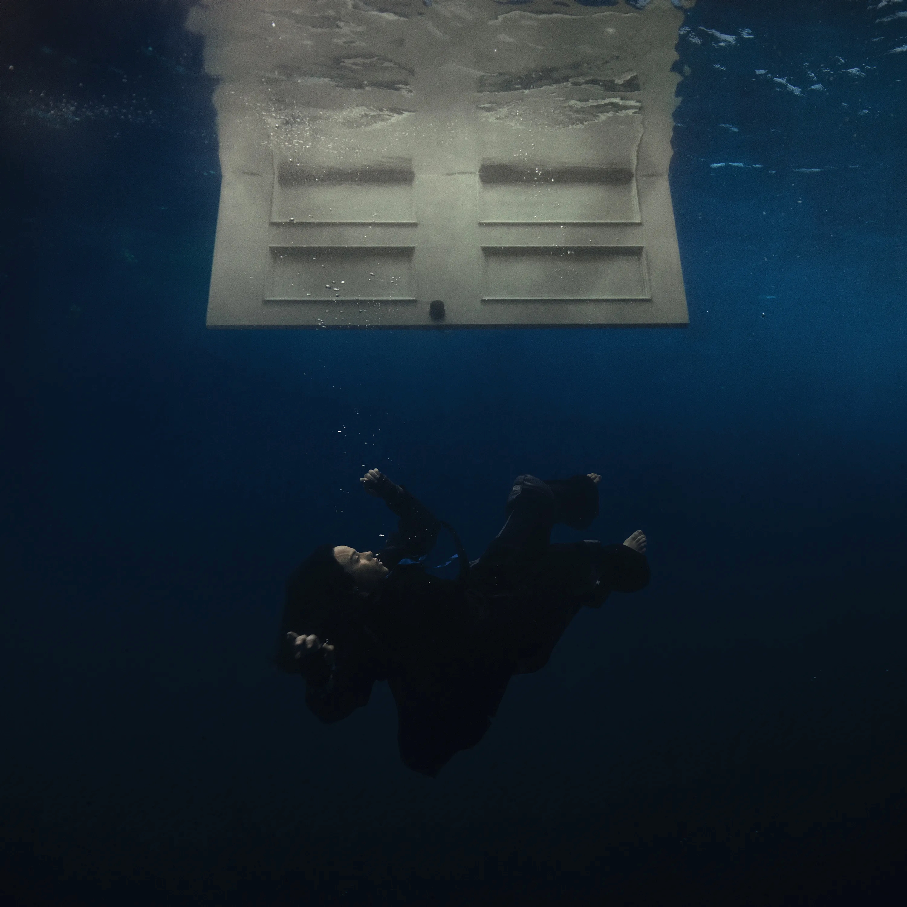
Captured by underwater photographer William Drumm, the image created for Billie Eilish’s 7x Grammy-nominated third album was a true labour of love. Shot in a 10ft deep water tank, the process involved Eilish submerging herself repeatedly for six hours to get the shot, with Drumm using diffusers to create a more atmospheric soft lighting. Of the shoot day, Drumm has explained: “We had set up the lighting and the background to reflect subtle blues and silvers, making it look as though Billie was actually deep in the ocean. She closed her eyes for a few seconds as if meditating on the emotions the album stirred within her, and that was the moment we captured the shot that ended up on the album cover.”
Peggy Gou – I Hear You

The apex of a collaboration between South Korean DJ Peggy Gou and Icelandic-Danish artist Olafur Eliasson that stretched throughout the campaign for her debut LP ‘I Hear You’, the record’s artwork sees Gou wearing Eliasson’s 2023 sculpture ‘Psychoacoustic empathy amp’. Nicknamed the ‘ring of ears’, the sculpture plays with the idea of artist and audience and the 'reciprocity' of that audio experience. 'It is not only the room that listens to her; she listens to the room,' explained Eliasson during a talk at Switzerland’s Fondation Beyeler. 'They are listening cones, whose kaleidoscopic, multidimensional quality amplifies the sound of the room when you wear them, allowing you to hear many truths.'
Beyoncé - Cowboy Carter
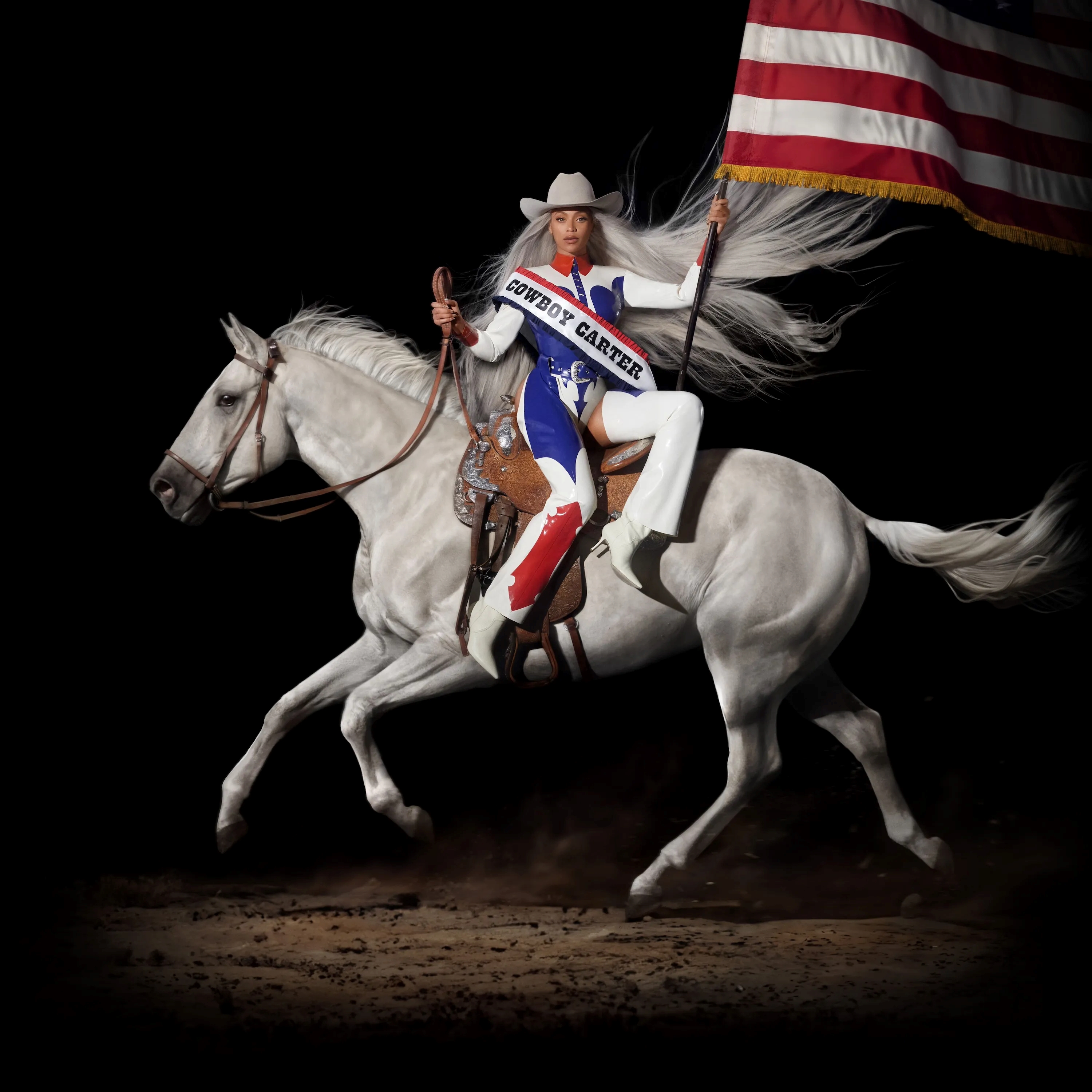
Photographed by long-term collaborator Blair Caldwell, the image that adorns the superstar’s first foray into country music is notable as much for the cultural story it tells as the impactful shot itself. Featuring the singer riding side-saddle - a stance associated with high-status women - and holding an American flag reminiscent of a rodeo queen, the traditions it nods to directly highlight the artist’s position as a Black woman in a genre that has long been whitewashed. Comparisons have been drawn to work by New York painter Kehinde Wiley, who references the style of Old Master paintings in his depiction of modern Black subjects including Barack Obama, while Beyoncé has previously said that the record was 'born out of an experience that I had years ago where I did not feel welcomed.'
Fontaines DC - Romance
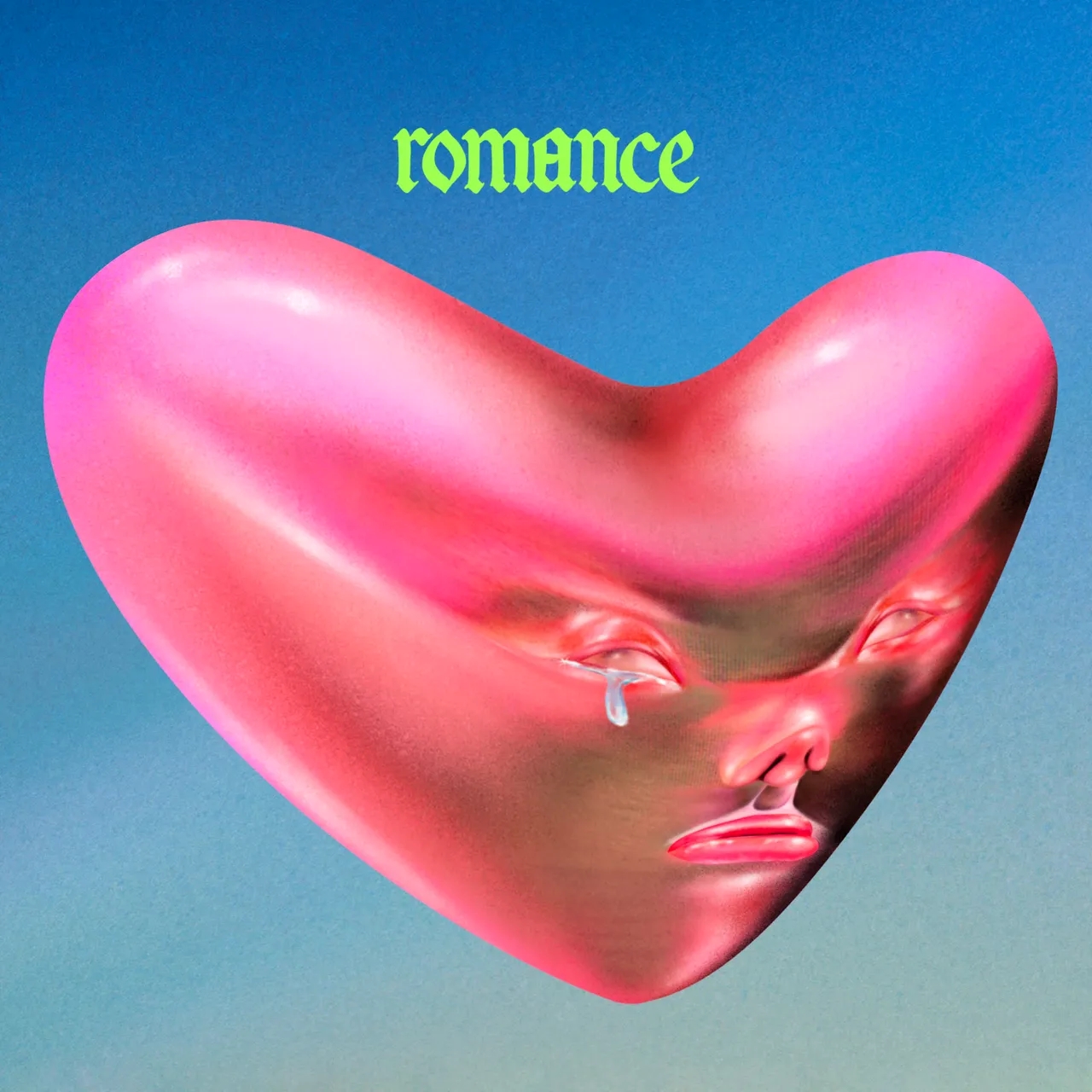
Where Dublin quintet Fontaines DC’s previous aesthetic was rooted in DIY sensibilities, for their game-changing fourth record ‘Romance’ they licensed the work of Taiwanese artist Lulu Lin to help build a world rooted in uneasy futurism. A “crying heart” created on an iPad, the image that graces the cover is one of five that has been used throughout the campaign, all encapsulating Lin’s warped, biomorphic designs. Of the creative concept as a whole, label XL Recordings’ art director Texas Maragh stated previously to Creative Review that: “When we listened to the album, we were struck by how big the music sounded so wanted to use bold bright acid colours and oversized typography to reflect that. Everything is heightened and loud. We wanted to create a sense of the artwork bursting out of the packaging, like it was too big to be contained."
Tyler, the Creator – Chromokopia
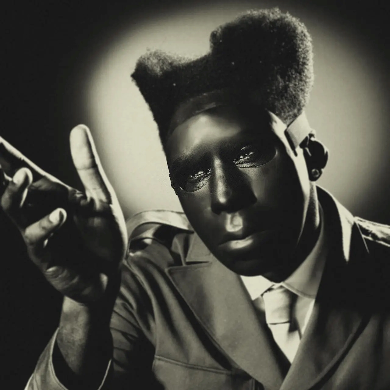
Collaborating with director of photography Luis Perez (the man behind previous Tyler albums ‘Igor’ (2019) and ‘Call Me If You Get Lost’ (2021)), for October’s ‘Chromokopia’ the musician and artist set about building an image referencing Alfred Hitchcock and 1940’s Hollywood. To add a sense of the uncanny, a specially-commissioned ceramic mask was made that Perez has described as “transcend[ing]” the usual expectations of the aesthetic. Similar, sepia-toned imagery has been used throughout the album’s videos and visuals; a world away from the Wes Anderson-like colour palettes of his most recent work. “Tyler wanted it to feel surreal,” Perez told Artnet about the project. “He was on this whole thing about Surrealism and creating a very unsettled experience.”
Hiatus Kaiyote - Love Heart Cheat Code
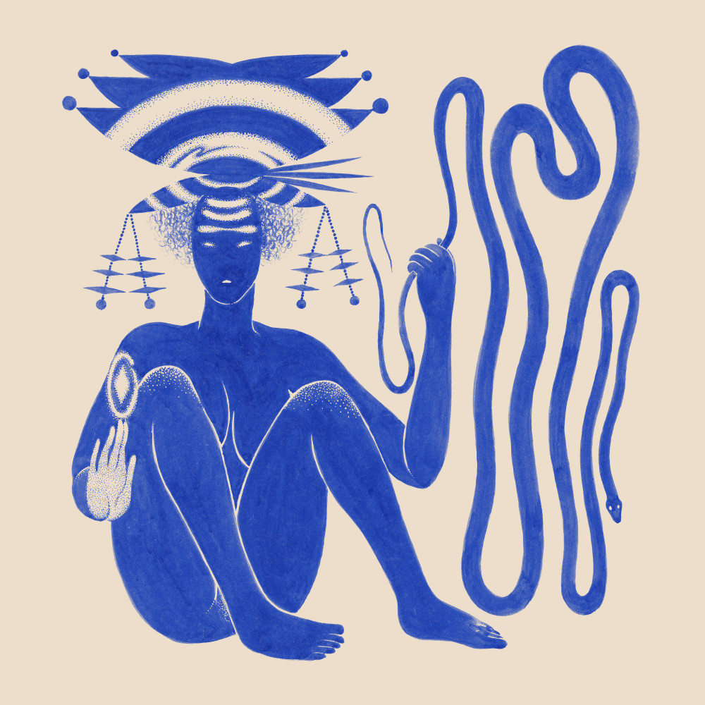
Using a painting by Sri Lanka-born, Toronto-based artist Rajni Perera as a starting point, Melbourne jazz-funk group Hiatus Kaiyote then went on to craft an entire multimedia world for their fourth album ‘Love Heart Cheat Code’. Working with illustrators Chloe Biocca and Grey Ghost to create symbols and artefacts for each track that fit alongside the original artwork, these illustrations were then turned into physical objects including jewellery and edible goods. Alongside the real life items, they also conceived of an imaginary ‘supermarket’ for them to be sold in - a comment, they’ve explained, on how musicians are increasingly thought of as products.
